What is Chainsaw Man?
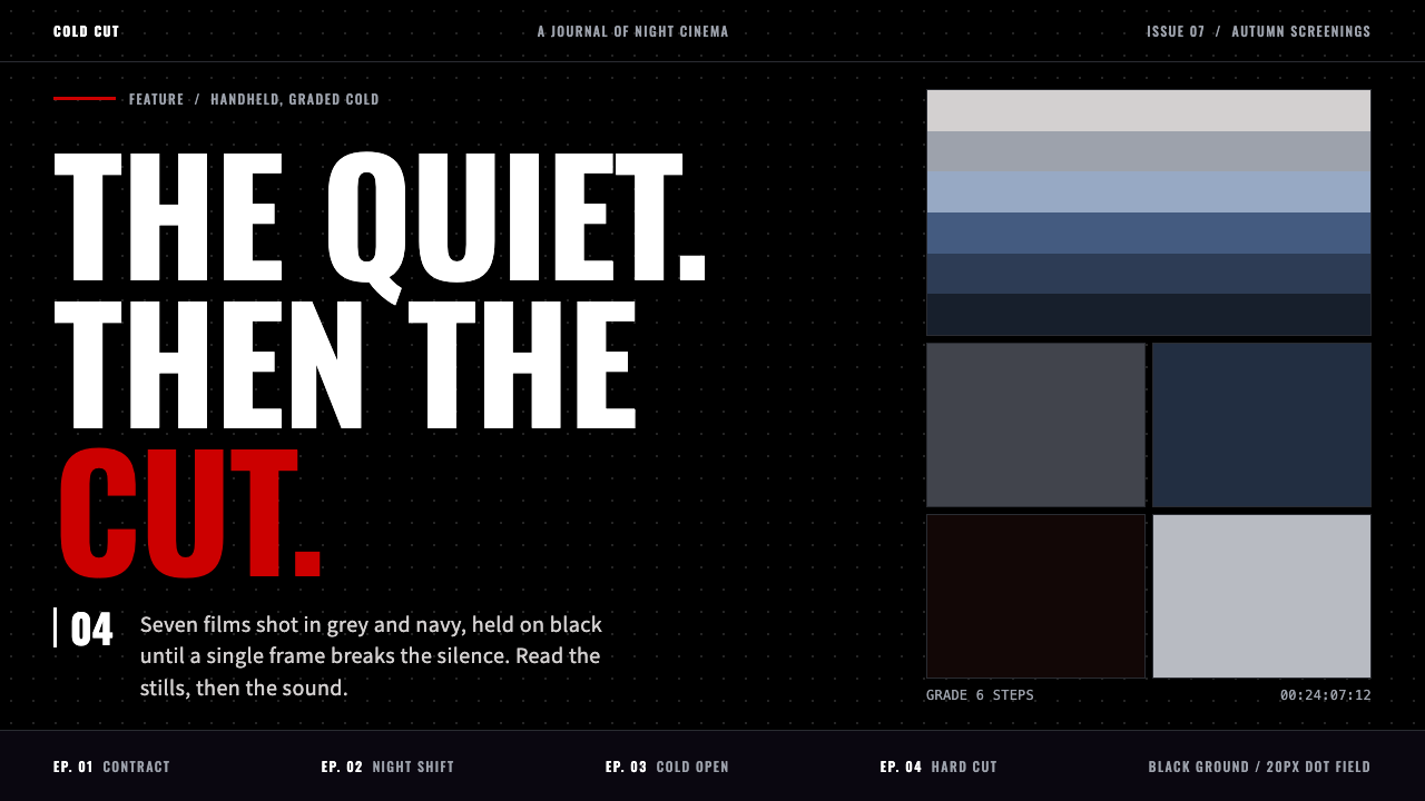
Chainsaw Man style is a quiet black page, cold grey and navy, with a single stamped red cut that arrives like the sound of a saw in a silent room.
Chainsaw Man in brief
Chainsaw Man style is a dark, cinematic design language drawn from MAPPA's 2022 television adaptation of Tatsuki Fujimoto's manga. The page is mostly black, covered in a fine dotted texture, with key visuals graded in cold grey and navy. It treats a shōnen action series the way a film treats a drama: restrained, grainy and a little detached.
The defining move is the split between silence and violence. Most of the surface is quiet and dim, and red is used as a single signal: the stamped title logo, a thin bar, or one word inside a headline. Because red is so rationed, each appearance reads like a cut. Typography supports this with condensed capital letters that feel like film credits, set against a clean Japanese sans-serif for everything else.
The mood is also deliberately anti-polish. Rather than a glossy shōnen poster, the style keeps the rough, scratchy character of the source drawing underneath, with aged, desaturated stills and visible grain. It does not use blood as decoration. What it borrows is the tension before the cut.

Where does Chainsaw Man come from?
The source is Chainsaw Man, a manga by Tatsuki Fujimoto. It began serialization in Weekly Shōnen Jump in 2018, and its first part ended in 2020, with the second part starting in 2022. Fujimoto's drawing is known for a raw, irregular line and a film-literate sense of framing, which later made it a natural candidate for a cinematic adaptation.
The television anime aired from October to December 2022, produced by the studio MAPPA and directed by Ryū Nakayama. Instead of the saturated, high-energy look common to the genre, the production adopted a restrained, realistic approach. Its key visuals were graded cold, its camera behaved as if handheld, and its editing followed film rhythms. Kazutaka Sugiyama worked on the character designs, translating Fujimoto's rough figures into forms that could be animated while keeping their unease.
The opening sequence became part of the identity. Its theme song was performed by Kenshi Yonezu, and the sequence is built as a parody of film references, cutting between cinema-like fragments. This film-parody quality reinforces the idea that the series should be read through the language of movies, not through the language of poster art.
As a design system, Chainsaw Man belongs to three overlapping currents: cinematic realism in television anime, the film-parody opening sequence, and the wave of dark action series that Jump produced across the 2010s and 2020s. The official site's black dotted pages and the red stamped title are the main references for the web language.
What defines the Chainsaw Man look?
Color
The base is near-black with cold grey and navy grading, so that photographs and stills feel faded and film-like. Red is the only strong hue and appears in one place per view: a stamped logo, a thin bar, or a single word. Because it is never spread across large areas, it keeps its violence. Everything else is a restrained range of greys, with white used sparingly for text and fine borders.
Typography
Latin headlines use a condensed grotesque in capital letters, tall and narrow like film titles and posters from a cinema lobby. Japanese text and body copy use a clean, neutral sans-serif, so reading stays comfortable against the dark ground. The contrast between narrow capitals and plain body type gives hierarchy without needing size jumps or ornament.
Texture and grain
The black ground is not flat. A fine dotted pattern covers it, reminiscent of halftone screens in print manga, and photographic elements carry visible grain and slight wear. This texture is what stops the darkness from feeling like a screen and makes it feel like a printed or projected surface, with a physical history.
The red stamp
The title treatment is a block of red with a pale edge, like a rubber stamp or a film slate pressed onto the page. It is the single loud object. The same stamped feeling can be reused for a primary button or a tag, but only one per view, so that the page keeps a single point of impact.
Composition
Layouts borrow from film framing: wide stills, deliberate negative space, off-centre subjects and slightly tilted compositions that suggest a handheld camera. Content blocks are sparse, with generous black around them. Rhythm comes from long quiet passages broken by one hard cut, not from evenly distributed cards.
Mood and restraint
The system deliberately refuses gloss. There are no neon glows, no gradients that sparkle, no decorative blood. Motion, where used, is slow and cinematic, such as a gentle push-in or a fade. The point is anticipation: the viewer should feel the quiet, and then feel the red.

Who shaped Chainsaw Man?
Fujimoto is the author and artist of the original manga. His rough, scratchy line and cinematic sense of framing are the root of the style, and the anime's decision to keep that rawness visible is what this design system tries to carry onto the page.
Nakayama directed the 2022 television adaptation. His approach, treating the story as a restrained, film-like drama instead of a conventional action spectacle, set the grey-navy tone, the handheld-style camera and the cinematic pacing that the system is built around.
Sugiyama handled the character designs for the anime, adapting Fujimoto's rough figures so they could be animated without losing their uneasy, slightly uneven quality. That balance between clean enough to move and rough enough to feel true is echoed in the design system's grain and dotted texture.
Yonezu performed the opening theme, whose film-parody sequence became part of the series' public identity. The sequence's rapid, cinema-referencing cuts reinforce the idea that the visual language belongs to film rather than to poster illustration.
How do you use Chainsaw Man today?
In slide decks, start with a black cover, a faint dotted texture and a single red element, such as a stamped title or a thin bar. Content slides stay dark and sparse, using condensed capitals for headings and one still image per slide, graded cold. Data slides should use grey for most series, with red reserved for the one number that cuts. This is a strong fit for film pitches, game or anime presentations, and moody product launches.
In web interfaces, the dark dotted background and condensed capital headings suit landing pages, portfolio sites and media hubs. Keep navigation quiet in grey, and make the primary call to action the one red stamp on the page. Pricing pages can work if tiers are laid out in dark cards with the recommended plan marked by the stamp, but avoid scattering red across all of them.
In dashboards, the dark ground is comfortable for long viewing and the restrained palette keeps charts readable. Use grey tones for normal data and red only for alerts or the single metric being discussed. This turns red into a true warning rather than a decoration, which is the same discipline the system uses everywhere else.
In editorial and marketing work, the style suits trailers, release pages, film and game coverage, and any story that benefits from tension. Use full-width stills with heavy grading, short captions in narrow capitals, and long pauses of black between sections. Let one headline word carry the red and leave the rest neutral.
The most common mistake is spreading red everywhere. When buttons, links, borders and headings all turn red, the cut disappears and the page looks like generic horror styling. The second mistake is gore or splatter graphics, which the system deliberately avoids. The third is making the grey too clean and the grade too warm, which removes the cold, filmic detachment that gives the style its identity.

Chainsaw Man — FAQ
What is the Chainsaw Man design style?
It is a dark, cinematic style built on a black dotted ground, cold grey and navy grading, condensed capital headlines and a single stamped red accent. It is derived from MAPPA's 2022 anime adaptation, which treated the manga more like a live-action film than a conventional action series.
Why is red used only once per screen?
Scarcity is what gives red its force. In the source, the visuals are mostly muted and quiet, and red arrives as a sudden cut. Using it for one thing per view, such as a title stamp or the primary button, preserves that surprise and also gives users a clear sense of what matters most.
Does the style require gore or violent imagery?
No. The system explicitly avoids blood as decoration. It borrows the tension and quiet that precede a violent moment, expressed through darkness, grain, restraint and one red mark. It works for any content that wants a tense, cinematic tone, including serious product and brand pages.
Which fonts suit this style?
A condensed grotesque in capital letters, such as Oswald, works for Latin headlines, paired with a clean Japanese sans-serif such as Noto Sans JP for body text. The key is the contrast between tall, narrow display capitals and plain, readable text, not any specific font name.
Can I use it in a light theme?
It is difficult. The dark ground, the grain and the stamped red are what make the style feel cinematic. A light version would lose the sense of silence that the red interrupts. If a light page is unavoidable, use a very desaturated grey ground and keep red as a single stamp, but expect a different mood.
Related design styles
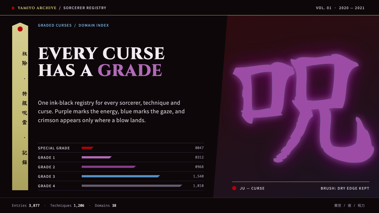 Jujutsu KaisenCrimson only at impact. Ink-black night, purple cursed glow, brush kanji and…
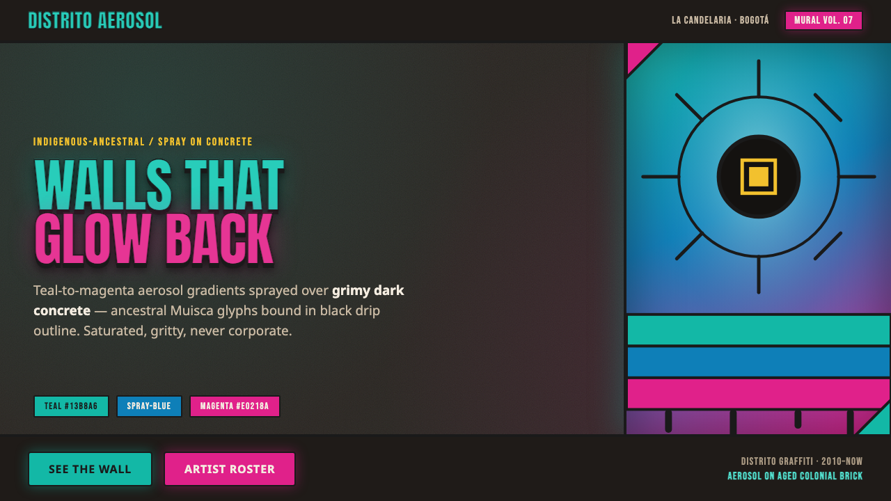 Bogotá Street MuralismNeon spray glowing off the wall. Teal-to-magenta aerosol on grimy concrete, i…
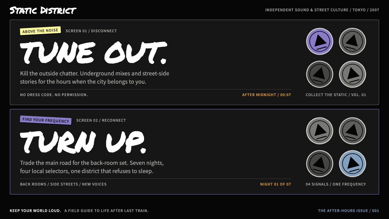 The World Ends with YouStreet noise, split in two. White marker type on ink black, with violet pins…
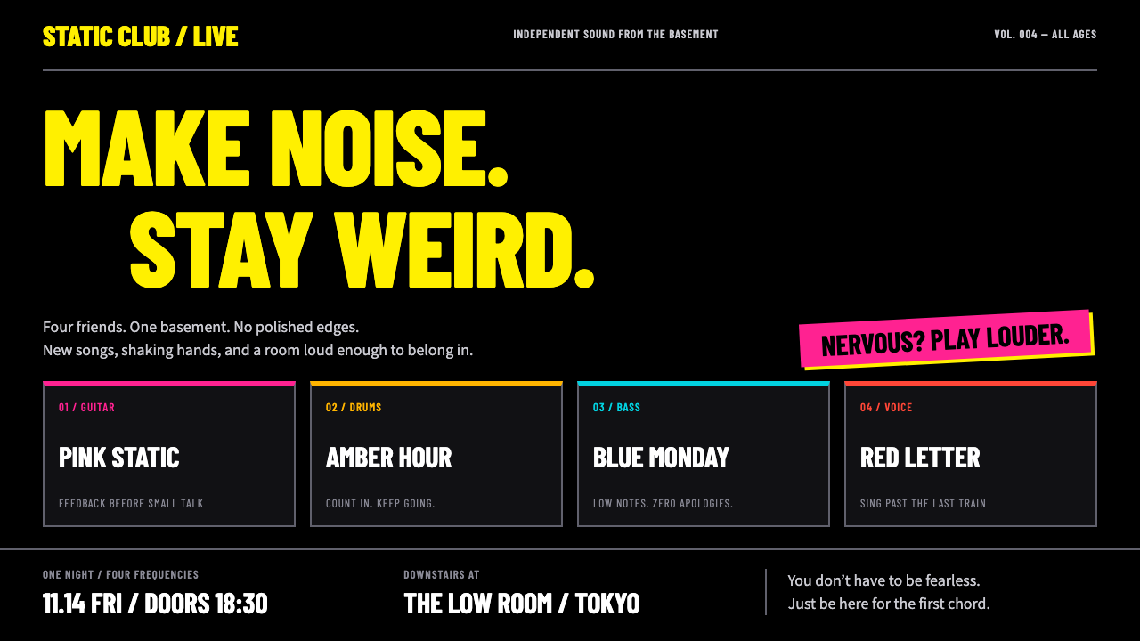 Bocchi the Rock!Nervous energy, turned up. Fluorescent yellow condensed type and four-colour…
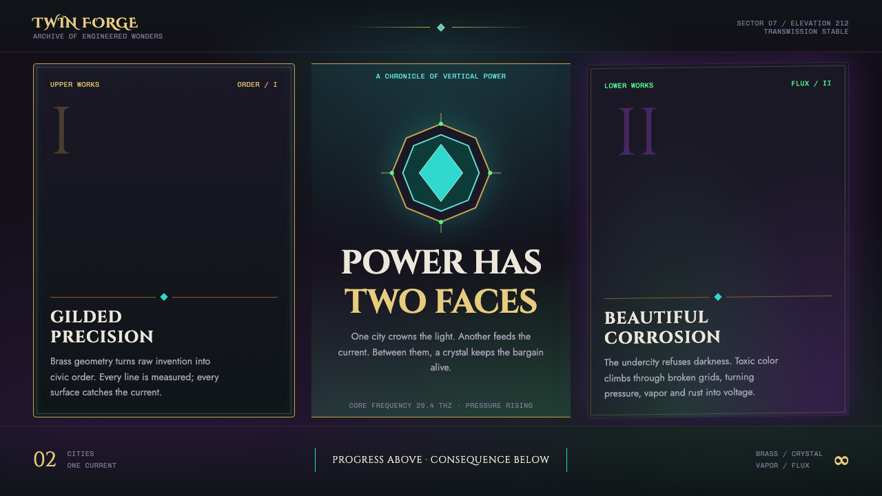 Arcane Hextech (2021)Progress and rot share a current. Brass symmetry meets teal crystal and toxic…
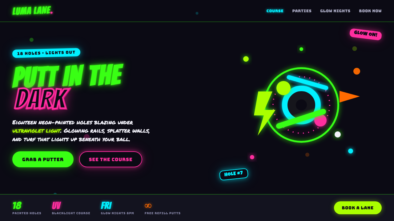 Blacklight Mini-GolfFamily-arcade kitsch under UV light. Day-glo green and hot pink glow off a bl…