What is The Martian?
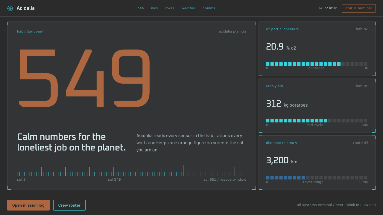
The Martian's interface looks like equipment, not spectacle: flat dark-grey panels, thin cyan linework, and a single rust orange kept for the number that matters.
The Martian in brief
The Martian style is the screen language created for Ridley Scott's 2015 film, set inside the habitat where a stranded astronaut survives on Mars. Rather than glowing holograms and floating panels, the interfaces are working monitors: flat dark-grey surfaces, thin cyan outlines, black wells that hold maps and video feeds, and short lowercase labels that read like nameplates on a piece of equipment.
What defines it is credibility. Every screen looks as if a real crew could operate it for months. Information is dense but orderly, type is small and functional, and nothing glows for the sake of drama. The overall mood is calm and technical, the opposite of the neon, cinematic sci-fi that audiences usually expect from a film set in space.
Colour is tightly rationed. The world of the film is tinted rust orange, but on the screens that orange is saved for what matters: the count of days on Mars, the mission status, the button you press. Everything else stays in grey, black and cyan, so the single warm accent becomes a signal rather than decoration.

Where does The Martian come from?
The interfaces were designed by Territory Studio, a London design studio, for the 2015 film directed by Ridley Scott and adapted from Andy Weir's 2011 novel. In film terms this is playback graphics, sometimes called fantasy user interface work: screens that are actually displayed on set so actors can react to them in real time. The studio produced roughly 400 playback screens across eight sets.
A distinctive feature of the production was its commitment to plausibility. NASA's Dave Lavery served as a consultant and checked the screens against real mission practice, asking in effect whether a crew could really use each one. That discipline pushed the design away from spectacle and toward the sober look of actual flight and habitat equipment, where legibility and function come before visual flourish.
The work sits within several overlapping traditions: plausible near-future NASA interface design, film playback graphics, and hard science fiction, the strand of the genre that cares about believable science. The Martian's story is built on problem solving and procedure, and its screens reflect that, showing monitoring, status and checklists rather than abstract light shows. David Sheldon-Hicks, who leads Territory Studio, and Marti Romances, associated with the studio's work on the film, are among the names tied to its creation.
The legacy of the look is a clear alternative to glossy science-fiction interfaces. It showed that a screen can feel futuristic simply by being believable, and it has since become a reference for designers who want control-room seriousness: monitoring tools, research software and mission dashboards that must read as reliable instruments rather than as showpieces.
What defines the The Martian look?
Flat dark-grey panels
Surfaces are matte, flat and dark grey, with no glass, no glow and no depth effects. Panels sit side by side like physical modules bolted into a wall, which gives the interface its equipment-like seriousness.
Thin cyan linework
Outlines, dividers and chart strokes are drawn in a hairline cyan. The line is delicate enough to stay out of the way yet crisp enough to define structure, and it is the main way the system shows edges and relationships.
Black wells for imagery
Maps, camera feeds and video sit in near-black recessed areas inside the grey panels. The contrast frames the imagery like a monitor inside a monitor and keeps the surrounding interface calm.
Rationed rust orange
The warm accent appears only on the sol count, mission status or the one control to press. Because everything else is cool and neutral, that single orange figure instantly becomes the most important thing on screen.
Short lowercase labels
Labels are brief, thin and lowercase, closer to a nameplate than a headline. Type stays small and functional, so the interface speaks in the quiet voice of an instrument panel.
Dense but ordered information
Screens carry a lot of data, yet it is arranged in clear modules with consistent alignment. The density signals competence, while the order keeps it readable, which is what makes the style believable as working software.

Who shaped The Martian?
Director of the 2015 film, whose production gave the screens their grounded, believable direction.
Associated with Territory Studio's creative work on the film's screens.
Leads Territory Studio, the London studio that designed the film's playback graphics.
A NASA consultant who checked the screens against real mission practice to keep them plausible.
How do you use The Martian today?
In slides, the style suits technical briefings, research updates and engineering reviews. A cover can be a dark-grey slide with a thin cyan frame, a short lowercase title and a single orange figure, such as a milestone count. Content slides should use panel-like modules with hairline outlines, and data slides can place charts in black wells with cyan strokes. Keep the orange for the one value the audience must remember.
On the web, it fits monitoring dashboards, scientific tools, mission trackers and developer consoles. Build the layout from flat grey modules, give media and maps recessed black areas, and make status indicators small and precise rather than glowing. Primary actions, such as confirm or launch, can take the orange, so that the one important button is unmistakable among many calm panels.
For editorial and marketing work, it can carry a film tie-in, a hard science-fiction publication, a space-technology company or a documentary about exploration. Long text should stay short and restrained, set in small, plain type, with data callouts doing the dramatic work. The tone to aim for is competence and calm, so avoid breathless copy that contradicts the sober visuals.
The classic mistake is to turn it into generic sci-fi by adding glows, gradients, floating glass panels and neon cyan everywhere. That destroys the point, which is believability. A second mistake is to spread the orange across many elements, which removes its signal value. A third is to make labels large and capitalised for impact; the style relies on small, quiet, lowercase text. Stay flat, thin and rationed.

The Martian — FAQ
What is the style of The Martian interface?
It is a believable, equipment-like interface language: flat dark-grey panels, thin cyan linework, black wells for maps and video, short lowercase labels, and a rust orange saved for the most important value. It was designed by Territory Studio for the 2015 film.
Why does it look so different from other sci-fi interfaces?
The production prioritised plausibility, and NASA's Dave Lavery checked screens against real mission practice. That favoured sober, functional design over glowing holograms and floating panels, so the interfaces read as instruments a crew could actually use.
How should the orange accent be used?
Rarely. Use it for the single most important value, status or control on a screen, such as a counter or a launch button. If it spreads across many elements, it stops working as a signal.
What kinds of products does it suit?
It suits products that need calm, credible and information-dense screens: monitoring dashboards, research and scientific tools, mission or project trackers, and developer consoles. It is less suitable for playful consumer apps.
Is it a dark theme only?
The original screen language is dark, with grey panels and black wells, and that is where its character comes from. A light adaptation is possible, but it would lose much of the instrument-panel atmosphere that defines the style.
Related design styles
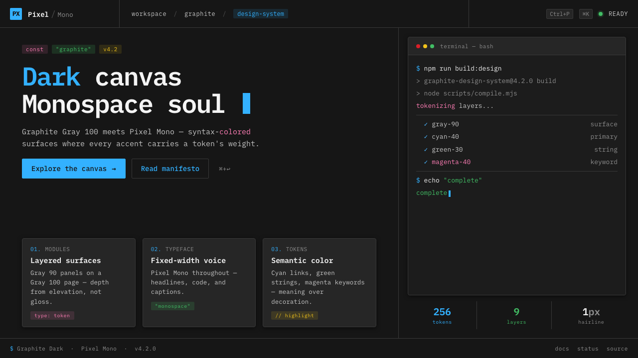 IBM Plex Mono DevColor used like syntax highlighting. Carbon Gray 100 canvas, IBM Plex Mono th…
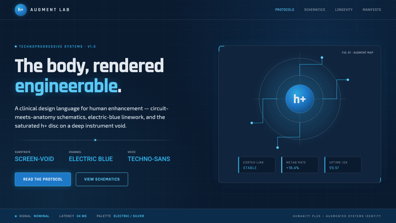 Transhumanism (H+)The body, rendered engineerable. Electric-blue circuit-anatomy schematics and…
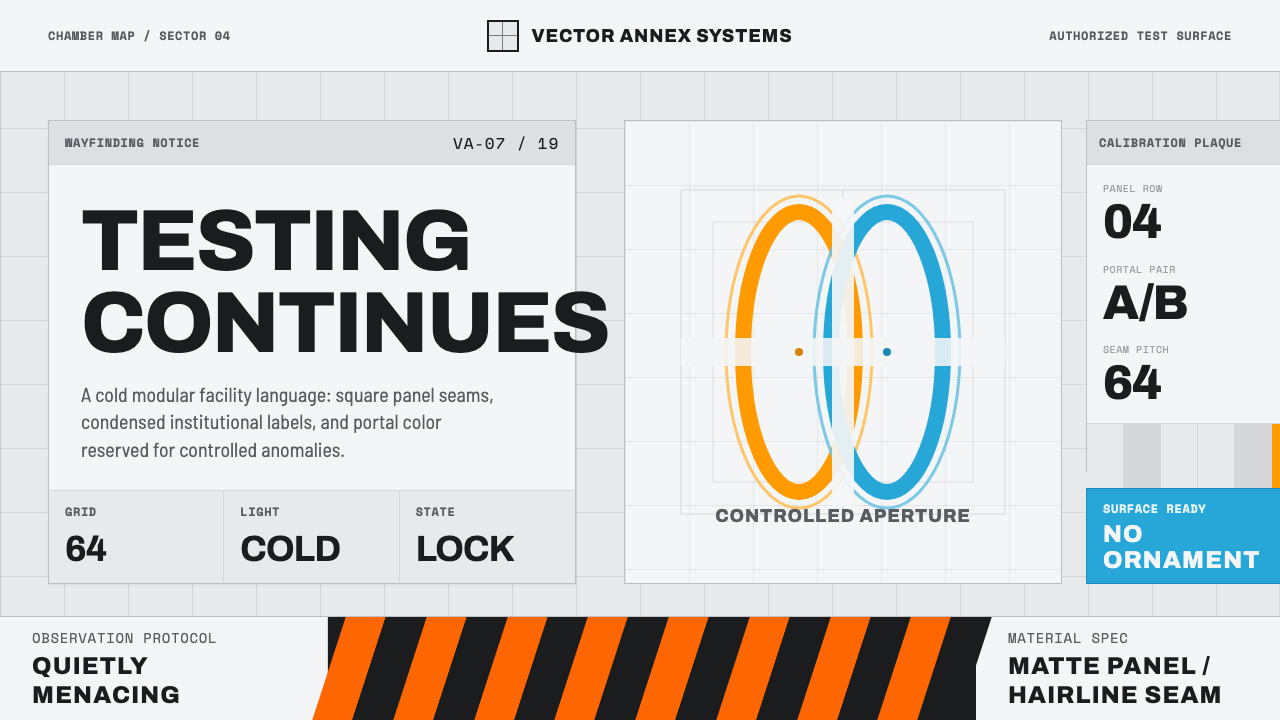 Aperture ScienceSterile authority. Cool panel seams, Archivo signage, and sparse orange-blue…
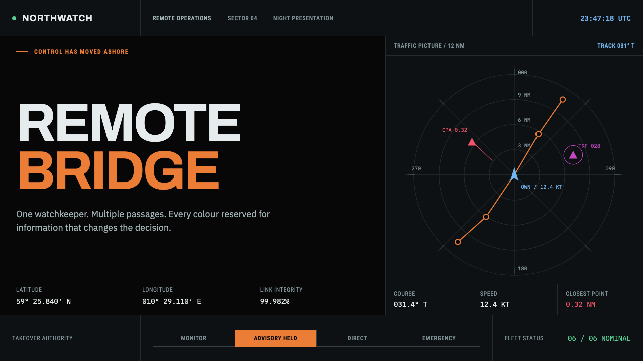 Autonomous Cargo Ship BridgeColour is protocol. Near-black chart grids reserve orange for decisions that…
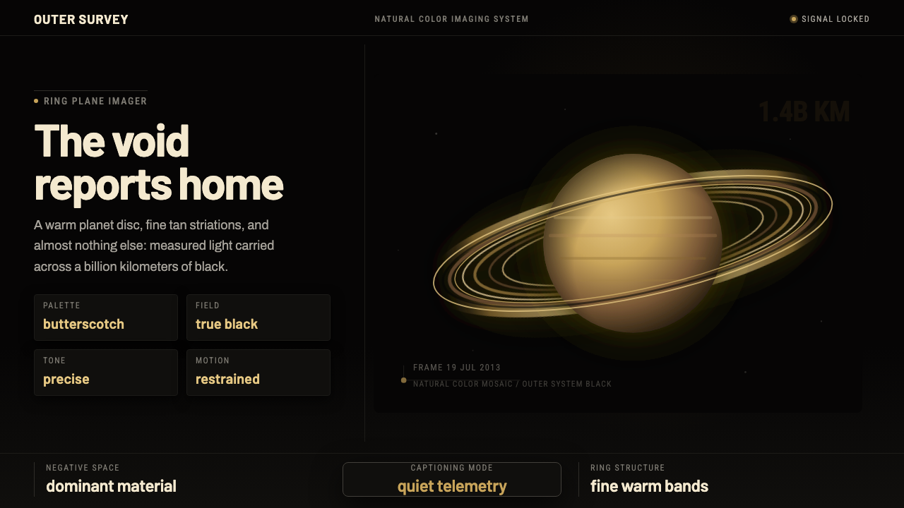 Cassini Saturn ImagingDeep space feels exact. Butterscotch Saturn floats in black with fine tan rin…
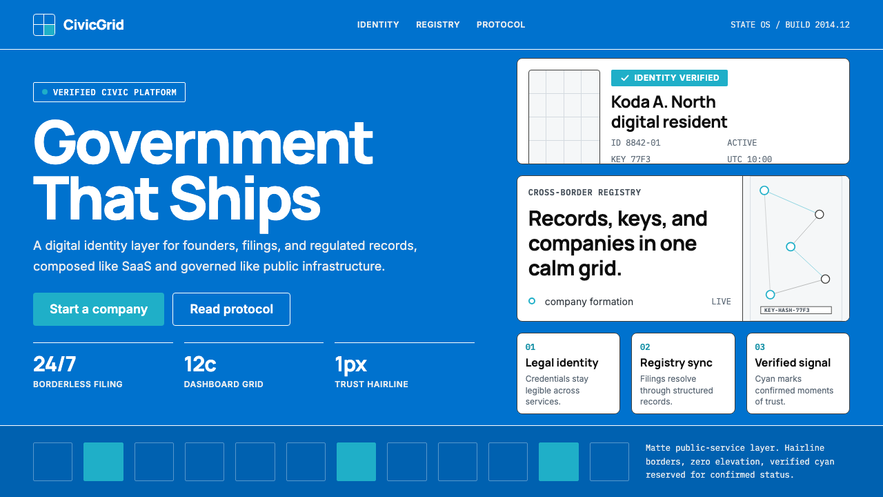 Estonia e-Residency Digital (2014)Trust without weight. Cornflower blue, 12-column grids, and cyan verified sig…