What is Sukhothai Thai Script?
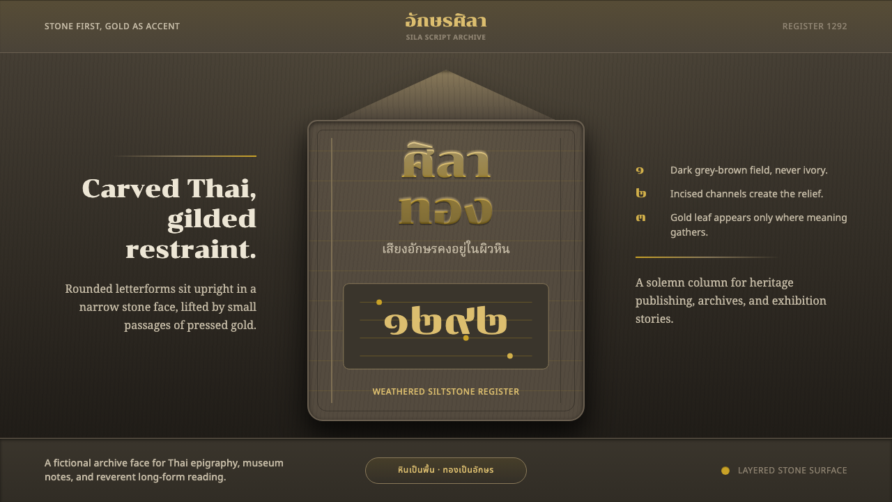
The earliest known Thai writing was chiselled into stone in 1292 — rounded letters carved deep enough to outlast the kingdom that made them.
Sukhothai Thai Script in brief
The Sukhothai Thai Script style is drawn from the Ram Khamhaeng Inscription, a four-sided stone stele carved in 1292 that carries the earliest known example of Thai writing. Its letterforms are rounded rather than angular, chiselled deep into a fine-grained, siltstone surface whose color reads as a dark, weathered gray-brown. As the founding document of Thai written language, the inscription's visual character carries an outsized cultural weight: it is not simply an old artifact but the literal origin point of a writing system still in daily use today.
The style's visual signature comes from combining two distinct material qualities: the deep-carved, monumental gravity of stone inscription, and the gold-leaf gilding tradition associated with Sukhothai-era temple manuscripts and religious objects. Where the stone stele itself is carved and unadorned, Sukhothai temple culture more broadly used gold leaf lavishly on manuscripts, Buddha images, and ceremonial objects — and this style borrows that gilded accent to lift the carved stone ground, using gold sparingly rather than covering the surface in it.
The resulting visual language reads as upright, reverent, and monumental: dark, weathered stone as the dominant ground, with gold-leaf yellow appearing only as accent rather than dominating the composition. Stone comes first; gold is ornament, never a wholesale gilded treatment. This restraint distinguishes the style from more purely ornamental gold traditions and keeps its character anchored to the gravity of a founding inscription rather than a purely decorative gilded object.

Where does Sukhothai Thai Script come from?
The Sukhothai kingdom, established in the thirteenth century in what is now north-central Thailand, is traditionally regarded as the first independent Thai kingdom and the foundational political and cultural entity from which later Thai statehood developed. Its most consequential ruler for this style's origin is King Ram Khamhaeng, traditionally credited with devising the Thai alphabet and commissioning the 1292 inscription that bears his name, an event regarded in Thai historical tradition as the founding moment of Thai written language.
The Ram Khamhaeng Inscription itself is a four-sided siltstone stele, its text carved into all four faces recording an account of the kingdom, its ruler, and aspects of Sukhothai society and religious life. Its letterforms — rounded, with fewer of the angular strokes that characterize some other regional scripts — represent a script design credited to Ram Khamhaeng's own innovation, adapting earlier Khmer and Mon script traditions into a form suited to represent the Thai language's specific tones and sounds.
Beyond the inscription itself, Sukhothai-era religious and manuscript culture more broadly employed gold leaf as a devotional and decorative material — gilding Buddha images, temple ornamentation, and manuscript covers as an expression of religious merit-making and royal patronage. This gilding tradition runs parallel to, rather than directly part of, the stone inscription itself, but the two are drawn together in this style because both represent defining material practices of the same Sukhothai cultural moment: monumental stone carving for permanent record, and gold leaf for devotional and ceremonial adornment.
The Ram Khamhaeng Inscription is now preserved and displayed at the National Museum in Bangkok and has been recognized by UNESCO's Memory of the World program, reflecting its significance not just to Thai national history but as a document of broader importance to the history of writing systems. Its authenticity and precise dating have been subjects of scholarly debate over the years, but it remains the traditionally accepted origin point of Thai script and continues to anchor Thailand's national narrative of its own written language.
What defines the Sukhothai Thai Script look?
Color
The dominant tone is a dark, weathered gray-brown evoking fine-grained siltstone, with gold-leaf yellow appearing only as a rationed accent rather than a broad fill. No bright white, no cream, and no additional hue appear anywhere in the palette — the entire visual identity rests on the contrast between weathered stone darkness and the rare glint of gold.
Rounded, Deep-Carved Letterforms
Sukhothai script letterforms are rounded rather than angular, chiselled deep enough into the stone surface to remain legible under raking light after centuries of weathering. This rounded quality, along with the depth of the carving, is a defining structural feature credited to Ram Khamhaeng's original script design and should be preserved as such rather than flattened into a purely graphic, non-dimensional treatment.
Weathered Siltstone Ground
The background reads as naturally weathered, fine-grained stone — dark, mineral, and time-softened rather than a neutral flat digital color. This ground carries as much of the style's monumental identity as the carved letterforms themselves, anchoring the composition in physical permanence.
Rationed Gold-Leaf Accent
Gold appears only in small, deliberate amounts — a highlight on a carved edge, a small ornamental detail — never as a wholesale gilded treatment covering the surface. This rationing preserves the style's monumental, upright gravity; a fully gilded surface would shift the character toward pure ceremonial ornament rather than the founding-inscription solemnity this style represents.
Four-Sided Monumental Format
The source stele is carved on all four faces, a format that suggests a composition meant to be encountered and read from multiple angles rather than a single flat front-facing surface. When adapted to a flat medium, this can translate into a layout that feels solid and object-like — bordered, self-contained panels — rather than an open, borderless composition.
Reverent Stillness
Beyond individual visual elements, the style carries an overriding tone of solemn permanence, upright and reverent rather than lively or ornamental. This should inform pacing and interaction design in any adaptation: rapid animation or playful motion sits uneasily against the style's founding-document gravity.

Who shaped Sukhothai Thai Script?
Traditionally credited with devising the Thai script and commissioning the 1292 inscription that bears his name, Ram Khamhaeng is regarded in Thai historical tradition as the founding figure of Thai written language. The inscription's rounded letterforms and its account of Sukhothai society are attributed to his reign, making him the single most consequential figure behind this style's origin.
The scribes and manuscript makers of the Sukhothai period, working in the broader gold-leaf gilding tradition applied to temple manuscripts and religious objects, contributed the devotional gilding sensibility that this style borrows to accent the carved stone ground.
The largely anonymous artisans who chiselled the Ram Khamhaeng Inscription into siltstone are responsible for the deep, rounded carving technique that has allowed the text to remain legible across more than seven centuries of weathering, a technical achievement central to the style's monumental visual identity.
How do you use Sukhothai Thai Script today?
For presentation slides, this style suits content about heritage, national history, foundational documents, or archival scholarship — a cover slide can use the dark, weathered stone ground as a full-bleed field, with title type rendered as if carved — deep-set or subtly embossed — in a muted tone, with a single small gold-leaf accent marking a key word or icon. Content slides should keep the palette restrained to stone-dark tones with gold used only for the rare moment that needs to draw the eye, such as a section marker or key figure.
For web interfaces, the style works well for museum, national-heritage, archival, or scholarly platforms where the brand identity depends on projecting historical gravity and permanence rather than everyday utility. The approach: a dark, weathered stone-toned background, carved-effect or embossed treatment for key headings, and gold reserved strictly for small, deliberate accents — a badge, an icon, a single highlighted element — never as a broad interface color.
In editorial and marketing work, the style supports long-form writing about the history of writing systems, Thai national heritage, epigraphy, or archaeology. A magazine-style layout can treat section openings the way the inscription treats its carved text — deep-set, monumental headings against the stone-dark ground — with gold-leaf accents reserved for pull-quotes or key figures. Marketing pages for cultural heritage tourism or museum exhibitions benefit from the style's inherent gravitas and sense of founding importance.
The style is poorly suited to playful, fast-moving consumer products or contexts where lightness and energy are the primary desired qualities, since its entire visual logic communicates solemn permanence rather than liveliness.
The most common mistake when adapting this style is over-using gold as a broad decorative fill rather than a rationed accent — a fully gilded surface shifts the style away from its founding-inscription solemnity toward generic ornamental gilding. A second common mistake is rendering the stone ground as flat, bright, or evenly toned rather than weathered and mineral-dark; a bright or clean stone-gray background loses the sense of centuries-old physical weathering that gives the style its monumental credibility.

Sukhothai Thai Script — FAQ
Is the Ram Khamhaeng Inscription universally accepted as the origin of Thai writing?
It is traditionally credited as such in Thai historical narrative and is recognized by UNESCO's Memory of the World program, but its authenticity and precise dating have been subjects of genuine scholarly debate over the years. Regardless of that ongoing academic discussion, it remains the culturally and historically foundational reference point for this visual style, and its status as the traditionally accepted origin of Thai script is what gives the style its monumental, founding-document character.
Why is gold used so sparingly instead of covering the surface, as in some other gilded traditions?
The stone stele itself is carved and unadorned — gilding was never part of the inscription's original material. This style borrows gold leaf from the parallel Sukhothai manuscript and religious-object gilding tradition specifically as an accent to lift the carved stone, not as an attempt to recreate a fully gilded object. Keeping gold rationed preserves the style's connection to the inscription's own monumental, unadorned gravity rather than shifting its character toward purely ceremonial gilded ornament.
How does this style differ from a generic 'ancient stone carving' aesthetic?
The key distinguishing details are specific: Sukhothai's rounded (rather than angular) letterforms credited to Ram Khamhaeng's script design, and the rationed gold-leaf accent borrowed from the parallel Sukhothai temple-manuscript gilding tradition rather than any generic gilded treatment. A generic stone-carving aesthetic without these two specific, historically grounded details would lose the connection to this particular founding document and its cultural weight.
Does this style suit products with a lighthearted or playful brand tone?
Generally not. The style's entire visual identity communicates solemn, monumental permanence — qualities suited to heritage, archival, museum, or national-history contexts, but poorly matched to a lighthearted or playful brand tone. Applying it to such a context risks a visual-tonal mismatch that undermines both the brand's intended lightness and the style's own gravity.
Can the carved-letterform effect be achieved convincingly on a flat digital screen?
Yes, through subtle inset shadow or embossing techniques that suggest recessed depth without requiring literal three-dimensional rendering — the goal is to evoke the sense of carved relief rather than reproduce photographic stone texture exactly. What matters most is preserving the dark, weathered ground tone and the sense that the letterforms are set into the surface rather than printed flat on top of it.
Related design styles
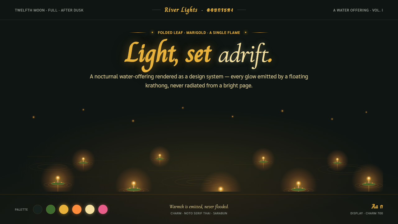 Loy KrathongLight, set adrift. Candle-gold flames on near-black river water — warmth emit…
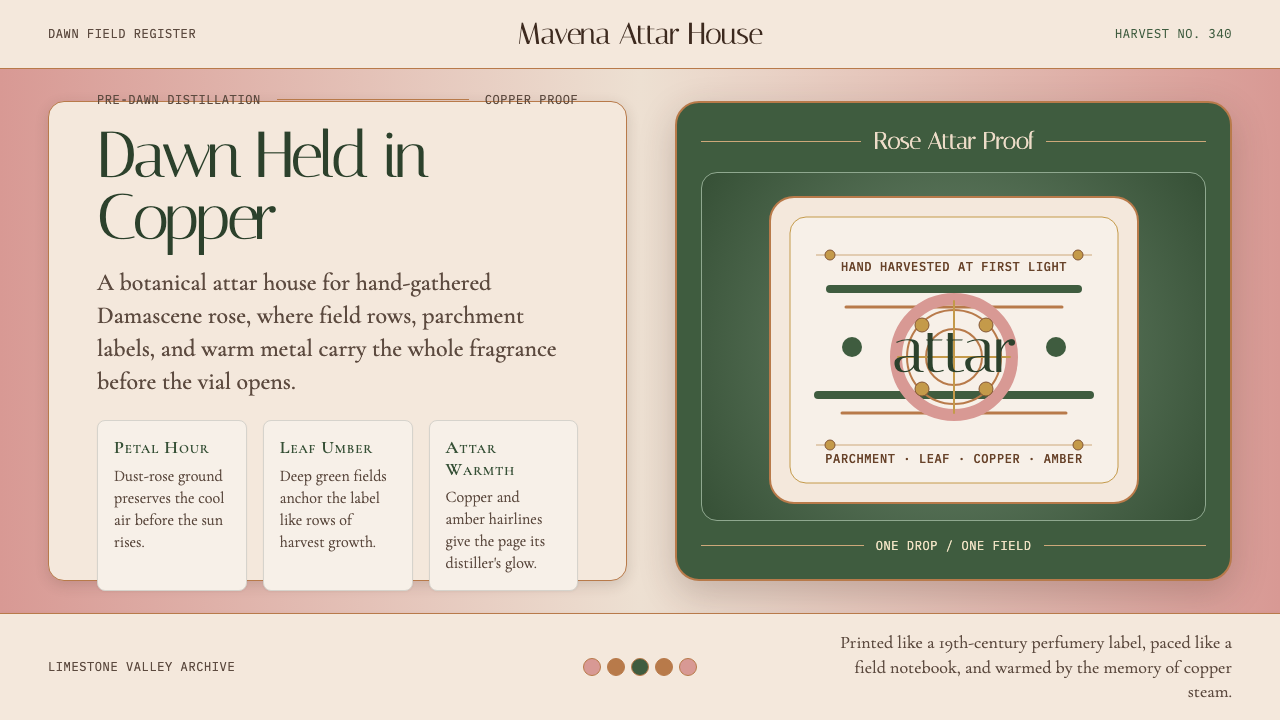 Bulgarian Kazanlak Rose ValleyDawn feels distilled. Dust-rose ground, leaf green, and copper label geometry…
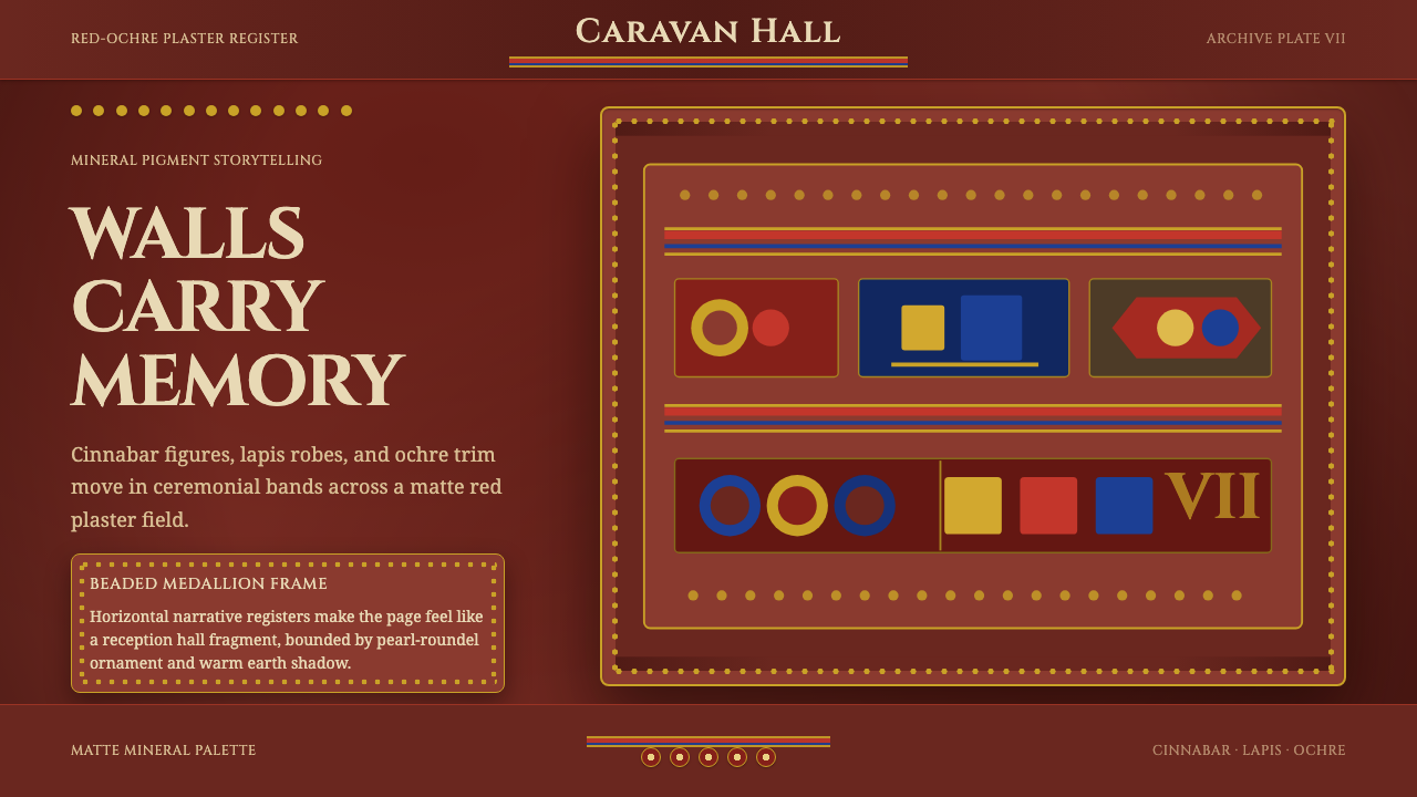 Sogdian FrescoAncient ceremony glows. Cinnabar, lapis and ochre stack into beaded fresco ba…
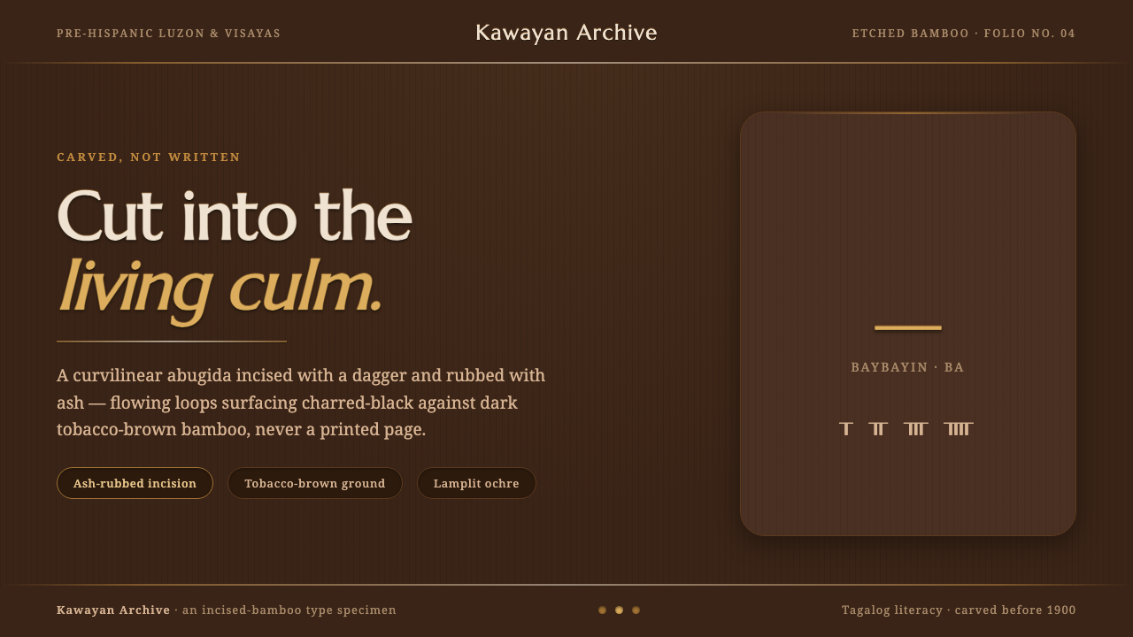 Baybayin ScriptCarved, not written. Curvilinear baybayin ash-rubbed into tobacco-brown bambo…
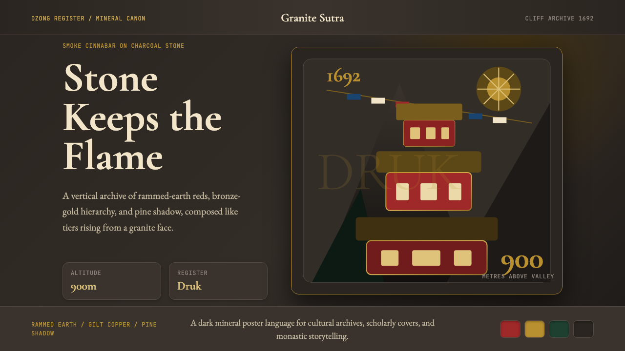 Bhutanese Tiger's Nest Cliff MonasterySacred altitude, mineral-dark. Cinnabar tiers and bronze rules climb charcoal…
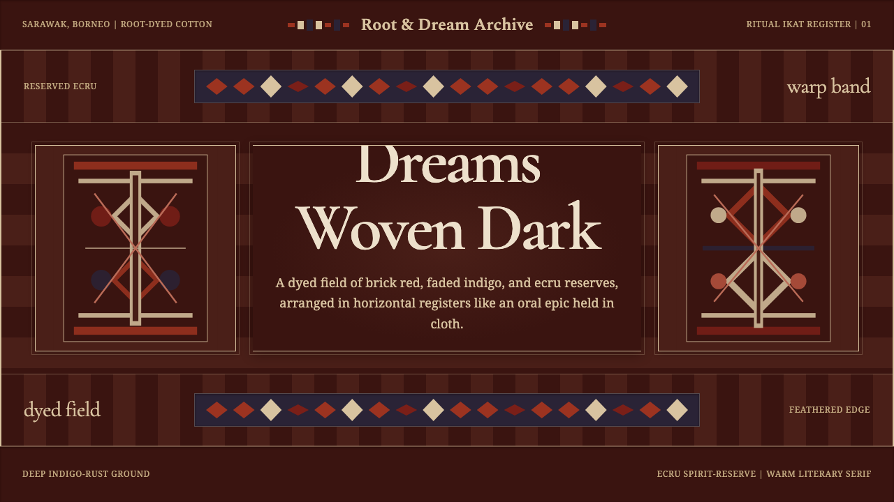 Iban Pua KumbuSacred cloth logic. Indigo-rust bands, ecru reserves, and blurred ikat edges…