What is Thai Lai Rod Nam Gold-Black Lacquer?
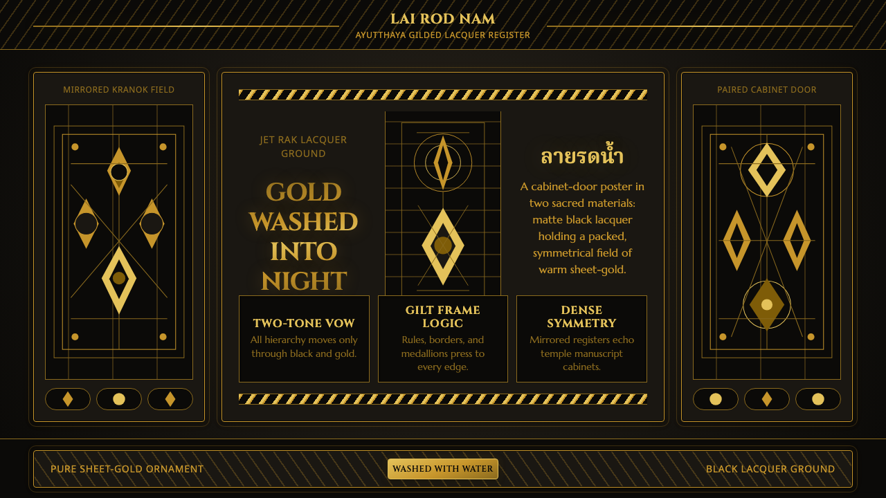
Thai Lai Rod Nam Gold-Black Lacquer turns a dark surface into an uninterrupted field of gold: symmetrical, ceremonial, and dense enough to feel architectural.
Thai Lai Rod Nam Gold-Black Lacquer in brief
Lai rot nam, commonly understood as designs washed with water, is the gilded black-lacquer art associated with Ayutthaya-era Siam. Its appearance is built from a stark material contrast: a true black lacquer ground carries warm sheet gold, with no middle layer to soften the encounter. Gold does not function as a small highlight. It is the image itself, covering figures, foliage, borders, and lettering in a continuous ornamental field.
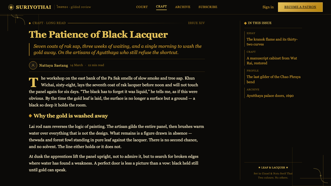
The method gives the style its unusual visual authority. Artisans build the ground from successive coats of rak lacquer, creating a deep black surface. Gold leaf is then laid over the whole composition. Water removes the unwanted areas, leaving the intended motifs in gold. The resulting image is not painted onto darkness in an illustrative way; it appears recovered from the gold layer through removal, which makes black and gold feel structurally inseparable.
The visual vocabulary includes celestial deities, kranok flame-scrolls, and mythical forest fowl. These forms are packed closely together rather than isolated as individual emblems. Borders repeat and mirror around a central field, while interior motifs answer one another across the composition. The effect is richly ceremonial: the viewer encounters a complete surface whose order comes from repetition, symmetry, contour, and controlled density rather than from open space.
Where does Thai Lai Rod Nam Gold-Black Lacquer come from?
Lai rot nam belongs to the gilt-lacquer tradition of Ayutthaya, active during the seventeenth and eighteenth centuries. Its name identifies the decisive operation in the process: water washing reveals the design by removing the parts of the gilded surface that do not belong to the final image. That sequence explains why the style feels both ornamental and exact. Each line is defined not by added paint but by the disciplined preservation of gold.
The tradition is rooted in central Thailand, particularly Ayutthaya and Bangkok, and it continued in Rattanakosin workshops. The geographic continuity matters because the style is not merely a decorative pattern collection. It is a lacquer-and-gilding practice whose visual rules are inseparable from the surfaces, workshop knowledge, and devotional objects on which it was used.
Royal chang rak lacquer masters and temple gilding artisans carried this work through specialist practice. Their labor joined black lacquer preparation, gold application, and the water-wash process into one system. The craft therefore demands a different reading from ordinary metallic decoration: its abundance is highly controlled. A black ground is prepared to make gold absolute, while every retained gold contour must remain clear enough to hold a figure, flame-scroll, or border within a crowded field.
Tu phra tham cabinet workshops are central to the style's surviving identity. Manuscript cabinets, temple doors, window panels, and related sacred furnishings offered broad, flat surfaces for dense gilded compositions. In this context, the mirrored border is not a detachable frame added after the image. It is part of the object’s total order, binding sacred motifs, surface, and enclosure together. Contemporary use should retain that sense of complete coverage rather than reducing the tradition to a generic black-and-gold luxury treatment.
What defines the Thai Lai Rod Nam Gold-Black Lacquer look?
Black Lacquer Ground
The dark field should feel matte, deep, and continuous, like lacquer rather than a generic dark backdrop. It is an active visual material: its silence gives the gold its brightness and turns every unfilled area into part of the design. Avoid mottled effects, casual texture, or competing dark colors. The ground must read as one uninterrupted plane beneath the ornament.
Warm Sheet Gold
Gold is used as a full graphic substance, not as a restrained accent. It should suggest leaf laid across the surface: warm, metallic, and visually present even when it is rendered in flat digital form. Gentle variation can imply the character of sheet gold, but the gold must remain legible as one coherent material across figures, borders, and type.
Edge-to-Edge Density
This style does not seek contemporary spaciousness. Motifs occupy the surface with deliberate abundance, approaching one another closely and leaving little visual silence. Density must still be organized: contours need enough separation to remain readable, while repeated forms should produce rhythm rather than confusion. The goal is fullness with discipline, not indiscriminate decoration.
Mirrored Borders
Borders are structural devices rather than optional trim. They repeat, mirror, and contain the central field, making the page or object feel enclosed and ceremonial. A border should answer the interior motifs in scale and contour, not compete with them through unrelated decoration. Its purpose is to make the entire composition feel intentionally bounded.
Sacred Motif Field
Celestial deities, kranok flame-scrolls, and mythical forest fowl provide a figurative vocabulary with devotional character. These motifs should be treated as linked parts of a larger field, not isolated illustrations or casual icons. Their value lies in the relationship between contour, repetition, and enclosure: every figure contributes to the density and symmetry of the whole.
Gold Typography
Lettering belongs to the ornamental system. It should feel gilded, formal, and embedded in the field rather than floating as neutral interface text above it. Keep hierarchy clear through placement, scale, and surrounding ornament, but let the lettering share the same warm gold material as the borders and figures. Black and gold remain the governing visual conversation.

Who shaped Thai Lai Rod Nam Gold-Black Lacquer?
Royal chang rak lacquer masters represent the specialist lacquer tradition behind the black ground. Their work establishes the material condition on which gilding can become so visually absolute: a prepared lacquer field deep enough to hold dense ornament without weakening the contrast between gold and darkness.
Temple gilding artisans embody the application of gold leaf within Thai Buddhist decorative arts. Their contribution is not simply visual embellishment. Gold defines the retained image after washing, turning borders, sacred figures, and ornamental lines into one continuous ceremonial surface.
Tu phra tham cabinet workshops connect the style to manuscript cabinets and their broad decorated panels. These workshops clarify why the system values full coverage, mirrored borders, and formal enclosure. The gilded lacquer surface was conceived in relation to a sacred object, not as a free-floating pattern.
How do you use Thai Lai Rod Nam Gold-Black Lacquer today?
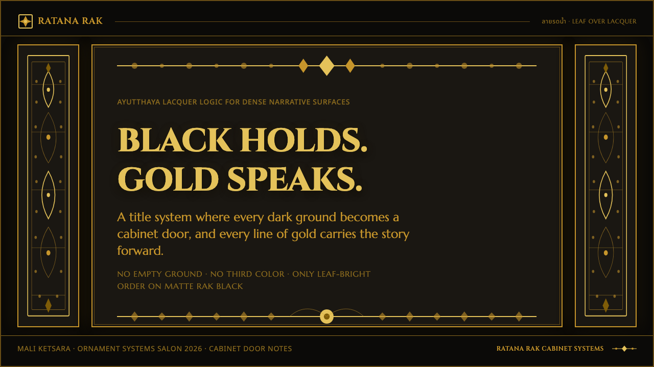
For presentation covers, treat the page like a cabinet door rather than a sparse title slide. Set the title inside a framed gold field, with a dominant central motif or a tightly controlled ornamental axis. Content slides require a calmer interpretation: preserve the black-and-gold material logic, but reserve the densest ornament for headers, margins, and section transitions so reading remains possible. Data slides should use gold marks, rules, and labels as a coordinated system; the chart must feel engraved into the visual world, not pasted over it.
For web interfaces, this approach is most convincing in editorial destinations, collection pages, ceremonial landing pages, and premium narratives where atmosphere matters alongside navigation. Use the dark lacquer field as the persistent ground and allow warm gold to unify interactive labels, dividers, panel edges, and featured imagery. Dashboards and pricing pages can borrow the formal discipline, but they need carefully protected reading areas. Dense ornamental borders can establish identity around the edges while operational information remains direct and easy to scan.
For editorial and marketing work, use the style to make a subject feel precious, archival, or ritualized. Long-form pages can open with a full ornamental field, then move into structured black-and-gold sections where headings, pull quotations, and image captions participate in the same gilded logic. Campaign pages can use mirrored frames to create a sense of occasion around a product, event, or collection. The most successful layouts make ornament carry hierarchy and containment, rather than treating it as a decorative wallpaper behind ordinary content.
The common mistake is reducing Lai Rod Nam to black backgrounds with random gold flourishes. That loses the craft logic of water-wash gilding, the material force of a unified lacquer field, and the compositional discipline of mirrored density. Another mistake is importing pale text, bright accent colors, soft decorative effects, or large empty zones that interrupt the two-tone system. Start with black and warm gold, build the border and central field together, and let every added motif reinforce enclosure, symmetry, and ceremonial fullness.
Thai Lai Rod Nam Gold-Black Lacquer — FAQ
Is Lai Rod Nam simply a black-and-gold luxury style?
No. Black and gold are essential, but the style is defined by a specific gilded-lacquer process and a compositional system. Rak lacquer creates the black ground; gold leaf covers the surface; water removes the non-design areas. Its characteristic density, mirrored borders, and sacred motifs arise from that craft context. A generic dark layout with metallic accents may look luxurious, but it does not necessarily carry Lai Rod Nam’s structural logic.
Why is the composition so dense?
The style is associated with decorated temple furnishings and manuscript cabinets, where the surface is conceived as a complete ornamental field. Gold forms, borders, and figures work together to fill and enclose the object. Density is therefore not a failure to edit. It is a deliberate expression of ceremonial richness, provided that contour, symmetry, and repeated rhythm still keep the surface legible.
Can the style use colors beyond black and gold?
The supplied design system holds firmly to black and warm metallic gold. That restriction is not a limitation to solve; it is the source of the style’s clarity. Adding unrelated accent colors weakens the contrast that makes the lacquer ground and retained gold image feel inseparable. If variation is needed, express it through the perceived character of gold, ornamental density, or the scale of the framed field rather than through a broader palette.
How can a dense gold field remain readable in digital work?
Separate decorative density from reading priority without splitting the visual system. Give primary text a clearly framed zone, use gold lettering that belongs to the same material world, and place the most intricate motifs around boundaries, transitions, or focal areas. A dashboard or content page does not need to imitate every surface of a manuscript cabinet. It needs to preserve the logic of enclosure and abundance while protecting the information people must act on.
Related design styles
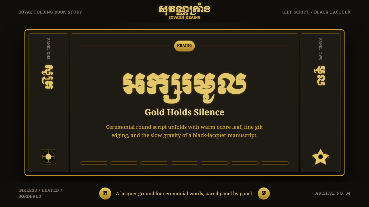 Khmer Aksar MulCeremony held in gold. Moul type glows on black lacquer with panel-by-panel g…
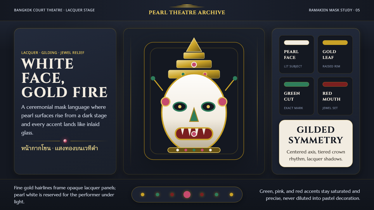 Thai Khon Hanuman MaskThai court theatre, digitized. A pearl-white mask and gilt coronet rise from…
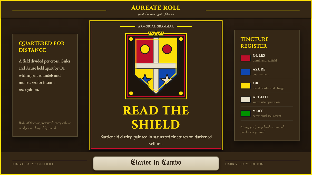 Heraldic BlazonCommand at a glance. Gules, Azure and Or quartering lock into a gilt shield o…
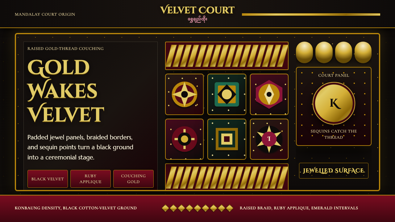 Burmese Kalaga TapestryVelvet becomes theater. Black ground, gold-thread borders, ruby and emerald p…
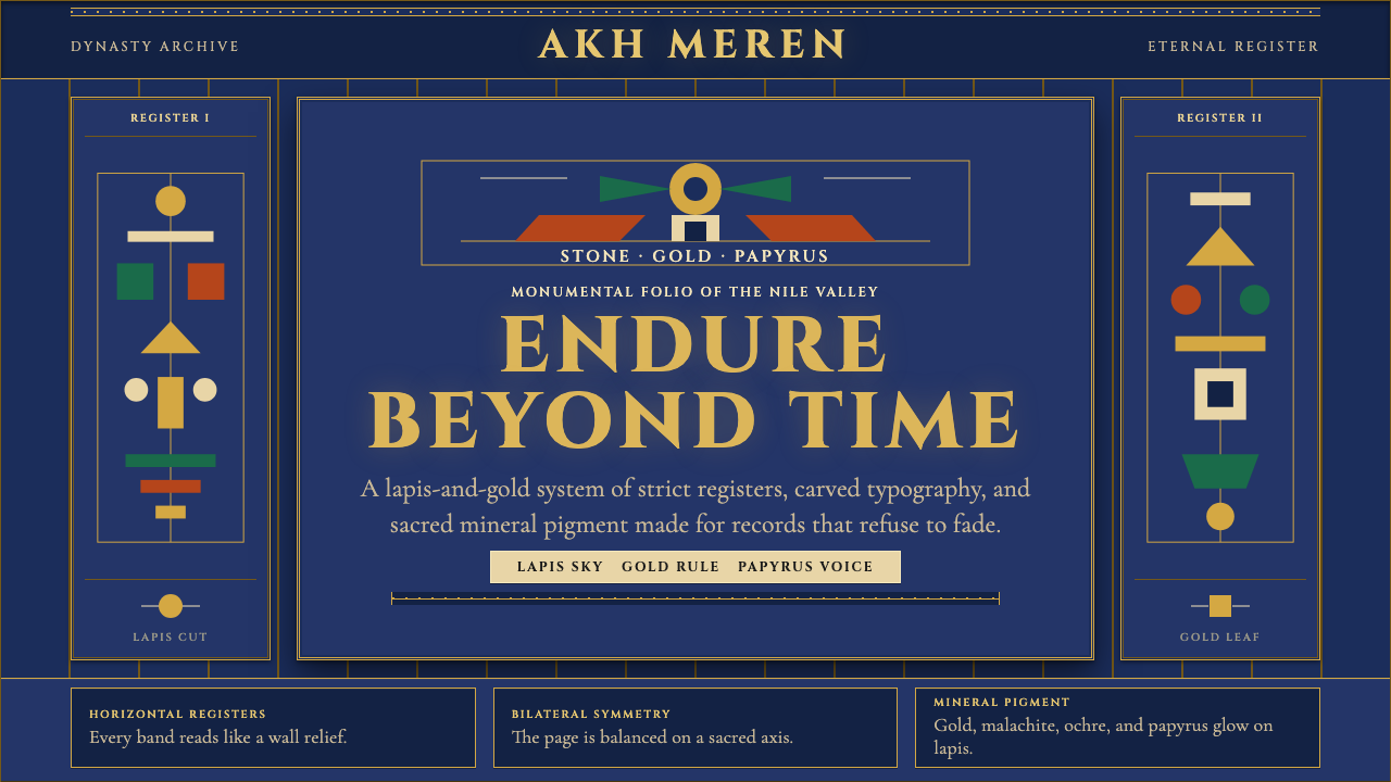 Egyptian PharaonicRegal permanence. Gold rules and Cinzel capitals carve papyrus registers into…
 Bhutanese Tiger's Nest Cliff MonasterySacred altitude, mineral-dark. Cinnabar tiers and bronze rules climb charcoal…