What is Optic Yellow Tennis Ball?
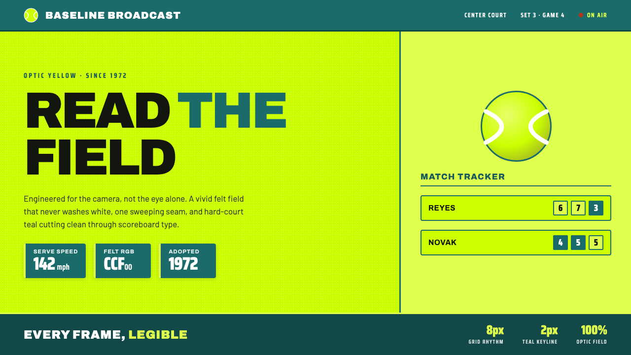
Optic Yellow Tennis Ball turns a broadcast necessity into a visual system: electric fluoro felt, a single sweeping white seam, and teal court graphics held in hard, legible tension.
Optic Yellow Tennis Ball in brief
The optic-yellow tennis ball is not simply a sports object translated into a color palette. It is the source of the palette’s logic. Adopted by the International Tennis Federation in 1972 so the ball would read clearly on color television, it supplies a vivid yellow-green field, a fuzzy felt surface, and a curved white seam. In interface terms, these become the background, the material cue, and the signature line. The result is a system built around recognition: the field catches the eye, the seam directs it, and teal provides the hard-court counterweight.
The style speaks in the language of broadcast tennis rather than club-house nostalgia. Its visual references are scoreboard headlines, lower-third stat blocks, match graphics, and the clean graphic structures that let information remain legible while play continues behind it. Typography is condensed and all caps, composition is disciplined, and every accent appears to have a job. The mood is immediate and authoritative: a court seen through the camera, organized for spectators who must understand it at a glance.
Nothing is muted, glossy, or deliberately playful. The yellow field stays electric instead of fading toward white; the felt remains visibly fuzzy rather than becoming a polished sphere; and white is reserved for the seam, where it has the greatest identity. Teal panels and type supply contrast without competing with the ball. Together, these decisions create an aesthetic that feels energetic because it is optically clear, not because it relies on decoration.
Where does Optic Yellow Tennis Ball come from?
The style’s historical horizon runs from the broadcast culture of 1950–1990 into the contemporary internet. Its central object belongs to a period when television visibility could determine how a sports object was perceived by a global audience. The optic-yellow tennis ball therefore enters design history not as an arbitrary fashion color, but as a response to the conditions of color broadcasting.
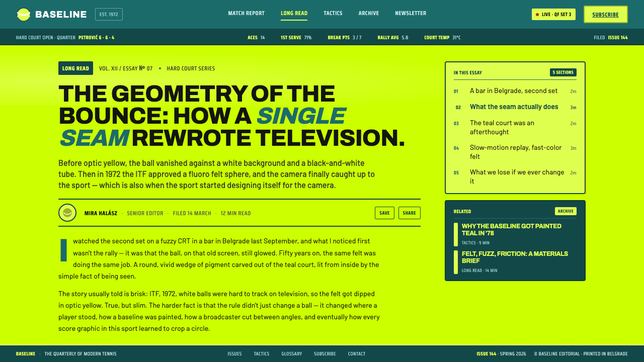
The International Tennis Federation adopted optic yellow in 1972 so the ball would read clearly on color television. That decision supplies the style with its foundational principle: visual identity begins with reliable recognition. The yellow is vivid because it must remain distinct in motion and at distance; the ball is memorable because its color, felt, and seam operate together as one coherent object.
The surrounding movement is sports broadcast design, supported by the more technical idea of TV-visibility colour engineering. This combination explains why the aesthetic feels both physical and diagrammatic. It preserves the recognizable surface of felt while organizing the screen through panels, scoreboard type, statistics, and controlled contrast. The result is not an illustration of tennis but a graphic system shaped by the demands of watching tennis through a camera.
From the current broadcast reading associated with the 2000s onward, the language moves naturally into internet interfaces. A digital product can retain the optic field, the seam, and the teal court contrast while adapting the scoreboard structure to navigation, data, pricing, or editorial hierarchy. Its historical source remains global: the International Tennis Federation and worldwide broadcast tennis provide the frame, while the internet becomes the new surface on which the system is reused.
What defines the Optic Yellow Tennis Ball look?
Optic Color
The dominant field is an electric optic yellow-green that refuses to become pale, dusty, or white. It should feel fluorescent without becoming decorative neon. Teal is the principal counter-color, recalling a hard court and giving text, panels, or data blocks a stable visual ground. White appears sparingly, because overusing it would weaken the seam’s identity. The palette is therefore vivid but controlled: yellow establishes recognition, teal establishes contrast, and white marks the signature.
Felt Material
The ball is a fuzzy felt sphere, not a polished plastic orb. Any surface treatment should preserve that tactile suggestion: soft visual grain, a slightly fibrous impression, and a sense that the object belongs to the court rather than to a luxury product catalogue. The texture is not an invitation to add realism everywhere. It is a single material cue that keeps the vivid field grounded in the physical identity of a tennis ball.
Sweeping Seam
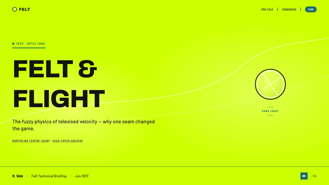
The single curved white seam is the style’s signature gesture. It should sweep rather than sit passively, introducing direction across an otherwise stable field. In a layout, the seam can become a dividing line, a route through information, or a framing arc around a focal object. Its power comes from restraint: because white is reserved for it, the seam reads as an identifying mark rather than a generic border.
Scoreboard Typography
Typography follows the condensed all-caps voice of a broadcast scoreboard. Headlines should feel compact, immediate, and built for quick recognition rather than literary elegance. Teal type works especially well against the optic field or within court-colored panels, while stat labels can be separated through scale, alignment, and grouping. The important quality is not aggression but broadcast discipline: every word should look ready to appear beside a live score.
Broadcast Structure
The composition is clean and information-led. Lower-third blocks, score panels, match labels, and statistics should be arranged so that the eye understands their relationship immediately. Strong graphic structure matters more than ornamental framing. A field can remain expansive, but the information placed on it must have unmistakable hierarchy. The style works when the screen feels like a broadcast package with a clear reading order, not like a poster covered in tennis references.
Electric Restraint
The style is energetic without being playful. It avoids muted treatment, glossy highlights, and ornamental effects that would make the ball feel like a toy or a premium object. The electric field, fuzzy surface, white seam, and teal contrast already provide enough character. Restraint means protecting those elements from competition. When every component remains direct and legible, the system gains authority from the clarity of its choices.
Who shaped Optic Yellow Tennis Ball?
The International Tennis Federation is the institutional anchor of the style. Its adoption of optic yellow in 1972, specifically so the ball would read clearly on color television, establishes the historical reason behind the palette. In this system, the ITF represents the point where sports governance, broadcast conditions, and visual recognition meet.
David Attenborough is named in the source material among the key figures associated with this reference style, but no specific program, artifact, date, or formal design role is supplied. He should therefore be understood as part of the broader broadcast-cultural frame, not as the author of the visual system. The documented anchors remain the ITF adoption and the camera-led tennis language.
Sports broadcast design supplies the style’s working grammar: scoreboard headlines, lower-third information, match labels, and graphic structures that must remain readable while action continues. Its contribution is organizational rather than ornamental. It turns the tennis ball’s visual identity into a repeatable screen language for live viewing and fast comprehension.
TV-visibility colour engineering explains why the yellow is treated as a functional field rather than a fashionable accent. The color must remain distinct on a screen, and the wider system must protect that distinction through teal contrast and controlled use of white. Visibility is therefore not separate from the aesthetic; it is the aesthetic’s first condition.
How do you use Optic Yellow Tennis Ball today?
For presentation slides, use the optic field as the cover’s immediate signal: a vivid yellow ground, a sweeping white seam crossing or framing the title, and condensed scoreboard type that feels ready for broadcast. Content slides should convert the same language into clean information blocks, with teal panels carrying labels or supporting data. Data slides benefit from the style’s match-graphic logic: scores, comparisons, and trends should appear as clearly grouped fields rather than as decorative illustrations. The strongest deck keeps the field, seam, and teal structure consistent across cover, content, and data pages.
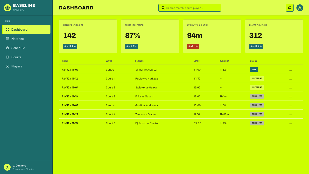
For web interfaces, the system suits dashboards, monitoring views, pricing pages, and other products where immediate scanning matters. Use optic yellow to establish the primary visual environment, teal to hold navigation or data panels, and white mainly for the seam or the most important moments of separation. Cards should feel like broadcast modules, with clear labels and compact statistics. Pricing tiers can borrow the language of match panels, but hierarchy should come from grouping and typography rather than from piling several bright accents into every section.
For editorial and marketing work, the style turns a page into a controlled broadcast frame. A feature article can open with a large yellow field, a white curved line, and a compact headline block that resembles a match introduction. Supporting sections can use teal panels for facts, quotes, or metadata, while the body remains structurally quiet enough for reading. Marketing pages can use the seam as a recurring route through the story, connecting product claims or calls to action without adding ornamental dividers.
The common mistake is to treat optic yellow as a generic energetic color and then surround it with glossy effects, playful illustrations, or multiple competing accent colors. That breaks the system’s source logic. The yellow must remain tied to camera visibility, the felt must retain its tactile suggestion, the white must preserve the seam’s identity, and teal must provide disciplined contrast. If every element tries to be loud, the result stops feeling like broadcast tennis and becomes ordinary sports decoration.
Optic Yellow Tennis Ball — FAQ
Is optic yellow simply a bright tennis-inspired accent color?
No. Its defining quality is functional visibility. The International Tennis Federation adopted optic yellow in 1972 so the ball would read clearly on color television. In the design system, the color should therefore remain a dominant field with strong recognition value, not a small decorative accent detached from the camera-oriented reason it exists.
Why is white reserved for the seam?
Because the single sweeping white seam is the object’s signature line. If white spreads freely across type, borders, highlights, and decoration, it loses that special role. Restricting white makes the seam immediately recognizable and gives it compositional authority. Other information can use teal or tonal contrast, allowing the white curve to remain the clearest visual signature.
Does the style require a realistic tennis-ball image?
No. The important thing is to preserve the ball’s defining cues: optic yellow, fuzzy felt, and the curved white seam. A flat interface can express those qualities through a field, a texture suggestion, and a sweeping line. Realistic imagery is useful only when it strengthens the material identity. Glossy rendering or excessive detail would move the style away from its broadcast clarity.
Can the optic-yellow tennis-ball language work in a dark interface?
It can be adapted, but the defined reference is a light, electric field rather than a dark mood. A dark treatment must still protect the yellow’s vividness, keep the seam legible, and use teal as a deliberate contrast instead of allowing the screen to become generally neon. If the dark background becomes the dominant personality, the result may no longer read as this reference style.
Where does this style work best?
It is strongest where information must feel immediate, organized, and camera-ready: sports dashboards, live status views, pricing comparisons, event pages, editorial explainers, and marketing systems with a strong broadcast voice. It is less convincing when the product depends on muted luxury, glossy polish, or deliberately playful softness. The right question is whether the product benefits from electric recognition and disciplined information structure.
Related design styles
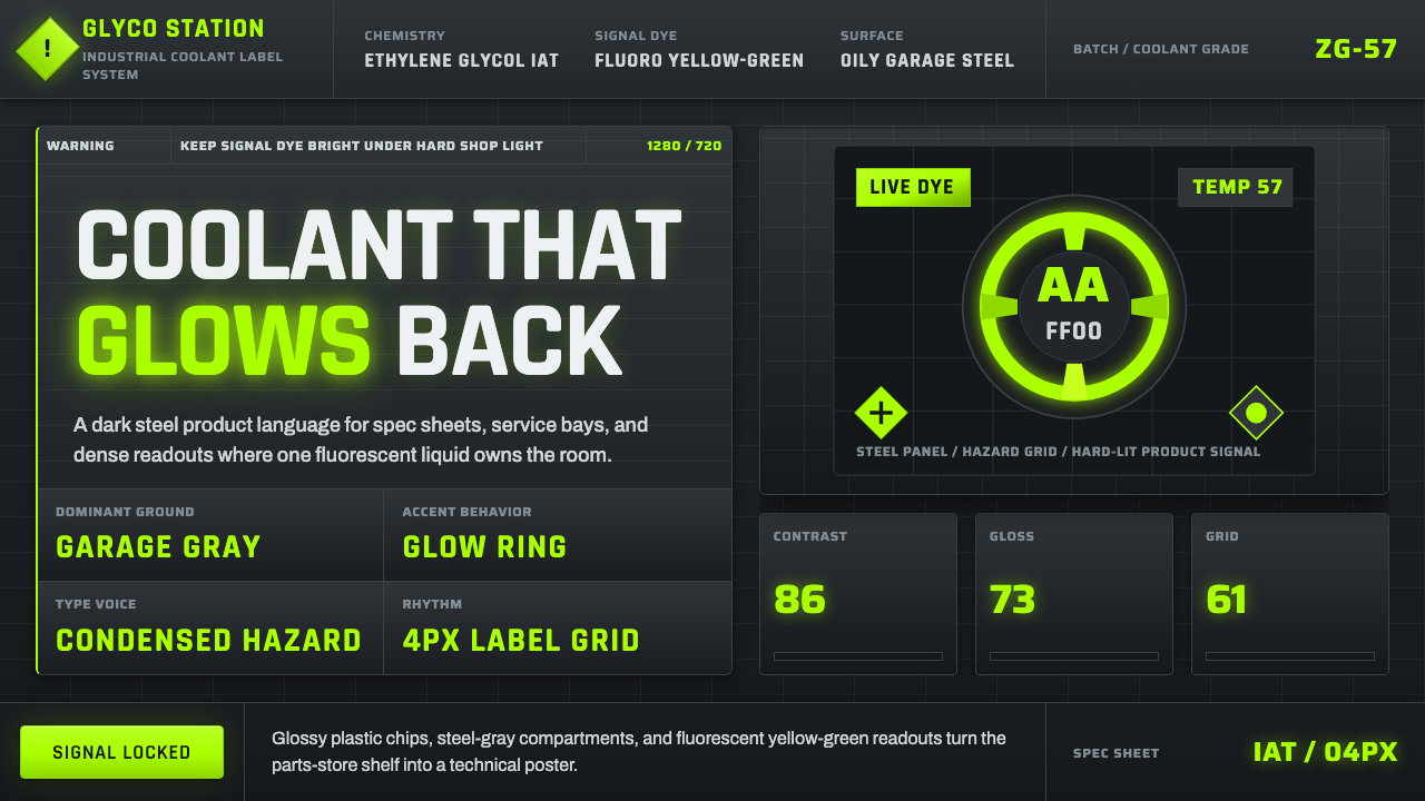 Fluorescent Antifreeze GreenCoolant becomes hazard signal. Fluoro green burns through steel-gray label gr…
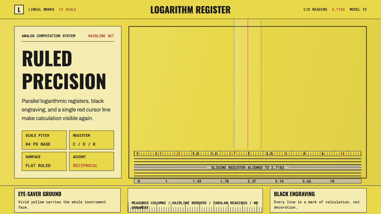 Slide RulePrecision made visible. Eye-saver yellow, black ticks, and one red hairline d…
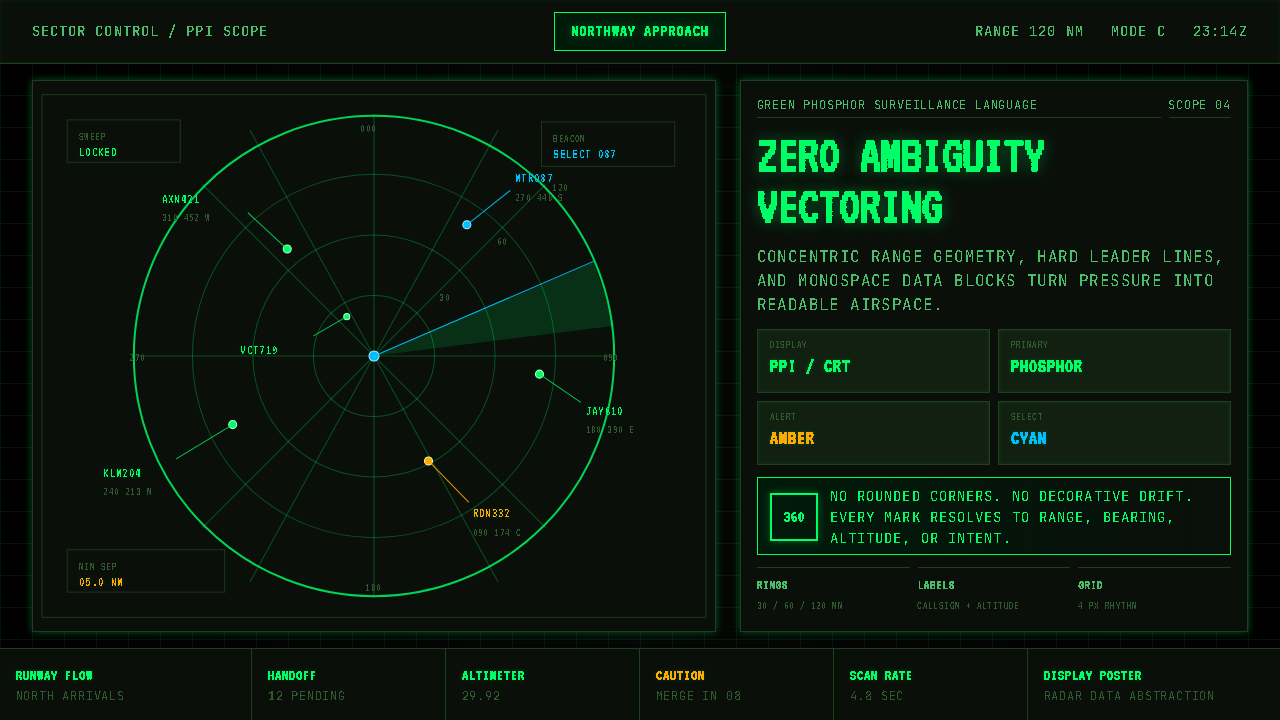 Air Traffic Control RadarOperational gravity. Phosphor green rings, sweep wedges, and monospace blips…
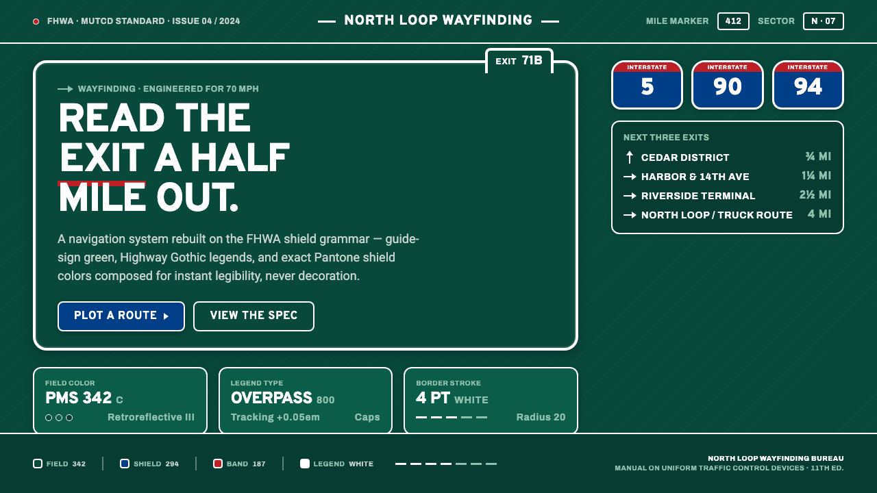 Interstate Highway ShieldEngineered for 70 mph. Guide-sign green, Pantone shield blue and red, Highway…
 Nikon F Professional BlackMechanical precision as brand. Black-enamel ground, chrome rims, white-filled…
 Office Rubber StampsProcedure made visible. Vermilion Oswald stamps strike a manila logbook grid.