What is Tencent QQ?
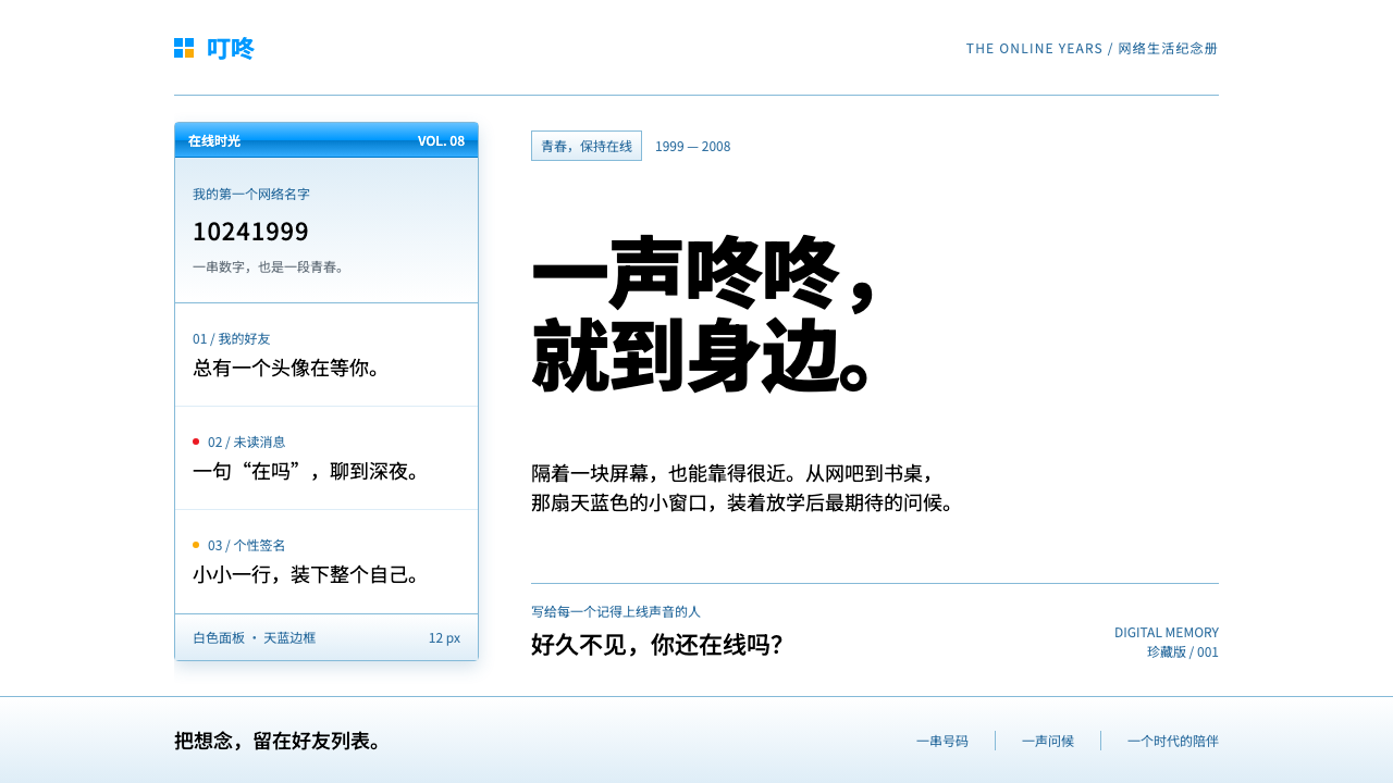
The Tencent QQ style recreates the tall, pale-blue instant-messenger window of the late 2000s: white panes, glossy title bars and tiny red signals.
Tencent QQ in brief
The Tencent QQ style recreates the desktop client and website that millions of Chinese users knew in 2007 and 2008. Its world is a tall, narrow window: a white buddy list sorted into collapsible folders, pale blue chrome around it, and a glossy gradient title bar in the spirit of the Windows XP era. Text is small and dense, and nearly every border is a thin blue line.
The penguin's colours, black, yellow and red, are not used as large fills. They appear as small signals: a red dot, a badge, a flashing message icon. This restraint is the heart of the style. The interface treats colour as information, not decoration, and gives the eye a few precise places to land.
The effect is sociable and slightly nostalgic. It evokes a period when a QQ number was many people's first online identity, when friends logged in from internet cafes, and when the arrival of a message was announced by a knock and a blinking icon. It is the look of early Chinese internet intimacy.

Where does Tencent QQ come from?
Tencent QQ began in February 1999 as OICQ, a small Windows messenger released by a young company in Shenzhen. The name echoed ICQ, the Israeli messenger that had shown the format, and a year later it was renamed QQ. The service grew from a simple chat window into a central part of Chinese online life, and for many people the first thing they did on a computer was log in to QQ.
The company's founders included Ma Huateng and Zhang Zhidong, and its design work later moved into the in-house user-experience team known as Tencent ISUX. The visual identity that stood out in the middle of the 2000s combined a light, friendly interface with the penguin as brand character. The penguin appeared in the lower corner of the window and blinked when messages arrived, turning a utility into something with a face.
The cultural setting matters. In China during this period, many people reached the internet through internet cafes, where shared computers, cheap hourly access and crowded rooms shaped how the web was used. QQ fitted this environment: you logged in, saw friends sorted into folders such as My Friends, Strangers and the Blacklist, and heard the knocking sound when someone came online. Identity was a number and an avatar, not a profile page.
A further strand was the culture of virtual goods and avatar dress-up. Users decorated their profiles, bought small digital items and displayed them as signals of taste and belonging. That habit helps explain the interface's love of small badges, tiny icons and compact decoration. The reference visuals of this style, the QQ client of 2007 and 2008 and the im.qq.com website of the same years, capture the moment when the service was at its most recognisable.
What defines the Tencent QQ look?
White panes
The main working surfaces are clean white panes, such as the buddy list and chat area. White keeps text clear at a small size and lets the blue frame and red signals carry all the colour. Panes are flat and boxy, with square corners and no soft shadows, matching the look of the Windows applications of the time.
Hairline blue borders
Panels are bordered by a single thin pale-blue line rather than thick frames. The line defines each region without adding weight, and its consistency gives the interface a tidy, engineered look. Because borders are so light, the eye reads structure through alignment and spacing as much as through lines.
Glossy title bars
Window title bars carry a subtle blue gradient with a bright highlight along the top, in the glossy manner of the early Windows XP period. This is the only place the style allows a gradient, and it signals that the window is an object that can be dragged and focused. It also gives the otherwise flat panes a touch of polish.
Compact small text
Body text is set small and dense, in a plain sans face with tight line spacing. The goal is to fit as many friends, groups and messages as possible into a narrow window. This is a style of information density rather than airy luxury, and it relies on consistent alignment and a restrained colour range to remain legible.
Penguin colours as signals
Black, yellow and red appear only in small doses: a red notification dot, a yellow badge, a flashing message icon. They never fill a large area. This keeps the blue-and-white chrome calm while making every alert instantly visible, and it makes the penguin's palette function as a vocabulary of status.
Folded groups and lists
Contacts are arranged in collapsible groups with small arrow icons and counts beside the group names. Each row holds a small avatar, a name and a status. This structure, a vertical list that folds and unfolds, is the most recognisable layout of the style and shows how the interface organises relationships as a tidy hierarchy.

Who shaped Tencent QQ?
Ma is a founder of Tencent and the figure most associated with the creation of OICQ in 1999. His company turned a small messenger into a central part of Chinese internet life. The style reflects the product's origin as a practical, quick-to-learn tool for ordinary users rather than a showpiece.
Zhang was a co-founder of Tencent and a leading technical figure in the company's early years. His work on the engineering side helped QQ handle the rapid growth in users that followed its launch. The lightweight, fast-loading character of the interface owes something to that engineering emphasis.
ISUX is Tencent's in-house user-experience design group, associated with the visual systems of the company's products. Its work shaped how the penguin, the pale blue chrome and the small status signals fitted together into a coherent look. The style is a record of the team's approach in the 2007 to 2008 period.
Not an individual, but the social setting in which QQ grew. Shared machines, crowded rooms and a habit of logging in to meet friends shaped the interface's compact density and its sound-and-icon alerts. The style captures that communal atmosphere as much as any particular screen.
How do you use Tencent QQ today?
For slides, the QQ style suits nostalgia-driven content: retrospectives on early internet culture, messaging-product histories, social-media decks and creative pitches that want a friendly, period feel. Use a pale blue frame around a white pane, a glossy title bar for the headline and a red dot as a callout. Content slides can mimic a chat window, with short messages stacked like a conversation.
For data slides, borrow the compactness. Build charts from thin lines and small rectangular bars on white panes, and use the red, yellow and black colours sparingly to mark highlights. Lists of metrics can follow the folded-group pattern, with small counts beside each heading. The aim is information density with clarity, so keep type small but consistent and avoid decorative effects.
In web UI, the style fits messaging apps, community forums, fan sites, retro-themed social products and any interface where a contact list is central. Use a narrow column for the list, a white main pane, thin blue borders and a glossy header strip. Notification states should rely on tiny red or yellow marks, optionally paired with a blink or a short sound. It also works well for nostalgic landing pages that invite visitors to feel they are logging in.
In editorial and marketing work, use it for anniversary campaigns, internet-history features and playful brand collaborations that reference early messenger culture. Chat-window layouts can frame quotes and testimonials as messages, and avatar-style icons can stand in for people. Keep copy conversational and short. Do not reproduce Tencent's logos or the penguin artwork directly; the style works through the palette, window chrome and signal colours.
The most common mistake is to modernise it with rounded cards, soft shadows and large type, which erases the 2007 character. Another is to apply the penguin colours as large fills; the style depends on them staying small. Finally, avoid making the gradient title bar the dominant feature. It should be a small polish on otherwise flat white and pale blue, not a heavy glossy theme across the whole page.

Tencent QQ — FAQ
Which QQ versions does this style refer to?
The reference visuals are the QQ client of 2007 and 2008 and the im.qq.com website from the same years. The service itself started in February 1999 as OICQ and was renamed QQ in 2000, but the specific look of white panes, pale blue borders and glossy title bars comes from that later period.
Why are the penguin's colours used so sparingly?
In the interface, black, yellow and red work as signals: a red dot, a badge, a flashing message. If they filled large areas, they would lose that meaning and compete with the calm blue-and-white chrome. Keeping them small makes alerts instantly visible and preserves the tidy look of the window.
Is the style suitable for modern products?
It works best for nostalgic, community-oriented or playful products where a contact list or chat window is central. For mainstream products, use it as a themed section or landing page rather than the whole interface, since the dense small type and flat chrome can feel dated for long daily use. Adapt it with care rather than copying it literally.
What made QQ so central to early Chinese internet life?
It combined a simple, fast messenger with a strong sense of identity: a QQ number, an avatar and a friend list. In an era of shared internet-cafe computers, it gave people a place to meet. Features such as groups, status signals and virtual goods turned the client into a social space, and its visual style became part of that memory.
Related design styles
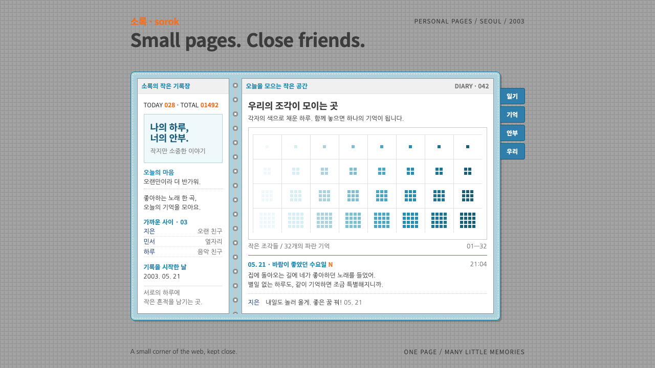 CyworldIntimacy at 12px. White diary pages in a stitched sky-blue binder, orange vis…
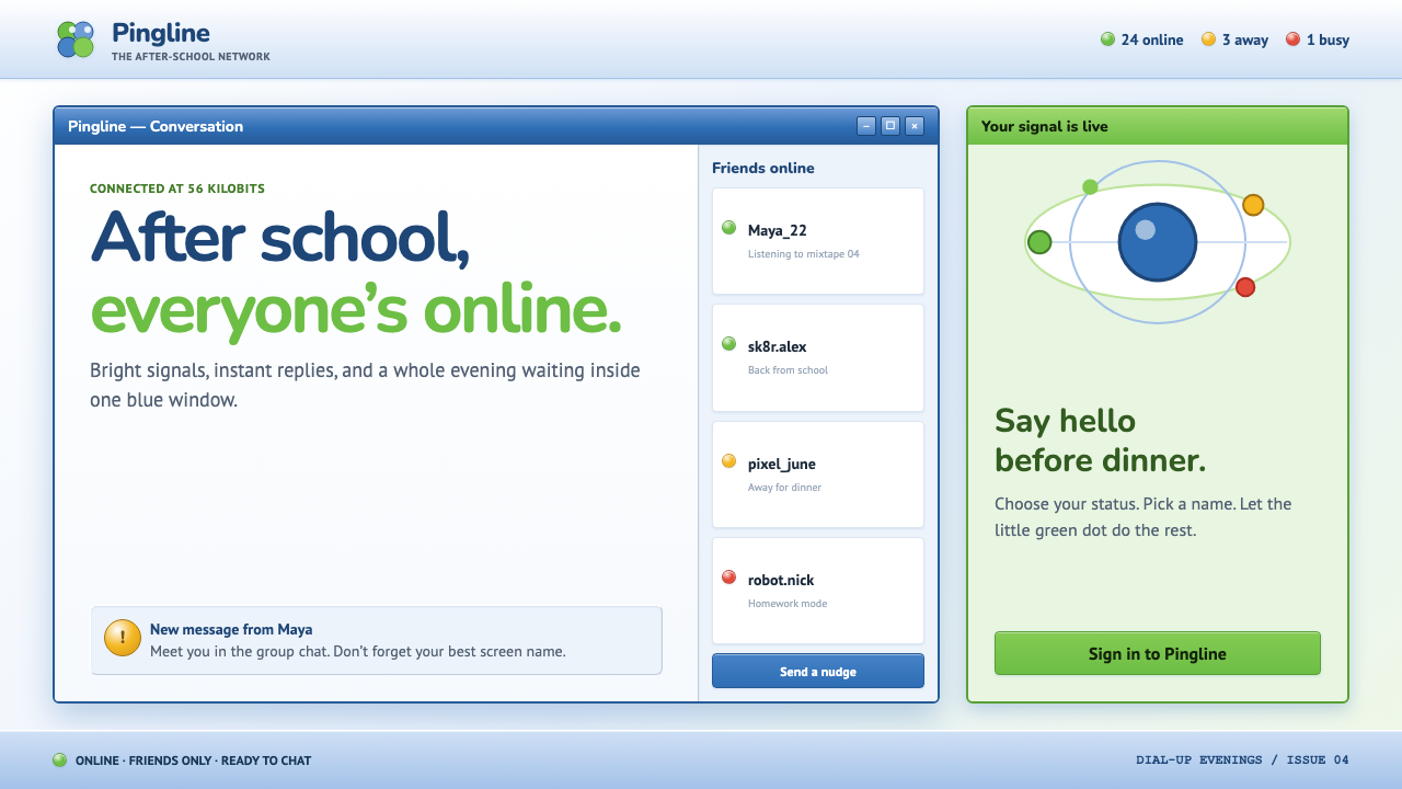 MSN Messenger (2001)Dial-up optimism, online. Luna-blue chrome and bright status dots keep every…
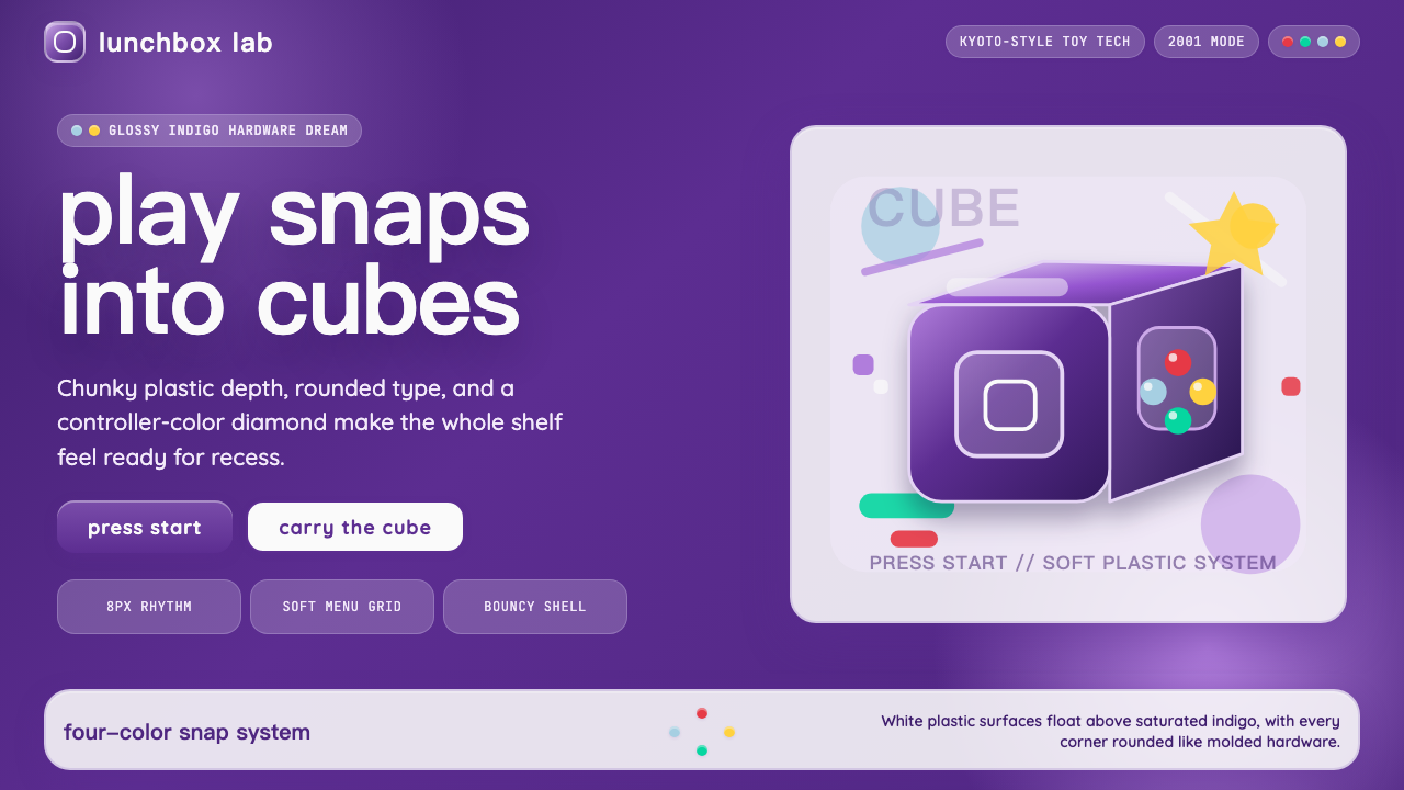 Nintendo GameCube (2001)Toy-tech refuses restraint. Indigo plastic, glossy cubes, and four-color butt…
 AIMThe Buddy List after school. Hard 2px grey bevels, flat yellow selection, blu…
 Windows XP Bliss (2001)Fresh-install optimism. Sky blue, hill green, and glossy gel chrome turn real…
 i-modeA whole world in a few dots. Bitmap type, white space and yellow bring the po…