What is AIM?
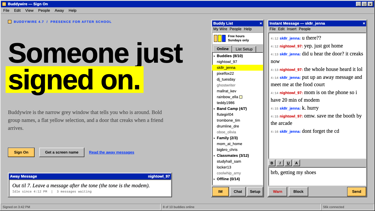
AIM is the Buddy List after school: a narrow grey Windows box with hard bevelled edges, a yellow selection bar and a screen name in blue for them and red for you.
AIM in brief
AIM, short for AOL Instant Messenger, is the Buddy List as a generation of young users saw it around 2001. The window is narrow and tall, in the classic Windows grey, with raised and sunken bevelled edges. Inside sits a white list pane, group names in bold black, and a flat yellow highlight on whichever group was clicked last. At the top stands the warm-yellow Running Man, the service's mascot.
The visual language is the Windows 9x desktop at its most literal: hard pixel edges, a title bar, a toolbar of small buttons, and controls that look like physical buttons being pressed in and popped out. There is no blur, no rounding and no gradient. Everything has a clear, square edge and a defined place, and the density is high because the window is small and the screen was never large.
Its conversation window is just as distinctive. The log shows each person's screen name, with the buddy's name in AOL blue and your own in red, followed by their message in a default serif face. The result is an interface that is both utilitarian and intimate: the system chrome looks like office software, while the content is a stream of teenage chat, away messages and profile text.

Where does AIM come from?
AIM launched in May 1997 from AOL's base in Dulles, Virginia. Until then, instant messaging had lived inside AOL's own dial-up service. AIM broke it out as a standalone Windows client that anyone could use with just a screen name, no AOL account required. JoRoan Lazaro and Barry Appelman are the names most often associated with its creation. The idea was simple and it spread: choose a name, add friends, and talk.
The classic clients are the AIM 4.x and 5.x generations, which dominated roughly 2000 through 2004. For many American teenagers, logging on after school was the first thing they did when they got home. A door creaked open when a buddy signed on and slammed shut when they left. Away messages and profiles filled up with song lyrics and in-jokes, serving as an early version of the status update. Screen names were a form of self-presentation, chosen with care and sometimes changed with the mood.
The design belongs to a specific moment in desktop software, the late-1990s and early-2000s Windows classic style, with its bevelled buttons, grey chrome and compact lists. It was not a branding exercise so much as the default grammar of the operating system, adapted to a chat list. That is why it feels so much like a period piece now: the same bevels were on every program people used.
The service changed over the years. The Running Man was dropped in 2011 and brought back in 2013, and AIM was shut down on 15 December 2017. By then the look of the classic client was already a piece of nostalgia, and the interface it left behind became shorthand for a certain kind of early-internet adolescence.
What defines the AIM look?
Color
The base is the classic Windows grey, with a white list pane and black text. Colour is used in very few, very flat ways: a solid yellow selection bar, the warm-yellow Running Man, AOL blue for the buddy's name and red for your own in the conversation log. There are no tints, no translucency and no gradients. Each colour is a plain fill with a clear role.
Typography
Interface text is a small, compact sans in the manner of Tahoma, here carried by Arimo. Group names are in bold, and buddy names are in regular weight. Message text in the conversation window falls back to the browser-like default serif, represented here by Tinos, matching the Times look of the original client. The mix of a tidy sans chrome and a plain serif message body is part of the period charm.
Layout
The Buddy List is a single narrow column. At the top is the mascot and a menu or toolbar, then a list of expandable groups, each with its buddies indented below, and a row of buttons along the bottom. Conversation windows are rectangular: a log above, an input box below, and a button row beneath. Nothing floats, and nothing overlaps. Everything is tiled into the window with a clear edge.
Bevels and borders
Edges are the heart of the style. Buttons and panels have hard, two-tone bevels that look raised; the list pane and text boxes have bevels that look sunken. A button pressed in changes its edge from raised to sunken, which is the only animation the interface needs. The effect is a convincing physical metaphor made entirely of flat pixels, and it must remain hard, with no softening.
Selection
Selection is a flat yellow fill across the whole row. It is not a pale tint and not a rounded pill; it is a solid bar that covers the group name from edge to edge. This is a deliberate, loud signal in an otherwise grey window, and it is the most distinctive colour moment in the layout after the mascot.
Screen names as identity
In the conversation log, each line begins with a screen name, in blue for the other person and red for you. Because there are no avatars in the log itself, the name carries the whole identity of the speaker. The pattern of alternating colours down the window is both a functional cue and a recognisable visual rhythm.

Who shaped AIM?
One of the two people most often credited with creating AIM at AOL in 1997.
Also credited with the creation of AIM, working with Lazaro at AOL in Dulles, Virginia.
The community that shaped the culture of away messages, profiles and carefully chosen screen names, which the interface was built around.
How do you use AIM today?
On slides, the style suits nostalgic talks, internet-history presentations, retro product launches and anything aimed at people who grew up around the year 2000. A cover slide can be a single grey window with a title bar and a bevelled frame. Content slides can be built as lists of grouped items with a yellow bar on the active one, or as a chat log with blue and red names. For data, a simple list or a plain table with hard borders is more faithful than a modern chart.
In web UI, it works for chat widgets, community pages, retro landing pages, easter-egg sections, game-like tools and any product that wants the feel of classic desktop software. The components are clear: a narrow grey window, bevelled buttons, a white list pane with bold group names, a flat yellow selection and a conversation log with coloured names. It is not suitable for modern dashboards where touch targets, responsiveness and accessibility must be at the centre, though it can be adapted carefully.
In editorial and marketing work, it provides an instantly legible signal of late-1990s and early-2000s internet life. It suits pieces on nostalgia, early social media, screen names and teenage digital culture, and it can frame a campaign that plays with remembered software. A mock window with a Running Man at the top is a recognisable motif, but it should be used with a light touch and a clear sense of the audience.
The most common mistake is to soften it. Adding rounded corners, soft shadows, a gradient or a translucent panel instantly makes the interface look like a modern pastiche rather than the real thing. The bevels must be hard and the colours flat. The second mistake is to ignore density: the original was compact, with small type and tight rows, and enlarging everything removes the character.
A third error is to confuse this with a generic grey UI. The details that make it AIM are specific: the solid yellow selection, the blue and red names, the bold group headings, and the mascot at the top. Without them, it is only grey.

AIM — FAQ
What was AIM?
AIM was AOL Instant Messenger, an instant-messaging client launched in May 1997. It worked as a standalone Windows program, and users needed only a screen name to join. It was shut down on 15 December 2017.
Why are the borders so hard?
The look comes from the classic Windows interface of the late 1990s and early 2000s, where buttons and panels had hard two-tone bevels to look raised or sunken. Rounding or softening them would break the period feel.
What do the blue and red names mean?
In the conversation log the buddy's screen name appears in AOL blue and your own in red. The alternating colours show who is speaking without needing avatars.
Which fonts does the style use?
Arimo stands in for Tahoma in the interface, and Tinos stands in for the default Times-style serif in message text. They are open, metric-compatible alternatives that capture the period look.
Can I use it for a modern product?
It works best for nostalgic, playful or retro contexts. For a modern product, use it as an accent such as a themed section or an easter egg, not as the main interface, because its density and small targets do not suit touch screens.
Related design styles
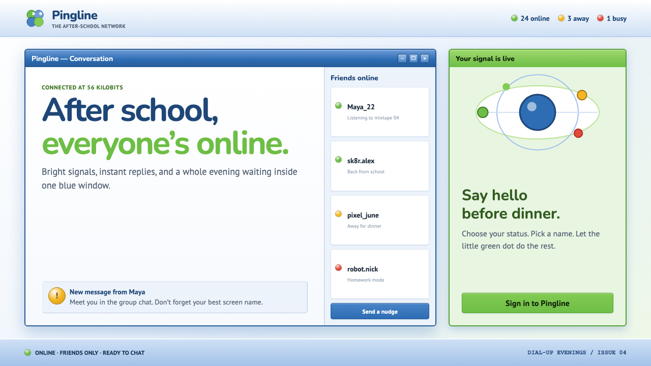 MSN Messenger (2001)Dial-up optimism, online. Luna-blue chrome and bright status dots keep every…
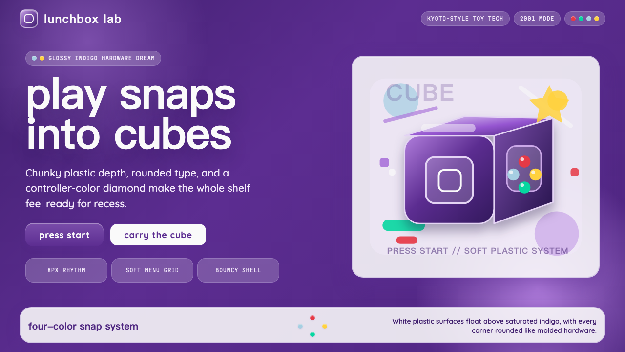 Nintendo GameCube (2001)Toy-tech refuses restraint. Indigo plastic, glossy cubes, and four-color butt…
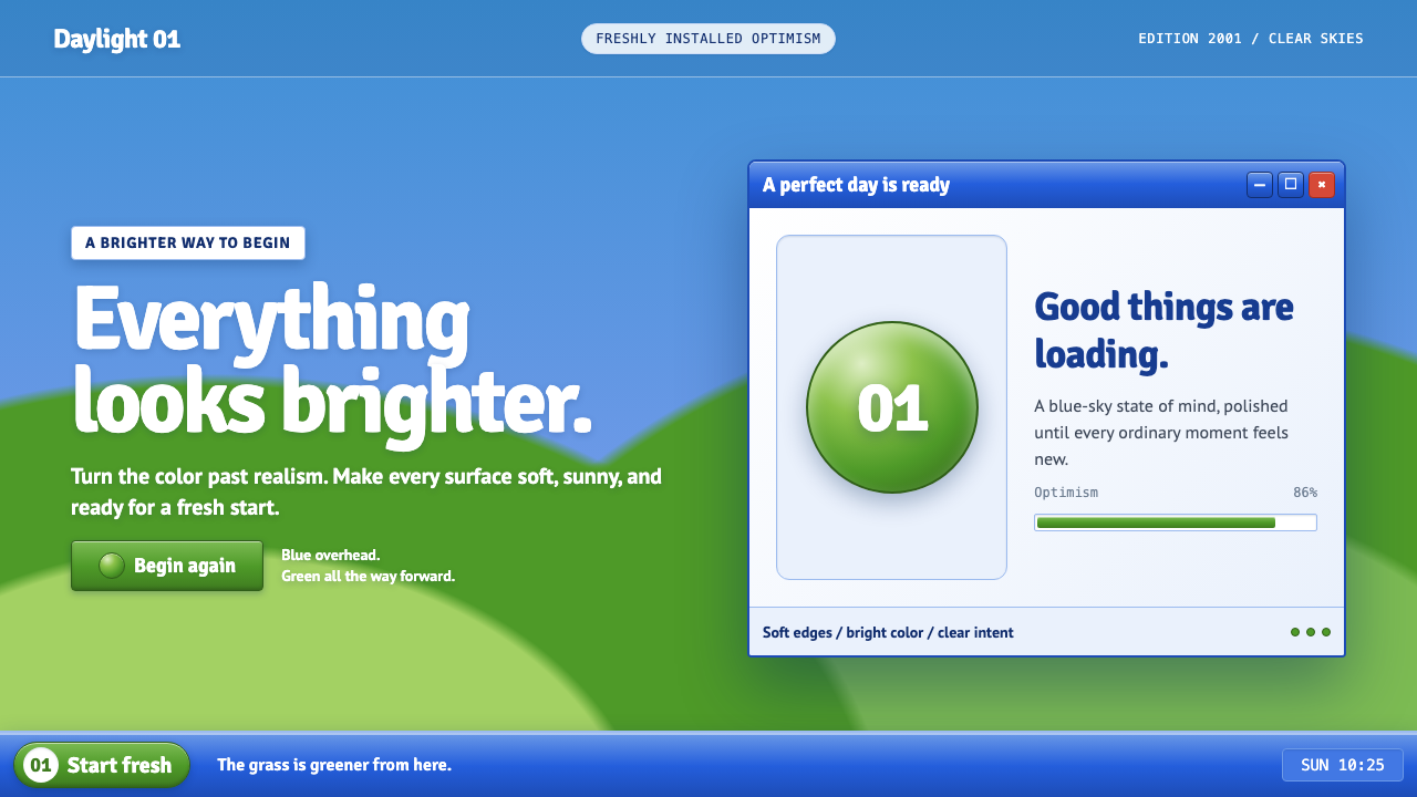 Windows XP Bliss (2001)Fresh-install optimism. Sky blue, hill green, and glossy gel chrome turn real…
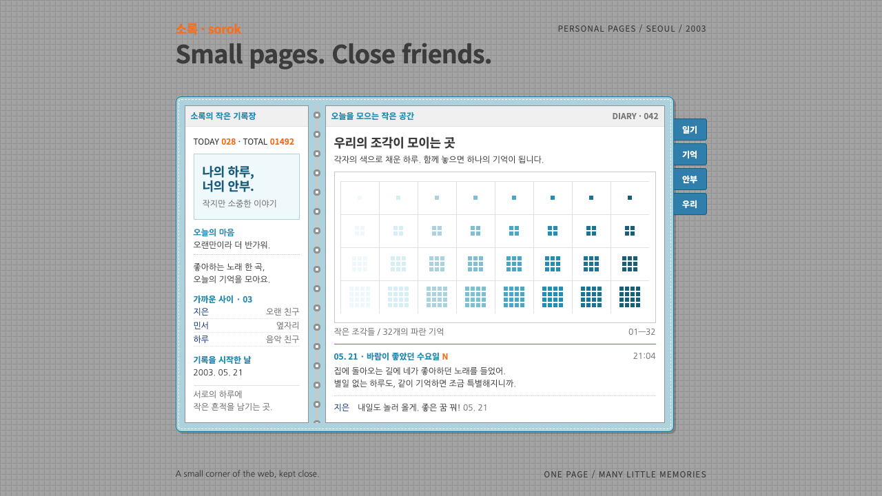 CyworldIntimacy at 12px. White diary pages in a stitched sky-blue binder, orange vis…
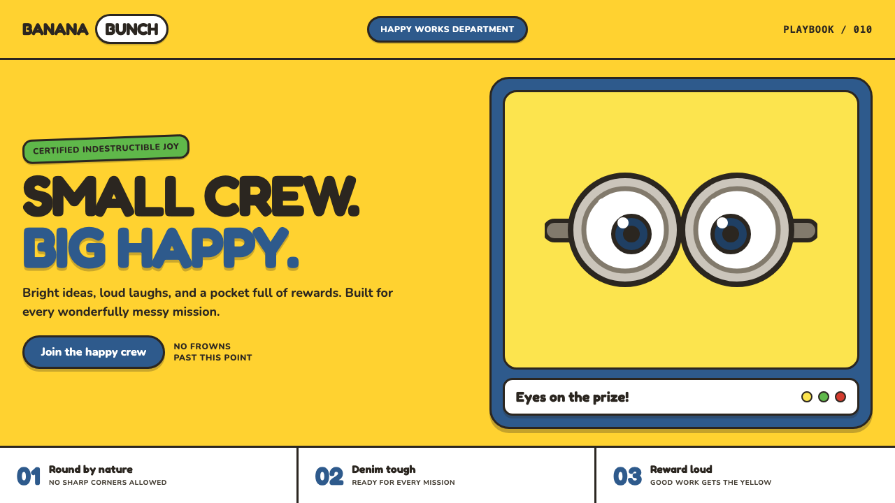 Minions (Despicable Me, 2010)Indestructibly cheerful. Minion yellow, denim blue, and chunky goggle geometr…
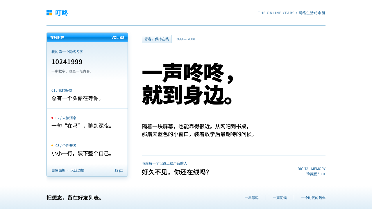 Tencent QQFriendship in a little blue frame. Glossy sky-blue chrome, white panes, tiny…