What is Tehran Pre-Revolution Modern?
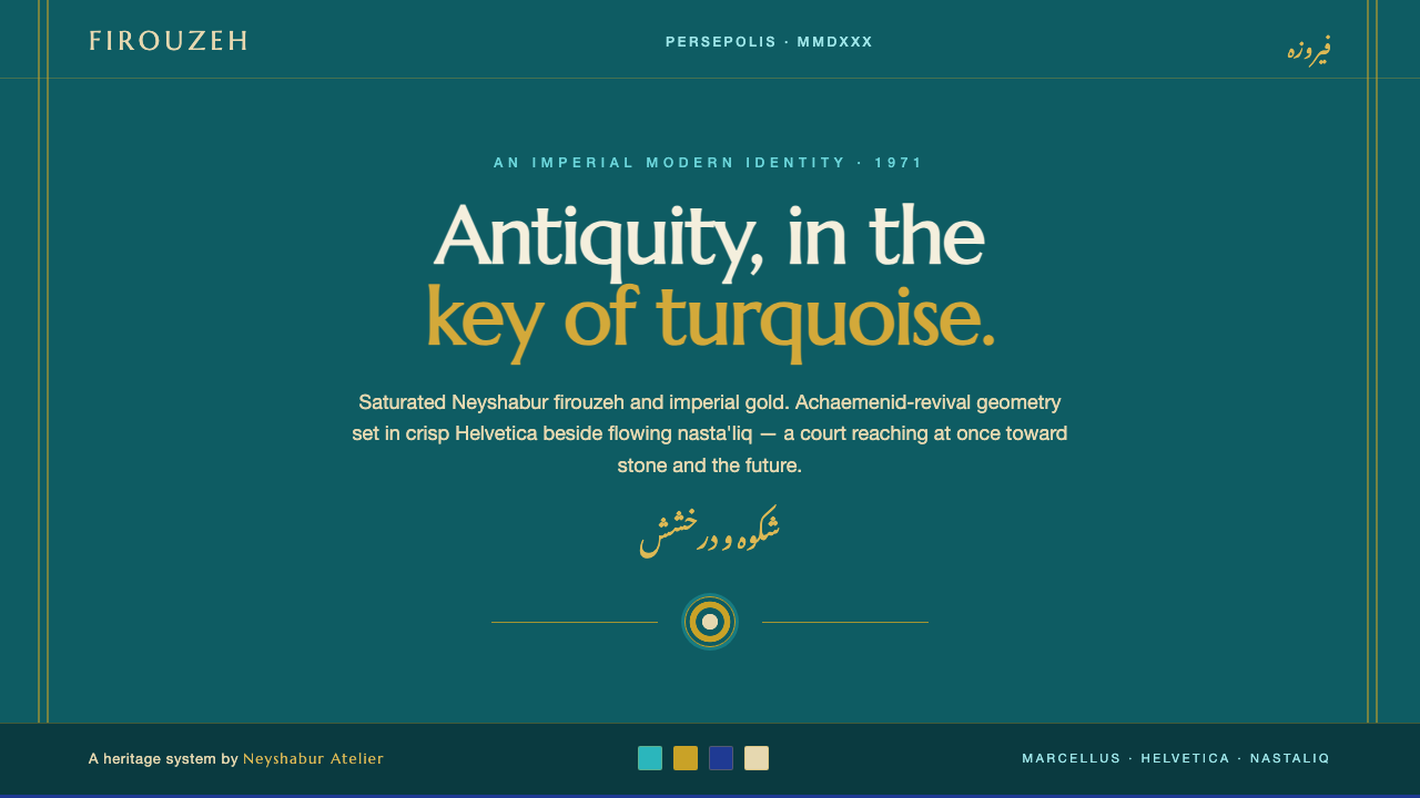
Tehran Pre-Revolution Modern placed antiquity in turquoise and gold, then gave it a crisp international voice through Helvetica beside nasta'liq.
Tehran Pre-Revolution Modern in brief
Tehran Pre-Revolution Modern describes the visual culture of Pahlavi-era Tehran from the mid-twentieth century through the late twentieth century, reaching its symbolic peak in the 1971 Persepolis celebration of 2,500 years of the Persian Empire. Its central tension is deliberate: the design looks backward toward Achaemenid antiquity while speaking in the clean, confident language of international modernism.
The signature palette is deep Persian turquoise, specifically Neyshabur firouzeh, paired with imperial gold on dark grounds. The color relationship is saturated, ceremonial, and unmistakably regional, yet the composition remains disciplined rather than ornamental. Crisp Latin Helvetica brings neutral modernity and structural clarity; elegant nasta'liq introduces movement, cultural memory, and a distinctly Persian rhythm.
The resulting mood is regal, modern, and cosmopolitan. Geometry recalls imperial history without becoming archaeological illustration, while typography announces a court reaching toward an international future. The style works through contrast: dark and luminous, ancient and current, measured and flowing, official and poetic. Its sophistication lies in holding these oppositions together without allowing one side to erase the other.
Where does Tehran Pre-Revolution Modern come from?
The style belongs to the Pahlavi-era modernization of Tehran, situated within the broader period from 1950 to 1990 and centered geographically on Tehran and Persepolis. Its historical identity is not defined by a single visual source. It emerges from the meeting of Pahlavi-era Tehran modernism, Achaemenid revival, and the International Swiss graphic style.
The 1971 Persepolis celebration of 2,500 years of the Persian Empire provided the clearest expression of this synthesis. The event’s visual world joined imperial spectacle with a self-consciously modern graphic register. Turquoise and gold made antiquity visible as atmosphere and color, while Achaemenid-revival geometry gave the composition a sense of inherited order. The result was neither a simple reconstruction of the past nor an imitation of European modernism.
The political and cultural presence of Mohammad Reza Pahlavi and Farah Pahlavi belongs to the style’s central narrative. Their inclusion among its key figures signals the relationship between courtly identity, national history, and a modern international image. The design language presents Iran as both the inheritor of an ancient empire and a participant in contemporary global culture.
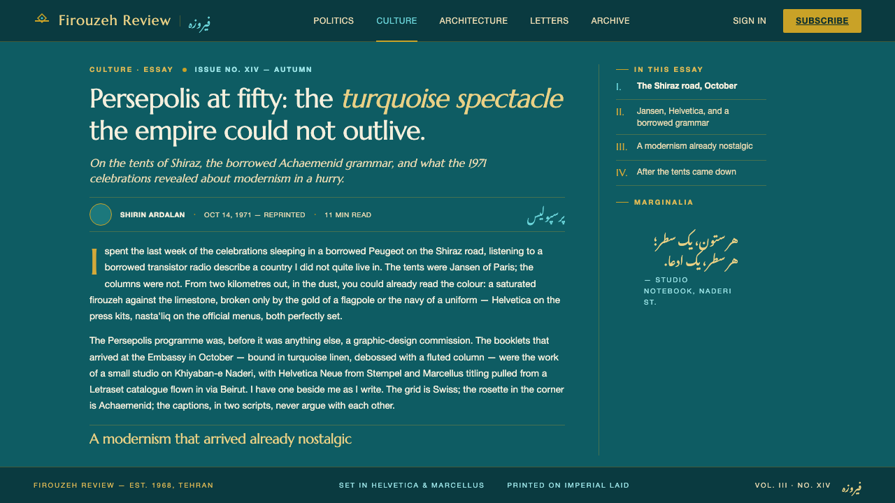
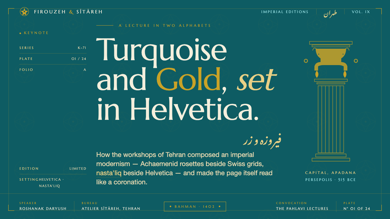
Tehran modernist designers translated that ambition into a graphic vocabulary capable of carrying different registers at once. Helvetica supplied clarity, neutrality, and international recognition; nasta'liq supplied elegance and cultural specificity. Together with dark grounds, saturated turquoise, imperial gold, and geometric structure, these elements formed a visual language that could feel ceremonial without becoming old-fashioned, and modern without becoming culturally anonymous.
What defines the Tehran Pre-Revolution Modern look?
Turquoise and Gold
The palette is led by saturated Persian turquoise and imperial gold, usually placed against a dark ground that makes both colors feel luminous. Turquoise carries the regional and historical identity of the style; gold adds ceremony, authority, and a sense of imperial continuity. The combination is powerful because it is treated as a system of contrast, not as decorative abundance.
Dark Luminous Ground
Dark backgrounds establish the style’s nocturnal, ceremonial atmosphere. They give the turquoise and gold a concentrated visual force while allowing white or pale typography to remain crisp. The ground should feel deep and composed, not textured or theatrical; its role is to create contrast and quiet around the brighter elements.
Helvetica Clarity
Helvetica represents the international modernist register. Its crisp, neutral Latin forms create reliable hierarchy, direct reading, and a sense of institutional confidence. It should organize titles, labels, and information with restraint, allowing spacing and scale to provide emphasis rather than ornamental lettering.
Nasta'liq Flow
Nasta'liq introduces a contrasting rhythm: elegant, inclined, and visibly shaped by the movement of handwriting. It is not merely a translation layer beside Latin type. It contributes cultural presence and visual motion, especially when set against the measured regularity of Helvetica. The pairing is strongest when both scripts retain their own integrity.
Achaemenid Geometry
Achaemenid-revival geometry gives the style its historical structure. Shapes and formal divisions should feel ordered, deliberate, and capable of carrying ceremonial meaning without becoming literal historical illustration. Geometry anchors the composition while color and script supply its emotional and cultural charge.
Modernist Contrast
The visual language depends on carefully staged oppositions: dark against luminous, strict against graceful, Latin neutrality against Persian expression, and inherited geometry against contemporary clarity. These contrasts should remain legible. When every element becomes equally ornate or equally bright, the style loses its modernist tension.
Regal Restraint
Although the palette suggests ceremony and luxury, the composition should remain controlled. Gold is an accent with symbolic weight, not a surface coating; turquoise is a field of identity, not a license for visual excess. The most convincing work lets authority emerge from proportion, contrast, and typographic discipline.
Who shaped Tehran Pre-Revolution Modern?
Mohammad Reza Pahlavi is one of the central figures in the political and imperial narrative surrounding Pahlavi-era Tehran design. In this visual history, his name is associated with the courtly ambition to connect Iran’s ancient imperial identity with a modern international image. The turquoise-and-gold ceremonial register and the Persepolis setting make that connection especially visible.
Farah Pahlavi represents the cultural and courtly dimension of the style’s identity. Her place among its key figures helps frame the aesthetic as more than a technical modernist exercise: it is also an image of national culture presented through a polished, contemporary, and cosmopolitan register. The balance of Persian script and international typography reflects that dual address.
Tehran modernist designers are the collective practitioners who translated the period’s historical and political ambitions into a usable graphic language. Their contribution is visible in the synthesis itself: Helvetica beside nasta'liq, Achaemenid-revival geometry beside Swiss clarity, and saturated turquoise and gold held within disciplined compositions. The collective is important precisely because the style is a design culture, not the signature of a single author.
How do you use Tehran Pre-Revolution Modern today?
For presentation covers, begin with a dark, composed field and let turquoise or imperial gold establish the first visual event. A strong title can be set in crisp Helvetica, with nasta'liq introduced as a cultural countervoice rather than a decorative caption. Content slides should keep the same discipline: clear alignment, generous breathing room, restrained geometry, and color reserved for emphasis. The cover may feel ceremonial; the interior should remain easy to scan.
Data slides benefit from treating information as an imperial diagram rather than a dashboard full of effects. Use turquoise to establish the primary data structure, gold to identify a decisive comparison or conclusion, and pale type for labels that must remain immediate. Geometric blocks, ordered bands, and strong contrast can make charts feel formal without becoming ornate. The visual system should clarify the information before it announces its historical reference.
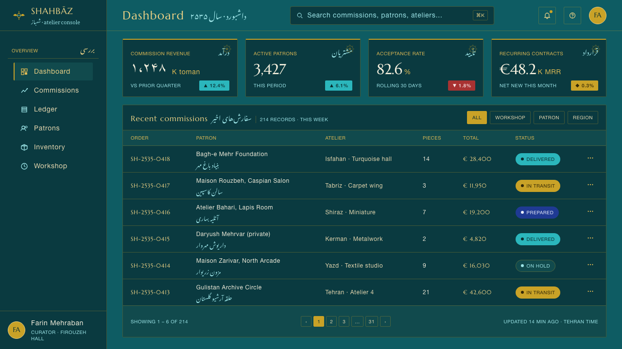
For web interfaces, the style suits dashboards and pricing pages that need authority, differentiation, and a memorable identity. A dark shell can carry pale Helvetica labels, turquoise interactive states, and gold signals for priority or premium distinction. Geometry can organize cards and panels, while nasta'liq should appear selectively where Persian cultural context is meaningful. The interface should remain operationally clear; historical atmosphere belongs in the framing, not in the wayfinding.
Editorial and marketing work can use the style to position a subject between heritage and the future. Article layouts may pair disciplined Helvetica headings with carefully placed nasta'liq phrases, using turquoise fields or gold rules to mark transitions. Campaign pages can alternate quiet dark space with concentrated luminous accents, giving images and statements room to carry weight. The strongest result feels like a cultural institution speaking with contemporary confidence.
The common mistake is to confuse imperial atmosphere with indiscriminate luxury. Covering every surface in gold, adding excessive ornament, or using decorative pseudo-calligraphy weakens the style’s central intelligence. Another failure is treating Helvetica and nasta'liq as interchangeable fonts rather than distinct voices. Keep the palette deliberate, preserve the contrast between order and flow, and let the historical reference emerge through structure as much as through color.
Tehran Pre-Revolution Modern — FAQ
Is Tehran Pre-Revolution Modern a historical style or a contemporary fusion?
It is a historical design language rooted in Pahlavi-era Tehran and expressed most clearly through the 1971 Persepolis celebration. Its identity comes from a specific meeting of Pahlavi-era modernism, Achaemenid revival, and International Swiss graphic style. Contemporary designers may adapt it, but the adaptation should preserve that historical tension between Persian antiquity and international modernity.
How should Helvetica and nasta'liq work together?
Treat them as complementary voices with different jobs. Helvetica should provide structural clarity for headings, labels, and information. Nasta'liq should introduce cultural presence, elegance, and movement. The pairing becomes weak when the script is used as decorative texture or when both systems compete for the same hierarchy. Give each one a clear role and enough space to remain legible.
Does the style require a dark background?
A dark ground is central to the supplied visual identity because it concentrates the luminous contrast of turquoise and imperial gold. However, the deeper principle is controlled contrast, not darkness for its own sake. A lighter adaptation can work if it preserves the saturated regional color, crisp modernist typography, restrained geometry, and clear distinction between historical expression and structural information.
Is this the same as traditional Persian design?
No. The style draws cultural identity from Persian history and nasta'liq, but its defining feature is the modern synthesis. Helvetica, Swiss graphic clarity, dark luminous grounds, and Achaemenid-revival geometry are brought into a single contemporary register. It is best understood as a cosmopolitan Pahlavi-era expression of Persian identity, not as a general label for all Persian design.
How can the style avoid becoming a generic luxury aesthetic?
Luxury should come from concentration and authority rather than surface excess. Keep imperial gold purposeful, let turquoise carry identity, and use geometry and typography to create order. The style becomes generic when it relies on glittering decoration, vague historical motifs, or unreadable script. Its strongest quality is the controlled conversation between ceremony and modern clarity.
Related design styles
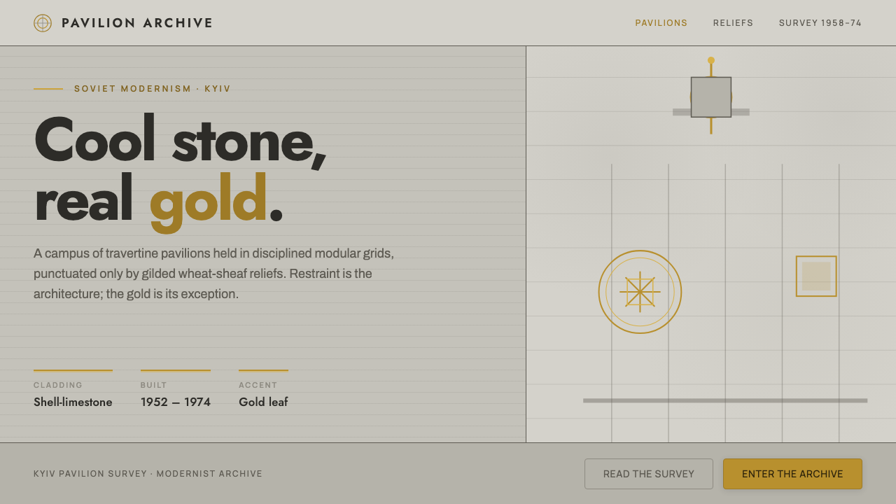 Kyiv VDNH Soviet ModernismRestraint made monumental. Cool travertine grey, geometric Jost type, wheat-s…
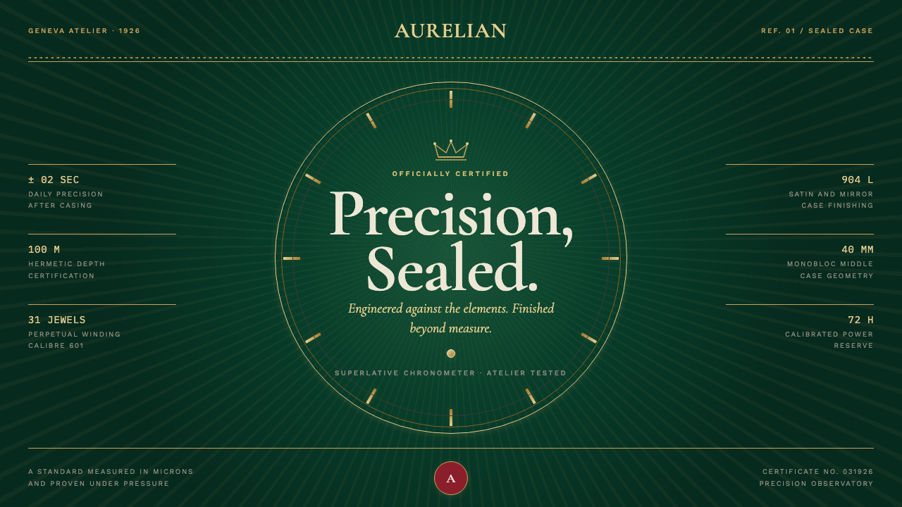 Rolex Oyster (1926)Luxury, calibrated. Champagne indices and guilloché rays lock into bottle-gre…
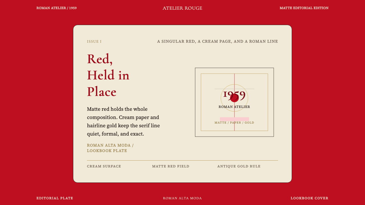 Valentino Rouge Couture (1959)Matte couture red holds the page. Cream paper and hairline gold keep it cerem…
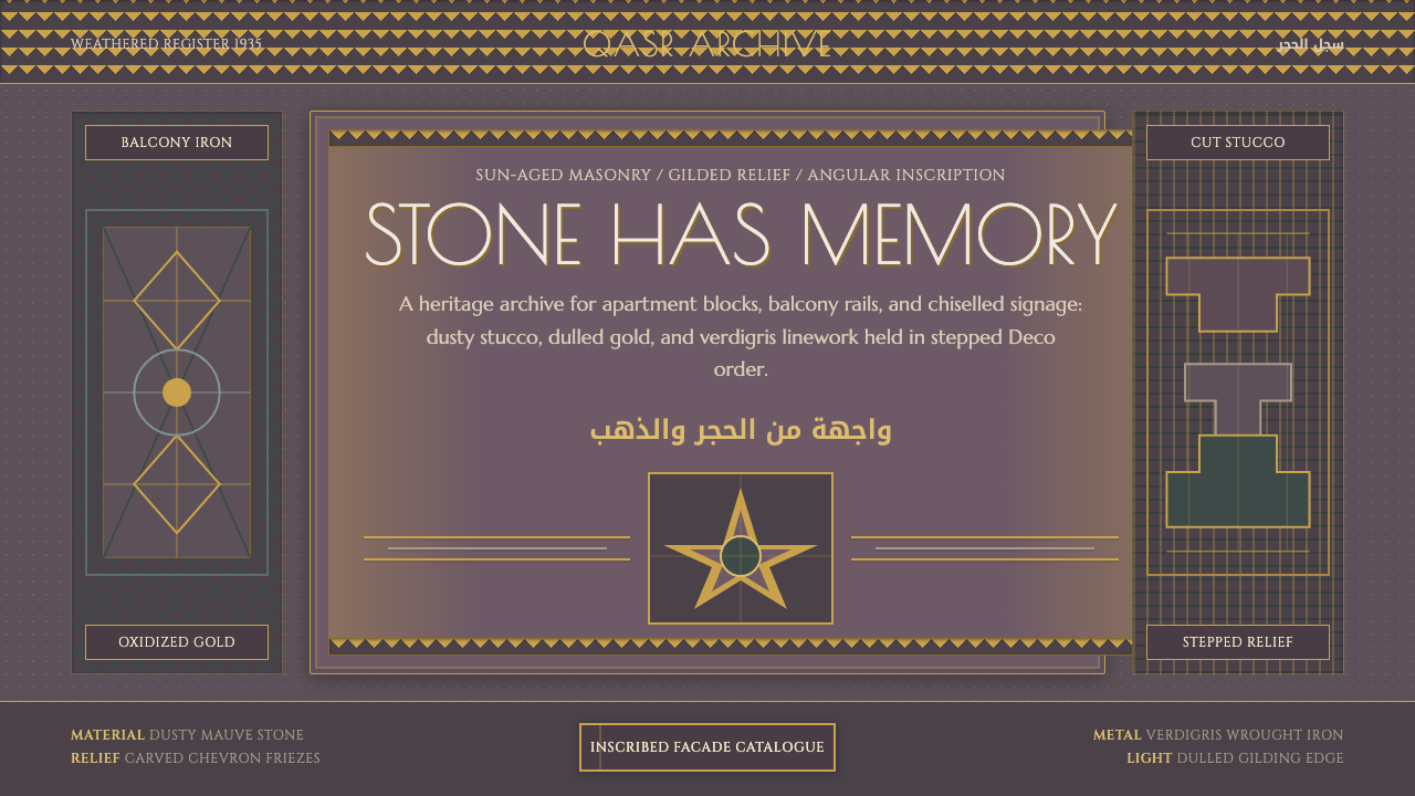 Cairo Downtown Art DecoStone-real glamour. Mauve stucco, dulled gold rules, and verdigris Deco geome…
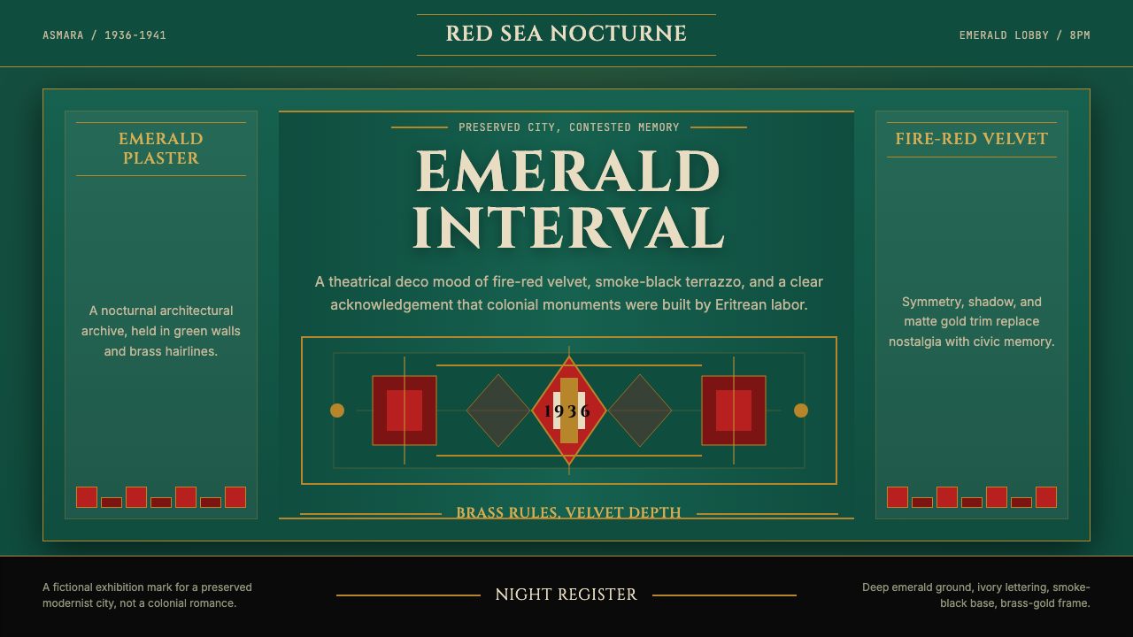 Eritrean Asmara Art Deco Cinema (1936)Nocturnal deco, critically lit. Emerald walls, fire red velvet, and brass rul…
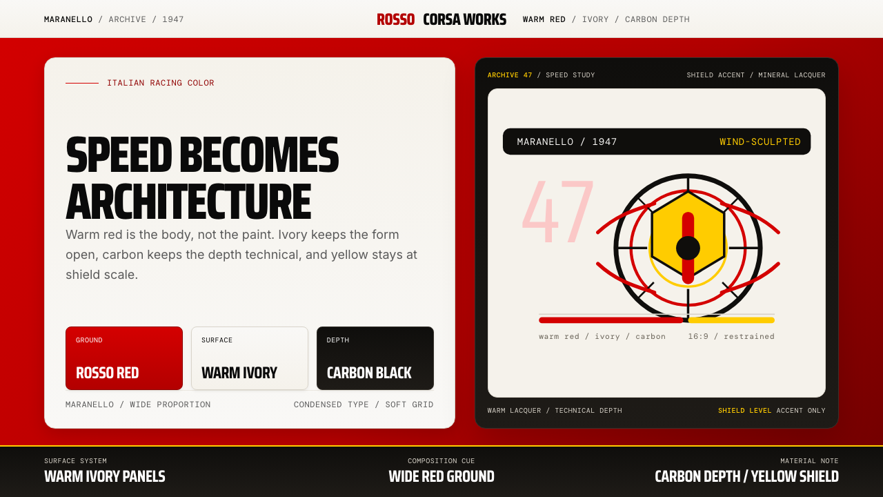 Ferrari Rosso Corsa (1947)Speed becomes architecture. Racing red, warm ivory, and carbon-black panels.