What is Rolex Oyster (1926)?
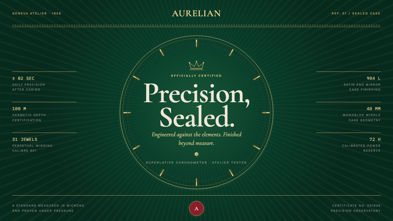
Rolex Oyster turns precision into luxury: bottle-green depth, champagne-gold calibration, and a perfectly centered detail that makes restraint feel engineered.
Rolex Oyster (1926) in brief
Rolex Oyster is a design language drawn from the Oyster wristcase, patented in 1926 and presented as the first waterproof wristcase. Its visual character begins with enclosure: a dark, sealed field that feels protected rather than empty; fine metallic lines that read like calibrated indices; and a composition held together by an invisible central pinion. The result is luxurious without being decorative in a casual sense. Every flourish is expected to behave like a component of a watch.
The style uses deep bottle-green grounds as an atmosphere of reserve and permanence. Champagne-gold details bring warmth, but they do not spread freely across the surface. They operate as markers, rules, signatures, and measured intervals. Guilloché sunburst texture provides the principal moment of richness, radiating beneath high-contrast serif display type like a machined dial surface catching the light. The texture is not a backdrop for unrelated content; it is the visual consequence of a centered system.
Rolex Oyster composition is tight, symmetrical, and deliberately aligned. Large display lettering carries the ceremonial authority of an engraved caseback, while restrained sans-serif text behaves more like dial notation or certificate information. The voice is that of a certified chronometer: sealed, signed, verified, and exact. It avoids visual noise, neon intensity, casual abundance, and anything that weakens the sense that each element has been placed under inspection.
Where does Rolex Oyster (1926) come from?
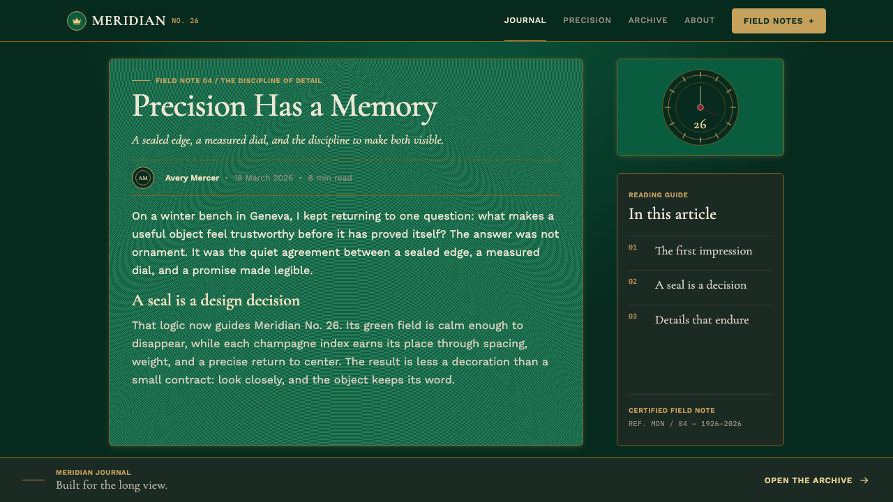
The Oyster story begins with a patent in 1926. Within this design language, that date is more than a historical label: it establishes the central metaphor of a sealed wristcase. A page, package, or presentation built in the Oyster manner should feel contained and protected, as though its surface has been closed with deliberate mechanical certainty. The reference is not generic luxury; it is luxury made credible through the idea of engineering.
The supplied historical frame places Oyster between Geneva and Bienne in Switzerland, while noting that Rolex was founded in London. That geography gives the style a productive tension between an international founding identity and Swiss horological discipline. Its visual language does not rely on regional ornament or sentimental craft imagery. Instead, it communicates refinement through controlled surfaces, measured marks, material suggestion, and the confidence to leave most of the field quiet.
The Perpetual rotor of 1931 expands the historical vocabulary from sealing to continuity. In visual terms, this supports rotational motifs, centered rays, circular rhythms, and compositions that imply a mechanism working beneath the surface. Guilloché sunburst pattern is especially effective because it can suggest movement while remaining disciplined: its lines travel outward from one governing point rather than dissolving into freeform texture.
Its strongest visual identity emerged during the 1950s through the 1970s, in a period shaped here by Swiss haute horlogerie, mid-century luxury-goods branding, and Art Deco precision engineering. These influences explain the blend of ceremonial display type and engineering-like detail. The system is neither purely industrial nor merely ornamental. It treats craftsmanship as evidence of exactness, then translates that exactness into a composed public identity.
What defines the Rolex Oyster (1926) look?
Bottle-Green Ground
The dominant ground is a deep bottle green: dark enough to suggest a sealed interior, yet rich enough to hold metallic detail without turning theatrical. It should read as depth, not as a fashionable dark mode. Large uninterrupted areas give the color authority and allow the composition to feel calm, expensive, and protected.
Champagne-Gold Calibration
Champagne-gold hairlines behave like watch indices. They define intervals, align content, mark transitions, and create a quiet sense of certification. Their value lies in precision rather than sparkle. Gold becomes strongest when it appears as a scarce, continuous system of marks rather than a broad decorative fill.
Radial Guilloché
Guilloché sunburst texture radiates from an implied center and acts as the style's single perfected machine-turned detail. It should remain subordinate to legibility and symmetry. Used beneath a title, a crest, or a central product image, it gives the surface depth through repeated engraved direction rather than through atmospheric blur or unrelated pattern.
Centered Symmetry
Every major decision is oriented around an implied center pinion. Symmetry is not simply mirroring; it is a declaration that the composition has been calibrated. Titles, rules, emblems, numerical information, and images should appear to share one governing axis. Small deviations are meaningful only when they clarify hierarchy or indicate a functional reading sequence.
Engraved Typography
High-contrast serif display type brings the formal presence of engraving: elegant, sharp, and controlled rather than nostalgic. It is paired with a restrained sans-serif for captions, specifications, and supporting information. The contrast between the two voices is essential. One speaks in ceremony; the other speaks in verified fact.
Sealed Negative Space
Empty space is treated as part of the case, not as unoccupied territory. Margins and pauses should feel intentional, bounded, and in balance with the central subject. This discipline prevents the dark field from becoming crowded and makes the few metallic or textured details feel more exact.
Certified Restraint
Luxury is expressed as restraint plus one immaculate detail. The system rejects clutter, neon, casual decorative mixtures, and visual effects that compete for attention. A signature, a seal-like mark, a radial texture, or a finely aligned rule may carry the richness of the composition. Adding several such gestures weakens the claim of precision.

Who shaped Rolex Oyster (1926)?
Hans Wilsdorf is named among the key figures in the supplied Oyster history. Within this design narrative, his significance is tied to the long arc from a London founding to a Swiss-centered identity of sealed construction, calibrated presentation, and enduring luxury.
Alfred Davis appears in the supplied list of key figures. His inclusion anchors the Oyster story in the company’s founding context and supports the style’s sense of luxury as an organized identity rather than an isolated visual treatment.
Emile Borer is identified as a key figure in the Oyster source material. In a system focused on watchcase precision, his name belongs to the technical and material frame behind the visual language: closure, protection, alignment, and the persuasive authority of a carefully made object.
René-Paul Jeanneret is included among the source material’s key figures. His presence broadens the historical frame beyond a single object, reinforcing that the Oyster identity developed as a sustained visual and luxury-goods language rather than a one-time technical announcement.
How do you use Rolex Oyster (1926) today?
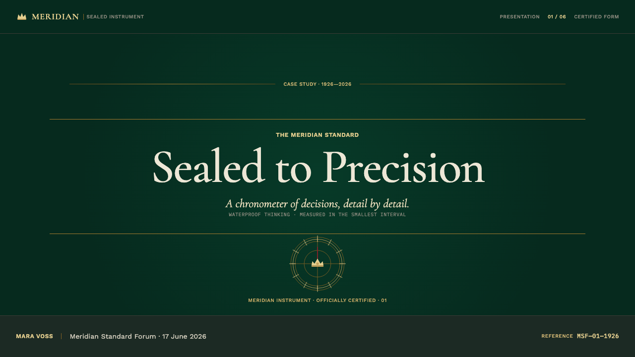
For presentation covers, Rolex Oyster works best when the title is treated as the central instrument. Place a high-contrast serif headline on the governing axis, allow bottle green to occupy most of the field, and use a restrained champagne-gold rule or index pattern to establish calibration. A guilloché sunburst may sit behind the title or central mark, but its purpose is to draw the eye inward, not to fill the slide. The cover should feel like a sealed certificate or the face of a finely made object.
Content slides should become ordered information dials. Use the centerline to organize section titles, supporting copy, and key labels; let sans-serif body text carry the practical explanation. Fine gold lines can separate groups of information, but they should behave as indices rather than ornamental borders. For data slides, translate charts into a disciplined hierarchy: one central finding, clearly ranked supporting values, and only enough metallic emphasis to identify the decisive measure. Avoid turning every data point into a jewel-like accent.
For web interfaces, the style is particularly suited to dashboards, account areas, membership experiences, and premium pricing pages where trust and exactness matter. A dashboard can use bottle green as the enclosing frame, with restrained light content surfaces or carefully separated data zones. Tables, metrics, and status markers should align as though they were read from a dial. Pricing pages benefit from a centered offer, certificate-like proof points, and one clearly distinguished commitment action instead of a noisy collection of competing buttons.
For editorial and marketing work, use the system to make a story feel considered and collectible. A campaign page can introduce a product or idea through one centered hero statement, then reveal details in measured sections with a recurring signature rule, radial motif, or seal-like device. Long-form editorial work benefits from the contrast between engraved-feeling display headings and calm sans-serif reading text. The rhythm should be formal but not stiff: each section earns its space, and each visual intervention should appear connected to the same central mechanism.
The common mistake is confusing Rolex Oyster restraint with generic dark luxury. Dark backgrounds, gold accents, and serif type alone do not produce the system. If texture appears everywhere, if every heading is oversized, if gold becomes a broad decorative surface, or if layouts abandon the central axis, the result becomes theatrical rather than calibrated. Start with symmetry, hierarchy, and silence; add one machine-turned or index-like detail only after the composition already feels complete.
Rolex Oyster (1926) — FAQ
Is Rolex Oyster simply a dark luxury style?
No. Its defining idea is calibrated enclosure. Bottle green, champagne gold, and formal serif type are visible signals, but the system depends on centered symmetry, index-like detail, a sealed sense of space, and disciplined hierarchy. Without those structural decisions, the look becomes generic luxury rather than Oyster-derived design.
How should guilloché texture be used?
Use it as a centered, directional detail with a clear purpose. A radial sunburst can support a hero title, emblem, or product focus by directing attention toward the axis. It should not become a repeating wallpaper, compete with body text, or appear on every section. Its rarity is part of its value.
Can the style work for information-heavy dashboards?
Yes, provided the watch reference informs the information structure rather than obstructing it. Align related metrics, use clear supporting text, reserve metallic details for navigation or status, and let the central hierarchy make the most important measure immediately visible. The result should feel precise and readable, not ceremonial at the expense of use.
Why pair display serif type with sans-serif text?
The pair separates ceremony from verification. High-contrast serif type carries the engraved, formal presence appropriate to names, titles, and defining statements. Sans-serif text carries specifications, captions, and supporting explanation with calmer functional clarity. Their contrast mirrors the source language: a finely finished exterior supported by exact information.
What should be removed when a layout feels too ornate?
Remove duplicate signals of luxury before removing structural clarity. Keep the strongest central axis, the most useful index line, and one refined texture or seal-like gesture. Then reduce extra gold surfaces, repeated patterns, competing ornamental marks, and decorative effects that do not improve reading or alignment. Oyster luxury becomes convincing when the remaining detail appears inevitable.
Related design styles
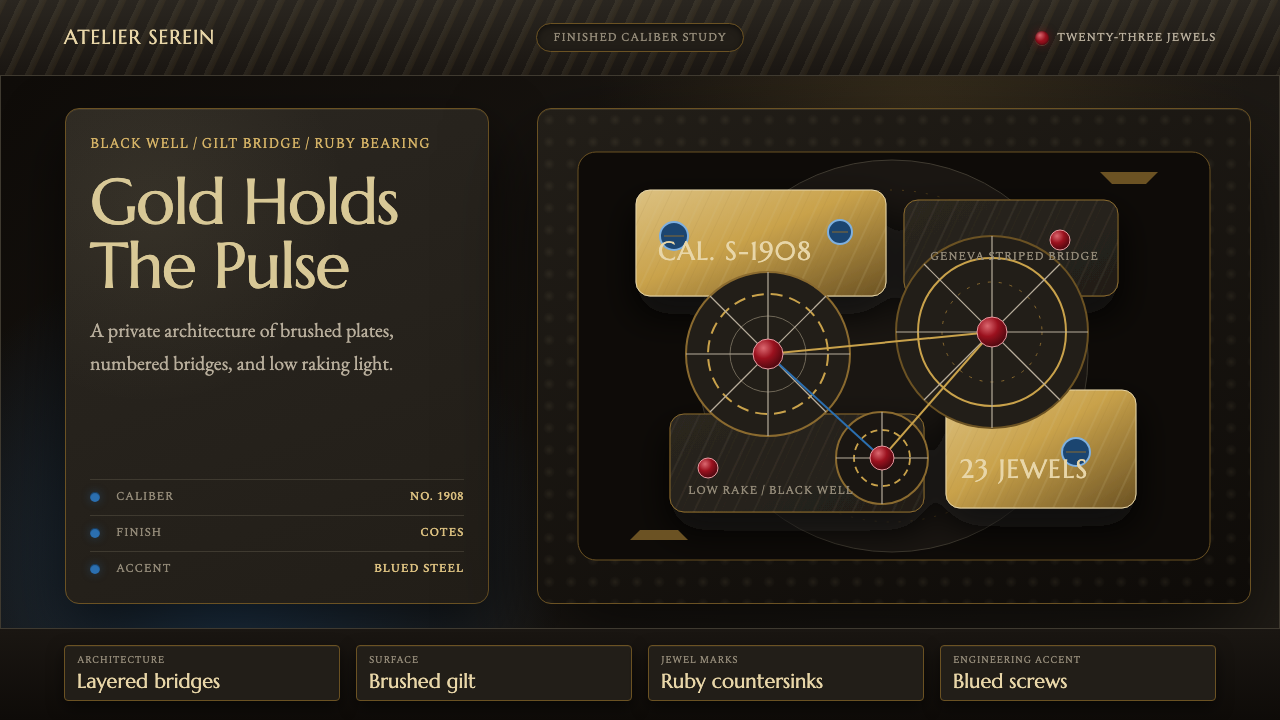 Watch MovementLuxury turns mechanical. Gilt stripes, ruby points, and blue accents glow on…
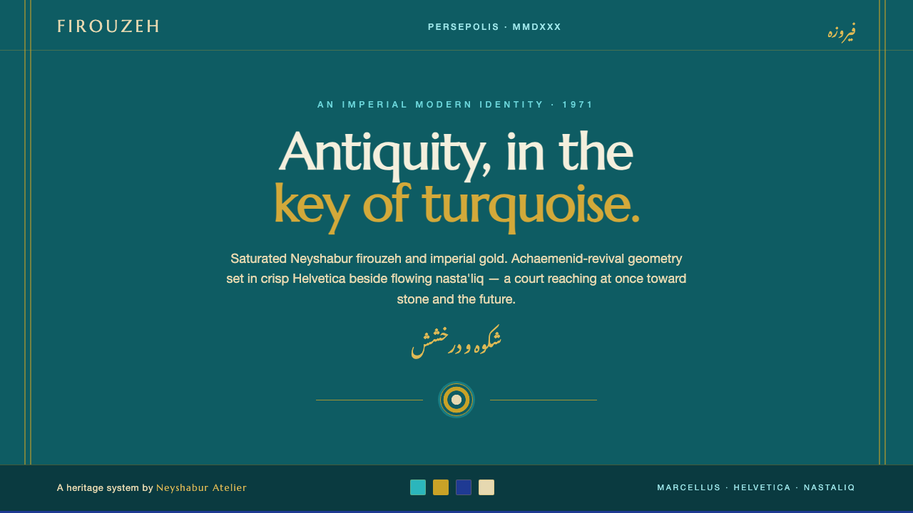 Tehran Pre-Revolution ModernAntiquity in turquoise. Saturated Neyshabur firouzeh and imperial gold, Helve…
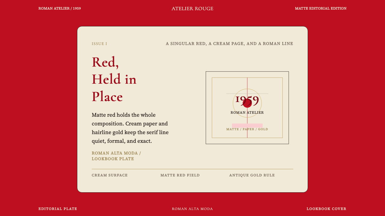 Valentino Rouge Couture (1959)Matte couture red holds the page. Cream paper and hairline gold keep it cerem…
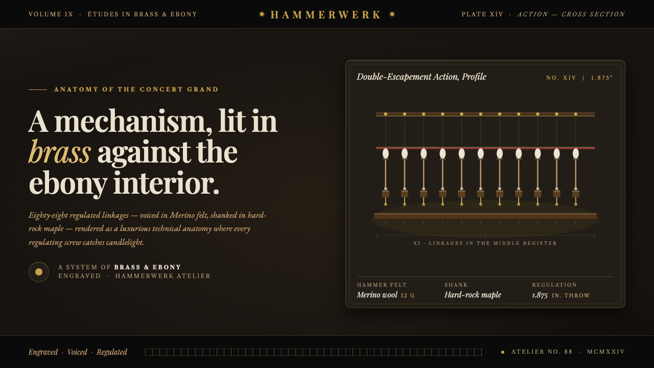 Grand Piano ActionMechanism as luxury. Brass screws and felt hammers lit out of ebony gloom, se…
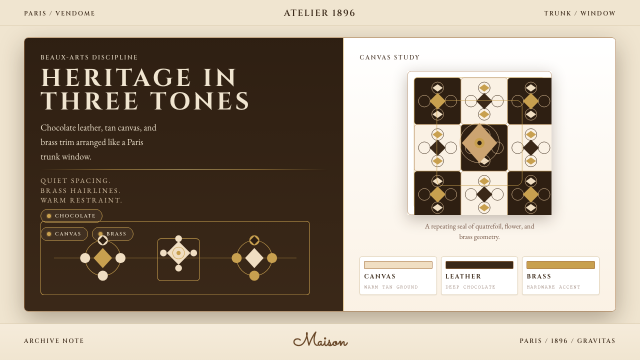 Louis Vuitton MonogramHeritage stays luminous. Chocolate, tan, and brass stage a Paris trunk window.
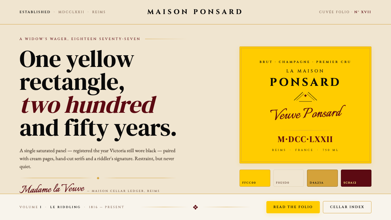 Veuve Clicquot (Yellow-Label)One audacious yellow rectangle, 250 years. Pantone yellow on cream, Cinzel se…