What is Tarot de Marseille?
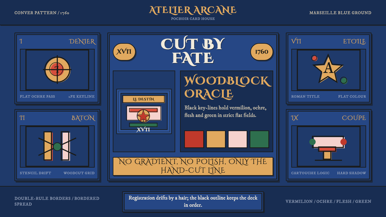
Tarot de Marseille is craft, not illustration — bold black woodblock lines filled with flat stencil color that never quite lines up.
Tarot de Marseille in brief
Tarot de Marseille refers to the canonical pattern of European tarot card design, standardized in France and most closely associated with the deck produced by Nicolas Conver in 1760, though the underlying tradition dates earlier, into the sixteenth and seventeenth centuries. Its production method defines its look entirely: bold black outlines were cut into woodblocks and printed, then flat color was applied by hand through stencils — a technique known as pochoir — using a strictly limited set of pigments: red, ochre, blue, a flesh tone, and occasionally a small amount of green.
Because the color was applied by hand through a stencil after the black outline was already printed, perfect registration was neither expected nor achieved — color fields sit a hair off the black key-line, a visible trace of hand labor rather than a flaw to be corrected. This is the single most important thing to understand about the style: it is a craft object, built through a repeatable manual production process, not an illustration drawn to achieve painterly realism or shading.
The imagery itself draws on a shared European visual vocabulary of allegorical and symbolic figures — cups, swords, wands, coins, and the trump cards' allegorical figures such as the Fool, the Magician, or the Wheel of Fortune — rendered with the same flat, unshaded, stencil-color logic throughout the deck. Nothing in a Tarot de Marseille card gradients, blends, or attempts photographic depth; every figure and symbol is a flat field of color bounded by a black line, exactly as the woodblock-and-stencil process produces.

Where does Tarot de Marseille come from?
Tarot cards originated in fifteenth-century Italy as a card game before their symbolic imagery was later adopted for divinatory and esoteric use, a shift that occurred gradually over subsequent centuries. By the time the pattern reached its canonical French form in Marseille — a major printing and trading city well positioned to standardize and distribute a widely reproduced card pattern — the deck's structure and much of its allegorical imagery had settled into the form that would define the tradition going forward: seventy-eight cards divided into a numbered suit system (cups, swords, wands, coins) and a separate sequence of twenty-two allegorical trump cards.
The production technique itself — woodblock printing for the black key-line, followed by hand-applied pochoir stencil coloring — was standard practice for inexpensive, mass-producible printed goods in this period, used for everything from devotional images to playing cards. Choosing this method over engraved or painted alternatives was primarily an economic and practical decision: it allowed a printer to produce large quantities of cards quickly, with color applied by relatively unskilled labor working from a template, while still achieving a visually consistent and recognizable pattern across print runs.
Nicolas Conver's 1760 deck, produced in Marseille, became the most influential and widely referenced version of the pattern, to the degree that 'Tarot de Marseille' today often specifically means the Conver pattern or its close derivatives, even though other printers — including Jean Dodal and Pierre Madenié, working in the same broader tradition slightly earlier or in parallel — produced their own versions of the same essential pattern with minor variations in figure design and color choice.
The style's visual identity — bold black outline, a strictly limited palette applied as flat unshaded stencil color, and slightly imperfect registration — persisted as the dominant tarot visual language for roughly two centuries before the 1909 Rider-Waite-Smith deck introduced a markedly different approach: fully illustrated, painterly scenes for every card in the deck, including the numbered suit cards, which the Marseille tradition had left as simple repeated suit-symbol arrangements rather than illustrated scenes. This divergence is what makes the two traditions visually distinct references today.
What defines the Tarot de Marseille look?
Color
The palette is strictly limited to red, ochre, blue, and a flesh tone, with occasional small areas of green — a deliberately narrow set of pigments applied flat and unshaded through the stencil process. No gradient, no blend, and no attempt at naturalistic modeling appears anywhere; every color field is a single, flat, opaque value bounded by the printed black key-line.
Black Key-Line
Every figure and symbol is bounded by a bold, printed black outline derived from the original woodblock, which holds the entire composition together and provides the structural framework color is later applied within. This key-line is not a delicate or refined drawing line — it is a deliberately heavy, printable woodblock cut, thick enough to survive repeated printing without breaking down.
Off-Register Stencil Fields
Color fields sit slightly off the black key-line rather than aligning perfectly, a visible and intentional trace of the hand-stenciling process rather than an error to be corrected. This slight misalignment is a defining authenticity marker of the style — a perfectly registered, pixel-precise color fill removes exactly the quality that signals hand-craft rather than mechanical illustration.
Numbered Suit Cards as Pattern
The forty numbered suit cards (cups, swords, wands, coins) are rendered as repeated arrangements of the suit symbol rather than illustrated scenes, a decorative-pattern logic distinct from the fully illustrated trump cards. This distinction between pattern-based suit cards and figuratively illustrated trumps is a structural feature specific to the Marseille tradition, setting it apart from later fully-illustrated decks.
Allegorical Trump Figures
The twenty-two trump cards depict allegorical figures — the Fool, the Magician, the Wheel of Fortune, and others — drawn from a shared medieval and early-modern European symbolic vocabulary, each rendered with the same flat woodblock-and-stencil technique as the rest of the deck. These figures carry the deck's symbolic and narrative weight and are the cards most often reproduced or referenced individually outside the full deck context.
Craft, Not Illustration
Perhaps the most important interpretive principle for this style: it should read as an object of repeatable manual production — woodblock print plus hand stencil — rather than as a piece of fine illustration aiming for painterly nuance. Any adaptation that introduces gradients, soft shading, or photographic rendering misrepresents the style's core identity as a craft product.

Who shaped Tarot de Marseille?
Conver produced the 1760 Marseille deck that became the single most influential and widely copied version of the Tarot de Marseille pattern, to the point that the pattern's name today often specifically refers to his design or its close derivatives.
Dodal produced an earlier version of the Marseille-pattern deck, working within the same broader woodblock-and-stencil tradition and contributing to the pattern's standardization before Conver's later, more widely referenced version.
Madenié produced another significant early Marseille-pattern deck, part of the small group of French printers whose individually produced versions of the shared pattern collectively define what is now understood as the Tarot de Marseille tradition.
How do you use Tarot de Marseille today?
For presentation slides, this style works well for content about symbolism, esoteric or cultural history, craft traditions, or narrative-driven storytelling — a cover slide can use the stencil-blue ground with a single allegorical-style figure rendered in flat, black-outlined color fields, echoing a trump card's composition. Content slides should avoid gradients or soft shading entirely, presenting data or icons as flat color fields bounded by bold black outlines, consistent with the woodblock-and-stencil logic.
For web interfaces, the style suits products related to games, storytelling, symbolism, personal reflection tools, or craft-and-heritage brands, where a hand-made, non-photographic visual identity is desired. The approach: flat, bounded color fields for icons and illustrations rather than gradients or shadows, a bold black outline treatment for key interface elements, and — critically — a slight, deliberate off-register quality in illustrated assets if the brand wants to lean into the craft authenticity of the source material rather than a cleaned-up, vector-perfect look.
In editorial and marketing work, the style supports long-form writing about tarot, divination, European folk printing traditions, or symbolic and allegorical imagery. A magazine-style layout can treat illustrated figures the way the deck treats its trump cards — bold outline, flat limited color — and can use the numbered-suit-card pattern logic for simple repeating decorative motifs in margins or section dividers.
The style is less suited to products requiring photographic realism, smooth gradients, or a polished, contemporary tech aesthetic, since its entire visual identity depends on the flat, slightly imperfect quality of a centuries-old hand-production process.
The most common mistake when adapting this style is over-perfecting the registration — making color fields align exactly with black outlines using vector precision — which removes the hand-crafted, slightly-off quality that is central to the style's authenticity. A second common mistake is broadening the palette beyond its historically narrow range; introducing many additional hues dilutes the disciplined, limited-pigment character that distinguishes Tarot de Marseille from fully illustrated, painterly tarot traditions like Rider-Waite-Smith.

Tarot de Marseille — FAQ
Why do the colors in Tarot de Marseille cards look slightly misaligned with the black outlines?
The deck was produced by first printing a black key-line from a carved woodblock, then applying color afterward by hand through a stencil — a technique called pochoir. Because the coloring step was a separate, manual process performed after printing, perfect alignment between the stencil and the printed line was neither guaranteed nor especially prioritized. This slight misregistration is a genuine trace of the hand-production method, and it is considered an authentic, defining feature of the style rather than a flaw.
How is Tarot de Marseille different from the Rider-Waite-Smith tarot deck?
The most significant structural difference is that Tarot de Marseille's forty numbered suit cards are rendered as simple, repeated suit-symbol patterns, while the 1909 Rider-Waite-Smith deck illustrates every numbered card with a fully narrative scene. Visually, Marseille relies on bold woodblock outlines and flat, limited stencil color with intentional imperfection, whereas Rider-Waite-Smith uses more painterly, fully shaded illustration across the entire deck. The two traditions represent genuinely different production methods and roughly a century and a half of separation.
Is it acceptable to add gradients or shading to modernize this style?
Adding gradients or soft shading fundamentally contradicts the style's identity. The entire visual character of Tarot de Marseille comes from the woodblock-and-stencil production method, which is incapable of producing gradients — every color field is necessarily flat and opaque. Introducing gradients removes the exact quality that signals hand-craft and historical authenticity, effectively producing a different, more generic illustrated style rather than an accurate reference to this one.
Why is the color palette so limited compared to other tarot or symbolic art traditions?
The narrow palette — red, ochre, blue, flesh tone, and occasional green — was a practical consequence of the stencil-coloring production method, which required a fixed, limited set of stencil cuts and pigments to keep large print runs affordable and consistent. What began as an economic constraint became the style's defining visual signature; expanding the palette significantly moves the design away from an authentic reference to the source material.
Does this style suit content unrelated to tarot or divination?
Yes, the underlying production technique and visual grammar — bold black outlines, flat limited stencil color, slight hand-craft imperfection — can be applied to any content that benefits from a hand-made, folk-print, or allegorical visual identity, such as game design, storytelling platforms, or heritage crafts, without necessarily referencing tarot symbolism directly. What should transfer is the technique's visual logic, not literal tarot iconography, unless the content is genuinely about tarot itself.
Related design styles
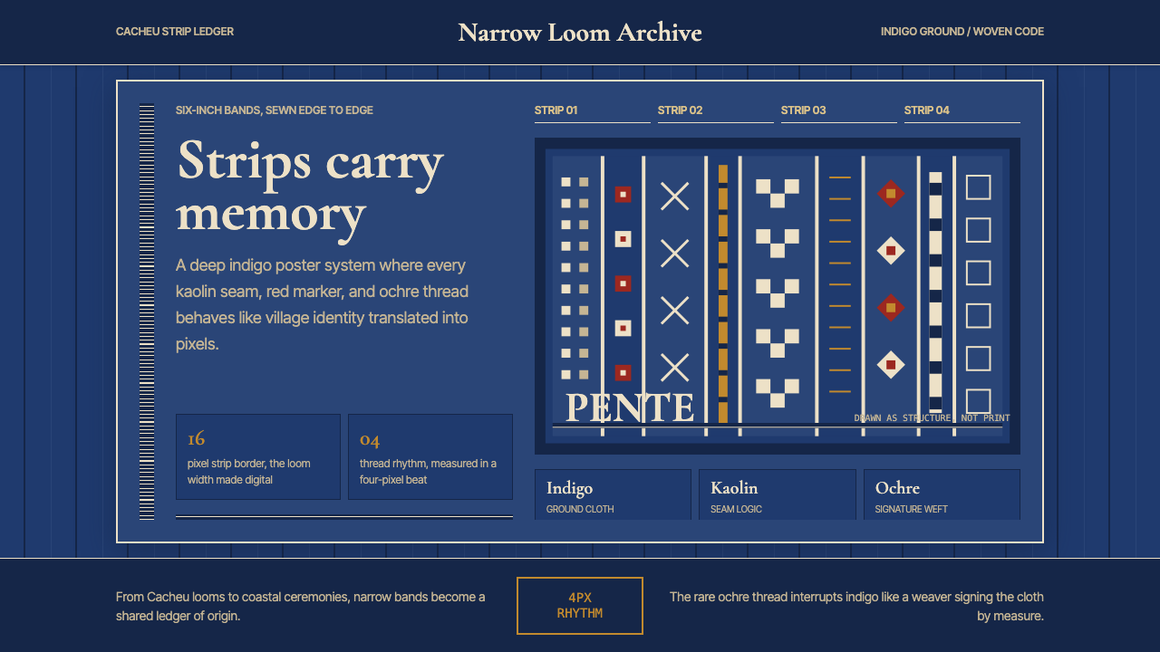 Bissau-Guinean Pano de PenteIndigo remembers. Narrow bands and kaolin seams turn weave grammar into pixel…
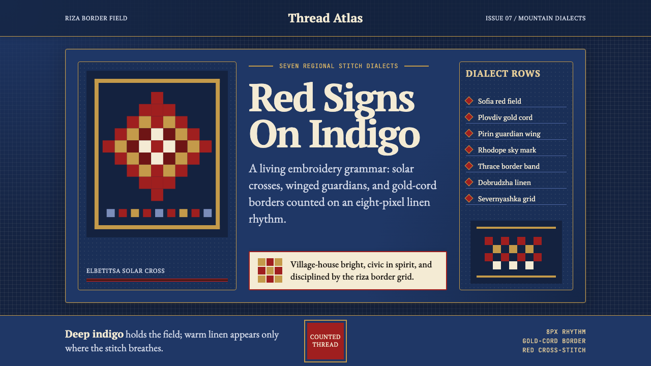 Bulgarian Shevitsa Folk EmbroideryVillage-bright code. Deep indigo carries shevitsa red crosses and gold-cord b…
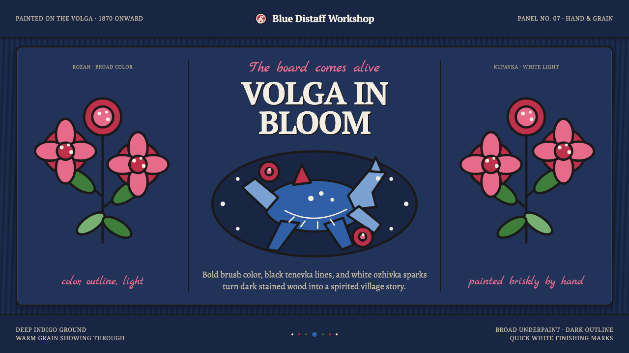 Gorodets Folk Panel PaintingFolk color moves at a gallop. Blue forms, red roses and white dots spark on i…
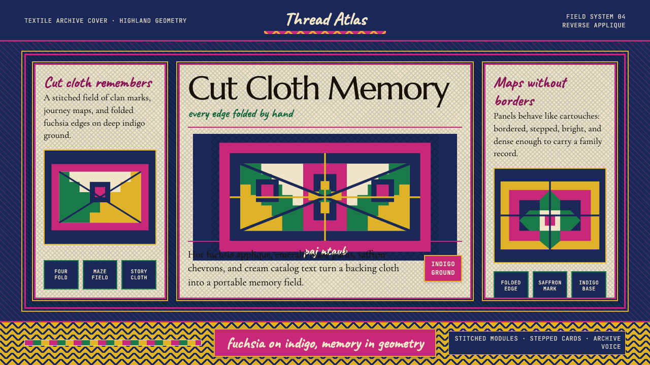 Hmong Paj Ntaub (Flower Cloth)Memory is geometric. Fuchsia applique on indigo forms stepped maze panels.
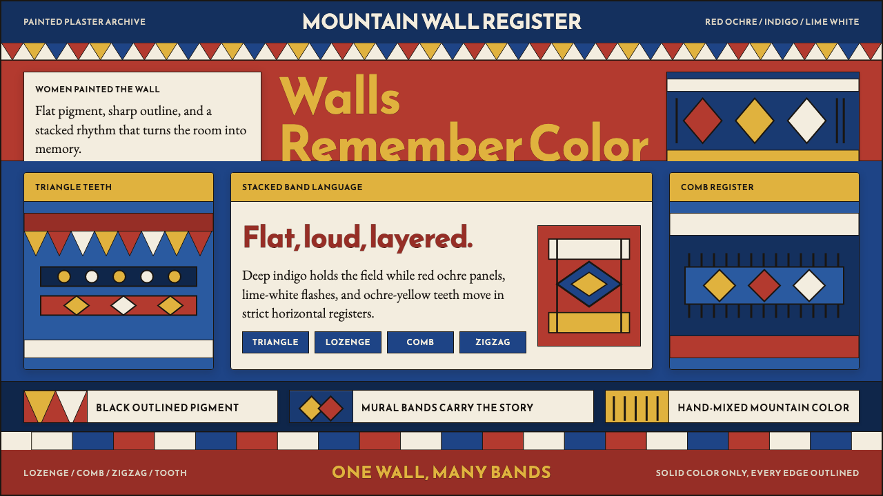 Saudi Asiri Qatt Wall PaintingPainted walls speak loudly. Indigo bands, red triangles, ochre teeth, black o…
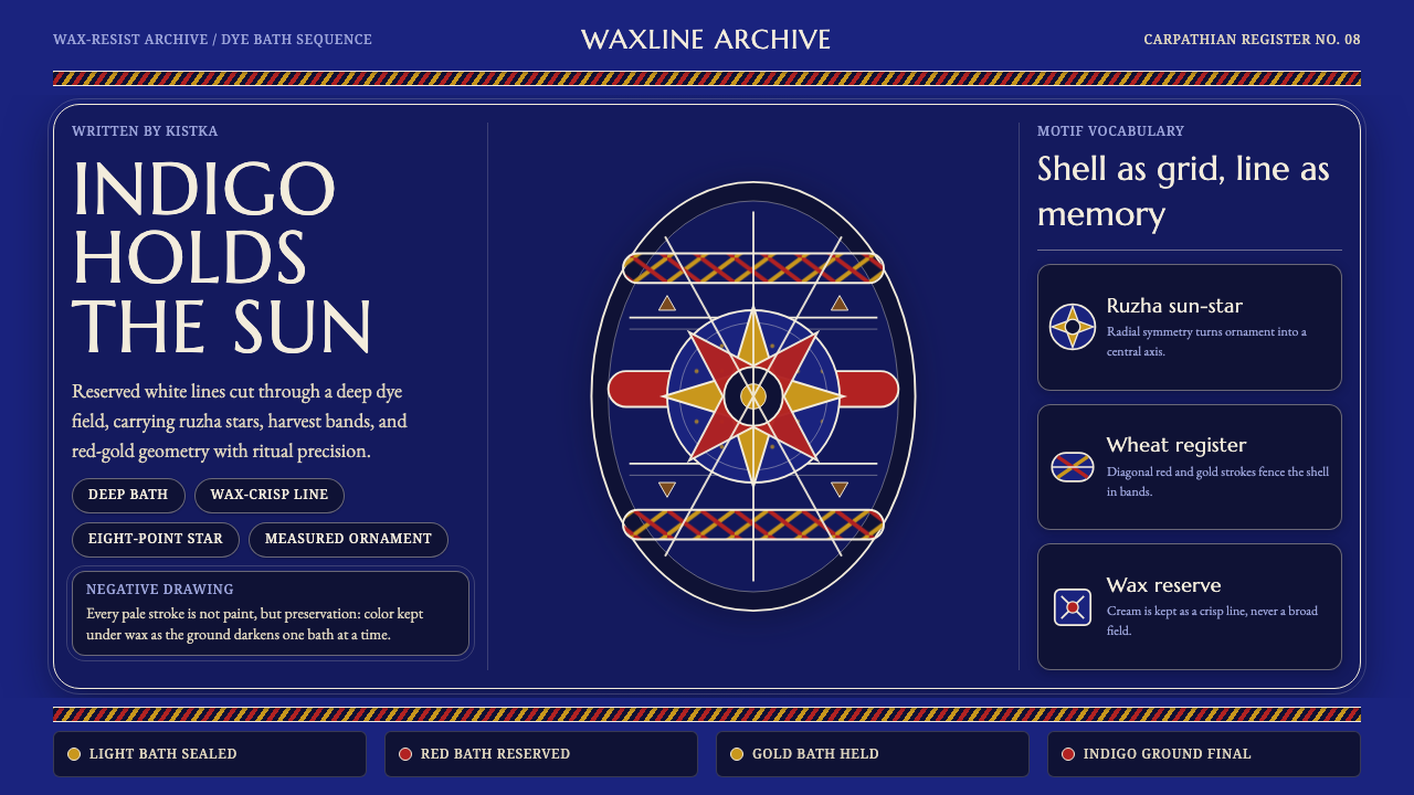 Ukrainian Pysanka Wax-Resist EggIndigo preserves ritual geometry. Wax-white lines hold red-gold stars and whe…