What is Tamil Talkie Song Book?
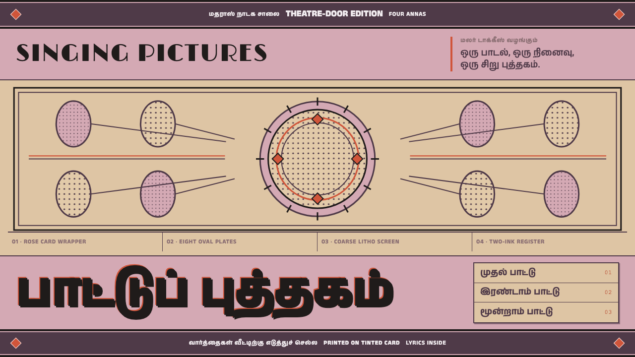
Tamil Talkie Song Book takes its look from the cheap printed lyric booklets sold at cinema doors in Madras: rose card, one violet-black ink, coarse halftone medallions, and not a square inch left unused.
Tamil Talkie Song Book in brief
Tamil Talkie Song Book is a design language drawn from the paattu puthagam, the song book of the early Tamil sound-film era. These booklets were sold at the theatre door in Madras in the 1930s and 1940s for a few annas. Each was a tinted card wrapper folded over cheap tan pulp leaves, and each carried every lyric that the talkie it belonged to would sing. They were meant to be bought on the way in, carried through the film and perhaps kept afterwards.
The cover in the source record, for the film Thayumanavar (Modern Theatres, 1938), shows the look in full. It is printed in a single violet-black lithographic ink on rose-pink card. An ornamented rule banner runs across the top and another across the bottom. In the middle, a boxed halftone collage holds a circular star medallion ringed by smaller ovals. The name of the film is set in brushed Art Deco Latin capitals, and the lower third of the cover is filled with fat Tamil display lettering.
Nothing about the object is refined, and that is the point. The halftone is coarse, the ink soaks into the paper, and the colour printing sits visibly off register. The retailer who sold it stamped his own address across the wrapper in purple. The crowding on the cover is the design: a jobbing press, working for a few annas a copy, used every square inch it had paid for. In this style, empty space is not elegance. It is waste.

Where does Tamil Talkie Song Book come from?
The song book belongs to the first generation of Tamil sound cinema. The source record places the style in the 1930s and 1940s, in the Tamil talkie era, and names two films as anchors: Thayumanavar from 1938 and Nandanar from 1942. The film circuits it traces run through Madras, Salem and Coimbatore, the cities of South India where these films played and where their booklets were sold. The books are an example of film music publishing, the business of printing the words of the songs for the people who had just heard them.
The format was dictated by price. A card wrapper in a tint, folded over leaves of cheap tan pulp, was the cheapest way to make something that felt like a real publication. The booklet was sold at the theatre door, so it competed with nothing except the spare coins in a viewer's hand. In the example the record describes, the retailer who handed it over left his own mark on it: a stamp in purple ink giving his address, applied straight across the wrapper without regard for the composition beneath.
The printing was jobbing lithography, the kind of work a press did for whoever walked in with an order. The ink was one violet-black, the stock was a rose-pink card, and the pictures were halftones coarse enough that the dots can be counted by eye. When more than one colour was printed, the plates drifted out of register, and the drift was left as it fell. Under these conditions the printer's habit was to fill the sheet: banners above and below, a box in the middle, a medallion in the box, a title across the bottom.
The source record names Modern Theatres, Gemini Studios and the Roja Muthiah Research Library among the key figures of the style, which places the books at the intersection of the film industry and the archive. Its movements are early Tamil sound cinema, jobbing litho ephemera and film music publishing. The design system takes this world as a whole, not as a pastiche. It keeps the economics of the original, the density that came from not wasting paper, and the unselfconscious energy of a cover made to be sold in a crowd.
What defines the Tamil Talkie Song Book look?
Rose card and one ink
The ground is a rose-pink tinted card, and the printed matter is in a single violet-black lithographic ink. The paper is part of the colour: the pink is not printed, it is the stock, and it shows through every light area. The restriction to one ink gives the cover its unity, because everything printed is the same dark violet-black against the same warm pink, and variety comes from pattern and scale rather than from additional colours.
Ornamented rule banners
A decorated rule runs across the top of the cover and another across the bottom, bracketing the composition like two book-ends. These banners are made of repeated ornament, small motifs strung in a line, so that they work both as borders and as texture. They hold the page in place, define where the cover starts and ends, and give the eye a way to move around the edges.
The boxed halftone collage
At the centre sits a boxed collage of halftone photographs, with a circular star medallion at its heart and a ring of smaller ovals around it. The medallion is the focal point: a performer's portrait treated as a seal. The ovals repeat the idea at a smaller scale, so the box reads as a cluster of faces, crowded together and arranged symmetrically around the star.
Coarse halftone and soaked ink
The halftone is coarse, with dots large enough to see, and the ink soaks into the cheap stock so edges swell and soften. These are not flaws to be hidden; they are the signature of the printing process. The pictures are reduced to a few tones, and the result is a graphic, high-contrast image that remains legible even when the print is poor.
Two scripts, two voices
The film name is set in brushed Art Deco Latin capitals, which give the cover a modern, cosmopolitan flourish. The lower third is occupied by fat Tamil display lettering, which carries the real weight of the message for the local audience. The two scripts do not try to harmonise. They sit at different sizes and in different moods, and the Tamil is allowed to dominate.
Every paid inch used
The composition is packed edge to edge. Banners, box, medallion, ovals and title fill the sheet, and margins are thin. The logic is economic: the press paid for the whole card, so it printed on the whole card. For a designer this means density is the default, and white space has to earn its place. A page in this style should feel full, with the pleasure of a crowded noticeboard rather than the calm of a gallery wall.
Found marks and misregistration
The colour printing drifts visibly off register, and a retailer's purple address stamp lands straight across the wrapper. Both are accidents of the object's life, but they give it character: a trace of the hands that printed it and sold it. In a design these appear as small deliberate imperfections, an overprinted stamp or a slight offset between layers, used sparingly so the page feels handled, not sterile.

Who shaped Tamil Talkie Song Book?
Modern Theatres is the film company behind Thayumanavar of 1938, the song book on which the style's central example is based. Its role in the story is that of the originating industry: a studio that made talkies and, with them, created a demand for printed lyrics. The design system treats the film company as the source of the occasion that the booklet served, even though the visible hand on the cover is the press's.
Gemini Studios is another film studio named among the key figures of the style, placing it within the same Tamil talkie industry that produced the booklets. The source record gives it as a reference point for the era's cinema culture rather than for a particular design decision. Its inclusion is a reminder that the song book is a product of an industry with several makers, not of one company.
The Roja Muthiah Research Library is the archive the record points to for this kind of material. Cheap printed ephemera such as song books were made to be used and thrown away, so what survives of them survives because someone kept it. For a design system built on such an object, a library that preserves and studies printed Tamil material is the reason the details of paper, ink and stamp can be known at all.
The real designers of the song book were the anonymous jobbing printers who set the type, cut the banners, screened the halftones and ran the sheets through the press. Their practice is the style's practice: work to a price, fill the sheet, accept the soaking ink and the drifting plate, and make the cover shout from a crowd. The design system respects their logic of economy and is built on it.
How do you use Tamil Talkie Song Book today?
Tamil Talkie Song Book rewards designers who are willing to fill the page. Its basic instruction is that every inch is paid for, so every inch should be used, and the most successful applications feel generous, loud and a little crowded. It suits subjects connected to cinema, music, festivals and popular entertainment, and it works best when the density is organised by banners, boxes and a clear focal medallion.
For presentation slides, a cover can follow the song-book structure directly: a rose-toned ground, an ornamented rule across the top and bottom, a boxed central image with a circular medallion at its heart, and a large, heavy title across the lower third. Content slides can break the page into boxed modules with bordered edges and small ornamented dividers. Data slides can use high-contrast, coarse-grained imagery and a single dark ink for all marks, with the ground colour showing through.
For web interfaces, pricing pages and promotional landing pages suit the style well: each tier or offer is a boxed panel with ornamented rules above and below, a medallion for the headline benefit and a heavy display line at the base. A purple-stamp-style overprint can carry a contact detail or a call to action, placed slightly askew. Dashboards are a harder fit, but a dense one can borrow the box-and-banner structure. Keep one ink, keep the card tone and let the borders do the organising.
For editorial and marketing work, the style suits film and music promotion, festival and event material, retro merchandise, cultural programmes, and any subject where nostalgia for early print is an asset. A magazine page can be built as a crowded sheet with a hero medallion, bordered captions and a heavy title. A campaign can reproduce the sense of a ticket-window handout: bright, cheap in the best sense, and impossible to ignore.
The most common mistake is to tidy the style up. Adding generous margins, polishing the halftone, harmonising the typefaces or adding gradients and soft shadows removes everything that makes the cover work. Using many colours instead of one ink dilutes the unity, and spraying random grunge filters over a clean layout fakes the wear without the underlying density. Keep one ink, keep the page full and let imperfections be few, small and plausible.

Tamil Talkie Song Book — FAQ
What is a paattu puthagam?
Paattu puthagam is Tamil for song book. In the 1930s and 1940s these were cheap booklets sold at the door of cinemas in Madras for a few annas, each with a tinted card wrapper folded over leaves of tan pulp paper and every lyric from the film inside. They are a form of film music publishing and a piece of jobbing print ephemera, and the design system takes its look from the cover of one of them, the song book for Thayumanavar of 1938.
Why does the style pack the page instead of using white space?
Because the original was an economic object. The jobbing press had paid for the whole card, so it printed on the whole card, and the crowding became the visual language. In this style white space is not elegance but waste. That does not mean chaos: the density is organised by banners above and below, a box at the centre, a medallion in the box and a heavy title at the base, so the eye always has a route through the page.
Should the misregistration and stamp marks be reproduced?
A little, and deliberately. The off-register colour and the retailer's purple stamp are part of the object's character, so a small offset between layers or an overprinted stamp can give a page a handled, authentic feel. But they should be few and plausible. Applied everywhere, or as a uniform filter, they become decoration. The best use is a single stamp-like element carrying real information, such as a contact line or an offer.
How should Tamil and Latin type be combined?
Follow the original: let them be different. The film name is set in brushed Art Deco Latin capitals and the lower third is filled with fat Tamil display lettering. They do not try to match, and the Tamil dominates. In practice, give the Tamil real scale and weight, use a proper Tamil face rather than a Latin face stretched to imitate it, and treat the Latin as the secondary, decorative voice.
What does the style suit, and where does it struggle?
It suits film, music, festival and event promotion, retro merchandise, cultural programmes and any subject that benefits from early-print nostalgia and popular energy. It struggles where calm, minimalism or high readability are required, such as long-form reading, data-heavy tools or accessibility-critical interfaces, because its density, coarse images and single dark ink on a tinted ground leave little room for quiet. It is a style for noise, used on purpose.
Related design styles
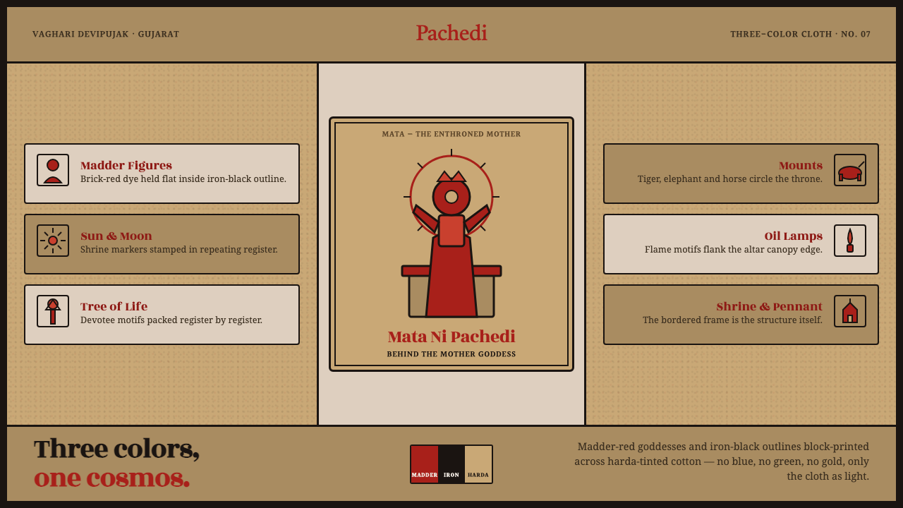 Mata Ni Pachedi Temple ClothThree colors, one cosmos. Madder-red goddesses, iron-black outlines, harda-ti…
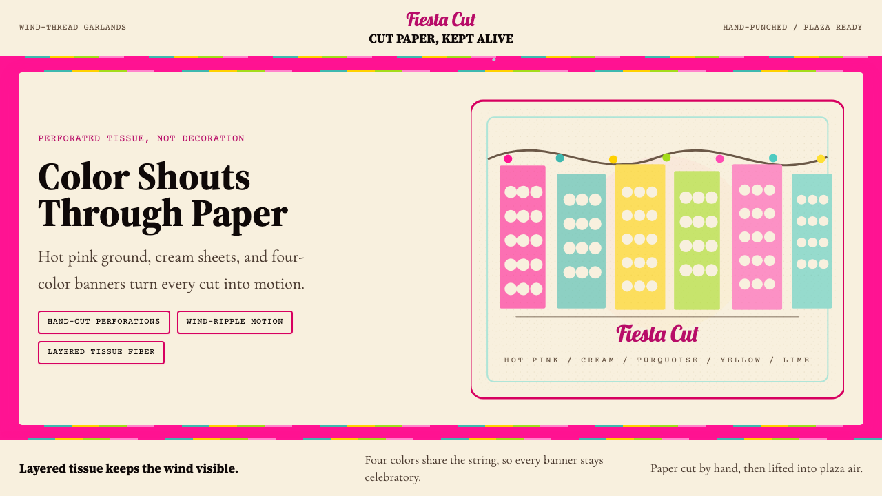 Mexican Papel Picado TissueFiesta cut paper. Hot pink, turquoise, yellow banners and hand-cut perforatio…
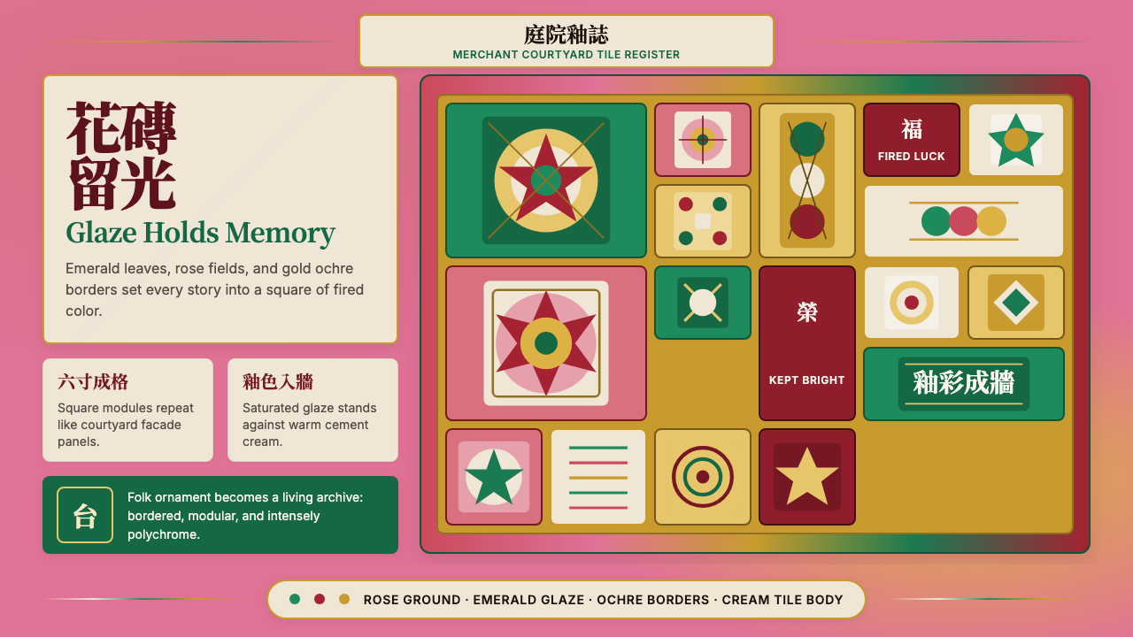 Taiwanese Painted Tile VernacularGlaze refuses to fade. Rose ground, emerald modules, ochre borders form a til…
 Thai Teak Canal HouseAged oiled teak, never fresh-sawn. Deep umber planks raised over the klong, l…
 Velvet Cinema DecoDark theater opulence. Aubergine velvet and gilt Deco geometry stage every su…
 Alþingi Millennium 1930A millennium held in one frame. Flag blue rules and red registration bind fif…