What is Tailwind UI?
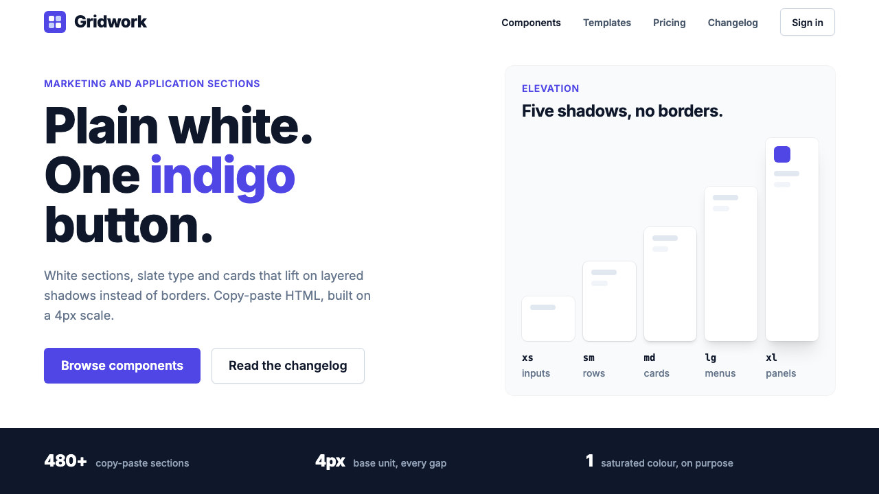
Tailwind UI is the look of the 2020s SaaS page: white sections, quiet slate type, soft layered shadows, and one indigo button doing all the shouting.
Tailwind UI in brief
Tailwind UI is the visual style of the paid component library that Tailwind Labs released in February 2020. It is a catalogue of marketing and application sections, such as hero blocks, pricing tables, feature grids, forms and dashboard shells, delivered as copy-and-paste HTML. Over the following years the look of those sections spread so widely that it became a default dialect for software companies presenting themselves on the web.
The style is plain on purpose. Sections alternate between white and a very light cool grey. Headlines are set in a heavy, tightly tracked Inter, body copy sits in a mid slate grey with generous line spacing, and a single indigo is held back for the one action that matters on the screen. Hierarchy is made from weight, whitespace and background tone rather than from boxes and rules.
Its signature move is depth without borders. Cards lift off the page using two soft, stacked shadows plus a hairline ring, so the edge reads as light rather than as a drawn line. The result feels modern and friendly, yet nothing in it competes for attention. It is a style built to make content, and one call to action, easy to find.

Where does Tailwind UI come from?
The roots of the style lie in the 2018 book Refactoring UI, written by Adam Wathan and Steve Schoger. The book was aimed at developers who had to build interfaces without a designer at hand, and it taught practical habits instead of theory: limit your palette, build a deliberate type scale, use shadows to suggest elevation, de-emphasise secondary text rather than shrinking it into illegibility, and let spacing do the work that borders usually do.
Tailwind UI arrived in February 2020 as the commercial expression of that advice. Tailwind Labs, a small remote team based in Ontario, Canada and working across North America, packaged the book's habits into finished sections built on its utility-first CSS framework. Instead of describing good proportions, the library let a developer paste them in. The design and the tooling were released as one thing, which is why the look is so tightly tied to the utility-class way of building pages.
The wider context is the rise of utility-first CSS and of the design-system-as-copy-paste library. Earlier component kits shipped opinionated widgets that were hard to bend. Tailwind UI shipped markup you owned and could edit, with a neutral surface that took on a brand easily. That neutrality is part of why it spread: any company could drop in a logo, swap the indigo for its own accent and look credible overnight.
The visual conventions settled in roughly the 2020 to 2024 window and then stayed remarkably stable. Because countless startup sites were built from the same blocks or imitated them, the style became a kind of shared grammar of the SaaS marketing page. Recognising it today means recognising a whole decade-defining habit of web design, from its generous white sections to its restrained, single-accent colour logic.
What defines the Tailwind UI look?
One indigo, rationed
Almost the whole interface is white and slate. The saturated indigo appears on the primary button, an active link or a selected state, so the eye always knows where the action is. Using it on more than a few elements would break the system's central trick.
Slate type hierarchy
Headlines are near-black slate in a heavy weight with tightened tracking, body text is a calmer mid grey, and captions drop lighter still. Importance is signalled by weight and tone, not by size alone, which keeps even dense pages readable.
Shadows instead of borders
Cards, menus and inputs lift off the page with layered, low-contrast shadows and a very fine ring. There is no heavy outline around anything. The edge is implied by light, which gives the page softness without making it feel blurry.
Alternating section bands
Long pages are paced by switching between white sections and pale cool-grey bands, with an occasional deep slate block as a closing statement. The rhythm replaces dividers and tells the reader where one idea ends and the next begins.
Generous, regular spacing
Padding is large and follows a consistent scale, so sections breathe and related items clearly group together. Whitespace is treated as a structural material, which is why the pages look calm even when they carry a lot of content.
Rounded but not playful
Corners are softened just enough to feel friendly, on buttons, cards and avatars alike. The rounding is consistent and modest, so it reads as polish rather than as cuteness, and it never overrides the system's businesslike tone.
Neutral, brand-ready surface
Because the base is mostly grey and white, swapping the indigo for another accent changes the whole feel with almost no other edits. The style is a template for a brand rather than a brand of its own.

Who shaped Tailwind UI?
Co-author of Refactoring UI and a leading voice behind the Tailwind utility-first approach to building interfaces.
Co-author of Refactoring UI, whose practical design tips about hierarchy, shadow and spacing shaped the look of the component library.
A member of the Tailwind Labs team associated with the framework and its component work.
A member of the Tailwind Labs team associated with the framework and its component work.
How do you use Tailwind UI today?
In slides, the style works best for clean product presentations. A cover can be a white slide with a large, tightly tracked slate headline and a short grey subtitle, with the indigo reserved for a small label or a link to the next step. Content slides profit from alternating white and pale grey backgrounds, which keeps a long deck from feeling like one endless sheet. For data slides, keep charts in slate and grey and let a single indigo series carry the point you want the audience to remember.
On the web, it is a natural fit for SaaS home pages, pricing pages, documentation hubs and admin dashboards. Build the page from stacked sections, give each one a clear headline and a short supporting paragraph, and place the one indigo button where the reader should act. Pricing tables work well when the recommended plan is the only card carrying the accent colour. Dashboards benefit from white cards on a pale grey canvas, where soft shadows separate panels without adding visual noise.
For editorial and marketing material, such as launch announcements, newsletters, case studies and landing pages for campaigns, the style gives a credible, unfussy frame. Long-form text should keep the calm mid-grey body colour and generous line spacing, with headlines doing the heavy lifting. Customer quotes, logo strips and feature lists can sit in simple rounded cards. It is a good choice whenever the goal is to look trustworthy and organised rather than expressive.
The most common mistake is to spend the accent too freely. When every button, badge, icon and link turns indigo, the page loses its single focal point and the restraint that defines the style disappears. A second mistake is to add heavy borders or dark drop shadows to cards, which fights against the soft, layered look. A third is to flatten the hierarchy by using the same weight and grey everywhere. Keep the accent rare, keep the shadows gentle, and let weight and whitespace carry the structure.

Tailwind UI — FAQ
What is Tailwind UI in design terms?
It is the visual style of the component library Tailwind Labs launched in February 2020: white and pale grey sections, slate typography in Inter, layered soft shadows, and a single indigo accent. It turned the advice from the book Refactoring UI into ready-to-paste page sections.
Why does so much SaaS design look like this?
The library offered finished, editable sections on a neutral base, so any company could add a logo and accent colour and look professional quickly. Many teams used the blocks directly and many more imitated them, which made the look a shared convention for software marketing pages.
How should the indigo accent be used?
Sparingly. Keep it for the primary button, the active link or the selected state, so that one element on screen clearly asks for action. If several things share the accent, the focal point disappears and the style loses its calm.
Can I use this style for a dark interface?
The core of the style is a light interface, with white sections and pale bands. It does include occasional deep slate blocks as closing statements, but a fully dark version would be an adaptation rather than the original character, so check contrast carefully if you try it.
Is it a good fit for editorial or brand-led work?
It suits clear, trustworthy communication better than expressive storytelling. Its neutrality is its strength for product pages and documentation, but work that needs a strong personality will want a bolder system or a heavily customised accent and typography.
Related design styles
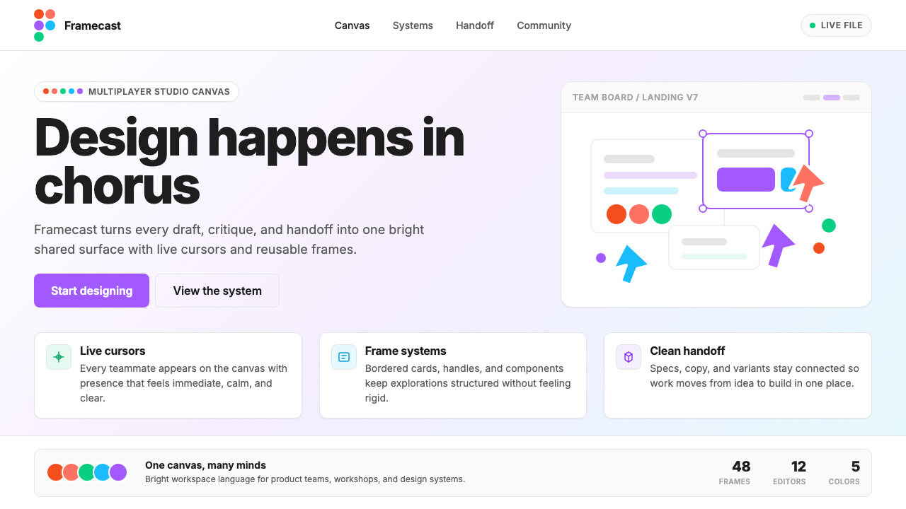 Figma 2024A brand that looks like its canvas. Five dots scatter like cursors, soft card…
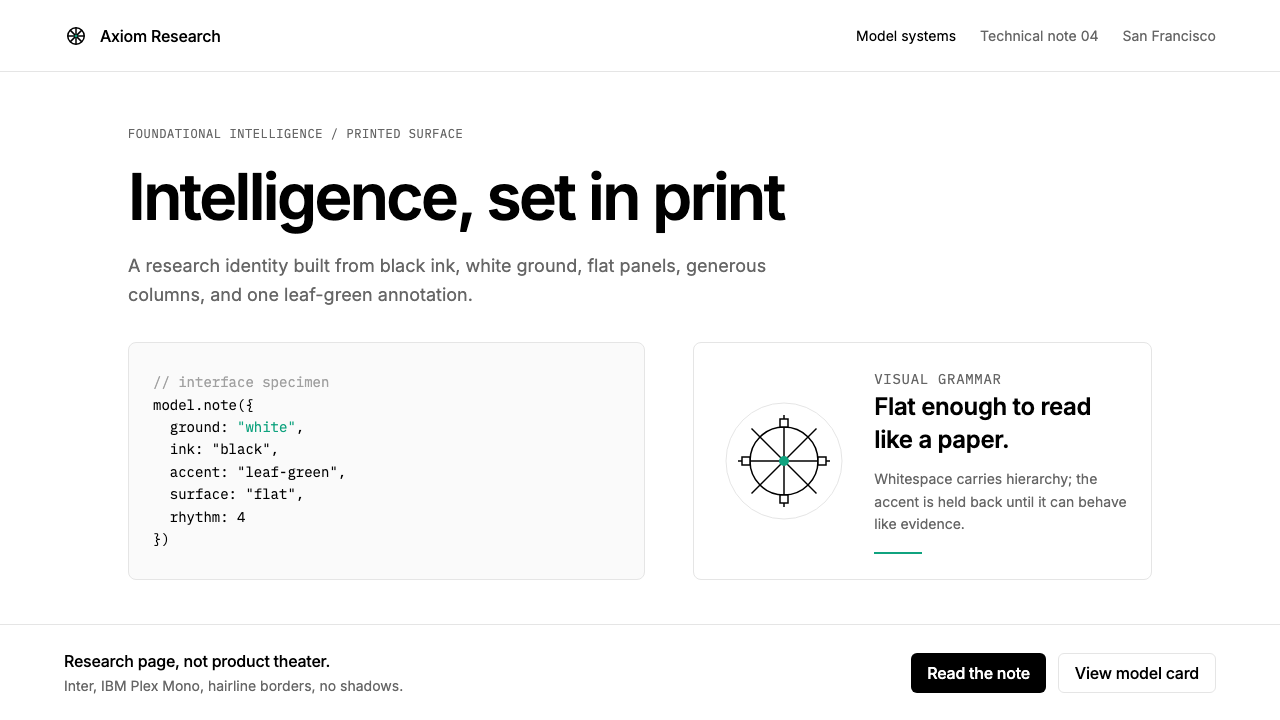 OpenAI 2024Research-grade restraint. Black-on-white Inter, flat code panels, one leaf-gr…
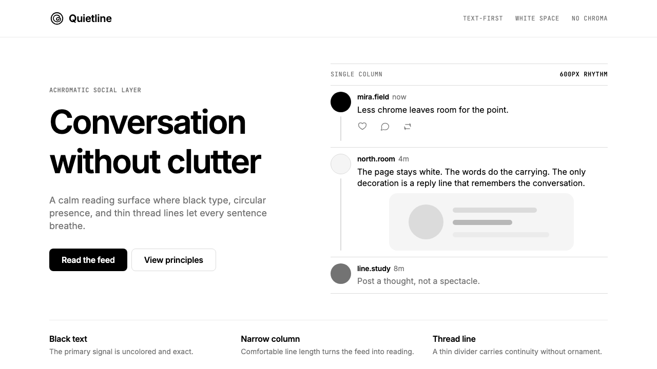 Threads (Meta)Restraint is the brand. Black Inter type, narrow feed, thin connectors, white…
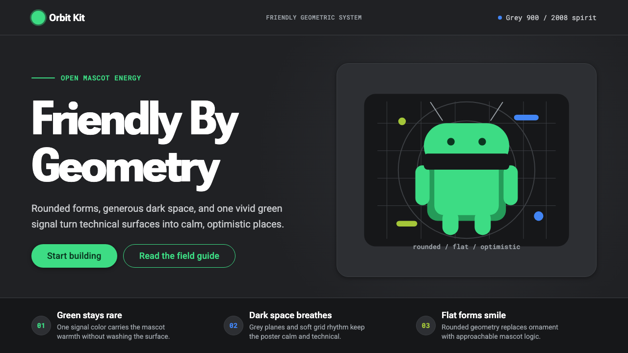 Android Bugdroid GreenFriendly tech, reduced to geometry. Vivid green pops from Grey 900 and rounde…
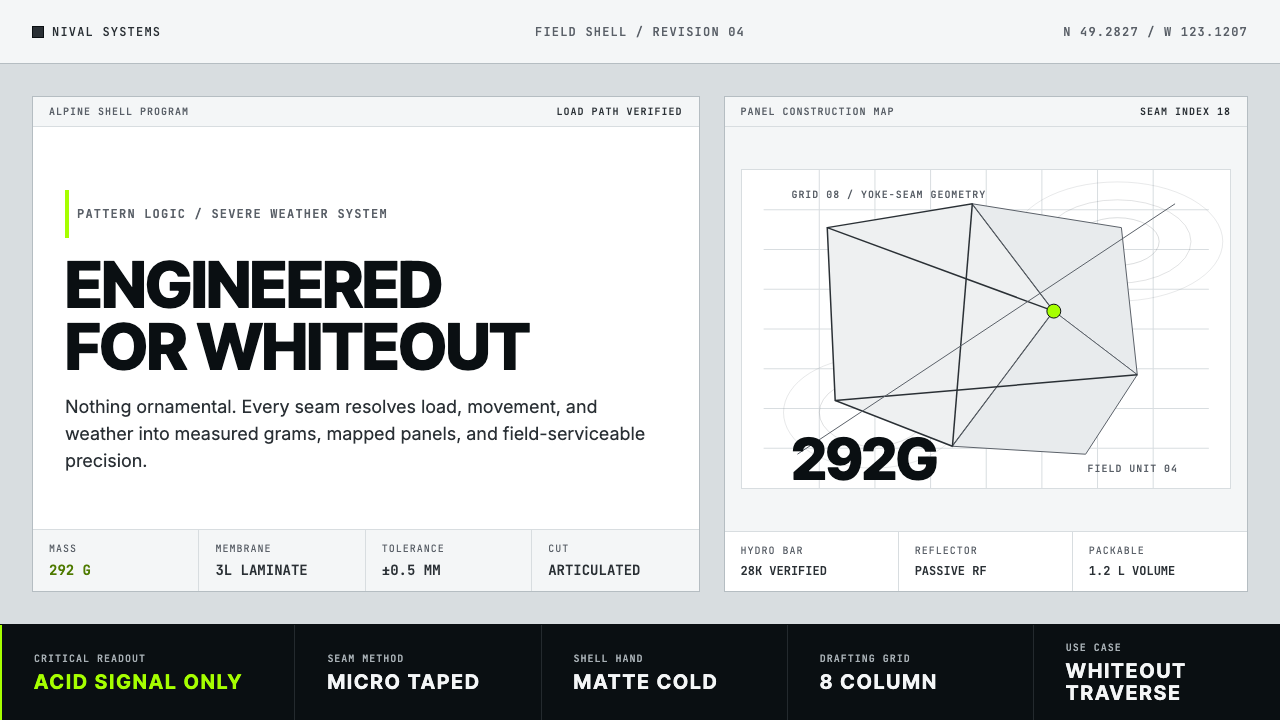 Arc'teryx Technical OutdoorEngineered, never ornamental. Glacier silver grid, mono specs, one acid-green…
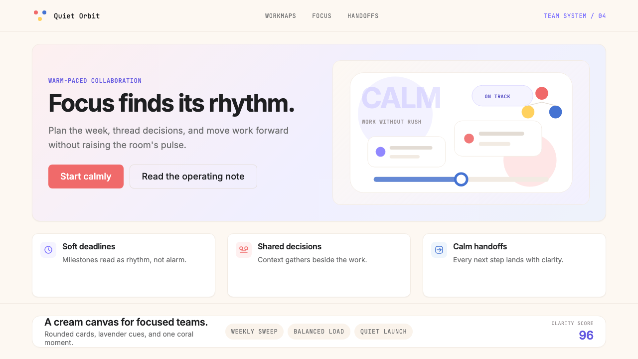 AsanaCalm productivity breathes. Cream canvas, lavender panels, coral-blue-yellow…