What is Suzhou Museum?
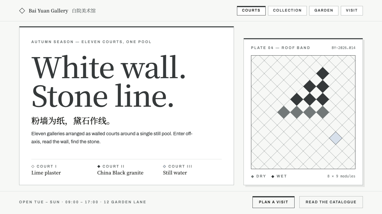
The Suzhou Museum design system turns I. M. Pei's late masterpiece into geometry: white plaster wall, dark granite lines, and diamond lattice standing in for the tiled roofs of Jiangnan.
Suzhou Museum in brief
The Suzhou Museum design system is drawn from the museum designed by I. M. Pei in Suzhou, Jiangsu, China. It begins from two of the most familiar materials of a Jiangnan town, the white plaster wall and the dark-tiled roof, and turns each into pure geometry. The wall stays a wall, a sunlit field of lime plaster. The small grey tiles become a diamond lattice in China Black granite, which looks deep grey in clear weather and close to ink black when it rains.
That same dark stone does the structural work on the page. It caps every field, outlines every opening and folds the roofline into diamonds. The page therefore behaves like a plan of walled courts rather than one open canvas. A card is a white room under a dark cap rule; a button is an outlined opening that fills in when pressed; navigation is a run of framed doorways.
What the system leaves out is as telling as what it contains. There are no dragons, no lanterns and no ink-wash textures. Dark ink arrives only as the silhouette of a slab of stone standing in front of a white wall. The result is a restrained, spacious style for museums, architecture practices, cultural institutions and publications that depend on empty space.

Where does Suzhou Museum come from?
The museum was designed between 2000 and 2006 and opened in October 2006 in Suzhou, Jiangsu. It is among the last major works of I. M. Pei, and the project is often discussed as a conversation between a modernist architect and the traditional gardens and townscape of Jiangnan, where white walls, grey tiles and carefully framed views are the vocabulary of everyday architecture.
The design system inherits that conversation. Its movements are late modernism, which gives it the clarity of geometric form and precise material detailing; the geometric abstraction of Jiangnan garden architecture, which reduces walls, windows and roofs to simple repeatable shapes; and the idea of the museum as landscape, in which a building is organised as a sequence of courts, paths and framed views rather than as a single monumental volume.
Alongside I. M. Pei, two further names are connected with the project: Chien Chung (Didi) Pei and Li Chung (Sandi) Pei, the architect's sons, who are named among the key figures associated with the museum. Their involvement marks the work as both a late masterpiece and a family practice.
A defining detail is the way rooms are entered. Visitors approach off-axis rather than straight down a monumental central line, in the manner of a garden path that reveals its views gradually. The design system carries that principle into page structure, so that content is arrived at obliquely through framed panels rather than announced by a single central banner.
What defines the Suzhou Museum look?
Sunlit plaster wall
The page is a warm lime-plaster white, as if lit by sun. The wall is the paper; it is deliberately left empty, and composition happens through what is placed against it rather than through texture on it.
Dark granite cap rules
A thick dark line caps each card and field, the way a stone coping caps the top of a wall. The same dark tone outlines openings, so edges and boundaries are always drawn in stone rather than in shadow or colour.
Diamond lattice for roof tiles
Where Jiangnan tradition would show small grey roof tiles, the system uses a diamond pattern in dark stone. It supplies texture and rhythm in a few chosen places, such as headers, dividers and footers, without becoming a decorative wallpaper.
Serif plaque headings
Headings are set in a serif in the manner of an inscribed plaque, giving titles a calm, institutional dignity. They sit on the wall like carved characters rather than shouting from a banner.
Outlined openings for controls
Buttons are drawn as outlined openings and fill solid only when pressed. Navigation items are framed like doorways. Controls therefore read as architectural apertures, consistent with the idea of the page as walled courts.
Off-axis entry
Layouts avoid a single monumental centre line. Content is entered from the side, in staggered panels, so the eye moves through the page as a visitor moves through connected courts.

Who shaped Suzhou Museum?
Architect of the Suzhou Museum, designed between 2000 and 2006 as one of his late major works.
Named among the key figures associated with the museum project.
Named among the key figures associated with the museum project.
How do you use Suzhou Museum today?
In slide decks, the style is a natural choice for museum proposals, architecture portfolios and cultural strategy presentations. Keep each slide as a white wall, place content in a card under a dark cap rule, and use the diamond lattice only on the cover or on section dividers. Titles in the serif plaque style carry authority without decoration. For data slides, draw tables and charts in dark line on white with plenty of margin, and use outlined frames rather than filled blocks to separate groups of numbers.
On the web, the pattern suits museum sites, gallery programmes, architecture offices and cultural institutions. Treat each section as an enclosed room: a white card with a dark cap rule at the top, content arranged inside, and generous empty wall around it. Primary buttons should be outlined and fill when pressed; navigation can be a row of framed items. For dashboards or pricing pages, use the same structure: each plan or metric group is a courtyard under its own cap rule, and emphasis comes from darkness of line, not from colour.
For editorial and marketing work, the style gives publications a measured, contemplative tone. Exhibition pages, essays on architecture and catalogue introductions can use large areas of empty white, a plaque-style heading, and a single image set off-axis. The silhouette of a stone slab against a white wall, rather than any decorative ink texture, is the right model for imagery: sparse, precise and tonal.
A common mistake is to add the clichés the system deliberately excludes. Dragon motifs, red lanterns or ink-wash backgrounds turn a restrained piece of geometric abstraction into a theme-park version of Chinese design. A second mistake is overusing the diamond lattice as a repeating wallpaper across the page; it is a roofline, and it belongs at the edges. A third is centring everything on a single axis, which erases the off-axis entry that gives the original architecture its quiet surprise.
Finally, remember that the system depends on emptiness. If a layout feels too sparse, resist filling it. The unoccupied wall is part of the composition, and the design rewards patience, proportion and the confidence to leave things alone.

Suzhou Museum — FAQ
Who designed the Suzhou Museum?
I. M. Pei designed it between 2000 and 2006, and it opened in October 2006 in Suzhou, Jiangsu. His sons Chien Chung (Didi) Pei and Li Chung (Sandi) Pei are also named among the key figures associated with the project.
What do the white wall and dark lines represent?
They abstract the white plaster wall and dark-tiled roof of a Jiangnan town. The wall stays white; the roof tiles become a diamond lattice in China Black granite, and the same stone is used to cap walls and outline openings. In the design system, the wall is the page and the stone is the line.
Why are there no traditional Chinese decorative motifs?
The system follows the logic of the architecture, which reduces tradition to geometry rather than decorating with symbols. Dragons, lanterns and ink-wash textures would turn it into pastiche. Dark ink appears only as the silhouette of a stone slab against a white wall.
What does the museum-as-landscape idea mean for layout?
It means organising content as a sequence of enclosed rooms and framed views rather than one open canvas. Each card is a white court under a dark cap rule, and the user enters off-axis instead of straight down a central line, as a visitor moves through connected courtyards.
Where does this style work best?
Museums, architecture practices, cultural institutions and publications that depend on whitespace. It is less suited to busy commercial interfaces that need dense information or bright promotional colour, since the system relies on emptiness and tone.
Related design styles
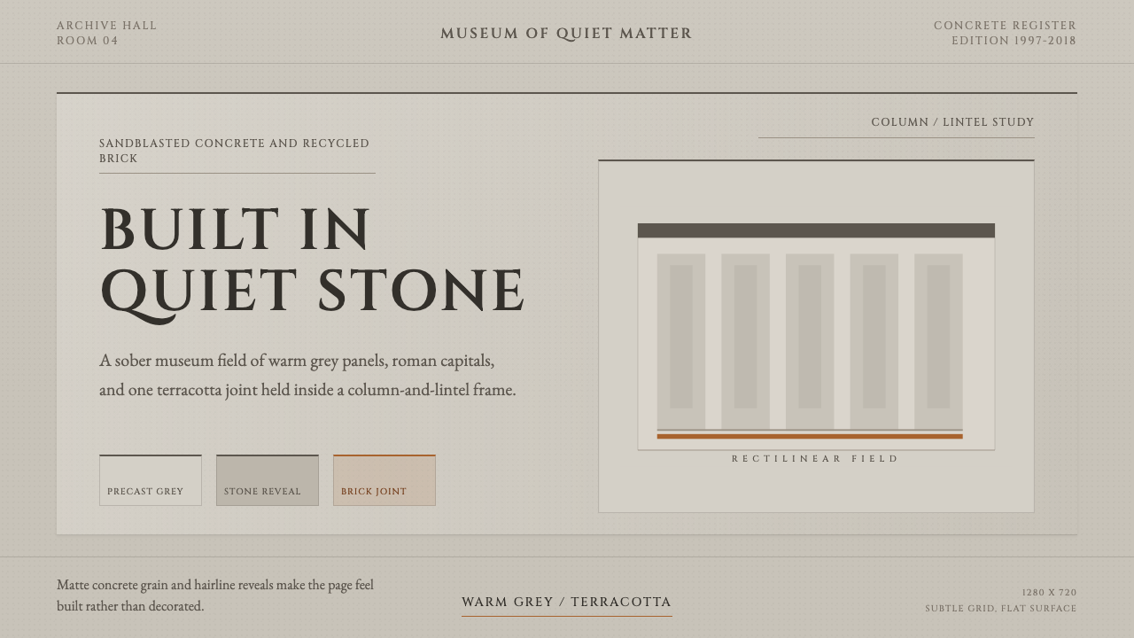 Chipperfield Museum GrayMuseum gravity, rendered quietly. Warm concrete grey, roman capitals, one ter…
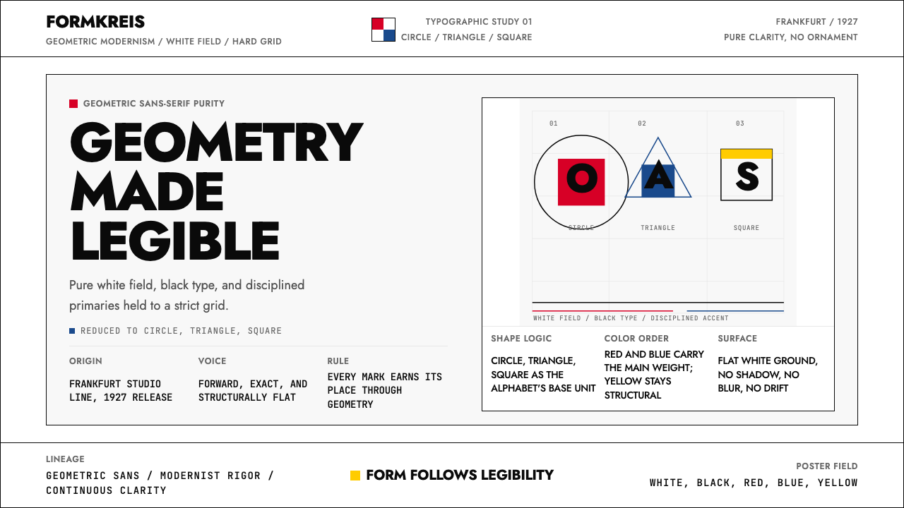 Futura Typeface (Renner, 1927)Geometry is legible. Black type and white fields, with red-blue-yellow anchor…
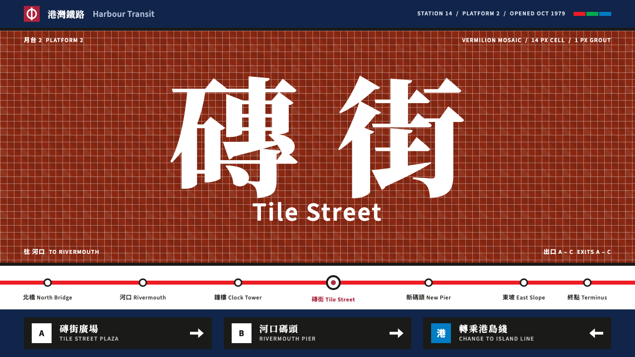 Hong Kong MTROne tile colour per station. Vermilion mosaic, black enamel signs, Chinese st…
 Le Corbusier Purist WhiteA house is a white argument: render-white planes, ribbon windows, one slap of…
 SANAA White LightnessArchitecture made of light. White planes float on cool silver-grey, edged in…
 Tadao Ando ConcreteSilence as material. Cool board-formed grey, tie-hole grid, one sliver of lig…