What is Superhuman?
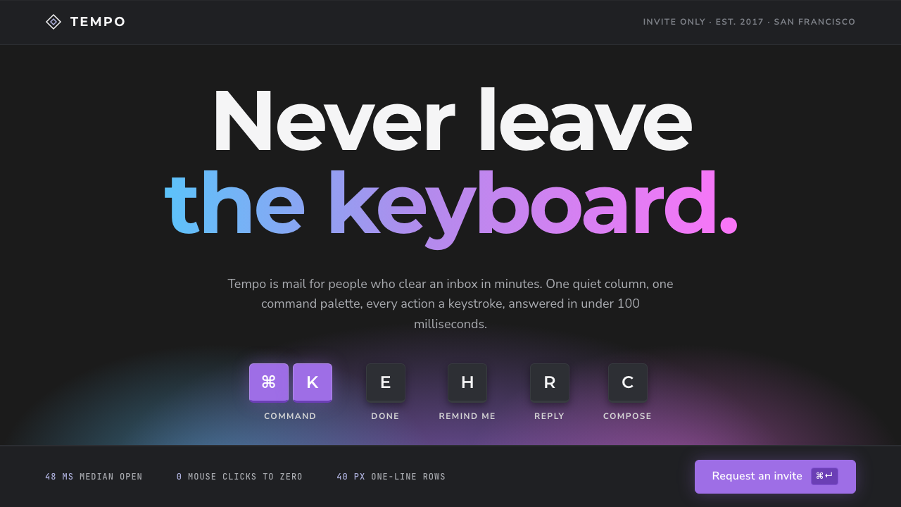
Superhuman made an inbox feel fast enough to be expensive: layered charcoal greys, a single glow of purple, and a small key chip beside every action to teach the shortcut.
Superhuman in brief
The Superhuman style comes from the email client of the same name, which Rahul Vohra opened by invitation in San Francisco in 2017. It is built on one premise: your hands should never have to leave the keyboard. Every action has a shortcut, a command palette opens on Cmd+K, and the inbox is a single calm column of one-line rows on a charcoal ground, with no avatars, no label trees and no red notification dots.
As a design language it is a considered dark theme. The base is a deep charcoal, not pure black, with several layers of grey stacked above it to separate panels and rows. Headlines are set in Montserrat and the interface in Nunito Sans. Small, uppercase key chips appear beside actions so that the product teaches its own shortcuts as you use it. Later versions of the brand added soft glows of purple, pink and sky blue.
The mood is quick, expensive and restrained. Nothing in the interface shouts. Speed is communicated through quiet density, sharp alignment and the visible presence of the keyboard, rather than through animation or colour. It is a style for tools that want to feel like instruments for experts.

Where does Superhuman come from?
Superhuman started in San Francisco in 2017 as an invite-only email client, led by Rahul Vohra, with Conrad Irwin and Vivek Sodera among the people associated with its early development. The invitation model was part of the product's identity: it suggested a tool for people who valued their time enough to be selective about what they used, and it let the team tune the experience for a small group before opening it more widely.
The design language belongs to a lineage of keyboard-first productivity software. Tools of this kind treat the mouse as a fallback and the keyboard as the primary instrument, and they usually rely on a command palette, a single searchable list from which any action can be summoned by typing. Superhuman took that idea and applied it to the most universal and most hated of knowledge-work chores, the inbox, making each message a single line and each action a keystroke.
The visual history of the brand has two distinct eras. From 2017 to 2022 the public site and the app's Carbon theme were built on a charcoal body colour with several layered greys above it, in the manner of a considered dark theme: depth through tone rather than through shadow, and little colour at all. From 2023 to 2024 the brand moved to a purple-gradient identity, with soft glows of purple, pink and sky blue appearing against the dark ground, which gave the product a warmer, more marketable face while keeping its restrained interface.
The system on this page blends both. It keeps the charcoal body and the layered Carbon greys of the earlier period, and borrows the glows of the later one as a single atmospheric accent. That combination reflects the real product: a quiet, dense interior wrapped in a brand that signals speed, taste and a little luxury. It sits in the broader family of considered dark-theme design that includes developer tools and command-driven apps.
What defines the Superhuman look?
Charcoal, not black
The body ground is a deep charcoal that is slightly lifted from pure black. This keeps text comfortable to read for long periods and gives the greys above it somewhere to rise from. It is the foundation of the style's calm, expensive feel.
Layered Carbon greys
Panels, rows and menus are separated by successive steps of grey rather than by borders or heavy shadow. Each layer sits a little lighter than the one beneath, so the hierarchy reads as depth. The effect is dense but quiet, and it lets a lot of information coexist without visual noise.
One purple glow
Colour is reserved for a soft, diffuse glow of purple, sometimes with hints of pink and sky blue, behind a hero or a key moment. It acts as an atmosphere, not as a control colour. Because everything else is grey, the glow feels like the one expensive thing in the room.
Key chips on every action
Shortcuts are shown as small, uppercase chips that look like physical keys and sit next to the action they trigger. They teach the product to the user in context, and they signal that the keyboard is the primary way to operate it. Menus and buttons are often incomplete without one.
Command palette as centrepiece
A single searchable overlay, opened by one key combination, stands in for most navigation. It sits centred on the dark ground, with a clear input at the top and a short list of results beneath. It makes the whole product feel reachable without leaving the keyboard.
Single-line density
The main list is a single column of one-line rows with consistent alignment and little decoration. There are no avatars, no nested label trees and no badge counts competing for attention. Density here comes from discipline, not from squeezing: every row looks the same so the eye can scan fast.
Two typefaces with clear jobs
Montserrat, a geometric sans with a confident, wide stance, carries headlines. Nunito Sans, rounder and more neutral, carries the interface and body text. The pairing gives the marketing surface some personality while keeping the working surface calm and legible.

Who shaped Superhuman?
Founder of Superhuman, who opened the email client by invitation in San Francisco in 2017 and set its keyboard-first premise.
Engineer associated with Superhuman's early development, part of the team that built the product's fast, keyboard-driven interface.
Co-founder associated with Superhuman, involved in the company's early formation and growth.
How do you use Superhuman today?
On slides, the style is natural for product, engineering and strategy decks that want to feel sharp and expensive. A charcoal ground with a single purple glow behind the title makes a confident cover. Content slides work as stacked panels in slightly different greys, with a small key chip used as a label or step marker. For data, restrained charts with a few muted accents suit the mood, and one highlighted series in the purple family can mark the point you are making.
On the web, it fits productivity tools, developer products and premium SaaS that sell speed and focus. A landing page can show a product shot floating in a purple glow, followed by feature rows that each pair a short headline with a key chip. In the application itself, use a single-column list, a command palette and tooltips that reveal shortcuts. Pricing pages should be calm, with tiers separated by grey layers and the chosen tier carrying the only glow.
In editorial and marketing work, the style suits launch announcements, founder essays and conference graphics that want to signal taste and efficiency. Large, quiet type on charcoal with one soft glow is enough. Photography should be minimal and mostly avoided in favour of screenshots and abstract light. A key chip can be used as a graphic motif, for instance to show the shortcut for the feature being announced.
The most common mistake is to treat dark as black and glow as neon. Pure black flattens the layers, and a saturated, hard-edged colour turns the calm interior into a gaming interface. A second mistake is to use the purple everywhere: it works only because it is rare. A third is to add decoration to the list, such as avatars, badges and colour labels, which destroys the single-line discipline that gives the style its speed.

Superhuman — FAQ
What is the Superhuman design style?
It is a keyboard-first dark theme based on the Superhuman email client. It uses charcoal grounds with layered greys, a single soft purple glow, small key chips beside actions and a command palette, to make a tool feel fast, quiet and expensive.
Is it the same as a generic dark mode?
No. A generic dark mode inverts a light interface. This style is designed dark from the start: a charcoal base rather than black, depth through several steps of grey, minimal colour, and visible keyboard cues. The restraint and the single-line density are what make it distinctive.
What are the key chips for?
They show the keyboard shortcut for an action, in small uppercase chips that look like physical keys. They teach the product in context and signal that the keyboard is the main way to operate it.
Which typefaces does the style use?
Montserrat is used for headlines, giving a confident geometric voice, and Nunito Sans is used for the interface and body text, which is rounder and more neutral. Each has a clear job, and the pairing keeps the working surface calm.
What is the most common mistake when using it?
Using pure black and neon-like colour, or spreading the purple across the whole interface. The style relies on layered charcoal greys and on a single rare glow. Adding decoration to the list, such as avatars and badges, also removes the single-line calm that gives it speed.
Related design styles
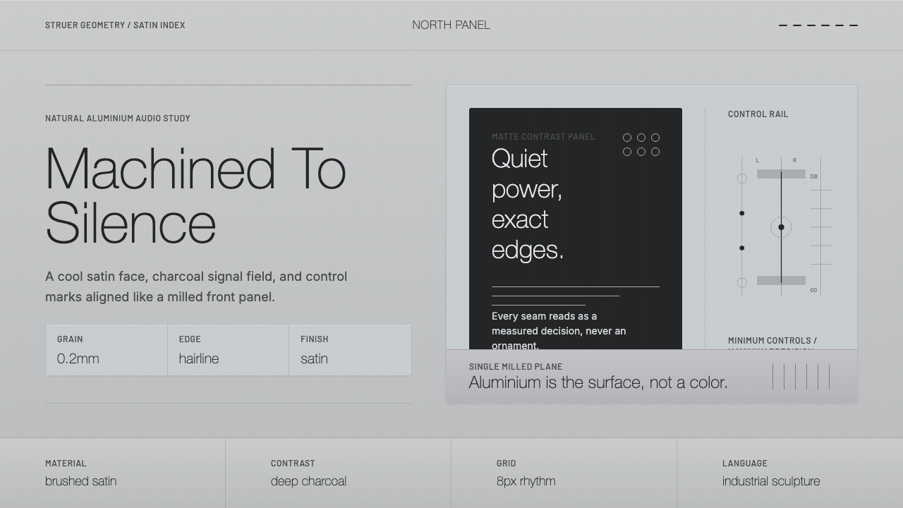 Bang & Olufsen AluminiumQuiet luxury, machined flat. Satin aluminium grain, hairlines, thin charcoal…
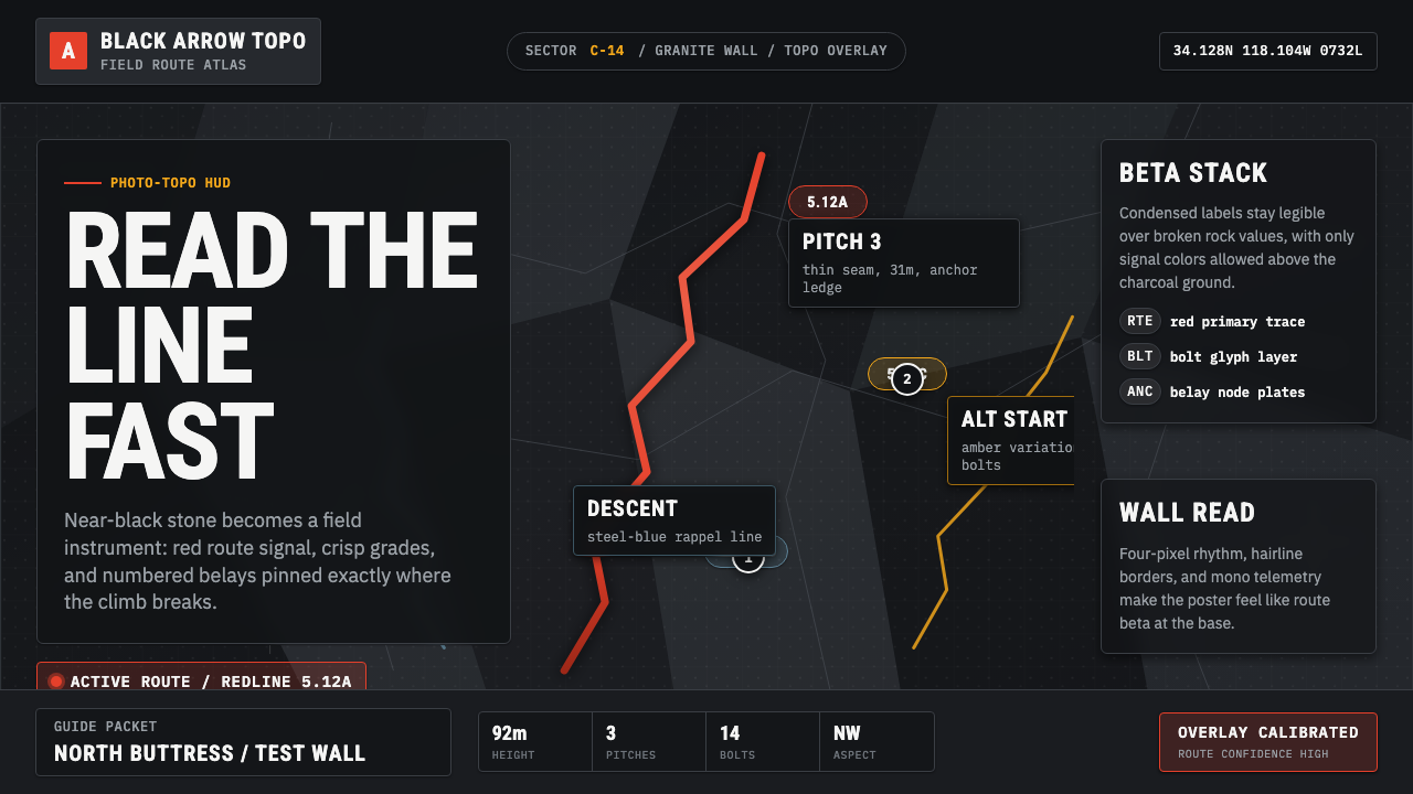 Climbing Topo GuideBeta at a glance. Red route telemetry cuts across near-black stone and conden…
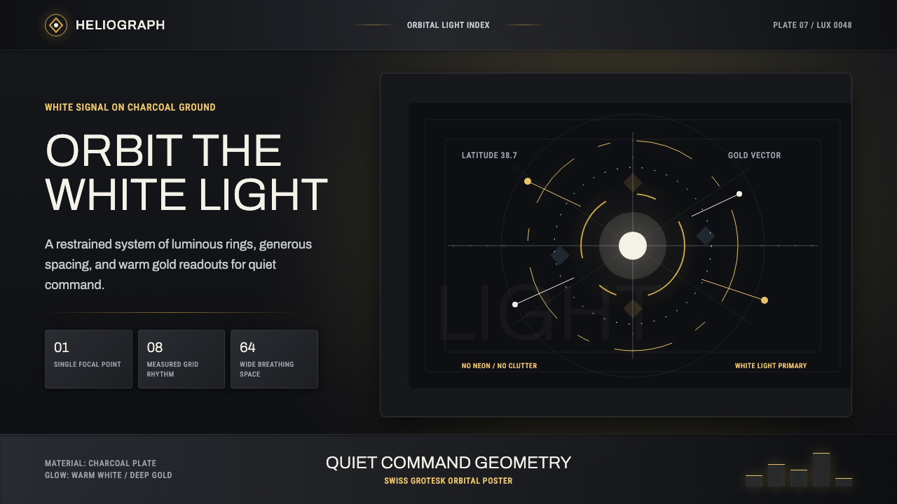 DestinyLuminous restraint. White-gold rings orbit charcoal plates in clean grotesk t…
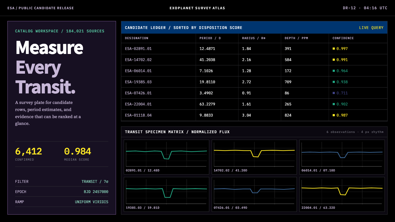 Exoplanet Survey AtlasNumbers stay legible at survey scale. Viridis ranks dense mono tables and tra…
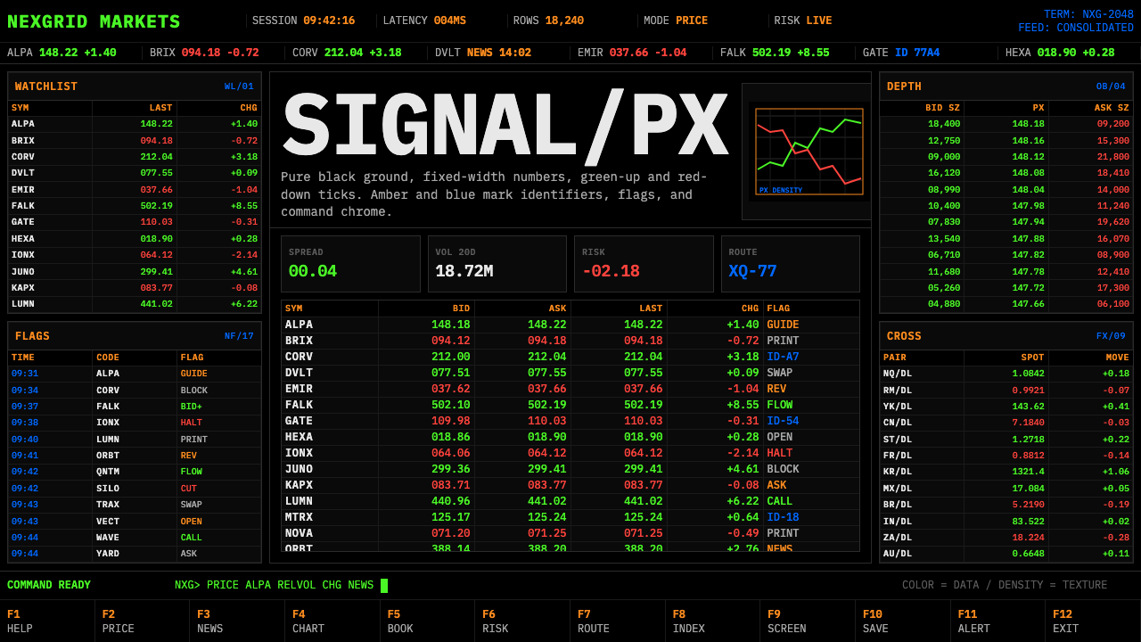 Financial Terminal MonoMaximum signal per pixel. Pure black, IBM Plex Mono, green-red ticks, amber-b…
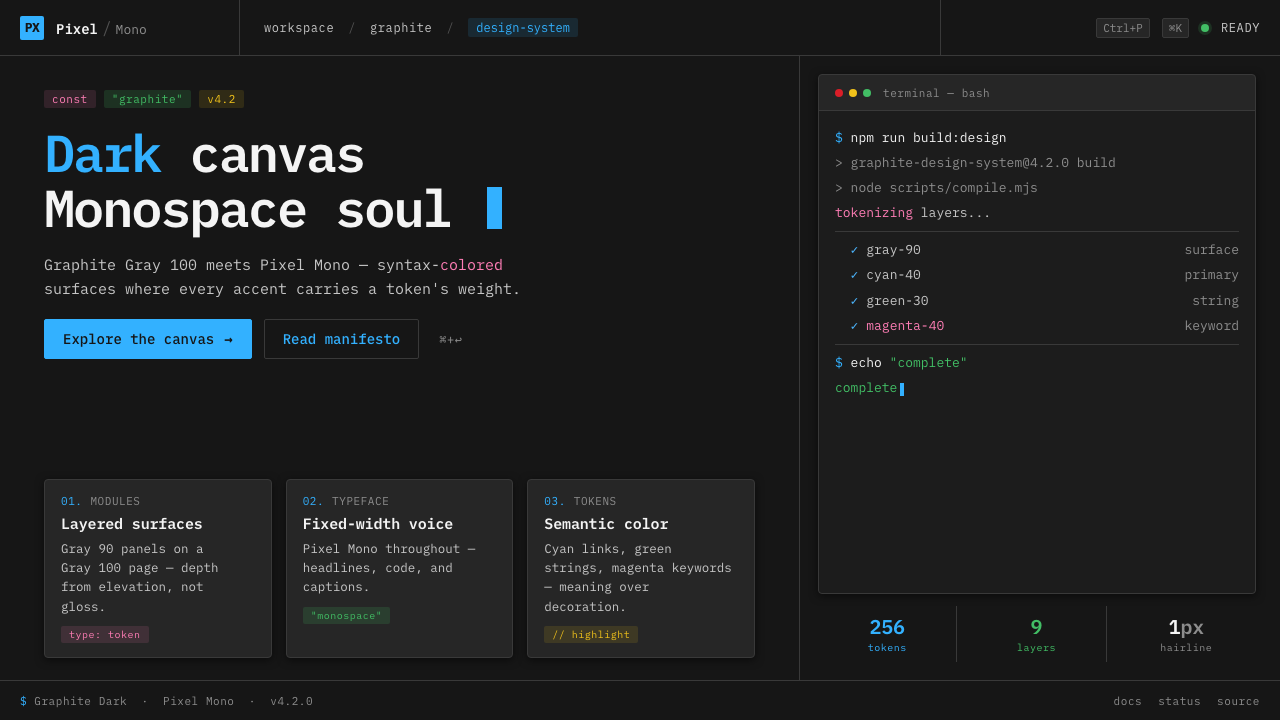 IBM Plex Mono DevColor used like syntax highlighting. Carbon Gray 100 canvas, IBM Plex Mono th…