What is Summer Wars OZ?
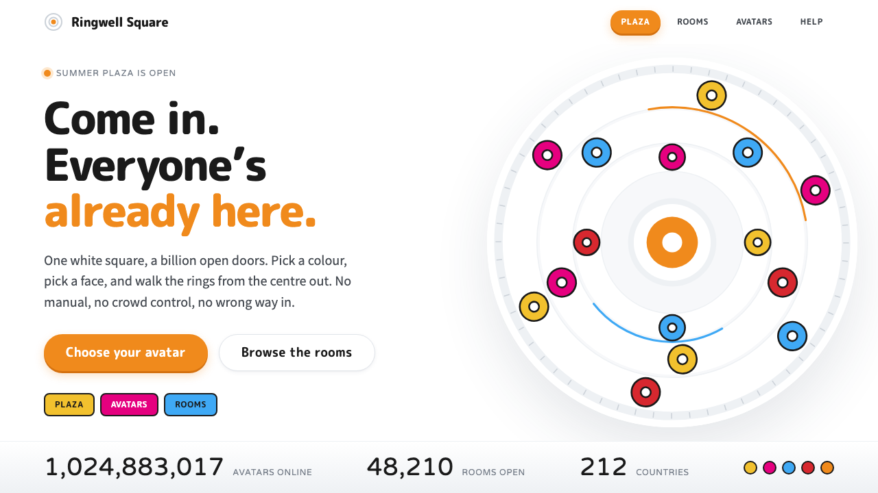
OZ is a virtual world drawn as a public square: layered whites, slowly turning rings, one orange system accent and a crowd of flat, cheerful avatars.
Summer Wars OZ in brief
Summer Wars OZ is a design style drawn from the virtual world at the centre of Mamoru Hosoda's 2009 animated film Summer Wars. In the film, OZ is a white sphere of concentric rings, slowly turning, inside which a billion people shop, file their taxes, play games and meet each other. Each person appears as a flat, brightly coloured avatar, and the whole place feels less like a hacker's cyberspace than like a town square that everyone is happy to walk into.
As a design language it is built on a small number of decisions. The ground is white, but not one white: several layers of it, each a shade apart, so that depth comes from tone rather than from shadow. Type is rounded and friendly. Layouts radiate outward from a central hub, echoing the rings of the sphere. Colour appears in two registers: a single orange used for system chrome and buttons, and a crowd of saturated flat colours that belong to the avatars.
What makes the style distinctive is the mood it sets. Most futuristic interfaces reach for darkness, glow and menace. OZ does the opposite: it is clean, busy and easy to use, an interface that a child and a grandparent could both enter without feeling that they had wandered into someone else's machine. It is a style about welcome, public life and trust at scale.

Where does Summer Wars OZ come from?
Summer Wars was released in Japan on 1 August 2009, directed by Mamoru Hosoda, and it went on to win the Japan Academy Prize for Animation of the Year in 2010. The story moves between two places: a sprawling rural family home and OZ, the online world that has quietly become the infrastructure of everyday life. That pairing matters to the look of OZ. The film wants the audience to feel that the virtual world is as ordinary and as crowded as the real one, and the visual design carries much of that argument.
Hosoda has described the layered whites of OZ as something that took considerable effort to get right: the difference between one white and the next is the whole architecture of the place. The colours and shapes, by contrast, took their cue from the clean, readable interfaces of Nintendo-style games, which are designed so that any player of any age can understand them at a glance. The result is a world whose surface is deliberately approachable, even as the plot around it turns on fragility and attack.
The film's creative team shaped the avatars and the characters who use them. Yoshiyuki Sadamoto, known for his character work, designed the human cast, while Takashi Okazaki is associated with the champion avatar King Kazma, whose red vest, black trousers and white rabbit body became the film's most recognisable silhouette. Satoko Okudera is credited with the screenplay. Together they produced a world in which the avatars read as flat, bold shapes rather than as rendered three-dimensional bodies.
That flatness connects OZ to a wider Japanese conversation about the picture plane. The Superflat tradition treats flat colour, bold outline and the collapse of foreground and background as strengths rather than limitations, and OZ borrows that sensibility for a social space. Seen against that background, the white sphere and its crowd of coloured chips are not a rejection of depth but a different answer to it: depth through layered tone, surface through saturated, unshaded colour.
What defines the Summer Wars OZ look?
Layered whites
The ground is a stack of whites rather than a single flat one. Panels, rings and cards are separated by small shifts in tone, so the interface gains depth without relying on heavy shadow. The effect is airy and bright, closer to a daylit plaza than to a screen, and it is the first thing that makes the style recognisable.
Concentric rings and radial layout
The sphere of OZ is built from rings turning around a centre, and the layouts follow. Content gathers around a hub and spreads outward, navigation can orbit a focal point, and circles recur as buttons, badges and dividers. Where a conventional page runs in rows, this one radiates.
One orange system accent
Interface controls share a single warm orange, reserved for system buttons and calls to action. Because the rest of the chrome stays white and quiet, the orange reads immediately as the thing you can press. It works like the colour of a public information desk: unmistakable, friendly and used with restraint.
Flat rainbow avatars
Where the interface is quiet, the people in it are loud. Avatars are flat, saturated shapes in many different colours, with no gradients or modelled shading. A crowd of them forms a lively mosaic, and because each is a clean, unshaded chip, the crowd stays legible instead of collapsing into clutter.
Rounded, friendly type
Letterforms are rounded, with soft terminals and generous proportions. The effect is approachable and slightly playful, signalling that this is a place for everyone rather than a specialist tool. Headlines can be large and plain; small labels stay clear against the pale grounds.
Generous air
Spacing is open. Elements are given room to breathe, which is what lets a lot of coloured avatars and controls coexist without noise. The style is busy in content but calm in structure, and that calm comes from space rather than from reducing the number of things on screen.
Hero colours from King Kazma
Alongside the orange, the champion avatar supplies a second, sharper set of colours: red, black and white. They appear as accents on featured items, status marks and highlights, giving the system a small, high-contrast vocabulary for moments that deserve to stand out from the soft whites.

Who shaped Summer Wars OZ?
Director of Summer Wars. He set the film's central idea of a virtual world that feels as ordinary and welcoming as a town square, and has spoken about the effort spent on the layered whites of OZ.
Character designer known for his work in Japanese animation, responsible for the look of the film's human cast.
Artist associated with the design of King Kazma, the champion avatar whose red, black and white palette and rabbit body became the film's signature silhouette.
Screenwriter credited on the film, who built the story that moves between the family home and the online world of OZ.
How do you use Summer Wars OZ today?
On slides, the OZ style suits a cover that wants to feel open and welcoming: a pale layered ground, a few concentric rings as a motif, a rounded headline and a single orange button-like element for the call to action. For content slides, keep to white panels separated by subtle tonal shifts, and let the rings or a central hub organise diagrams of ecosystems, communities and platforms. For data slides, use the saturated flat colours as category chips, and keep the number of series modest so that the chips remain individually readable.
On the web, it fits products that are public, social and trying to feel safe: community platforms, marketplaces, civic or government-adjacent services, onboarding flows and family-friendly apps. A dashboard can sit on layered whites with a radial summary at its centre and orange reserved for the one action per screen that matters. Pricing pages can use rounded cards on white and let avatars or colour chips stand in for plans or members. The orange should always mean the same thing, so that people learn where to press.
In editorial and marketing work, the style is good at conveying scale without coldness. A campaign about a million users can show them as a crowd of flat coloured chips arranged around a ring; a report about a shared platform can open on a quiet white cover with a single bright accent. Photography should be bright and daylit rather than moody, and illustration should stay flat to match the avatars.
A common mistake is to treat the style as simply white plus colour, and to lose the layering. If every surface is the same white, the page flattens into a blank sheet and the rings and hubs have nothing to sit on. A second mistake is to let the avatar colours leak into the interface chrome, which dilutes the orange and makes it unclear what is a control. A third is to add dark mode glow and neon, which turns the world into the very cold cyberspace that OZ was drawn to avoid.

Summer Wars OZ — FAQ
What is the Summer Wars OZ design style?
It is a design style based on OZ, the virtual world in Mamoru Hosoda's 2009 film Summer Wars. It combines layered white backgrounds, concentric rings, an orange system accent, rounded type and flat, saturated avatar colours to make an interface that feels like a welcoming public square.
Is OZ a dark, cyberpunk style?
No. It is the opposite: bright, open and friendly. The film deliberately presents its online world as a clean, busy public space rather than the cold, shadowy cyberspace common in hacker stories, and the design style keeps that light mood.
How does it relate to Superflat?
OZ borrows the flat-colour, unshaded sensibility of the Superflat tradition, especially in its avatars. Here that flatness is applied to a social interface: avatars are bold flat chips, while depth is created by layered tones of white instead of by shadow.
What kinds of products suit this style?
Public, social and community-oriented products fit best: marketplaces, community platforms, onboarding flows, civic services and family-friendly apps. It is also good for slides and reports that want to convey scale and openness without feeling cold.
What is the most common mistake when using it?
Flattening the whites into one uniform colour, which removes the layering that gives the style its depth. The second is letting avatar colours spill into interface controls, which weakens the single orange accent that tells people what to press.
Related design styles
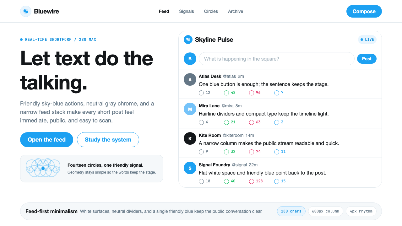 Twitter (Classic Bird)Text takes the stage. Sky blue actions, white feed stack, and hairline divide…
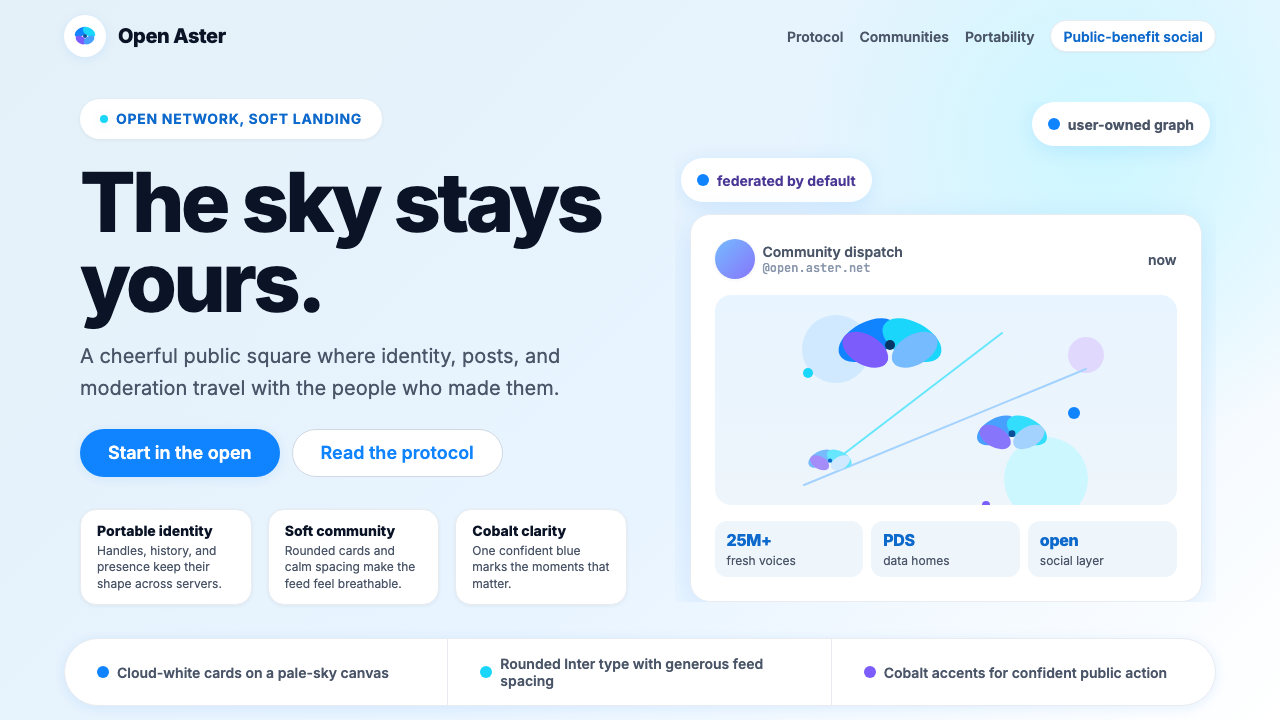 Bluesky AT Protocol 2024Open tech feels warm. Pale sky, cloud cards, Inter, and one cobalt accent car…
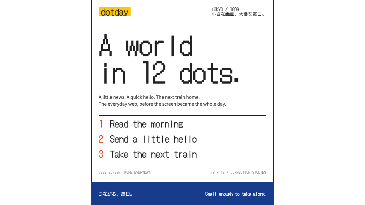 i-modeA whole world in a few dots. Bitmap type, white space and yellow bring the po…
 K-Beauty CleanCalm arrives dewy. Rose, sage, and peach pastels float through airy rounded f…
 KumamonA black circle on pure white. Official red lands only on cheeks, buttons and…
 MonzoOne loud coral, everything else calm. Navy type and mint-grey space keep mone…