What is Sumikko Gurashi?
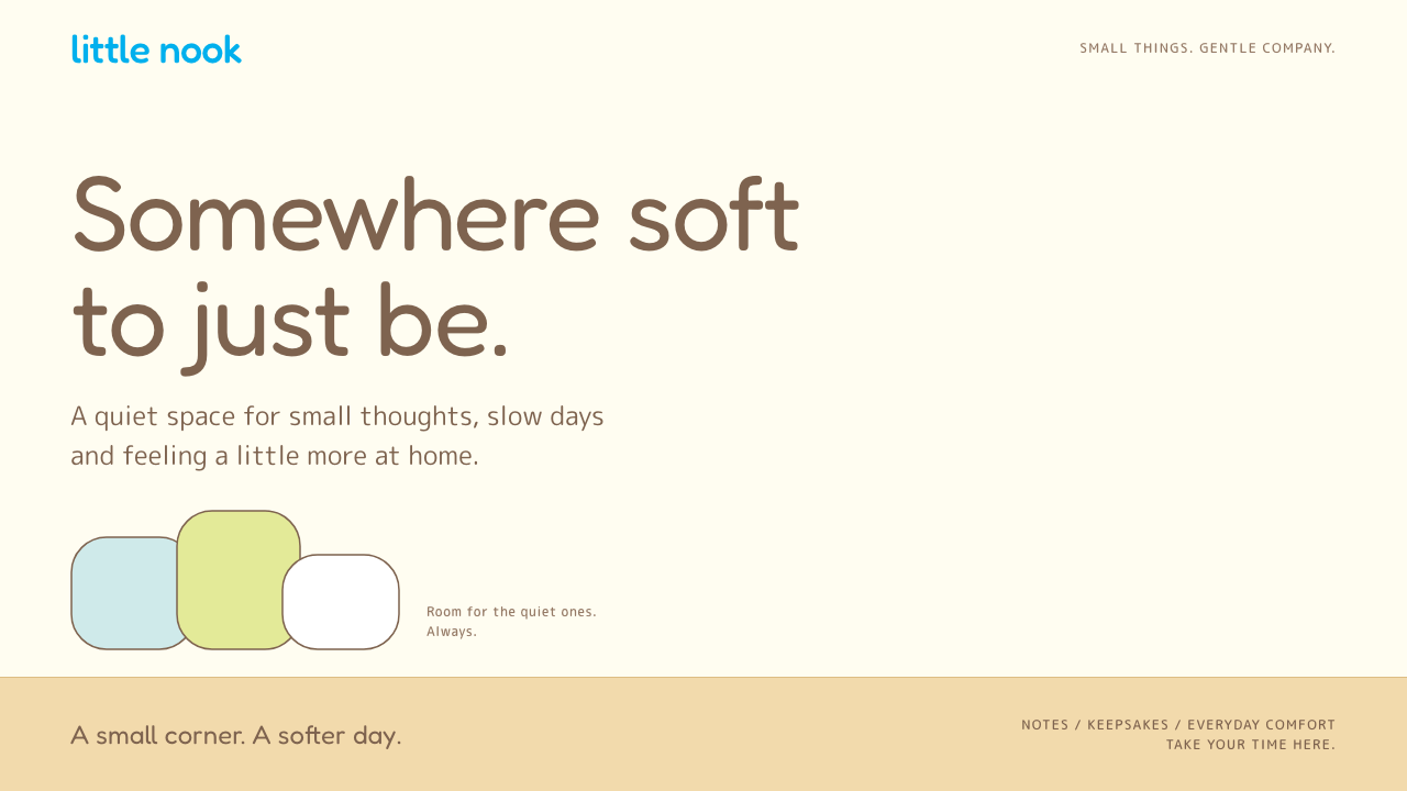
Sumikko Gurashi designs for the quiet ones: thin brown line, pastel fills, and content that gathers in a corner of a warm room.
Sumikko Gurashi in brief
Sumikko Gurashi is a character line launched by the Japanese stationery company San-X in 2012, illustrated by Yuri Yokomizo. The name means roughly 'living in the corner', and its cast is made of timid, slightly self-conscious creatures who feel safest where two walls meet: a polar bear that dislikes the cold, a penguin that is not sure it is a penguin, and the leftover edge of a pork cutlet.
As a design system, the style turns that room into an interface. A warm-white wall, a honey-tan floor band, thin brown outlines, soft pastel fills, and San-X cyan reserved for actions. Content is not spread across the page; it huddles toward one corner, and the space around it is left open on purpose.
The effect is gentle and reassuring. Where many interfaces compete for attention, this one invites you to relax. It is a style about permission: permission to be small, to take up little space, and to feel at home anyway.

Where does Sumikko Gurashi come from?
Sumikko Gurashi debuted in 2012 as a stationery line from San-X, the Tokyo company known for character goods sold in notebooks, pencil cases and small gifts. Yuri Yokomizo drew the original cast: characters whose personalities revolve around timidity, leftovers and small anxieties. Rather than being brave heroes, they prefer to hide in corners and are quietly proud of it. That inversion made them stand out in a market crowded with cheerful mascots.
The line grew far beyond stationery. In the later part of its life, a film era brought a refreshed look that the current visual language reflects, and the set of characters expanded to include a cat, a lizard and numerous smaller side figures. Even as the franchise became more elaborate, the basic visual grammar stayed constant: thin brown line work, pastel colour blocks, and a main scene staged in the corner of a room.
Sumikko Gurashi belongs to the Japanese kawaii fancy-goods tradition, in which cute characters appear on small, affordable objects that people use daily. San-X itself has a stationery heritage in this world, and its approach tends toward soft, rounded forms with an emotional backstory attached to each figure. What distinguishes this line is how little it asks of the viewer: its characters do not demand to be loved, they simply sit quietly nearby.
A related current is iyashi-kei, the Japanese healing-character culture. Iyashi means to soothe or heal, and iyashi-kei products are designed to calm fatigue and stress. The style's wide margins, warm light and low-contrast palette follow that logic. It is design for people who want a quiet pause in an otherwise busy day, which explains why the look has crossed from stationery into capsule toys, merchandise shops and calm lifestyle brands.
What defines the Sumikko Gurashi look?
Warm-white wall
The page background is a warm off-white, like a painted wall in soft indoor light. It is brighter than beige but far gentler than pure white, giving pastel fills a safe place to rest. There is almost no texture; the wall is a quiet backdrop that makes the corner feel like the only place where something happens.
Honey-tan floor
A horizontal band of honey-tan runs along the bottom, representing the floor where wall meets ground. It anchors the layout and creates the corner geometry that gives the style its name. In an interface, this floor can hold navigation, footers or a row of small objects, and it grounds the page without needing a hard border.
Thin brown line
Outlines are drawn in a thin, warm brown rather than black, with slightly uneven weight that suggests a hand-drawn pen. This softens every shape and prevents the pastel fills from looking harsh. Type follows the same logic, set in rounded brown letterforms that feel friendly and readable without shouting.
Pastel fills
Characters and decorative blocks are filled with soft pastels, such as pale pink, mint, cream and sky tones, each kept low in saturation. The colours huddle together in small groups, echoing the way the characters crowd close. They give variety without introducing any harsh contrast, so the mood remains calm even when many colours appear.
San-X cyan for action
Buttons, links and active states use a single cyan associated with the San-X brand. Because it is the only cool, saturated colour on a warm page, it reads as an unmistakable cue for what can be clicked. Using it so sparingly lets the interface stay soothing while remaining clear about where to go next.
Corner composition
Content gathers toward one corner of the page rather than spreading evenly, with generous open space left around it. This is the defining compositional idea: small things feel safest when tucked into an edge. Done well, it gives the layout an asymmetry that feels intimate rather than unbalanced, and it keeps visual density very low.

Who shaped Sumikko Gurashi?
Yokomizo is the illustrator behind Sumikko Gurashi. She drew the original characters in thin brown line on pastel fills, giving the franchise its quiet, huddled look. Her design instinct was to make shyness the point rather than a flaw, which is the emotional logic the whole visual style carries forward.
San-X is the Tokyo stationery and character-goods company that released Sumikko Gurashi in 2012. Its long tradition of fancy goods, small objects sold with an emotional story, shaped the line's rounded forms and gentle tone. The brand's cyan became the interface's single action colour.
Iyashi-kei is a broad cultural current rather than one person: products and media designed to soothe fatigue and offer small comforts. It supplies the style's rationale. Wide margins, soft light and low contrast are not accidents but deliberate choices that serve a calming purpose.
How do you use Sumikko Gurashi today?
For slides, the Sumikko style works best for gentle storytelling, lifestyle brands and creative pitches. Place the title in the corner area of a warm-white slide, with a honey-tan band along the bottom and a small illustrated figure tucked into the edge. Content slides should carry very little text and leave a large open field. The style communicates calm confidence, so it suits presentations that want to feel personal rather than authoritative.
For data slides, keep the density low. Use soft bars and rounded markers in pastel fills, outlined in thin brown, with the cyan reserved for the one number that needs attention. Group labels near the shapes they describe, as characters huddle together. Dense multi-series charts and compact tables work against the style, so split them across slides or simplify them.
In web UI, the style suits stationery shops, capsule-toy and merchandise stores, wellness and journaling apps, children's educational tools and any page that wants to lower the visitor's shoulders. Make the wall the page background, the floor a footer or navigation band, and let content cards sit near one side with generous margins. Buttons and links use cyan; everything else stays warm. Empty states are an excellent place for a small character that sits quietly rather than pops out.
In editorial and marketing work, use it for product catalogues, gift guides, seasonal campaigns and newsletters aimed at people who want a break from noise. Photography should be soft and warm, and copy should be short and slightly self-deprecating, in keeping with the characters' personalities. Packaging and printed inserts can borrow the warm-white and honey-tan pairing without reproducing the characters themselves.
The most common mistake is to fill the open space. The calm of the style comes from the emptiness around the corner, and cramming in more cards or banners destroys it. Another mistake is to swap the thin brown outlines for black, which makes the pastels look childish and harsh. Finally, avoid using the cyan for decoration; it must stay reserved for actions so that the interface remains both soothing and clear.

Sumikko Gurashi — FAQ
What does Sumikko Gurashi mean?
Roughly, it means 'living in the corner'. The word sumikko refers to a corner or nook, and gurashi means a way of living. The characters are creatures who prefer to stay in the corners of rooms, and the design style takes that literally by gathering content toward one corner of the page.
Why is the line so thin and brown instead of black?
Thin brown outlines keep the drawings warm and hand-drawn. Black would sharpen the pastels and add a sense of tension, which works against the soothing goal. The brown also echoes the honey-tan floor and the brown type, so the whole page shares one warm family and nothing feels harshly cut out.
Is the style only for children's products?
No. Its audience includes adults who want a calm break, which is the core of the iyashi-kei healing culture it belongs to. It works for stationery, wellness, journaling and gentle lifestyle brands. It is less suited to serious financial or technical tools where a playful tone might undermine credibility.
How much of the character art do I need to use?
Very little. The visual grammar, meaning the wall, the floor band, thin brown line, pastel fills and corner composition, carries the style without any character at all. Where you do include a figure, keep it small, tucked into an edge and not competing with the content. Reproducing the official characters requires licensing, so original small mascots in the same spirit are a safer choice.
Related design styles
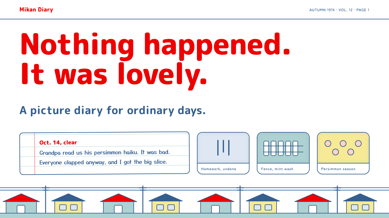 Chibi Maruko-chanQuiet, dry, domestic. Fat red rounded titles on white, blue-inked cards, flat…
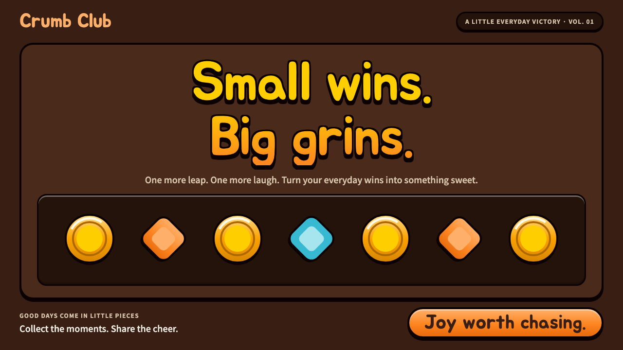 Cookie RunLittle wins feel enormous. Chubby Jua, candy gloss and orange pills on chocol…
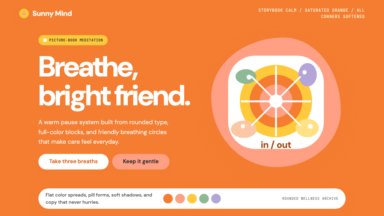 Headspace Orange MeditationMeditation becomes friendly. Orange blocks, DM Sans, and pill shapes soften e…
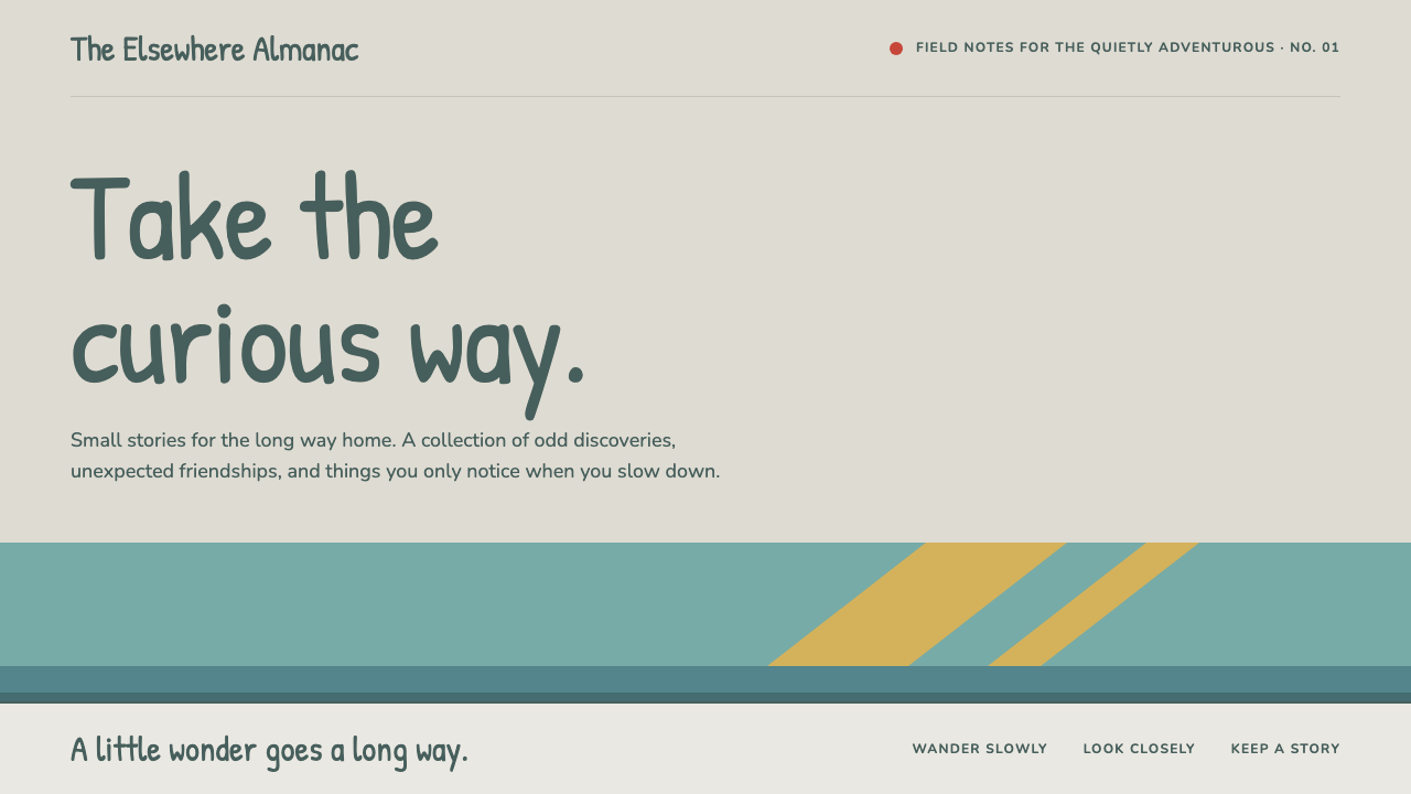 HildaQuietly curious. Hand-lettered type on snow greige, with teal bands and flat…
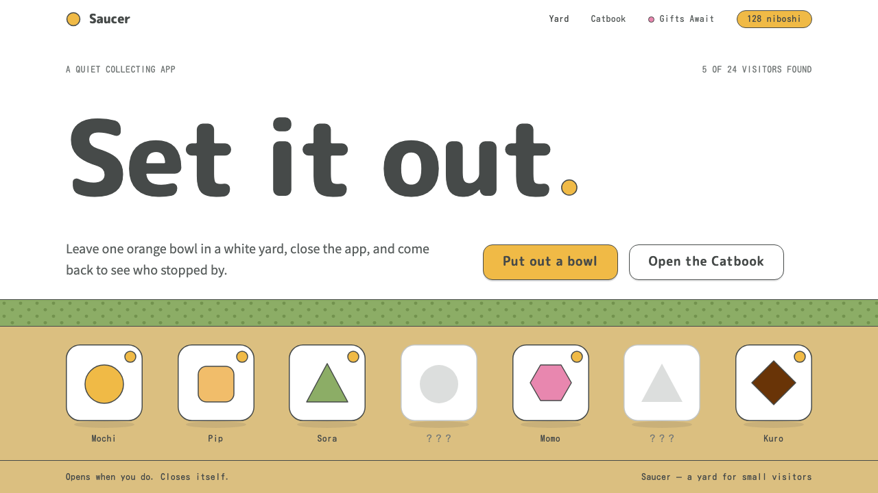 Neko AtsumeA quiet white yard, one orange bowl. Thin charcoal outlines, rounded type, or…
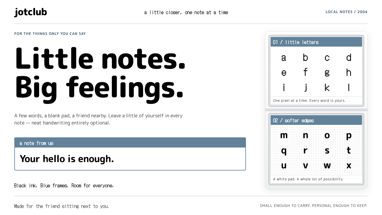 Nintendo DSSmall notes, warm connections. Bitmap ink and rounded type sit in stacked gre…