What is Nintendo DS?
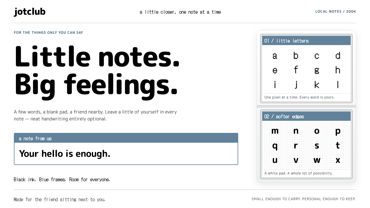
Nintendo DS PictoChat turned a chat window into a scrap of notepaper: grey-blue frames, jagged black ink and a stylus-sized sense of play.
Nintendo DS in brief
PictoChat is the chat application built into every Nintendo DS from its 2004 launch. The design language drawn from it is small, tactile and a little goofy. Two screens sit stacked one above the other: the conversation log on top, and below it a white drawing pad where a stylus leaves black, deliberately jagged strokes. A grey-blue frame wraps every message, tab and primary button, and the whole surface feels like a note passed across a classroom desk.
The system's identity comes from a handful of ingredients used consistently. A single greyish blue, the firmware's default profile colour, acts as the brand accent. Bitmap system type handles usernames and prompts, rounded headings add softness, and a pale silver reminiscent of the DS Lite's glossy white shell colours the keys and screen borders. Nothing is complicated, and that simplicity is exactly what makes it approachable.
In a design library, Nintendo DS is the style for products that want to lower the barrier to entry. It tells users that nothing here is serious or intimidating, that mistakes are fine, and that drawing a wobbly line is part of the fun. It is flat and clean, but never cold, because every edge has the slight imperfection of hand-made ink.

Where does Nintendo DS come from?
The reference period is 2004 to 2006, running from the DS launch through the arrival of the DS Lite. Nintendo is based in Kyoto, Japan, and the DS was the company's bold bet on a dual-screen, touch-driven handheld at a time when most consumer electronics still relied on buttons. The system software team and Satoru Iwata, then the company's president, are the names associated with that era of hardware and software direction.
PictoChat was a small but telling feature. Rooms labelled A to D let a handful of nearby players, up to sixteen per room, scribble or type short messages that appeared on the upper screen in the sender's personal colour. There was no account, no friend list and no internet; proximity was the only requirement. That simplicity made it a social space for kids, and its constraints shaped the look: a limited palette, a pixel font, and a drawing box that invited quick doodles rather than polished art.
The style belongs to the family of mid-2000s touch-screen consumer electronics, in which interfaces borrowed the friendliness of toys. It also sits inside Nintendo's Touch Generations line, which aimed to bring people who did not consider themselves gamers into play. Looking further forward, PictoChat anticipated later doodle and sticker culture on phones, where a quick hand-drawn reaction often says more than typed words.
Because the original ran on very low-resolution screens, its visual character is partly an accident of technology: stair-stepped lines, chunky pixel type and flat fills were what the hardware could do. The design system treats that accident as a feature and keeps the ink jagged on purpose, so that the page still feels hand-drawn rather than vector-perfect.
What defines the Nintendo DS look?
Stacked two-screen layout
Content is organised as an upper conversation area and a lower input area, each in its own framed panel. The vertical stacking gives interfaces a clear rhythm of reading above and acting below.
Grey-blue as the single accent
One muted greyish blue frames messages, tabs and primary buttons. Because it is calm rather than loud, it signals interactivity without shouting, and it lets users' own colours stand out in conversation.
Jagged one-pixel ink
Drawn strokes and fine rules are thin, black and deliberately stair-stepped, as if rendered by a coarse display. The roughness is the point: it reads as handwriting, not as a smooth vector line.
Bitmap system type
Usernames, timestamps and system prompts are set in a blocky pixel face. It marks the machine's voice as distinct from the user's own, and gives small text a tidy, grid-aligned texture.
Rounded headings
Headings use a soft, rounded typeface that contrasts with the pixel body text. The combination feels like a friendly label on a toy, light and non-threatening.
Keycaps in silver grey
The on-screen keyboard and screen borders use a pale silver tone with a faint gloss, echoing the white plastic shell of the DS Lite. Keys look pressable, and the surfaces feel like moulded plastic rather than paper.
Personal colour per sender
Each participant is represented by a colour, which tints their message frame. It lets a crowded conversation stay readable without avatars or heavy labelling.

Who shaped Nintendo DS?
Nintendo's president during the DS era, closely associated with the company's push toward approachable, touch-driven play.
The in-house team that built the DS firmware, including PictoChat, under the Kyoto company's hardware-and-software integration approach.
The product line that framed the DS as an accessible device for people who did not think of themselves as gamers.
How do you use Nintendo DS today?
On slides, Nintendo DS works well for casual team updates, classroom material, community meetups and anything that wants to feel friendly. A cover can use a pale silver background with a thick grey-blue frame and a rounded title, while subtitles take the pixel face. Content slides can mimic the two-screen split: a statement on top, a hand-drawn diagram or sketch below. For data, thick flat bars in the grey-blue with black outlines keep things readable and charming, and leave plenty of white space around each chart.
In web interfaces, the style suits chat apps, community forums, learning tools for younger users and lightweight collaboration products. Messages become framed bubbles tinted with each person's colour, tabs are rounded and clearly labelled, and primary buttons use the grey-blue fill with a black outline. Dashboards can use the stacked layout, with a summary above and an interactive panel below. A pricing page can lean on large, clear framed cards, with the recommended plan marked by a slightly heavier frame rather than a loud badge.
In editorial and marketing work, it is a good fit for stationery-like campaigns, nostalgic mid-2000s features, stickers, zines and playful launch announcements. Let hand-drawn doodles share the page with the pixel type, and keep layouts loose, as though a message had been scribbled and sent. The tone is gentle and humorous; copy should be short, friendly and written in plain words.
The most common mistake is polishing it too much. Smooth vector lines, soft drop shadows, glossy gradients on everything and an overly refined type scale will erase the hand-made quality that gives the style its charm. Another error is adding bright, saturated accent colours that compete with the grey-blue and users' personal colours. Keep the surfaces flat, keep the ink jagged, and let the small imperfections carry the personality.

Nintendo DS — FAQ
What is PictoChat?
PictoChat is the chat program built into every Nintendo DS from its 2004 launch. Nearby players join one of four rooms and send hand-drawn or typed messages, each shown in the sender's personal colour.
Why is the ink deliberately jagged?
The original handwriting looked stair-stepped because of the DS's low-resolution screens. The design system keeps that roughness on purpose, since it reads as genuine handwriting and gives the interface a tactile, playful character.
What is the main colour of the style?
A muted greyish blue, the firmware's default profile colour, frames messages, tabs and primary buttons. Pale silver grey handles keys and borders, while the page itself stays white.
What projects suit the Nintendo DS style?
Chat and community products, learning tools, casual presentations, zines and playful campaigns. It works best where approachability matters more than polish, and poorly for formal, luxury or heavily data-dense work.
Which period is this style based on?
It draws on the 2004 launch of the DS through the DS Lite era around 2006, a period when touch-screen consumer electronics were adopting toy-like, friendly interfaces.
Related design styles
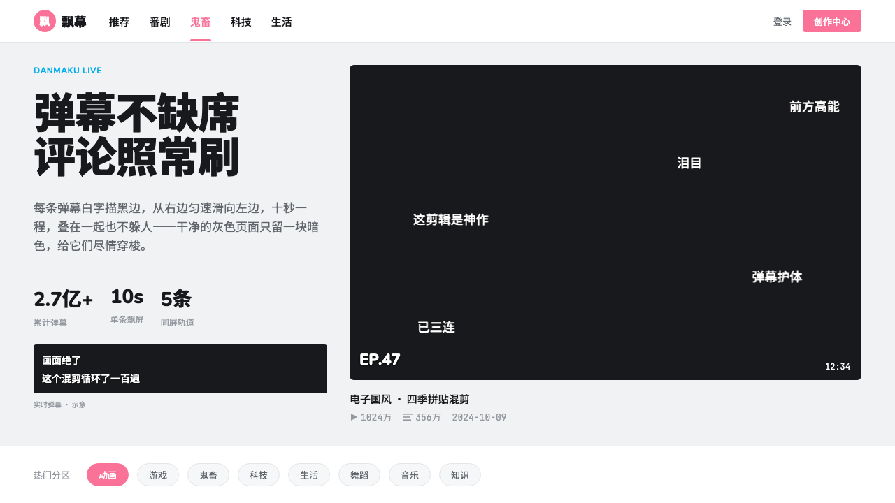 bilibiliCold grey feed, hot pink actions. White outlined danmaku race left across one…
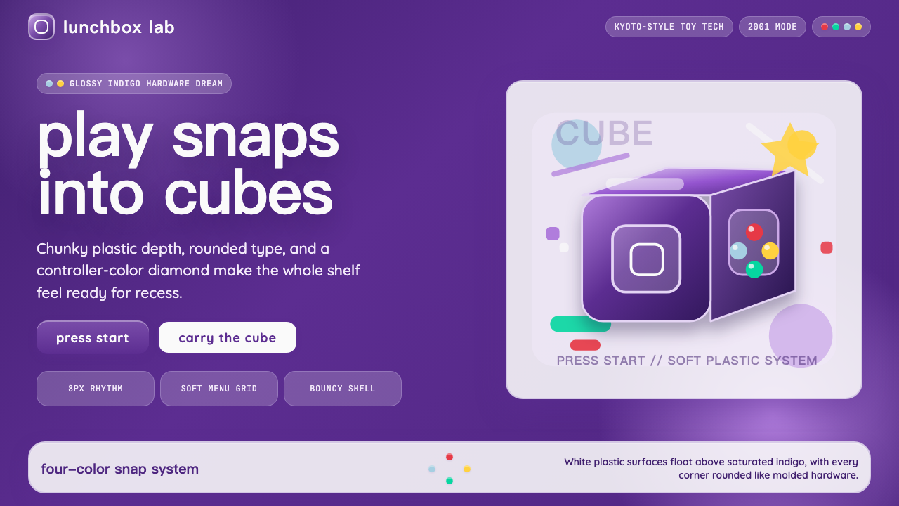 Nintendo GameCube (2001)Toy-tech refuses restraint. Indigo plastic, glossy cubes, and four-color butt…
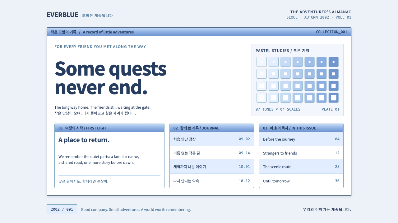 Ragnarok OnlineSmall adventures, lasting warmth. Periwinkle chrome, navy hairlines and dense…
 Steven UniverseSoft, round and a little off register. Lemon logotype with a lavender drop on…
 Baemin TypefacesShop-sign Hangul at billboard scale. Mint on plain white, flat hairline panel…
 Crayon Shin-chanEveryday mischief, crayon-bright. Red bubble type bounces on ink-outlined yel…