What is Crayon Shin-chan?
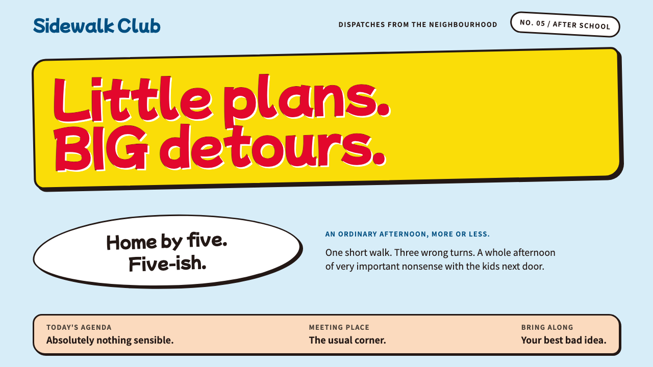
Crayon Shin-chan's look is everyday mischief made visible: a pale sky-blue ground, flat crayon-bright fills, thick wobbling lines and white speech bubbles, as if a five-year-old had drawn every edge on purpose.
Crayon Shin-chan in brief
Crayon Shin-chan is the visual language of Yoshito Usui's gag manga about Shinnosuke Nohara, a five-year-old who runs around Kasukabe in a red shirt and yellow shorts. The manga has been published by Futabasha since 1990, and Shin-Ei Animation has made the TV Asahi anime since 1992. As a design system, it follows the official key visual: a pale sky-blue ground, flat fills in crayon-bright colors, thick lines with a deliberate wobble, and plain white speech bubbles.
The central idea is that the interface should look drawn by a child, but drawn with total confidence. Shapes are simple and slightly lopsided, colors are applied as flat blocks with no shading, and outlines are heavy enough to be read from across a room. Nothing is polished. The charm lives in the gap between the crude surface and the very precise comic timing that sits behind it.
The palette is narrow and cheerful. Red and yellow come directly from the main character's outfit, and they carry headlines, badges and highlights. The pale sky blue of the background evokes a suburban spring day over Kasukabe, giving the whole system a light, open, Sunday-evening mood. White is reserved for speech bubbles and cards, which stand out on the blue as clearly as a caption in a comic panel.

Where does Crayon Shin-chan come from?
The source is a manga that began in 1990 in Futabasha's Weekly Manga Action, written and drawn by Yoshito Usui. It belongs to the long Japanese tradition of family gag manga, in which a small household and its neighbors generate endless episodes out of ordinary routines. Shinnosuke, his parents, his little sister and the family dog Shiro live in Kasukabe, a commuter suburb in Saitama Prefecture, and almost every story begins from something recognizably mundane: shopping, a school run, a trip to the park.
The anime adaptation arrived in April 1992 on TV Asahi, made by Shin-Ei Animation. It became a fixture of Sunday-evening family television, the sort of program that parents and children watch in the same room, sometimes with different kinds of laughter. The voices of Akiko Yajima and Yumiko Kobayashi are named in the source material among the people most closely associated with the show's identity. The series has run for decades and, together with annual theatrical films, built a timeline that viewers recognize across generations.
Visually, the current key visual of roughly 2018 to 2024 is the reference for this system. It keeps the cartoon's flat color and crooked line while cleaning up the layout, which is what allows it to translate to an interface. Backgrounds are pale and open, characters sit on top as bold flat shapes, and text is set in friendly bubbles or on plain bands.
The deeper lineage is suburban everyday comedy. The show finds its jokes not in fantasy but in the small embarrassments of family life and the stubbornness of a child who will not behave. A design language that makes screens look a little careless, a little crayon-drawn and a little cheeky is the natural visual counterpart of that humor, and it is why the system feels more like a living-room television than a corporate brand.
What defines the Crayon Shin-chan look?
Pale sky-blue ground
Pages sit on a light, airy blue that stands for a spring sky over Kasukabe. It is bright enough to feel open and quiet enough to let red and yellow shapes pop. The blue is applied flat, with no gradients or textures, like a sheet of colored paper.
Flat crayon-bright fills
Color is applied in solid blocks with no shading and no gloss. Red, yellow and a few supporting hues behave like crayon pigment on paper: saturated, a little uneven in feeling, and always bounded by a line. Depth comes from overlap, not from light.
Thick, wobbling lines
Outlines are heavy and slightly irregular, as if drawn by hand with a thick marker. Rectangles are not perfectly straight and circles not perfectly round. This looseness is intentional: every edge should look like a child drew it on purpose.
White speech bubbles
Text lives in white bubbles and cards with a bold outline, borrowed from the comic page. They act as the main container for copy, captions and callouts, and a small tail can point toward the character or element that is speaking.
Red and yellow as the character's colors
Red and yellow come straight from the hero's shirt and shorts. They are used for headlines, buttons and highlights, and they work best in generous, simple patches rather than in small decorative flecks.
Rounded, friendly lettering
Headlines use a heavy, rounded, slightly bouncy lettering that sits a little off the baseline, like a title lettered by hand. Body text stays plain and readable, so that the personality lives in the display type and the bubbles rather than in every line of copy.
Comic-panel pacing
Layouts borrow the rhythm of comic panels: blocks of different sizes, a clear reading order, and one joke or one piece of information per frame. White space is generous, and the page breathes between each panel as a comic breathes between beats.

Who shaped Crayon Shin-chan?
The creator of the manga, whose rough, direct drawing style and observational family comedy are the source of the whole look.
Named in the source material as one of the voices most closely associated with the anime's identity.
Also named in the source material among the voices linked to the anime's identity.
The studio that has made the TV Asahi anime since 1992 and translated the manga's rough line into a consistent screen look.
How do you use Crayon Shin-chan today?
In slides, the style is a natural fit for playful presentations: school events, children's content, family-oriented products and light-hearted internal decks. A cover can pair the pale blue ground with a huge red headline and a yellow banner, while content slides use white bubble cards for each point. Data slides can present figures as chunky numerals inside bubbles, with bar charts drawn as flat colored blocks with thick outlines and no gridlines.
On the web, it works for program guides, character cards, schedules and event timelines, especially anything that resembles a television listing or an annual film lineup. A timeline of releases becomes a row of flat blocks with a bold line behind them. Fan sites, entertainment microsites and family-friendly landing pages can lean fully into the look, using bubble-shaped buttons and flat illustrated backgrounds.
For editorial and marketing, it carries well to posters, seasonal campaign banners, packaging mockups and social posts where humor is the point. Because color is flat and outlines are thick, artwork reproduces cleanly across print, screens and low-resolution thumbnails. Headlines can be written as jokes, in the voice of the character, and set inside bubbles that point at an illustration.
Dashboards and dense tools are a poor match: the loose line and large shapes cost space, and the comedic tone can undermine seriousness. If it must be used for something data-heavy, keep the data area plain and let the personality sit in the frame, header and empty states.
The most common mistake is to over-clean it. Straightening every line, adding soft shadows, using gradient fills, or setting everything in a neutral sans-serif turns the system into a generic pastel template with yellow accents. The wobble, the flatness and the thickness are the identity; if the edges look too perfect, the joke has stopped working.

Crayon Shin-chan — FAQ
What is the Crayon Shin-chan design style?
It is a design language based on the official key visual of Yoshito Usui's gag manga and its TV Asahi anime: a pale sky-blue ground, flat crayon-bright color fills, thick slightly wobbly lines and white speech bubbles. The aim is for every edge to look like a child drew it on purpose.
Where does the style come from?
It comes from the manga, serialized from 1990, and the anime that Shin-Ei Animation has made since 1992. The system specifically follows the more recent key visual of roughly 2018 to 2024, which keeps the crude line while organizing the layout for screen use.
Which colors define it?
Red and yellow, taken from the hero's outfit, carry headlines and highlights; a pale sky blue forms the ground; and white is reserved for speech bubbles and cards. All of them are used as flat fills with no gradients or shading.
Is it suitable for serious business interfaces?
Generally no. The thick lines, large flat shapes and comic tone suit entertainment, family and children's contexts. For data-heavy tools, use it sparingly in the frame and empty states, and keep the working area plain.
What is the most common way to ruin it?
Making it too neat. Perfectly straight lines, soft shadows, gradients and neutral type take away the childlike, deliberate roughness that gives the style its humor and turn it into a generic pastel theme.
Related design styles
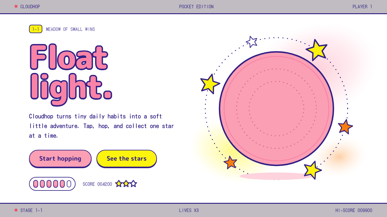 KirbyOne pink puff in a sea of white. Indigo outlines, rounded yellow stars, a gre…
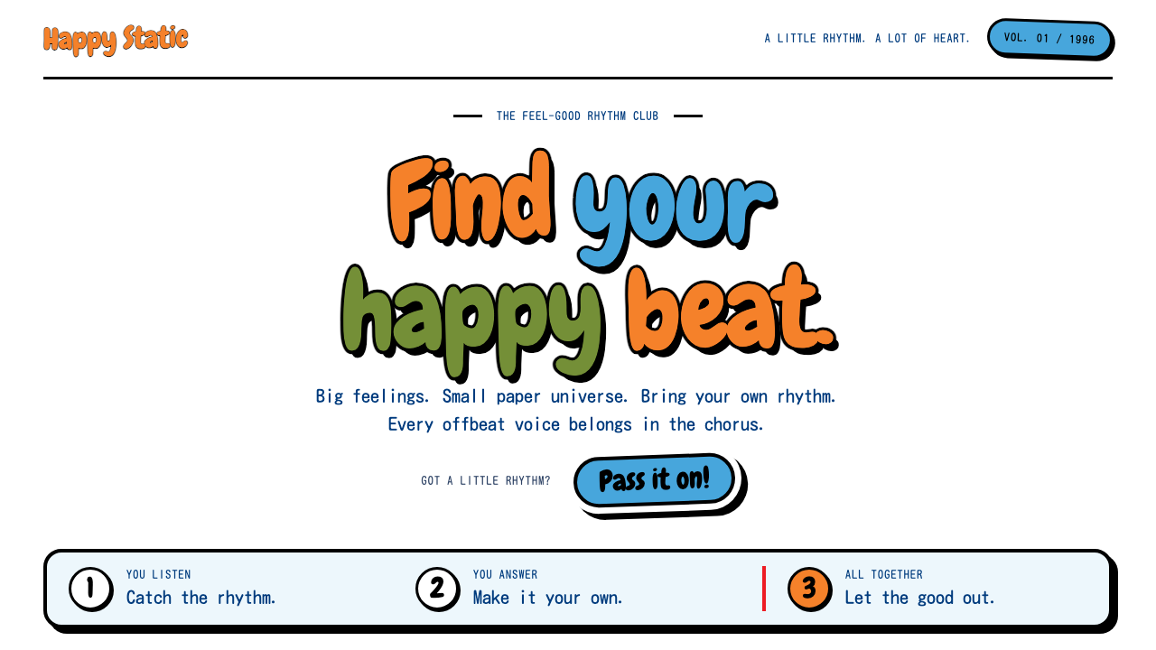 PaRappa the RapperPlayfulness in paper-thin layers. Orange Chewy lettering, black ink and hard…
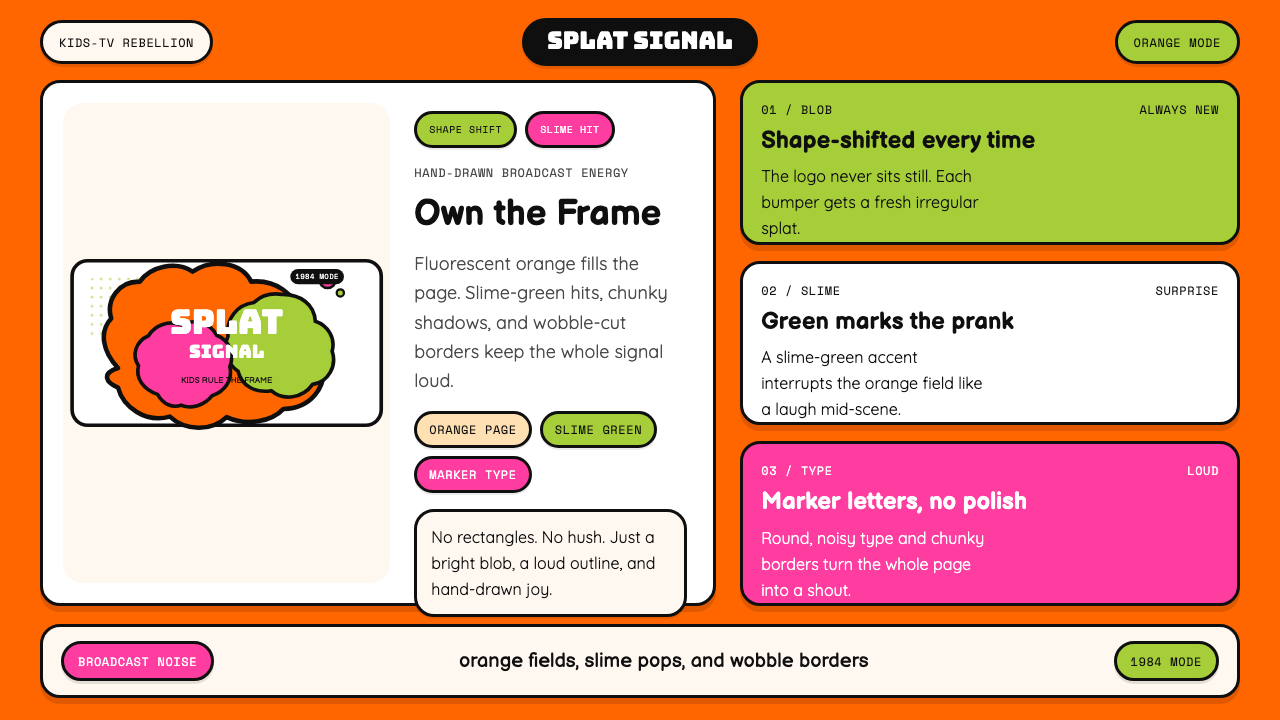 Nickelodeon Orange Splat (1984)Kids own the screen. Orange fields, slime-green pops, and wobble borders do t…
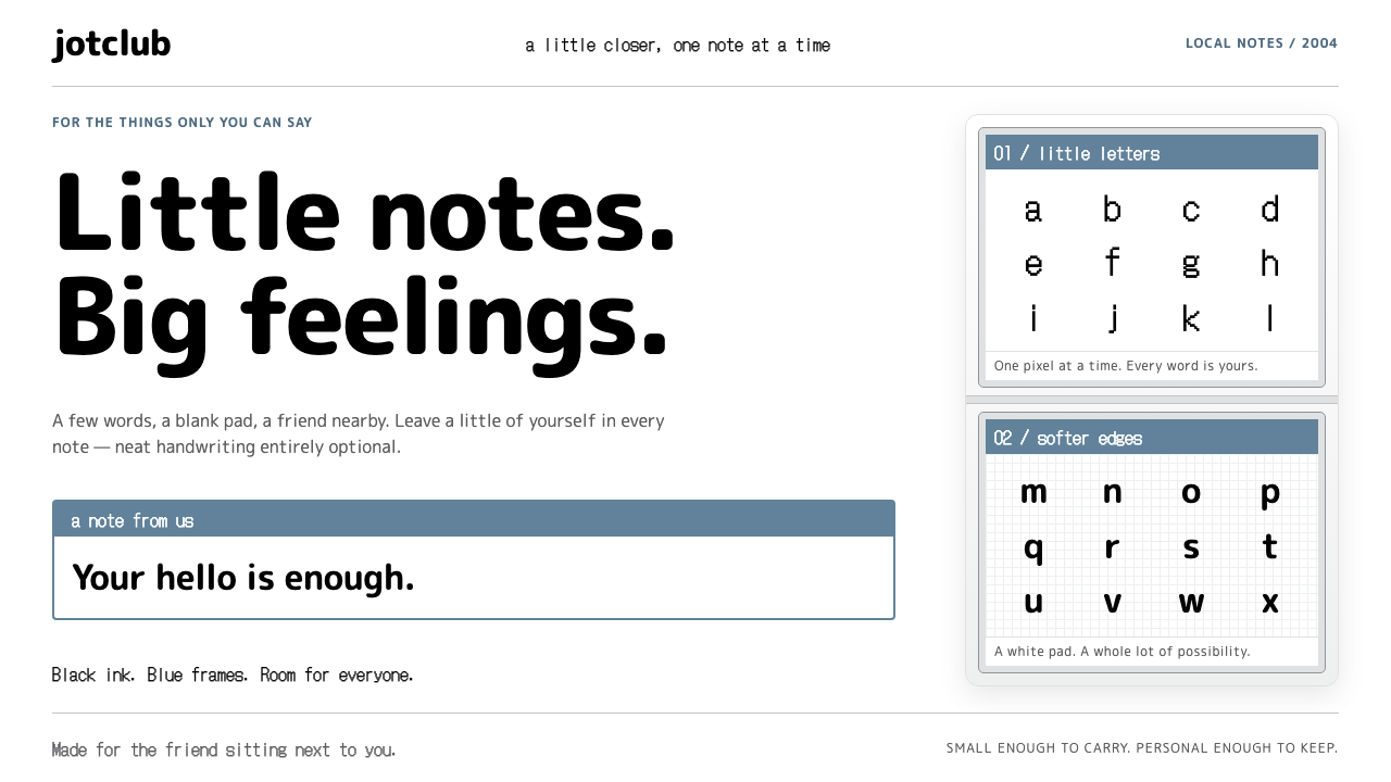 Nintendo DSSmall notes, warm connections. Bitmap ink and rounded type sit in stacked gre…
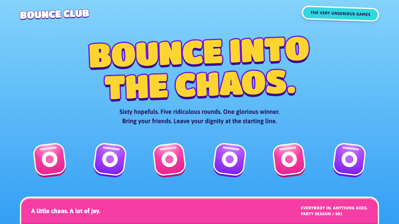 Fall GuysJoy at full volume. Gold Titan One, candy pink and chunky white rims on a sky…
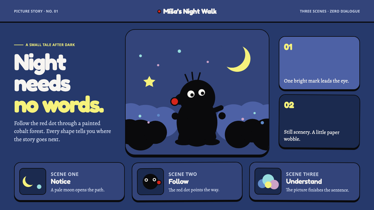 Krtek AnimationWordless wonder. Cobalt gouache stages black paper forms, guided by one red d…