What is Fall Guys?
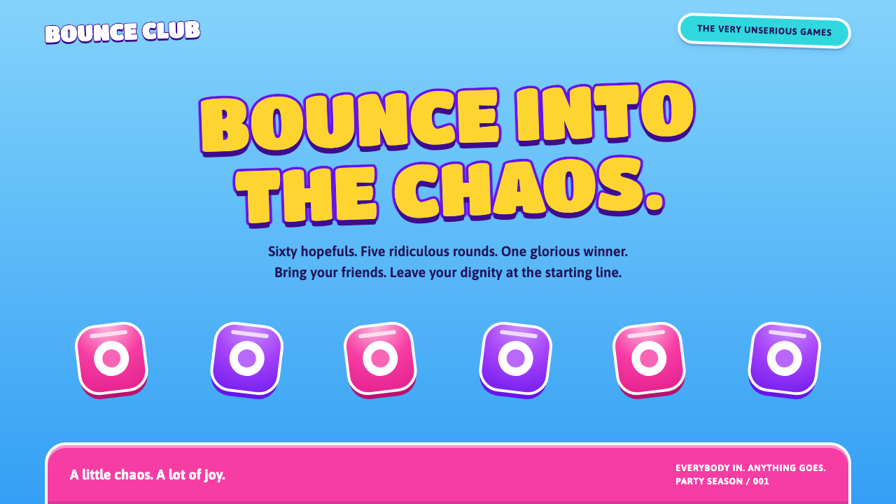
Fall Guys turned a battle royale into a Saturday-night game show, and its interface is pure squeezable joy: sky-blue stages, candy pink, glossy buttons and gold headlines that tilt as if they are about to bounce.
Fall Guys in brief
Fall Guys is the visual style of Mediatonic's 2020 party battle royale, in which sixty jellybean contestants tumble, shove and flop through floating obstacle courses until a single bean wears the crown. As a design style it takes the opposite approach to the cold, tactical look usually associated with the genre. Its interface borrows from television game shows and from squeezy bath toys rather than from shooters.
The look is built on a pale sky-blue ground, pink for progress and highlights, cyan and purple gradient buttons wrapped in thick white rims, and headlines in a fat display face set in gold with heavy dark outlines. Everything is rounded, glossy and a little off-axis. Shapes are plump, corners are generous, and elements are tilted by a few degrees so that nothing on the page looks rigid or serious.
The goal of the style is immediate delight. It is designed to make someone smile before they have read a word, and to make every tap feel like it will bounce back. It sits in the family of cheerful, high-saturation, toy-like interface design, and it works because it commits fully: the colors are loud, the outlines are thick and the whole page is built to feel springy.

Where does Fall Guys come from?
Fall Guys launched on 4 August 2020 on PlayStation 4 and PC, developed by Mediatonic in London. It arrived in the middle of a year when many people were stuck at home and looking for something light, and it became an overnight phenomenon because it offered competition without menace. The game took the elimination structure of the battle royale format and replaced its grim tone with slapstick, so that losing was funny rather than frustrating.
That tonal choice shaped the whole visual identity. The reference points were not other video games but television: obstacle-course game shows where contestants fall into foam and mud, bright studio sets, announcers with huge enthusiasm and trophies made to look overblown. The interface borrows the same logic. Menus feel like a game-show set, banners feel like the show's graphics package, and the bean avatars themselves look like inflatable toys that happen to be competing.
Physics-driven party games supplied the other half of the heritage. In that tradition the character's body is a comedic object, wobbling, collapsing and bouncing, and the interface is expected to echo this with the same softness. Joe Walsh and Jeff Tanton are named among the people behind the game, and the studio, Mediatonic, later became part of Epic Games, while the game itself moved to a free-to-play model in 2022 with a visual refresh that pushed the brightness and polish even further.
Seen historically, the style is a modern descendant of the cheerful, candy-colored interface tradition, updated with glossy highlights and thick outlines that read well on any screen. It also reflects a broader shift in games toward inclusive, low-threat design, where color and shape are used to say that everyone is welcome to play and nobody should take it too seriously.
What defines the Fall Guys look?
Sky-blue stage
The ground is a pale, open sky-blue, evoking the cloudy arena above which the courses float. It keeps the page airy and bright and gives the saturated pinks, golds and purples a clean stage to bounce against. The blue stays light rather than deep, so the whole composition feels daytime, optimistic and uncluttered.
Candy pink highlights
Pink is the voice of progress and emphasis, used for progress bars, active states and important highlights. It is a sugary, slightly hot candy pink that sits well against sky blue and gold. Because it is reserved for the things that matter, it quietly directs the eye without needing arrows or heavy labels.
Thick white rims
Buttons and panels are wrapped in generous white rims that look like the lip of a plastic toy. Inside, cyan and purple gradients give them a glossy, squeezable body. The rim separates each element cleanly from the busy background and makes every control read as a large, friendly target, which also suits fast, casual tapping.
Gold outlined headlines
Headlines use a fat, rounded display face, filled with gold and surrounded by heavy dark outlines, and are sometimes tilted a few degrees. The effect is the title card of a game show: huge, shiny and impossible to ignore. The outline ensures legibility even over busy imagery, and the tilt adds the playful instability the style depends on.
Rounded, glossy shapes
Every shape is plump and rounded, with soft highlights suggesting a smooth plastic or jelly surface. There are almost no sharp corners and no hairlines. The surfaces look touchable. This gloss is deliberate rather than decorative: it tells users that things are soft, safe and ready to respond.
Off-axis energy
Nothing sits perfectly level. Titles, badges and cards are tilted slightly, and layouts allow elements to overlap and bounce into one another. This controlled looseness replaces the rigid grid of serious interfaces with something that feels alive, as if the page had just been dropped and was still settling.

Who shaped Fall Guys?
Named in the source material as one of the key figures behind Fall Guys at Mediatonic. His association with the game ties the style to its core idea: a competitive format deliberately played for laughs, in which the character design and tone were chosen to keep the experience friendly.
Also named among the key figures behind the game. His name is attached to the look and feel of the project, whose bright, rounded, toy-like presentation is the direct source of the interface style described here.
The London studio that developed Fall Guys and launched it on 4 August 2020. The studio's decision to pair a battle-royale elimination format with game-show slapstick is the creative root of the style, and its later free-to-play refresh from 2022 pushed the visual polish further.
The company that later brought Mediatonic into its group and supported the game's move to a free-to-play model. Its involvement is part of why the bright, accessible look became so widely seen, reaching audiences well beyond traditional battle-royale players.
How do you use Fall Guys today?
For slide decks, the style suits playful audiences and informal occasions: team events, community updates, game and entertainment pitches, education for younger audiences and any presentation where the goal is to lower the temperature in the room. A cover with a tilted gold headline on a sky-blue field sets the mood immediately. Content slides can use pink for progress and highlights, and thick-rimmed cards to hold each point, while data slides benefit from rounded bars and bold labels.
In web interfaces, the style gives call-to-action buttons enormous charm. Thick white rims and glossy gradients make buttons feel like physical objects, and progress indicators in pink turn mundane tasks into small wins. It suits onboarding flows, rewards pages, leaderboards, casual game lobbies, kids' learning apps and quiz products. Pricing pages can use plump cards with a tilted badge for the favored option, as long as text on every card stays clear and readable.
For marketing and editorial work, it excels at launches, events, festival promotions, social campaigns and merchandise, anything that wants to be seen and smiled at in a crowded feed. Poster headlines in outlined gold type are legible from a distance and carry personality, and the rounded shapes translate naturally into stickers, badges and animated reactions. It is a style that rewards bold, short copy rather than long paragraphs.
The style also needs structural discipline underneath the fun. Keep body text on clean, high-contrast panels instead of on the busy background, and use the thick outlines to guarantee legibility. A small number of strong elements per screen keeps the exuberance readable, and animation, if any, should feel springy and quick rather than slow or elaborate.
The most common mistake is to use the style for a product that must feel serious. Medical, legal, financial and security contexts get undermined by tilted gold headlines and jelly buttons. Another mistake is to dilute the style halfway: removing the outlines and rims while keeping the colors makes it look unfinished, and adding too many different effects on one screen turns joy into noise. Commit to rounded, glossy and bouncy, or choose a different style.

Fall Guys — FAQ
What is the Fall Guys design style?
It is a playful interface style drawn from Mediatonic's 2020 party battle royale. Its signature features are a pale sky-blue ground, candy pink highlights, glossy cyan and purple gradient buttons with thick white rims, and gold display headlines with heavy outlines, all rounded and slightly tilted so that the whole page feels ready to bounce.
Where does the style come from?
It comes from Fall Guys, which launched on 4 August 2020 on PS4 and PC from the London studio Mediatonic. The look draws on television game-show slapstick, the elimination structure of battle royale, and physics-driven party games, with a free-to-play visual refresh arriving from 2022.
Can a serious product use this style?
Rarely. The style is designed to feel soft, funny and low-stakes, so it clashes with products that need to project authority or caution, such as banking, legal or medical tools. It works better for casual games, rewards, education for younger users, events and consumer apps where delight is part of the value.
How do I keep it readable?
Lean on the thick outlines for headlines, place body text on clean, high-contrast panels, and limit each screen to a few strong elements. The rims, rounded shapes and tilt are there for personality, so keep the actual information blocks simple, large and well spaced.
What are the most important elements to get right?
Four things carry the style: the light sky-blue stage, the candy pink for progress, the thick white rims around glossy buttons, and the gold outlined headlines set slightly off-axis. If those four are in place and everything else stays rounded and plump, the page will read as Fall Guys immediately.
Related design styles
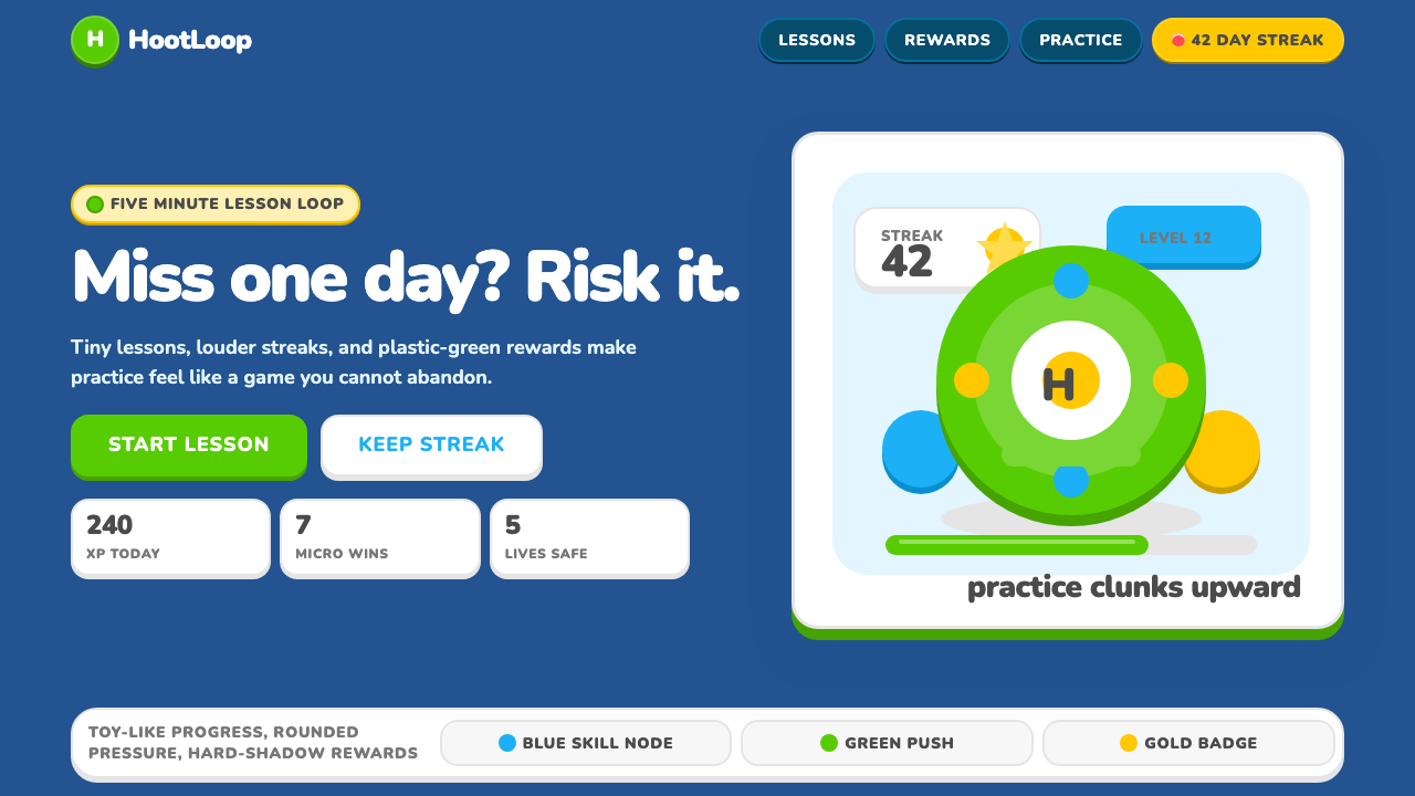 Duolingo 2024Adorable pressure wins. Feather Green, Nunito heft, rounded push-shadows gami…
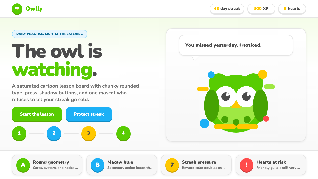 Duolingo Green Owl MascotFriendly guilt goes loud. Saturated green, Nunito heft, and press-shadow butt…
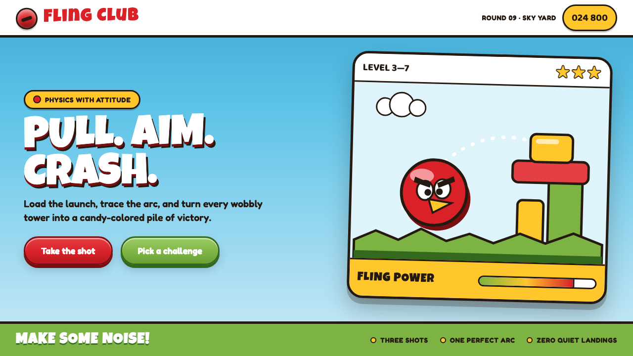 Angry Birds (2009)Adorable aggression takes flight. Candy primaries, chunky outlines, and a dot…
 Barbie DreamhousePink is the whole world. Hot magenta ground, Pacifico script, scallops and gl…
 Discord 2024Blurple cozy. Charcoal grounds, illustrated characters — every surface says '…
 Naver Webtoon (2024)Built for late-night scroll. Charcoal grids, Noto Sans KR, and green episode…