What is PaRappa the Rapper?
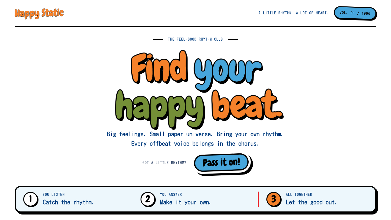
PaRappa the Rapper made the whole world out of paper: heavy black outlines, flat fills and sticker shadows with a beat running through them.
PaRappa the Rapper in brief
PaRappa the Rapper is a 1996 PlayStation rhythm game whose look has become a style in its own right. Its hero is a square-headed dog in an orange beanie, drawn as a paper cutout and placed in front of a bright three-dimensional set. Every character keeps the same sticker-like construction: a heavy black outline, a flat fill of colour and a fat white border around the outside, as though cut from a sheet of adhesive paper.
As a design system, it places that sticker sheet on a white page. Orange drives action, sky blue carries speech bubbles, navy takes care of reading text and red is saved for the beat marker and for alerts. Cards and buttons look freshly peeled from a sticker book, and shadows are hard, offset and unblurred, so every element looks like a layer of paper lying on top of another.
In a design library, PaRappa the Rapper is the style for humour, rhythm and lightness. It is flat, graphic and bold, but it is never aggressive, because every outline is rounded and every colour is friendly. It tells users that the product is easy, silly in a good way and happy to be a little ridiculous.

Where does PaRappa the Rapper come from?
The game was released in Japan on PlayStation in 1996 and reached Western audiences in 1997. It was produced by Masaya Matsuura and his studio NanaOn-Sha in Tokyo, with character art by the American illustrator Rodney Greenblat from New York. That pairing of a Japanese music creator and an American picture-book artist gave the game its unusual blend of musical invention and cartoon charm.
The paper-thin look has a playful origin. PaRappa's name plays on a Japanese word for something as thin as paper, and so every character was drawn as a flat, paper-like figure. The idea was carried through to the way they appear on screen: flat characters moving through a fully three-dimensional environment, a contrast that made the cast feel like cutouts in a diorama. Players followed a teacher's rapped lines and answered them in rhythm, so the visuals needed to be clear, bold and instantly legible.
Rodney Greenblat's artwork brought with it an established tradition. His picture-book and CD-ROM illustrations used chunky outlines, bright colour and a cheerful, slightly odd cast of characters, and PaRappa translated that language into a game. Around it sat other currents: early rhythm-game design, in which interface elements such as beat markers and prompts had to be read at a glance, and 1990s hip-hop treated as playful pop rather than as something serious or threatening.
As a style, it belongs to the mid-1990s moment when early 3D consoles encouraged designers to mix flat illustration with polygonal worlds. The sticker aesthetic has proved durable because it works at any scale, from a tiny icon to a large poster, and because its rules are so simple that anyone can follow them: outline, fill, border, hard shadow.
What defines the PaRappa the Rapper look?
Heavy black outlines
Every shape is enclosed by a thick, confident black line of consistent weight. The outline unifies disparate elements into one system and keeps everything legible against bright colour.
Flat colour fills
Colour is applied in solid areas with no gradients, textures or highlights. Flatness gives the look its paper-cutout quality and makes the colours read as pure and cheerful.
Fat white sticker border
A thick white margin wraps around characters and cards, separating them from whatever lies behind. It is the detail that makes an element feel like a die-cut sticker rather than a drawing.
Hard offset shadows
Shadows are solid, shifted copies of the shape with no blur. They give the impression of paper layers stacked slightly above the page, adding depth without softness.
Orange, sky blue, navy and red roles
Beanie orange marks primary actions, sky blue is for speech bubbles, navy handles body text and red is kept for the beat cursor and warnings. The roles are clear, so a bright palette never becomes confusing.
Rounded bubbly lettering
Headlines use a chewy, rounded display face with thick strokes, often in orange with a black outline. The letters look inflated and bouncy, as though they were part of the rhythm.

Who shaped PaRappa the Rapper?
Music creator and head of the Tokyo studio NanaOn-Sha, who produced the game and shaped its rhythm-driven design.
New York illustrator whose picture-book and CD-ROM cartoons supplied the paper-thin character look.
The Tokyo studio that developed the game and carried the idea of a musical, playful interface through to release.
How do you use PaRappa the Rapper today?
On slides, PaRappa the Rapper is excellent for kids' education, music events, team-building sessions and any deck that should make the audience smile. A cover can place a big orange bubble title on a white page, with a sky-blue speech bubble carrying the subtitle. Content slides can use sticker cards with thick white borders and hard shadows, one idea per card. For data, use chunky bars with black outlines in orange and sky blue, and mark the key number with a red beat cursor.
In web interfaces, the style suits children's products, music and rhythm apps, event pages, onboarding flows and brands that want to show some humour. Primary buttons take the orange fill, black outline and hard shadow, and press down by moving into their own shadow on click. Chat or help text appears in sky-blue speech bubbles with navy copy. Pricing cards can be separate stickers, with the recommended plan given a red beat marker instead of an aggressive badge.
In editorial and marketing work, the aesthetic is a strong fit for posters, packaging, playful campaigns and festival promotion. Cutout-style characters or objects, stacked with offset shadows on a white field, instantly signal fun. Copy should be short, rhythmic and conversational, with lines that almost sound like they could be rapped.
The most common mistake is blurring it. Soft shadows, gradients and photographic textures destroy the paper-layer illusion at once. Another is using the colours without the black outline, which leaves flat shapes floating without structure, or using red everywhere so the beat marker loses its meaning. A third is making it too clean: the style depends on slight wobble, chunky strokes and a willingness to look silly, so keep the personality high.

PaRappa the Rapper — FAQ
What is the PaRappa the Rapper style?
It is a sticker-like, paper-cutout look from the 1996 PlayStation rhythm game: heavy black outlines, flat colour fills, a thick white border and hard offset shadows, set on a white page.
Who made the original game and its art?
The game was produced by Masaya Matsuura and the Tokyo studio NanaOn-Sha, while the character art came from the American illustrator Rodney Greenblat. It was released in Japan in 1996 and in the West in 1997.
Why are the characters so flat?
The hero's name plays on a Japanese word for paper-thin, so the cast was drawn as flat paper figures moving through a 3D world. The design system keeps that idea by using flat fills and hard layered shadows.
What projects suit this style?
Children's products, music and rhythm apps, event pages, playful campaigns, packaging and brands that want humour. It is a poor match for formal, luxurious or serious data-heavy work.
What is the biggest mistake when using it?
Softening it with blur, gradients or photographic texture. The paper-layer illusion depends on hard outlines, flat colour and unblurred shadows, so keep every edge decisive.
Related design styles
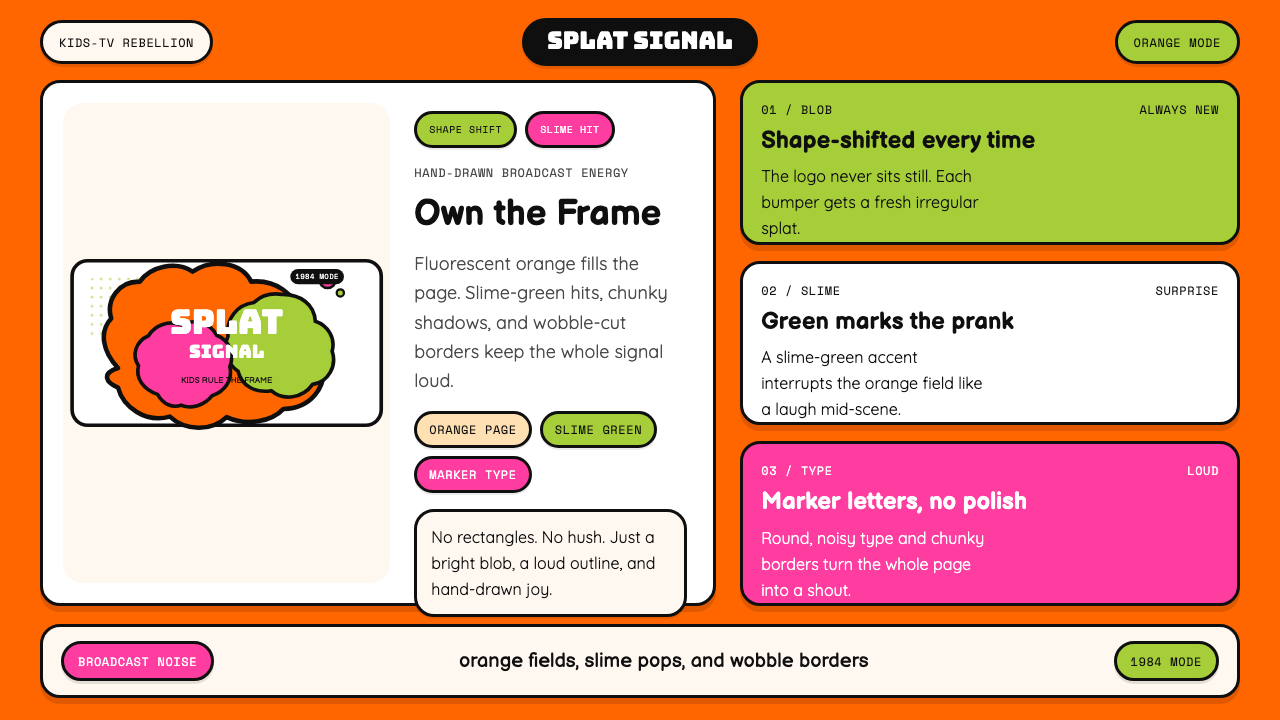 Nickelodeon Orange Splat (1984)Kids own the screen. Orange fields, slime-green pops, and wobble borders do t…
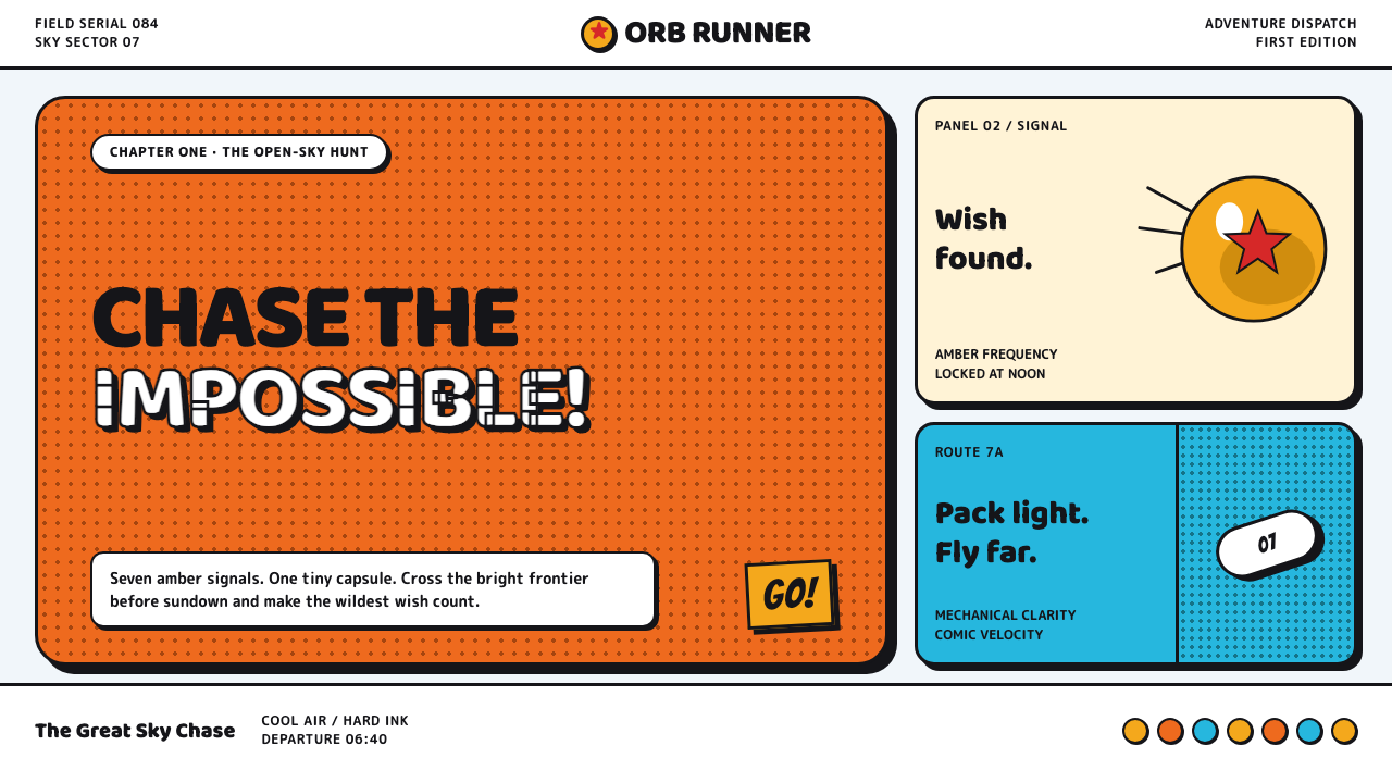 Dragon Ball (1984)Adventure lands with comic force. Gi-orange panels, amber spheres and crisp h…
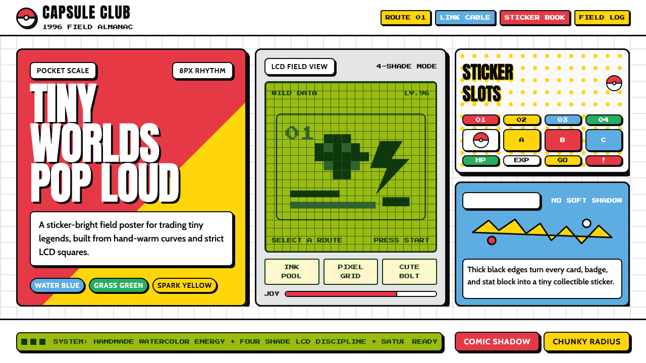 Pokémon Game BoyKawaii meets cartridge logic. Capsule red, LCD green, Anton heft, and 8px gri…
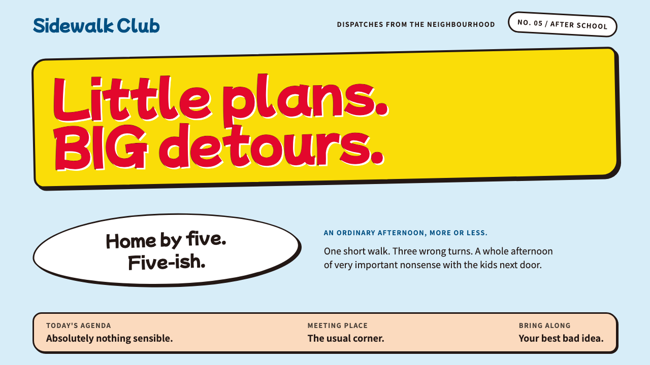 Crayon Shin-chanEveryday mischief, crayon-bright. Red bubble type bounces on ink-outlined yel…
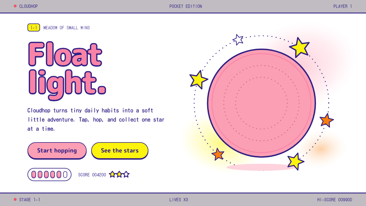 KirbyOne pink puff in a sea of white. Indigo outlines, rounded yellow stars, a gre…
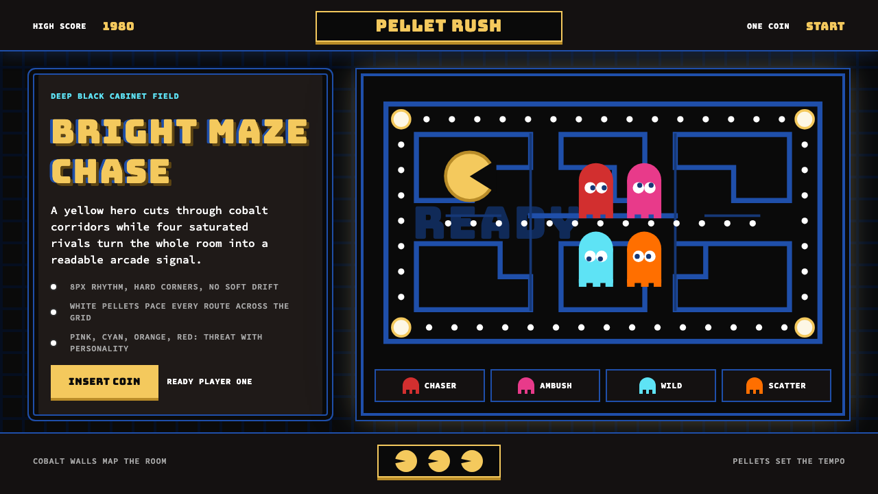 Pac-Man (Namco 1980)Arcade joy burns bright. Yellow disc, cobalt maze, and four ghost hues snap o…