What is Neko Atsume?
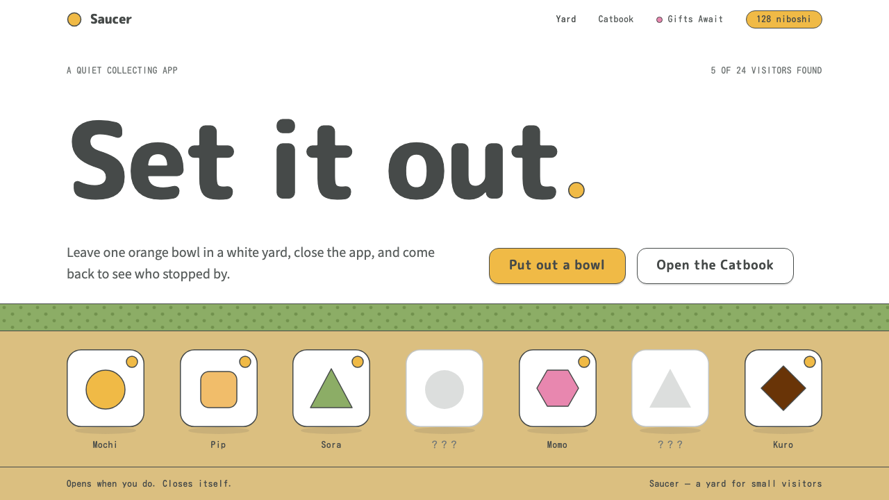
Neko Atsume as a design style is a quiet white yard with one orange bowl in it: thin charcoal outlines, rounded letters, and a surface calm enough that every visitor feels like an event.
Neko Atsume in brief
The Neko Atsume style is drawn from Hit-Point's 2014 mobile game, in which you leave food and toys out in a small yard and then put the phone away and wait. Cats come and go on their own schedule. You do not control them, you only set the scene, and you check back later to see who visited. The design system borrows this whole manner of being: slow, quiet, unhurried and a little bit funny.
Visually, it is built from a handful of very simple ingredients. The sky is a flat white. The ground is a tan dirt floor, and a pale green hedge runs along the back. Every object, from the food bowl to the cat to the toys, is outlined in a soft charcoal line that is thin and slightly uneven, like a pen drawing made without a ruler. Inside the outlines, colour is flat and light.
The one strong hue is a tabby orange. It is reserved for fills only: buttons, cats, golden fish treats. It is never used for text, which stays in a dark charcoal. Combined with rounded letters, generous empty space and almost no interface chrome, this produces a surface so calm that the few things on the page feel like visitors rather than features.

Where does Neko Atsume come from?
Neko Atsume was released by the Japanese developer Hit-Point Co., Ltd. in October 2014 in Japan, with an English version following in October 2015. The source credits the Hit-Point development team as a whole rather than naming individuals, which suits the game: the voice of the work is a studio voice, quiet and collective, not a single author's signature.
The game belongs to the family of idle and collection mobile games, in which the player does very little and the pleasure comes from returning to find that something has happened. This shapes the interface. A game that is meant to be glanced at for a few seconds should not shout. It needs a clear object to look at, a calm place to put it, and a small reward when you return. The design system turns that logic into a general rule: keep the surface empty so that the few things in it can be noticed.
A second root is the Japanese neko-cafe boom, the wave of cafes in which visitors sit among resident cats. Neko Atsume carries the same pleasure into a phone: not the activity of playing with cats, but the quiet of watching them arrive and settle. The yard is the cafe, and the player is the host who prepares a place and then steps back.
The third root is visual: the thin-line cartoon style of Japanese picture books and stationery. This is the world of notebook covers, letter paper and small illustrated goods, where a pen line is allowed to wobble and a character is drawn with few strokes. The result is a look that is friendly without being loud and handmade without being rough, which is why it transfers so readily to quiet, small and personal interfaces.
What defines the Neko Atsume look?
Flat white sky
The upper part of the page is simply white. There is no gradient, no illustration and no texture. This large quiet field is the first thing you notice, and it gives the style its sense of air. It also means content has a lot of room around it, so even a single small object can anchor the whole screen.
Earthy ground and hedge
A tan dirt floor and a pale green hedge are the only landscape elements. They are muted and low in contrast, serving as a gentle stage rather than a decoration. In interface terms, they work as a quiet footer or a background band that grounds the layout without competing with its subject.
Uneven charcoal outlines
Every object is traced with a thin, soft charcoal line that wobbles slightly, as if drawn freehand. The outline does the work that shadow and shading would do in other styles: it separates things and gives them weight. Keeping all outlines the same thickness and tone is what holds the style together.
Orange only as fill
Tabby orange appears in buttons, cats and golden fish, always as a solid fill inside an outline. It is never used for text or for thin lines. This single rule keeps the accent colour feeling like an object in the scene, something you could pick up, rather than a decorative tint.
Rounded type
Letters are rounded and friendly, with soft terminals and open shapes. They sit comfortably next to the thin outlines and never feel heavy. Type is used sparingly, in short labels and small counters, so the page is more picture than text.
Almost no chrome
Navigation, panels and toolbars are kept to a minimum. Controls appear as small outlined objects and sit in the scene instead of in a separate bar. The effect is that the interface seems to dissolve into the picture, and a few things on a mostly empty surface become the entire composition.

Who shaped Neko Atsume?
The source names the Hit-Point development team, not individuals, as the key figure behind Neko Atsume. They released the game in Japan in October 2014 and in English in October 2015. Their design choices, a nearly empty yard, a single accent colour and thin outlines, are the entire basis of this style.
The source lists the Japanese neko-cafe boom as one of the movements behind the style. It is a cultural setting rather than a person: places where people go to sit quietly near cats. The design system's calm pacing and its idea of the user as a host who sets a scene both come from that setting.
The genre of idle and collection mobile games is the other movement the source cites. It establishes the interaction pattern: little input, long waits and small discoveries. For designers, it supplies the justification for restraint, because an interface that rewards a glance should never demand more.
The source points to the thin-line cartoon style of Japanese picture books and stationery as the visual lineage. This tradition of simple outlined characters on plain grounds is where the uneven charcoal line, the flat fills and the friendly roundness come from.
How do you use Neko Atsume today?
In slides, the Neko Atsume style is best for gentle, personal or explanatory decks: a short talk, a workshop, a children's lesson, a product update with a human tone. Use the white sky as the slide background, keep one object per slide, and let the orange appear only on a single focal item. A cover slide can be nothing but a title, a small outlined illustration and the dirt floor along the bottom.
On the web, it suits light tools and small, personal products: habit trackers, collection catalogues, reading logs, to-do lists, notebook apps and portfolio sites with the feeling of a stationery shop. Buttons are tabby-orange fills with charcoal outlines, cards are outlined shapes on white, and empty states are the best place for the yard motif. The surface should always have more room than content.
For data slides and dashboards, keep it simple. Use outlined bars or dots with flat fills, one fill colour for the thing being highlighted and a pale neutral for the rest. Labels stay charcoal and small. A chart in this style should look like a hand-drawn sketch in a notebook, so avoid heavy grids and dense legends.
In editorial and marketing work, it conveys warmth and quiet charm without noise. It is good for gentle newsletters, community pages, pet or lifestyle content, and brand moments that want to feel like a small gift. Writing should be short and relaxed to match: one clear sentence is better than a paragraph.
The most common mistake is to add too much. The whole point is the empty space, so crowding the page with cards, banners and icons removes the calm and leaves a generic cute theme. The second mistake is to use orange for text or thin lines, which breaks the rule that it belongs inside shapes. The third is to switch to perfectly straight vector outlines; the slight unevenness of the line is what makes the style feel handmade.

Neko Atsume — FAQ
What is the Neko Atsume design style?
It is a calm, minimal style taken from Hit-Point's 2014 mobile game. A flat white sky, a tan ground and a pale hedge form the scene. Every object is outlined with a thin, slightly uneven charcoal line, tabby orange is used only for fills, type is rounded and the interface chrome is almost invisible.
Why is orange never used for text?
The orange is meant to feel like an object in the scene: a button, a cat or a fish treat. Text in orange would turn it into a tint, and thin orange text is also harder to read on a white sky. Text stays in charcoal, which keeps the page quiet and legible.
Is this style only suitable for games?
No. The game is its source, but the principles are general: lots of empty space, one accent colour, soft outlines and a small number of well-placed objects. That makes it a good fit for lightweight tools, collection and catalogue sites, personal portfolios and any product that wants a stationery-like calm.
Which influences shaped it?
The source names three: idle and collection mobile games, the Japanese neko-cafe boom, and the thin-line cartoon style of Japanese picture books and stationery. The first sets the slow pace, the second the feeling of quietly watching cats, and the third the look of the outlines.
How do I keep it from looking generic?
Protect the empty space and the handmade line. Use fewer elements than feels necessary, keep the outline thickness consistent, and let the line wobble slightly. Reserve orange for one or two focal objects per screen. The charm comes from restraint, so every addition should earn its place.
Related design styles
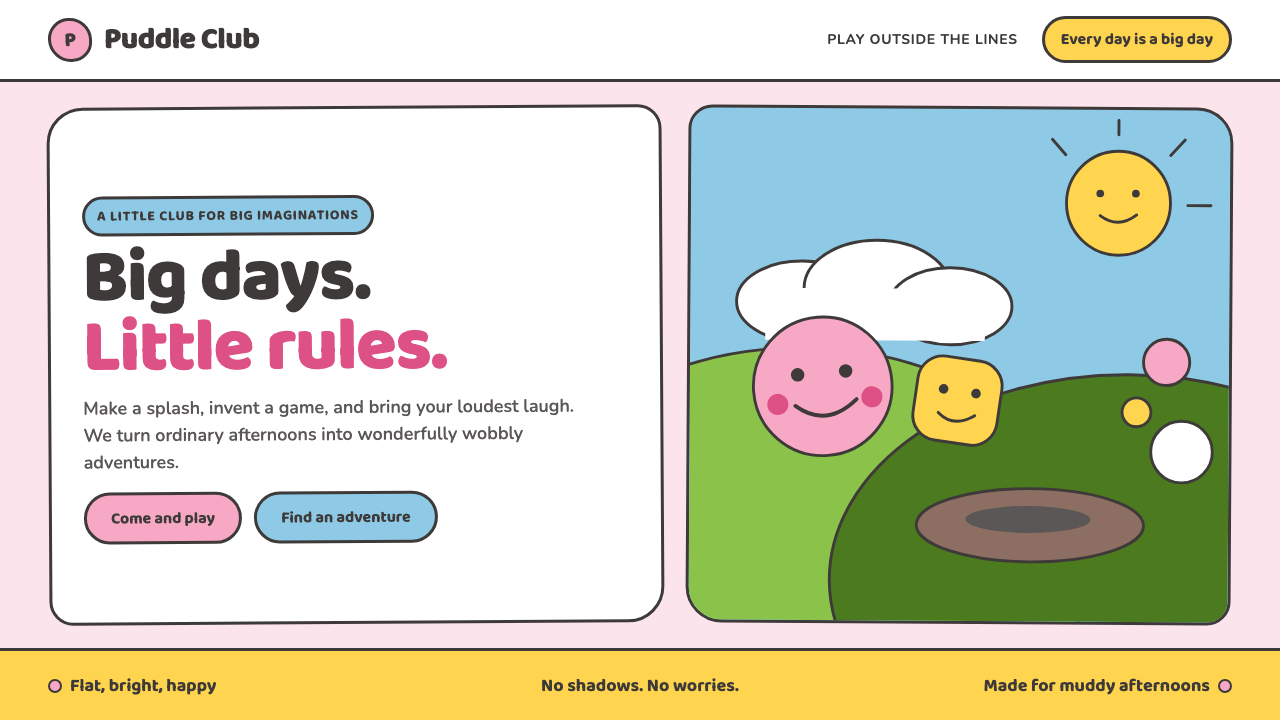 Peppa Pig (2004)Cheer without irony. Bubblegum pink, chubby type and thick outlines keep ever…
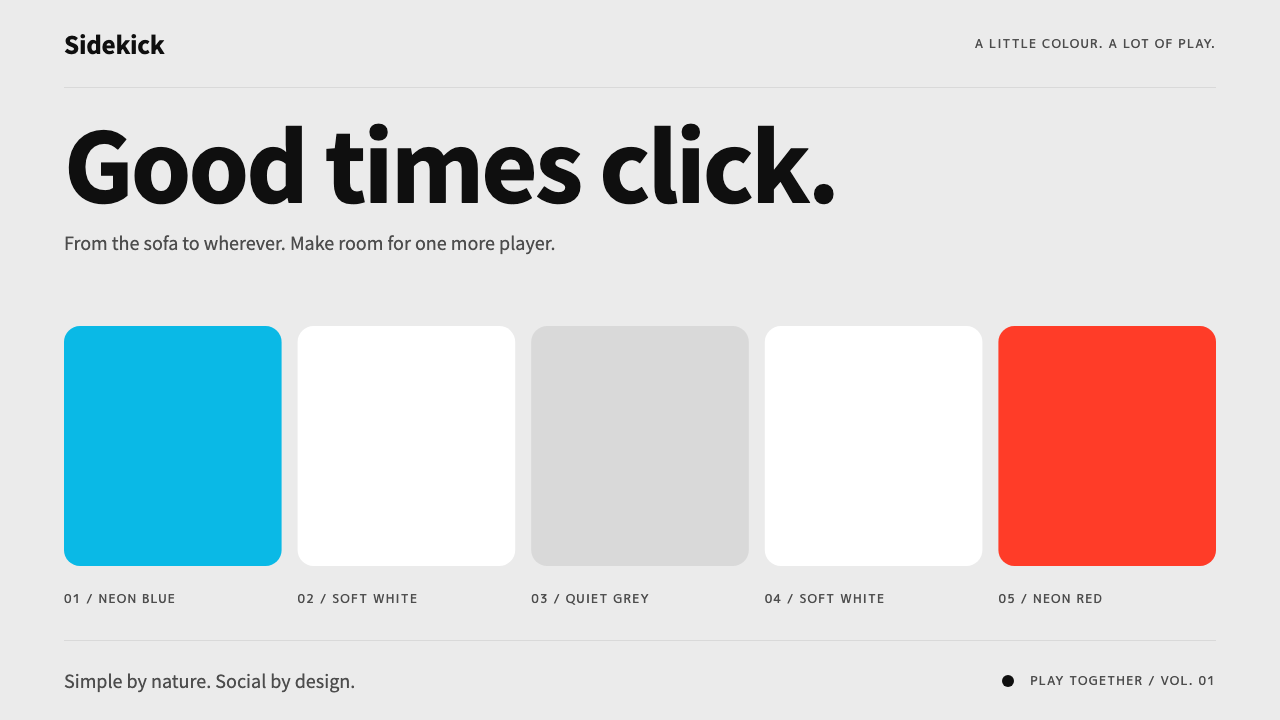 Nintendo SwitchQuiet meets playful. Neon blue and red bookend rounded tiles on a light-grey…
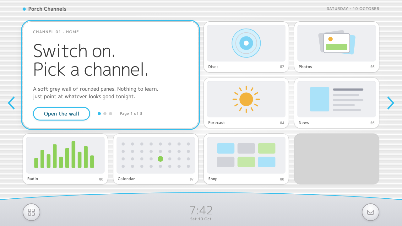 Wii MenuSwitch-on calm. White TV panes on a grey scanline wall, one thin blue line on…
 Doge Meme (2013)Anti-design becomes pure joy. Candy Comic Neue captions drift at lazy angles…
 K-Beauty CleanCalm arrives dewy. Rose, sage, and peach pastels float through airy rounded f…
 Kakao FriendsOne yellow, one gesture per cell. A white sticker sheet where speech bubbles…