What is Cookie Run?
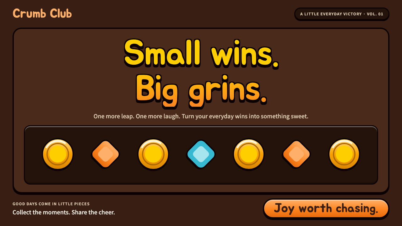
Cookie Run turns a phone-sized endless runner into a design language: cocoa-brown ground, thick chocolate outlines, candy-gloss highlights and pill buttons in hot orange, all rounded, bouncy and slightly too big.
Cookie Run in brief
Cookie Run is the visual language of the casual mobile game that the Seoul studio Devsisters released on the KakaoTalk platform in April 2013. In the game, GingerBrave and friends escape from the Witch's oven and sprint through stage after stage of jellies and coins, jumping and sliding while friends compete on a weekly leaderboard. As a design system, it borrows the interface of that game wholesale: a dark, warm chocolate ground, thick near-black outlines around every frame, glossy candy highlights and a cheerful, slightly over-inflated sense of scale.
What makes it distinctive is that everything looks edible and squeezable. Buttons are fat pills in a saturated orange that reads as the main action on any screen. Coin counters glow amber, score numerals are bright yellow, and panels sit inside rounded frames whose dark borders make each element feel like a sticker or a piece of confectionery on a dark tray. Typography is chubby and rounded, built from a soft Korean display face whose strokes look as if they had been inflated.
The dark, brown-based ground is a deliberate choice for a game whose subject is sweet. Instead of pastel pinks and creams, which would dissolve into a bright page, the system lets saturated candy colors glow against deep chocolate. The result feels lively without being noisy: it is loud in the way a candy shop is loud, with a clear hierarchy of what to press and what to collect.

Where does Cookie Run come from?
The story begins with Devsisters, a studio based in Seoul, and its earlier mobile game OvenBreak from 2009. That title already contained the core idea: a gingerbread man fleeing an oven. The lineage runs from OvenBreak in 2009, through Cookie Run for Kakao in April 2013, to Cookie Run: OvenBreak in 2016, which carried the franchise onto global app stores. The source material ties the creation of the franchise to figures such as Lee Ji-hoon and Kim Jong-heun, who are associated with Devsisters.
The 2013 release was inseparable from KakaoTalk, the dominant messaging app in South Korea. Games on its platform were social by construction: you were invited by friends, sent hearts to them, and saw your score ranked against theirs. That social loop shaped the interface. Score screens, leaderboards and gift buttons had to be readable in a few seconds on a crowded subway ride, and every component had to feel friendly enough to press repeatedly. The big pills, bold numbers and high-contrast outlines are what that environment demanded.
Visually the game belongs to a wider tradition of Korean cute character design, the world of round-headed mascots, sticker packs and chat emoticons that were part of everyday life on Korean phones. Characters have simple shapes, few lines and expressive faces, and the interface around them follows the same logic: soft corners, generous padding, outlines that do the work of drawing a shape so that it survives small screens and low-quality displays.
The third thread is the endless runner itself. The genre rewards instant comprehension: one thumb, two actions, a stream of collectibles and a score that keeps climbing. Its interface language had to be playful but unmistakable, and it evolved a vocabulary of coins, hearts, energy gauges and large result screens that celebrate every small win. Cookie Run took that vocabulary and dressed it in dessert. The key art of the period, roughly 2013 onward, is the reference that this design system distills into reusable rules.
What defines the Cookie Run look?
Cocoa-brown ground
The page sits on a warm, dark chocolate brown rather than white. This makes saturated candy colors glow, gives the interface a cozy, confectionery mood and stops bright accents from washing out. Surfaces step through slightly lighter browns to build depth without any need for cool grays.
Thick chocolate outlines
Every frame, button and badge is wrapped in a heavy near-black outline. The outline does the job of separating shapes, so the system rarely needs subtle borders or soft shadows. It also gives the elements a sticker-like, cartoon quality that matches the game's characters.
Hot-orange pill buttons
Primary actions are wide, fully rounded pills in a vivid orange, with a lighter highlight along the top edge. They read instantly as the thing to press. Secondary actions step down to quieter tones so that there is only ever one obvious call to action on a screen.
Amber and yellow reward colors
Coin counters glow amber and score numerals are bright yellow. These warm golds are reserved for things the player earns, so color itself teaches the economy of the game: orange means act, gold means reward, and nothing else competes with them.
Chubby rounded Korean type
Headlines and numbers use a soft, inflated display face with rounded terminals and very thick strokes. Letters are spaced generously so that they never clog, and the weight stays heavy even at small sizes. The type behaves like part of the illustration rather than a layer on top of it.
Candy-gloss highlights and bounce
Surfaces carry a bright highlight along one edge, like the sheen of a glazed sweet, and elements are meant to squash and bounce when touched. The gloss is graphic rather than photographic: flat shapes laid over flat shapes, never a realistic gradient.
Everything slightly too big
Touch targets, numerals and icons are scaled up beyond what a business interface would use. Generous size is part of the charm and part of the function: it makes the interface forgiving for a thumb in motion and gives every small win a sense of occasion.

Who shaped Cookie Run?
The Seoul-based studio behind OvenBreak in 2009, Cookie Run for Kakao in 2013 and Cookie Run: OvenBreak in 2016. Its interface choices are the foundation of this system.
A figure named in connection with the creation of the Cookie Run franchise at Devsisters.
Another figure named in connection with the creation of the franchise at Devsisters.
The gingerbread hero who bolts from the Witch's oven. His round, simple silhouette is the template that the whole interface imitates.
How do you use Cookie Run today?
In slides, this system works best for covers and section dividers where the goal is warmth and energy rather than formality. A cocoa-brown background with a huge rounded headline in yellow, and one orange pill carrying a short label, is enough to establish the whole look. For content slides, keep one outlined card per idea, and use the amber reward color for the single number you want the audience to remember. Data slides can show metrics as big chunky numerals inside rounded frames, with progress bars drawn like candy gauges.
On the web, it suits casual game landing pages, event microsites, loyalty programs and playful dessert or snack brands. A pricing or plan page can use pill buttons for each tier, with the featured plan in orange and the others in a lighter brown. Dashboards are a harder fit because dense tables fight the oversized scale, but leaderboards, achievement lists and reward summaries translate beautifully: rank numbers, avatars and scores already speak the same language as the original game.
For editorial and marketing work, the system is excellent for campaign posters, social announcements and seasonal promotions, especially around holidays and food. Headlines can be stacked in big rounded type with a thick outline, and badges such as new or limited can be drawn as coin-like discs. Because every element carries its own outline, layouts survive being placed over busy photographs or illustrated backgrounds without losing legibility.
Keep the number of hot colors under control. The charm depends on orange meaning action and gold meaning reward; once every element is bright, the hierarchy collapses and the page becomes the visual equivalent of shouting. Reserve the strongest saturation for the two or three things a user should notice, and let the brown ground do the rest.
The most common mistake is to thin the system out: replacing the heavy outlines with hairline borders, swapping the chubby type for a neutral sans-serif, or shrinking buttons to a tidy business size. Each of those moves is individually reasonable and together they erase the identity, leaving a generic dark theme with orange accents. If the interface does not feel a little too big and a little too glossy, it is probably no longer Cookie Run.

Cookie Run — FAQ
What is the Cookie Run design style?
It is a design language drawn from the interface of Devsisters' endless-runner mobile game, which launched on KakaoTalk in April 2013. It combines a cocoa-brown ground, thick chocolate outlines, hot-orange pill buttons, amber and yellow reward colors and chubby rounded Korean type, all with a glossy, bouncy, slightly oversized feel.
Why does the style use a dark brown background?
A dark chocolate ground lets saturated candy colors glow instead of washing out, and it gives the sweet subject matter a cozy, confectionery mood. It also makes the thick outlines and gold reward colors stand out clearly on small phone screens.
What kinds of projects is it suited to?
It suits casual games, event pages, leaderboards, loyalty and reward programs, and light-hearted food or dessert brands. It is less suited to dense data tables or serious financial and legal interfaces, where the oversized scale and playful tone would get in the way.
How is it connected to Korean character design?
The game sits within the tradition of Korean cute character design: round mascots, simple shapes, expressive faces and sticker-like outlines that were part of everyday phone culture. The interface applies the same logic of soft corners, heavy outlines and generous size to every button and panel.
What is the easiest way to break the style?
Thinning it out. Replacing the heavy outlines with hairline borders, using a neutral sans-serif instead of the chubby rounded type, or making every element bright all at once removes the hierarchy and identity, leaving a generic dark theme with orange accents.
Related design styles
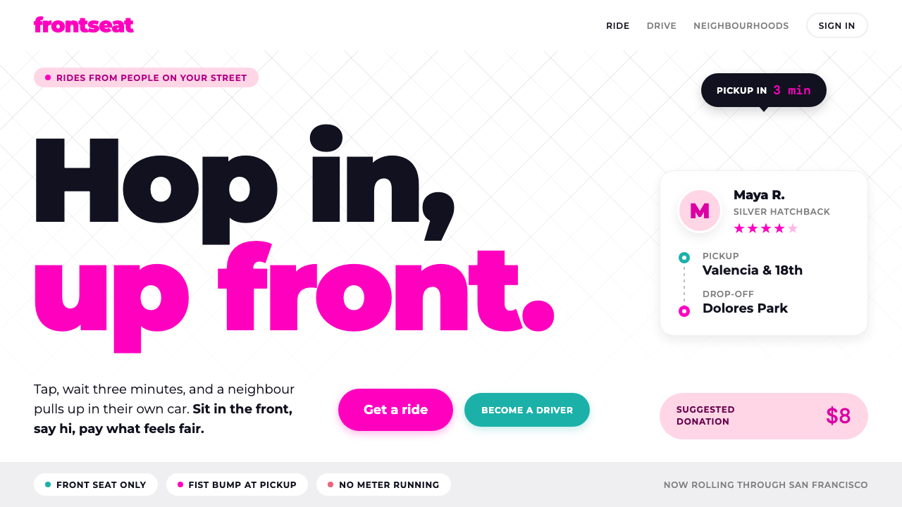 LyftA friend's car, not a taxi. Neon pink on white, heavy Montserrat, pill shapes…
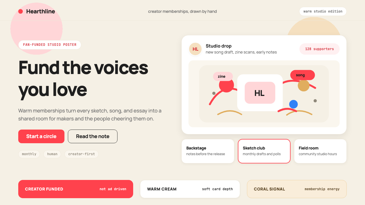 Patreon 2017Creator funding feels human. Coral CTAs on warm cream, rounded cards, hand-dr…
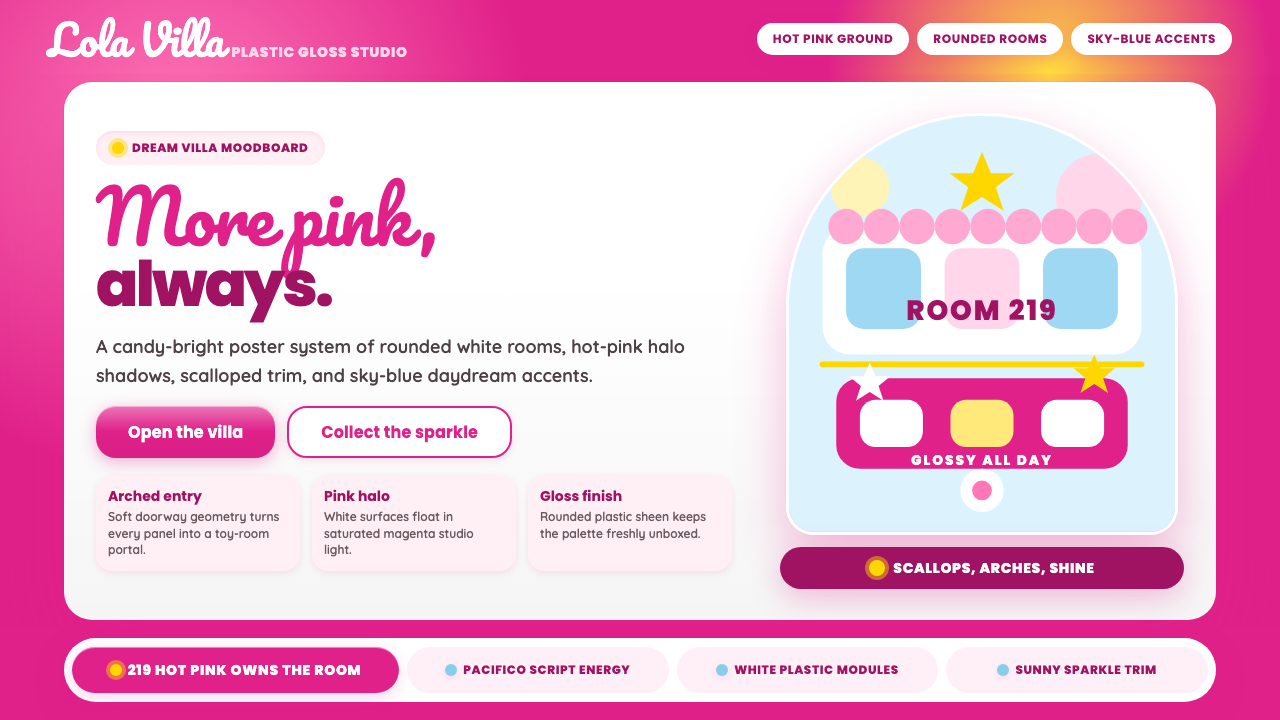 Barbie DreamhousePink is the whole world. Hot magenta ground, Pacifico script, scallops and gl…
 Friends Central Perk (1994)Sitcom warmth, turned TV-bright. Grape walls, couch orange, and bouncing colo…
 Kakao FriendsOne yellow, one gesture per cell. A white sticker sheet where speech bubbles…
 KartRiderCheerful, full-throttle nostalgia. Rounded Jua, blue panel frames and yellow…