What is Suica?
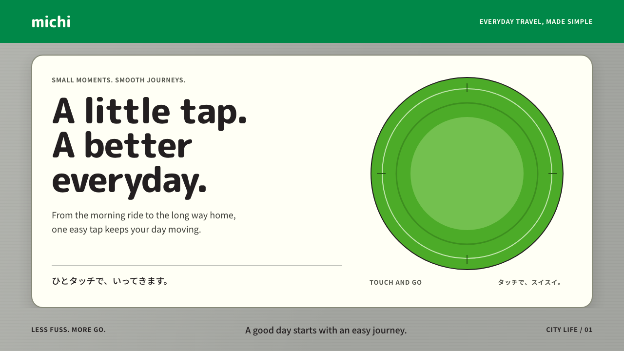
Suica turned a commuter's fare card into a friendly object: brushed silver, a yellow-green panel, rounded letters and a penguin who waits in the corner.
Suica in brief
The Suica style is drawn from the contactless fare card that JR East introduced across Greater Tokyo in November 2001. The card has a silver plastic face, a slanted yellow-green panel carrying a rounded logotype, and a small penguin standing in the lower corner. The gates it opens are marked with the same green, and the station signs around it speak in the shortest possible sentences.
Translated into an interface, this becomes brushed-silver page backgrounds, penguin-white cards, a circular green tap target that sends out rippling rings when touched, and copy that reads like a station sign: brief, calm and legible at a glance. Corners are generously rounded, type is soft and open, and decoration is minimal.
What makes the style distinctive is its tone. It treats everyday infrastructure, something people use twice a day without thinking, as a place for a little friendliness. The penguin is not a mascot slapped on top of a cold system; it is the system's face, the one element that talks back and reminds you that the machine was designed for people.

Where does Suica come from?
Suica arrived in November 2001 as an IC card for the JR East rail network around Tokyo. It was built on FeliCa, the contactless technology developed by Sony, which let a passenger touch a card to a reader instead of feeding a ticket into a gate. The tagline on the gates, Touch and Go, summarised the whole idea. The speed of the interaction mattered enormously: during a rush-hour surge, a fraction of a second at the gate multiplies across thousands of people.
The visual identity solved a specific problem. A technology that asks people to trust an invisible exchange needs a visible, friendly signal that it worked. The answer was a bright yellow-green panel, a rounded logotype and a character. The penguin was drawn by Chiharu Sakazaki, whose soft, slightly rounded illustrations gave the card a face that did not feel corporate. Rather than being hidden in the corner, the penguin became how the whole system was remembered.
This approach sits inside the Japanese tradition of character-led corporate branding, often called kyara culture. Railways, banks, local governments and shops in Japan routinely adopt mascots to humanise services that would otherwise feel impersonal. The tradition does not treat a character as childish decoration; it treats it as an interface layer, a way of making institutions approachable. Suica is one of the best-known examples, because its mascot appears on an object that millions of people touch every day.
The card's reach grew over the following years. Mobile Suica arrived in 2006, moving the card onto phones, and by 2013 IC cards from different regions became interoperable across Japan, so one card could pay for trains and buses in many cities. Throughout that expansion the look stayed consistent with the original: silver and green, rounded type, a penguin who stays in the corner. The surrounding vocabulary of JR station wayfinding, with its clear signage, restrained colour and short phrasing, provided the rest of the visual grammar.
What defines the Suica look?
Brushed silver ground
Pages sit on a cool, lightly textured silver that recalls the card's plastic face. It is neutral enough to let the green and the white cards stand out, yet slightly metallic so the surface feels like a manufactured object rather than a blank sheet. The brushing is subtle and directional, never glittery.
Yellow-green accent
The signature colour is a yellow-green, used for the slanted panel on the card, for gate readers and for the main tap target on screen. It carries one meaning: this is where you touch. Because it is rare against silver and white, it works as a clear call to action without needing any extra emphasis.
Rounded type
Lettering is soft, open and rounded at the terminals, in a way that echoes the card's logotype. It reads as approachable rather than authoritative, which suits a service used by everyone from commuters to tourists. Hierarchy comes from weight and spacing; there is no ornate display face and no tight, aggressive tracking.
Ripple tap target
The central interaction is a green circle that sends concentric rings outward when pressed, a direct visual translation of touching a card to a reader. The motion is short and satisfying, confirming the action immediately. It is the one place where the style allows itself an animated flourish, and it earns that place by being functional.
Penguin-white cards
Content lives on clean white cards with generous rounding, borrowing the white of the penguin's belly. The cards float lightly above the silver background, separated by gentle shadow and spacing rather than heavy borders. They hold one idea each, such as a balance, a route or a charge confirmation.
Station-sign copy
Wording is short, plain and instantly scannable, in the spirit of JR wayfinding. Labels name the action rather than describe it, and sentences rarely run past one line. The penguin may add a brief friendly remark, but it never turns into marketing prose, which keeps the experience fast.

Who shaped Suica?
Sakazaki is the illustrator who drew the Suica penguin. Her soft, rounded drawing style gave the card a character that felt gentle rather than corporate, and the penguin became the face by which the whole system is recognised. Her work shows how a single well-judged mascot can carry the personality of an infrastructure brand.
JR East launched the card in 2001 and runs the station network whose signage supplies the style's visual grammar. As the operator, it set the standard of clarity, brevity and restraint that the interface inherits. The company's later steps, including Mobile Suica in 2006 and nationwide interoperability in 2013, widened the card's reach without changing its look.
Sony developed FeliCa, the contactless IC technology on which Suica runs. Although it is not a visual designer of the style, its speed and reliability made the touch-and-go interaction possible, and the interface is built around that promise. The ripple animation and instant confirmation express the technical fact that the exchange happens in a moment.
Not a single person but a long practice, character-led branding gave Suica its template: use a friendly figure to make an institution approachable. The penguin is a high-profile case of this practice, and the style borrows its confidence that warmth and efficiency can coexist in the same system.
How do you use Suica today?
For slides, the Suica look suits covers and process explanations. Use a silver background with a single white card carrying the title, and place the yellow-green accent on one key element such as a number or a button-shaped label. Content slides work best as short, sign-like statements with plenty of space. The style is especially good for decks about services, onboarding, mobility, payments or customer experience.
For data slides, keep charts simple and rounded: soft bars, circular indicators and a single accent colour for the figure that matters. Put each metric on its own white card with a short label, as if it were a station display. Avoid dense axes and stacked legends, which fight the quick-glance spirit of the system. Ripple-ring graphics can mark a highlighted value in a restrained way.
In web UI, the style fits payment screens, balance checkers, ticketing flows, utility dashboards and any product that people use habitually. Make the main action a large circular green target, group information into rounded white cards over a silver ground, and keep microcopy to a few words. A friendly mascot or small illustrated assistant can appear in empty states and confirmations, speaking briefly. This is where the style is strongest: routine tasks that should feel effortless.
In editorial and marketing work, use it for transit campaigns, fintech explainers, city guides and service announcements. Pair the silver-and-green palette with a character illustration in the corner rather than at the centre, mirroring the card's composition. The tone is cheerful but efficient, so headlines should be short and body copy should resist long paragraphs. Printed material can use a subtle brushed texture to evoke the card without copying its actual logo.
The most common mistake is to use the green everywhere. The accent only works because it is scarce, and filling large areas with it erases the tap target's meaning. Another is to add a mascot without letting it speak or react, which turns it into decoration rather than the interface's face. Finally, do not heavy-handedly imitate the real JR East logo or card artwork; borrow the silver, the green accent, the rounded type and the corner-character composition instead.

Suica — FAQ
What do the colours in the Suica style mean?
Silver is the neutral ground, recalling the card's plastic body. White is for content cards, echoing the penguin. The yellow-green is the one action colour, used for the slanted card panel, gate readers and the main tap target on screen. Because each colour has a single role, the interface stays instantly understandable.
Is this style only for transport apps?
No. It originates in a fare card, but its principles transfer to any product built around quick, repeated actions: payments, loyalty cards, ticketing, smart-home controls, utilities and customer portals. What matters is a single obvious action, short copy and a friendly face. It is less suited to long-form reading or highly expressive, atmospheric brands.
Who designed the penguin?
The penguin was drawn by Chiharu Sakazaki. It appeared on the Suica card when it launched across Greater Tokyo in November 2001, standing in the corner of the silver card, and over the years it became the best-known symbol of the service. The style uses the penguin as a small, friendly presence rather than a dominant illustration.
How does Suica differ from a plain minimalist style?
Minimalism removes nearly everything and relies on restraint alone. Suica is equally economical but keeps a deliberate point of warmth: a rounded type voice, a tap target that responds with ripples, and a character who greets you. It is efficient infrastructure with a smile, so it feels friendlier than a pure grid-and-grey minimal system.
Related design styles
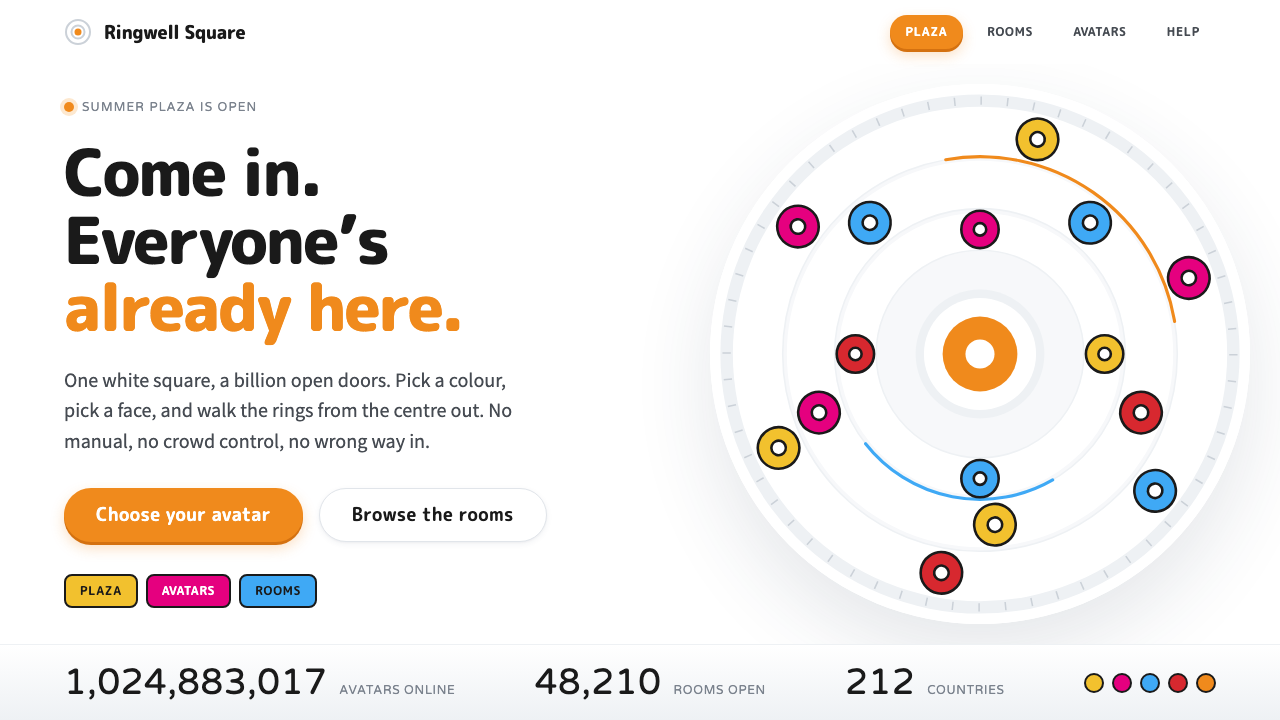 Summer Wars OZA public square made of white. Concentric rings, orange chrome and flat rainb…
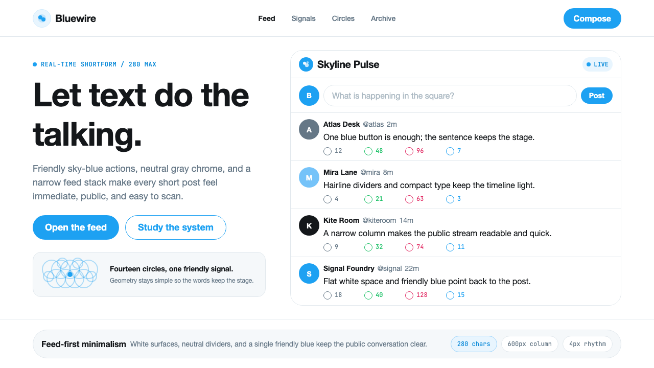 Twitter (Classic Bird)Text takes the stage. Sky blue actions, white feed stack, and hairline divide…
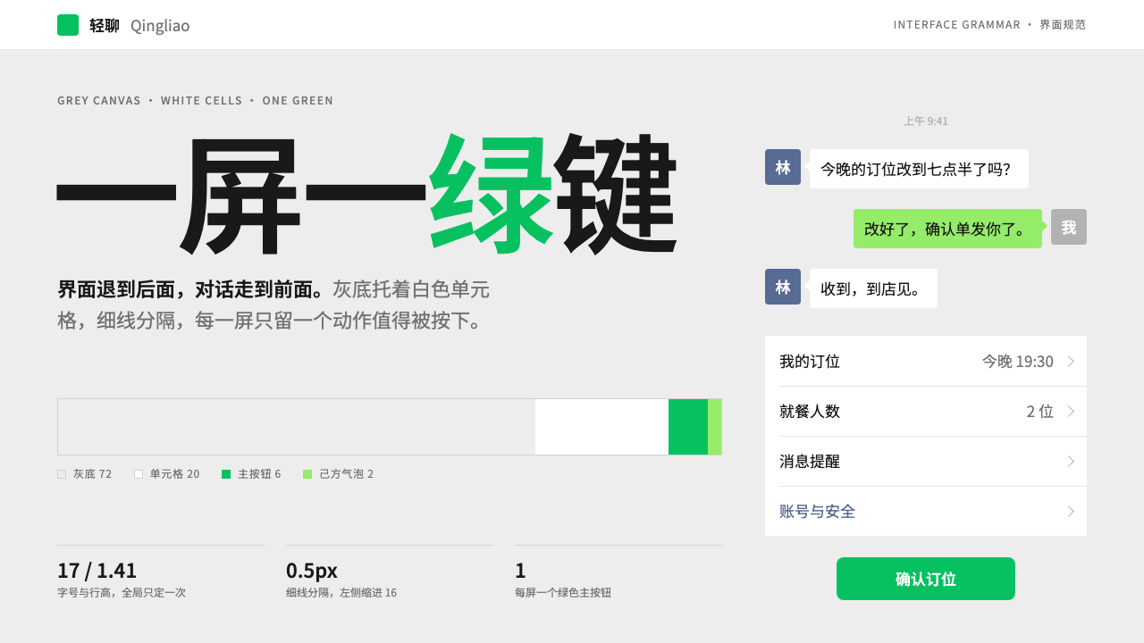 WeChatRecedes on purpose. Grey canvas, white hairline cells, and a single green but…
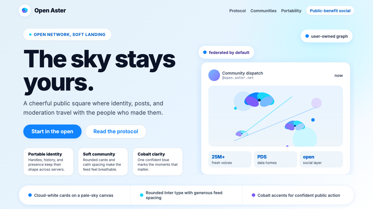 Bluesky AT Protocol 2024Open tech feels warm. Pale sky, cloud cards, Inter, and one cobalt accent car…
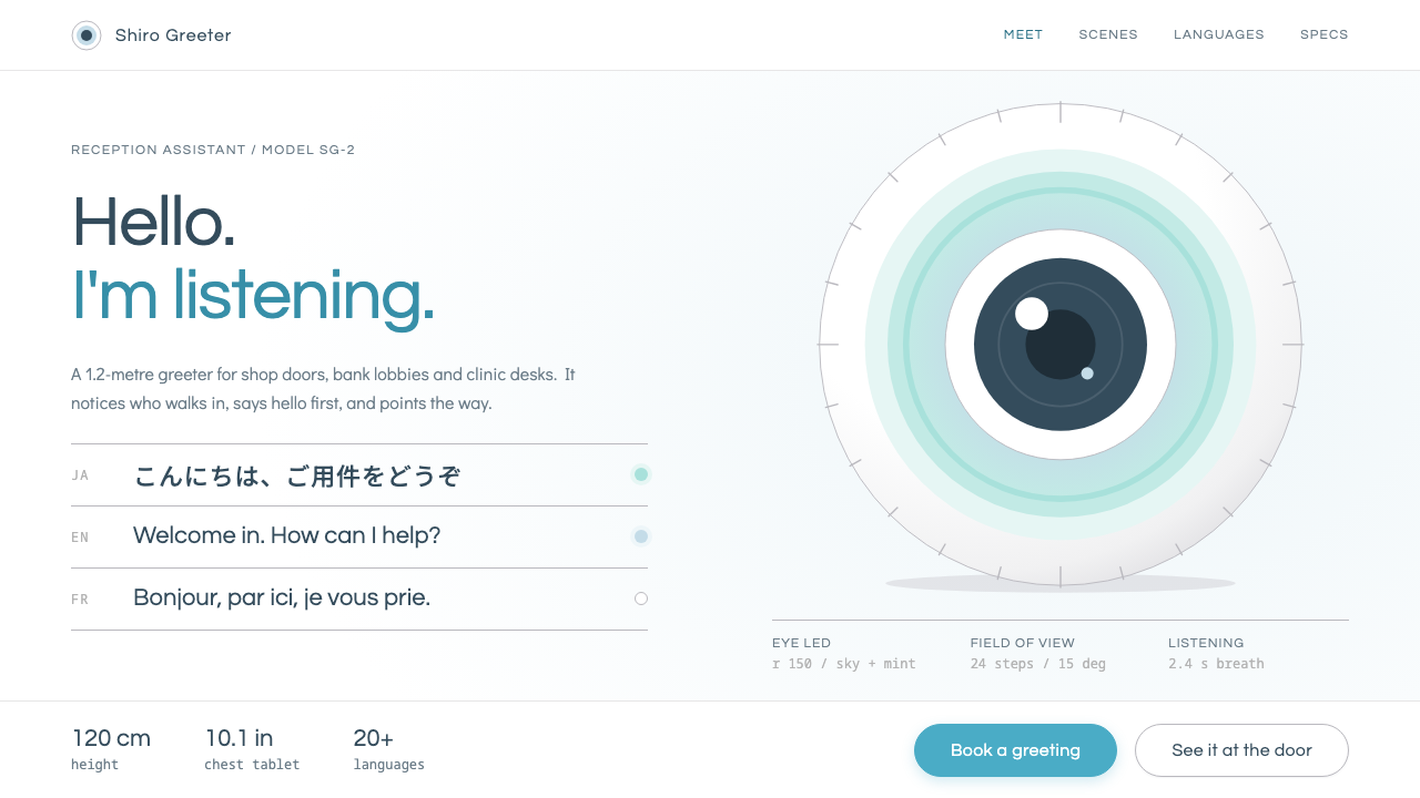 PepperA polite machine at the door. Pure white ground, blue-grey gloss shading, one…
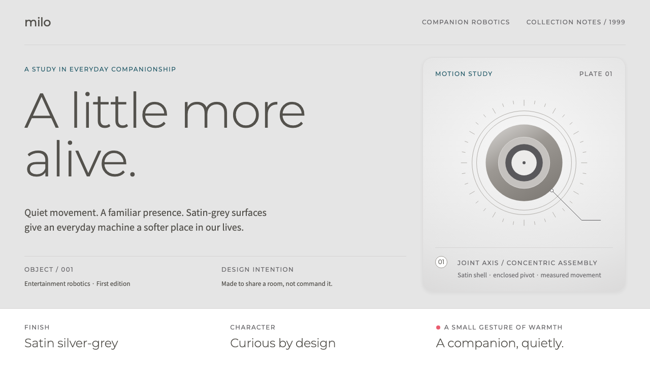 Sony AIBOMachines with a softer presence. Satin greys, light Montserrat and fine manua…