What is Sony AIBO?
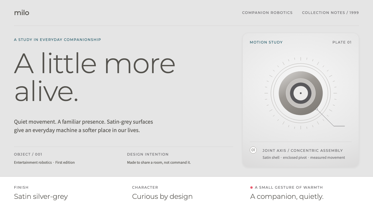
The first AIBO was a robot dog dressed like a museum object: satin silver-grey, three-quarter view, cool seamless backdrop, and a soft shadow pooling under its paws.
Sony AIBO in brief
The Sony AIBO style takes its cues from the ERS-110, the first-generation robot dog that Sony released in Japan in June 1999. Its body was shaped by the illustrator Hajime Sorayama: a satin silver-grey shell, a darker face mask, a camera set into the nose, and a tail that wagged. The style borrows that machine body and, just as importantly, the way it was always photographed, which is as a single animal-shaped object standing on a cool grey seamless sweep with a faint shadow beneath its feet.
Pages in this style read like a museum label crossed with an owner's manual. Pale grey cards sit beside open white sections. Model numbers are set in a light geometric sans. Thin leader lines run from each joint of a diagram to a numbered caption, the way an exploded view or an anatomical plate explains its parts. The effect is calm, explanatory and unhurried, a machine presented as something to be studied and admired rather than sold hard.
Warmth enters in small, deliberate doses. A single pink bone-shaped toy, the aibone, appears as a tiny accent. The later white aibo, which returned in 2018, contributes a rounder, friendlier shell to the mood. The overall result is a quiet, restrained palette of greys and whites that lets the object breathe, with just enough softness to remind the viewer that this robot was meant to be a companion.

Where does Sony AIBO come from?
AIBO began as Sony's attempt to bring robotics into the living room. The first-generation ERS-110 reached the market in Japan in June 1999 as an entertainment robot: a pet-like machine that could move, express and respond, built by a team that included researchers and engineers such as Toshitada Doi and Masahiro Fujita. It belonged to the late-1990s moment of Japanese consumer-electronics design, when companies were confident enough to treat gadgets as characters, and when the line between toy, appliance and artwork was pleasantly blurred.
The robot's body is the contribution that gave the style its character. Hajime Sorayama, an illustrator celebrated for his glossy, metallic figures, designed the ERS-110's shell. His approach to machine bodies, smooth and sensual with highlights that slide across curved metal, is widely known as a signature genre of its own. On AIBO it was translated into a satin finish rather than a mirror, keeping the sculptural curve while reducing glare. The result looked less like a toy and more like a designed animal, which is exactly why the robot later entered museum collections such as MoMA and M+.
The photography matters as much as the object. Nearly every well-known image of the first AIBO uses the same grammar: a three-quarter view, a cool grey seamless backdrop, a soft pool of shadow under the paws. This is the visual language of industrial design catalogues and museum displays, and it taught audiences to see the robot as an object of study. The style on this page inherits that grammar, adding the manual-like diagram conventions of thin leader lines and numbered labels.
The first-generation line continued until 2006, and the ERS-1000 revival followed in 2017 and 2018, with Kazuo Hirai among the Sony figures associated with the company's robotics return. The white aibo gave the brand a second life and a rounder shell, and the pink aibone toy became part of its small vocabulary of affection. In design-history terms, the style sits in three overlapping streams: entertainment robotics, late-1990s Japanese consumer-electronics design, and the Sorayama tradition of machine-body illustration.
What defines the Sony AIBO look?
Satin silver-grey
The dominant tone is a cool, slightly soft silver-grey that mimics the robot's satin shell. It avoids both mirror shine and flat dullness, so surfaces feel like brushed or lightly frosted metal. Greys step gently from pale to mid, and large areas are calm rather than dramatic.
Cool seamless backdrop
Hero images stand on a cool grey seamless sweep with no horizon line, so the subject floats in an endless studio. A soft, diffuse shadow gathers beneath the feet, grounding the object without a hard edge. This is the single most recognisable image convention of the style.
Light geometric type
Model numbers and headings are set in a light-weight geometric sans-serif with open, round letterforms. The thin strokes echo the delicacy of the machine's joints. Hierarchy comes from size and spacing rather than heavy weights, keeping the voice quiet and precise.
Leader-line diagrams
Thin leader lines run from each joint, sensor or part to a numbered caption, like an anatomical plate. The lines are fine, evenly weighted and never decorative. They turn the product into something to be read, supporting the museum-label tone of the whole system.
Pale cards and open white
Content alternates between pale grey cards and open white sections. The cards group specifications softly, with generous inner padding and low contrast edges, while white areas give the page space to breathe. The rhythm feels like turning gallery rooms rather than scrolling a catalogue.
One pink accent
The only warm color is a small pink, drawn from the bone-shaped aibone toy. It appears as a dot, an icon or a thin highlight, never as a field of color. Its rarity makes it affectionate rather than loud and keeps the greys in charge.

Who shaped Sony AIBO?
Illustrator celebrated for glossy metallic figures, who shaped the satin silver-grey body of the first-generation ERS-110 in 1999.
Sony researcher associated with the development of the entertainment robot that became AIBO.
Sony engineer connected with the robot's behaviour and the first-generation project.
Sony executive associated with the company's robotics revival and the ERS-1000 aibo of 2017 and 2018.
How do you use Sony AIBO today?
On slides, the AIBO style suits product showcases and technology stories where the object deserves to be studied. Place the hero image on a cool grey ground with generous empty space, set the product name in a light sans, and let a thin leader line connect one or two callouts. Content slides work best with pale grey cards on white, short captions and plenty of margin. Keep colors almost entirely grey, with at most one small warm accent.
For data and specification slides, borrow the manual format: a numbered list of parts or metrics on one side, a clean diagram or chart on the other, and fine lines tying labels to features. Light weights and low-contrast greys make the numbers feel precise rather than aggressive. Use the single pink accent to mark the one value you want the audience to remember, and resist adding more highlight colors.
In web and app interfaces, the style fits hardware product pages, device companion apps, robotics and smart-home dashboards, and any museum or archive collection site. A white page with grey cards, a large product photograph on a seamless backdrop and a quiet specification table gives a calm, premium impression. Hover and focus states should stay soft, with gentle shadows rather than sharp outlines, so the interface matches the object's satin finish.
For editorial and marketing use, think exhibition catalogue. Posters, press kits and long-form features can place a single object in space, add a restrained caption block and rely on whitespace to carry the mood. The nostalgic late-1990s Japanese consumer-electronics angle is strong enough that copy can stay minimal. Pair it with photographs shot on grey paper with soft overhead light for the strongest match.
The most common mistake is to treat grey as boring and add saturated colors, heavy gradients or dramatic dark backdrops, which destroys the satin calm. Another is to use heavy bold type that overpowers the delicate leader lines. Keep weights light, shadows soft and accents rare, and let the object, not the interface, hold attention.

Sony AIBO — FAQ
What is the Sony AIBO design style?
It is a quiet, museum-like style drawn from the first-generation ERS-110 robot dog: satin silver-grey surfaces, pale grey cards on open white, light geometric type, thin leader-line diagrams, and a single small pink accent from the aibone toy.
Who designed the original AIBO?
The body of the 1999 ERS-110 was shaped by the illustrator Hajime Sorayama, known for glossy metallic figures. Sony researchers and engineers, including Toshitada Doi and Masahiro Fujita, are associated with the project behind it.
Why does the style use a grey seamless backdrop?
Because nearly every well-known photograph of the first AIBO was framed that way: a three-quarter view on a cool grey sweep with a soft shadow. The convention comes from industrial design catalogues and museum displays, and it invites viewers to study the object.
What products is this style good for?
Hardware and robotics product pages, device companion apps, smart-home dashboards, exhibition and archive sites, and any story where a single designed object should be presented calmly and in detail.
How do I keep it from feeling cold?
Use the small pink accent sparingly, keep corners and shadows soft, and choose warm, friendly captions. The rounded white aibo of the later revival is a good reminder: the restraint is calm, not clinical, so let small touches of affection show.
Related design styles
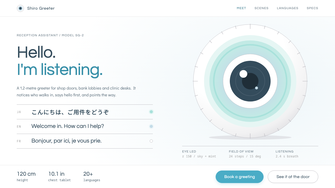 PepperA polite machine at the door. Pure white ground, blue-grey gloss shading, one…
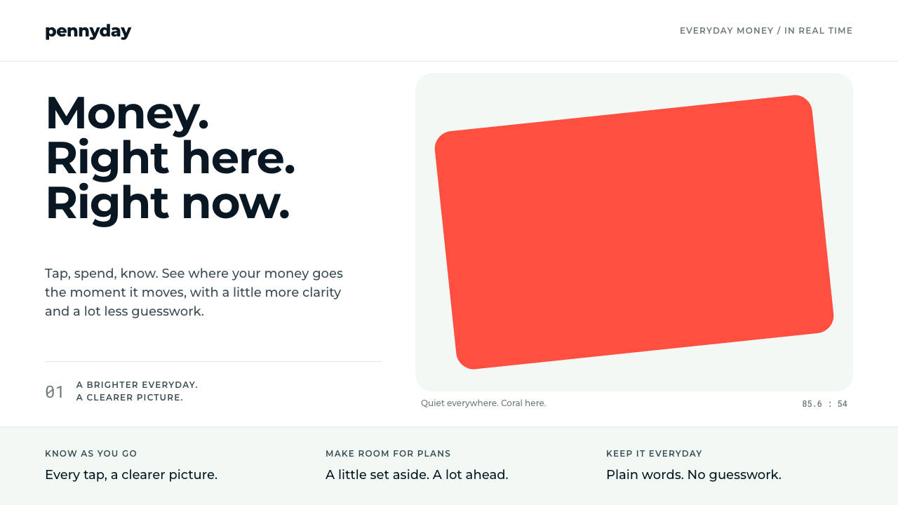 MonzoOne loud coral, everything else calm. Navy type and mint-grey space keep mone…
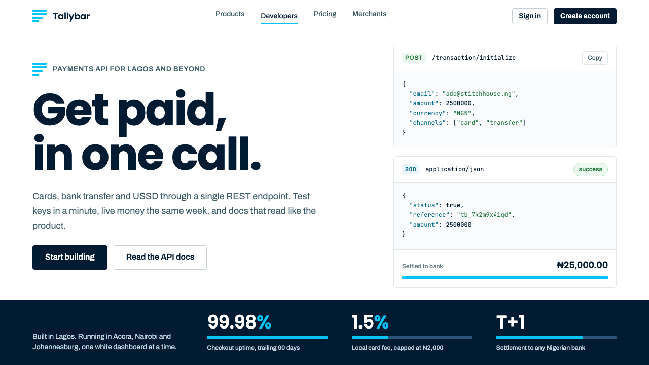 PaystackPlain-spoken payments infrastructure. White page, navy ink, four flat cyan ba…
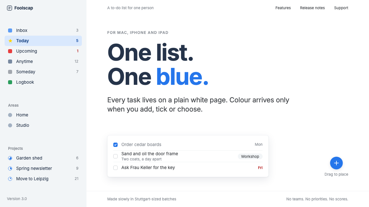 Things 3Colour saved for action. White page, cool-grey sidebar, one blue for the plus…
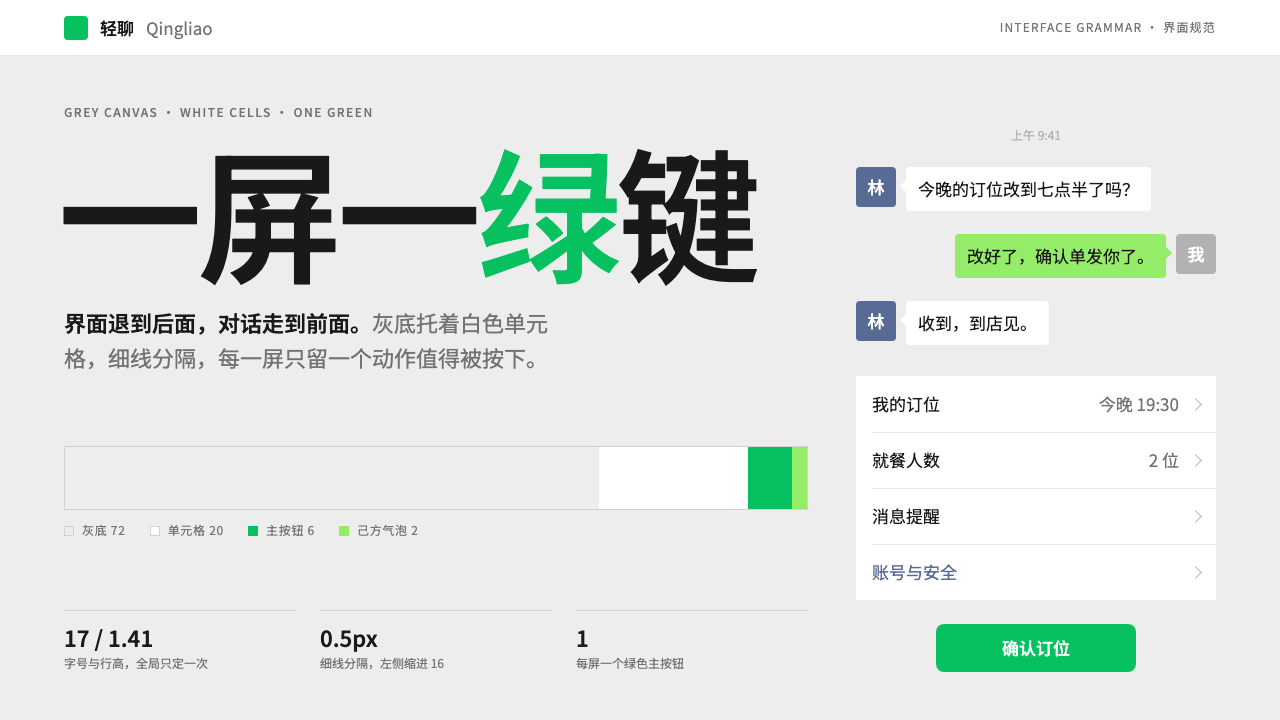 WeChatRecedes on purpose. Grey canvas, white hairline cells, and a single green but…
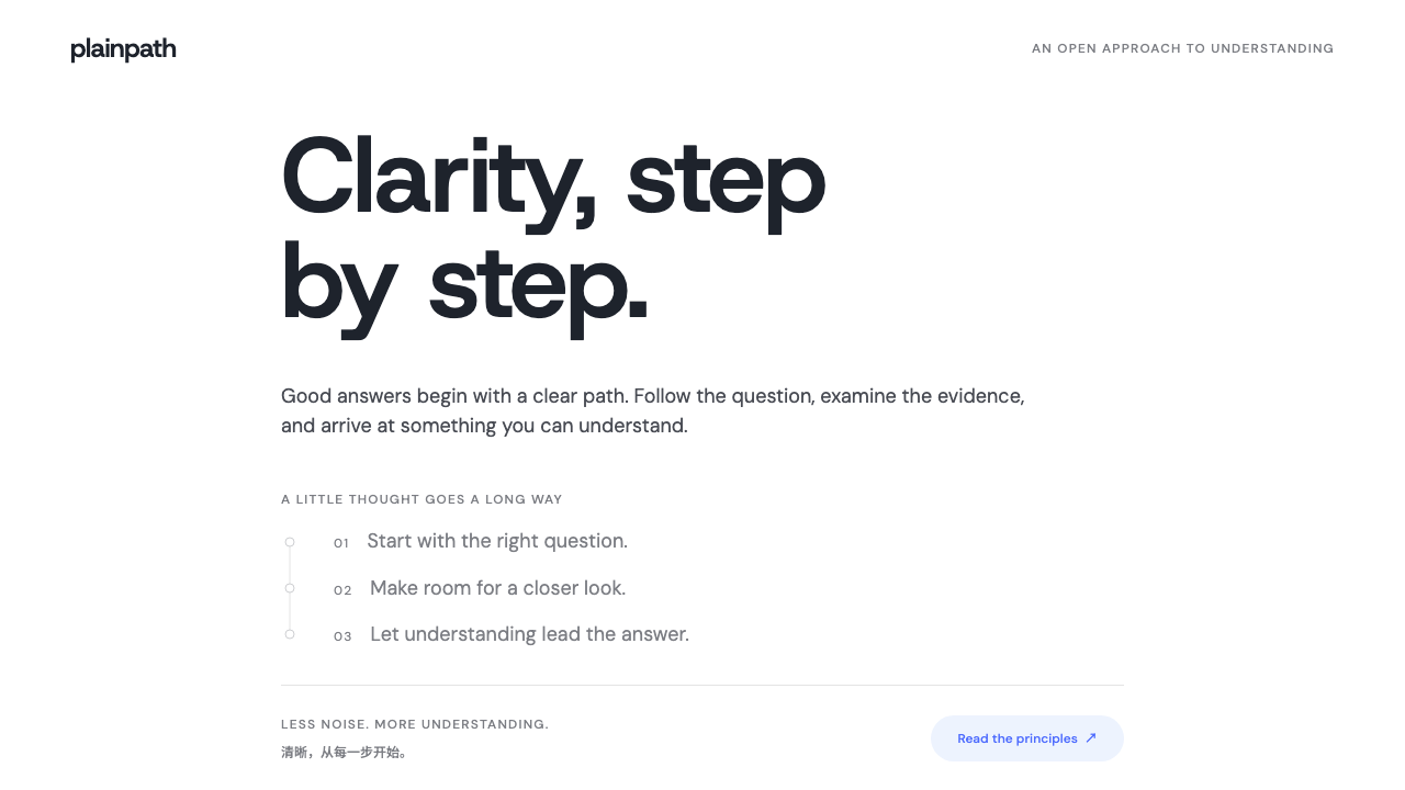 DeepSeekClarity without spectacle. White space, whale blue and a grey trail of though…