What is Pepper?
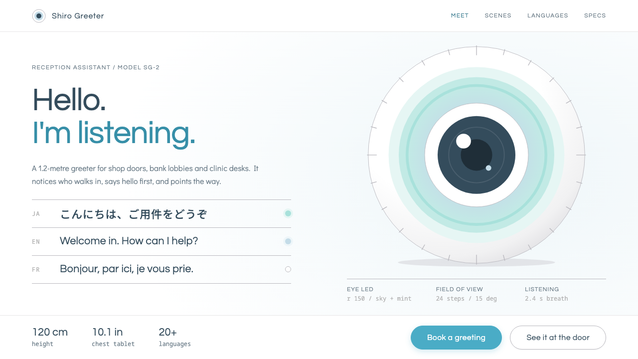
Pepper turns a talking robot into a design language: a pure white studio ground, glossy blue-grey shading, and one calm blue reserved for everything you are meant to touch.
Pepper in brief
Pepper is a visual style drawn from the humanoid robot that SoftBank and Aldebaran Robotics introduced in June 2014. The robot stands about a metre and a fifth tall, with a white body, round dark eyes, softly glowing ears, a tablet screen on its chest, and a tapering base that glides on hidden wheels. It was designed to greet people at the door, read their mood, and talk back, and its look was engineered to make that job feel welcome rather than threatening.
As a design system, Pepper borrows from the robot's official product photography and brand guidelines. The ground is pure white, like a photography studio with the horizon erased. Shading is cool and slightly blue, the way light slides across glossy plastic. Headings are set in a deep slate rather than black, body text uses a rounded geometric sans in the spirit of Century Gothic, and a single interactive blue marks anything a visitor can tap.
The overall effect is best described as a polite machine. It is friendly without being cartoonish, clean without being clinical, and technological without borrowing the neon and chrome clichés of science fiction. If Bauhaus is a manifesto and brutalism is a shout, Pepper is a quiet greeting at the entrance of a shop.

Where does Pepper come from?
Pepper was unveiled in June 2014 in Tokyo. It came out of a partnership between SoftBank, the Japanese telecom and technology group led by Masayoshi Son, and Aldebaran Robotics, the French robotics company founded by Bruno Maisonnier. The collaboration joined two geographies: engineering and the humanoid-robot lineage from Paris, and commercial ambition and retail reach from Tokyo. A developer edition followed in February 2015, and consumer sales began in Japan in June 2015.
What made Pepper unusual was its purpose. Earlier humanoid robots were usually research platforms or industrial machines meant to lift, weld, or walk. Pepper was positioned as a social and emotional robot, one that could stand in a shop, a bank, or a cafe and chat with whoever walked in. That purpose shaped everything about its appearance. A robot meant for conversation needed a face that read as attentive, a body that read as safe, and an interface that any customer could operate without instruction.
Through the late 2010s the robot was rolled out across retail environments, which meant its look was seen mostly in public spaces: store entrances, service counters, and demonstration events. Its visual identity therefore had to work under harsh commercial lighting, in photographs, and on a screen small enough to be read from a metre away. The glossy white shell, the pale grey-blue shading, and the single accent colour all follow from that practical context.
In the design-history sense, Pepper belongs to three overlapping currents: social and emotional robotics, the push for affordable humanoid robots in shops and homes, and tablet-based human-robot interfaces. The last of these matters most for the style. By putting a tablet on the robot's chest, the designers gave the machine a conventional touch interface, so the look of the robot and the look of the screen had to feel like one family. This library entry carries that unity into web and slide design.
What defines the Pepper look?
Color
The palette is nearly monochrome. A pure white ground does most of the work, shading is a cool blue-grey that suggests light on glossy plastic, headings sit in deep slate, and one calm interactive blue is kept for touchable things. Because there is only a single chromatic note, it carries real meaning: if something is blue, you can press it.
Typography
Type follows the rounded geometry of Century Gothic: near-circular bowls, open apertures, and an even, friendly rhythm. Headings are set in slate rather than black, which softens their authority. The effect is of a speaker who is clear and patient, never loud. Weights stay moderate, and nothing is set in aggressive capitals.
Surface and gloss
Panels and cards imitate molded white plastic: smooth, lightly glossy, with faint cool shading at the edges rather than hard outlines. Depth is suggested by soft tonal change, not by heavy drop shadows. Surfaces should feel like an object photographed in a studio, clean enough to touch but never sterile.
Shape
Everything is rounded in the way the robot is. Corners are generous, buttons are pill-like, and avatars and icons sit in circles echoing Pepper's eyes. There are no sharp spikes or aggressive diagonals. Shapes are meant to read as approachable at a glance, the visual equivalent of a head tilted slightly to listen.
Space and layout
Layouts give each element plenty of room, much like a product shot on an infinite white backdrop. A single subject, a short greeting, and a clear next action tend to occupy a screen. Content is centred or lightly asymmetric but never crowded, because a robot at a doorway can only say one thing at a time.
Interaction tone
The interface voice is courteous and a little ceremonial. Buttons are labelled plainly, confirmation messages are warm, and error states apologise rather than accuse. Transitions are gentle and unhurried. Because the original product lived on a chest-mounted tablet used by strangers, every touch target is large, obvious, and forgiving.
Imagery
Photography follows the official product-shot convention: the subject isolated against white, evenly lit, shot at eye level, with soft reflections on the glossy surfaces. Illustrations, where they appear, are simple, rounded, and cool-toned. Stock photography of crowds and handshakes is deliberately absent; the object is the hero.

Who shaped Pepper?
Founder and leader of SoftBank, he fronted the 2014 unveiling of Pepper in Tokyo and championed the idea of an affordable robot that could keep people company and serve customers. His commercial backing is why a humanoid reached shop floors rather than staying in a laboratory.
Founder of Aldebaran Robotics in France, he led the engineering lineage on which Pepper was built. His company's earlier humanoid work gave the robot its movement, its sensing, and its idea that a machine should be approachable before it is capable.
As the commercial partner and deployer, SoftBank placed Pepper in its own stores and then in banks, cafes, and other public venues. Its brand guidelines and product photography are the direct visual source for this style.
The Paris-based company supplied the hardware and software foundation of the robot. Its role is a reminder that Pepper's look is not only decoration but a consequence of how the machine was built: the wheeled base, the tablet, and the expressive head.
How do you use Pepper today?
For slides, Pepper suits cover and content pages in the service, retail, hospitality, and education sectors. Start a cover with a large white field, a slate title, and a single blue accent line or button-shaped label. Content slides should carry one idea each, with a friendly rounded sans and plenty of margin. Because the style is built on gentleness, it works best when presenting customer experience, onboarding, or product walkthroughs rather than dense financial analysis.
For data slides, keep the restraint. Use slate for axes and labels, the single blue for the series you want noticed, and cool pale greys for everything else. Resist adding more hues for categories; instead, vary lightness within the blue-grey family or label directly. A chart in this style should look like it was drawn for a visitor, not an analyst, with generous spacing and short, plain titles.
For web interfaces, Pepper is a natural fit for kiosks, check-in screens, reception tablets, help centres, and onboarding flows, anywhere a stranger must be guided without anxiety. Large rounded buttons in the interactive blue, clear greetings, and white cards on a white ground produce an interface that feels attended. Dashboards can adopt it too, provided information density stays modest and the blue remains reserved for actions.
For editorial and marketing work, think product photography first. Landing pages, launch announcements, and brand sites can build around a single isolated subject, a short headline, and a clear call to action. Copy should sound like a courteous host: short sentences, warm verbs, no jargon. Email headers, app-store screens, and event signage will inherit the same calm authority.
The common mistake is to overload the blue. Once decorative elements, secondary headings, and background panels all adopt it, the visitor can no longer tell what is touchable, and the whole point of the system collapses. The other frequent error is adding heavy shadows or neon glows to look more futuristic, which replaces polite with theatrical. Keep it white, keep it soft, and let a single blue say press here.

Pepper — FAQ
What is the Pepper design style based on?
It is based on the visual identity of the humanoid robot Pepper, introduced by SoftBank and Aldebaran Robotics in June 2014. The style draws on the robot's official product photography and brand guidelines: a pure white ground, cool blue-grey shading on glossy plastic, slate headings, rounded geometric type, and one calm interactive blue.
Why is there only one accent colour?
Because the accent has a job: it tells people what they can touch. The robot was built for strangers in public places, so its interface had to be understood without instruction. Keeping a single blue for interactive elements makes the rule instantly learnable, and it keeps the rest of the page calm and neutral.
Is this style only suitable for robotics or hardware products?
No. Its origin is a robot, but its logic of white space, soft shading, rounded shapes, and courteous tone transfers well to any service that needs to feel welcoming: retail, banking, hospitality, healthcare onboarding, education, and customer-support tools. It is less suited to dense, expert-oriented tools where heavy information density matters more than approachability.
How does Pepper differ from other friendly, minimal styles?
Many friendly minimal styles lean on pastel palettes or playful illustration. Pepper is stricter: its warmth comes from shape and tone of voice, not from colour. The ground is pure white, the shading is cool, and the only chroma is a functional blue. It reads as a polite machine rather than a toy, which keeps it credible in commercial and service settings.
What are the most important rules when applying it?
Keep the ground white, reserve the blue for touchable things, set headings in slate rather than black, round the corners generously, and give every element room. Avoid heavy shadows, neon glows, and extra accent hues. If a screen holds one subject, one greeting, and one clear action, you are applying it correctly.
Related design styles
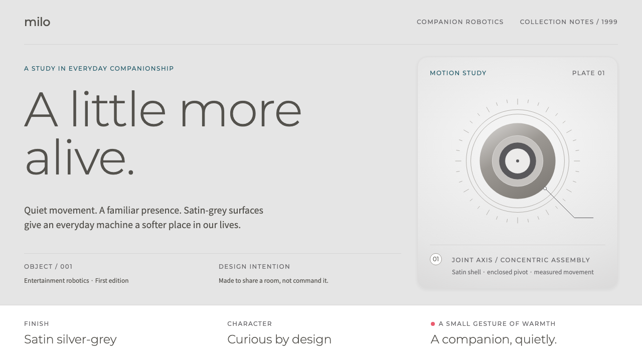 Sony AIBOMachines with a softer presence. Satin greys, light Montserrat and fine manua…
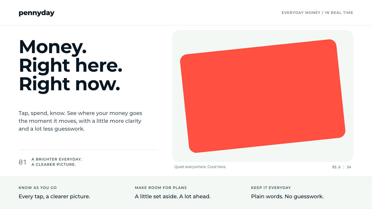 MonzoOne loud coral, everything else calm. Navy type and mint-grey space keep mone…
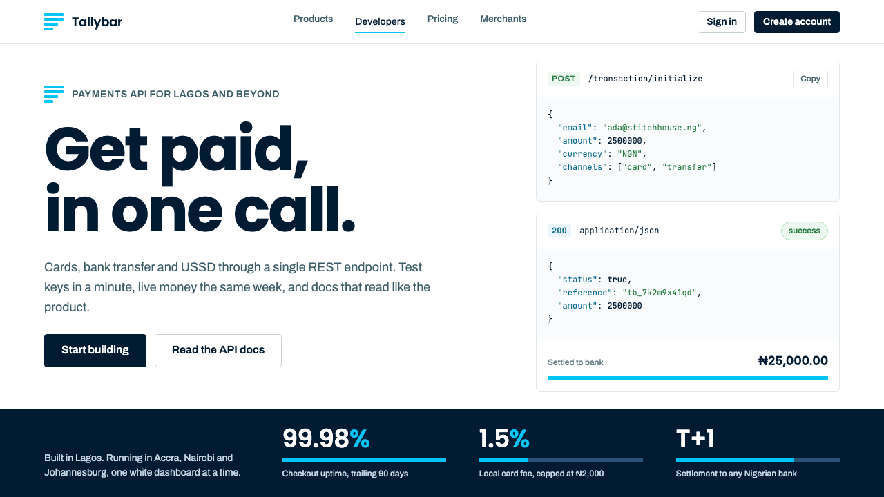 PaystackPlain-spoken payments infrastructure. White page, navy ink, four flat cyan ba…
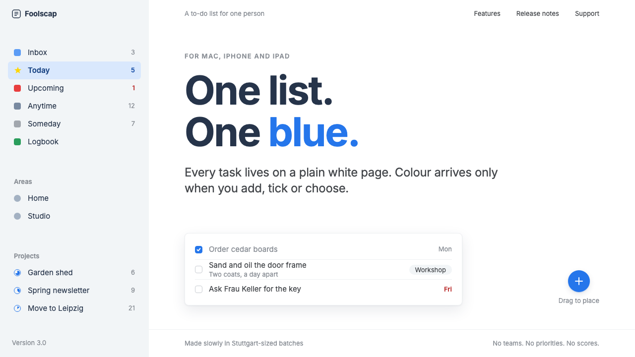 Things 3Colour saved for action. White page, cool-grey sidebar, one blue for the plus…
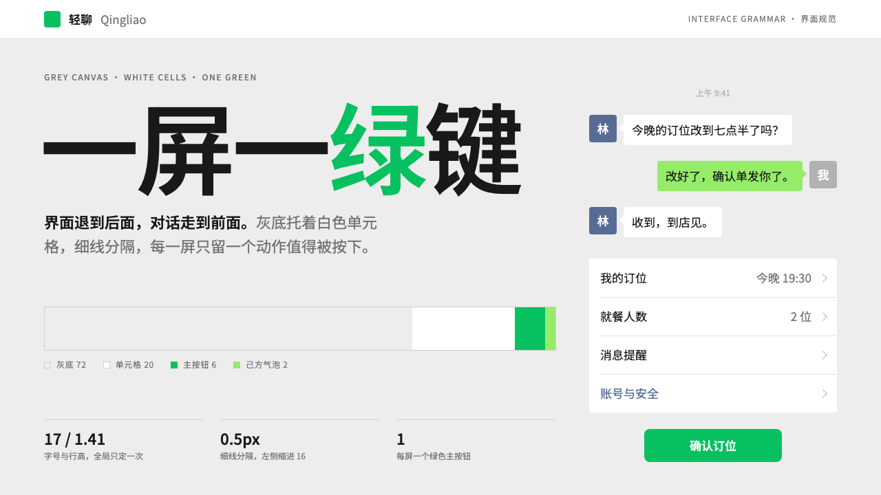 WeChatRecedes on purpose. Grey canvas, white hairline cells, and a single green but…
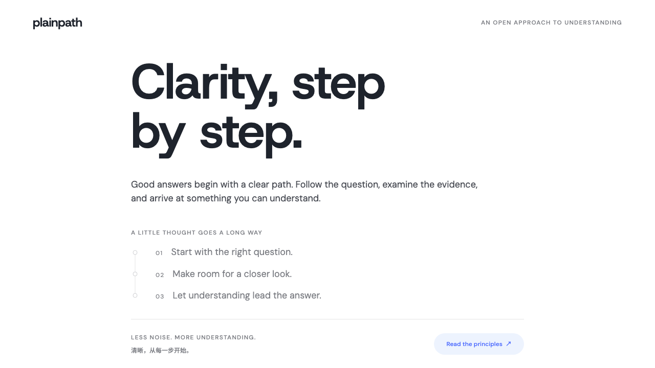 DeepSeekClarity without spectacle. White space, whale blue and a grey trail of though…