What is Sufi Whirling (Konya)?什么是 Sufi Whirling (Konya)?
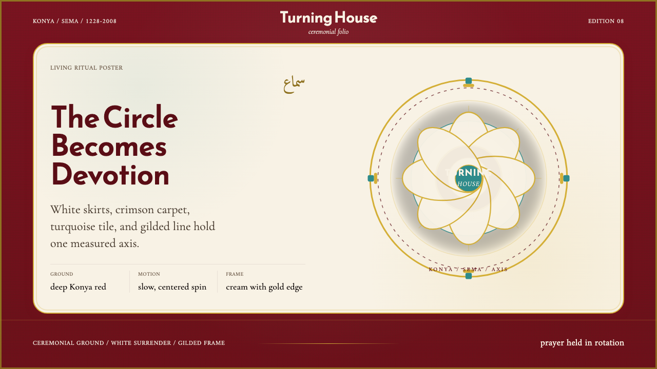
The Mevlevi sema turns devotion into visual language — deep crimson grounds, white arcs of surrender, turquoise from a poet's tomb, and gold from centuries of Ottoman reverence.梅夫拉维旋转仪式将虔诚化为视觉语言——深红的大地、臣服的白弧、诗人陵墓的绿松石,以及数百年奥斯曼朝觐的帝王金。
Sufi Whirling (Konya) in briefSufi Whirling (Konya) 速览
Sufi Whirling (Konya) is a design system rooted in the visual world of the Mevlevi sema ceremony — the ritual whirling practice of the Mevlevi Sufi order founded in thirteenth-century Konya, Turkey. Its palette, compositional logic, and typographic sensibility all derive from that living ceremony: the deep-crimson Anatolian carpet on which dervishes spin, the pure white of their wide-skirted tennure robes signifying spiritual surrender, the luminous turquoise of Rumi's tomb dome rising above the city, and the gilded calligraphic ornament of Ottoman manuscript and tilework tradition.苏菲旋转(科尼亚)是一套植根于梅夫拉维旋转仪式视觉世界的设计系统——这一仪式属于十三世纪兴起于土耳其科尼亚的梅夫拉维苏菲教团。系统的色板、构图逻辑与排印气质,皆源自这一延续至今的仪式:德尔维希旋转其上的深红安纳托利亚地毯、代表精神臣服的纯白宽裙旦努尔长袍、从城市升起的鲁米陵墓穹顶的明亮绿松石,以及奥斯曼手抄本与瓷砖传统中的镀金书法纹饰。
The system is not a historical pastiche. It takes a ceremony still performed today — listed by UNESCO as an Intangible Cultural Heritage of Humanity in 2008 — and distills its essential visual grammar into a design language suited to contemporary screens, printed matter, and spatial environments. The result is simultaneously ancient and immediate: colors that read as warm and ceremonially weighted, compositions that carry a sense of circular, meditative motion, typography that honors both the Arabic calligraphic tradition and the classical Latin serif forms that have long coexisted in Turkish cultural life.这套系统并非历史的复刻。它以一场至今仍在举行的仪式——2008年被联合国教科文组织列入人类非物质文化遗产名录——为源泉,将其核心视觉语法提炼为适用于当代屏幕、印刷物与空间环境的设计语言。结果是古老与即时的统一:色彩读来温暖而具有仪式分量,构图携带着循环、冥想式运动的感知,字体致敬阿拉伯书法传统与在土耳其文化生活中长期共存的古典拉丁衬线形式。
Where many design systems built on historical sources extract only surface detail — a color here, a motif there — Sufi Whirling (Konya) is structured around the ceremony's underlying logic: rotation as organizing principle, layered translucency as metaphor for spiritual proximity, and the tension between the earthly crimson ground and the pure white figure spinning above it. These structural ideas generate compositions that feel coherent and purposeful rather than merely decorative.许多以历史来源为基础的设计系统只提取表面细节——此处一个颜色,彼处一个纹样——苏菲旋转(科尼亚)则围绕仪式的底层逻辑构建:以旋转为组织原则,以层叠透明度为精神接近的隐喻,以及大地深红底面与其上纯白旋转身影之间的张力。这些结构性理念生成的构图,令人感到连贯而有目的,而非仅仅装饰。
See the Sufi Whirling (Konya) design system查看 Sufi Whirling (Konya) 完整设计系统
Where does Sufi Whirling (Konya) come from?Sufi Whirling (Konya) 从何而来?
The Mevlevi order traces its founding to Mevlana Jalaluddin Rumi, the Persian-speaking mystic poet who settled in Konya around 1228 and remained there until his death in 1273. Rumi's thousands of verses — collected in the Masnavi and the Divan-i Kebir — form the theological and poetic foundation of Mevlevi practice. The sema ceremony itself, as a codified ritual form, was shaped significantly by his son Sultan Veled after Rumi's death, around 1312, when the order was formally established with Konya as its spiritual center. The ceremony's seven movements, each carrying distinct symbolic meaning, the specific garments worn, and the musical ensemble featuring the ney reed flute and the kudum drum were all formalized in this period.梅夫拉维教团的创立可追溯至梅夫拉纳·贾拉鲁丁·鲁米——这位波斯语神秘主义诗人约于1228年定居科尼亚,并在此生活直至1273年辞世。鲁米汇集于《玛斯纳维》与《大德旺》的数千首诗歌,构成梅夫拉维修行的神学与诗学基础。旋转仪式本身作为成文的仪式形式,在鲁米去世后由其子苏丹·韦莱德大力塑造——约于1312年,教团正式建立,以科尼亚为精神中心。仪式的七个动作(各有其独特象征意涵)、特定服饰,以及以芦笛和库都姆鼓为核心的音乐编制,均于这一时期定型。
Ottoman patronage from roughly 1450 onward transformed the Mevlevi order from a regional Anatolian institution into an empire-wide religious and cultural force. Sultans and viziers endowed mevlevihaneler — the lodge-complexes where dervishes lived, trained, and performed — across the empire from Istanbul to Damascus to Cairo. This patronage brought the order into contact with the full weight of Ottoman visual culture: the master tilework of Iznik ceramics in their characteristic turquoise and cobalt, the gilded illuminated manuscripts of the imperial scriptorium, the geometrically complex arabesque ornament of mosque interiors. The visual identity of Sufi Whirling (Konya) draws on this Ottoman synthesis as much as on the ceremony itself.大约自1450年起,奥斯曼帝国的赞助将梅夫拉维教团从一个安纳托利亚地区机构转变为帝国范围的宗教与文化力量。苏丹与维齐尔在从伊斯坦布尔到大马士革再到开罗的帝国版图上捐赠梅夫拉维哈内——德尔维希在其中生活、修炼与表演的道院综合体。这种赞助使教团与奥斯曼视觉文化的全部积淀产生接触:伊兹尼克陶瓷标志性的绿松石与钴蓝彩釉砖工、帝国文书处镀金照明手抄本、清真寺内部几何复杂的阿拉伯式花纹。苏菲旋转(科尼亚)的视觉身份,从这一奥斯曼综合传统中汲取的养分,不亚于从仪式本身。
The order was suppressed along with all other Sufi orders in Turkey by Atatürk's secular republic in 1925, and the Konya tekke was closed. For nearly three decades the sema could not be publicly performed. A significant reversal came in 1953, when performances were allowed to resume in Konya — initially framed as cultural rather than religious events. The decades-long interruption paradoxically helped preserve the ceremony's visual and musical form by subjecting it to scholarly documentation and curation rather than organic evolution. When full practice resumed, the ceremony's aesthetic details — the specific shade of the dervish's white robe, the proportions of the tall felt sikke hat, the arrangement of the musical ensemble — had been carefully recorded and were restored with unusual fidelity.1925年,凯末尔世俗共和国镇压了包括梅夫拉维教团在内的所有苏菲团体,科尼亚道院随之关闭。近三十年间,旋转仪式无法公开举行。1953年出现重大转机——演出获准在科尼亚恢复,初期以文化而非宗教活动的名义呈现。这段漫长的中断,吊诡地帮助保存了仪式的视觉与音乐形式:它促使学者对仪式进行系统性记录与整理,而非任其自然演化。当完整修行重新恢复时,仪式的美学细节——德尔维希白袍的具体色调、高毡帽的比例、音乐编制的排列——均已被仔细记录,并以罕见的忠实度得到还原。
UNESCO's 2008 inscription of the Mevlevi sema on the Representative List of the Intangible Cultural Heritage of Humanity marked the ceremony's global recognition not only as a living spiritual practice but as a form of embodied cultural knowledge. Today the sema is performed regularly in Konya and in Mevlevi communities around the world. The visual material generated by centuries of Mevlevi and Ottoman practice — the architectural fabric of the Mevlana Museum complex in Konya, the surviving illuminated manuscripts, the ceramic tilework, the embroidered textiles — constitutes one of the richest documented visual traditions in the Islamic world, and it is from this record that the Sufi Whirling (Konya) design system takes its precise aesthetic cues.联合国教科文组织2008年将梅夫拉维旋转仪式列入《人类非物质文化遗产代表作名录》,标志着这一仪式作为活态精神实践与具身文化知识的双重价值获得全球认可。今天,旋转仪式定期在科尼亚及世界各地的梅夫拉维社群中举行。数百年梅夫拉维与奥斯曼实践所积累的视觉遗产——科尼亚鲁米博物馆建筑群的建筑肌理、存世的照明手抄本、陶瓷砖工、刺绣纺织品——构成伊斯兰世界记录最为完整的视觉传统之一,苏菲旋转(科尼亚)设计系统正是从这份记录中汲取其精确的美学线索。
What defines the Sufi Whirling (Konya) look?Sufi Whirling (Konya) 的视觉特征是什么?
Palette: Crimson, White, Turquoise, Gold色板:深红、纯白、绿松石、帝王金
The four-color palette is derived directly from the ceremony's visual field. The deep crimson — the color of the traditional Konya carpet and of the earthly plane in Sufi cosmology — serves as the dominant ground tone, warm and weighty. Pure white, the color of the dervish's robe, reads as luminous and expansive against this ground. Turquoise, taken from the glazed tile of Rumi's tomb dome, provides the system's coolest note — a color historically associated with paradise and divine mercy in the Persian-Turkish tradition. Gold, derived from Ottoman gilded calligraphy and illuminated manuscript borders, functions as an accent of reverence, used sparingly and with intention. These four colors carry accumulated cultural meaning; they are not simply chosen for aesthetic balance.四色色板直接源自仪式的视觉场域。深红——传统科尼亚地毯的颜色,也是苏菲宇宙论中大地层面的颜色——作为主导底色,温暖而具分量。纯白是德尔维希长袍的颜色,在这一底色映衬下显得明亮而开阔。绿松石取自鲁米陵墓穹顶的釉彩砖工,提供系统中最冷静的音符——在波斯-突厥传统中,这一色彩历来与天堂和神圣慈悲相关联。金色源自奥斯曼镀金书法与照明手抄本边框,作为虔诚的强调色,使用克制而有意图。这四种颜色承载着积累的文化意涵,并非仅仅出于美学平衡而选取。
Rotational Composition旋转式构图
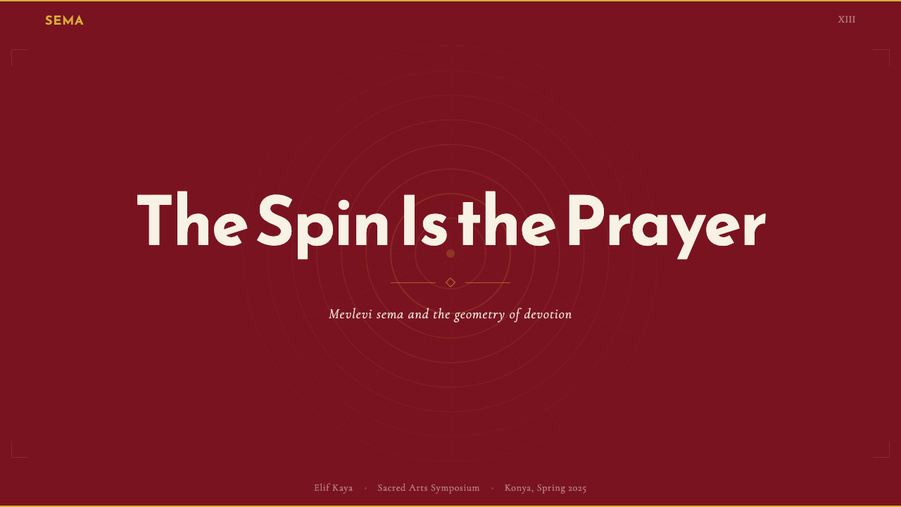
The organizing compositional principle is circular rather than rectilinear. While the system uses grid structures for text and data, its visual focal elements — figures, imagery, decorative motifs — are arranged along curves and arcs, or positioned to imply rotation around an implied center point. This reflects the sema's central act: the dervish spinning with right hand raised toward heaven and left hand turned toward earth, the body as axis between the divine and the earthly. Compositions built on this principle carry a sense of continuous, unhurried movement — a quality distinct from the static grid compositions that dominate contemporary digital design.组织性的构图原则是圆形的而非矩形的。尽管系统为文字与数据使用网格结构,其视觉焦点元素——人物、图像、装饰母题——沿弧线与曲线排列,或被定位为暗示围绕某一隐含中心点的旋转。这反映了旋转仪式的核心动作:德尔维希旋转,右手举向苍穹,左手转向大地,身体作为神圣与世俗之间的轴心。建立在这一原则上的构图,携带着一种持续而从容的运动感——这是当代数字设计中主导的静态网格构图所不具备的品质。
Layered Translucency层叠透明度
Unlike design systems that enforce flat, opaque surfaces, Sufi Whirling (Konya) uses overlapping translucent forms to suggest depth and spiritual proximity — the idea, central to Sufi thought, of veils between the perceiver and the real. White forms set against crimson grounds with reduced opacity create a luminous, diaphanous quality reminiscent of the dervish's robe in motion. Gold elements rendered as semi-transparent overlays on turquoise evoke the effect of gilded manuscript illumination on a colored ground. This translucency is not decorative softness; it is a structural device that creates visual hierarchy and an atmosphere of contemplative depth.不同于强调平面不透明表面的设计系统,苏菲旋转(科尼亚)使用重叠的半透明形态来暗示深度与精神接近——这一观念在苏菲思想中居于核心:感知者与实在之间存在层层帷幕。将透明度降低的白色形态置于深红底面上,产生出一种明亮、轻盈的品质,令人联想到旋转中的德尔维希长袍。以半透明叠加渲染在绿松石上的金色元素,唤起彩色底面上镀金手抄本装饰的视觉效果。这种透明度并非装饰性的柔化,而是一种结构性手段,创造视觉层级与冥想深度的氛围。
Calligraphic Typography书法式排印
The typographic sensibility of the system honors two parallel traditions: the Arabic Naskh calligraphic script — one of the primary scripts used in Rumi's manuscripts and in Ottoman religious texts — and classical Latin serif letterforms, which carry a comparable sense of historical weight and craft. The two traditions are not mixed within a single text block; rather, they are used in counterpoint — calligraphic forms for headings, ornamental labels, or pull quotes where contemplative character is desired, and classical serifs for body text where legibility over extended reading is the priority. Both traditions share a quality of deliberate, measured stroke; this shared sensibility makes them visually compatible despite their different cultural origins.系统的排印气质致敬两条平行传统:阿拉伯纳斯赫书法字体——鲁米手抄本和奥斯曼宗教文本所使用的主要字体之一——以及携带着同等历史分量与工艺感的古典拉丁衬线字形。两种传统不在同一文字段落内混用;而是以对位方式运用——书法形式用于标题、装饰性标签或引用段落(需要沉思气质之处),古典衬线体用于正文(延展阅读的可读性为优先)。两种传统共享一种审慎、有节奏的笔触品质;正是这一共同的气质,使它们尽管文化渊源不同,在视觉上仍然相互兼容。
Geometric Arabesque Ornament几何阿拉伯式纹饰
The system incorporates geometric arabesque patterning — the mathematically precise interlaced star and polygon forms characteristic of Ottoman tile, woodwork, and manuscript borders — as a controlled ornamental register. Unlike styles where decoration accumulates without discipline, arabesque ornament here is used at borders, separators, and background fields in a carefully modulated way: present enough to establish cultural register and visual warmth, restrained enough not to compete with content. The patterns used are geometrically derived from historical Konya and Ottoman sources, characterized by six- and eight-pointed star geometries with interlaced continuous lines.系统将几何阿拉伯式纹样——奥斯曼瓷砖、木雕与手抄本边框所特有的数学精确的交错星形与多边形——作为一种受控的装饰语域加以运用。与装饰随意堆积的风格不同,这里的阿拉伯式纹饰在边框、分隔线与背景底面处以精心调节的方式出现:存在感足以建立文化语境与视觉温度,克制感足以不与内容竞争。所用纹样在几何上源自科尼亚及奥斯曼历史案例,以六角与八角星形结合交错连续线为特征。
Meditative Negative Space冥想式留白
The sema ceremony is organized around stillness as much as movement — the dervishes spin, but the space between them and the watching sheykh is charged with silence. The design system reflects this by treating negative space not as emptiness to be filled but as active presence. Generous margins, wide leading in text, and compositional voids around central figures create a quality of breath and contemplation. This approach is at odds with the density-maximizing tendency of much contemporary digital design, but it is precisely this expansiveness that gives the style its ceremonial gravity.旋转仪式的组织,既关乎运动,同样关乎静止——德尔维希旋转,而他们与注视着的谢赫之间的空间,充满寂默。设计系统对此的反映是:将负空间视为主动的存在,而非待填充的空白。宽裕的页边距、文字的大行距,以及核心图形周围的构图空白,创造出呼吸与沉思的品质。这一方式与当代数字设计密度最大化的倾向相悖,但正是这种开阔感,赋予了这种风格其仪式性的庄重。
Warm Material Weight温暖的材质分量
The overall tactile quality of the system is weighted and textured rather than sleek and cool. This is achieved not through photographic texture overlays but through the inherent warmth of the palette — the deep red ground reads as fabric-like, the gold accents read as metallic — and through the use of slightly irregular, handcrafted-feeling calligraphic forms alongside the geometric precision of the arabesque. The result is a system that reads as simultaneously rigorous and humanly made: the precision of a master craftsman's tile rather than the precision of a laser-cut template.系统整体的触觉品质是有分量、有质感的,而非光滑、冷峻的。这并非通过摄影纹理叠加实现,而是通过色板固有的温度——深红底面读来如织物,金色强调读来如金属——以及将微有不规则感、带有手工艺温度的书法形式与阿拉伯式纹样的几何精确并置来达成。结果是一套既严谨又带有人手温度的系统:匠师砖工的精准,而非激光切割模板的精准。

See the Sufi Whirling (Konya) design system查看 Sufi Whirling (Konya) 完整设计系统
Who shaped Sufi Whirling (Konya)?谁塑造了 Sufi Whirling (Konya)?
Rumi (1207–1273) is the founding poetic and theological authority of the Mevlevi tradition. Born in Balkh (present-day Afghanistan) and educated across the Persian-speaking Islamic world, he settled in Konya around 1228, where he would spend the rest of his life. His Masnavi — a six-volume spiritual poem in Persian, often described as the Persian Quran — and the lyric verses of the Divan-i Kebir are the textual foundation of Mevlevi practice. Rumi's tomb, housed in the Mevlana Museum complex in Konya, is topped by the distinctive fluted turquoise dome that gives the design system one of its defining colors. His influence on Persian, Turkish, and globally translated mystical literature is without parallel.鲁米(1207—1273年)是梅夫拉维传统的奠基性诗歌与神学权威。生于巴尔赫(今阿富汗),在波斯语伊斯兰世界各地接受教育,约于1228年定居科尼亚,并在此度过余生。他的《玛斯纳维》——一部波斯语六卷本精神诗篇,常被称为波斯语《古兰经》——以及《大德旺》的抒情诗章,是梅夫拉维修行的文本基础。鲁米的陵墓位于科尼亚鲁米博物馆建筑群内,其上方是独特的带槽绿松石穹顶,赋予设计系统一种定义性的颜色。他对波斯、土耳其及全球翻译的神秘主义文学的影响无与伦比。
Sultan Veled (1226–1312), Rumi's eldest son, is credited with formally organizing the Mevlevi order after his father's death and codifying the sema ceremony into the structured ritual form it retains today. He established the order's administrative hierarchy, defined the roles of the sheykh and the dervishes within the ceremony, and composed music for the sema including some of the earliest-known Mevlevi compositions. Sultan Veled's organizational work transformed his father's spiritual circle into an enduring institutional order, ensuring that the ceremony's visual and musical forms were transmitted across generations with the consistency that makes them recoverable centuries later.苏丹·韦莱德(1226—1312年),鲁米的长子,被认为在其父去世后正式组织了梅夫拉维教团,并将旋转仪式成文化为它今日保留的结构化仪式形式。他建立了教团的行政层级,规定了谢赫与德尔维希在仪式中的角色,并为旋转仪式创作音乐,包括现知最早的梅夫拉维乐曲。苏丹·韦莱德的组织工作将其父的精神圈子转变为一个持久的机构性教团,确保了仪式的视觉与音乐形式跨代传承,其连贯性使它在数百年后仍可得到复原。
Şefik Can (1919–2005) was a Turkish scholar, poet, and Mevlevi practitioner who played a central role in the preservation and transmission of Mevlevi practice through the decades when it was suppressed and then carefully restored in Turkey. His extensive scholarship on Rumi's poetry and on Mevlevi ritual practice provided the documentary foundation that allowed authentic restoration of the ceremony's details — including its visual and musical dimensions — when public performance resumed. Can Dede represents the scholar-practitioner model through which living knowledge of the ceremony's precise aesthetic forms survived the institutional rupture of the twentieth century.舍菲克·坎(1919—2005年)是土耳其学者、诗人与梅夫拉维修行者,在梅夫拉维修行受到镇压、继而在土耳其被审慎恢复的数十年间,在保存与传承梅夫拉维传统方面发挥了核心作用。他对鲁米诗歌与梅夫拉维仪式修行的大量研究,提供了文献基础,使仪式细节——包括其视觉与音乐维度——在公开演出恢复后得以真实还原。坎德德代表了学者-修行者的模式,正是通过这一模式,仪式精确美学形式的活态知识才得以在二十世纪的制度性断裂中存活下来。
The Mevlevi tradition produced some of the finest examples of Persian and Turkish calligraphy and manuscript illumination across several centuries of Ottoman patronage. The anonymous master calligraphers and illuminators who produced the gilded, turquoise-bordered, and geometric-patterned manuscripts held in the Mevlana Museum and in Istanbul's Topkapi Palace archives are the direct visual ancestors of the Sufi Whirling (Konya) design system's typographic and ornamental language. The precise geometric arabesque borders, the calibration of gold and turquoise against warm cream vellum, and the relationship between calligraphic text and illuminated margin all inform the system's visual decisions in ways that no named individual can fully claim credit for.梅夫拉维传统在数百年奥斯曼赞助下,产生了波斯与土耳其书法及手抄本装饰艺术的一些最精美范例。这些无名的书法大师与装帧师,留下了收藏于鲁米博物馆和伊斯坦布尔托普卡帕宫档案馆中那些镀金、绿松石边框、几何纹样的手抄本——他们是苏菲旋转(科尼亚)设计系统排印与装饰语言的直接视觉先祖。精确的几何阿拉伯式边框、金色与绿松石在温暖奶油色羊皮纸上的校准,以及书法文字与装饰页边之间的关系,都以任何单一命名个体都无法独自声索的方式,影响着系统的视觉决策。
How do you use Sufi Whirling (Konya) today?今天怎么用 Sufi Whirling (Konya)?
Sufi Whirling (Konya) is a system defined by warmth, ceremonial weight, and meditative pacing. Applying it effectively requires understanding what it is doing structurally — using the tension between a heavy crimson ground and luminous white forms to create depth, using rotational composition to create movement, using gold and turquoise as carefully rationed accents of reverence and serenity — rather than simply layering its colors onto a neutral layout.苏菲旋转(科尼亚)是一套以温暖、仪式分量与冥想节奏为定义的系统。有效应用它,需要理解它在结构上所做的事——用深红底面与明亮白色形态之间的张力创造深度,用旋转式构图创造运动,将金色与绿松石作为精心配给的虔诚与宁静强调色——而非仅仅将其色彩叠加在中性版面上。
For presentation slides, the system is strongest when applied with restraint and scale. A cover slide benefits from the full weight of the palette: a deep crimson ground with a centrally or asymmetrically placed white form — a circle, an arc, a silhouette — and a title set in classical serif type with gold used only as a single accent element. Content slides should keep body text in white or near-white on the crimson ground, with section headings differentiated by size and by turquoise rather than by additional typefaces. Data slides work well when chart elements are assigned palette colors with purpose — crimson for primary series, turquoise for secondary, gold for highlight — and surrounded by sufficient margin that the data reads within the system's contemplative pacing rather than in spite of it.对于演示文稿,当应用节制而有规模感时,这套系统最为有力。封面幻灯片受益于色板的完整分量:深红底面上居中或非对称放置的白色形态——圆形、弧线或剪影——以古典衬线字体排列标题,金色仅作单一强调元素。内容幻灯片应在深红底面上保持白色或接近白色的正文,用尺寸和绿松石而非附加字体来区分段落标题。数据幻灯片在将图表元素有意图地赋予色板颜色时效果出色——深红用于主要系列,绿松石用于次要系列,金色用于高亮——并以充足的留白环绕,使数据在系统的沉思节奏中阅读,而非与之对抗。
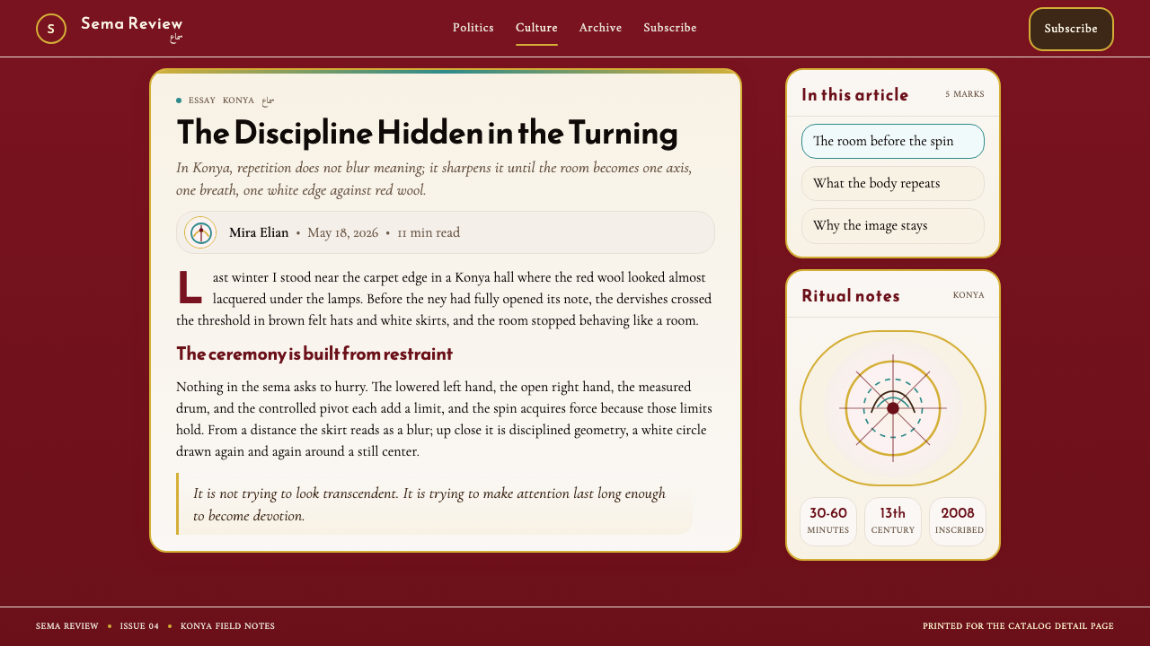
For web interfaces, the system suits platforms where trust, cultural depth, and considered experience are the desired values: cultural institutions, luxury goods, editorial platforms, retreat and wellness services, and educational environments in the humanities. Dashboard applications can use the palette effectively by assigning the crimson ground to header regions and navigation, white to content areas, and turquoise to interactive states or positive data indicators. The rotational composition principle translates well to hero sections and feature spotlights: circular image treatments, arc-shaped dividers, and radially arranged iconography all extend the system's logic into interface patterns.对于网页界面,这套系统适合信任感、文化深度与审慎体验是期望价值的平台:文化机构、奢侈品、编辑平台、静修与健康服务,以及人文学科的教育环境。仪表板应用可通过将深红底面分配给标题区域与导航、白色分配给内容区域、绿松石分配给交互状态或正向数据指示来有效运用色板。旋转构图原则在英雄区块与特性聚焦点中转化良好:圆形图像处理、弧形分隔线与径向排列的图标,都将系统逻辑延伸至界面模式中。
For editorial and marketing work, Sufi Whirling (Konya) delivers strong visual authority in contexts where the content carries historical or spiritual weight — cultural journalism, arts and humanities publishing, travel editorial focused on Turkey or the broader Islamic world, and luxury brand stories with artisan or heritage narratives. A Sufi Whirling editorial spread works well with a predominantly crimson or near-black background, generous white text set in classical serifs at a relatively large measure, and turquoise used for pull quotes or section breaks. Marketing pages benefit from the system's poster-like ability to hold a single strong figure — a white-robed form, a calligraphic headline, a geometric motif — against the weighted crimson ground, reserving gold for calls to action that should feel earned rather than urgent.对于编辑与营销内容,苏菲旋转(科尼亚)在内容承载历史或精神分量的场景中传递强烈的视觉权威:文化新闻、艺术与人文出版、聚焦土耳其或更广泛伊斯兰世界的旅行编辑,以及具有工匠或遗产叙事的奢侈品牌故事。苏菲旋转编辑跨页在以深红或近黑为主要背景、以古典衬线字体大尺度排列的白色文字,以及用绿松石区分引用段落或段落分隔时效果出色。营销页面受益于这套系统海报式的能力,将单一强有力的图形——白袍形态、书法标题、几何纹样——置于有分量的深红底面,将金色保留给应当令人感到值得赢取而非紧迫的行动号召。
A common mistake when applying Sufi Whirling (Konya) is treating it as a general warm-toned Middle Eastern style — loosely mixing its colors with other regional motifs or defaulting to a generic 'exotic' visual register. The system is specific: it is Mevlevi, Ottoman, and Anatolian, not broadly Islamic or generically Eastern. A second common error is deploying all four palette colors simultaneously at full saturation, which erases the system's careful tonal hierarchy. Authentic use typically leads with the crimson ground, carries the white as the primary figure, and uses turquoise and gold sparingly — the way a dervish's single gold-embroidered collar mark reads against an otherwise undecorated white robe.应用苏菲旋转(科尼亚)时最常见的错误,是将其视为泛化的中东暖色调风格——将其色彩与其他地域纹样随意混合,或退回到一种泛泛的「异域」视觉语域。这套系统是具体的:它是梅夫拉维的、奥斯曼的、安纳托利亚的,而非泛伊斯兰的或泛东方的。第二个常见错误是同时将四种色板颜色全部以最高饱和度铺开,这会抹去系统精心建立的色调层级。真实的使用通常以深红底面为主导,以白色作为主要前景图形,而将绿松石与金色用得克制——正如德尔维希单一金色刺绣衣领标记,在一件其他部分毫无装饰的白袍上所呈现的那样。
See the Sufi Whirling (Konya) design system查看 Sufi Whirling (Konya) 完整设计系统
Sufi Whirling (Konya) — FAQSufi Whirling (Konya) · 常见问题
Is this system only appropriate for projects with Islamic or Turkish content?这套系统只适合与伊斯兰或土耳其内容相关的项目吗?
No, though cultural fit matters. The system's visual language is specific enough that applying it to unrelated content will create a strong sense of borrowed identity — which can work as deliberate artistic choice but feels incongruous as a general-purpose corporate style. It is most naturally suited to projects that share some of its underlying values: contemplation, craft, historical depth, and ceremonial seriousness. A cultural institution, a heritage brand, a spiritual practice platform, or a humanities publisher can use the system authentically even without direct Islamic or Turkish subject matter. A consumer tech startup or a casual entertainment product would feel misaligned.不是,但文化适配度很重要。这套系统的视觉语言足够具体,以至于将其应用于不相关的内容,会产生一种强烈的借用身份感——这可以作为蓄意的艺术选择发挥作用,但作为通用企业风格则会显得格格不入。它最自然地适合分享其底层价值观的项目:沉思、工艺、历史深度与仪式庄重。即便没有直接的伊斯兰或土耳其主题,文化机构、遗产品牌、精神修行平台或人文出版商也可以真实地运用这套系统。消费科技初创公司或休闲娱乐产品则会显得错位。
How do you distinguish authentic Sufi Whirling application from generic 'Islamic-inspired' design?如何区分真实的苏菲旋转应用与泛化的「伊斯兰风格」设计?
The key is specificity and structural logic. Generic Islamic-inspired design tends to borrow surface elements — crescent shapes, arabesque swirls, gold filigree — without a consistent underlying system, resulting in decoration that feels applied rather than structural. Sufi Whirling (Konya) is built around a specific ceremony's visual logic: the crimson-white tension is not just a color combination, it is the earth-spirit duality of the sema; the rotational composition is not just a layout choice, it is the ceremony's central act made visual. Authentic application keeps this structural logic visible. When the palette, composition, and typographic choices all reinforce the same underlying idea — meditative rotation between earth and spirit — the result is coherent. When only the surface ornament is borrowed, the result is pastiche.关键在于具体性与结构逻辑。泛化的伊斯兰风格设计倾向于借用表面元素——新月形、阿拉伯式旋涡、金色镂空花纹——而没有一致的底层系统,导致装饰感觉是附加的而非结构性的。苏菲旋转(科尼亚)建立在一个具体仪式的视觉逻辑之上:深红-纯白的张力不仅仅是一种色彩组合,它是旋转仪式的大地-精神二元性;旋转式构图不仅仅是一种版面选择,它是仪式核心动作的视觉化。真实的应用保持这一结构逻辑的可见性。当色板、构图与排印选择都强化同一底层理念——在大地与精神之间的冥想旋转——结果是连贯的。当仅仅借用表面纹饰时,结果是仿制品。
Can the system work on a light or white background, or does it require the deep crimson ground?这套系统能在浅色或白色背景上使用吗?还是必须使用深红底面?
The deep crimson ground is the system's canonical base, and it is where the style's full weight is expressed. A light-background variant is possible and useful for long-form reading contexts — white or warm cream with crimson used as a strong typographic and border accent, turquoise for interactive elements, and gold used very sparingly. However, the light variant sacrifices the system's most distinctive quality: the luminous contrast between the weighted crimson earth and the white figure above it. If that tension is replaced by a light ground, the design will read as warm and classical but will lose the specific ceremonial gravity that differentiates it from other historically-informed serif styles. Use the light variant where readability over extended text is the primary requirement; use the crimson ground for high-impact, feature, and cover contexts.深红底面是系统的标准基底,也是风格完整分量得以表达之处。浅色背景变体是可能的,且在长篇阅读场景中有其用处——白色或温暖奶油色,以深红作为强烈的排印与边框强调,绿松石用于交互元素,金色极为克制地使用。然而,浅色变体牺牲了系统最鲜明的品质:有分量的深红大地与其上白色图形之间的明亮对比。若以浅色底面替代这一张力,设计将呈现为温暖而古典,但会失去将其与其他历史启发衬线风格区别开来的特定仪式庄重感。在延展文字阅读性为首要需求之处使用浅色变体;在高冲击力、特性聚焦与封面场景中使用深红底面。
How does the arabesque ornament work without making the design feel busy or dated?如何让阿拉伯式纹饰发挥作用,同时不让设计显得繁复或过时?
The key is treating arabesque pattern as a tonal texture rather than a featured motif. When arabesque appears at low contrast against its ground — a slightly lighter crimson pattern on a crimson field, or a gold-toned pattern at reduced opacity on a cream background — it reads as surface depth rather than decoration. It enriches the ground without competing with the content placed above it. When arabesque is used at full contrast as a primary visual element, it becomes the focus, and the design's informational or narrative content has to compete with it. The former approach is authentic to how arabesque functions in its source contexts — as the background fabric of architectural surfaces and manuscript borders — while the latter is the error of treating an architectural material as a poster element.关键是将阿拉伯式纹样视为色调纹理而非主角纹样。当阿拉伯式纹样以低对比度出现在其底面上——深红底面上略浅的深红纹样,或奶油背景上透明度降低的金调纹样——它读来是表面深度而非装饰。它丰富了底面,而不与置于其上的内容竞争。当阿拉伯式纹样以全对比度作为主要视觉元素出现时,它成为焦点,设计的信息性或叙事性内容不得不与之竞争。前一种方式忠实于阿拉伯式纹饰在其源头语境中的功能方式——作为建筑表面与手抄本边框的背景织物——而后一种方式则是将建筑材料当作海报元素处理的错误。
What is the correct balance between the calligraphic and the Latin serif typographic registers?书法字体与拉丁衬线字体两种排印语域之间,正确的平衡是什么?
The two typographic registers should be used in counterpoint, not in competition. The calligraphic register — whether realized through actual Arabic Naskh forms or through Latin serif typefaces with strong calligraphic heritage — belongs at the level of display: large headings, ornamental labels, opening pull quotes, and any typographic element meant to be seen before it is read. The classical Latin serif belongs at the level of extended text: body paragraphs, captions, data labels, and any context where reading over time is the purpose. Mixing them within a single text hierarchy — a calligraphic subheading immediately above a calligraphic pull quote above a calligraphic caption — eliminates the contrast that makes both registers legible in their distinct roles. One register should clearly dominate at any given scale; the other should appear only when the scale or function changes.两种排印语域应以对位方式使用,而非相互竞争。书法语域——无论是通过真实的阿拉伯纳斯赫字形实现,还是通过具有强烈书法传承的拉丁衬线字体实现——属于展示级别:大标题、装饰性标签、开篇引用段落,以及任何意在被看见先于被阅读的排印元素。古典拉丁衬线字体属于延展文字级别:正文段落、说明文字、数据标签,以及任何随时间阅读为目的的场景。在单一文字层级内混用两者——书法式副标题紧接书法式引用段落再接书法式说明文字——会消除使两种语域在各自独特角色中清晰可辨的对比。在任何给定尺度下,应有一种语域明确主导;另一种只应在尺度或功能改变时出现。
Related design styles相关设计风格
 Jordanian Petra Rose NabataeanGeology feels monumental. Crevice umbra, rose strata, and Cinzel capitals car…地质感如纪念碑。暗峡底、玫瑰岩层与Cinzel碑铭体凿出页面。
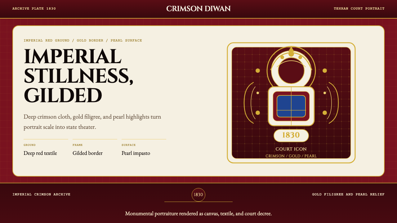 Persian Qajar Portrait (1830)Imperial stillness, gilded. Deep crimson, gold filigree, and pearl accents st…帝国深红与鎏金纹样,让肖像像王权圣像一样静立。
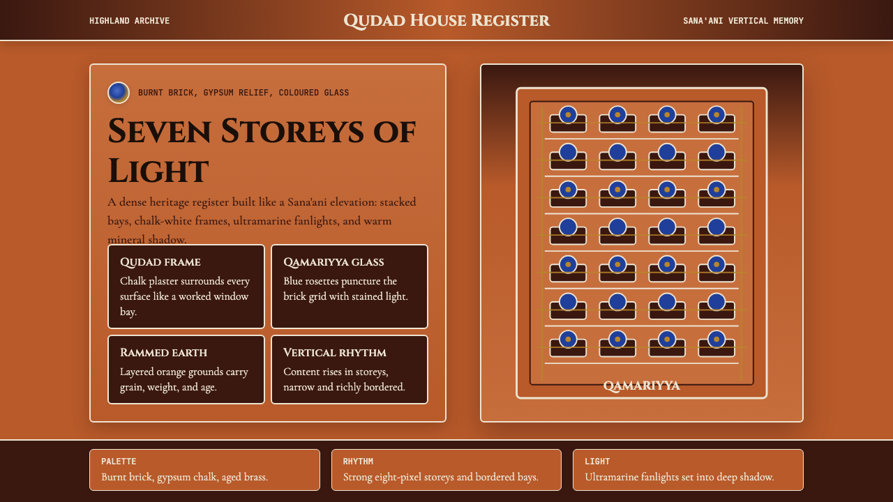 Yemeni Sana'a Old City Tower-HouseVertical memory, densely framed. Brick orange, gypsum white, and blue rosette…垂直记忆被密集镶框:砖橙、石膏白与蓝色花窗层层上升。
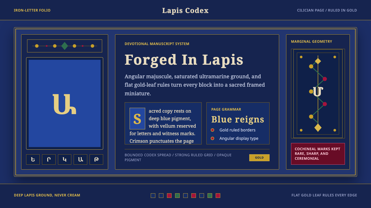 Armenian ErkatʿagirDevotional lapis reigns. Gold rules and angular serif glyphs frame a sacred g…虔敬青金石主宰:金色线框与棱角字形围合神圣网格。
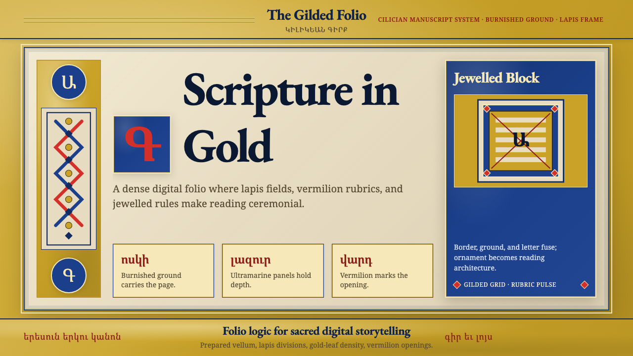 Armenian Illuminated ManuscriptGilded maximalism. Burnished gold, lapis frames, and vermilion initials build…鎏金极繁。金箔底、青金框与朱砂首字构成密实书页。
 Bhutanese Dzong (Fortress Red)Monumental red holds the page. Cobalt frames and gold bands lock the fortress…厚重藏红掌控页面。钴蓝窗框与金色横带锁定宗堡节奏。