What is Stardew Valley?
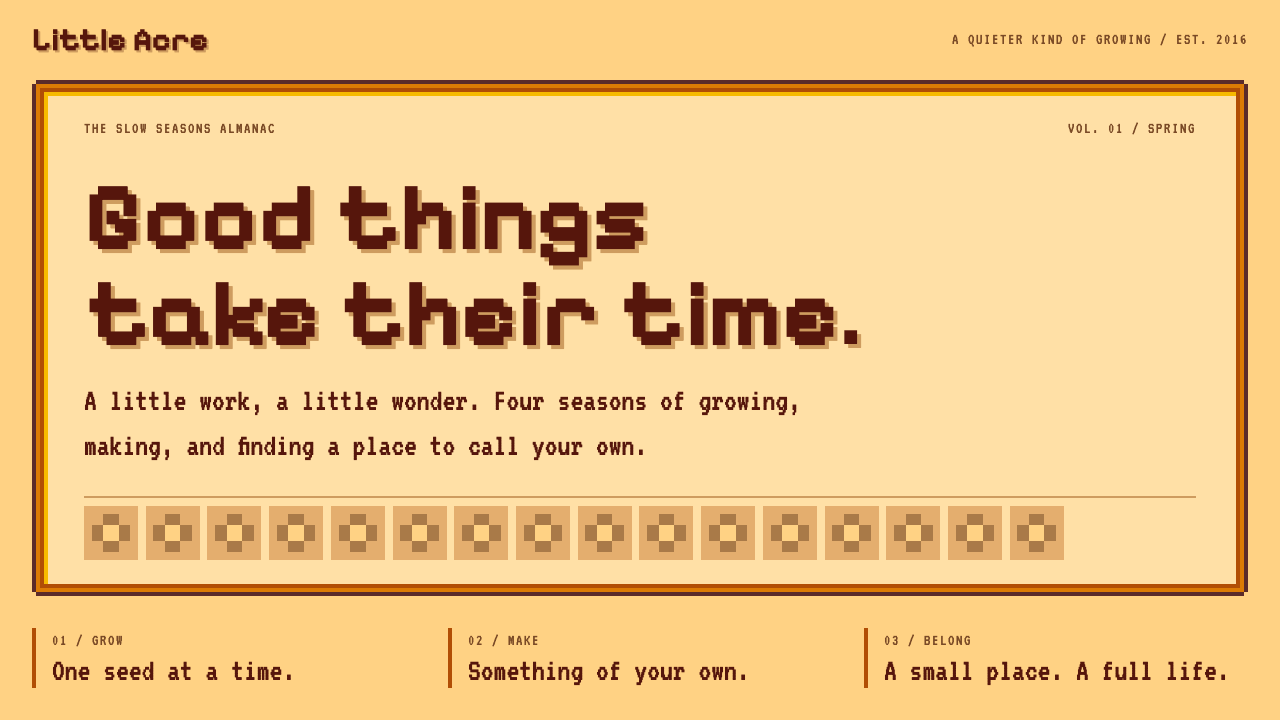
Stardew Valley's interface is a slow, handmade kind of warmth: plum pixel type on tan paper, held inside stepped orange wooden frames.
Stardew Valley in brief
The Stardew Valley style is the visual language of the menus, dialogue boxes and inventory screens in Stardew Valley, the farming game Eric Barone built on his own and released in February 2016. Its building block is a flat tan paper panel enclosed in a thick orange wooden frame, which is in turn outlined by a dark plum-brown edge.
Type is chunky and pixel-cut, set in a deep plum rather than pure black, so text feels inked rather than printed. Inventory slots sit on a strict square grid, corners are notched instead of rounded, and when a villager speaks, a framed pixel portrait sits beside the dialogue text. Nothing glows or blurs; every edge is a visible step on the pixel grid.
The overall effect is warm, handmade and deliberately unhurried. It belongs to the cosy-game tradition, where an interface is not a cold control surface but a small piece of furniture in the world: something you open, rummage through and put away, like a drawer in a farmhouse kitchen.

Where does Stardew Valley come from?
Stardew Valley came out of one person's long, solitary project. Eric Barone, who publishes under the name ConcernedApe and lives in Seattle, wrote the code, drew the pixel art and composed the music himself. The game reached players in February 2016 on PC, with Chucklefish acting as publisher, and console and mobile ports followed between 2016 and 2018. Because a single hand made nearly every asset, the interface carries a unity that team-built games often have to work hard to achieve: the same plum, the same tan, the same orange recur in every panel, because one person kept choosing them.
The game is openly a homage to the Harvest Moon series, known in Japan as Bokujō Monogatari. Those older farming games taught a generation of players that a video game could be about tending soil, befriending neighbours and watching seasons turn rather than defeating enemies. Stardew Valley inherited that premise and gave it a more generous, more detailed shell, and its menus took the same cue: a farm game should look like it was made with patient hands.
The visual style also sits inside the broader indie pixel-art revival of the 2010s. After years in which pixel graphics were treated as a technical limitation to be escaped, a wave of small developers adopted them as a deliberate expressive choice. In that setting, Stardew's interface reads as a statement. The chunky type, notched corners and flat colour fills are not a compromise with old hardware; they are a decision to make a screen feel like a crafted object.
A third strand is cosy-game culture, the loose movement of games designed to soothe rather than to challenge. Cosy games avoid fail states, favour routines, and lean on soft palettes and gentle sound. The Stardew menu is one of the clearest examples of how that mood is built visually: warm woods and paper tones, a limited palette, and a rhythm of slots and frames that invites you to arrange and tidy. Its popularity turned the look into a reference point that designers now reach for when they want an interface to feel like a home rather than a tool.
What defines the Stardew Valley look?
Color
The palette is a small, warm family: tan paper surfaces, orange wooden frames, and a deep plum-brown used for edges and type. There are no cool greys and no pure blacks. Contrast comes from value rather than hue, with dark plum text against light tan, and the few accent colours that appear, such as status greens and highlights, stay saturated but small.
Wooden frames
Every panel is wrapped in a thick orange frame that looks carved rather than drawn. The frame steps inward in tiers, with a lighter highlight on one side and a darker shade on the other, so the panel appears to sit in a groove. This stepped construction is the signature of the style, and it is built entirely from flat pixel blocks without any gradient.
Pixel type
Lettering is chunky and cut on the pixel grid, with strokes that are visibly built from squares. It is set in plum, left-aligned, and sized generously, because the interface is meant to be read at a relaxed pace. Headings are distinguished by position and framing rather than by dramatic size jumps, which keeps the typographic voice gentle.
Square slot grid
Inventory and storage are laid out as strict rows of identical square slots. Corners are notched rather than rounded, and the repetition is part of the pleasure: items drop into place, and the grid itself says that everything has a spot. In interface work, this translates into dense but calm collections of cards or tiles with uniform size and spacing.
Portrait dialogue
Conversation happens in a wide framed box with the speaker's pixel portrait set beside the text. The portrait changes expression with the mood of the line, so the dialogue box doubles as a tiny stage. It makes a human face the anchor of every exchange, which is central to the style's warmth.
Flat, shadowless depth
Depth is conveyed only through the stepped frame and through overlap between panels. There are no soft shadows, no blur and no glass effects. Elements are what they appear to be: a paper panel, a wooden border, a coloured square. This honesty is what lets the interface sit comfortably over a pixel-art game world without competing with it.

Who shaped Stardew Valley?
Barone is the sole author of Stardew Valley: he programmed it, drew its art and wrote its music. Working alone in Seattle, he treated the interface as part of the world rather than a layer on top of it, which is why menus, items and characters share one palette and one pixel logic. Nearly every decision in the style traces back to a single sensibility.
Chucklefish published the game in 2016 and helped carry it to wider audiences. Its role was less about shaping the look than about giving a one-person project a route to release and, later, to console and mobile platforms, where the interface had to be adapted to controllers and touch without losing its handmade character.
Wada created the original Harvest Moon, the Japanese farming-life series that Stardew Valley openly honours. His games established the idea that routine, seasons and neighbourly relationships could be the whole point of a video game. Stardew's menu design inherits the warm, domestic tone that those earlier titles made familiar.
A wide circle of small developers made deliberate pixel art respectable again during this decade. They did not invent the look, but they proved that blocky graphics could carry emotion and craft. Stardew Valley's interface stands on that shared groundwork, and in turn became one of the best-known examples of the idiom.
How do you use Stardew Valley today?
For slides, the Stardew look works best on covers and section dividers, where a tan paper panel inside an orange stepped frame can hold a single title in plum pixel type. On content slides, use one framed panel per idea and keep the body copy short and left-aligned. Because the style is inherently narrative, it suits decks about stories, communities, small businesses and creative journeys, and it is a poor fit for dense financial tables.
For data slides, treat each chart as an item in a slot: a framed square or rectangle with a plain label beneath it. Use the plum and orange family for series colours rather than bringing in unrelated hues, and prefer simple bar or tile layouts that echo the inventory grid. Avoid smooth gradients and thin hairline axes, which break the pixel logic.
In web interfaces, the style suits game companion sites, hobbyist communities, craft marketplaces, farm-to-table brands and personal portfolios with a gentle voice. Cards become paper panels with wooden frames, buttons become small framed tabs, and lists become slot grids. A dashboard can work if it is about something humane, such as a garden planner or a reading log, but it should keep panel counts low so the frames do not pile up into visual noise.
In editorial and marketing work, use the framed dialogue box as a device for quotes, testimonials and onboarding messages, with a small portrait or mascot beside the text. Seasonal campaigns are a natural fit, because the source game is organised around seasons. Newsletters, packaging inserts and event pages can adopt the tan paper and plum type without needing pixel art everywhere, which keeps the tone warm but not gimmicky.
The most common mistake is to copy only the colours or only the pixel font and leave out the stepped frames. Without the frame construction, the result looks like a generic retro theme rather than the Stardew idiom. The opposite error is overuse: nesting frame inside frame inside frame makes pages heavy and hard to scan. Keep one frame per meaningful unit, preserve generous spacing between panels, and let the plain tan paper do most of the work.

Stardew Valley — FAQ
Is the Stardew Valley style the same as generic pixel art?
No. Generic pixel art simply means graphics built from visible squares. The Stardew look adds a specific interface grammar on top: tan paper panels, thick stepped orange frames, plum type, notched corners and portrait dialogue boxes. You can have pixel art in a cold, neon or monochrome palette that feels nothing like Stardew, so the warm colour family and the carved frame are what actually define the style.
Why is the type plum instead of black?
Plum keeps the text in the same warm family as the tan paper and orange frames. Pure black would feel harsh against that palette and would flatten the handmade tone. A deep plum still reads clearly on light tan, but it looks inked rather than printed, which supports the slow, crafted mood the whole interface is aiming for.
Which Stardew Valley release does this style come from?
It comes from the original game released in February 2016 on PC, developed by Eric Barone and published by Chucklefish. Console and mobile versions followed between 2016 and 2018, and they carry the same menu language adapted for controllers and touch screens. The style described here is the shared look of those menus, not any one platform's variation.
Can I use this style for a serious business product?
Yes, if the product's tone is humane and the information load is modest. Craft shops, community tools, family-oriented apps and creative portfolios suit it well. For dense analytics or compliance screens it will feel mismatched, because the thick frames and generous type consume space. A sensible compromise is to use the style on landing pages and onboarding, and keep working screens quieter.
Related design styles
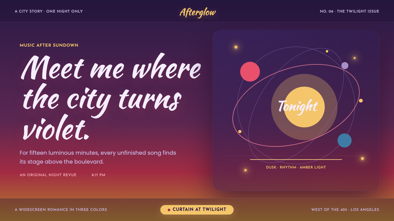 La La Land (2016)Twilight waits for a dance. Violet dusk, rose horizons and amber bulbs frame…
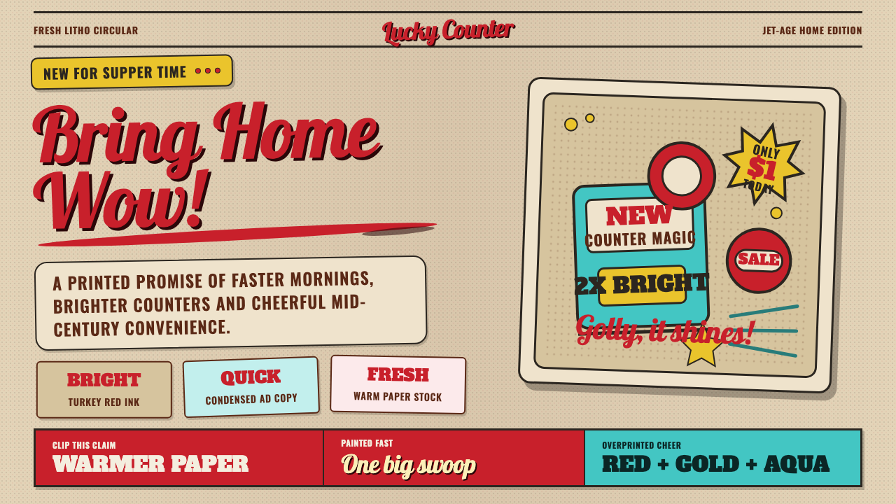 1950s Brush Script AdSells tomorrow in one swoop. Turkey red script, tan paper, starbursts, and ha…
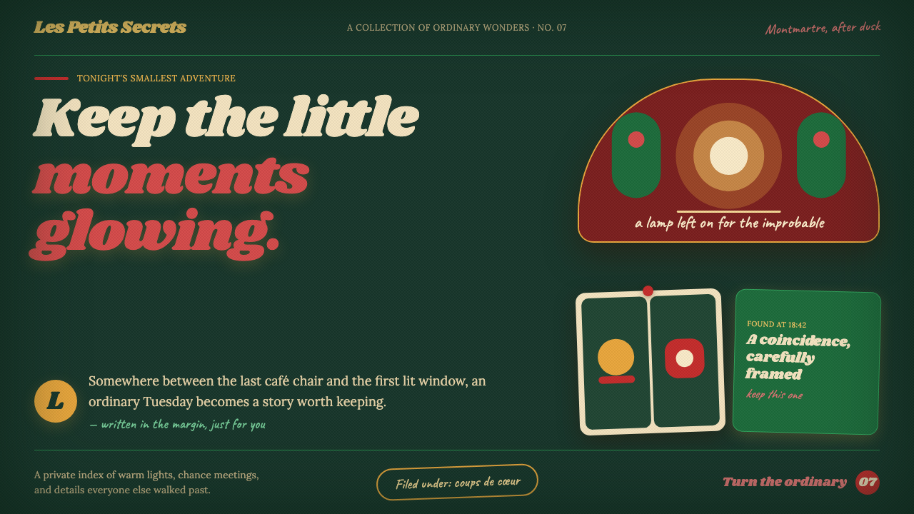 Amélie (Montmartre 2001)Ordinary moments glow like secrets. Storybook green, carmine accents, and cre…
 Pink Panther Cartoon (1963)Cool silence with a grin. Pink field, black ink, cream cel space.
 Polaroid InstantMemory made tangible. Photo-white frames tilt on aged paper with a warm rainb…
 1970s Earth TonesWarm maximalism stays muddy. Bulbous slabs, avocado bands, and harvest-gold r…