What is St. Patrick's Day Parade?
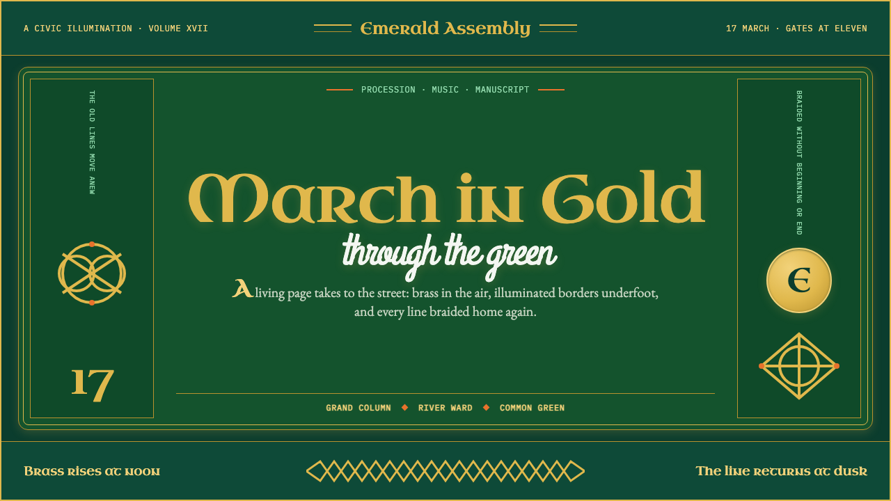
St. Patrick's Day Parade dresses street-festival noise in manuscript gold — bottle green and gilded interlace borrowed from a thousand-year-old gospel book.
St. Patrick's Day Parade in brief
St. Patrick's Day Parade is a design system built from two layers that do not obviously belong together: the loud, crowd-pleasing spectacle of an Irish-heritage street parade, and the disciplined, interlacing ornament of early medieval Irish manuscript art. A deep bottle-green ground carries brighter shamrock greens for highlight and contrast, while gold is reserved for heraldry and lettering rather than spread everywhere. The result reads as festive without ever reading as cheap.
The signature move is interlace, or knotwork: ribbon-like bands that never simply stop at a border or a corner. Instead they braid back into themselves in a closed loop, the way ornament behaves on an illuminated manuscript page, where a strand that enters a panel is required to find its way back out and rejoin itself. Key patterns and spiral motifs fill the same role at smaller scale, packing a frame edge to edge without ever resolving into a static, symmetrical grid.
A single heraldic emblem, the gold harp, functions as the system's anchor — placed the way a wax seal or a coat of arms is placed, always once, always deliberate, never scattered as a repeating pattern. Parade energy here comes from saturation and density rather than from clip-art shamrocks or plastic-green pastel washes; the style borrows its authority from the discipline of the page it descends from, not from novelty-shop iconography.
Where does St. Patrick's Day Parade come from?
The visual root of this system is the Book of Kells, an illuminated Gospel manuscript produced around 800 CE by Columban monks working in the Insular tradition shared by Ireland, Scotland, and early medieval Britain. It survives as one of the most elaborately decorated manuscripts of the early Middle Ages: entire pages are given over to a handful of words wrapped in interlace, spirals, and key patterns so dense that the lettering nearly dissolves into ornament. Housed today at Trinity College Dublin, its knotwork panels are the direct ancestor of the gold interlace this parade system borrows for its borders and capital letters.
For most of its history, March 17 was a solemn feast day rather than a public festival. The Catholic Church formally added Saint Patrick's feast to its liturgical calendar in the seventeenth century, fixing the date as a religious commemoration of the missionary bishop credited with Ireland's Christianization centuries earlier. For roughly two hundred years afterward, the day belonged to church observance, not to marching bands or street crowds.
The parade itself was invented an ocean away from Ireland. In 1762, Irish soldiers serving in British regiments stationed in colonial New York City marched through the streets on March 17 with fifes and drums, using the day to publicly reconnect with an Irish identity that had to stay quiet the rest of the year. Historians generally point to this march as the first St. Patrick's Day parade — meaning the format that eventually defined the holiday worldwide was an American diaspora invention that only later exported itself back across the Atlantic.
The manuscript-grade look draws on a separate, later thread: the nineteenth- and twentieth-century Celtic Revival, a renewed interest in early medieval Celtic ornament that ran alongside a broader search for Irish cultural identity during a period of mass emigration. George Bain spent decades studying surviving interlace, key patterns, and spirals in stone and vellum and reverse-engineered the geometric grids that generate them, turning ornament that had looked almost mysterious into a method other designers could reproduce. Archibald Knox, working for the London retailer Liberty & Co. in the early twentieth century, carried the same Insular vocabulary into Arts and Crafts metalwork and jewelry. Decades later, Jim Fitzpatrick's illustrated retellings of Irish myth kept interlace and spiral ornament circulating in popular graphic art, far outside museum cases — which is how a monastery's manuscript ornament ended up decorating a modern parade banner.
What defines the St. Patrick's Day Parade look?
Color
Deep bottle green carries the ground, with a brighter shamrock green reserved for highlight and contrast rather than covering equal area. Gold is used sparingly for heraldry and lettering, never as an allover wash. Structural linework sits in black or a deep brown, and small gaps in the interlace let a parchment-cream tone read through, echoing the vellum page underneath the ornament.
Interlace and Knotwork
Ribbon-like bands never terminate at a border or corner; they braid back into themselves, forming a closed loop the way strands behave across a manuscript page. The rule is topological, not decorative: a strand that enters a panel must find its way back out and rejoin itself, which is what separates authentic interlace from a random tangle.
Heraldic Anchor
The gold harp of the Irish coat of arms is used the way a wax seal or a crest is used: placed once, at a deliberate point in the composition, never repeated as a pattern. It gives the whole system a single unambiguous focal emblem, which is what allows the surrounding ornament to stay dense without becoming visually noisy.
Lettering
Headline treatment draws on the rounded, majuscule letterforms of Insular manuscript script, rendered in gold to echo an illuminated capital rather than a contemporary sans-serif. Because these forms are ornamental rather than built for extended reading, they are reserved for short headlines and titles, never for body copy.
Density and Saturation
Ornament fills a frame edge to edge rather than leaving open pastel space; the style's festive quality is communicated through density and color saturation, not through empty background or diluted, novelty-store green. Restraint is expressed by limiting how many distinct knot patterns appear, not by thinning out any single pattern.
Material Weight
Gold reads as gilt or leaf, with a matte, weighted quality, rather than as glitter or neon shine. Green reads as pigment or enamel rather than a flat digital hue. Nothing in the system should look printed-cheap; the material sensibility is closer to a ceremonial object than to a party-store banner.

Who shaped St. Patrick's Day Parade?
A Scottish art teacher who spent decades studying surviving Celtic interlace, key patterns, and spirals carved in stone and drawn on vellum. In his book Celtic Art: The Methods of Construction, he reverse-engineered the geometric grids that generate these patterns, turning ornament that had looked almost mysterious into a drafting method other designers could reproduce and teach.
A Manx designer who worked for the London retailer Liberty & Co. in the early twentieth century, fusing Insular interlace with the flowing line of Art Nouveau in silver, pewter, and enamel jewelry and tableware. His work proved the manuscript vocabulary could migrate from a vellum page to a manufactured object without losing its identity.
An Irish illustrator who, from the 1970s onward, retold Irish mythology in books rendered in a bold, poster-flat Celtic style. His work carried interlace and spiral ornament into popular, psychedelic-era graphic design, keeping the aesthetic visible to a mass audience well beyond museum cases and manuscript facsimiles.
How do you use St. Patrick's Day Parade today?
The system's core discipline — a border logic that loops instead of stopping, plus a single fixed heraldic anchor — transfers cleanly to any format built around a strong frame: parade programs, festival posters, pub signage, and heritage-brand packaging all benefit from the same restraint.
For presentation slides, a cover works well with a dark bottle-green field, one gold harp placed deliberately in a corner or center, and a single continuous knotwork rule running along an edge. Content slides should use interlace only as a border or divider, never as a filled background that competes with text; data slides should hold to one desaturated highlight color used sparingly, so a chart reads clearly against the dark ground.
For web interfaces, treat interlace the way a picture frame is treated: at the page perimeter, in dividers, in corner flourishes — never as the background behind body content. Keep the main content area a flat bottle green or parchment cream, reserve gold for a single wordmark or crest lockup rather than for every icon, and set body copy in a plain, highly legible typeface, saving the uncial-derived headline treatment for short titles only.
For editorial and marketing work, a heritage or event brand is best served by one fixed crest used consistently across print and digital, paired with a small, limited set of interlace motifs. Introducing many different knot patterns in competition with each other reads as clutter rather than richness — the system rewards repetition of a few motifs over variety.
The most common mistake is reaching for clip-art shamrocks, pastel-green washes, or generic four-leaf-clover icons to signal the holiday. This style earns its authority from manuscript-grade line discipline and heraldic restraint, not from novelty-shop iconography — the harp, not the shamrock, should carry the visual weight.
St. Patrick's Day Parade — FAQ
Isn't this style just green plus shamrocks?
No — the shamrock is largely absent from an authentic version of this system. Its visual authority comes from Insular manuscript interlace, the closed-loop knotwork seen in the Book of Kells, and from a single heraldic anchor, the gold harp. That is a much older and more disciplined vocabulary than the pastel-green, clip-art shamrock look sold in novelty stores, and it reads as considered rather than seasonal.
Why is gold reserved for just a few elements instead of used everywhere?
In the Insular manuscript tradition, gold marked emphasis — an illuminated capital, a sacred name, a border around the most important passage. It was never applied evenly across a page. Carrying that hierarchy into the parade system means gold still functions as a marker of importance: the harp, a headline, a border. Spread it everywhere and it stops signaling anything, which is why the system keeps it scarce.
Does this style require a dark background to work?
The parade version leans dark and saturated — deep bottle green — because that intensity is what carries festival energy and makes the gold heraldry read as gilt rather than flat print. A lighter, parchment-cream version is historically legitimate too, closer to the vellum page itself, but it trades festive punch for a more solemn, document-like feeling — better suited to heritage or ceremonial contexts than to street-parade energy.
How can you tell authentic knotwork from a generic 'Celtic' clip-art pack?
Look at whether the interlace is topologically continuous: in authentic knotwork, based on the construction methods George Bain documented, every strand that enters a panel eventually finds its way back out and rejoins itself in a closed loop, with a consistent strand width throughout. Generic clip-art packs often break this rule — lines that appear to cross but don't actually complete a loop, or strand widths that shift without reason. The tell is always in whether the knot actually closes.
Related design styles
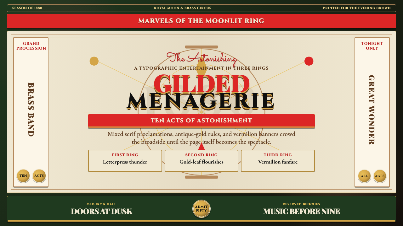 Victorian Circus Poster (1880)Spectacle leaves no inch quiet. Forest green, antique gold borders, mixed ser…
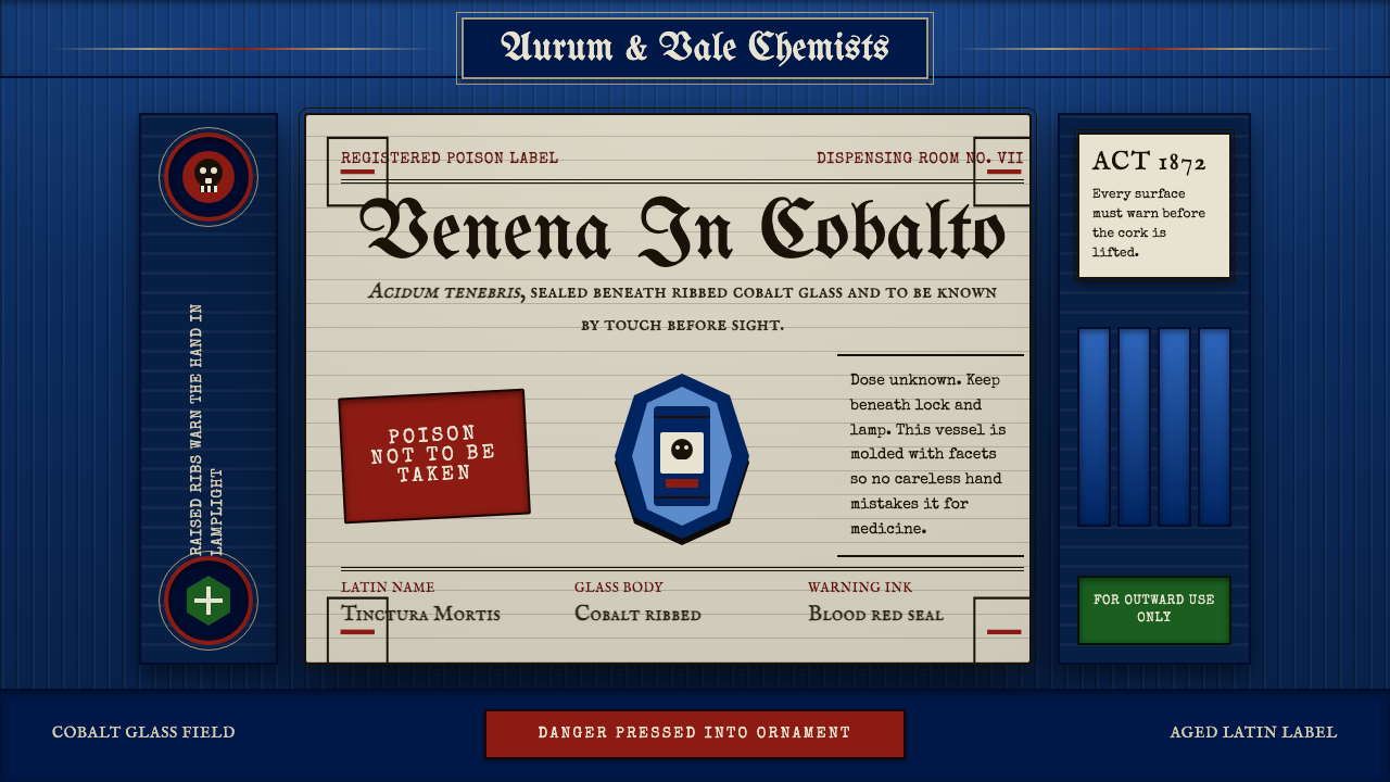 Apothecary Poison LabelDanger made ornate. Cobalt ribs, aged paper, and red POISON rules make fear t…
 Journey to the West (Monkey King)A god roars off the block. Vermilion opera paint and gilt rules ignite a lacq…
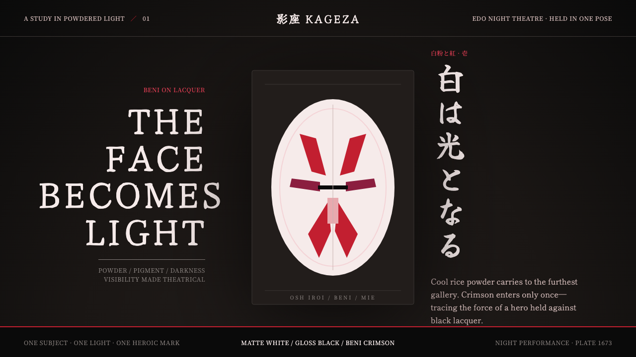 Kabuki Oshiroi WhitefacePowder becomes stage light. Cool white cuts through black lacquer with one he…
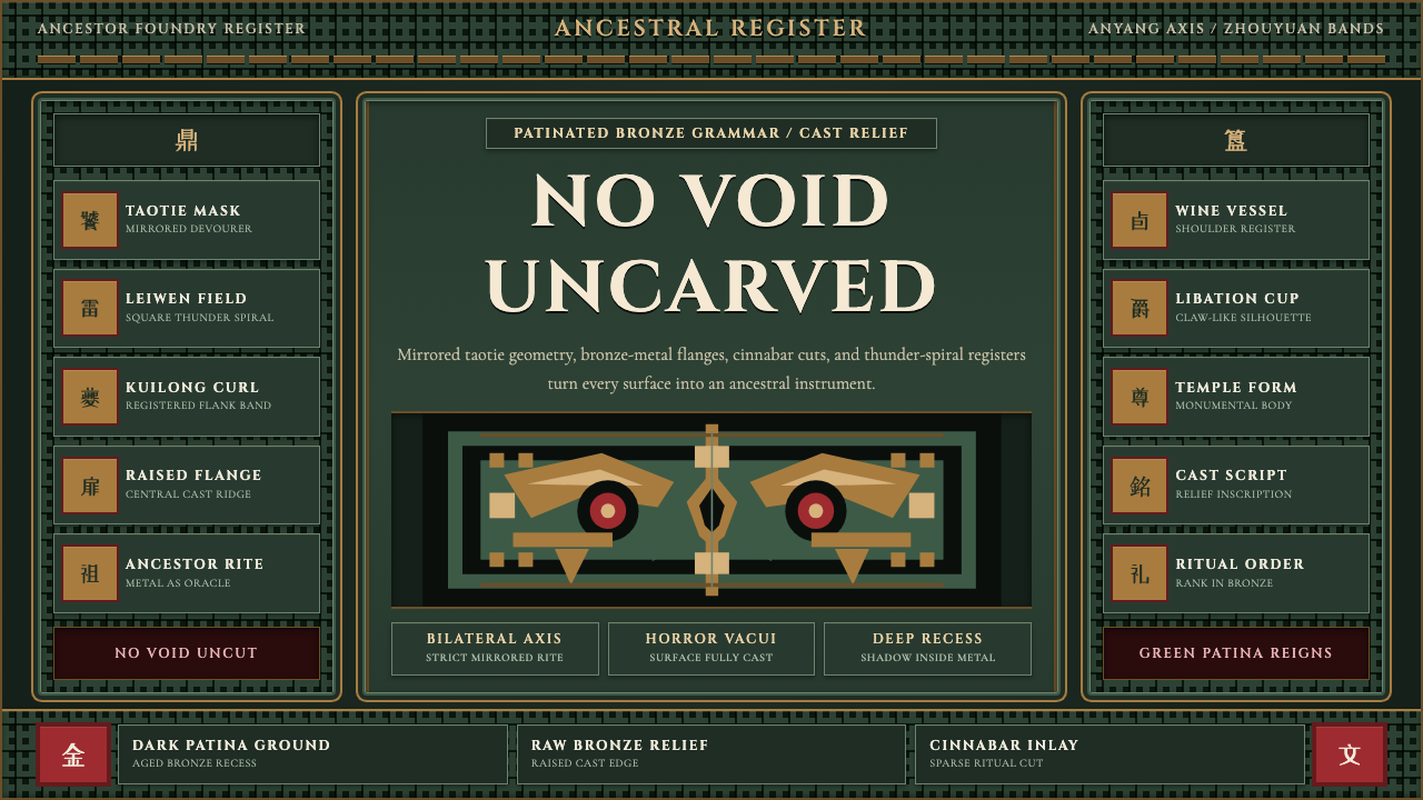 Shang-Zhou Ritual BronzeAncient terror fills every surface. Patina green, bronze relief, mirrored tao…
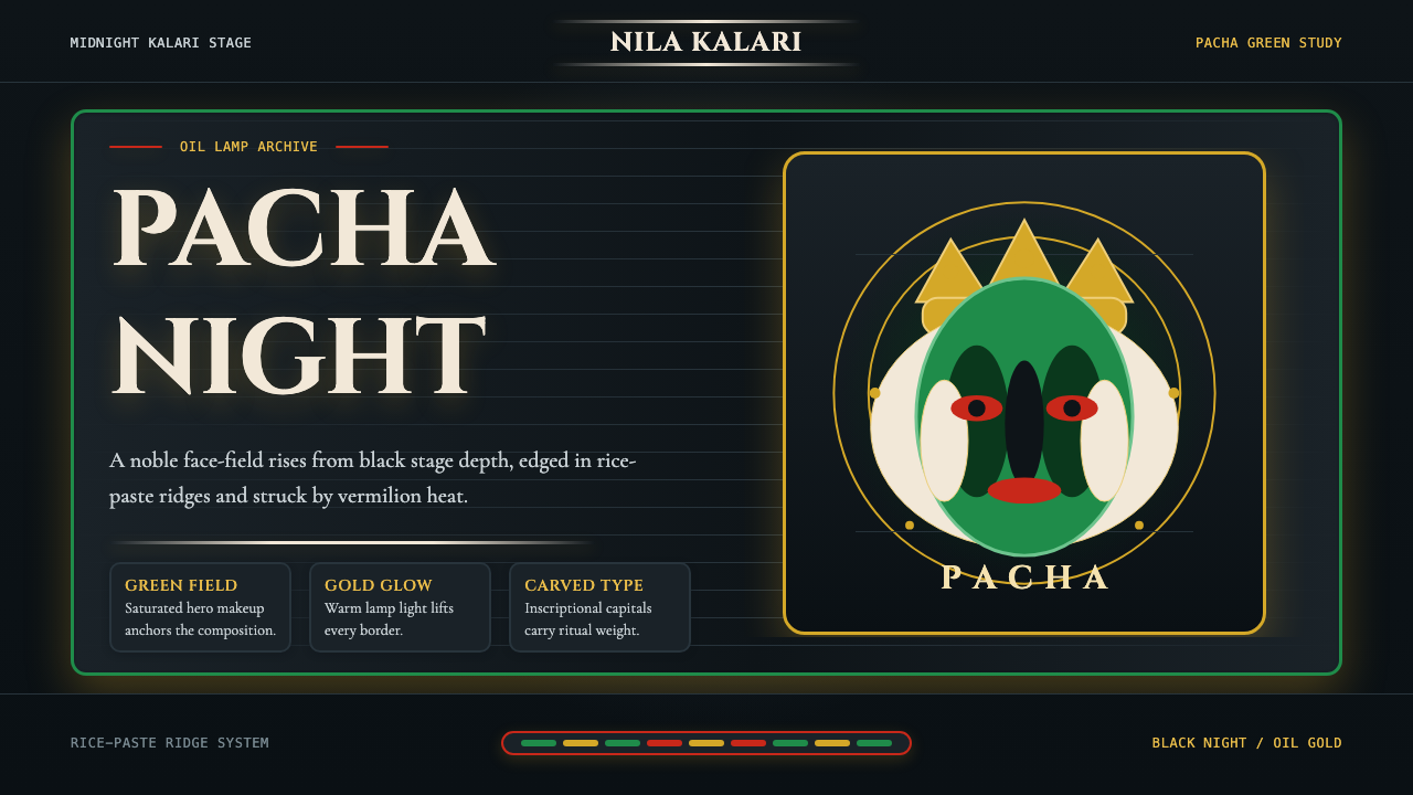 Kerala Kathakali (Pacha Green Makeup)Fierce ceremonial night. Pacha green, vermilion, and oil-gold frame monumenta…