What is SPY×FAMILY?
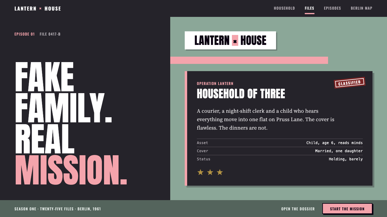
SPY×FAMILY builds its look from a single calm key visual: a flat sage field, a plain white title plate and one small, bright pink accent, all with the dry humor of a spy poster about a fake family.
SPY×FAMILY in brief
The SPY×FAMILY Forger style is a restrained, light-toned aesthetic based on the 2022 anime adaptation of Tatsuya Endo's manga. The story follows a spy, an assassin and a telepathic child who pretend to be a family in Berlint, a city drawn from Cold War Berlin. The design system takes its cue from the first key visual: a flat sage grey-green field, a plain white logo plate, and the pink of the child, Anya, as the brightest thing in the frame.
The style is built on contrast between seriousness and play. The structure borrows from espionage: condensed capital lettering of the kind seen on 1960s spy-film posters, mission dossiers, identity cards and split-screen panes. The color and the characters inside it are soft, domestic and funny. This pairing of tense form with gentle content is what gives the style its dry, cool humor.
Overall it is clean and quiet. Surfaces are flat, shapes are simple, and the palette is narrow. Instead of shouting, the style relies on precise placement, strong typographic capitals and a single pink accent to make a layout feel intentional, like a well-made title sequence.

Where does SPY×FAMILY come from?
The manga SPY×FAMILY, by Tatsuya Endo, launched in 2019 on Shonen Jump+, and its first anime season aired from April to December 2022. The adaptation was produced by Wit Studio and CloverWorks together. Kazuhiro Furuhashi is credited among its key figures, Kazuaki Shimada appears in connection with character design, and the music is credited to the project (K)NoW_NAME.
The look draws on 1960s spy-film title and poster design. In that era, thriller posters and title sequences leaned on bold condensed capitals, flat color fields, strong geometric blocks and sliding bars of color. Their graphic language promised secrecy and efficiency in a few simple shapes. SPY×FAMILY borrows that vocabulary but uses it to frame a comedy about a pretend household.
Its story setting adds another layer. Cold War espionage fiction, with its divided city, double identities and quiet menace, gives the series its mood of concealment. At the same time, the show belongs to the tradition of Japanese television anime family comedy, where daily domestic life, school and meals are the heart of the story. The visual system sits exactly between these two traditions: the grammar of the spy thriller applied to the content of a family sitcom.
The first key visual established the palette that this system reuses. A single flat green-grey tone fills the frame, a white title plate sits plainly on it, and the pink of Anya's hair becomes the focus. The choice to make one small element the brightest color, rather than filling the picture with saturation, is the principle the whole style follows.
What defines the SPY×FAMILY look?
Flat sage field
The page ground is a single flat grey-green with no gradient, texture or photograph. It is calm, slightly cool and slightly retro, and it keeps the layout from feeling either clinical or childish. Everything else is placed on this quiet field.
The plain white plate
Titles and key content sit on clean white plates with no decoration. The plate acts like the logo card in a title sequence: it gives the most important information the highest contrast and the most calm. The simplicity of the plate is what lets small accents stand out.
Condensed spy-poster capitals
Headlines use tall, narrow, heavy capital letters in the manner of 1960s spy-film posters. They look authoritative and slightly theatrical, and they fit a lot of words into a narrow space. Set in all caps with generous spacing around them, they feel like a classified header.
One pink bar
Pink is the single bright accent, used as a sliding bar, underline or small highlight. It echoes the child at the center of the story and gives the eye a place to land. Because it is used so sparingly, it reads as a deliberate signal rather than decoration.
Split-screen panes
Layouts divide into panes that slide or stack, borrowing from the title sequences of the series. Two halves of a screen can show two sides of a story, such as the spy and the family, or the public face and the secret one. Edges are straight and gaps are narrow and consistent.
Mission dossiers and identity cards
Information is presented as files and cards: a dossier with labeled fields, an identity card with a photo area, a ranked list of missions. The structure is formal, but the content can be funny. Star-shaped merit badges from the child's school add a small, comic layer of bureaucracy.
Cool, dry humor
The tone is understated. Copy is short and deadpan, and the layout never explains the joke. Humor comes from the gap between official form and ordinary content, such as a classified file that contains breakfast plans. The design leaves space for that gap to be felt.

Who shaped SPY×FAMILY?
Endo is the manga artist who created SPY×FAMILY, launching it in 2019 on Shonen Jump+. The premise of a fake family assembled for a secret mission, and the comedy between its three members, is the source of everything this design system expresses.
Furuhashi is credited among the key figures of the anime adaptation produced by Wit Studio and CloverWorks. The adaptation turned the manga's black-and-white pages into the calm, color-controlled screen language from which this design system takes its palette and composition.
Shimada is listed among the creative figures of the adaptation, and is associated with the character design. The simplified, clean figures of the family members are what let the flat, poster-like presentation work without visual clutter.
(K)NoW_NAME is credited for the music of the adaptation. The music's cool, jazzy, spy-film sensibility is the sonic counterpart of the style's visual references to 1960s spy cinema, and the two together create the series' dry, stylish tone.
How do you use SPY×FAMILY today?
In slides, this style is excellent for reports, project updates, onboarding decks and any presentation that needs to feel organized but not corporate-grim. A flat sage background with a white title plate and a single pink bar makes a distinctive cover. For content slides, keep one idea per white plate, set the headline in condensed capitals, and use a split-screen layout when comparing two sides. Data slides benefit from dossier-style tables, with a single pink highlight on the key figure.
On the web, it fits product sites, tools, documentation, service pages and brand sites that want a quiet, confident look with a wink. Navigation can be minimal and typographic. Dashboard or workflow pages can borrow mission-file and identity-card structures for lists and profiles. Pricing pages can be set as clean white plates on the sage field, with pink marking the recommended plan.
For editorial and marketing work, it suits title cards, newsletters, event invitations, case-study covers and social posts that need a distinct, cinematic opening. Pair short, deadpan headlines with one strong image or none at all. The title-sequence feel works best when motion is simple, such as a bar sliding across the screen.
Keep the pink accent scarce. One bar, one underline or one badge per view is enough. The calm of the sage field is what makes the pink visible, and the discipline of using it rarely is what keeps the style from turning into generic pastel design.
The most common mistake is filling the sage field with more colors, gradients or textures, which destroys the flat, poster-like clarity. Another is over-playing the spy theme with literal clip-art such as magnifying glasses and silhouettes. The style works through typographic structure and restraint, not through props.

SPY×FAMILY — FAQ
What is the SPY×FAMILY Forger style?
It is a restrained, light-toned style based on the 2022 anime adaptation of Tatsuya Endo's manga. It combines a flat sage grey-green field, a plain white title plate, condensed spy-poster capitals, split-screen panes, mission-dossier layouts and a single pink accent bar.
Where does the spy-poster look come from?
It comes from 1960s spy-film title and poster design, which used bold condensed capitals, flat color fields and sliding bars of color. The anime adapted that visual language and applied it to a family comedy set in a city modeled on Cold War Berlin, and this design system carries the same combination into interfaces.
Why is only one pink bar used?
The pink represents the child at the center of the story and is the brightest thing in the original key visual. Using it once makes it the focal point and keeps the flat sage field calm. Multiple pink elements would compete with each other and weaken the signal.
Is it a light or dark style?
It is a light style. The sage field and white plates give it a pale, calm overall tone with dark text. It is not a high-key white interface, though; the grey-green ground gives it more warmth and character than plain white.
What kinds of projects suit it best?
Reports, onboarding materials, product and tool sites, documentation, newsletters and brand pages that want a clean, confident and slightly witty look. It suits content that is organized into files, cards and lists. It is less suited to high-energy entertainment or maximalist designs, where its quiet restraint would feel underpowered.
Related design styles
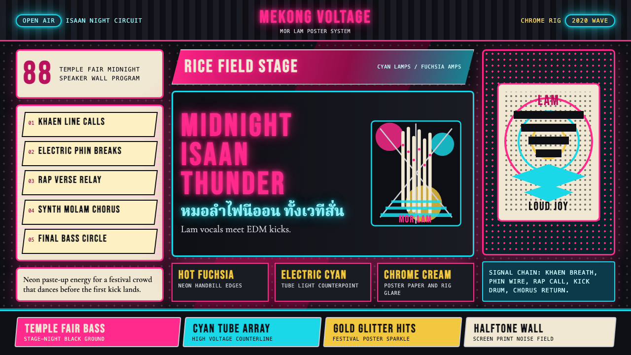 Thai Mor Lam Isaan (2020)Joy at maximum volume. Fuchsia-cyan neon, chrome type, and halftone grids hit…
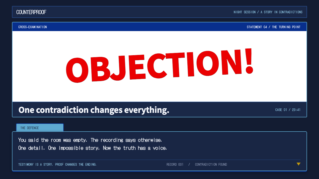 Ace AttorneyQuiet testimony. One red shout breaks the navy calm, with bitmap dialogue bel…
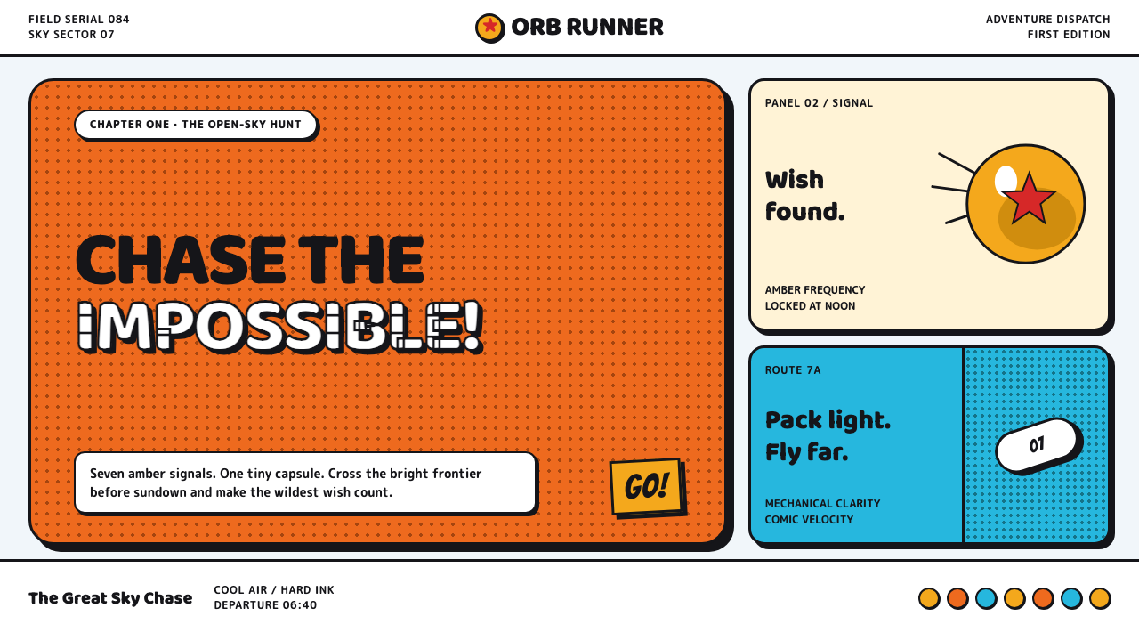 Dragon Ball (1984)Adventure lands with comic force. Gi-orange panels, amber spheres and crisp h…
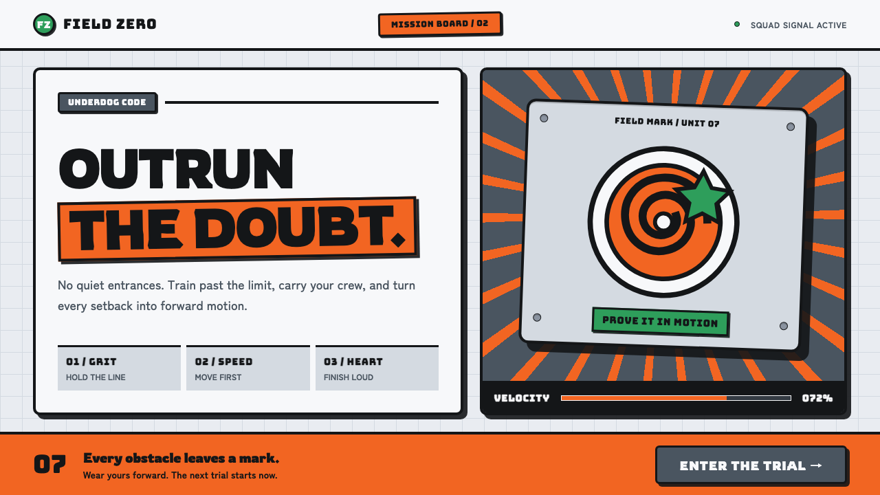 Naruto (2002 anime era)Underdog energy refuses the background. Hazard orange strikes steel-gray grid…
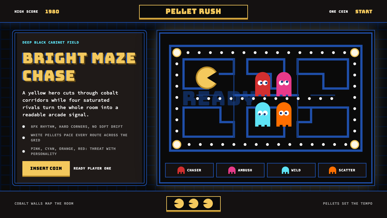 Pac-Man (Namco 1980)Arcade joy burns bright. Yellow disc, cobalt maze, and four ghost hues snap o…
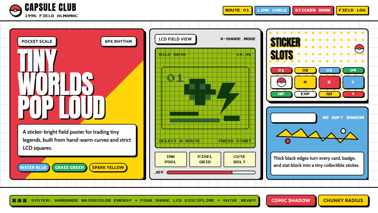 Pokémon Game BoyKawaii meets cartridge logic. Capsule red, LCD green, Anton heft, and 8px gri…