What is Spore Print Card?
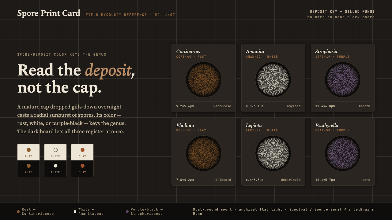
Read the deposit, not the cap: Spore Print Card turns radial fungal evidence into a sober field system of rust, white, purple-black, and near-black board.
Spore Print Card in brief
Spore Print Card distills the reference cards used by mid-century North American field and herbarium mycologists. Its visual subject is not the mushroom cap but the deposit left by its gills: a radial pattern in rust-brown, white, or purple-black, placed on contrasting paper and mounted against a near-black board.
The style is documentary rather than illustrative. A spore print is treated as evidence that can help key a genus, so the composition gives priority to legibility, contrast, and pattern. The radial structure becomes the main image; surrounding elements stay quiet, allowing the deposit to carry the meaning.
Its mood is sober, monochromatic, and data-forward. Rust brings an earthy note, white supplies clarity, and purple-black deepens the field without introducing brightness or playfulness. The near-black mounting ground gives the card the presence of a specimen record: measured, tactile, and designed for comparison.
Where does Spore Print Card come from?
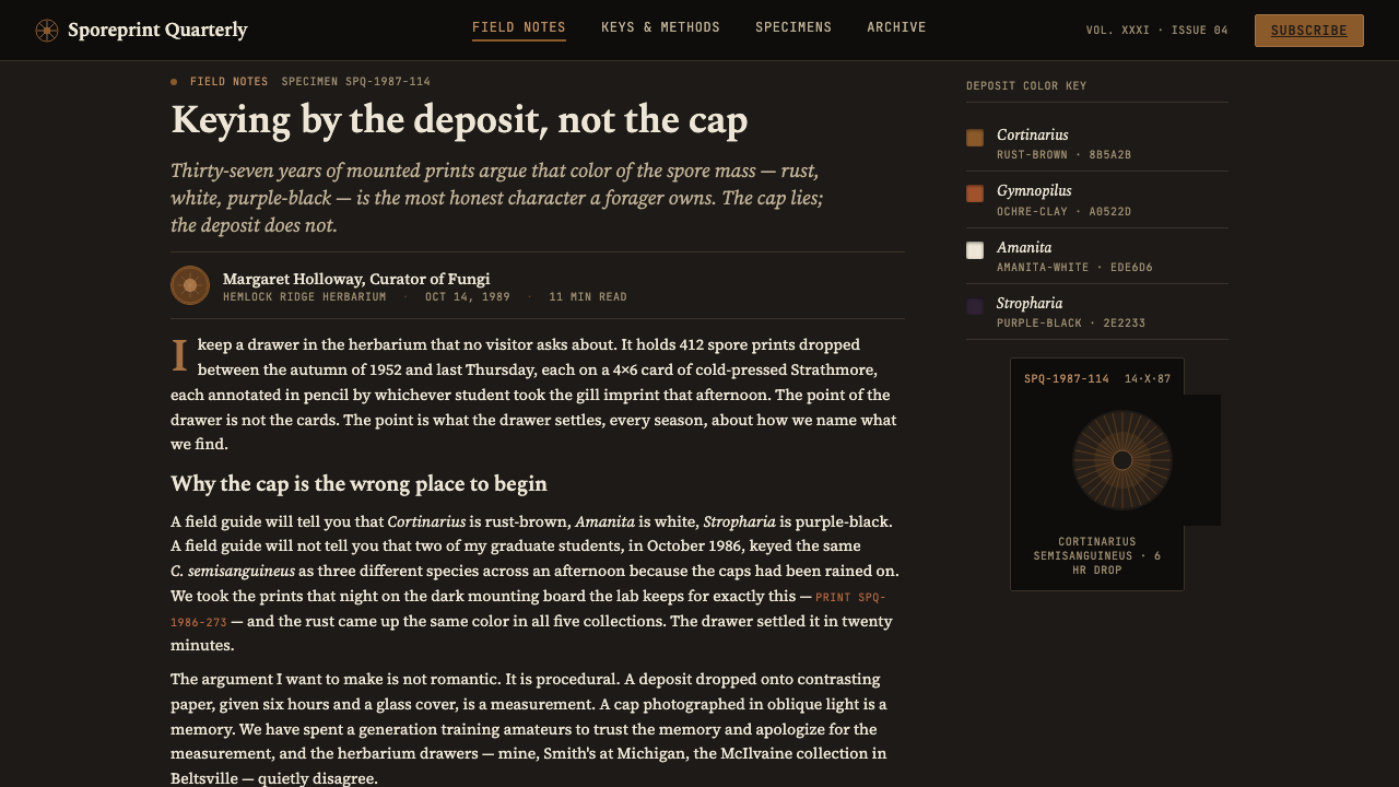
The style belongs to the practical world of North American field mycology from the middle of the twentieth century through the end of the century. Its point of departure is the reference card: a compact record made to preserve a visual deposit and support identification across field and herbarium collections.
Spore-print keying gives the system its central image. The gill pattern is expressed as a radial deposit rather than as a picture of the organism that produced it. That shift is decisive. The card records a diagnostic trace, so shape, density, direction, and color matter more than naturalistic depiction.
Color practice follows the needs of observation. White prints require a dark surface, while dark prints require a light one. The near-black mounting ground therefore has a practical origin, not merely a dramatic one: it allows white, rust, and purple-black deposits to remain distinguishable within the same visual family.
Between the field and the herbarium, the reference card becomes a bridge between collection and comparison. The resulting design language is restrained because its purpose is not display but dependable reading. Spore Print Card carries that discipline into a contemporary visual system while preserving the character of the original documentation practice.
What defines the Spore Print Card look?
Near-Black Ground
The mounting ground is near-black, matte, and visually quiet. It gives the card a dense field against which pale deposits can register clearly, while also making rust and purple-black feel like material evidence rather than decorative color.
Radial Deposit
The radial gill pattern is the governing geometry. It should read as a deposited structure with a clear center and outward movement, not as an ornamental sunburst or an abstract decorative motif.
Restricted Deposit Colors
The palette stays with rust-brown, white, and purple-black. These colors are simultaneously distinguishable but closely related, producing variation without breaking the sober, nearly monochromatic character.
Contrast as Method
Contrast is functional. Light deposits need the dark board; dark deposits need a lighter paper field. The system uses contrast to preserve information, never to create spectacle.
Documentary Hierarchy
The deposit receives the strongest visual emphasis. Supporting labels, captions, and classification details should remain subordinate, creating the feeling of a reference record rather than a poster competing for attention.
Earthbound Restraint
The style is earthy without becoming rustic and scientific without becoming sterile. Matte surfaces, subdued colors, and controlled spacing keep the experience tactile, serious, and free of playful novelty.
Who shaped Spore Print Card?
These practitioners give the style its documentary purpose. Their work connects field collection with herbarium reference, making the spore deposit a readable record rather than an image used only for atmosphere.
Their attention to deposit color makes the palette structural. Rust-brown, white, and purple-black are not interchangeable accents; each belongs to the visual evidence being compared.
As a working method, practical mycology supplies the style with its directness: observe the deposit, preserve the pattern, and organize the card around identification.
This practice supplies the card format and its sober discipline. The result is a visual language built for repeated consultation, comparison, and classification.
How do you use Spore Print Card today?
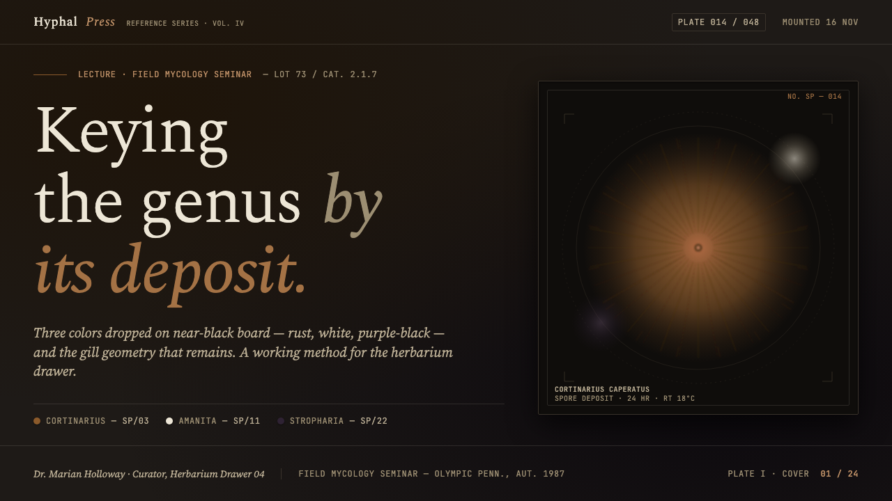
For presentation covers, use the radial deposit as the central visual event against a near-black field. Keep the title restrained and let the evidence-like pattern establish the subject immediately. A rust-brown deposit can introduce warmth; white can create the clearest reading; purple-black can make the cover feel denser and more archival.
For content and data slides, treat each page as a reference card. Give one deposit or radial structure clear priority, then organize captions, labels, and comparison notes around it. Data should feel catalogued rather than decorated: restrained color distinctions, quiet supporting text, and generous empty ground are more faithful to the system than dense infographic ornament.
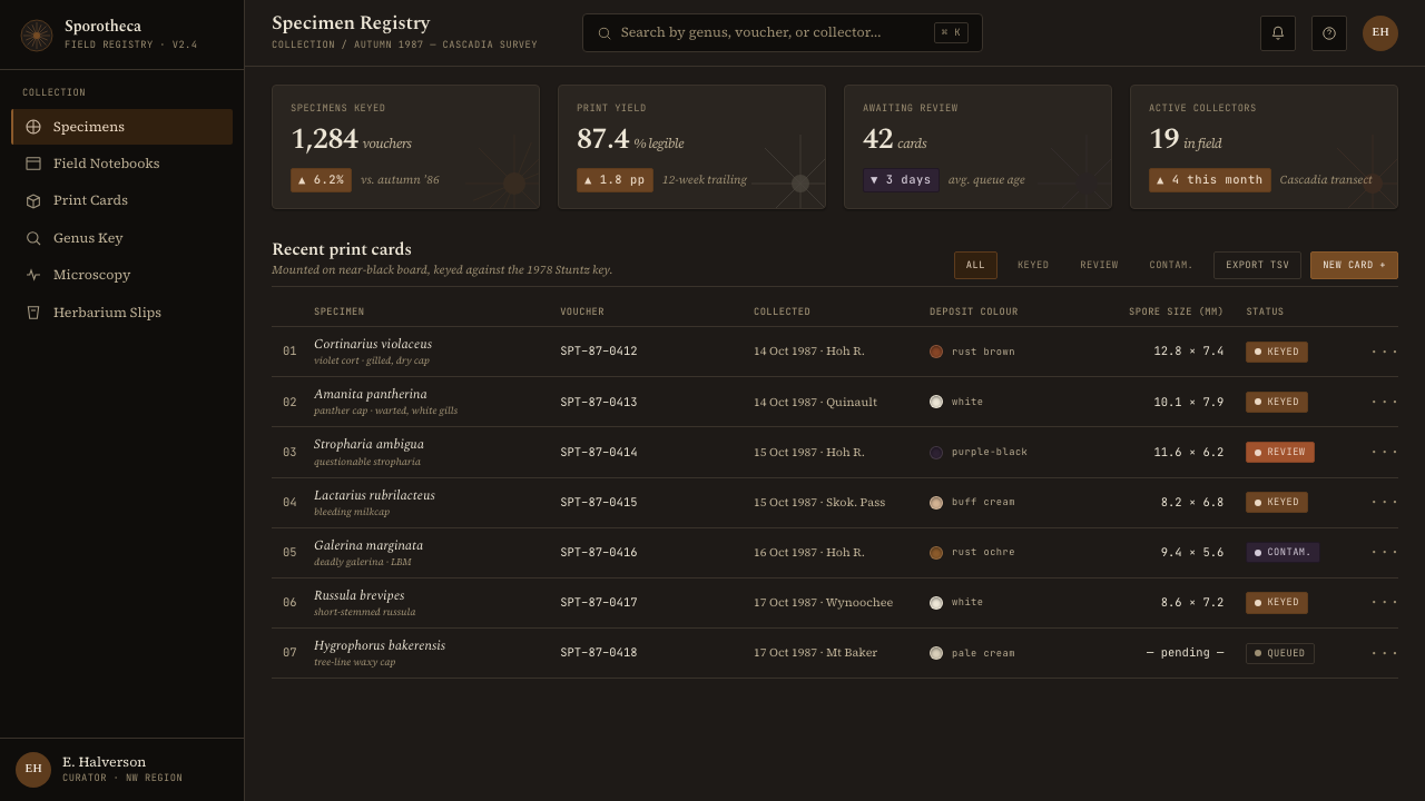
For web interfaces, Spore Print Card suits dashboards, classification tools, research indexes, and pricing pages that want to communicate seriousness and evidence. Use near-black surfaces for the main frame, pale fields where dark information must be read, and rust or purple-black only where status, grouping, or emphasis requires it. Cards should feel mounted and collected, not floating like soft consumer widgets.
For editorial and marketing work, the style supports specimen-led storytelling. A feature page can pair a large radial deposit with a narrow column of explanatory copy, collection notes, or classification labels. Marketing pages benefit from the contrast between near-black board and earthy rust, especially when the product is positioned as careful, durable, archival, or research-minded.
The common mistake is treating Spore Print Card as a generic dark mushroom theme. Adding bright natural colors, playful fungi illustrations, glossy surfaces, or decorative radial bursts breaks the logic. The deposit must remain the subject, contrast must remain functional, and the palette must stay close to rust-brown, white, purple-black, and near-black.
Spore Print Card — FAQ
Is Spore Print Card simply a dark mushroom aesthetic?
No. Its subject is the spore deposit, especially the radial trace left by gills, not the mushroom as an illustrated object. The dark board exists to make the deposits legible and to preserve the character of a field or herbarium reference card. Without that documentary purpose, the palette becomes a surface treatment rather than the style itself.
Why does the system use a near-black mounting ground?
Because contrast is part of the recording method. White prints need a dark surface, while dark prints need a light one. The near-black board provides a strong viewing ground for pale deposits and lets the three deposit colors remain distinct when presented as one reference family.
Can the radial pattern be used as decoration?
It can organize a composition, but it should not become an ornamental sunburst. The pattern carries the memory of a gill deposit, so it needs a visible center, directional expansion, and a documentary relationship to the surrounding labels or notes. If the radial form is detached from evidence, the design loses its specific identity.
Where does Spore Print Card work best?
It works best where careful comparison, classification, and trust matter: research dashboards, reference libraries, data-led presentations, analytical products, and editorial work with an archival tone. It is less suited to products that depend on cheerfulness, glossy energy, or abundant color. The style asks the audience to look closely and read the deposit as information.
Related design styles
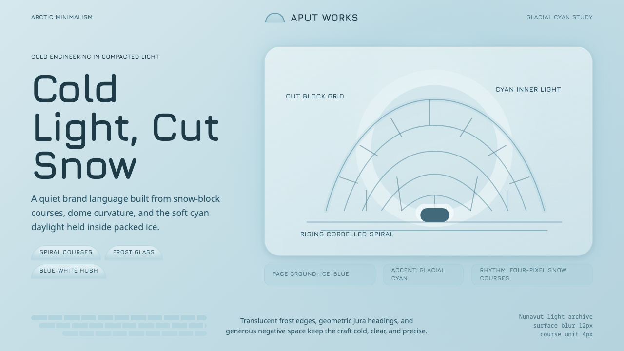 Inuit IglooCold craft, clear light. Glacial cyan and Jura type trace a spiral-block dome…
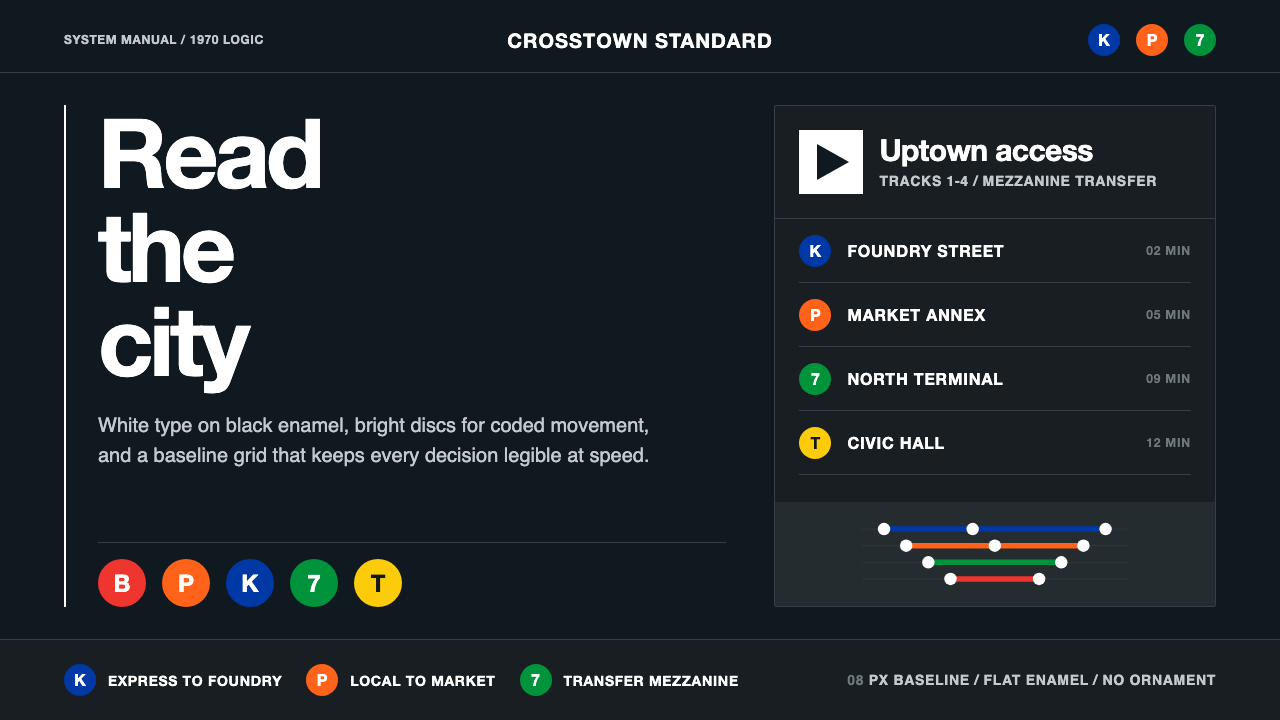 NYC Transit HelveticaOrder made visible. White type, black enamel, route discs, and a grid that ne…
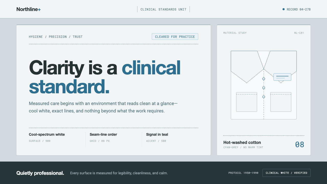 Doctor's Clinical Lab CoatSterile by design. Cool clinical white, teal signals, and seam-line grids enf…
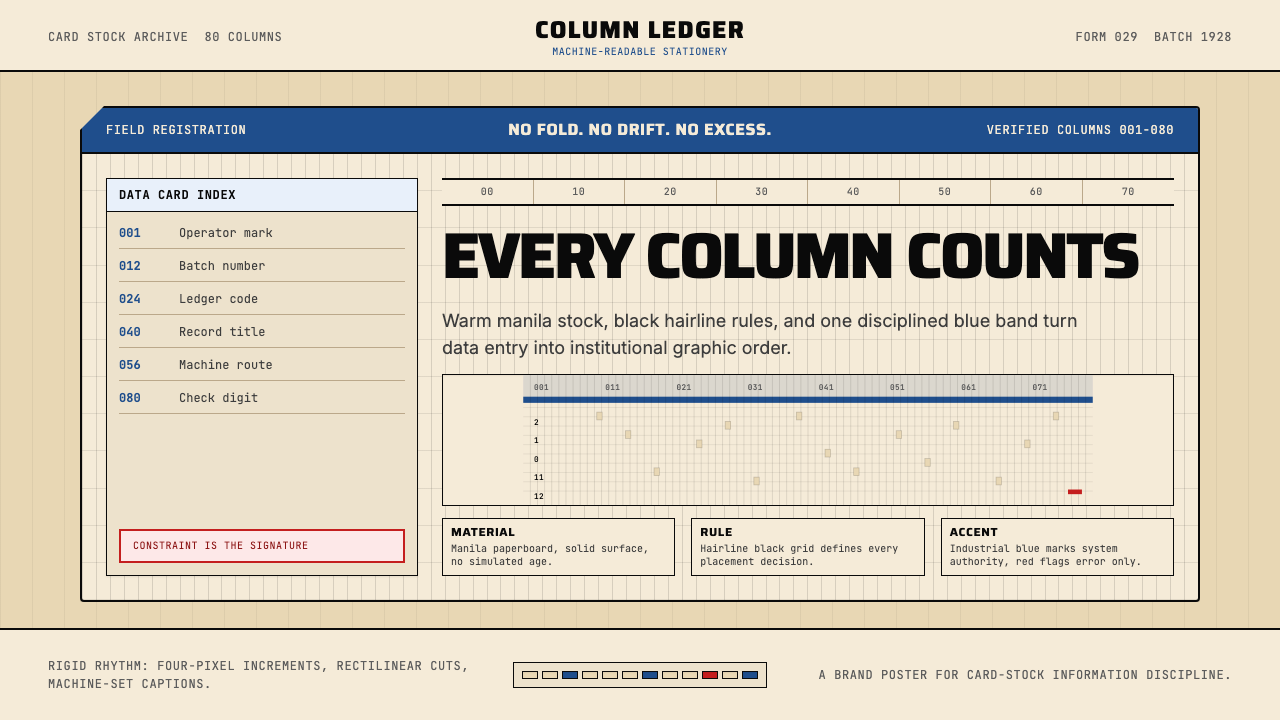 IBM Punchcard 029 (1928)Constraint becomes authority. Manila stock, hairline grid, industrial blue.
 Microfiche ArchiveRecords as lit frames in a matrix. Cyan-blue back-lit panel, glowing mono typ…
 Shark Jaw & DentitionForensic and strictly greyscale. Bone-white serrated dentition floats on a co…