What is Spider-Verse?
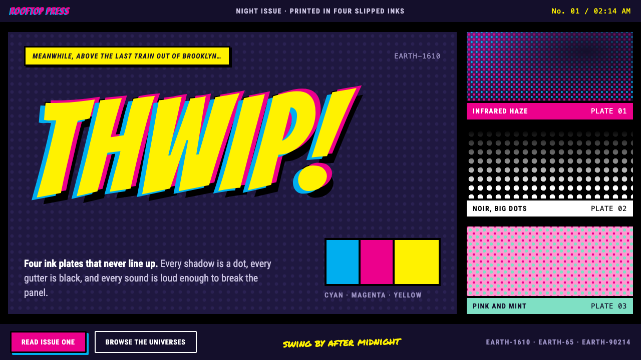
Spider-Verse made a film look like a comic book that had just come off a slightly misaligned printing press, and that happy accident of ink, dots and black gutters became a style of its own.
Spider-Verse in brief
The Spider-Verse Halftone style is a dark, print-inspired aesthetic drawn from the 2018 animated film Spider-Man: Into the Spider-Verse. It rebuilds the look of old comic-book printing: process inks that never quite line up, dot screens standing in for every shadow, and thick black gutters that hold a page together. Beneath it all sits night-time Brooklyn, rendered in a deep subway violet and lit by a hot process magenta.
The central idea is that imperfection is the design. Where most digital interfaces chase clean edges and exact alignment, this style deliberately lets color plates slip away from their outlines, lets dots show their mechanical regularity, and lets lettering shout in the manner of a comic sound effect. The result is energetic, tactile and a little rude.
A second idea runs alongside the first: every section may have its own drawing style. In the film, each Spider-person arrives from a different universe with a different way of being drawn, and the design system mirrors this by allowing blocks of a page to switch between a pastel, a stark black-and-white halftone, or a loud pop palette without breaking the whole.

Where does Spider-Verse come from?
Spider-Man: Into the Spider-Verse was released in December 2018 and won the Academy Award for Best Animated Feature in 2019. It was directed by Bob Persichetti and Peter Ramsey, with Rodney Rothman among its key credited creators, and Justin K. Thompson is credited as a leading figure in its production design. Its look was not a filter laid over computer animation; it was a deliberate attempt to make a computer-animated film move and feel like a printed comic page.
The sources of that look are older than the film. The Ben-Day process, a technique of laying small dots in regular patterns to build tone and color in cheap printing, defined American comic books for decades. Four-color offset printing, with its separate cyan, magenta, yellow and black plates, produced the slight misregistration that fans learned to read as the texture of comics. Pop Art halftone, familiar from painters who enlarged those dots to the scale of a wall, turned the same printing accident into high-art vocabulary.
A third strand is mixed-media animation. By combining three-dimensional computer animation with hand-drawn line work, printed textures and graphic overlays, the film's makers showed that animation could borrow from illustration, graffiti and comics without apology. Captions in narration boxes, thought bubbles and onomatopoeia appear on screen as part of the picture, which is exactly the habit this design system carries into interface work.
The Brooklyn setting is not incidental either. Subway tunnels, street art and nighttime color give the style its dark, violet-lit base, and the neon of the city is translated into magenta and cool blue ink. This is why the system feels urban and late-night even when its dots and letters are playful.
What defines the Spider-Verse look?
Misregistered ink plates
Color fills sit slightly off their outlines, like cyan, magenta and yellow plates that never lined up perfectly on the press. The offset is small but deliberate, and it gives flat shapes a vibrating edge. Used on key shapes only, it feels printed; used everywhere, it feels like a rendering bug.
Halftone dots for shadow
Shadows and gradients are built from visible dot screens rather than smooth blends. Dots grow denser where tone deepens and fade out where light returns. The pattern is regular and mechanical, which is exactly the point: depth is shown as a printing process, not as a soft blur.
Subway-violet night ground
The base of the page is a deep violet-black, the color of a Brooklyn subway tunnel at night. It lets bright inks glow without any real light source. Against it, process magenta becomes the hottest accent, and cooler blues and yellows act as supporting plates.
Thick black gutters
Panels and sections are separated by heavy black gutters, the empty channels between comic frames. They are structural rather than decorative: they hold content apart, give hard edges to every block, and make a dense layout readable. Corners stay sharp and borders stay bold.
Shouting display lettering
Headlines are set in a bold, comic-book display face meant for sound effects and exclamations. It is loud, compact and slightly irreverent. It works best in short bursts of one or two words, the way a comic prints an impact word across a panel.
Hand-lettered captions and narration boxes
Secondary text comes in two voices: a marker-like hand lettering for stickers and scribbled notes, and a tight condensed sans-serif inside narration boxes for interface text. The two voices let the style feel both handmade and organized, with a clear line between an exclamation and information.
One system, many drawing styles
Different sections are allowed their own treatment: a soft pastel block, a stark black-and-white halftone, a bright pop palette. Each one still uses the same gutters, lettering and dot logic. The shared structure keeps the page unified while the variety recreates the film's idea of many universes.

Who shaped Spider-Verse?
Thompson is credited as a leading figure in the film's production design. His work is associated with the decision to treat the entire frame as a printed comic page, with line, dot and color plate effects built into the image itself instead of added as a surface filter.
Persichetti is one of the film's directors. Along with his co-directors, he shaped a project that treated graphic experimentation as storytelling, so that the look of a scene carries meaning about the character on screen.
Ramsey is the film's other credited director. His involvement connects the project to a tradition of directors who bring a strong sense of visual identity into mainstream animation, and the film's commitment to a printed, handmade look reflects that ambition.
Rothman is credited among the key creators of the film. His role sits on the story side, shaping the multiple-universe premise that justifies the style: because several characters come from different worlds, several drawing styles are allowed to coexist on one screen.
How do you use Spider-Verse today?
In slides, this style is excellent for covers, section openers and bold statements. Use a deep violet-black slide, one huge comic-style headline, a magenta dot-screen shadow and a thick black frame. For content slides, treat each key point as a comic panel, separated by heavy gutters, with a narration-box caption beneath. Data slides can use a dot-density pattern as a deliberate chart texture, as long as the numbers themselves stay in clean, readable lettering.
On the web, it fits entertainment, youth culture, music, games, events and creative portfolios. Landing pages can be organized as a comic page with panels of differing sizes; a pricing section can present each plan as its own panel with its own drawing style; a gallery can use bold black borders around every tile. Interface elements such as buttons and tags should keep the sticker-like, hard-edged treatment, with a small offset between fill and outline.
For editorial and marketing work, it suits posters, social covers, album and event announcements and any campaign that wants energy and attitude. Onomatopoeia-style headlines work well for short, punchy messages. Let one block per page break into a distinct drawing style to give the layout a surprise without losing control.
Keep the rules of hierarchy simple: one loud headline, one hot accent color, and heavy gutters doing the structural work. The dots and misregistration are texture, not content, so keep them away from small body text and critical data.
The most common mistake is applying the effects uniformly. If every shape is misregistered, every surface dotted and every word shouted, the page becomes visual noise and the comic feel disappears. The style needs contrast between loud areas and calm areas. A second mistake is bright, white page backgrounds, which remove the night-time violet that makes the inks glow.

Spider-Verse — FAQ
What is the Spider-Verse Halftone style?
It is a dark, comic-print aesthetic inspired by Spider-Man: Into the Spider-Verse. It combines misaligned process-color inks, visible halftone dots for shadow, thick black gutters, bold comic lettering and a subway-violet night ground, and it allows different sections to adopt their own drawing styles.
What is the Ben-Day process and why does it matter here?
Ben-Day is a printing technique that builds tone and color from small, regularly spaced dots. It defined the look of American comic books for decades, and it is the direct ancestor of this style's dot-based shadows. The film borrowed it to make animation feel printed, and this system borrows it to give interfaces the same tactile quality.
Is it the same as Pop Art?
They are related but not identical. Pop Art enlarged halftone dots and comic imagery into fine-art subjects. Spider-Verse draws on that halftone vocabulary but is also grounded in actual comic-book printing, mixed-media animation and a night-time Brooklyn mood. Pop Art is one of its ancestors, not the whole story.
Which projects suit it best?
Entertainment sites, music and event pages, games, youth-oriented brands, creative portfolios and campaign posters. It suits any project that benefits from attitude, energy and a handmade feel. It is a poor fit for conservative financial, medical or legal content, where its noise and irreverence would undermine trust.
How do I keep it readable?
Reserve the effects for headlines, frames and decorative areas, and set body text in a clean, condensed sans-serif on a flat dark panel with no dots behind it. Keep strong contrast between text and ground, limit the loud headline to one per view, and let the thick gutters, not the textures, organize the layout.
Related design styles
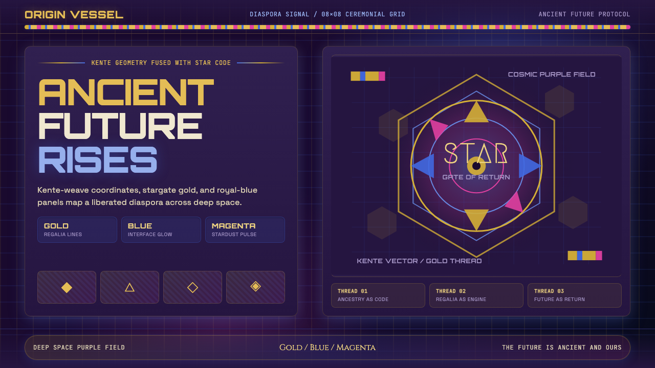 AfrofuturismAncient future, fully luminous. Gold kente grids cut through cosmic purple an…
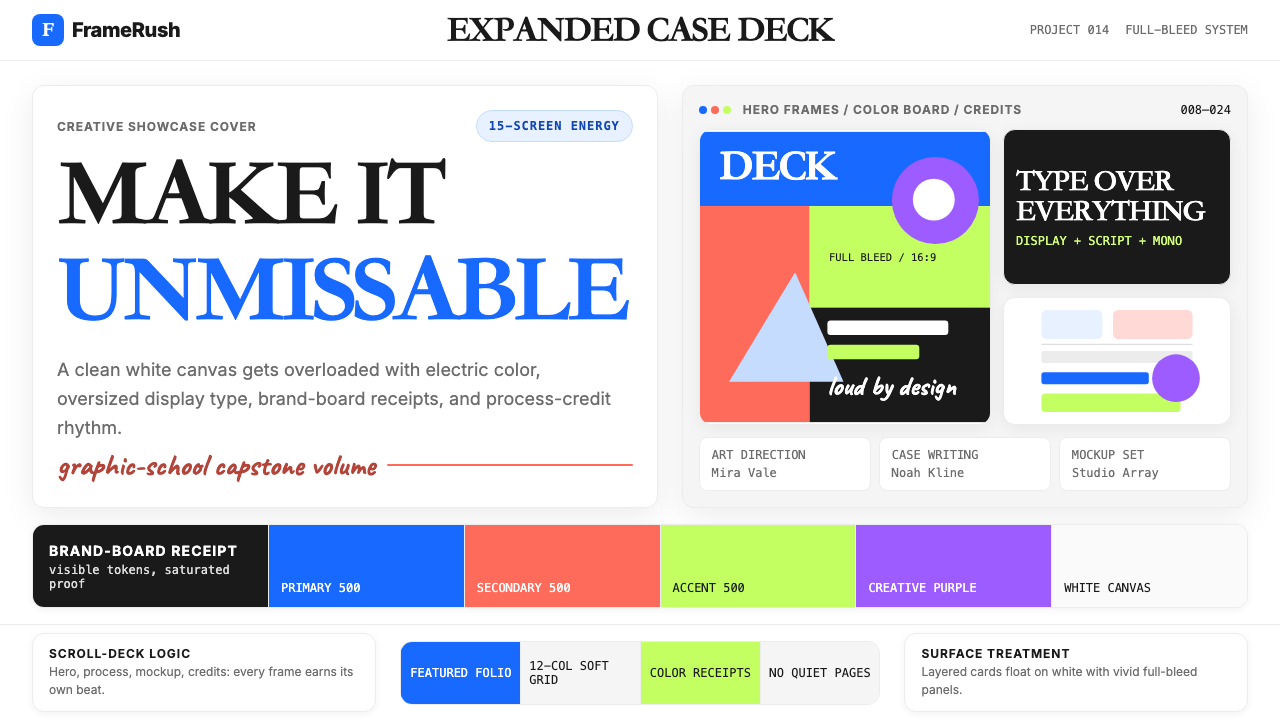 Behance Maximalist PortfolioPortfolio volume at max. Electric blue, coral and lime stack into a full-blee…
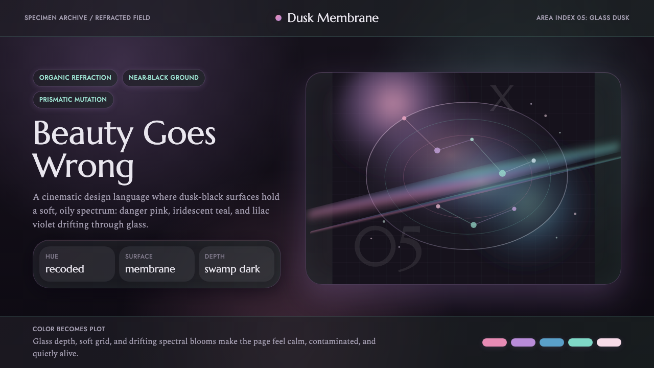 Annihilation (The Shimmer)Beautifully wrong. Dusk black carries pink, teal, and lilac refraction throug…
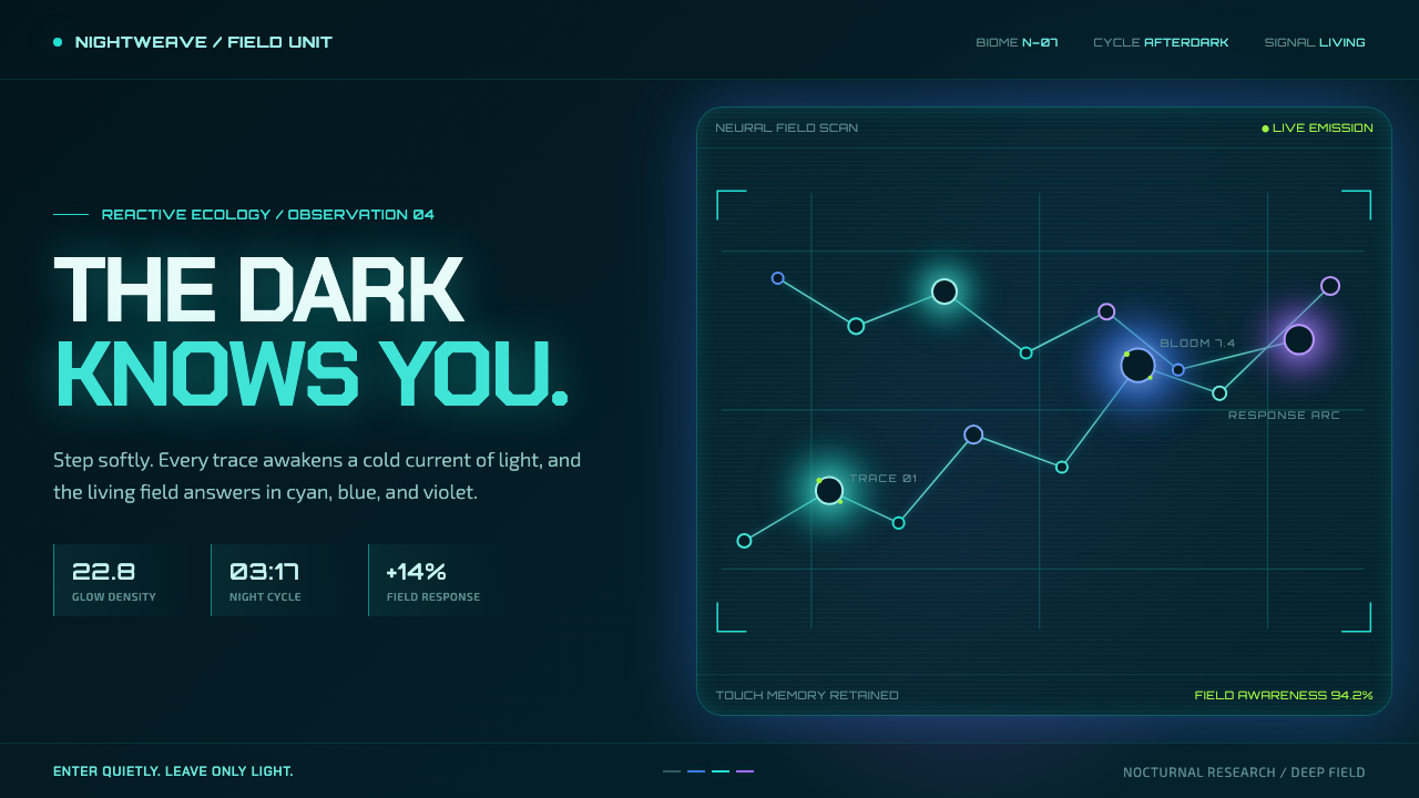 Avatar — Pandora Bioluminescence (2009)The forest knows you are there. Cyan light blooms across a deep-teal living f…
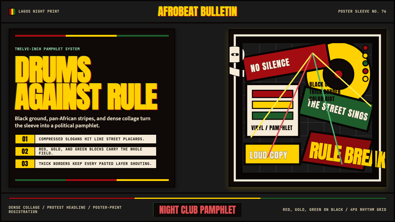 Fela Kuti Afrobeat Album (1976)Protest rhythm made visual. Red-yellow-green blocks and compressed Anton shou…
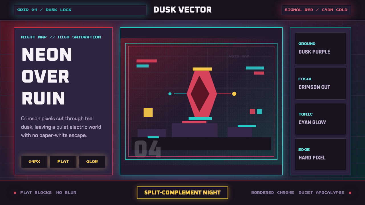 Hyper Light DrifterBeautiful ruin glows. Dusk purple holds crimson pixels and cyan grid light.