What is Space Channel 5?
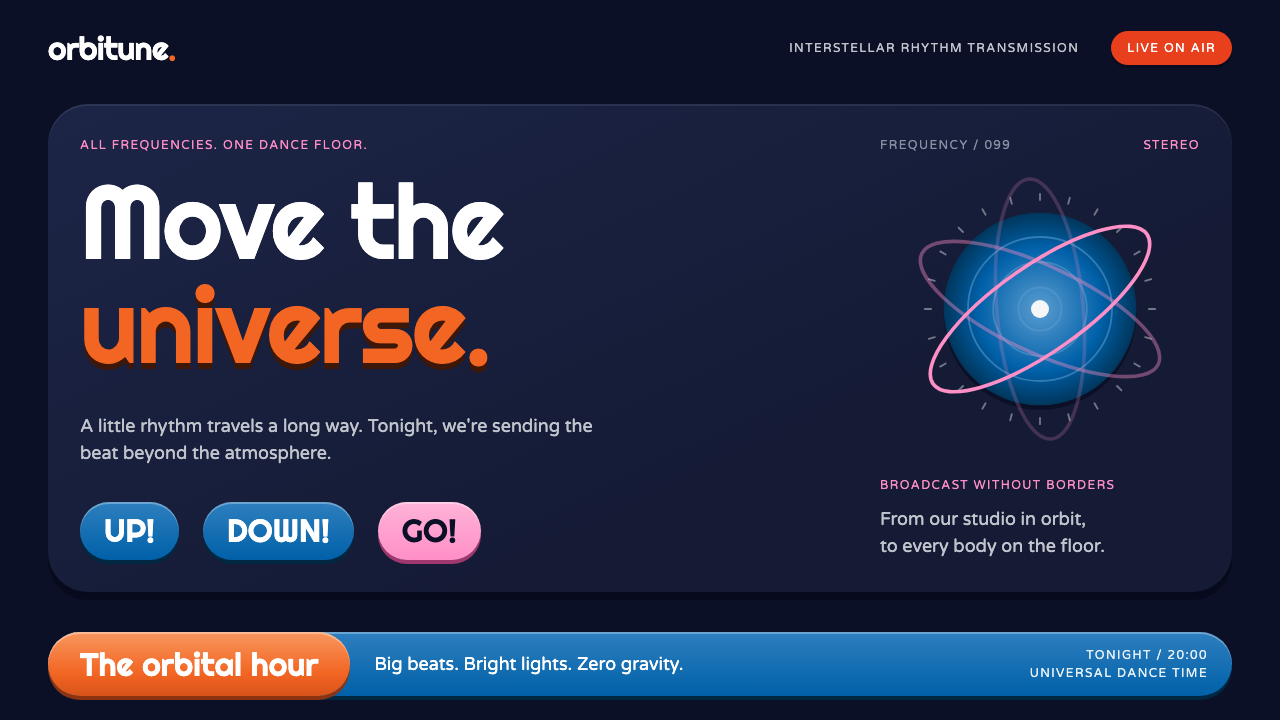
Space Channel 5 imagined the future as a live television studio: deep-space navy, glossy orange capsules, rounded type and a ratings meter that fills like a stage light.
Space Channel 5 in brief
The Space Channel 5 style is drawn from the 1999 Dreamcast rhythm game of the same name, in which a reporter called Ulala dances invading Morolians into submission on live television. Its palette starts from two things: the deep space behind her on the European box, and the orange of her mini-dress. Everything else follows from the idea of a broadcast set seen through the eyes of the 1960s.
The world it depicts is rounded, glossy and lit like a studio. Pill-shaped buttons sit on hard drop shadows rather than soft blurs. Panels have a plastic sheen, like toys under bright lights. A ratings meter fills in Dreamcast orange, a hover state glows pink, and a lower-third caption bar in Sega blue frames the text as if a news ticker were running along the bottom of the screen. The overall feel is of a show that has just gone live and is still excited about it.
This is a dark-mode system by nature. The navy backdrop makes the saturated colors seem to emit light, which is the point. It suits interfaces that want to feel like a broadcast or a performance, such as live streams, event pages and anything that benefits from a little stage presence.

Where does Space Channel 5 come from?
Space Channel 5 was released by Sega on the Dreamcast in Japan in 1999, with a Western release in 2000 and a sequel, Part 2, in 2002. It was produced by Tetsuya Mizuguchi, a designer known for building games around music and synaesthesia, and developed within Sega's creative teams. Its heroine, Ulala, is a reporter for a space television station who steps in rhythm with alien invaders, copying their dance moves in a call-and-response of up, down and shout.
The art direction owes its look to the mid-century. The game draws on 1960s mod and space-age pop design, the Barbarella-era retro-futurism of go-go boots, vinyl surfaces and rounded spacecraft. The future in this vision is not cold and metallic; it is playful, plastic and coloured like a toy shop. Even the technology on screen has a cheerfully handmade, lit-from-below quality, as though a television crew were building tomorrow out of stage lights and bright props.
That aesthetic was also a branding statement. The late-1990s Dreamcast era had a distinct brand look at Sega, with strong colors, rounded emblems and a confident, slightly cheeky tone. Members of the game's creative staff, among them Takumi Yoshinaga and the composers Naofumi Hataya and Kenichi Tokoi, are associated with the project's identity. The deep-space navy, the orange of Ulala's dress and the Sega blue of the lower caption bar are an expression of that house style as much as of the story.
As a design system, it sits where three streams meet: 1960s mod and space-age pop, Barbarella-era retro-futurism, and the Sega Dreamcast brand look of the late 1990s. It looks backward and forward at once, nostalgic for a future that never arrived, and that double vision is what makes it so distinctive. It reads as a costume party for interfaces, bright and theatrical and slightly knowing.
What defines the Space Channel 5 look?
Deep-space navy ground
The base is a deep navy that suggests outer space seen from inside a studio. It is dark enough to make colors glow, yet carries enough blue to feel rich rather than black. Panels step slightly lighter against it, creating layers without any outlines.
Orange capsule buttons
Primary buttons are fully rounded pills in a vivid orange taken from Ulala's dress and the Dreamcast logo colour. They carry a plastic sheen along the top edge and sit on a hard drop shadow. The silhouette is unmistakable and invites pressing.
Hard drop shadows
Shadows are offset and crisp, like cut-out paper or solid toy bases, rather than soft and diffuse. They give each element a toy-like physical presence against the dark ground and keep silhouettes legible. The effect is graphic and playful, not realistic.
Ratings meter
Progress is shown as a ratings meter that fills in Dreamcast orange, borrowing the game's own mechanic of winning over the audience. It turns any progress bar, score or goal into a piece of broadcast theatre. The fill is bold and glossy, and the track behind it stays a quiet dark tone.
Pink glow on hover
Interactive states light up in pink, echoing Ulala's pink ponytails and the neon of a 1960s space set. The glow signals attention and fun, and it contrasts strongly with the orange and navy. It appears only on interaction, so it stays special.
Lower-third caption bar
A bar in Sega blue runs along the lower part of a panel or screen, framing captions or subtitles like a television lower third. It anchors the layout and reinforces the broadcast conceit. Rounded type in light colours sits on it for maximum legibility.
Rounded geometric type
Type is soft, round and slightly futuristic, with generous curves that match the pills and panels. Headlines are bold and friendly, and text is set in lighter, open forms. The voice is upbeat and theatrical, like a presenter introducing the next segment.

Who shaped Space Channel 5?
Producer of the 1999 game, known for building interactive experiences around music and rhythm.
Member of the game's creative staff associated with its visual identity.
Co-composed the game's soundtrack with Kenichi Tokoi; the music is what every one of Ulala's moves is timed to.
Co-composed the soundtrack with Naofumi Hataya for the Dreamcast-era production, giving the rhythm game its beat.
How do you use Space Channel 5 today?
On slides, the Space Channel 5 style suits entertainment, gaming, event and launch decks. Open with a deep navy cover, a big title in rounded bold type and a single orange pill carrying the topic or date. Content slides keep the dark ground with panels a step lighter, orange for primary points and pink for the thing you want emphasised. A lower-third bar in blue can carry captions or source lines like a television graphic.
For data slides, use the ratings meter as your main device. Progress, targets and rankings can be shown as orange fills in dark tracks, with labels set in light colour. Charts work best when kept simple: a few bold bars or rings in orange, one pink highlight and a lot of dark space. Hard offset shadows on cards help each metric read as a distinct object under studio lights.
In web and app interfaces, it fits live streams, event and festival pages, rhythm and music apps, game launchers and any product that benefits from stage presence. Pill buttons, glossy panels and a bottom caption bar create a clear and playful hierarchy. Hover and focus states glow in pink. Keep the interface dark by default so the saturated colours feel lit rather than flat.
For editorial and marketing, think of a broadcast: posters, trailers, countdowns and social cards that promise something happening now. Short, punchy headlines in rounded type, orange capsules for dates and a navy sky behind everything give an instant retro-futurist mood. The 1960s mod and Barbarella-era references make it especially good for fashion, music and party-related projects.
The most common mistake is to put it on a light background, which kills the glow and turns the glossy colours garish. Another is to soften the shadows into blurs; the hard offsets are essential to the toy-like look. Overusing pink also dilutes the system. Keep orange as the main action colour, pink as an occasional spark and navy as the stage.

Space Channel 5 — FAQ
What is the Space Channel 5 design style?
It is a dark, retro-futurist style drawn from the 1999 Dreamcast rhythm game: deep-space navy grounds, glossy orange capsule buttons, hard drop shadows, pink hover glows, a ratings-meter progress bar and a Sega-blue lower caption bar.
Where do the colors come from?
The palette starts from the deep space behind Ulala on the European box art and the orange of her mini-dress. Pink comes from her ponytails, and the lower caption bar uses the blue associated with Sega. Together they form a stage-lit, toy-like set.
Which design movements does it draw on?
Primarily 1960s mod and space-age pop design, the retro-futurism associated with the Barbarella era, and the Sega Dreamcast brand look of the late 1990s. It remembers an optimistic, plastic vision of the future.
What interfaces is it best for?
Live streams, event and festival pages, music and rhythm apps, game launchers and promotional pages for anything that should feel like a show. It works best in dark mode, where the saturated colours seem to emit light.
Why are the shadows hard instead of soft?
Hard, offset shadows give panels and buttons a toy-like physical presence and keep silhouettes crisp on the dark ground. Soft blurs would make the style feel generic and weaken its playful, graphic character.
Related design styles
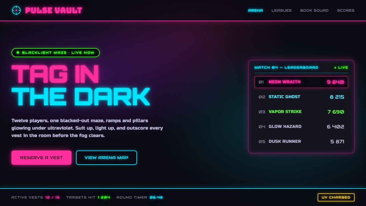 Laser Tag Arena BlacklightSuit up in the dark. UV pink, acid green and cyan glow on matte arena black,…
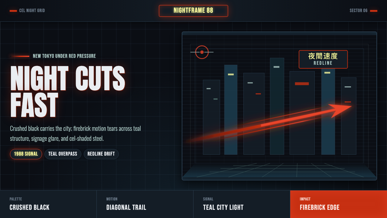 Akira Neo-TokyoNight moves fast. Firebrick trails cut crushed black, teal grids, and condens…
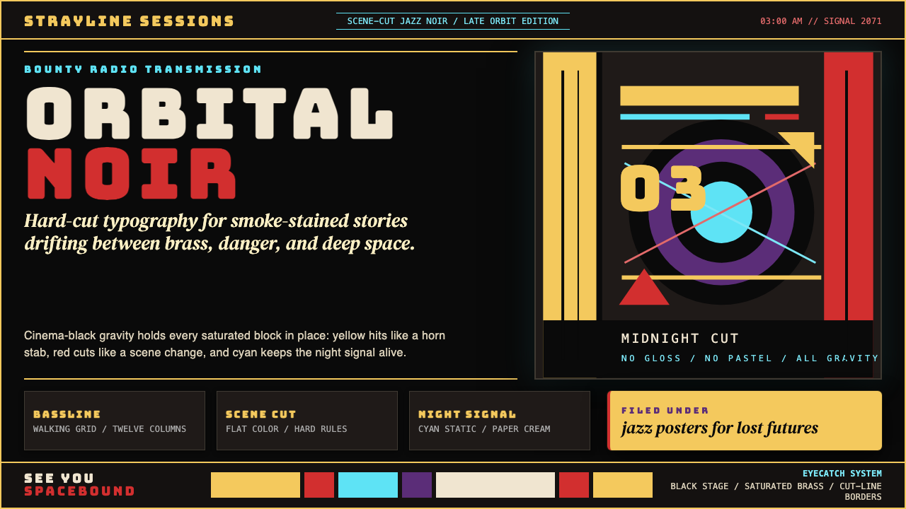 Cowboy Bebop Jazz-NoirCool at 3 AM. Bungee type, jazz yellow, red cuts, and cyan rules hit deep bla…
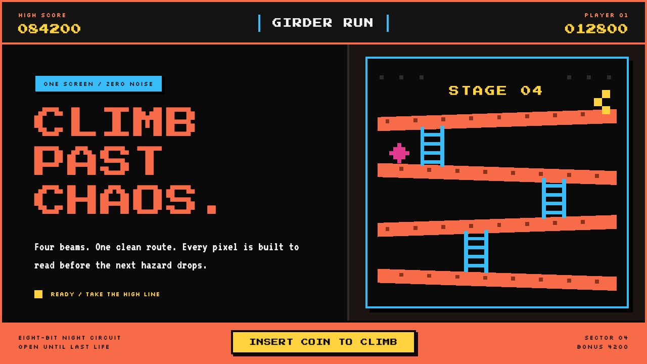 Donkey Kong (1981 Arcade)Built to read through the smoke. Coral girders and cyan ladders cut across a…
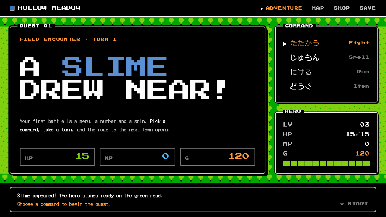 Dragon QuestA black window, a white rule, a ▶ cursor. Flat NES color chips over a green t…
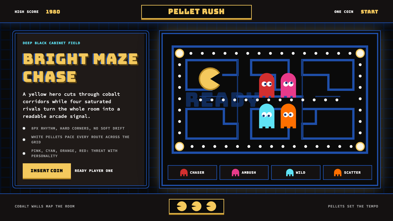 Pac-Man (Namco 1980)Arcade joy burns bright. Yellow disc, cobalt maze, and four ghost hues snap o…