What is Dragon Quest?
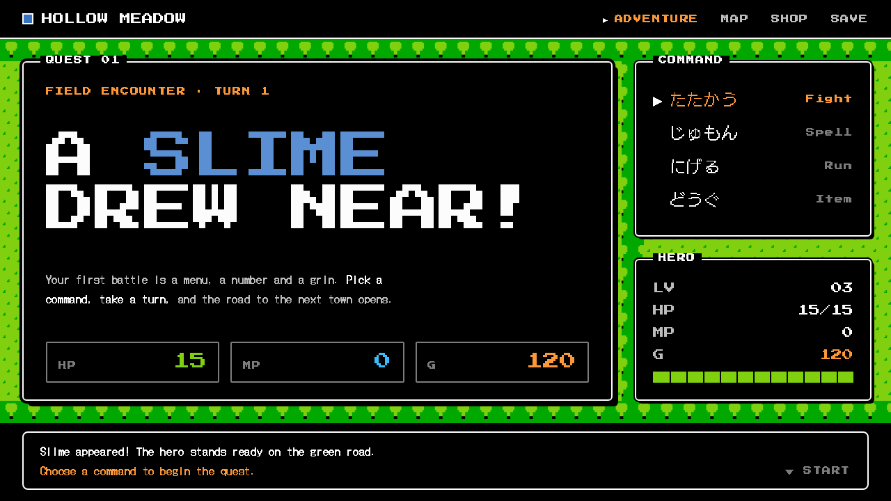
Dragon Quest design is the grammar of the first console RPGs: a black window, a thin white rule, a triangle cursor, and a smiling blue slime waiting on a field of green tiles.
Dragon Quest in brief
Dragon Quest style is the visual language of the 1986 Famicom game that taught a generation how a role-playing game should look. Its screen is mostly black. Command windows with thin white rounded rules and white pixel text float over a top-down map built from simple tiles of grass and forest. The first monster most players meet, a grinning blue teardrop designed by Akira Toriyama, became the face of the whole series.
As a design system, the style keeps that grammar strictly. Every panel is a window. Every list has a triangular cursor pointing at the current choice. Every message types itself out one character at a time and waits at the end on a blinking downward triangle until the player presses a button. Colour appears as flat chips from the limited palette of the Nintendo hardware, with no blur, no gradient and no gloss.
The result is a look that is at once extremely minimal and extremely nostalgic. It works because it is functional first. Dragon Quest was designed so that a child with a Famicom controller, not a computer enthusiast with a keyboard, could navigate a complicated role-playing game, and its menus are therefore as clear and as predictable as interface design gets.

Where does Dragon Quest come from?
Dragon Quest was released on the Famicom on 27 May 1986 in Tokyo-centred Japanese game development, created by Yuji Horii with artwork by Akira Toriyama, music by Koichi Sugiyama, and programming associated with Koichi Nakamura. Western computer role-playing games of the time were intricate and keyboard-driven. Horii's goal, as the source material describes, was to rework that complexity into something a primary-school child could handle with a simple controller, and the interface was central to that goal.
The result was console JRPG as a genre. Its menus follow a small number of repeating patterns: a command window listing a handful of verbs, a status window holding names and numbers, and a message window where all narration happens. A cursor shows which item is selected. Text is revealed progressively, which gave early cartridges a sense of rhythm and drama while also working around the limited graphical capacity of the machine. When the game later reached the American Nintendo Entertainment System in 1989 as Dragon Warrior, the same interface travelled with it.
The graphics sit within the constraints of Famicom tile graphics. The world is built from small repeating square tiles, so that grass, forest, water and walls snap onto a visible grid, and characters are tiny sprites that step from tile to tile. The palette is a fixed set of flat colours, which is the origin of the style's refusal of gradients. Toriyama's monsters, with their soft rounded shapes and expressive faces, softened the severity of the interface and gave the game warmth.
Sugiyama's music is part of the same movement. Eight-bit chiptune, with its square-wave melodies and simple arrangements, accompanies the visual minimalism, and together they define what many people mean when they say a game looks and sounds retro. A design system built on Dragon Quest therefore draws on a specific piece of history: the moment when computer RPG complexity was successfully compressed into a black window and a cursor.
What defines the Dragon Quest look?
Black windows with white rules
Panels are solid black rectangles with softly rounded corners, bordered by a thin white pixel line. The contrast is maximal and the shape is unmistakable. Windows float over the content behind them rather than sitting in a column, which makes the whole screen feel layered without using any shadow.
Triangle cursor and waiting arrow
Selection is shown by a small right-pointing triangle beside the current item, and a blinking downward triangle at the end of a message means more is coming or the player must confirm. These two glyphs are the style's signature, and they replace hover states, underlines and highlight bars.
Typewriter message flow
Text appears one character at a time in a message window and then pauses. The pacing is part of the design: it controls attention, creates suspense and makes even a simple notification feel like dialogue. In a modern interface, it suits tutorials, announcements and narrative onboarding.
Flat NES-palette colour chips
Colour appears only as flat, saturated chips drawn from the limited console palette. There is no blur, no gradient and no gloss, and shapes are never softened with transparency tricks. Because the palette is so narrow, every colour has a job: green for terrain, blue for water and the slime, white for text and rules.
Green tile field
Backgrounds are built from repeating square tiles of grass and forest seen from above. The visible grid gives the page order and a toy-like, board-game feel, and it provides a calm backdrop against which the black windows can stand out sharply.
Slime as mascot
The grinning blue teardrop designed by Akira Toriyama acts as the friendly face of the system. Its soft, rounded body is the only curved organic shape in a world of squares and rules, so it provides emotional relief and a clear focal point for empty states and error screens.

Who shaped Dragon Quest?
Horii is the creator of Dragon Quest. His idea of making the computer role-playing game approachable for a child with a console controller is the origin of the interface grammar this style preserves: few verbs, clear menus, steady pacing.
Toriyama drew the monsters and characters, including the Slime. His rounded, expressive designs gave a severe black-window interface a friendly personality, and the blue teardrop is now the visual shorthand for the entire franchise.
Sugiyama composed the music. His eight-bit melodies are inseparable from the look of the game, and they show how a tiny hardware budget can still deliver an emotional identity.
Nakamura is credited among the key figures in the source material and is associated with the game's programming. Work like his made the tile maps, windows and message system function on the constrained Famicom hardware, which is the technical root of the style's flatness.
How do you use Dragon Quest today?
For slides, this style is a strong choice for game-related talks, retro-themed events, developer meetups, hackathon openings and any presentation that wants to feel playful while staying clear. A title slide can be a black window with a thin white rule, a short line of text and a blinking arrow beneath it. Content slides work best as one window per idea, with a triangle cursor marking the key point in a list. On data slides, put figures inside black status windows with white text and use flat chips of colour for categories, avoiding gradients in charts altogether.
For websites and product interfaces, it suits game communities, launcher pages, retro-themed landing pages, onboarding flows, achievement lists and interfaces with a childlike warmth. Navigation menus can become command windows, selected items can take the triangle cursor, and system messages can type out and wait for confirmation. Keep the number of windows on screen small, because the style relies on a handful of clear panels rather than a crowded dashboard.
For editorial and marketing work, it gives events and campaigns an immediately recognisable retro-game feel. A poster, a social card or an email banner built as a black message window over a green tile field, with one line of typed text and the blue slime peeking in a corner, communicates the era and the tone at a glance.
The most common mistake is to add effects. Soft shadows, glass blur, gradients, glow and anti-aliased rounded cards all contradict the pixel logic and make the result look like a costume rather than a system. Another frequent mistake is to use too many colours: the original works because only a few colour chips are in play, each with a job. Finally, avoid putting long paragraphs of body text inside the typewriter flow, since the effect that is charming for a sentence becomes tiring for a page.
The practical rule is to hold on to the grammar: windows, rules, cursors, flat chips and slow messages. If those five things are present and consistent, the page will read as Dragon Quest even if the content is entirely modern.

Dragon Quest — FAQ
When was the original Dragon Quest released?
Dragon Quest was released in Japan for the Famicom on 27 May 1986. The Nintendo Entertainment System version in North America followed in 1989 under the title Dragon Warrior.
Who made Dragon Quest?
The game was created by Yuji Horii, with character and monster art by Akira Toriyama and music by Koichi Sugiyama. Koichi Nakamura is also credited among the key figures. Together they defined the console JRPG, including the menu and message grammar this design system keeps.
Why does the style avoid gradients and shadows?
The original hardware could only draw flat chips from a small fixed palette, so the look has no blur, gradient or gloss. Keeping to that rule is what makes a modern interface feel authentically like a Famicom game rather than a generic pixel theme.
What do the two triangle symbols mean in the interface?
A right-pointing triangle is the cursor and marks the item currently selected in a list. A blinking downward triangle at the end of a message means the player must press a button to continue. They replace hover highlights and next buttons in the design system.
Is this style only for games?
No. It also suits retro events, community pages, onboarding flows and any product with a childlike warmth. It works best when the audience shares the memory of early console games, and less well for formal or data-heavy products that need conventional visual hierarchy.
Related design styles
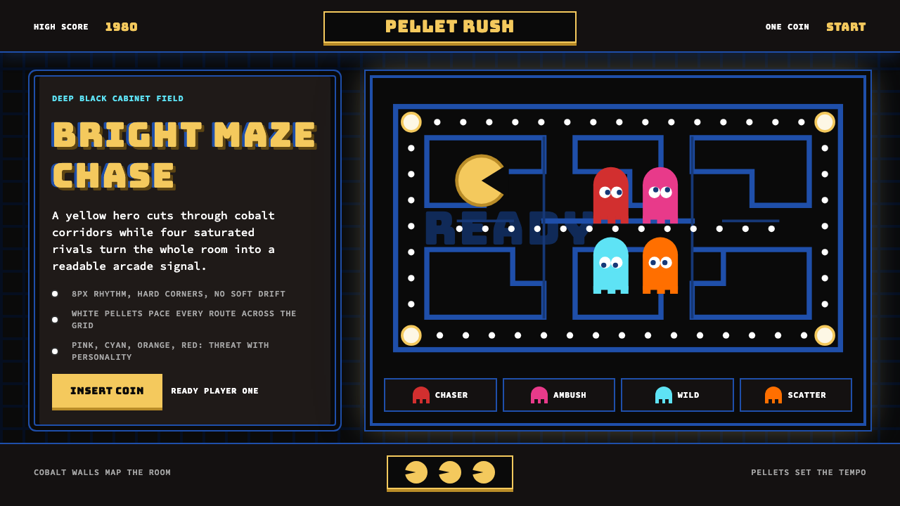 Pac-Man (Namco 1980)Arcade joy burns bright. Yellow disc, cobalt maze, and four ghost hues snap o…
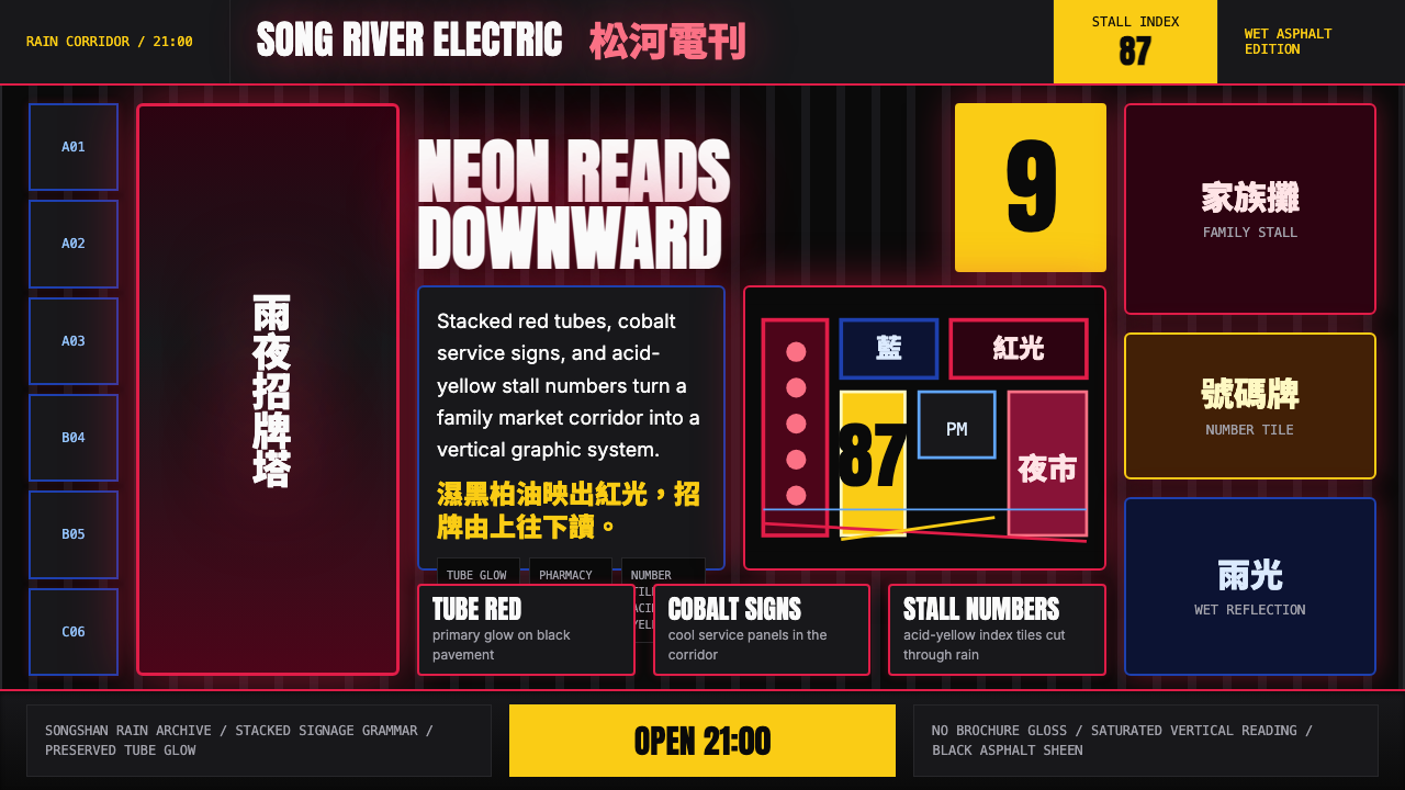 Taiwanese Raohe Night Market NeonTaipei night reads vertically. Neon red, cobalt panels, and acid-yellow numbe…
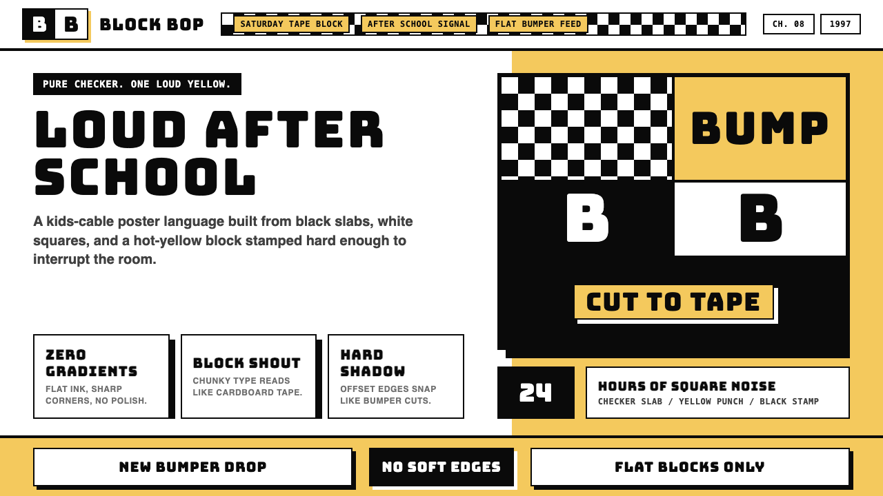 Cartoon Network 90s BlocksKids-cable noise, squared. Black-white checkerboards crash into hot-yellow Bu…
 Dragon Ball (1984)Adventure lands with comic force. Gi-orange panels, amber spheres and crisp h…
 Pokémon Game BoyKawaii meets cartridge logic. Capsule red, LCD green, Anton heft, and 8px gri…
 Sonic the Hedgehog (1991)Velocity has teeth. Sky-cyan, cobalt slant type, gold rings, checkerboard tur…