Design style guide设计风格指南
What is South African Rainbow Nation 1994?什么是 South African Rainbow Nation 1994?
South Africa's Rainbow Nation visual language is the design of hope made concrete — a six-color civic palette born in the inauguration morning light of 1994 and still legible as the most optimistic graphic act of the post-Cold-War world.南非彩虹国度的视觉语言,是将希望具象化的设计——一套诞生于1994年就职典礼晨光中的六色公民色板,至今仍是冷战后世界最乐观的平面设计宣言。
South African Rainbow Nation 1994 in briefSouth African Rainbow Nation 1994 速览
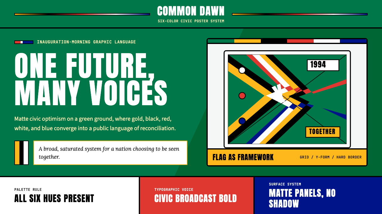
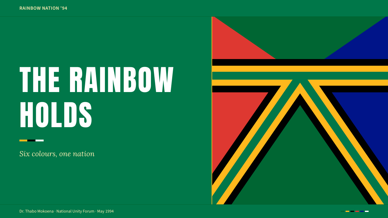
South African Rainbow Nation 1994 is a civic design system rooted in one of the most politically charged graphic decisions of the twentieth century: the adoption of a new national flag on 27 April 1994, the day Nelson Mandela was inaugurated as South Africa's first democratically elected president. The flag's six-color Y-form — merging the green, black, and gold of the African National Congress liberation movement with the red, white, and blue of the outgoing Afrikaner-led republic — made visual compromise look not like defeat but like triumph. No color was erased; every strand of the nation's contested history was woven into a single converging form.南非彩虹国度1994是一套植根于二十世纪最具政治分量的平面决策的公民设计系统:1994年4月27日——纳尔逊·曼德拉宣誓就任南非首位民主选举产生的总统那天——一面新国旗冉冉升起。国旗的六色Y形构图将非洲国民大会解放运动的绿、黑、金与旧阿非利卡人政权的红、白、蓝融为一体,让视觉上的妥协看起来不像失败,而像胜利。没有一种颜色被抹去;这个国家饱受争议的历史中每一条线索,都被编织进那个汇聚向前的单一形态之中。
The aesthetic system that grows from this flag is matte, saturated, and unapologetically bold. It draws on the visual culture of the transition years: the broadcast graphics of SABC television during the election coverage, the banknote typography of the Mandela era, and the documentary photography of 1994 to 1999, when South Africa was covered by the world's press as a living proof of political possibility. The result is a palette that feels neither colonial nor merely pan-African but specifically South African — inclusive of all the nation's constituent colors, structured around the logic of convergence and forward motion.从这面国旗生长出来的美学系统是哑光的、饱和的、毫不克制的。它汲取过渡年代的视觉文化:选举报道期间南非广播公司的电视频道包装、曼德拉时代纸币的排版风格,以及1994至1999年间的纪实摄影——彼时全球媒体将南非当作政治可能性的活体证明加以记录。由此形成的色板既不殖民,也不仅仅是泛非式的,而是特属南非的——涵盖这个国家所有组成部分的颜色,以汇聚与前行的逻辑为结构。
The system resists minimalism. Where other contemporary civic identities sought restraint, the Rainbow Nation visual language insists on presence. Color is not used sparingly or symbolically in the way of modernist design traditions; it is used fully, celebratorily, as evidence of abundance rather than scarcity. The Y-form itself encodes this philosophy: multiple streams meeting and merging into one, moving forward together. Applied to interfaces, presentations, or editorial work, the style carries that same directional energy — it points forward, it includes, it does not exclude.这套系统抵抗极简主义。其他当代公民视觉识别在追求克制的地方,彩虹国度视觉语言坚持存在感。色彩不像现代主义设计传统那样被节制或象征性地使用,而是被充分地、欢庆式地使用——作为丰盛的证明而非匮乏的暗示。Y形本身编码了这一哲学:多条溪流相遇、汇合,共同向前推进。将这种风格应用于界面、演示或编辑内容时,它携带同样的方向性能量——它指向前方,它包容,它不排斥。
Where does South African Rainbow Nation 1994 come from?South African Rainbow Nation 1994 从何而来?
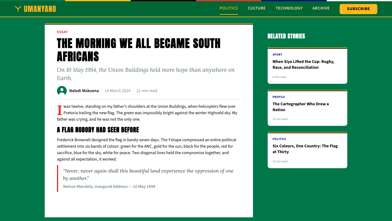
The flag that gave birth to this visual system was designed in remarkable haste. As the 1994 elections approached, South Africa still flew the apartheid-era flag — a design carrying associations with racial oppression that made it politically impossible to retain. A national competition failed to produce an acceptable design. With weeks to spare, State Herald Frederick Brownell created the six-color Y-form flag almost single-handedly, working from a brief requirement: incorporate the ANC's traditional colors alongside those of the existing flag, and find a form that reads as forward motion. He submitted the design as a provisional solution, and it was adopted permanently. The speed of its creation has become part of the flag's mythology — a symbol improvised under pressure that somehow captured everything.催生这套视觉系统的那面国旗,是在极度紧迫中完成设计的。1994年选举临近,南非仍在飘扬种族隔离时代的旗帜——那面旗帜携带的种族压迫联想,使其在政治上无法保留。全国设计竞赛未能产生令人满意的方案。距选举仅剩数周,国家纹章官弗雷德里克·布朗内尔几乎凭一己之力创作了六色Y形国旗,依据简短的要求:将非国大传统色彩与现行国旗颜色融合,找到一种读起来像前行运动的形态。他以临时方案的名义提交了设计,最终被永久采纳。其诞生速度本身已成为国旗神话的一部分——一个在压力下即兴创作、却不知何故捕捉了一切的符号。
The inauguration on 10 May 1994 at the Union Buildings in Pretoria became the central visual event that anchored this aesthetic. For one morning, the building's sandstone facades, the ceremonial green lawns, and the new flag formed a backdrop against which Mandela's appearance in his green-gold Madiba shirt — a garment that would itself become a design icon — was broadcast to a global audience. The palette of that morning — saturated national greens and golds in strong midday light, with the ceremonial red and the blue sky of a Johannesburg autumn — entered the visual memory of everyone who watched. South African graphic design of the following decade consistently returned to these colors as reference.1994年5月10日在比勒陀利亚联合大厦举行的就职典礼,成为锚定这套美学的核心视觉事件。那个上午,建筑的砂岩立面、礼仪绿草坪与新国旗共同构成背景,曼德拉身着绿金色马迪巴衬衫——那件衬衫本身将成为设计图标——出现在向全球直播的画面中。那个早晨的色板——约翰内斯堡秋日正午强光下的饱和国旗绿与金,加上礼仪红与蓝天——进入了所有观看者的视觉记忆。此后十年南非的平面设计,一再将这些色彩作为参照系。
The Truth and Reconciliation Commission, chaired by Archbishop Desmond Tutu from 1996 to 1998, extended the visual language of the transition into a sustained national project. The TRC's public hearings produced a distinctive aesthetic of transparency and witness: large public venues, broadcast on live television, with diverse South Africans — Zulu, Xhosa, Afrikaner, English, Coloured, Indian — appearing together in a shared civic frame. The graphic design of the period absorbed this imagery, using the full national palette to signal inclusion rather than neutrality, boldness rather than bureaucratic calm.由大主教德斯蒙德·图图从1996年至1998年主持的真相与和解委员会,将过渡时期的视觉语言延伸为一个持续的全国性项目。真和委的公开听证会产生了一种透明与见证的独特美学:在向全国直播的宽阔公共场所里,祖鲁人、科萨人、阿非利卡人、英语裔、有色人种与印度裔南非人一同出现在共同的公民框架中。这一时期的平面设计吸收了这些图像,用完整的国家色板来传达包容而非中立、大胆而非官僚式的平静。
By the time of the 2010 FIFA World Cup — hosted in South Africa and accompanied by a graphic identity that drew directly from the Rainbow Nation visual tradition — the style had matured into a global recognizable South African aesthetic. The tournament's official design, the vuvuzela as acoustic symbol, the Bafana Bafana kits, and the urban murals commissioned across Johannesburg and Cape Town all spoke the same saturated, multi-color, civic language first assembled at the Union Buildings in 1994. The style was no longer provisional; it was foundational.到2010年国际足联世界杯——由南非主办,配套视觉识别直接汲取彩虹国度视觉传统——这套风格已成熟为全球可辨认的南非美学。赛事官方设计、作为声学符号的乌呼拉拉号角、班扬班扬球衣,以及约翰内斯堡与开普敦各处委托创作的城市壁画,都在诉说同一种饱和的、多色的、公民性的视觉语言——那种语言最初就是在1994年的联合大厦前拼合起来的。这套风格不再是临时方案;它已成为基础。
What defines the South African Rainbow Nation 1994 look?South African Rainbow Nation 1994 的视觉特征是什么?
Color Palette色彩色板
The palette is anchored by the six colors of the national flag — a mid-tone national green, a warm gold, a deep black, a bright white, a vivid red, and a clear blue — used at full saturation rather than muted or tinted. In practice, ANC green dominates as the primary ground color, with gold serving as the principal action color. The red, white, and blue take supporting roles, appearing in accents, typographic elements, and structural dividers. The key characteristic is that all six are present — the system signals inclusion by refusing to let any strand drop out.色板锚定于国旗的六种颜色——中调国旗绿、暖金色、深黑、亮白、鲜红与清蓝——以完全饱和度使用,不加柔化或调淡。实践中,非国大绿占主导,充当主色调地面色;金色作为主要的行动色。红、白、蓝则扮演配角,出现在强调色、排版元素与结构性分隔线中。关键特征是六种颜色全部在场——这套系统拒绝让任何一条线索缺席,以此传达包容的信号。
The Y-Form as Compositional LogicY形作为构图逻辑
The Y-shape of the flag is not merely a flag motif — it is a compositional philosophy. Multiple streams converge toward a single forward-pointing form. Applied to layouts, this translates into diagonal energy, converging lines, and compositions that feel directional rather than static. Color blocks do not sit passively in rectangular fields; they move toward a common vanishing point. This gives Rainbow Nation design a kinetic quality rare in civic identity systems, which typically favor stability and symmetry.国旗的Y形不仅仅是一个旗帜母题——它是一种构图哲学。多条线流汇聚为一个指向前方的单一形态。应用于版面时,这转化为对角线张力、收敛线条,以及令人感到具有方向性而非静态的构图。色块不是被动地停在矩形区域内;它们朝着共同的消失点运动。这赋予彩虹国度设计一种在公民视觉识别系统中罕见的动态感——后者通常偏爱稳定与对称。
Saturation and Matte Finish饱和度与哑光质感
Colors are deployed at full, unmodulated saturation — not reduced, not tinted, not softened by transparency. The surface quality is matte rather than glossy, referencing the flat-ink printing of South African broadcast graphics and banknotes from the Mandela era. This matte, saturated combination gives the style a civic rather than commercial character: it reads as public, as official, as belonging to everyone. The absence of gradients or sheen reinforces the style's material honesty — these colors are what they are, without decoration.色彩以完全的、未经调制的饱和度部署——不削减,不调淡,不以透明度软化。表面质感是哑光而非光泽,呼应曼德拉时代南非广播图形与纸币的平版印刷质感。哑光与饱和的组合赋予这种风格公民性而非商业性的特征:它读起来像公共的、官方的、属于所有人的。渐变与光泽的缺席强化了这种风格的材料诚实——这些颜色就是它们本身,没有装饰。
Civic Typography公民字体排印
The typographic anchor of this style is a heavy, condensed sans-serif — the kind of letterform associated with SABC broadcast chyrons, stadium signage, and the bold logotype work of the post-apartheid public institutions. The type is always present at strong weight, set in high contrast against the color grounds. Uppercase dominates in headline settings; when body text appears, it tends toward generous spacing and open tracking, projecting legibility over the kind of tight editorial refinement associated with European print traditions. The goal is to be read across a crowd, not held in the hand.这种风格的排版锚点是粗重的窄体无衬线字形——这种字母形态与南非广播公司的广播字幕、体育场标识,以及后种族隔离时代公共机构的醒目标识文字相关联。字体始终以强字重呈现,在色彩底面上形成高对比度。大写字母主导标题设置;正文出现时,往往以宽松间距和开放字距排布,追求在人群中被识读的可及性,而非欧洲印刷传统那种紧凑的编辑精致感。目标是能被人群远远看见,而非被捧在手中细读。
Inclusive Representation包容性呈现
Unlike design systems that build visual unity by reducing diversity — choosing one ethnic reference, one cultural tradition, one color family — Rainbow Nation design achieves unity by insisting on multiplicity. All six flag colors must be present; all strands of the national story are woven in. In photographic or illustrative choices, the style privileges images that show South African society in its diversity: the Nguni cattle, the Karoo landscape, the Cape Malay architecture, the Joburg skyline, the TRC hearings. Visual unity here is produced not by subtraction but by addition and convergence.与那些通过削减多样性——选择单一民族参照、单一文化传统、单一色彩家族——来建立视觉统一的设计系统不同,彩虹国度设计通过坚持多元性来实现统一。六种国旗颜色必须全部在场;这个国家故事的所有线索都被编织进来。在摄影或插图的选择上,这种风格优先呈现南非社会多样性的图像:恩古尼牛群、卡鲁高原景观、开普马来建筑、约堡天际线、真和委听证现场。这里的视觉统一不是由减法产生,而是由加法与汇聚产生。
Bold and Unapologetic Scale大胆而毫无歉意的尺度
Rainbow Nation design operates at a large, public scale. Color blocks are broad, type is set at commanding sizes, and visual hierarchies are generous rather than intricate. This reflects the design culture of street murals, political banners, and broadcast television — formats where communication must work at distance and in a fraction of a second. Refinement at small scale is less important than legibility at large scale. The style is more comfortable on a billboard, a stage backdrop, or a full-bleed web hero than on a business card or a narrow sidebar.彩虹国度设计在宏大的公共尺度上运作。色块宽阔,字体以有气势的尺寸排布,视觉层级慷慨而非精巧。这反映了街头壁画、政治横幅与广播电视的设计文化——这些媒介需要在远距离、一瞬间内完成传达。小尺度的精致感不如大尺度的可读性重要。这种风格在广告牌、舞台背景或全出血网页主图上比在名片或窄侧边栏上更自在。
Documentary Photographic Register纪实摄影基调
When photography is integrated into Rainbow Nation design, it tends toward the documentary register: unposed, daylight-lit, densely peopled images that read as witnesses to history rather than productions of an art director. The 1994 election queues stretching for miles, the Union Buildings inauguration crowd, the faces at TRC hearings — this photographic inheritance means that even staged images in this style carry an obligation of authenticity. Overly styled or obviously retouched photography feels alien; the visual language respects the weight of what it is commemorating.当摄影被整合进彩虹国度设计时,它倾向于纪实基调:未经摆布、自然光照、人群密集的图像,读起来像历史的见证者而非艺术总监的制作。1994年排成数英里长龙的选举队伍、联合大厦就职典礼的人海、真和委听证现场的面孔——这份摄影遗产意味着即便是这种风格中的摆拍图像,也承担着真实性的义务。过度造型或明显修图的摄影感觉格格不入;这套视觉语言尊重它所纪念之事的分量。
Who shaped South African Rainbow Nation 1994?谁塑造了 South African Rainbow Nation 1994?
The State Herald who designed South Africa's post-apartheid flag under extraordinary time pressure in early 1994. Brownell's decision to create a Y-form that incorporated all the colors of the competing factions — rather than choosing between them — was the foundational design act of the Rainbow Nation visual system. A trained vexillologist, he understood that a flag must work at a distance and in motion, qualities that gave the new design its bold, saturated, graphic character. His solution, submitted as a provisional measure, became permanent, making the 1994 South African flag one of the few national flags in the world that was designed and adopted within weeks.1994年初在巨大时间压力下设计南非后种族隔离时代国旗的国家纹章官。布朗内尔选择创作一个Y形——将各方的全部颜色融合其中,而非在它们之间做取舍——这是彩虹国度视觉系统的奠基性设计行为。作为受过专业训练的旗帜学家,他深知国旗必须在远距离和运动中发挥效果,这一要求赋予了新设计其大胆、饱和、图形化的特质。他以临时措施提交的方案被永久采纳,使1994年南非国旗成为世界上少数几面在数周内完成设计并被采纳的国旗之一。
As president from 1994 to 1999, Mandela embodied the visual culture of the Rainbow Nation period in his own person. His Madiba shirts — loosely fitted, vibrantly patterned garments in tropical prints — became a studied rejection of Western formal wear as political self-presentation, and their saturated color and bold patterning aligned perfectly with the Rainbow Nation palette. The shirts were not accidental; Mandela worked with designer Desré Bunn to develop a signature style that communicated warmth, cultural pride, and confident informality. His presidency produced an archive of visual images — the inauguration, the World Cup final, the Freedom Day celebrations — that remain the primary visual source material for this design system.曼德拉担任总统期间(1994—1999年),以其自身具象化了彩虹国度时期的视觉文化。他的马迪巴衬衫——宽松裁剪、以热带印花大胆图案装饰的服装——成为对西方正装作为政治自我呈现方式的深思熟虑的拒绝,其饱和色彩与大胆图案与彩虹国度色板完美契合。这些衬衫并非偶然为之;曼德拉与设计师德瑞·邦合作,发展出一种传达温度、文化自豪与自信随性的标志性风格。他的总统任期留下了大量视觉图像档案——就职典礼、世界杯决赛、自由日庆典——至今仍是这套设计系统最主要的视觉原始材料。
As Chair of the Truth and Reconciliation Commission (1996–1998) and the most visible public figure of the post-apartheid transition beyond Mandela himself, Tutu's presence shaped the visual culture of the period. The TRC hearings, broadcast nationally, created a distinctive civic aesthetic: the public witness, the national colors as backdrop, the deliberate inclusivity of who was seated at the table. Tutu's own deeply affective public presence — weeping openly, laughing expansively, praying in Zulu and English and Afrikaans — modeled the style's emotional range: saturated, warm, unguarded, communal. He coined the term 'Rainbow Nation' itself, crediting Mandela, and in doing so gave the entire visual tradition its name.作为真相与和解委员会主席(1996—1998年),以及后种族隔离时代过渡期除曼德拉本人之外最具公众可见度的人物,图图的存在塑造了这一时期的视觉文化。全国直播的真和委听证会创造了一种独特的公民美学:公开见证、作为背景的国家色彩、座席安排上刻意的包容性。图图本人深度情感化的公共存在——公然流泪、开怀大笑、以祖鲁语、英语和阿非利卡语祈祷——示范了这种风格的情感幅度:饱和的、温暖的、毫不设防的、共同体性的。他本人创造了「彩虹国度」这个词,将功劳归于曼德拉,由此为整个视觉传统命名。
A South African visual artist whose satirical, bold, flat-color work has consistently engaged with the visual legacy of the Rainbow Nation project and its contradictions. Murray's most visible work operates in the tradition of political poster-making — high contrast, declarative type, saturated color — while subverting the optimistic iconography of the liberation movement to comment on corruption, inequality, and the betrayal of the transition's promise. His practice demonstrates that the Rainbow Nation visual system is not a closed historical document but a living graphic language that can be deployed critically as well as celebratorily.南非视觉艺术家,其讽刺性的、大胆的、平涂色彩作品持续介入彩虹国度项目的视觉遗产及其内在矛盾。穆雷最具可见度的作品在政治海报制作传统中运作——高对比度、宣告式文字、饱和色彩——同时颠覆解放运动的乐观图像学,以此评论腐败、不平等与对过渡时期承诺的背叛。他的实践证明,彩虹国度视觉系统不是一份封闭的历史文献,而是一种鲜活的图形语言,可以批判性地被使用,也可以庆典式地被使用。
The graphic identity developed for South Africa's hosting of the 2010 FIFA World Cup — the first World Cup held on African soil — represents the most internationally visible deployment of the Rainbow Nation visual system. The tournament's identity drew on Ndebele geometric patterns, the flag's six colors, bold sans-serif display type, and a documentary photographic aesthetic to produce a design language understood globally as specifically South African. The identity gave the visual system its international currency and confirmed that it had matured from a political emergency solution into a fully realized, internationally legible design tradition.为南非主办2010年国际足联世界杯——第一届在非洲土地上举办的世界杯——开发的平面视觉识别,代表了彩虹国度视觉系统在国际上最具可见度的部署。赛事视觉识别汲取恩德贝勒几何图案、国旗六色、粗重无衬线展示字体与纪实摄影美学,打造出一套被全球理解为特属南非的设计语言。这套视觉识别为该视觉系统赋予了国际通货价值,并确认它已从政治紧急方案成熟为一套完整实现、国际可读的设计传统。
How do you use South African Rainbow Nation 1994 today?今天怎么用 South African Rainbow Nation 1994?
Applying the Rainbow Nation visual system requires understanding its core logic before reaching for the palette: this is a style about convergence, inclusion, and forward motion — not simply a six-color South African flag deployed decoratively. A designer who uses only the green and gold, or only two of the six colors, is misreading the system. The entire premise is that all streams are present and meeting. The full palette, used in appropriate proportion, is what communicates the style's meaning rather than simply its appearance.应用彩虹国度视觉系统,需要在拿起色板之前先理解其核心逻辑:这是一种关于汇聚、包容与前行的风格——而不仅仅是将南非六色国旗装饰性地部署。一个只使用绿色与金色、或只使用六色中的两色的设计师,是在误读这套系统。其整体前提是所有线流都在场并相互汇聚。以适当比例使用的完整色板,才是传达这套风格之意义而非仅仅传达其外观的东西。
For presentation slides, the style excels at cover pages and section dividers where bold visual statements serve well. A cover built in this system might use national green as the dominant background, gold for the title type, and one of the secondary colors — red or blue — as a geometric accent element or horizontal band. The Y-form composition logic can be adapted into diagonal layouts where two color blocks converge behind a centered title. Content slides should be more restrained: black type on white or cream, with color reserved for data visualization, callout labels, or key-term emphasis. Data slides benefit from the full palette: use distinct flag colors for distinct data series, keeping bars and segments at full saturation to maximize readability.在演示文稿中,这种风格擅长封面页与章节分割页——那些大胆视觉陈述有其用武之地的场合。用这套系统构建的封面,可以以国旗绿作为主背景色,金色用于标题字体,其中一种辅助色——红或蓝——作为几何强调元素或水平色带。Y形构图逻辑可以被改编为对角线版面,让两个色块在居中标题后方汇聚。内容页应更为克制:在白色或奶油底上用黑色字体,色彩保留给数据可视化、标注标签或关键词强调。数据页从完整色板中受益:用不同国旗色彩区分不同数据系列,柱条与扇区保持完全饱和度以最大化可读性。
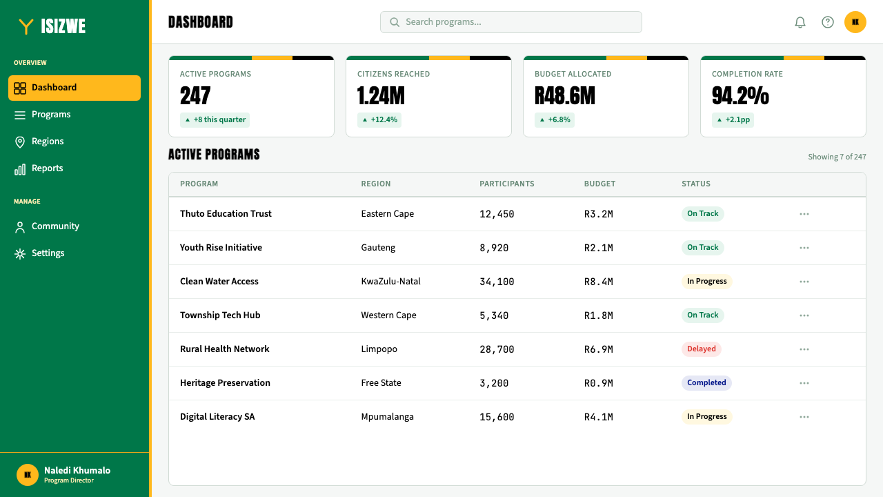
For web and digital interfaces, the style is most at home on civic, educational, or culturally oriented platforms where inclusivity and warmth are core values. Dashboard layouts can use national green as a sidebar color, gold for primary action buttons, and the neutral black-and-white field for data-dense content areas. The palette's high saturation means that color should be used for large, deliberate elements rather than fine-grained detail — a broad hero band, a full-width color block, a large icon fill — not for tiny tags or hairline borders. Card components should use shadow rather than border to define boundaries, allowing color to belong to the content field rather than the framing device.对于网页与数字界面,这种风格最适合公民性、教育性或文化导向的平台——包容性与温度是这类平台的核心价值。仪表板版面可以用国旗绿作为侧边栏颜色,金色用于主要操作按钮,黑白中性底面用于数据密集的内容区域。色板的高饱和度意味着色彩应被用于大面积的、有意为之的元素——宽阔的主图色带、全宽色块、大图标填充——而非细粒度的细节,不适合用于微小标签或细线边框。卡片组件应使用阴影而非边框来定义边界,让色彩属于内容区域而非框架装置。
For editorial and marketing work, the style's poster-like scale and saturation make it effective for campaign materials, cultural event identities, and public-interest communications. Full-width feature blocks alternating between the six flag colors create a powerful sequential reading experience. Typography at a commanding, condensed weight reads as authoritative without being cold — the warmth of the palette prevents the severity that would result from the same approach in a monochrome system. Avoid using the style for luxury or highly exclusive positioning; the system's values are fundamentally egalitarian and democratic, and it reads as incongruous in premium-brand contexts that depend on scarcity signals.对于编辑与营销内容,这种风格海报式的尺度与饱和度使其在活动宣传材料、文化活动视觉识别与公共利益传播中效果突出。六种国旗颜色交替出现的全宽特性色块,创造出有力的连续阅读体验。以有气势的窄体字重排布的字体读起来权威而不冷漠——色板的温度阻止了相同处理在单色系统中会产生的那种严酷感。避免将这种风格用于奢侈或高度排他性的品牌定位;这套系统的价值观本质上是平等主义与民主的,用在依赖稀缺性信号的高端品牌语境中读起来会格格不入。
A common mistake when applying this style is treating it as an exercise in maximum saturation — using all six colors at equal weight across every element of a layout, producing visual chaos rather than visual convergence. Authentic Rainbow Nation design has a clear hierarchy even within its palette: green grounds, gold acts, and the remaining colors serve. A second frequent error is using the colors at reduced saturation or in tinted, pastel variants, which produces a palette that looks neither South African nor of any particular tradition — a misremembering of the style's essential boldness. The six colors at full strength, in a composition that builds toward a focal point, is what makes the system work.应用这种风格时最常见的错误,是将其理解为极致饱和度的练习——在版面的每个元素上以同等分量使用全部六种色彩,产生视觉混乱而非视觉汇聚。真实的彩虹国度设计即便在色板内部也有清晰的层级:绿色铺底,金色行动,其余颜色服务于整体。第二个频繁出现的错误,是以降低饱和度或调成粉彩变体的方式使用这些色彩,产生的色板既不像南非的,也不属于任何特定传统——那是对这种风格本质大胆感的失忆。六种颜色以完全强度,在朝向焦点构建的构图中使用,才是让这套系统奏效的方式。
South African Rainbow Nation 1994 — FAQSouth African Rainbow Nation 1994 · 常见问题
Is Rainbow Nation design the same as pan-African design?彩虹国度设计与泛非设计是同一回事吗?
They overlap but are distinct. Pan-African design typically draws on the red, black, and green of the pan-African flag adopted in 1920, together with Kente cloth patterns, Adinkra symbols, and West African visual traditions. Rainbow Nation design is specifically South African and incorporates colors that would be considered colonial in a pan-African context — notably the red, white, and blue of European national flags — because the South African project was about incorporating and transforming all of the country's histories rather than rejecting one in favor of another. The result is a visual system with more internal tension than pan-African design, and arguably more complexity, because it insists on holding contradictory inheritances together.两者有交集,但截然不同。泛非设计通常汲取1920年采纳的泛非旗帜的红、黑、绿三色,加上肯特布图案、阿丁克拉符号与西非视觉传统。彩虹国度设计是特属南非的,融入了在泛非语境中会被视为殖民性的颜色——尤其是欧洲国旗的红、白、蓝——因为南非的项目是关于纳入与转化这个国家所有的历史,而非拒绝其中一种以偏袒另一种。结果是一套比泛非设计内部张力更大、可以说也更复杂的视觉系统,因为它坚持将相互矛盾的遗产一同承载。
How do you prevent the full six-color palette from looking chaotic?如何防止六色完整色板显得杂乱无章?
Through strict hierarchy and proportion. In authentic Rainbow Nation design, the six colors are not used at equal weight. National green occupies the largest surface area as the ground. Gold — the action color — occupies the next largest share and draws the eye to the most important elements. The remaining four colors — red, white, blue, and black — appear in progressively smaller proportions, mostly in accents, typographic elements, and geometric detail. This hierarchical structure keeps all six colors present without visual noise. A useful test: if you cover the green ground and the result still reads as South African, the green is not dominant enough. The green should be the unmistakable base from which everything else departs.通过严格的层级与比例。在真实的彩虹国度设计中,六种颜色不以同等分量使用。国旗绿作为底面占据最大的表面积。金色——行动色——占据次大的份额,将视线引向最重要的元素。其余四种颜色——红、白、蓝、黑——以递减的比例出现,主要用于强调色、排版元素与几何细节。这种层级结构让六种颜色全部在场而不产生视觉噪声。一个有用的测试:如果遮住绿色底面,结果看起来还像南非风格,那么绿色就不够主导。绿色应该是无可置疑的底面,其他一切从它出发。
Does the style work in a digital dark-mode context?这种风格在数字深色模式下能奏效吗?
With care. The original visual system is strongly light-ground: the white band of the flag, the cream-and-daylight quality of the inauguration photographs, and the SABC broadcast aesthetic all point toward light backgrounds. A dark inversion is possible — using deep black as the ground, which allows the gold and green to vibrate against it with great intensity — but it risks losing the civic, inclusive warmth of the original and sliding toward something more dramatic and exclusive. If using a dark ground, the gold should remain the dominant action color rather than white, which can feel too stark. The black-ground variant works well for special events, cultural celebrations, and brand expressions that want richness over openness.需要谨慎。原始视觉系统强烈偏向浅色底面:国旗的白色条带、就职典礼照片的奶油色与日光质感,以及南非广播公司的电视美学,都指向浅色背景。深色反转是可能的——以深黑为底面,让金色与绿色在其上以强烈的能量振动——但这有失去原版公民性、包容性温度的风险,滑向更具戏剧感和排他性的效果。若使用深色底面,金色应保持作为主要行动色,而非白色——后者在这里感觉过于冷峻。黑色底面变体适合特殊活动、文化庆典,以及追求丰盛感而非开放感的品牌表达。
Is this style appropriate for non-South African contexts?这种风格适合用于非南非语境吗?
Yes, with awareness of what is being referenced. Rainbow Nation design carries a specific political and historical meaning — it commemorates one of the most celebrated peaceful transitions in modern history and is built from the colors of a specific national flag. Using it outside South Africa requires acknowledging that the style has content, not just appearance. Projects that share the system's values — civic inclusion, the resolution of conflict through dialogue, the possibility of national renewal — can draw on it credibly. Projects that invoke the visual language merely for its colorful boldness without any relationship to its meaning risk a kind of aesthetic appropriation. The most successful non-South African uses of the style tend to be in pan-African, post-conflict, or democracy-celebrating contexts where the values genuinely align.可以,但需要对所引用的内容保持清醒。彩虹国度设计承载特定的政治与历史意义——它纪念现代史上最受赞誉的和平政权过渡之一,并由特定国旗的色彩构成。在南非以外使用它,需要承认这种风格有内容,而不仅仅是外观。与这套系统价值观相符的项目——公民包容、通过对话化解冲突、民族更新的可能——可以可信地汲取它。仅仅因为其色彩大胆而援引这套视觉语言、与其意义毫无关联的项目,则有一种美学挪用的风险。这种风格在非南非语境下最成功的使用,往往发生在泛非、后冲突或庆祝民主的场合——那里的价值观与之真正契合。
How does this style differ from other post-colonial national identity systems?这种风格与其他后殖民国家视觉识别系统有何不同?
Most post-colonial national identity systems resolve the tension between colonial and indigenous visual traditions by favoring one over the other — either reclaiming pre-colonial iconography and color traditions, or modernizing within an inherited European graphic framework. South Africa's Rainbow Nation system did something structurally different: it refused to resolve the tension at all. The flag and its derived visual language hold both in dynamic coexistence, using the Y-form to represent convergence rather than replacement. This makes the South African system unusual among post-colonial identities for its formal embrace of visual contradiction as a political statement. The result is more complex than most national identities, more visually demanding, and arguably more honest about the actual texture of a post-colonial society.大多数后殖民国家视觉识别系统通过偏向其中一方来化解殖民视觉传统与本土视觉传统之间的张力——要么回收前殖民时代的图像学与色彩传统,要么在继承的欧洲平面框架内实现现代化。南非的彩虹国度系统做了结构上完全不同的事情:它拒绝化解这种张力。国旗及其衍生的视觉语言将两者以动态共存的方式承载,用Y形代表汇聚而非取代。这使得南非系统在后殖民视觉识别中罕见地将视觉矛盾的形式性拥抱作为政治陈述。结果比大多数国家视觉识别更为复杂、视觉上要求更高,也可以说对后殖民社会的实际质地更为诚实。
Related design styles相关设计风格
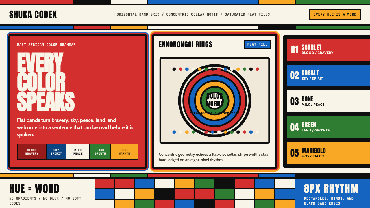 Maasai Shuka & BeadworkColor becomes language. Scarlet bands, cobalt panels, and concentric bead rin…色彩即语言:绯红横带、钴蓝面板与同心珠环共同编码。
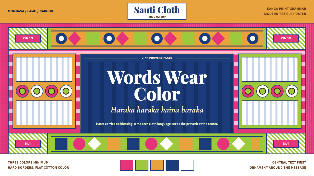 Kenyan Kanga PrintText speaks first. Hot pink ground, lime pindo border, indigo italic proverb…文字先发声:热粉底、青柠边框、靛蓝斜体谚语板。
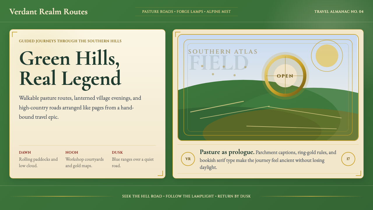 NZ Lord of the Rings TourismEpic feels approachable. Pasture green, ring-gold, and Garamond book frames.史诗却亲近:牧场绿、戒指金与Garamond书框。
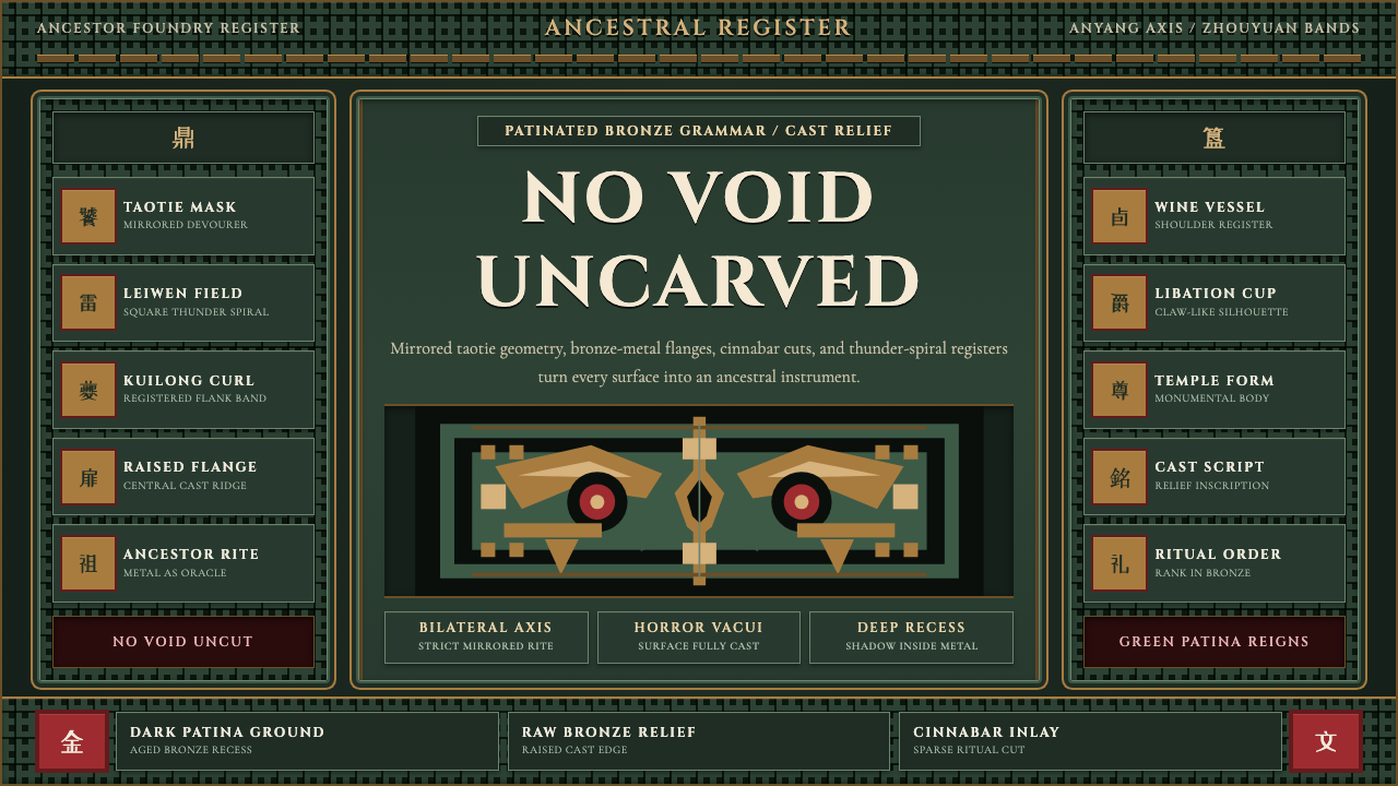 Shang-Zhou Ritual BronzeAncient terror fills every surface. Patina green, bronze relief, mirrored tao…古老森严填满表面:铜绿底、青铜浮雕与镜像饕餮锁住网格。
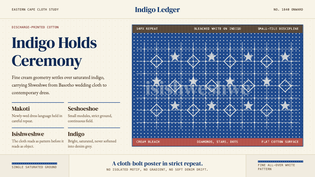 South African Shweshwe IndigoCeremony in indigo. Cream serif type and tiny bleached repeats tile a saturat…靛蓝里的仪式感:奶油衬线与细密漂白纹样铺成布面网格。
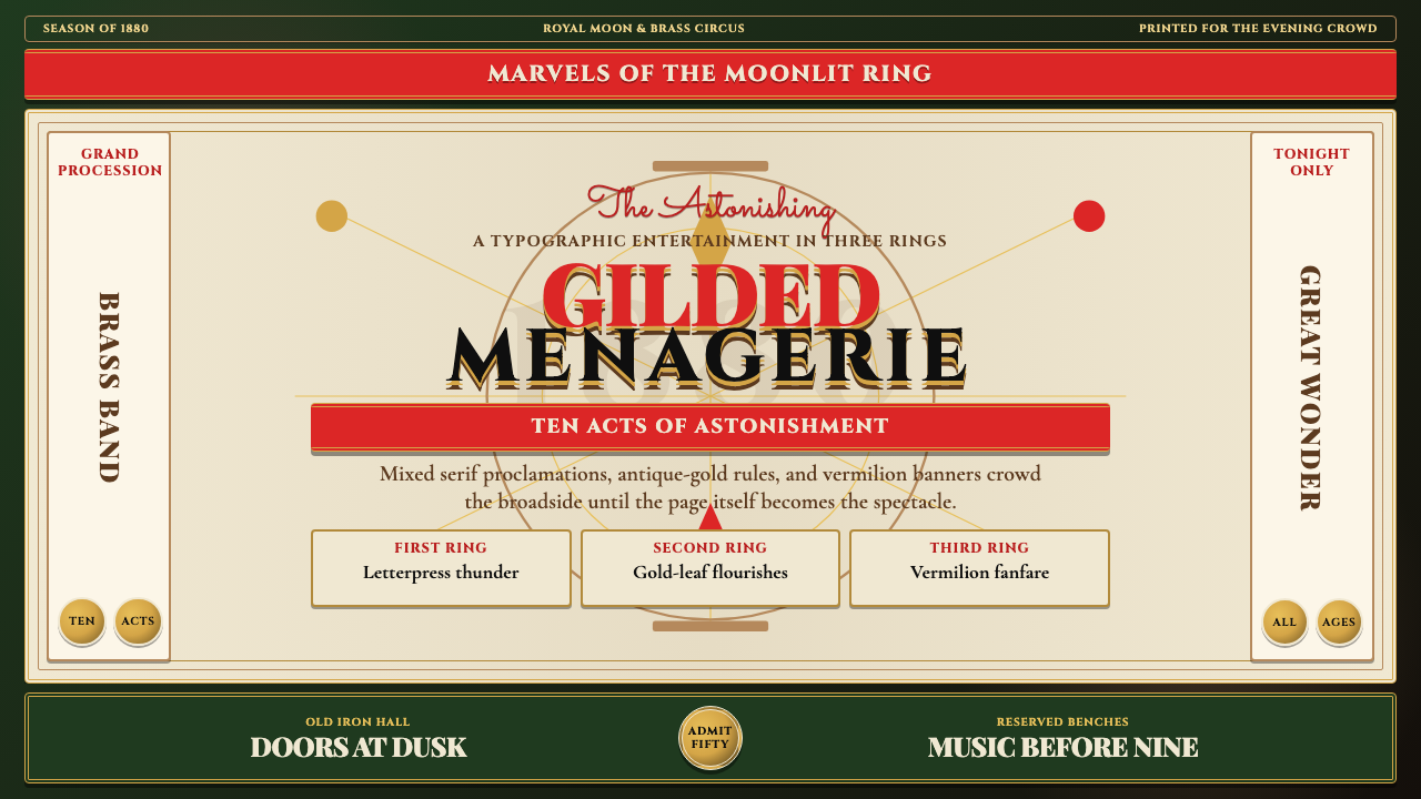 Victorian Circus Poster (1880)Spectacle leaves no inch quiet. Forest green, antique gold borders, mixed ser…寸寸皆戏。深林绿、古金双线、混排衬线与朱红横幅。