What is Slovene Beehive Panels?
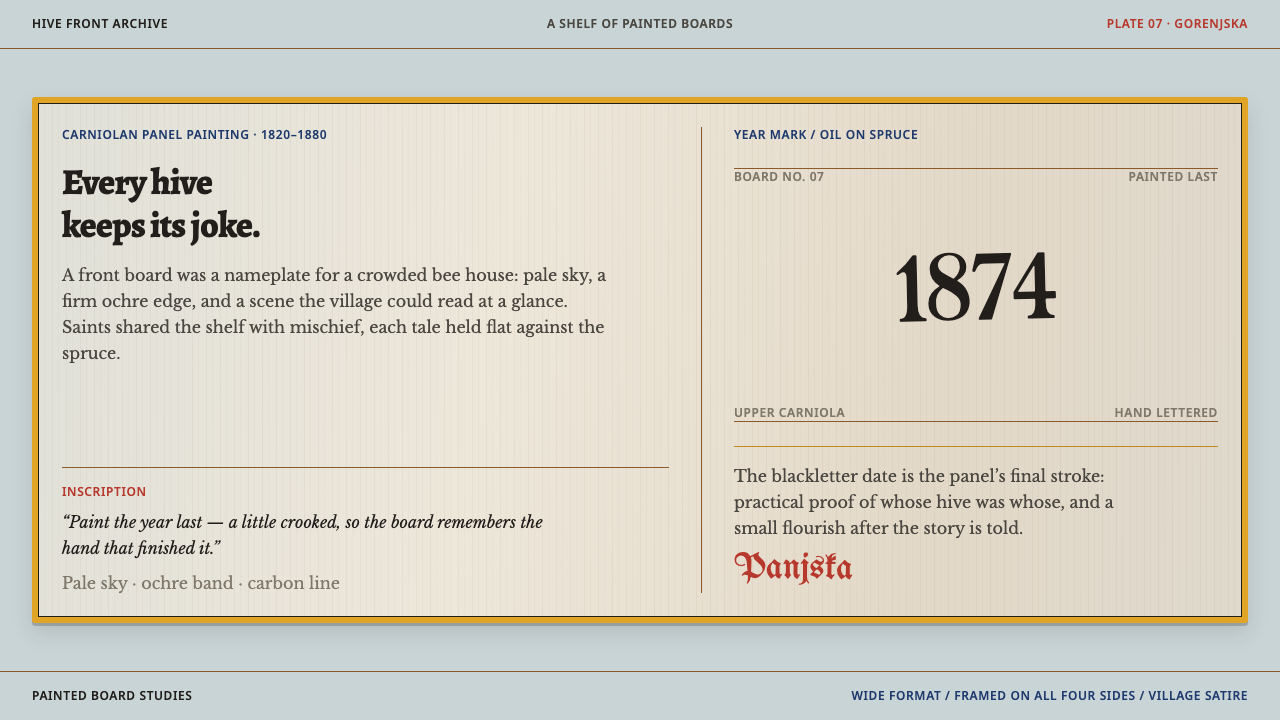
Slovene beehive panels turn the front of a hive into a tiny hand-lettered stage — a pale sky, an ochre frame and a village joke everyone already knew.
Slovene Beehive Panels in brief
Slovene beehive panels — each one a panjska končnica — are the small painted boards that close the front of a Carniolan hive. A panel is only about twelve to fifteen centimetres high and nearly two and a half times as wide, a squat horizontal strip that behaves less like a painting than like a label that happens to be a picture. The visual system is simple to describe: a pale, cool sky-coloured ground, a band of ochre running around the edge like a frame, figures drawn side-on in a thin layer of space, and a date lettered by hand in crooked blackletter in one corner.
This is folk painting of the kind that is useful first and expressive second. The boards were painted so that a beekeeper could tell one hive from another in a bee house where the boxes were stacked in tiers, which means a picture had to be legible at a glance from a few steps away. About six hundred motifs survive. Roughly half are saints and devotions. The rest are village satire: the devil sharpening a woman's tongue on a whetstone, animals hauling the hunter to his grave, two men fighting over a pair of trousers.
What makes the look so persuasive, and so useful to borrow, is the pairing of a strict frame with a loose hand. The ochre band, the flat sky and the horizontal format hold steady from panel to panel, so a wall of them reads as one family. Inside the frame, proportions are off, perspective is wrong, and nobody minds. The untrained hand does what polished illustration cannot: it makes a joke feel as if a neighbour told it.

Where does Slovene Beehive Panels come from?
The panels come from Upper Carniola (Gorenjska), the highland region of present-day Slovenia that lent its name to the Carniolan honeybee and to a whole culture of keeping it. The source dates the practice from the middle of the eighteenth century, with production at its peak between 1820 and 1880. In those decades a village's hives were not scattered boxes but stacked rows inside a bee house, their fronts turned outward. The front board was the one part of each hive a keeper looked at every day, and it was the natural place to put a mark, a name or a picture.
The practical reason for painting them is the one the source gives: the boards let beekeepers tell hives apart when many sit side by side. The method follows from that. Beekeepers handed the boards to painters who went from village to village, and the pictures were finished in oil paint, strong enough to face the weather at the front of a bee house and bright enough to be read from across a yard. Because the boards were small and the format fixed, it is easy to see how a good composition could be repeated and varied rather than invented from nothing each time — which is one reason that around six hundred distinct motifs can be counted at all.
The sources of the pictures were mixed. The source lists Baroque devotional prints among the traditions behind the panels, and the saints and devotions in the first half of the repertoire are where that shows: poses, attributes and compositions arrive from printed images that circulated in churches and homes, then get reduced to a few flat colours and a firm outline. The satirical half belongs to the village itself. Its jokes — the shrew, the hunter, the quarrel over trousers — draw on proverbs and local gossip rather than church imagery, and they are the reason the panels have a reputation for wit.
Behind all this stands the wider culture of Carniolan beekeeping, which the source represents through one key figure, Anton Janša. His name is tied to the region's reputation for beekeeping, the same reputation that made a decorated hive front worth the trouble. The painters, by contrast, are largely anonymous: what survives is a hand rather than a name, and a date lettered in the corner. Over time the panels moved from the fronts of working hives into museums, collections and reproductions, where they are now read as one of the most recognisable strands of Slovenian folk art.
What defines the Slovene Beehive Panels look?
Sky Ground
The palette is quiet at the centre and warm at the edge. A pale, slightly grey-blue sky fills the field, outlines and lettering are black, and figures are filled with a short list of earthy, flat colours with no blending. Nothing glows. The sky is not weather so much as a neutral stage: it lets the ochre frame and the small bright figures read from a distance, and it is the single most recognisable colour decision in the style.
The Ochre Band
The frame is not an ornament added after the picture is finished; it is part of the logic of the field. A band of ochre of even width follows the edge of every panel, separating the scene from the wooden surround and from its neighbours in the stack. In interface terms it does the work of a card border or section container: whatever chaos happens inside, every scene arrives with the same outer shape.
Wide Strip Format
A panel is nearly two and a half times as wide as it is high, so scenes are composed like friezes: figures arranged left to right along a single ground line, with the action read in sequence, such as a hunter's funeral procession stretching across the whole width. The format rewards horizontal storytelling and punishes tall, stacked layouts. It suits banners, timelines, tickers and any card that wants to feel like a strip rather than a block.
Shallow Stage
People stand side-on in a thin layer of space, overlapping one another rather than receding. Perspective is absent or wrong and proportions drift, with heads large, hands small and animals about the same size as the people they carry. This is not a flaw to be corrected. The wobble is the style's authority: it tells the viewer that a person made this, for people, and the style loses its point once it is tidied into smooth vector perfection.
Hand-Lettered Dates
In one corner sits a date, or a short inscription, painted by hand in blackletter. The letters lean, the spacing wanders and one numeral is wider than its neighbour. This lettering is the painter's signature and the board's date of birth, and it is the only typography in the picture, so it is kept small, dark and slightly crooked. It works as a stamp, not as a headline.
One Joke Per Panel
Each scene carries a single idea that can be read in a second, usually a reversal: the prey carrying the hunter, a tongue treated as a blade, two grown men fighting over a pair of trousers. There is no caption because the audience already knew the story. For design this means one message per container, a clear subject, and an image that works as the punchline instead of illustrating a paragraph.

Who shaped Slovene Beehive Panels?
The source names Anton Janša among the key figures of this tradition, as the best-known name of Carniolan beekeeping. He is a reference point for the culture around the panels rather than for the panels themselves: the care for bees, the training of keepers and the local pride in hive-keeping are what made it worth marking each hive with a picture. For a design system built on these boards, his name anchors the look to a real craft and a real region.
The painters who went from village to village are anonymous, and that is part of the style. What they left is a recognisable hand: a firm outline, flat colour, a stage a few figures deep and a crooked date in the corner. Their work shows how a working craft handles repetition, reusing and varying a small stock of compositions until about six hundred motifs had accumulated, all of them still recognisably from the same family.
The keepers were the patrons. They needed to tell one hive from another in a stacked bee house, and they chose the images, whether devotions to protect the bees or jokes the whole village would recognise. The panels are best understood as a conversation between keeper and painter, and between one keeper and the neighbours who walked past. That social function, a picture that is shared and read aloud, is part of what the style carries into modern work.
The source lists Baroque devotional prints among the movements behind the panels. The print-makers are not named, but their influence is visible in the first half of the repertoire, where saints appear in recognisable poses with recognisable attributes. The panel painters turned a refined printed image into a flat, bold, regional one, and that translation from print to hand is a useful model for anyone adapting a formal source into an approachable one.
How do you use Slovene Beehive Panels today?
Borrowing from the beehive panel works because the style is built from reusable structure: a firm frame, a calm ground, a wide format and a small measure of hand-made imperfection. Used well, it gives a product or document the feeling of something made locally and with humour, without needing a single literal bee.
For presentation slides, the wide strip is the cover. Let a pale field fill the slide, set a heavy ochre band around its edge, put one small scene or icon in profile on a single ground line, and place the title in plain, quiet type with a hand-lettered date or issue number in the corner. Content slides can reuse the frame as a consistent container and carry one idea each, in the one-joke-per-panel spirit. Data slides suit horizontal formats such as timelines, ranked bars and sequence strips, with the date lettering treated as a stamp rather than an axis label.
For web interfaces, the style fits cards, changelogs, onboarding sequences and pricing pages that want warmth rather than authority. Keep the ground calm and cool, give every card the same ochre-toned border, and let one illustrated strip per section carry the personality. Dashboards should use the frame as a container and keep the content inside sober; the crooked blackletter belongs on a single stamp, such as a 'last updated' mark, and nowhere near body text or numbers that people must read quickly.
For editorial and marketing work, the panel is a ready-made format for story strips, newsletter headers, packaging for food and craft products, and anything that tells a small local story with a punchline. Pair each panel with a plain caption set in a neutral type, so the picture can stay silly while the information stays clear. The style is especially at home in work about honey, farms, cooperatives and regional makers, where its provenance is a feature rather than a costume.
The most common mistake is to clean the style up. Smooth vector curves, correct proportions and perfectly even lettering remove the hand that gives the panels their authority and leave only a pale blue rectangle with an orange border. The second mistake is overcrowding: a panel holds one joke, and a layout that stacks five on one canvas turns a village punchline into noise. The third is using blackletter for anything longer than a date.

Slovene Beehive Panels — FAQ
Why are beehive panels so wide and short?
The panel closes the front of a hive, so its shape follows the opening: about twelve to fifteen centimetres high and nearly two and a half times as wide. That shape forced painters to compose scenes as strips, with figures lined up along one ground line. It is a gift to modern layouts that want a banner or timeline feel, and a poor fit for tall portrait compositions, which are better broken into several panels in a row.
Why does half the repertoire make fun of people?
The panels were public pictures in a small community, seen by the keeper's neighbours every day, so satire was a natural register. About half of the roughly six hundred surviving motifs are saints and devotions; the rest are village jokes about shrews, hunters, quarrels and reversals. The humour is what makes the panels memorable, and it is why the style suits communication that wants to be friendly and a little irreverent rather than formal.
Is the crooked lettering a flaw I should fix?
No. The hand-lettered date is the painter's signature and one of the most recognisable features of the style. Keep it small, dark and slightly uneven, and use it once per layout as a stamp. What you should fix is the opposite problem: if blackletter creeps into body text or headlines, legibility suffers, and the style tips from charming into hard to read. A neutral typeface for real information keeps the crooked date funny rather than frustrating.
Can the style work on a dark background?
It is a light-ground system: the pale sky is the stage that lets the ochre frame and the small figures read. A dark version is possible, but it needs care, because the sky is what keeps the palette calm. If you must invert, keep the ochre band as the brightest element, keep the field a muted dark tone rather than pure black, and preserve the flat, unglowing quality. Glows, gradients and neon accents belong to a different style entirely.
How do I use photography with this style?
Treat photographs as flat panels inside the same ochre frame, cropped to the wide strip format, and keep them few. The style's identity comes from the painted figures and the hand-lettered date, so a photograph should sit beside them rather than replace them. Candid, slightly imperfect photographs of hives, farms and makers pair well; glossy stock imagery with soft shadows and sharp depth of field works against the flat, shallow stage that defines the look.
Related design styles
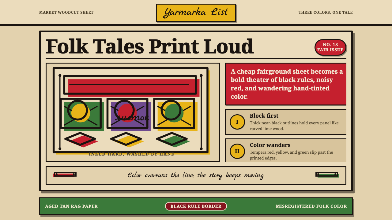 Russian LubokFolk print sings. Tan rag paper, black woodcut rules, red and green fills mis…
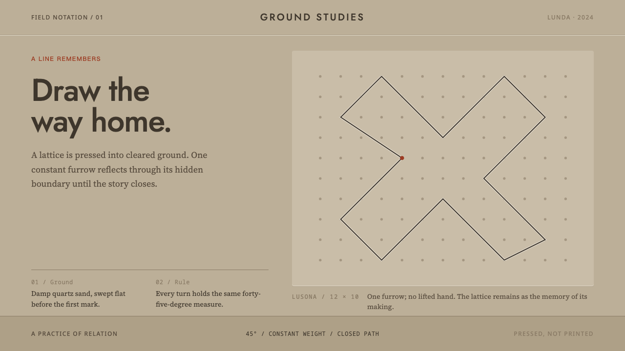 Angolan SonaA story closes in one stroke. A 45° furrow crosses visible dots on damp sand.
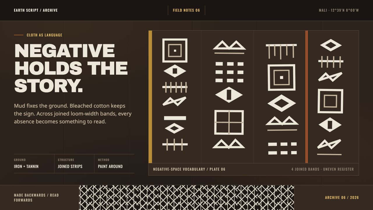 Bogolanfini MudclothAbsence becomes language. Warm iron-black bands hold uneven bleached-cotton s…
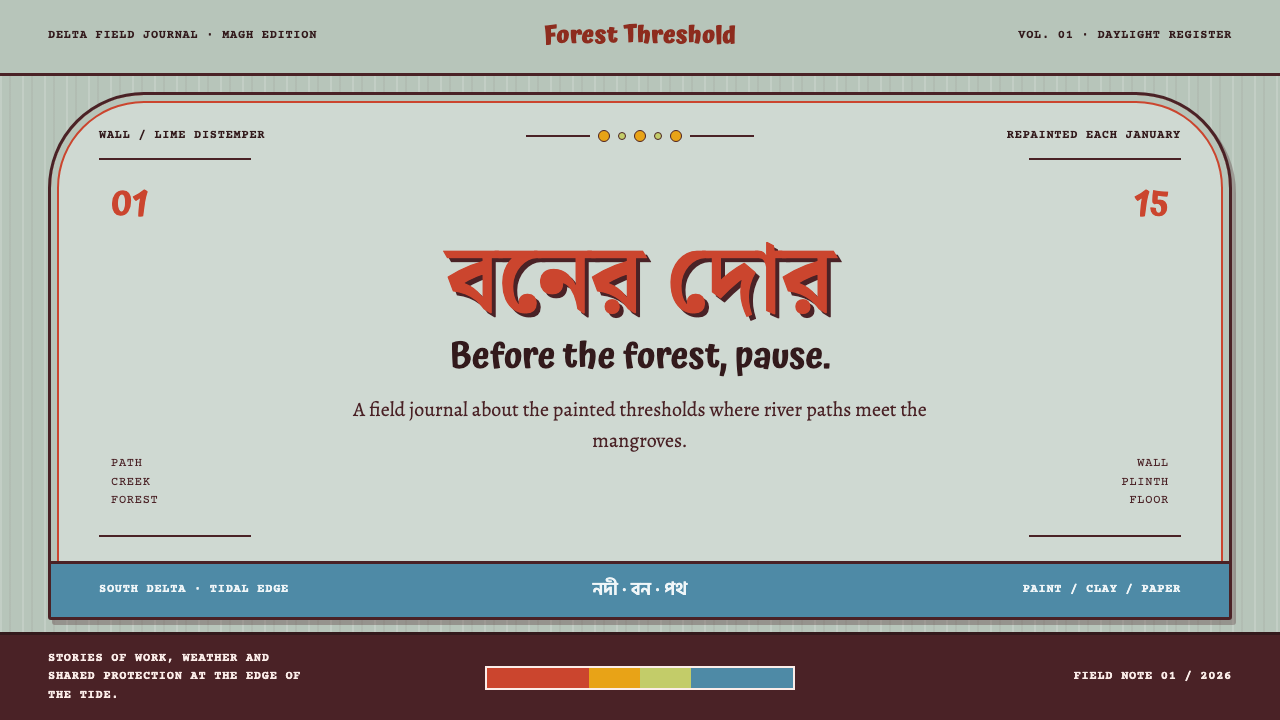 Bonbibi Shrine PaintingA shrine wall holds the forest back. Vermilion type rises from green-grey dis…
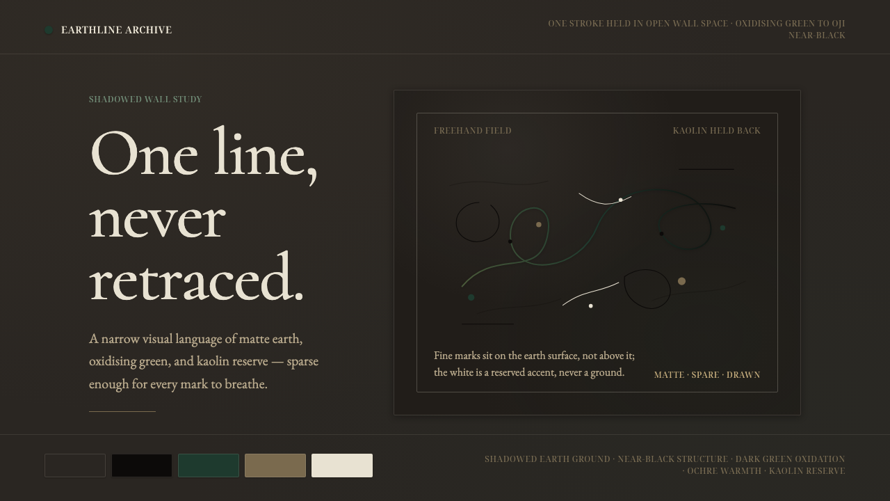 Igbo Uli Painting NigeriaSpare line carries the wall. Near-black curves breathe on dark earth with kao…
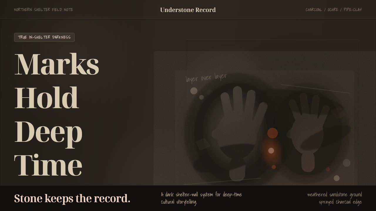 Kakadu Rock Shelter CharcoalDarkness carries memory. Charcoal stencils and haematite dust sit on weathere…