What is Slavic Firebird Folklore?
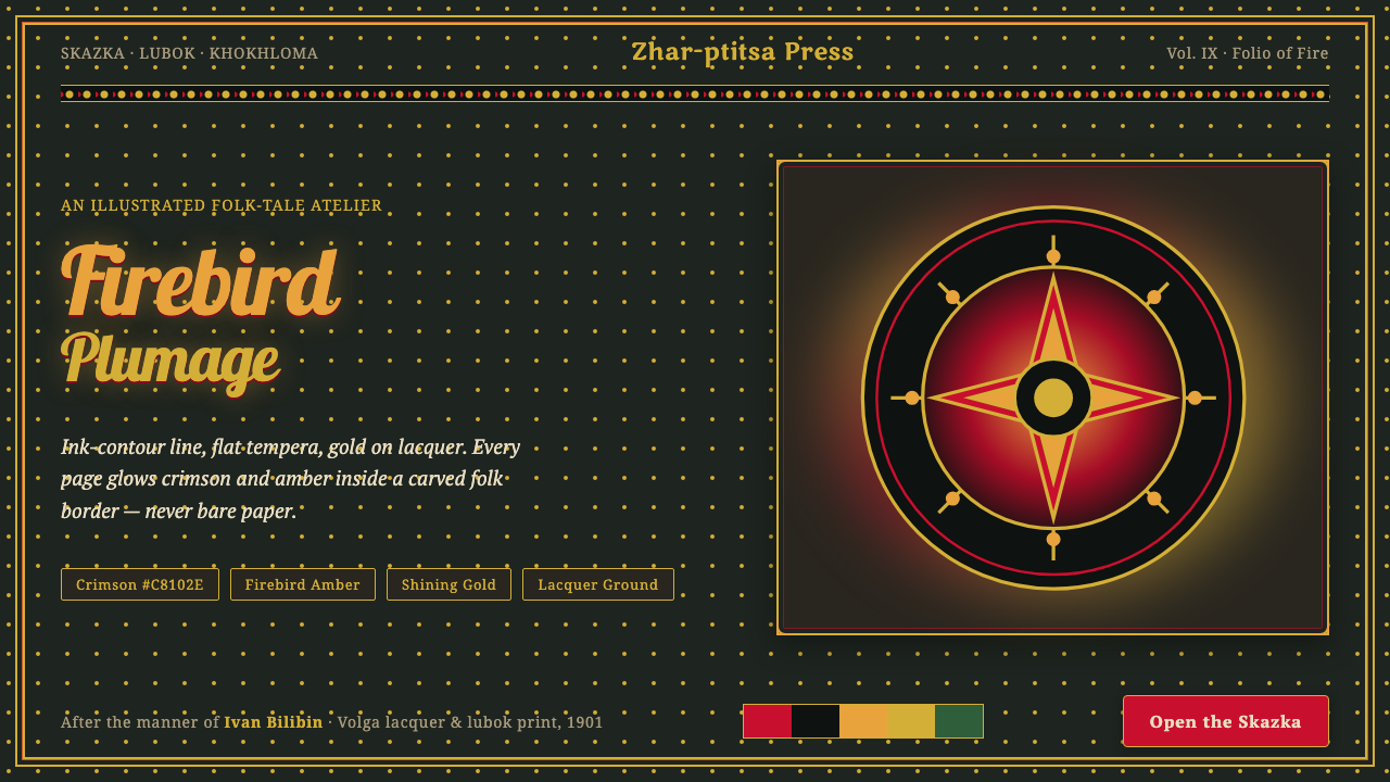
Slavic Firebird folklore turns the page into a lacquered folk object, where crimson, amber, and gold glow inside firm ink contours and carved ornamental frames.
Slavic Firebird Folklore in brief
Slavic Firebird folklore is a visual language rooted in Russian fairy-tale illustration, especially the work of Ivan Bilibin. Its defining image is the Zhar-ptitsa firebird: a legendary creature rendered through saturated crimson, amber, and shining gold, with every form enclosed by a deliberate ink contour. The style feels simultaneously narrative and ceremonial, as though each scene were a storybook panel, an icon, and a folk-carved object at once.
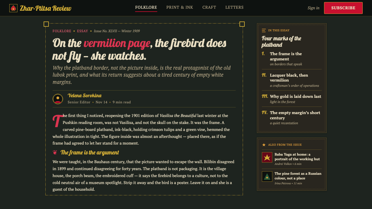
The palette is never placed on bare paper. Illustrations sit against deep lacquer black-green grounds and are enclosed by ornate carved-platband borders known as nalichnik. These frames draw on peasant embroidery, carved folk architecture, and the dense patterning of lubok prints. The border is not an afterthought around the image; it is part of the image’s world, turning the page into a contained stage for mythic action.
The visual system joins flat tempera color with dense ornament and strong contour drawing. The firebird, Prince Ivan, and Baba Yaga are not modeled through soft naturalistic shading but built from clear silhouettes, patterned surfaces, and disciplined color fields. The result is dark, vivid, and highly decorative without becoming vague: every figure is legible, every border has rhythm, and every red or gold accent carries the heat of folklore.
Where does Slavic Firebird Folklore come from?
The style belongs to the period of Russian fairy-tale book illustration spanning 1900–1950, with Bilibin’s visual language reaching its peak from 1901. Its region is Eastern Europe, specifically Imperial and early-Soviet Russia. Rather than emerging from a single isolated source, it gathers several related traditions: the Russian skazka, the lubok print, the revivalist culture of Mir iskusstva, and Khokhloma lacquer folk art.
Bilibin’s contribution was to give Russian fairy tales a definitive visual identity. He combined firm ink contours with flat tempera, allowing figures and scenery to read as organized shapes rather than loosely painted scenes. His illustrations treated the page as a complete designed surface: the story, the characters, the ground, and the surrounding ornament belonged to one system.
The lubok tradition supplied the language of flatness and pattern density. Its influence can be felt in the compressed spatial logic, the clarity of silhouettes, and the sense that ornament can carry narrative atmosphere as strongly as a landscape or facial expression. The anonymous lubok printmakers therefore matter not as individual personalities but as a collective source of visual discipline.
Khokhloma folk painters supplied another essential strand: the dramatic relationship between lacquer black-green, crimson, and gold. In the resulting style, dark ground and luminous ornament intensify one another. Folk borders modeled on carved platbands and embroidery complete the synthesis, making the page feel less like an open sheet and more like a precious object preserved inside a ceremonial frame.
What defines the Slavic Firebird Folklore look?
Lacquer Ground
The ground is deep lacquer black-green rather than bare paper. It creates a nocturnal, precious atmosphere and gives crimson, amber, and gold the intensity of illuminated enamel. Dark space is not empty; it is the field that makes the folklore glow.
Crimson and Gold
Crimson carries heat and narrative force, while amber and gold suggest firebird plumage, treasure, and ceremonial radiance. The palette is saturated and concentrated, with color used as a primary storytelling device rather than a quiet background mood.
Ink Contour
Every major figure and shape is held together by a firm ink contour. The line clarifies silhouettes, separates patterned surfaces, and prevents dense ornament from dissolving into visual noise. It gives the style its graphic authority.
Flat Tempera
Forms are filled with flat tempera color instead of soft atmospheric modeling. Surfaces read as designed fields, allowing feathers, clothing, foliage, and architecture to share one graphic language. Depth comes from overlap, contour, and pattern rather than simulated realism.
Folk Frame
Nalichnik-inspired borders surround the illustration like carved architectural trim. Embroidery-like motifs and repeated ornamental rhythms make the frame structurally important: it contains the scene, establishes cultural identity, and turns the page into an object.
Patterned Myth
The firebird and other fairy-tale figures are made mythic through pattern as much as anatomy. Feathers, garments, vegetation, and surroundings can become rhythmic surfaces, but the ink contour keeps each transformation readable and intentional.

Who shaped Slavic Firebird Folklore?
Bilibin gave Russian fairy tales their definitive visual appearance. His method joined firm ink contour, flat tempera, folk borders, and saturated black-green, crimson, and gold into a unified book-page system. The Zhar-ptitsa firebird, Prince Ivan, and Baba Yaga become memorable through this balance of graphic clarity and ornamental density.
The anonymous makers of lubok prints represent the collective folk source behind the style. Their tradition contributes flat composition, clear silhouettes, compact storytelling, and dense pattern. Because the source is collective rather than authored by one named figure, its influence feels embedded in the visual grammar itself.
Khokhloma folk painters contribute the lacquer-like relationship between dark ground, crimson ornament, and gold. Their influence gives the style its material fantasy: the page seems polished, precious, and hand-decorated, even when its imagery depicts a forest, a royal figure, or a supernatural creature.
The Zhar-ptitsa is the style’s central emblem rather than a historical designer. Its crimson-gold plumage concentrates the visual system’s essential qualities: heat against darkness, ornament organized by contour, and myth expressed through a luminous patterned body.
How do you use Slavic Firebird Folklore today?
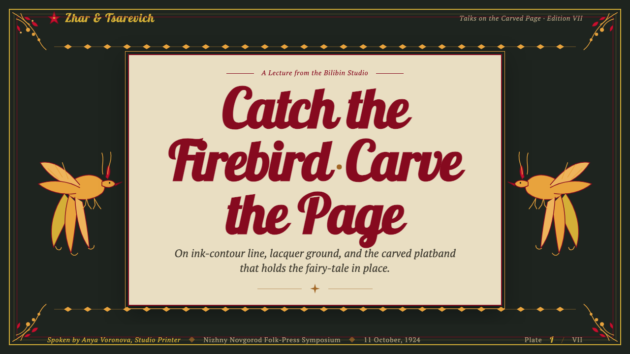
For presentation covers, use the style as a framed story object. Place the title against a lacquer black-green ground, surround the composition with a restrained folk border, and let one crimson or gold form establish the focal point. Content slides should keep the same visual grammar: firm contours, flat illustrated motifs, and repeated embroidery-like ornament used to separate sections. Data slides can translate charts into folk diagrams, with bars, symbols, or fields treated as flat patterned shapes rather than glossy interfaces.
For web interfaces, the style suits dashboards and pricing pages that need a strong cultural identity and a dark, theatrical atmosphere. Use the deep ground as the continuous environment, reserve crimson for active states or important actions, and use gold sparingly for emphasis and hierarchy. Cards should feel framed rather than floating, with borders and patterned dividers replacing generic decoration. Icons work best when simplified into clear silhouettes or folk-like geometric marks.
For editorial and marketing work, build a page system in which the border, not only the central image, carries the brand voice. Article layouts can place portraits, quotations, or section headings inside nalichnik-inspired frames, while dense pattern can mark transitions between chapters. Marketing pages benefit from the style’s storybook authority: a product or campaign can be presented as a treasured object, provided the imagery remains legible and the ornament does not overwhelm the message.
For illustrated storytelling, assign each scene a clear ground, contour, and ornamental rhythm before adding detail. Characters should read immediately through silhouette and color, while patterned clothing, foliage, and architecture create the sense of a larger folk world. The strongest applications preserve the tension between dark enclosure and luminous color: the page should feel rich and inhabited, never pale, loose, or casually decorative.
The common mistake is to copy the red-and-gold palette while leaving the composition on an open white background. That removes the lacquer atmosphere and turns the style into generic folk decoration. Another mistake is adding soft realism, glossy gradients, or unrelated modern ornaments. The system depends on flat color, firm line, dark containment, and borders that belong to the same cultural vocabulary as the central image.
Slavic Firebird Folklore — FAQ
Is Slavic Firebird folklore simply a red-and-gold folk style?
No. Red and gold are important, but the identity depends on their relationship with a deep lacquer black-green ground, firm ink contour, flat tempera, and dense folk framing. Remove the dark enclosure or the contour discipline and the result becomes decorative color styling rather than the complete visual language.
Why are the borders so important?
The border makes the illustration feel like a folk object rather than an isolated image on paper. Its nalichnik-like carving and embroidery-like rhythm connect the scene to vernacular craft, while also containing the visual energy of the characters and patterns. It is both cultural signal and compositional structure.
Can this style use a light background?
A light variation can borrow the contour, flat tempera, and folk ornament, but it will move away from the defining lacquer atmosphere. The approved visual language is strongest when the page is not bare and when luminous crimson and gold are set against deep black-green. If the ground becomes pale, the frame and dark structural accents must work harder to preserve enclosure.
How should imagery be treated in a modern interface?
Treat imagery as a designed surface, not as a realistic window. Use clear silhouettes, flat color fields, patterned details, and strong framing. Photography can be difficult to integrate if it introduces soft naturalism or unrelated lighting; illustrations that share the ink-contour and lacquer-ground logic will produce a more coherent result.
What makes the style feel authentic rather than merely ornate?
Authenticity comes from structural agreement. The border, ground, contour, palette, and pattern density must appear to belong to one folk-art world. Ornament should clarify atmosphere, hierarchy, or cultural identity, while flat color and silhouette preserve readability. If every element is equally elaborate, the page loses the firm visual order that makes Bilibin-derived work distinctive.
Related design styles
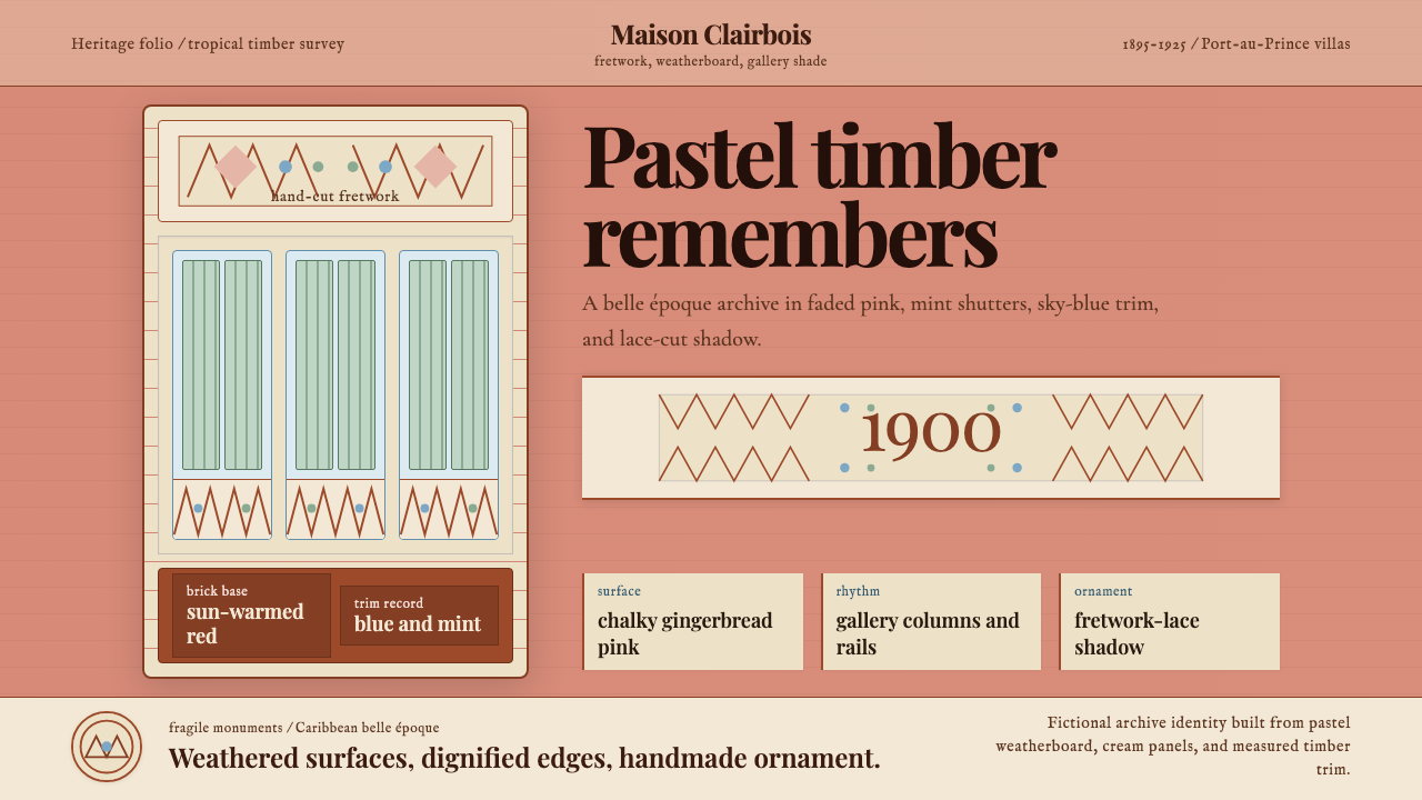 Haitian Gingerbread House (1900)Fragile elegance endures. Faded pink walls carry mint shutters and fretwork-l…
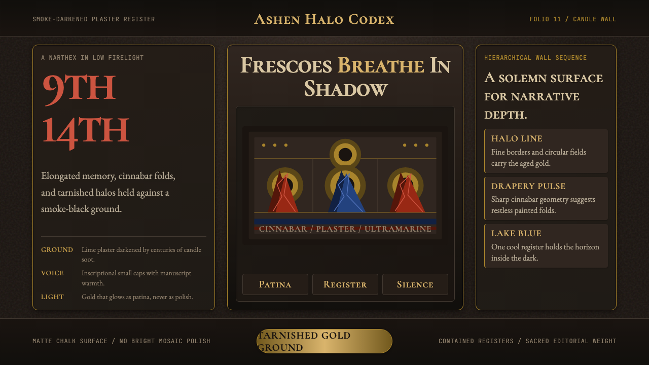 Macedonian Ohrid Fresco (Byzantine)Sacred darkness breathes. Tarnished gold rings, cinnabar folds, and plaster g…
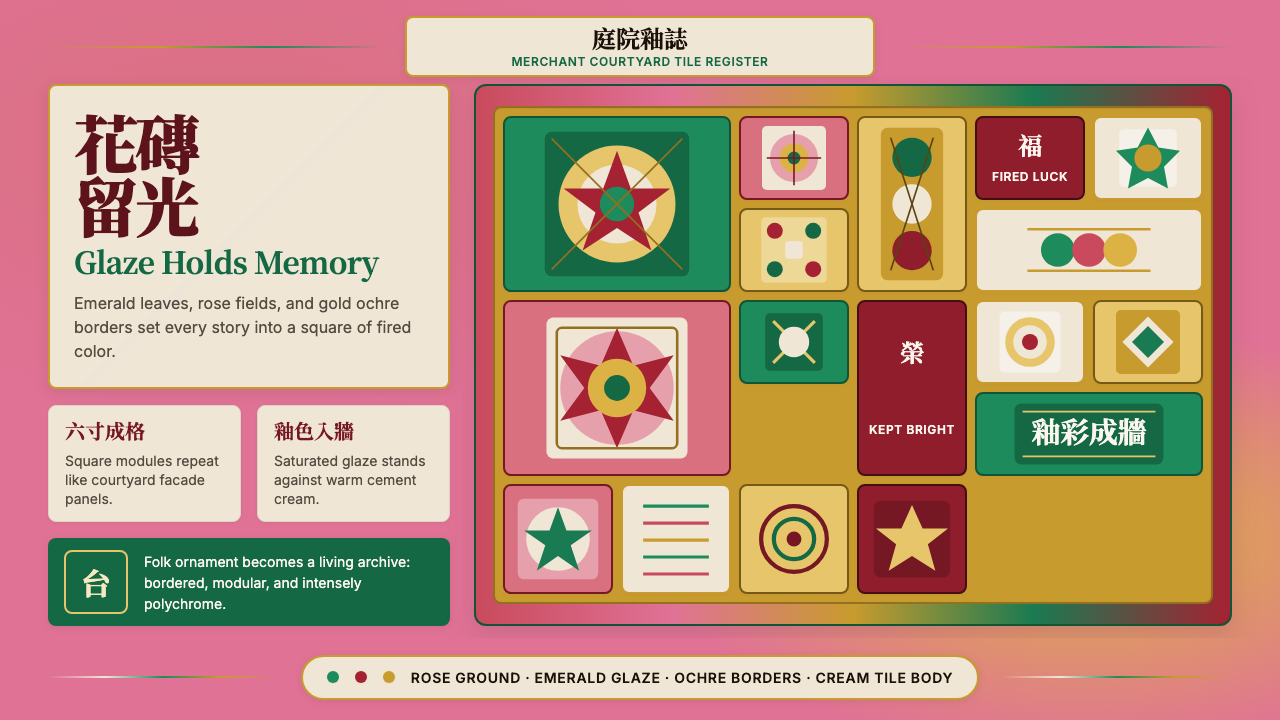 Taiwanese Painted Tile VernacularGlaze refuses to fade. Rose ground, emerald modules, ochre borders form a til…
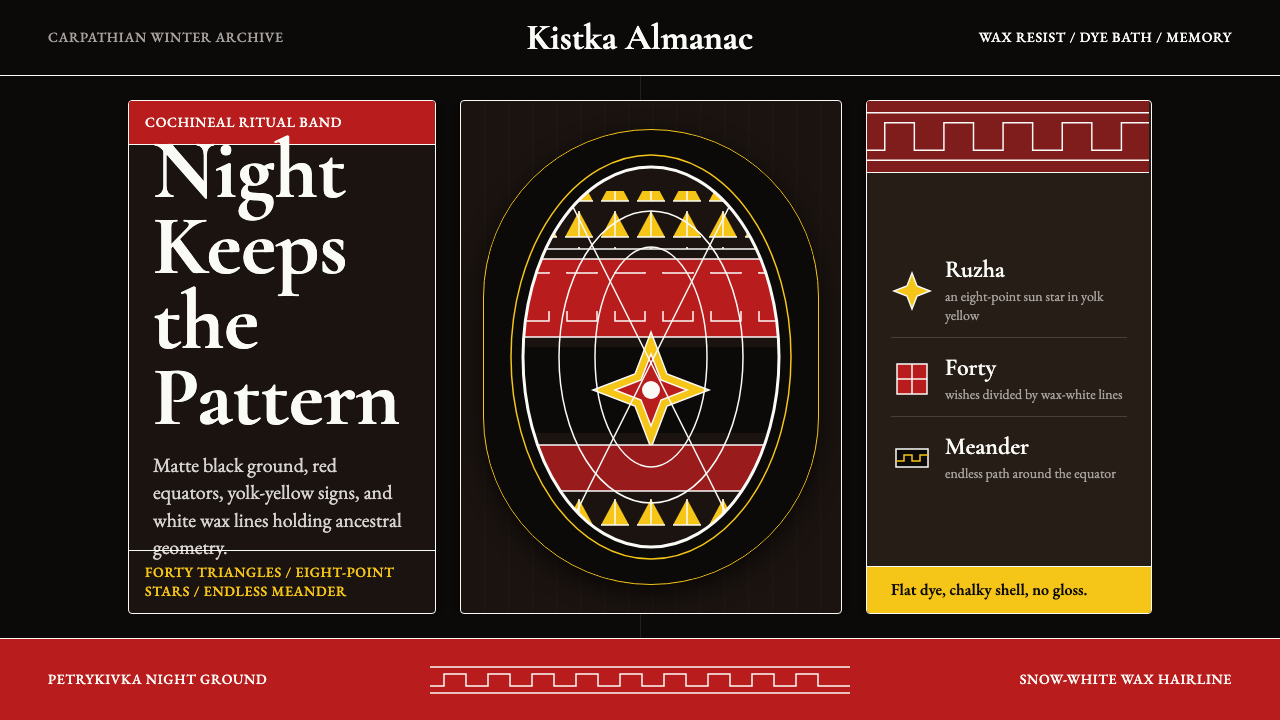 Ukrainian Pysanky (wax-resist egg)Night holds memory. Red bands, yolk geometry, and white wax lines cut matte b…
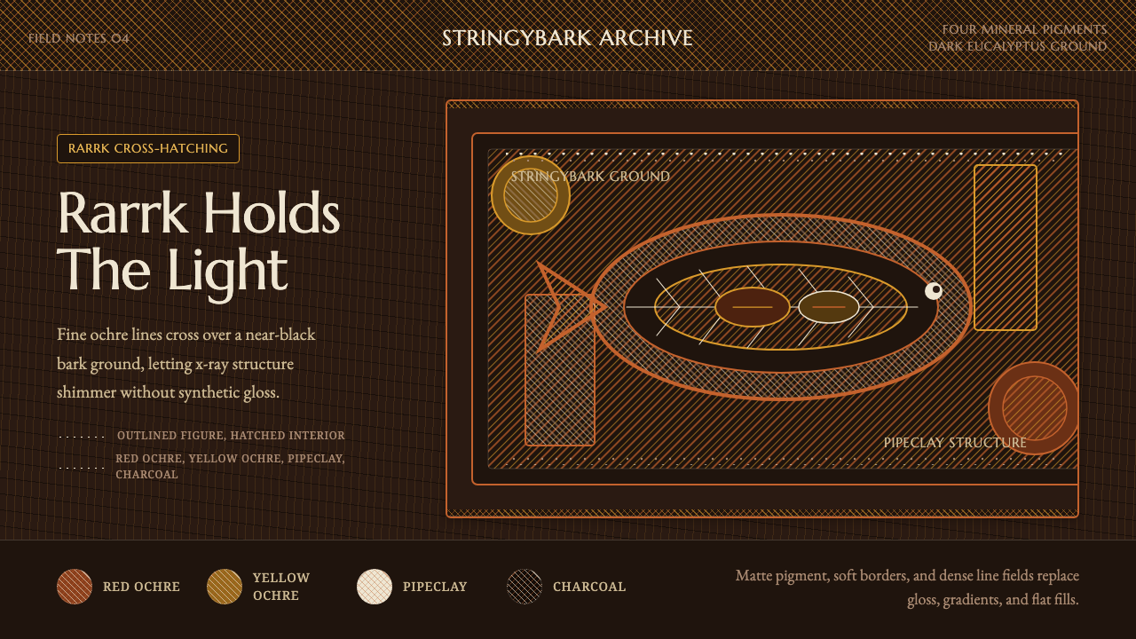 Arnhem X-Ray Bark PaintingShimmers without gloss. Ochre rarrk lines vibrate on dark stringybark.
 Burmese Yun LacquerwareLacquer glows in cut lines. Cinnabar, orpiment and viridian band a mirror-bla…