What is Welsh Slate?
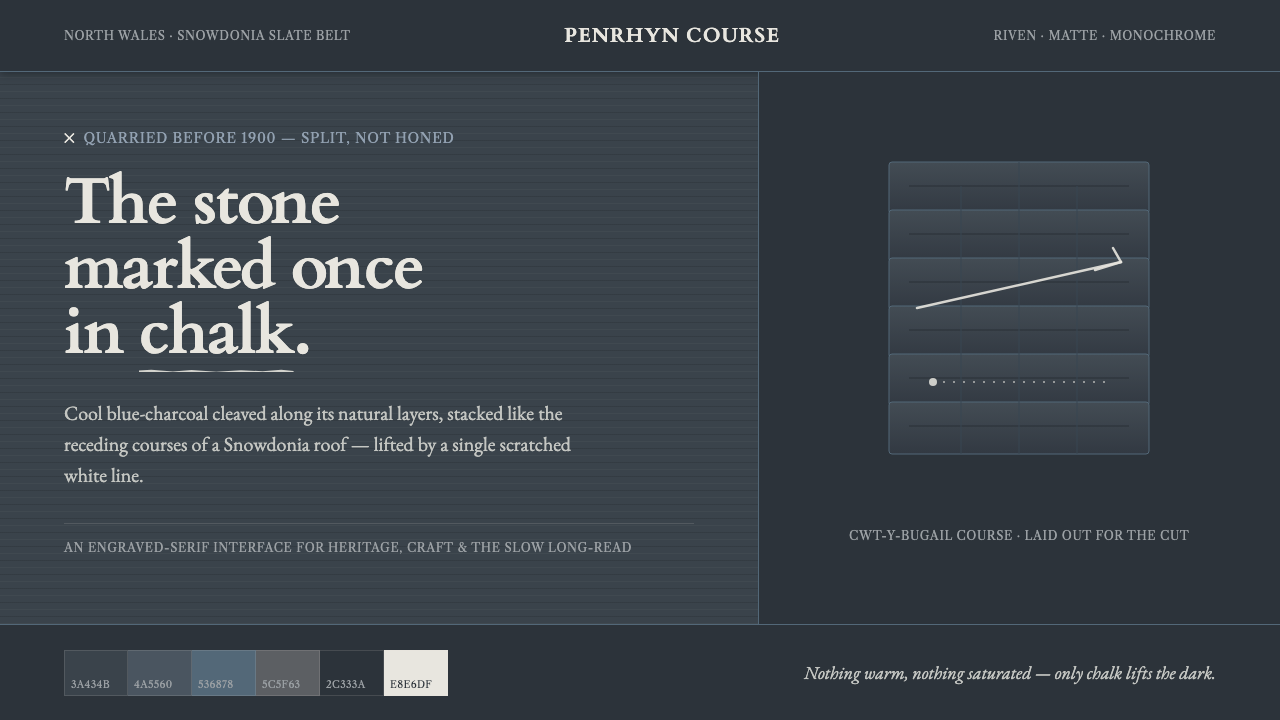
Welsh Slate turns the interface into a dark geological surface: cool blue-charcoal planes, cleaved layers, engraved serif lettering, and one chalk-white mark that feels scratched rather than placed.
Welsh Slate in brief
Welsh Slate is a material-led design language drawn from the roofing and writing slate of North Wales. Its visual foundation is a cool, dark, matte blue-charcoal ground, supported by Payne’s-grey and cool-stone tones. The surface should feel cleaved along natural layers, never polished smooth, with stacked rectangular courses recalling overlapping slate tiles on a Snowdonia roof.
The system depends on restraint. Darkness is not treated as a dramatic backdrop for a busy accent palette; it is the primary material. A single chalk-white mark provides the only bright lift, recalling the scratched line made by a slater or a schoolchild on slate. That mark may identify an action, separate a section, or draw attention to a key fact, but it should always feel purposeful and scarce.
Typography completes the illusion of material. An engraved serif such as Cardo gives headings the authority of lettering cut into stone, while the surrounding interface remains quiet and legible. Forms are rectangular, layered, and weighty. Surfaces stay matte, edges remain deliberate, and warmth is excluded: no cream, pure white, warm hues, or high-saturation color should dilute the cold mineral character.
Where does Welsh Slate come from?
Welsh roofing and writing slate was split from the cliffs of North Wales before 1900, making the material inseparable from the region’s industrial and vernacular history. The slate belt around Snowdonia supplied a stone whose natural cleavage made it possible to separate broad, thin pieces from the rock. The resulting surfaces were practical, durable, and visibly marked by the layers through which they had been split.
The Penrhyn quarry and Cwt-y-Bugail belong to this North Wales slate landscape. Their significance in the design language is not presented through ornament or historical illustration, but through the physical evidence of extraction: dark blue-charcoal stone, riven striations, repeated courses, and surfaces that retain the memory of geological pressure. Every visual layer should suggest that it has been separated from a larger mass.
The industry grew within Victorian industrial extraction while remaining connected to vernacular British roofing tradition. That combination gives Welsh Slate its particular tension. It is industrial without becoming mechanical, and traditional without becoming nostalgic. The interface should therefore feel engineered and dependable, yet visibly made from a natural material whose irregular cleavage has not been erased.
The human figures in this history are collective rather than heroic. The North Wales slate-quarrying industry represents the organized labor of cutting, splitting, and preparing the stone. The Penrhyn quarrymen represent the hand and eye behind the material: the worker who follows a seam, judges a split, and leaves a mark. The design preserves that relationship by making every bright accent feel like a human intervention on a dark mineral field.
What defines the Welsh Slate look?
Mineral Palette
The palette stays within cool blue-charcoal, Payne’s-grey, and cold stone tones. The ground is deep and matte; supporting surfaces differ through subtle shifts in value rather than bright contrast. Chalk white is reserved for a single decisive mark. Warm neutrals and saturated colors are excluded because they change the material identity from slate to painted surface.
Riven Layering
Panels, cards, and content bands should read as courses of slate laid over one another. Their edges may align with a shared structural order, but the visual impression remains layered rather than floating. Depth comes from overlap, tonal separation, and the suggestion of natural cleavage, not from glossy effects or soft atmospheric shadows.
Engraved Serif
Headings use an engraved serif character, with Cardo as the clearest reference. Letterforms should feel cut into the surface: firm, measured, and slightly ceremonial without becoming ornate. Body copy may remain simpler, but it should share the same sense of material seriousness and should never introduce a decorative type contrast.
Chalk Mark
One chalk-white accent provides the system’s visual lift. It may appear as a rule, label, cursor-like indicator, or handwritten-feeling intervention, but its role is always singular: to mark attention against the dark field. Repeating it everywhere weakens the metaphor. The mark is powerful because the surrounding surface remains quiet.
Matte Depth
Welsh Slate does not imitate polished stone, glass, or wet mineral surfaces. Its depth is quiet and absorbent, built through near-dark planes and restrained tonal changes. Borders should feel like seams between pieces, while shadows, if used, should remain blunt and structural rather than diffuse or luminous.
Stacked Rectangles
The dominant geometry is rectangular and horizontally composed, recalling roofing courses and split slabs. Repetition creates rhythm, but the rhythm should remain irregular enough to suggest hand-worked material. Avoid rounded, inflated, or organic containers that make the interface feel soft, polished, or synthetic.
Who shaped Welsh Slate?
This collective figure provides the system’s industrial foundation. It represents the organized extraction and preparation of slate before 1900, and the continuing life of the quarries today. Its influence appears in the interface’s disciplined stacking, durable dark surfaces, and refusal of decorative excess.
The Penrhyn quarrymen embody the human act of reading and splitting stone. Their presence is felt through the chalk-mark accent and the riven surface language: every bright line suggests a worker’s intervention, while every layered edge suggests a judgment made along the stone’s natural cleavage.
This tradition supplies the system’s repeated horizontal rhythm. Slate courses are not merely a decorative reference; they explain why the interface favors stacked bands, rectangular modules, and practical hierarchy. The result should feel built for use, with pattern emerging from construction rather than being applied afterward.
How do you use Welsh Slate today?
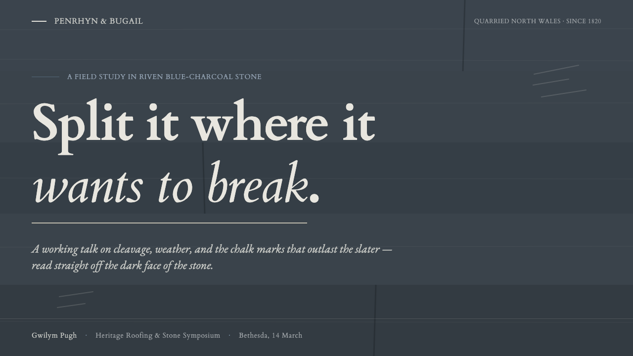
For presentation slides, Welsh Slate works best when the cover behaves like a single large slab: a dark field, an engraved serif title, and one chalk-white intervention that establishes the subject. Content slides can use stacked horizontal bands, with each band carrying one clear idea. Data slides should turn charts into quarry-like diagrams: restrained cool tones establish the field, while the chalk mark identifies the decisive value or change. The hierarchy should come from placement, scale, and tonal weight rather than a crowded accent palette.
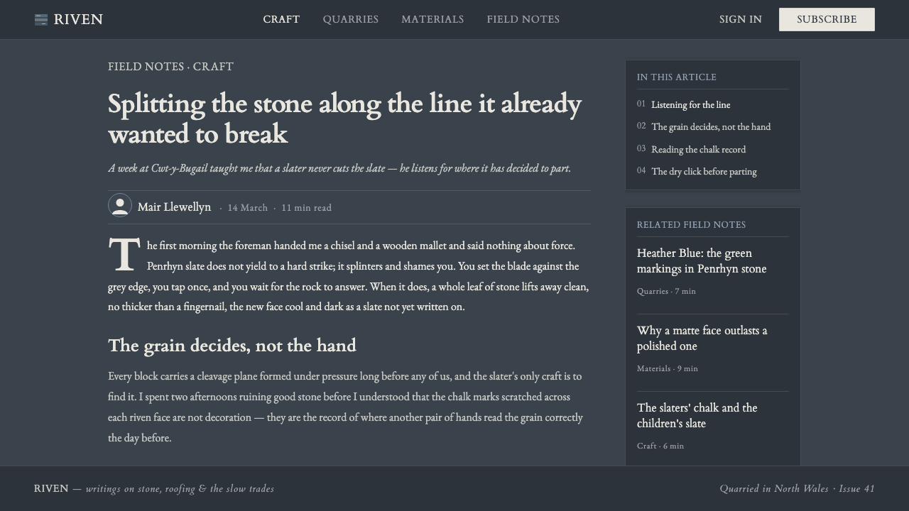
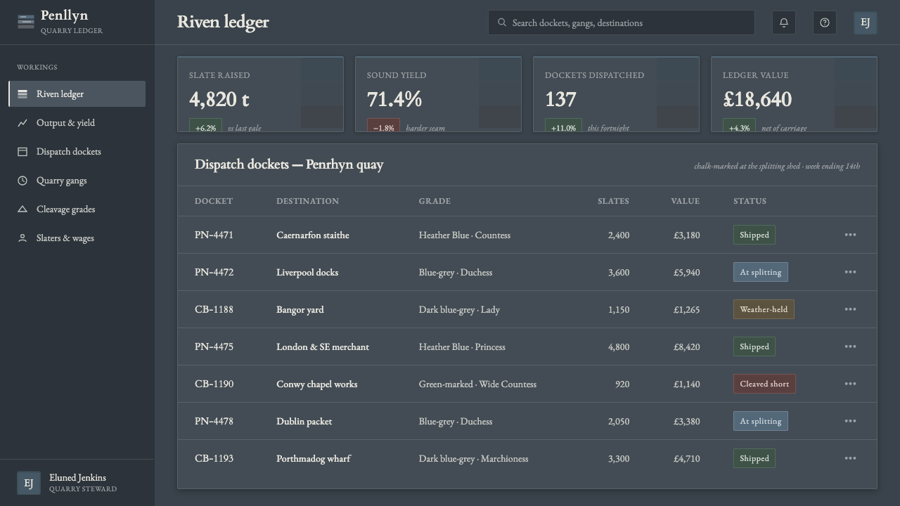
For web interfaces, the system suits dashboards, monitoring tools, archives, and analytical products that need authority without visual glare. Keep navigation and body text within the cool mineral range, distinguish cards through layered surfaces and seams, and reserve the white mark for active states, selected data, or a primary action. Pricing pages can treat each plan as a separate slate course, but the strongest tier should be identified by structure and the singular mark rather than by a bright promotional color.
For editorial and marketing work, Welsh Slate creates a strong sense of place and material credibility. Articles can place a quiet serif headline over a deep field, then divide sections with horizontal seams that recall roofing courses. Pull quotes and metadata should feel engraved or chalked into the surface, not placed in glossy badges. Marketing pages can use the contrast between dark mineral planes and one white signal to make a promise, product name, or call to action feel deliberate and memorable.
For brand systems and cultural products, the style is especially effective when the subject involves craft, landscape, archives, education, construction, or durable tools. Photography, if introduced, should reinforce the slate logic through cool darkness, matte surfaces, and visible layers. The interface should remain tactile without becoming rustic: its order comes from stacked construction, while its atmosphere comes from the stone’s cold, quiet density.
The common mistake is to confuse Welsh Slate with any generic dark theme. Black backgrounds, bright white text, and random blue accents do not create the material language. Another failure is over-texturing the surface with noisy grain, glossy highlights, or literal stone photographs. The system depends on suggestion: cool tonal layering, disciplined rectangular courses, an engraved serif, and one scarce chalk-white mark. Add more effects and the quarry disappears beneath decoration.
Welsh Slate — FAQ
Is Welsh Slate simply a dark mode theme?
No. A dark mode theme begins with usability and contrast, while Welsh Slate begins with material identity. Its dark blue-charcoal ground, Payne’s-grey support tones, riven layering, engraved serif, and singular chalk-white mark form a specific visual system. Removing those relationships leaves a dark interface, but not Welsh Slate.
Can the style use several bright accent colors?
It should not. The source language is built around one chalk-white lift against cool dark stone. Introducing several bright accents changes the visual hierarchy and turns the surface into a graphic theme rather than a geological one. If more distinction is needed, use shifts among the cool supporting tones, changes in layering, or stronger structural placement.
Why is an engraved serif important to Welsh Slate?
The serif supplies the human and historical counterpart to the stone. It recalls writing cut or marked onto a durable surface, giving headings weight without relying on ornament. Cardo is the clearest reference in the source material. The treatment should remain measured and legible; overly ornamental lettering would make the system theatrical rather than workmanlike.
Can Welsh Slate be used for a light-background interface?
The system is fundamentally dark because the stone is its subject. A light variant may borrow the layered rectangles, engraved serif, and chalk-mark idea, but it would no longer carry the same material force. If the dark ground is softened, preserve the cool mineral temperature and keep the accent scarce; otherwise the design will drift toward generic editorial styling.
What makes the layered surface feel authentic rather than decorative?
Authenticity comes from constructional logic. Each band or card should appear to belong to a shared order, as if separated from the same larger slab. Tonal differences should explain grouping, and seams should clarify structure. Random texture, excessive irregularity, gloss, and soft atmospheric shadows work against the idea because they simulate surface effects without explaining how the interface is built.
Related design styles
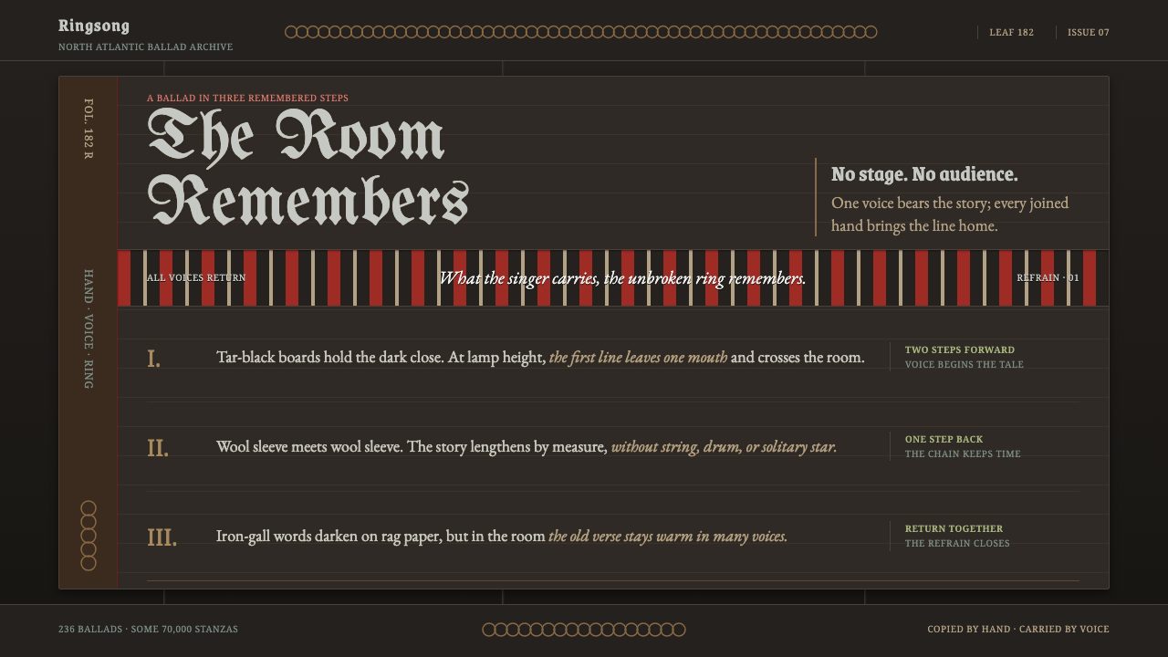 Faroese KvæðiThe room sings as one. Silver type and red refrain bands rule a tar-black man…
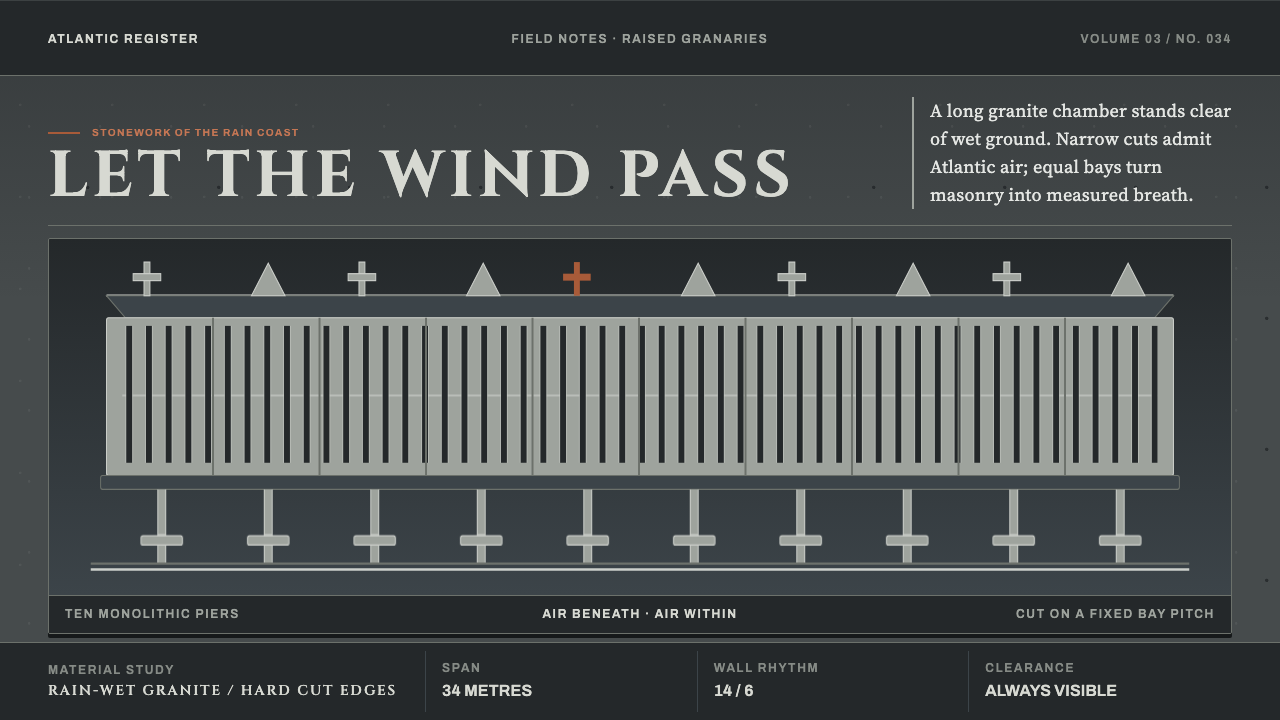 Galician HórreoStone learns to breathe. Wet granite, narrow slits and raised bays conduct At…
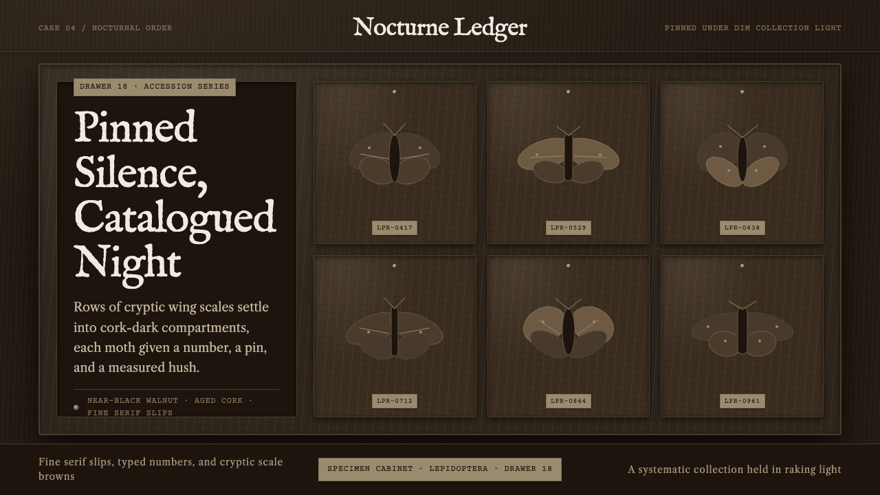 Lepidoptera DrawerDark, ordered hush. Walnut ground, IM Fell type, cork slips, and gridded moth…
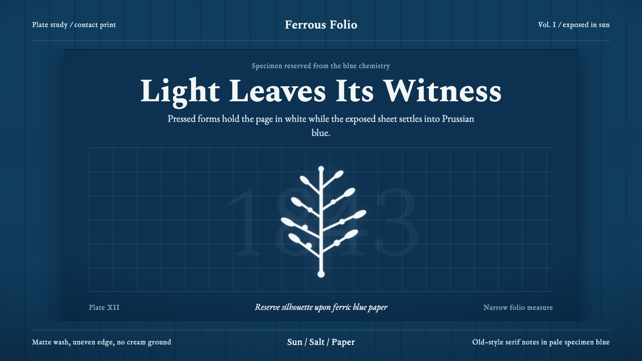 Anna Atkins CyanotypeScience turns spectral. Prussian blue ground, white reserves, Victorian serif…
 Fern CyanotypeStillness turns scientific. Prussian blue field, white photograms, Victorian…
 Joseon Moon JarQuiet imperfection glows. Milk-white porcelain floats on charcoal with a visi…