What is Peranakan Shophouse Tile (Joo Chiat)?
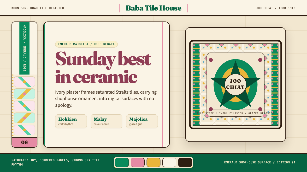
The Peranakan shophouses of Joo Chiat carry a century of ornamental confidence in their emerald-and-rose majolica grids — a design language born where Hokkien craft, Malay colour intuition, and European industrial tile met on a tropical street.
Peranakan Shophouse Tile (Joo Chiat) in brief
Peranakan Shophouse Tile (Joo Chiat) is a design style rooted in the visual identity of Singapore's Straits Chinese terrace houses — the two- and three-storey shophouses that line Joo Chiat Road, Koon Seng Road, and Emerald Hill. Its most recognisable element is the majolica tile: richly glazed ceramic squares arranged in repeating geometric grids, typically in saturated emerald green against ivory, soft rose, or powder blue grounds, with decorative borders and corner rosettes lending the whole facade an air of composed exuberance.
The style is not merely decorative. It represents the visual identity of the Baba-Nyonya community — the Peranakan Chinese, descendants of early Chinese migrants who settled in the Malay Archipelago and developed a hybrid culture that absorbed Malay, Chinese, Dutch, and British influences over several centuries. Their built environment was a material expression of that cultural negotiation: Chinese spatial typologies adapted to tropical climate, European industrial ornament applied with the chromatic boldness of Malay textile tradition, and a layering of geometric pattern that reads simultaneously as order and as celebration.
As a digital design system, it channels this unapologetic ornamental richness into screen interfaces. Every component carries the saturated joy and layered confidence of a Koon Seng Road facade — geometric tile motifs in the background, deep jewel-toned accents, generous use of white stucco-like space between ornamental zones, and a typographic sensibility that echoes the painted lettering of Peranakan shopfront signboards.
Where does Peranakan Shophouse Tile (Joo Chiat) come from?
The Peranakan shophouse as an architectural type crystallised in the Straits Settlements — the British colonial ports of Penang, Melaka, and Singapore — during the second half of the nineteenth century and the early decades of the twentieth. The peak construction period ran roughly from the 1880s to the 1940s, when prosperous Baba-Nyonya merchants commissioned terraces that expressed both their commercial ambitions and their cultural complexity. Singapore's Joo Chiat and Katong districts, Emerald Hill near Orchard Road, and the Georgetown streets of Penang preserve the densest surviving concentrations of these facades.
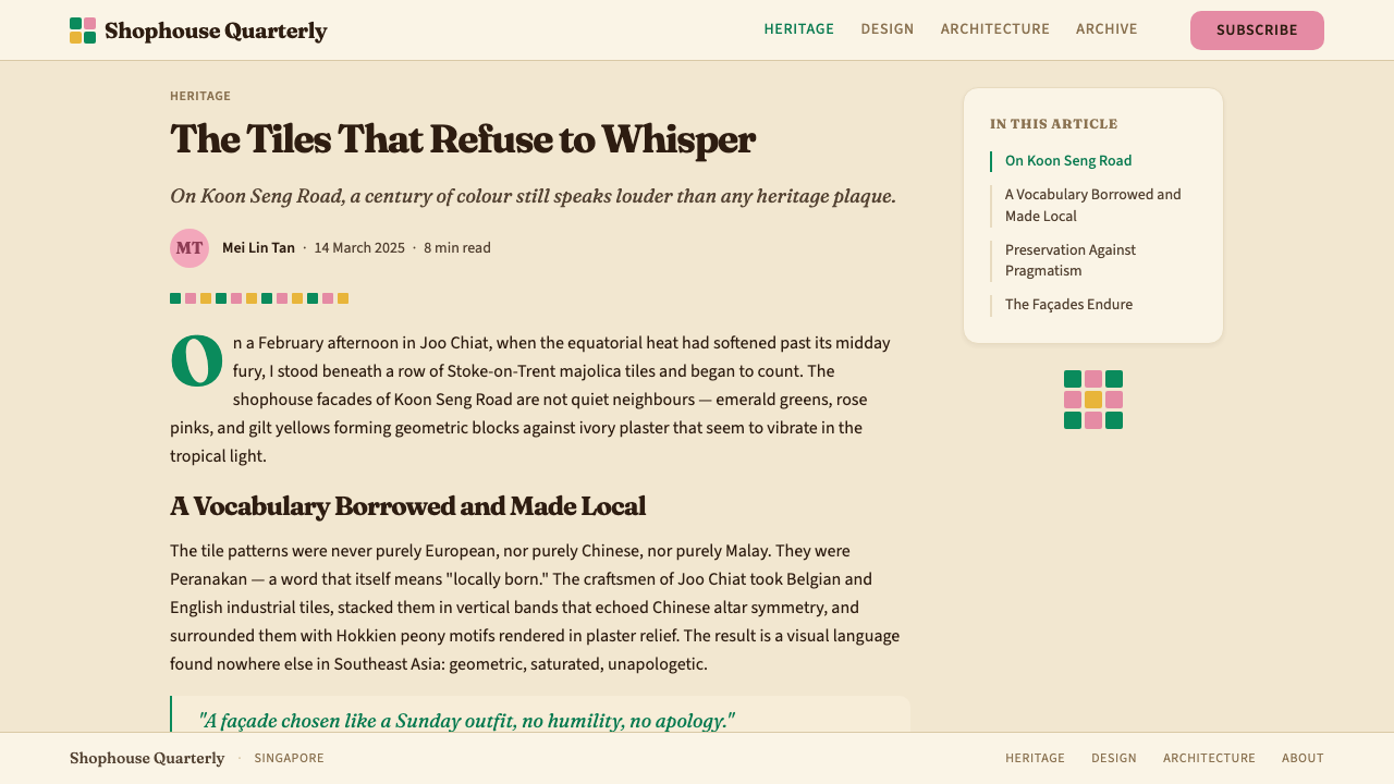
The majolica tile itself arrived through the British colonial trade network. Manufactured primarily in Staffordshire, England, and in Portugal, these industrially produced glazed tiles were adopted by Peranakan builders as the ornamental skin of choice for the lower register of shophouse facades. The visual outcome was a striking synthesis: European mass-production technology carrying patterns that blended Art Nouveau floral scrollwork, Islamic geometric lattice, and Chinese auspicious motifs — phoenixes, bats, and peony blooms — all rendered in glazes whose depth and saturation far exceeded anything achievable in local handcraft at equivalent cost.
Colour played a culturally coded role. Emerald green, the dominant hue of the style, carried auspicious resonance in both Chinese and Malay folk traditions — green as the colour of jade, of growth, and of spiritual protection. Rose and terracotta pinks echoed the Nyonya porcelain and embroidery tradition, where warm pinks were associated with feminine refinement and celebration. The ivory and cream grounds reflected the plastered stucco pilasters and arched loggias of the facades, providing a neutral foil against which the tile colour could declare itself at full intensity.
The Peranakan cultural revival of the 1980s and 1990s in Singapore, driven partly by the conservation movement and partly by a broader renegotiation of multicultural national identity, brought renewed scholarly and popular attention to this visual tradition. Heritage researchers like Lee Kip Lin documented the architectural fabric systematically before demolition could claim it; collectors and curators like Peter Wee and Edmond Chin brought the material culture — nyonya ware, embroidered kasot manek beaded slippers, ceremonial textiles — into public collections. The Urban Redevelopment Authority's conservation programmes from 1989 onwards designated significant shophouse clusters as conservation areas, ensuring that the tile-faced facades would not vanish behind the glass towers rising around them. Contemporary Peranakan design, championed by figures like scholar Kwa Chong Guan, has since extended the tradition into graphic design, hospitality interiors, and digital products.
What defines the Peranakan Shophouse Tile (Joo Chiat) look?
Colour
The palette is anchored by a deep, saturated emerald green — not a cool mint or a dark forest, but the vivid, almost luminous green of high-quality glazed tile under tropical light. This dominant hue is balanced against ivory or cream grounds and punctuated by warm rose, soft terracotta, and occasional cobalt blue. The overall effect is richly chromatic but never chaotic: each colour occupies a distinct compositional zone, and the contrast between jewel-toned tiles and pale stucco grounds gives the palette its characteristic clarity-within-abundance.
Pattern and Geometry
The tile grid is the foundational structural element. Geometric arrangements — four-square repeating units, eight-pointed star rosettes, interlocking diamond lattices — provide the organizing rhythm, while floral and faunal motifs (stylised peonies, phoenixes, bats as symbols of good fortune) animate the individual tiles within that grid. The result is a two-level visual system: macro-level geometric order and micro-level ornamental richness, each readable at different viewing distances. Border strips and corner pieces frame the main tile field, reinforcing the compositional logic of containment and display.
Layering and Depth
Peranakan shophouse facades achieve depth through deliberate layering: the tile field is set within plaster pilasters and arched loggias; the pilasters carry painted panels; the upper floors feature carved and painted timber shutters. In digital translation, this principle becomes a stacking of visual registers — background tile pattern, midground decorative border, foreground content — each with a distinct tonal value that keeps the layers visually legible. Depth is never simulated through soft shadow or gradient but through the careful ordering of flat ornamental zones.
Typography
The typographic sensibility is rooted in the painted signboard tradition of Peranakan commercial streets — bold, confident letterforms with a hint of calligraphic warmth, neither rigidly classical nor informally loose. In digital application, this translates to a preference for display typefaces with a gentle optical stress and moderate stroke contrast, set large enough to read as an architectural statement rather than a quiet caption. English and Chinese characters coexist naturally in this tradition, reflecting the bilingual reality of the Straits Chinese merchant class, and the digital system honours this by treating both scripts with equal typographic care.
Ornament as Structure
Unlike design traditions that position ornament as applied decoration on top of a neutral structural shell, Peranakan shophouse design treats ornament as constitutive of the structure itself. The tile grid is both skin and order system; the decorative border defines the compositional edge; the corner rosette anchors the spatial hierarchy. In digital work, this means that the decorative motifs should not feel like cosmetic additions to a functional skeleton — they are the skeleton, carrying colour, rhythm, hierarchy, and cultural meaning simultaneously.
Festive Warmth
The emotional register of this style is unambiguously celebratory. Where many ornamental traditions carry a note of formality or reverence, Peranakan shophouse design carries joy — the joy of a community that mastered the art of cultural blending and wished to make that mastery visible in the most public way possible, on the face of the building that was also their place of work and family home. In digital application, this warmth should be preserved: avoid the trap of rendering the tile motifs in muted or desaturated tones in an attempt to modernise, as this drains the system of its essential character.
Spatial Generosity
Despite the ornamental density of the tile field, Peranakan shophouse facades are not visually suffocating. The plastered pilasters and arched loggias provide generous intervals of undecorated surface; the upper storeys often feature large painted shutters or louvred windows that interrupt the ornamental rhythm with expanses of solid colour or open shadow. In digital work, the equivalent discipline is to allow ample breathing space between ornamental elements — generous margins, uncrowded content zones, and clear visual pauses between decorative registers — so that each ornamental passage can be savoured rather than overwhelmed.
Who shaped Peranakan Shophouse Tile (Joo Chiat)?
A Singapore architect and urban historian, Lee Kip Lin produced one of the most systematic photographic and cartographic records of Singapore's pre-war built environment before large-scale urban redevelopment in the 1970s and 1980s could erase it. His documentation of the shophouse precincts of Joo Chiat, Chinatown, and Tanjong Pagar provided the empirical foundation for later conservation advocacy and remains the primary visual archive for researchers and designers working in the Peranakan tradition.
Born into a Peranakan family at Katong and long a resident of the neighbourhood, Peter Wee became one of Singapore's foremost collectors and curators of Peranakan material culture — nyonya ware, beaded slippers, ceremonial clothing, and domestic objects. His collection, displayed at his family home on East Coast Road for many years before formal museum arrangements, served as a living demonstration that Peranakan visual culture was an integrated aesthetic system, not a set of isolated curiosities, and helped build the popular case for its preservation and revival.
A jewellery designer and cultural advocate, Edmond Chin has been instrumental in extending Peranakan aesthetics into contemporary luxury design. His work demonstrates how the chromatic richness, layered ornamental logic, and symbolic vocabulary of the Peranakan tradition can translate into modern applied art without either nostalgic pastiche or loss of cultural specificity. His advocacy within Singapore's design community helped establish Peranakan visual culture as a source of serious creative authority, not merely a heritage tourism asset.
A historian and cultural scholar, Kwa Chong Guan has contributed substantially to the academic and public understanding of Peranakan history and identity in Singapore and the broader region. His research situates the Peranakan community within the longer arc of maritime Southeast Asian trade and cultural exchange, providing the intellectual framework within which the visual tradition can be understood not as an exotic hybrid curiosity but as the product of a sophisticated, self-aware cosmopolitan culture with deep local roots.
How do you use Peranakan Shophouse Tile (Joo Chiat) today?
Peranakan Shophouse Tile (Joo Chiat) is among the most visually distinctive design systems available for work that needs to communicate cultural specificity, festive warmth, and ornamental confidence. Applying it well requires understanding its structural logic — the layering of geometric ground, decorative border, and foregrounded content — rather than simply tiling a surface with emerald-coloured pattern and calling it done.
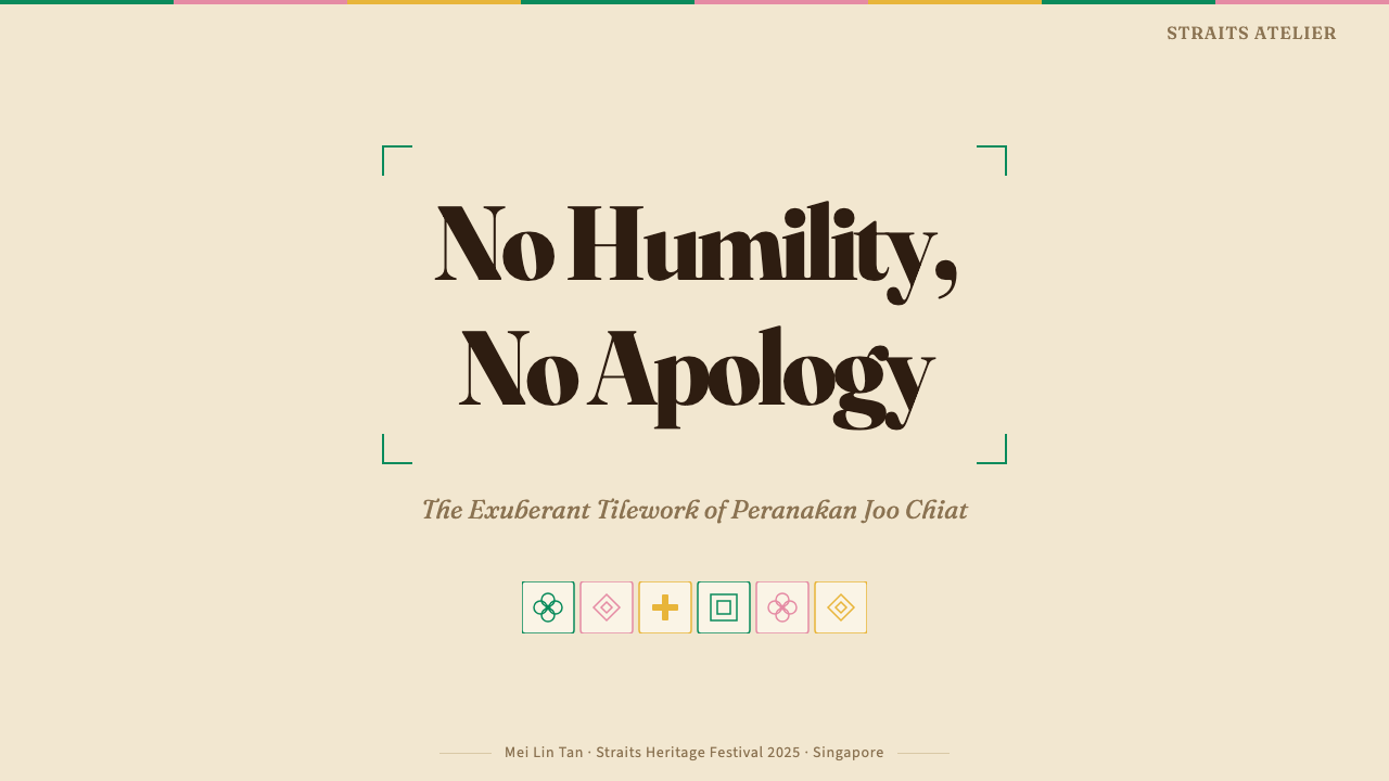
For presentation slides, this system rewards a cover-page approach that commits fully to the ornamental register. A full-bleed tile pattern in the background, contained by a central panel in cream or ivory that holds the title in bold display type, immediately signals the cultural idiom. Content slides should use the tile motif more sparingly — perhaps as a header band, a side border, or a footer strip — reserving the maximum ornamental density for transitional and section-opener slides. Data slides work best when charts and tables are framed within decorative borders that echo the tile's compositional logic, treating the data container as a display object rather than a clinical grid.
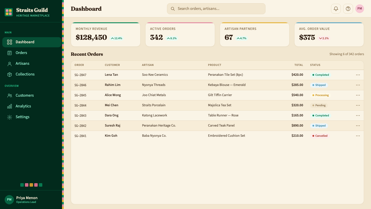
For web interfaces, the style is particularly well-suited to hospitality, cultural institution, and lifestyle product contexts where warmth, celebration, and cultural identity are primary values. Dashboard and navigation elements should be grounded in the rich jewel palette, with the emerald green anchoring primary actions and rose or cream tones differentiating secondary states. Component cards should feel like framed display objects — given shadow depth and decorative border treatment — rather than flat content containers. Avoid applying the full tile density to functional form elements such as input fields and dropdowns; reserve the ornament for framing, dividers, and hero zones.
For editorial and marketing work, the system's boldness translates effectively to print and digital publication. Full-page feature spreads benefit from the tile pattern used as a structural background against which photography or illustration is placed in framed vignettes. Marketing pages can use the colour system — jewel tones against cream — to create strong section differentiation without relying on the full tile pattern in every zone; a single decorative border strip can carry the cultural signature without overwhelming the content hierarchy. The festive warmth of the palette makes the system particularly effective for seasonal campaigns, cultural events, and product launches that benefit from an atmosphere of celebration.
A common mistake when applying this style is treating the emerald green as the only active colour and desaturating everything else in an attempt to achieve contemporary restraint. This contradicts the system's fundamental logic: Peranakan ornamental colour is meant to be read as a composed ensemble, where emerald, rose, ivory, and cobalt each occupy their designated role in the composition. Stripping the palette to a single accent colour on a greyed ground produces something that neither reads as Peranakan nor as a coherent modern minimal system — it occupies an uncomfortable middle ground. Commit to the full chromatic ensemble, or choose a different style.
Peranakan Shophouse Tile (Joo Chiat) — FAQ
Is this style specific to Singapore, or is it common across the Malay Archipelago?
The Peranakan shophouse tradition spans the former Straits Settlements — Singapore, Penang, and Melaka — and extends into parts of Indonesia where significant Straits Chinese communities settled. Joo Chiat in Singapore is perhaps the best-known surviving concentration, but Georgetown in Penang preserves equally dense and distinctive facades, and Melaka has its own variations. The visual vocabulary is broadly shared, but each location developed regional inflections: Penang shophouses tend to be more elongated with narrower frontages; Singapore's examples from Emerald Hill show stronger European neoclassical influence in the upper-storey details. The design system draws specifically from the Joo Chiat concentration but is recognisable as Peranakan across all these contexts.
How does this style relate to other Southeast Asian tile traditions?
The majolica tile in Peranakan shophouses was an imported industrial product, not a locally developed craft. Its closest visual relatives are the azulejo tradition of Portugal and its colonial extensions in Brazil, the encaustic tile traditions of France and Britain, and the Moorish-influenced geometric tile work of the Iberian peninsula. These all fed into the Victorian and Edwardian-era export tile industry that supplied the colonial world. What the Peranakan context added was a distinctive colour sensibility — the preference for deep jewel tones, especially emerald green and warm pink — and a cultural layering that mixed European floral patterns with Chinese auspicious motifs in ways that had no direct precedent in the source traditions.
Can this style work for dark-background interfaces, or is it inherently light-ground?
The historic Peranakan shophouse palette is fundamentally light-ground — cream and ivory backgrounds against which the jewel-toned tiles read at full intensity. A dark inversion is possible but requires care. On a deep ground, the emerald green retains its vibrancy well, but the rose and terracotta tones can become muddy rather than warm, and the ivory that normally provides restful visual pause disappears entirely. A dark variant works best when it treats the cream as a luminous accent rather than a ground — for example, using ivory type and border details against a deep teal or near-black, with the emerald reserved for primary interactive elements. This is a genuine design decision, not a cosmetic preference, and should be made deliberately.
How should the ornamental pattern be handled at small sizes and on mobile screens?
The geometric tile pattern in this style operates at multiple scales simultaneously in the original architecture — the overall grid is legible from across the street, while the individual tile's floral and faunal motifs reward close inspection. In digital applications, the same principle applies: the macro-level geometric rhythm should remain readable at small sizes, while the micro-level ornamental detail is either simplified or scaled so that it reads as texture rather than identifiable motif. On mobile screens, avoid tiling the full complex pattern as a background behind text — it creates illegibility and visual noise. Instead, reserve the full pattern for hero zones, section openers, and large decorative elements; use solid jewel tones or simple two-colour geometric units for smaller interface components.
What is the difference between Peranakan design and other ornate Southeast Asian styles like Thai or Balinese?
All three traditions are ornamentally rich, but their underlying logic differs significantly. Thai ceremonial design is rooted in Buddhist and Hindu iconography — the ornament carries religious meaning and is organised around sacred hierarchies of gold, red, and emerald. Balinese design is deeply connected to natural materials, textile craft, and a cosmological worldview in which organic form (the lotus, the banyan tree, the demon mask) is the primary vocabulary. Peranakan shophouse design, by contrast, is fundamentally urban, commercial, and hybrid — it is the aesthetic of a merchant community that synthesised multiple cultural traditions not in a sacred context but in the context of trade, domesticity, and social display. Its ornament is joyful rather than devotional, cosmopolitan rather than rooted, and produced by industrial process rather than sacred craft. This makes it distinctly modern in spirit even when its visual forms are historical.
Related design styles
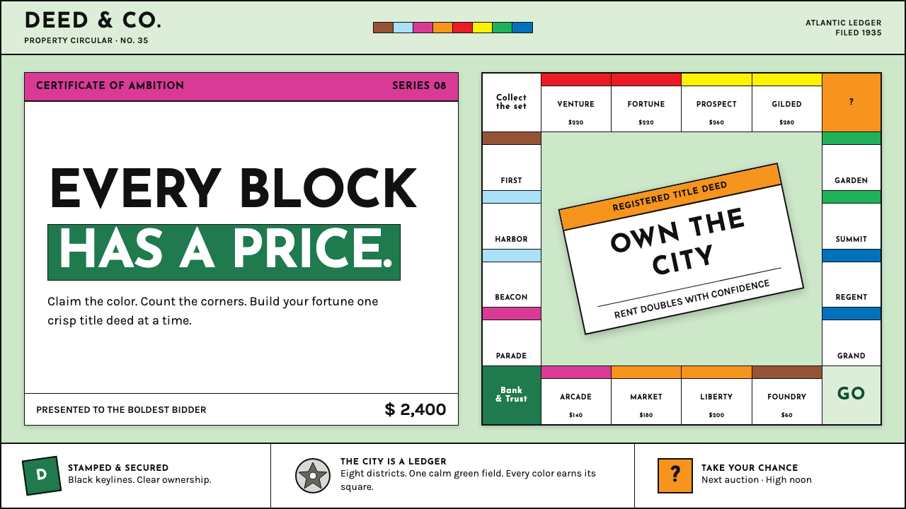 Monopoly (1935)Everything is ownable. Candy-bright deed bands snap across a calm sage board.
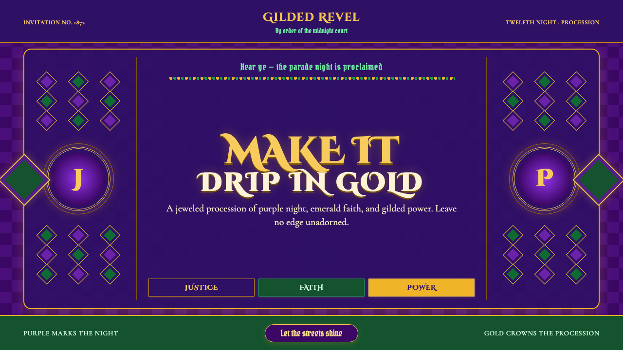 Mardi Gras New OrleansJoyfully excessive. Gilded type, jewel purple, emerald, and bead-strand borde…
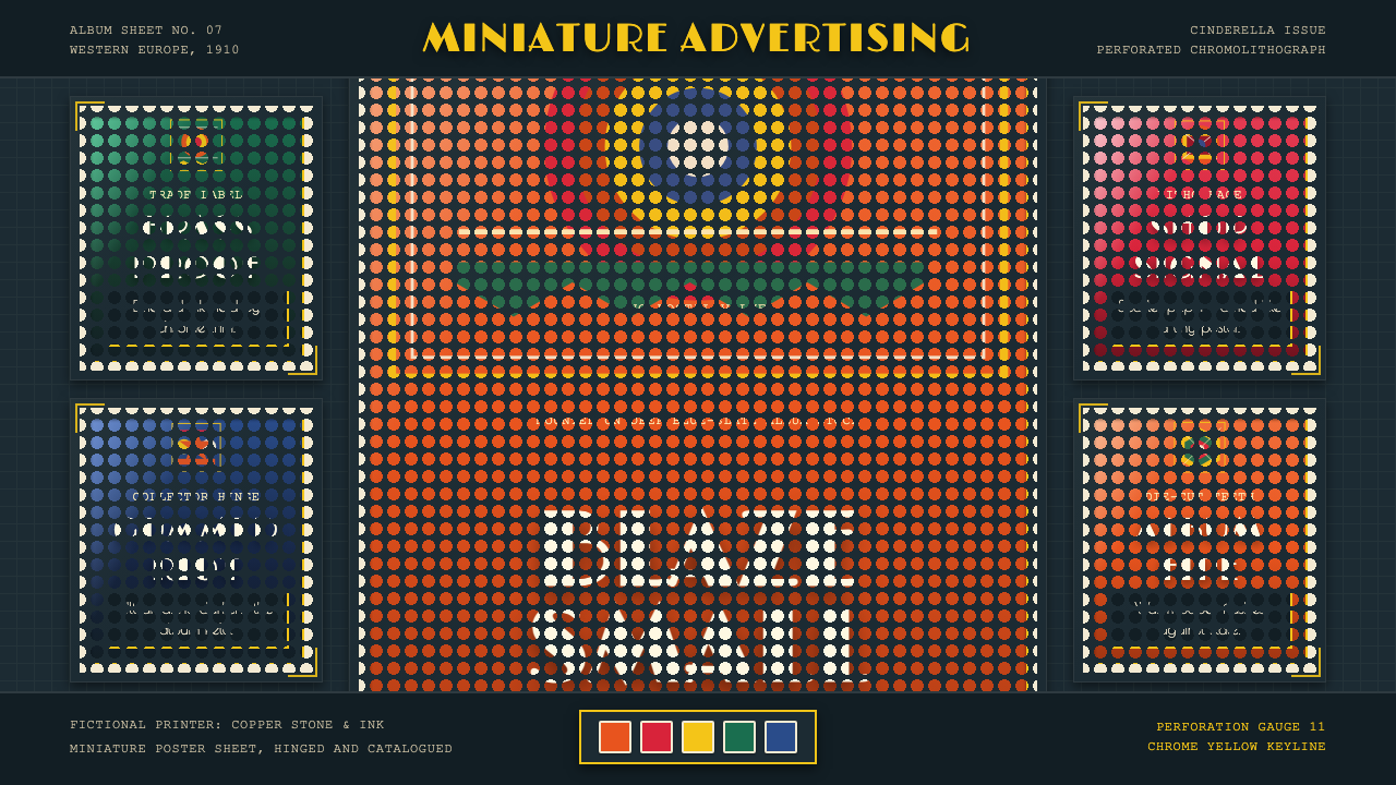 Poster Stamp (Cinderella)Blazes in miniature. Vermilion stamps, chrome keylines, and toothed edges on…
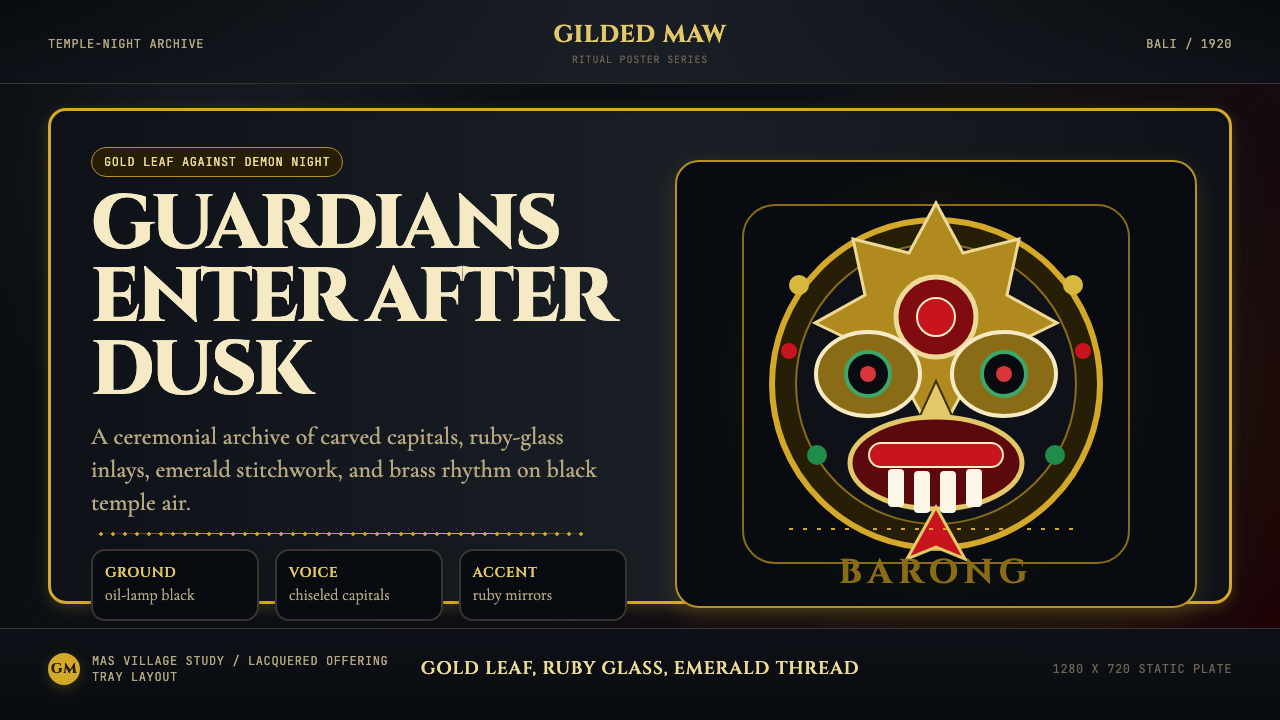 Balinese Barong Mask (1920)Protection glows after dark. Cinzel capitals frame gold, ruby, and emerald ge…
 Chettinad Athangudi TilesColour that glows underfoot. Five ground-oxide tones on dark teak in bordered…
 Hindu Pantheon Bazaar PrintDevotional calendar art, edge to edge. Gold halos and garland borders on baza…