What is SimCity 2000?
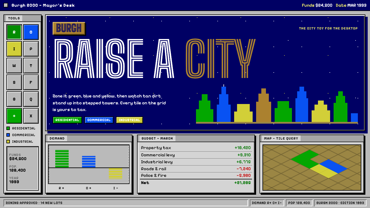
SimCity 2000 put a whole city inside a desktop: tilted pixel terrain, bevelled grey windows, green, blue and yellow zoning, and a navy starfield for the opening credits.
SimCity 2000 in brief
The SimCity 2000 style is a desktop-era interface language drawn from Maxis's 1993 city-building simulator. It combines two layers: an isometric pixel-art world of hills, coastlines and stepped Art Deco towers, and a surrounding frame of light-grey toolbars, dialog boxes and ledgers built with hard raised and sunken bevels. The effect is of a mayor's office rendered as software: a map you can touch and a set of instruments with which to run it.
Colour is functional. Residential, commercial and industrial zones are coded in green, blue and yellow, a convention so strongly associated with the game that the three colours alone evoke it. Windows are grey and tactile, buttons look pressed in or popped out, and typographic voice is plain and instructional. When a title screen is needed, a deep navy field scattered with small stars takes over, recalling the DOS opening.
What makes the style appealing today is its sincerity. It treats information as something to be manipulated with tools, not simply consumed. Every control looks like a control, every panel looks like a place where you can change something, which gives the whole interface a friendly, practical, slightly toy-like character.

Where does SimCity 2000 come from?
SimCity 2000 was released in 1993 for Macintosh and MS-DOS by Maxis, the software company based in the San Francisco Bay Area. It was the sequel to the original SimCity, which had established the city simulator as a genre in the late 1980s, and it carried forward Will Wright's idea of the software toy: a system with no fixed win condition, in which the player learns by tinkering and watching consequences unfold. Windows 95 and console ports followed, and a Network Edition appeared by 1996.
The most visible change from the first game was the shift to an isometric view. Instead of a flat top-down map, the world was drawn from an oblique angle, which allowed terrain to have height and buildings to have faces. Tan ground became hills, valleys and coastlines. Towers acquired setbacks reminiscent of Art Deco skyscrapers, and late-game arcologies, vast self-contained ecological buildings, stood in the distance as speculative landmarks. Fred Haslam and Jenny Martin are credited as key figures alongside Wright.
Around the map, the interface was built in the grammar of early-1990s desktop software. Mac and Windows 3.x applications of the period used bevelled, pseudo-three-dimensional controls in light grey, a look intended to make widgets appear physical. SimCity 2000 used it fully: a toolbar of icons for roads, power lines and zones, a query tool, a budget window like a ledger, and a city newspaper whose headlines changed according to the player's decisions. The newspaper in particular gave the simulation a voice, turning statistics into stories.
In design history, the game sits at the intersection of pixel art, the bevelled interface and the software-toy tradition. Its isometric pixel language influenced a long lineage of strategy and management games, while its interface remains one of the clearest examples of the desktop skeuomorphism of its period. The design system treats that interface not as nostalgia alone but as a grammar of tangible, tool-like controls that still communicates clearly.
What defines the SimCity 2000 look?
Bevelled surfaces
Windows and buttons are light grey with hard-edged highlights along the top and left and shadows along the bottom and right, so that raised elements look pressable and sunken elements look recessed. The bevel is made of crisp, flat strips of colour, with no blur or gradient. This gives every control a physical, plastic feel, as though the interface were built from moulded parts.
Zone colours
Green, blue and yellow code the three main kinds of land use: residential, commercial and industrial. These colours are saturated but simple, and they are used as fills for zones, legends, chart bars and tags. The coding is consistent across the whole interface, so a user can learn it once and apply it anywhere, which makes it a model for categorical colour systems in dashboards.
Isometric terrain
The world is drawn on a diamond-shaped tile grid, with every tile shown at an oblique angle so that height and depth are legible. Pixel art is crisp and hand-placed, with no anti-aliasing blur. Terrain is built from stepped blocks and simple colour ramps, so hills, water and buildings are clear shapes rather than textures. This isometric view is used for hero imagery and diagrams.
Toolbars and ledgers
Tools are grouped into small icon palettes with clearly labelled hover states, and information is presented in ledger-style windows with rows, columns and plain figures. Budgets, charts and query dialogs read like instruments rather than infographics. Labels are short and instructional, and the interface assumes that the user is there to operate something.
Starfield splash
For title cards, credits and special moments, the system switches to a deep navy ground scattered with tiny stars. This provides a dramatic contrast to the grey, practical working interface and signals a shift from tool to story. It is used briefly and with simple, centred text.
Voice and tone
Everything has a friendly, slightly playful practicality. Copy is plain, headlines in the in-world newspaper can be witty, and nothing tries to look sleek. The interface feels like a well-made tool for a curious person, and that unpretentious character is as much a part of the style as the bevels and colours.

Who shaped SimCity 2000?
Wright is the designer who created the original SimCity and led the Maxis tradition of software toys. His interest in systems, emergence and learning through play shaped the series, including SimCity 2000, and explains why the interface presents a city as something to be tinkered with rather than won.
Haslam is credited among the key figures behind SimCity 2000. His involvement in the project underlines how the sequel was a collaborative engineering and design effort, in which the isometric engine and the desktop interface had to work together smoothly on the hardware of the early 1990s.
Martin is likewise named as a key contributor to the game. Her inclusion reflects the breadth of the team that built the finished product, from the simulation core to the interface and artwork that gave the city its legible, approachable character.
How do you use SimCity 2000 today?
For slide decks, the style is a natural fit for playful, practical presentations: product tutorials, onboarding, internal tools and retrospectives with a sense of humour. Use a light-grey ground with bevelled window frames to hold each content block, and the green, blue and yellow trio to separate categories. A navy starfield slide makes a strong opener or closer. Keep slides tidy; the charm comes from order, not decoration.
For web interfaces and dashboards, the bevelled look is effective when users should feel they are operating instruments. Settings panels, admin consoles, retro-themed tools and developer sandboxes can use raised buttons, sunken input fields and ledger tables. The zone colours are particularly useful for tag systems and category charts, because they are simple and mutually distinct. Use the style consistently so that every control reads as clickable.
For editorial and marketing work, it suits nostalgic campaigns, game-related content, urban-planning and civic-tech stories, and educational sites about systems thinking. A newspaper-style headline panel can deliver news in the voice of the interface, and isometric diagrams can explain processes or maps. Because the style evokes a known moment of computing history, it works especially well where an audience will recognise the reference.
For simulation, strategy or management products, the style offers a strong foundation for information-dense layouts. A map in the centre, tool palettes along the edges, a ledger for numbers and a newsletter-like feed for events is a pattern that is still sound, and it avoids the clutter of overly ornamental dashboards. It shows that a dense interface can be friendly when each element has a clear role.
The common mistake is to imitate the bevels without discipline: blurring the shadows, adding gradients or rounding the corners turns the look into a vague skeuomorphic effect and loses the crisp, hard-pixel character. A second mistake is using the zone colours as decoration; they are a code, so reserve them for categories. A third is overlooking contrast, since classic grey-on-grey can be hard to read, so make sure labels remain legible.

SimCity 2000 — FAQ
What do the green, blue and yellow colours mean?
In the game they code the three main zone types: green for residential, blue for commercial and yellow for industrial. In the design system they serve as a general categorical palette. Because they are simple, saturated and clearly distinct, they work well for tags, legends and chart series, as long as they are used consistently as a code.
Why is the interface bevelled and grey?
It reflects the desktop software conventions of the early 1990s, when Macintosh and Windows 3.x applications used light-grey, pseudo-three-dimensional controls to make buttons and windows look physical. SimCity 2000 adopted that grammar fully. The design system keeps it because it communicates affordance clearly: raised means pressable, sunken means input.
What is an isometric view?
It is an oblique way of drawing three-dimensional space on a flat surface, in which the three axes appear at equal angles and objects keep a constant size regardless of distance. SimCity 2000 used it so that terrain could show height and buildings could show their sides. In the design system, isometric pixel art works well for hero graphics, maps and process diagrams.
Is the style only for retro or game projects?
No. Retro and game projects are the obvious fit, but the underlying principles — clear affordances, ledger-style information, consistent categorical colour and tool-like controls — apply to any operational interface. It is especially suitable for admin tools, educational products and civic or planning platforms, where friendliness and clarity matter more than polish.
What is the starfield splash used for?
It echoes the deep navy, star-scattered opening of the DOS release and acts as a title-card background. In the design system it is meant for brief, dramatic moments such as covers, closing slides and credits, set against the practical grey of the main interface. It should be used sparingly so that it remains special.
Related design styles
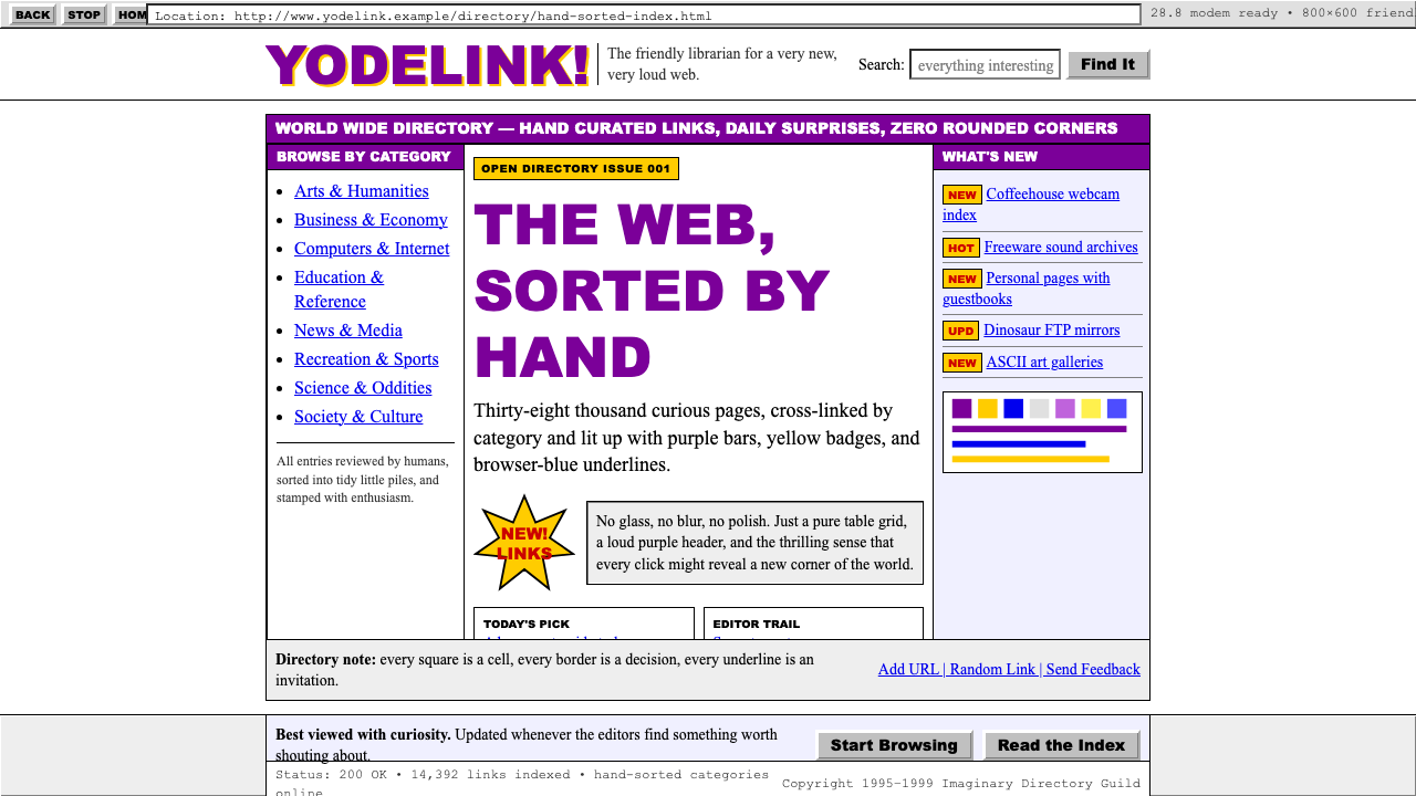 Yahoo! 1995Directory-era optimism. Purple table bars, yellow NEW badges, blue underlined…
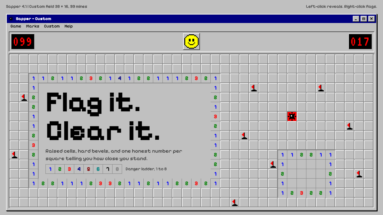 MinesweeperCold logic, warm nostalgia. Silver bevelled cells, VGA numerals, red seven-se…
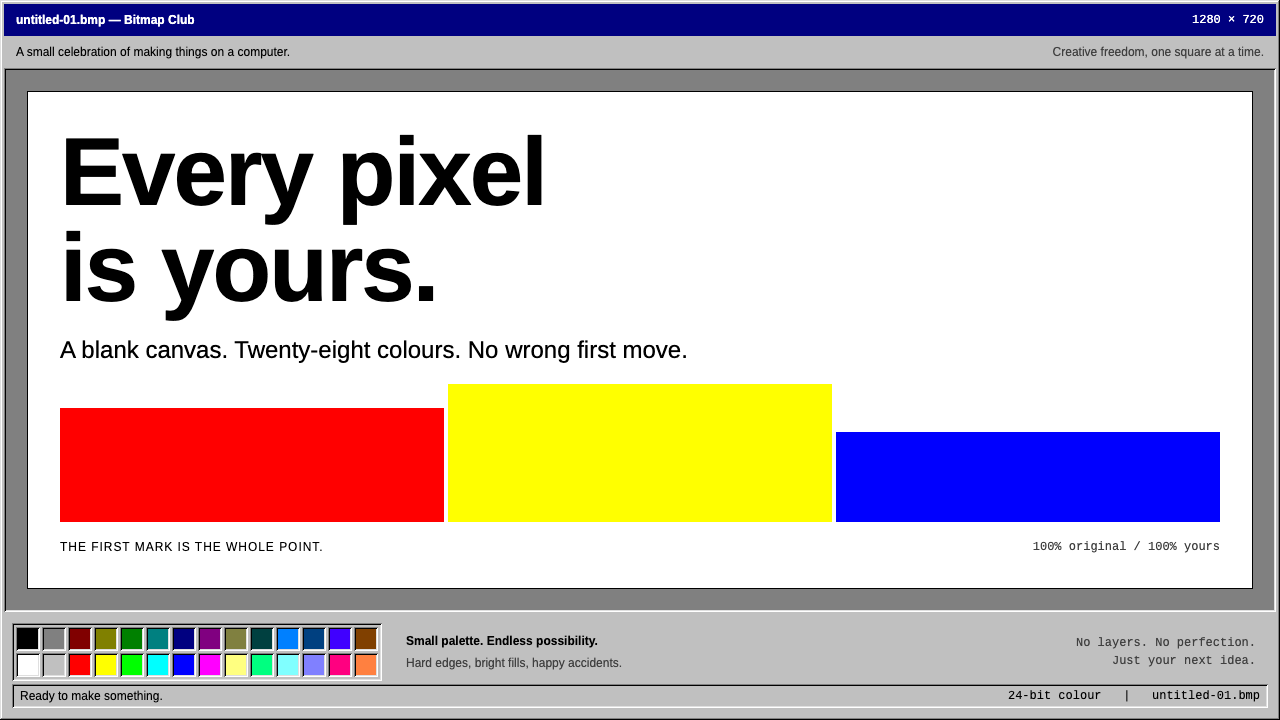 MS PaintFirst-computer freedom. Navy captions, grey bevels and 28 fixed colours frame…
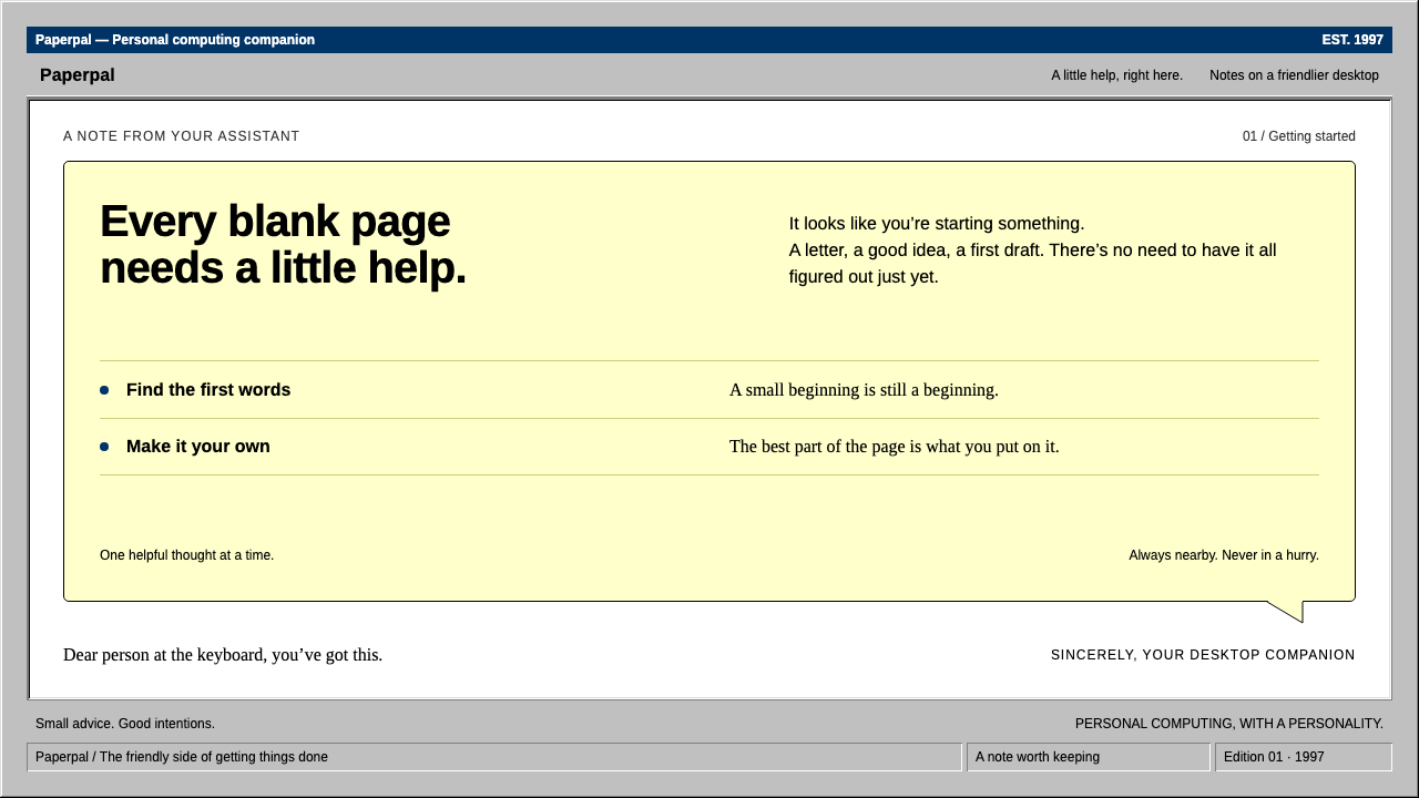 ClippyHelp with a human touch. Pale-yellow balloons, navy trim and hard grey bevels.
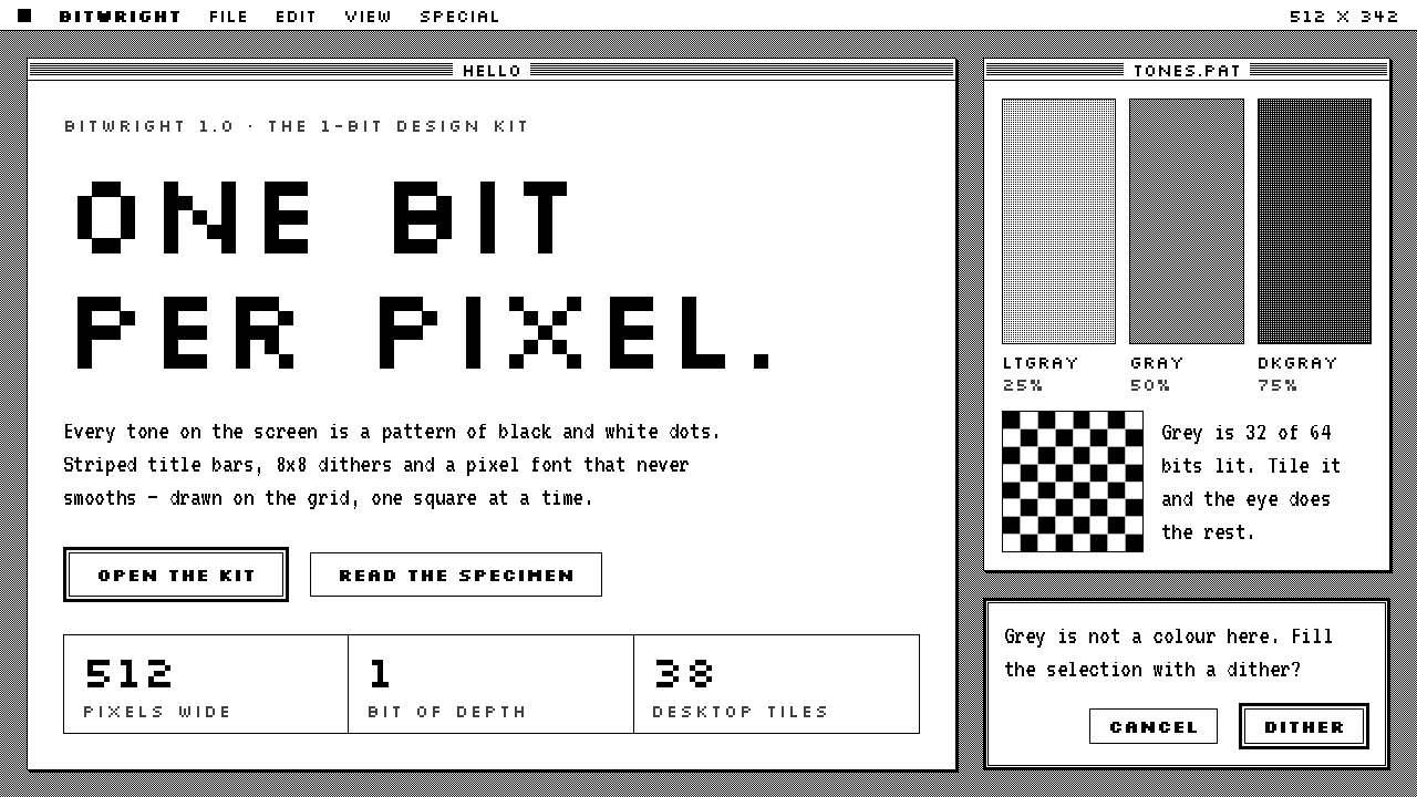 Macintosh 1984One bit per pixel, no grey. Black on white, striped title bars, dither fills…
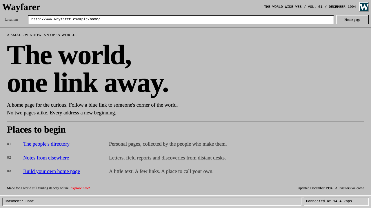 Netscape NavigatorThe web before polish. Grey bevels, blue underlined links and unadorned Times…