What is Netscape Navigator?
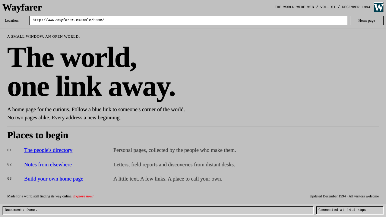
Netscape Navigator is the web before polish: grey bevels, blue underlined links, unadorned serif text and a comet racing across a teal night sky.
Netscape Navigator in brief
The Netscape Navigator design style recreates the browser window that was, for many people, their first view of the web. A flat, medium-light grey page sits under a bevelled grey toolbar. A white Location field shows the address in a monospaced face, body text is black in a default serif, and links are blue and underlined. It looks like what it was: a tool for reading linked documents, built before anyone worried about making it look modern.
Two small touches give it personality. In the corner sits a square icon with a white serif N on a deep teal night sky, where comets streak past while a page loads. And on pages themselves appears a tiny badge reading Netscape Now!, a bit of early web self-advertisement. Both are artifacts of a time when the browser itself was part of the page.
The system rebuilds that window faithfully: one-pixel highlights and shadows around buttons, sunken white input fields, default HTML flow aligned to the left, and the badge in its small size. It does not try to look modern, and that refusal is the entire point.

Where does Netscape Navigator come from?
Netscape Navigator 1.0 arrived in December 1994, out of Mountain View, California, and the two names most associated with it are Marc Andreessen and Jim Clark. It appeared at the moment when the web was moving from academic curiosity to commercial medium. For a large share of early users, Navigator was not one browser among many; it was simply what the web looked like.
Its visual language was shaped by the screen constraints and defaults of the time. Interface chrome was drawn with pixel bevels: a lit edge on the top and left, a dark edge on the bottom and right, so a button appeared to rise from the surface and a field appeared to sink into it. The page itself used the plain flow of early HTML, with the browser's own default grey, serif body text and link colors. Nobody had yet separated the browser's look from the page's look, which is why the two feel like one object.
The comet N throbber arrived with version 1.1 in 1995. It was a small animated square in the corner that played while a page was loading. In an era of dial-up modems, when a page took many seconds to arrive, people watched that comet for a long time, and it became the most remembered piece of the interface. Meanwhile, Netscape Now! badges spread across websites through versions 2.0 and 3.0 in 1996, a sign that sites were declaring which browser they were built for.
The surrounding movements explain why the look is so plain. This was the early commercial web, shaped by HTML 2.0 and by Netscape's own extensions to it, and by the browser wars that soon pitted rival browsers against each other and pushed features faster than designers could keep up. The default grey page, blue links and Times-style text are the visual residue of that moment: a system defined by what the browser provided, not by what a designer chose.
What defines the Netscape Navigator look?
Color
The page ground is a flat, medium-light grey, the same grey used for the toolbar and buttons. Text is plain black, links are a strong blue with underlines, and the input field is white. The only richer color lives in the corner icon, a deep teal night sky with a white serif N and a dark planet beneath streaking comets. The restraint is not stylistic but technical: these were the defaults of the browser itself.
Pixel Bevels
Buttons and toolbar elements use one-pixel highlights on the upper and left edges and one-pixel dark edges on the lower and right, creating a raised look without any gradients or blur. Pressed or sunken states invert the lighting. This is the signature of early graphical interfaces, and it should be drawn with crisp lines rather than soft shadows.
Sunken Fields
The Location field and other inputs are white and set into the grey surface with the opposite bevel of a button: dark edge on top and left, light edge below and right. Inside, the address appears in a monospaced face. The sunken field instantly reads as a place to type, long before flat design taught people to infer that from a thin outline.
Default Typography
Body text is a plain serif in the Times tradition, set in black and aligned to the left. Headings are simply larger and bolder versions of the same face, and links are underlined blue. There are no custom typefaces, no refined hierarchy and no tuned line lengths. The text flows to fill the window, exactly as an early HTML page would, which gives the system its unfiltered, document-like honesty.
The Comet N Throbber
The square icon in the corner shows a white serif N against a deep teal night sky, with comets crossing a black planet while the page loads. It is the system's one piece of illustration and its one animation. It works best as a small corner badge, since its charm lies in being a tiny, hopeful signal that something is arriving.
The Netscape Now! Badge
A tiny rectangular badge reading Netscape Now! appears on the page as a kind of web-era self-advertisement. It is a reminder that the browser and the site once shared branding space. Keep it small and place it at the foot of a page or in a sidebar, as sites of the time did.

Who shaped Netscape Navigator?
A central name behind Netscape Navigator, whose 1.0 release in December 1994 introduced a large number of people to the web. The browser's plain, document-first interface is the look this design system reproduces.
Associated with Andreessen in the founding of Netscape. His name belongs to the story of how a browser became the face of the early commercial web.
The Mountain View company behind the browser. Through the comet N throbber and the Netscape Now! badges, its branding spread across the pages people visited, from version 1.1 in 1995 through versions 2.0 and 3.0 in 1996.
How do you use Netscape Navigator today?
In slides, the style is a perfect vehicle for talks about internet history, early technology, nostalgia and the evolution of interfaces. A title slide can be drawn as a browser window: grey toolbar with bevelled buttons, a sunken white Location field holding the talk's title, and the comet icon in the corner. Content slides can use the default left-aligned, black-on-grey document look with blue underlined links as the visual cue for emphasis. Data slides work as plain tables on a grey ground, with sunken fields standing in for input values.
On the web, it suits retro landing pages, personal homepages with a wink, museum or archive projects about early computing, and playful product sites that want to be deliberately unpolished. A dashboard can borrow the grey surface, bevelled panels and sunken inputs for a utilitarian, tool-like feel. Pricing pages can present plans as simple bordered tables. The key is to let the default flow stand: left-aligned text, visible links, and a toolbar that looks like it came with the browser.
For editorial and marketing work, the look is a shorthand for the mid-1990s web. Campaigns about the dot-com era, throwback launches or anniversary retrospectives can use the grey chrome as a frame around screenshots and quotes. Posters can display the comet icon as a hero, and newsletters can use the blue-underlined link style as a deliberately old-fashioned emphasis device. The visual honesty of the system makes it a strong contrast to modern, heavily designed layouts.
The most common mistake is to modernize it. Rounded corners, soft shadows, gradients and polished typography all cancel the effect, and the result looks like a generic grey theme. A second mistake is to over-decorate the page with extra graphics, when the system's charm is in what it leaves alone. A third is to blow up the Netscape Now! badge or the comet icon; both are meant to be tiny. Finally, avoid centering everything, since the default document flow is left-aligned.

Netscape Navigator — FAQ
What does the Netscape Navigator style look like?
A flat grey page beneath a bevelled grey toolbar, a sunken white Location field in a monospaced face, black serif body text and blue underlined links, with a comet icon in the corner and a small Netscape Now! badge on the page. It deliberately looks like an early-web browser window, not a modern interface.
What is the comet in the corner?
It is the animated icon of the browser, a white serif N on a deep teal night sky, with comets streaking past a dark planet while a page loads. It arrived with version 1.1 in 1995 and became the most remembered part of the interface during the dial-up era.
How do I draw the bevels?
Use one-pixel light lines on the top and left edges and one-pixel dark lines on the bottom and right of a grey button to make it look raised, and invert them for sunken fields and pressed states. Avoid gradients, blur and soft shadows; the effect depends on crisp pixel lines.
Is it suitable for a modern product?
It works when the retro quality is the point: nostalgia campaigns, internet-history talks, archives, playful landing pages and deliberately unpolished tools. It does not make sense as a neutral interface for everyday software, because its whole identity is looking unmodern.
What era does it belong to?
The early commercial web, from Navigator 1.0 in December 1994 through the comet icon of 1995 and the Netscape Now! badges of 2.0 and 3.0 in 1996. It reflects HTML 2.0 defaults, Netscape's own extensions and the browser wars of the period.
Related design styles
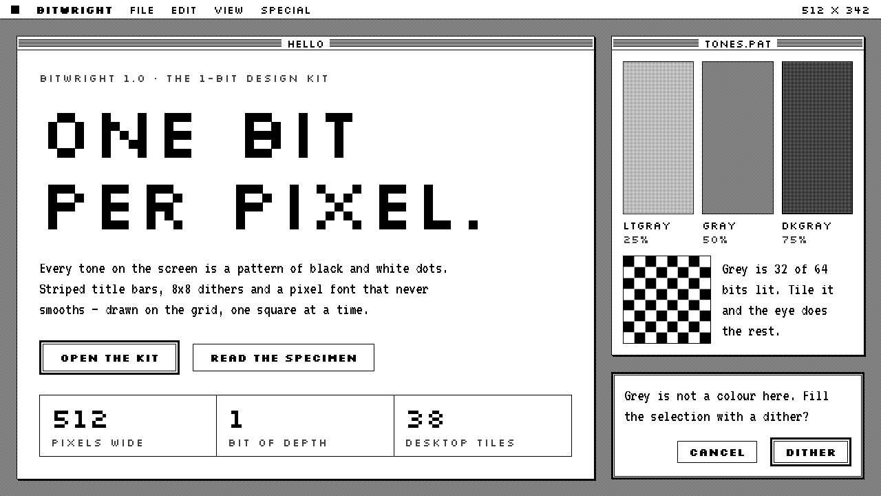 Macintosh 1984One bit per pixel, no grey. Black on white, striped title bars, dither fills…
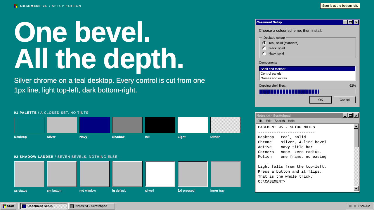 Windows 95One bevel does all the depth. Silver chrome and a navy title bar on a flat te…
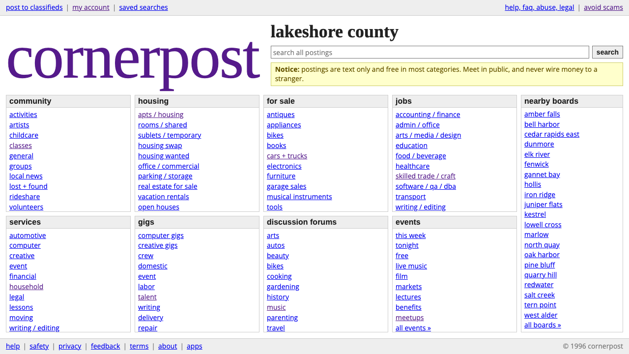 craigslistNothing designed, everything findable. Blue underlined links and a purple ser…
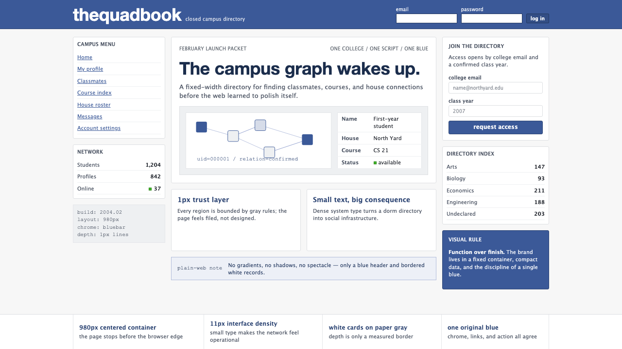 Facebook 2004Dorm-web austerity. Original blue, 980px grid, 1px borders, tiny Lucida Grand…
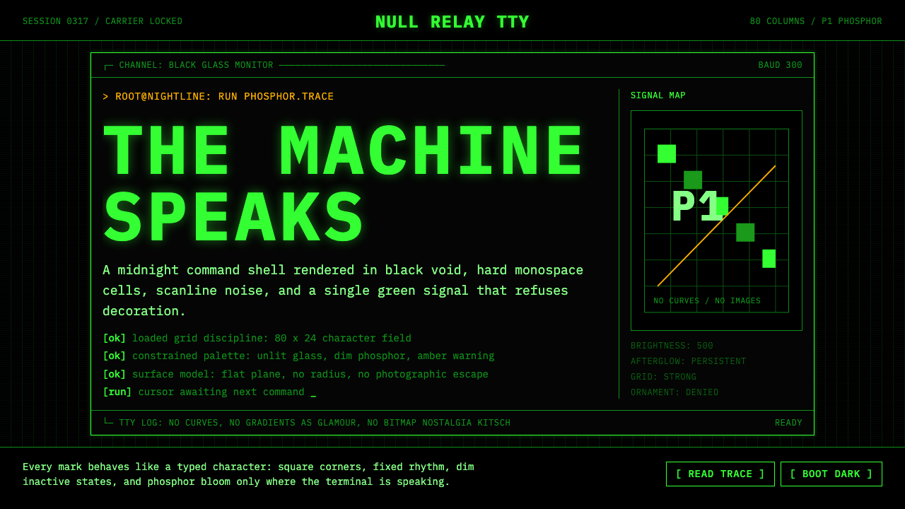 CLI Hacker Phosphor Green (1985)Pure terminal myth. Black glass, P1 green mono type, scanlines, and rigid 80-…
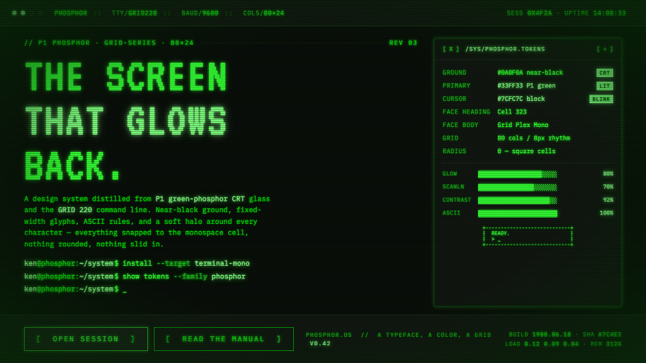 Unix Terminal MonoNear-black CRT glass that glows back. P1 phosphor green, VT323 mono, ASCII ru…