What is Silesian Miner Czako?
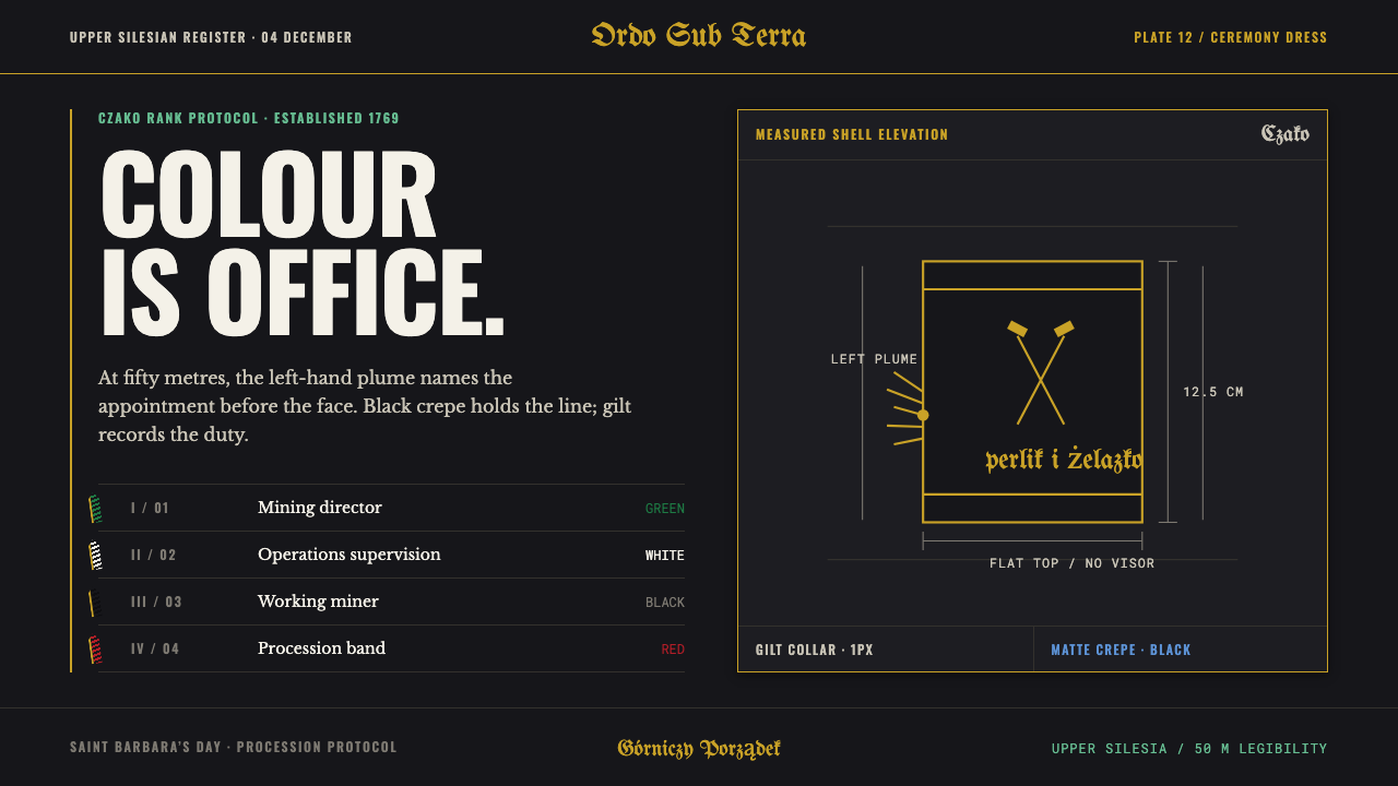
Silesian Miner Czako is a design language in which colour is an office, not a mood: matte black crepe, a thin line of gilt, and one stiff plume set to the left that tells you rank before you have seen a face.
Silesian Miner Czako in brief
Silesian Miner Czako is a dark, ceremonial design system drawn from the gala headgear of Upper Silesian coal miners. The czako itself is a peakless cylinder of stiffened cardboard, a little over twelve centimetres tall, wrapped in matte black crepe. A gilt hammer-and-chisel is fixed to the front, and a bundle of stiff cockerel hackles rises from the left side. The visual language that follows from this object rests on a few fixed facts: a soft black ground that absorbs light, a fine gilt line that outlines and divides, and one vertical accent that is never centred.
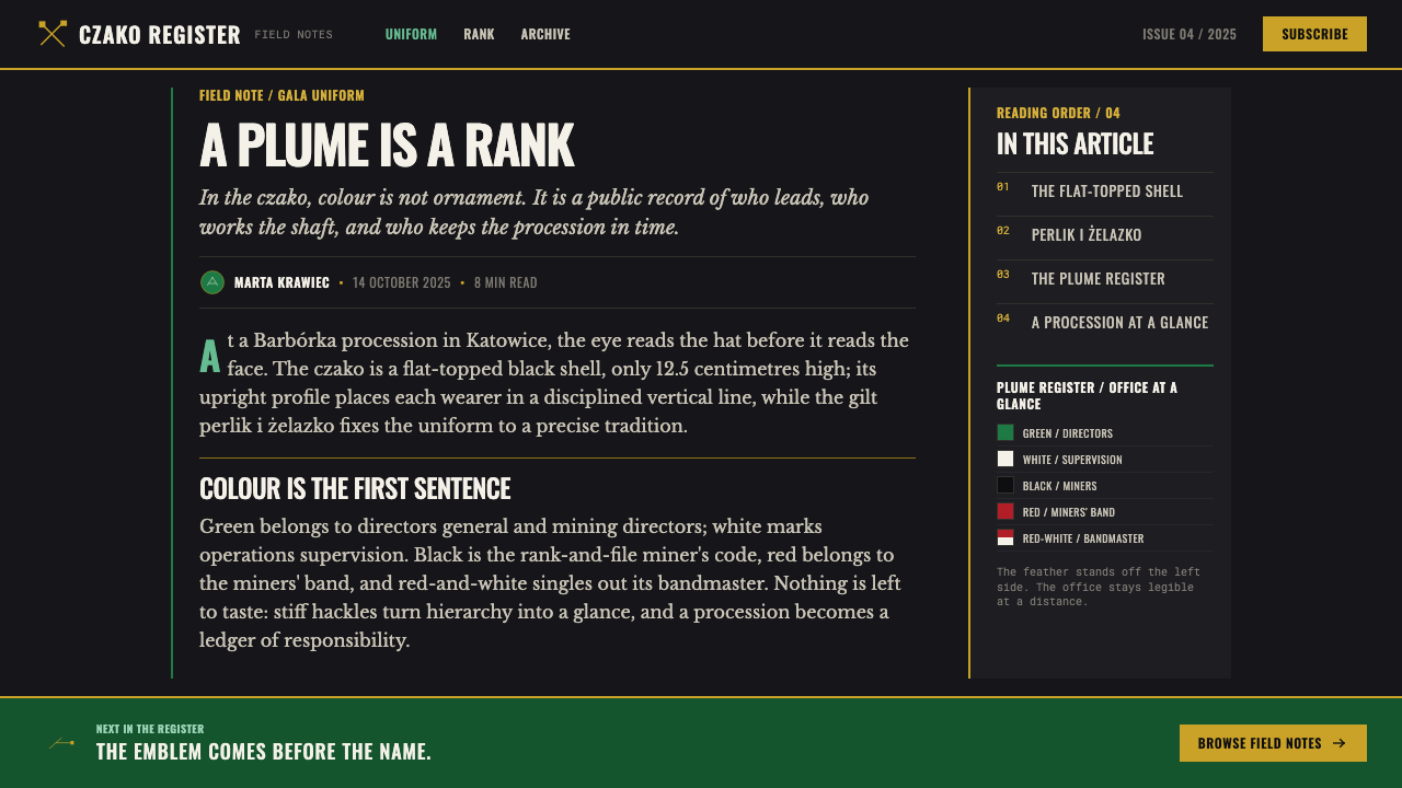
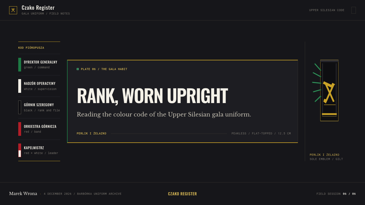
The idea at the heart of the style is that colour is an assignment. In the miners' dress tradition a plume does not decorate the hat; it announces an office. Green belongs to a director general, white to operations supervision, black to the rank-and-file miner, red to the band, and red-and-white to the bandmaster. Read across a procession, the colour tells you the role before the face does. The design system carries that rule onto the page and the screen: each colour is given one meaning and keeps it, so a viewer learns the code once and can then read hierarchy at a glance, even from some distance.
Visually the result is formal and quiet rather than loud. Surfaces are matte, never glossy. Gold appears as trim rather than as filled shine. The black around it is warm and woolly, like cloth over card, rather than cold and glassy like a screen. Because the palette is held back so firmly, the single plume colour in a layout carries real weight: wherever it appears, it means something.
Where does Silesian Miner Czako come from?
The czako's most distinctive feature began as a tool. According to the tradition this system draws on, the plume started as the brush a miner tucked into his hat band to sweep out blast holes: a stiff, practical working object, kept where it was within reach. Over time it stopped doing that job and became a badge. The same object that once cleaned a drill hole now marks who is a director, who supervises operations, who is a rank-and-file miner and who leads the band. It is a small, clear case of function surviving as form. The shape stayed, the task disappeared, and the meaning moved from use to status.
The black habit itself is traced in the source to Friedrich Wilhelm von Trebra at Marienberg in 1769, and the Upper Silesian gala form is treated as a later, local expression of that dress: the version worn from 1900 to 1950 and still worn today. That lineage explains why the tradition goes by two names. In German it is Bergmannstracht, the dress of the mining guilds; in Polish it is mundur górniczy, the miner's uniform. The design system takes the Silesian gala form as its reference, the black uniform as it settled into the coal towns of the region.
Two older layers sit on top of the uniform. The first is Schlägel und Eisen, the crossed hammer-and-iron heraldry of mining, which survives on the czako as the gilt hammer-and-chisel on the front. The second is Saint Barbara, the patron saint of miners, whose feast on the fourth of December gives the profession its yearly holiday, Barbórka. On that day the miners form a procession in full dress, bands included, and the uniform is seen as it was meant to be: a legible order of ranks moving through a street.
The setting is the Upper Silesian coal basin in southern Poland, the area around Katowice, Zabrze and Bytom. In a place where thousands of people work in the same industry, a uniform is not a costume but a public language, shared by everyone and understood by everyone, and renewed every year at the procession. The design system inherits that civic quality. It is a style for settings in which many people must be sorted, greeted and recognised quickly, and where ceremony and clarity turn out to be the same thing.
What defines the Silesian Miner Czako look?
Colour as assignment
The defining rule is that each plume colour has exactly one meaning: green for the director general, white for operations supervision, black for the rank-and-file miner, red for the band, red-and-white for the bandmaster. The system never uses these hues for mood, emphasis or variety. A colour is assigned to a role and stays with that role, so the palette works like a table of offices rather than a mood board.
Matte black crepe ground
The page is a dark, dense, soft black with the dullness of crepe stretched over card. There is none of the wet shine of polished black. This keeps contrast high without glare and lets small accents read clearly, in the way a plume reads against the cylinder it rises from. The ground is warm and woolly, not cold and glassy, which gives the whole style a worn-in, ceremonial weight.
Gilt as trim
Gold is used the way braid is used on a uniform: collar lines, fine borders, the single hammer-and-chisel mark. It outlines and divides rather than fills. Treated this way, gilt organises the surface and signals formality without competing with the content, and it stays thin enough that the black ground remains the dominant impression.
The plume that stays left
The plume rises from the left side of the hat and is never centred. In layout terms this establishes a deliberate asymmetry: the strongest accent sits to one side, vertical, rising from the edge of a block instead of from its middle. The offset gives a composition direction, and it makes the accent colour feel like a rank mark rather than a decoration. Centring it would turn the system into something generic.
Hierarchy legible at distance
Rank made legible at distance is a design requirement, not a slogan. Hierarchies are coarse and bold: a few tiers, each recognisable at a glance, with no subtle gradations that only reward close reading. The style assumes the viewer is some steps away, as in a procession, so shapes are simple, contrast between tiers is firm, and every level has a single clear marker.
Stiff and upright
A cockerel's hackles are stiff, narrow and straight, and the system borrows that character. Emphasis is vertical, edges are firm, and uprights are slender; nothing floppy or rounded-off creeps in. Forms feel stiffened, like cardboard under crepe: structured and formal, with a posture that stays correct from top to bottom.
Ceremony without ornament
Despite the gold, the style is not ornamental. Everything on the surface is a sign: the hammer-and-chisel is heraldry, the colour is office, the line is trim. Nothing is there merely to be pretty. That restraint is what keeps a dark and gilded palette from looking showy, and it is why the style reads as dignified rather than luxurious.

Who shaped Silesian Miner Czako?
The source credits von Trebra with the origin of the black mining habit, at Marienberg in 1769. His place in the story is as the early reference point for the black uniform that the Silesian gala form later inherited. For a designer, his name stands for the idea that mining dress could be a deliberate, shared system of signs rather than a loose collection of working clothes.
Saint Barbara is the patron saint of miners, and her feast on the fourth of December is the occasion for the Barbórka procession. She is a devotional figure rather than a design figure, but she explains why the uniform is worn in public as ceremony at all. The formal, solemn tone of the design system is the tone of a feast day, not of a working shift.
This is not a person but the living institution that keeps the code alive. Each year the procession puts the whole hierarchy on the street at once: directors, supervisors, miners, band and bandmaster, each in the colour of their office. It is the place where the plume code is learned and checked by everyone present, and the best single reference for how the system is meant to look when it is working.
How do you use Silesian Miner Czako today?
Silesian Miner Czako suits work in which people, roles or states must be told apart quickly and respectfully. It is a dark, formal system, so it works best where gravity and order are welcome and less well where playfulness is the aim. Its real strength is that it gives you a ready-made way to turn a list of categories into a visible hierarchy without relying on size alone.
On slides, treat the cover as the front of a uniform: a matte black field, a fine gilt line marking the frame or the title rule, and a single vertical accent set against the left edge. Content slides should assign one colour to each category and keep it for the whole deck; if green means leadership on the third slide, it means leadership on the thirtieth. Data slides suit the style well, because chart series can be keyed to roles or teams exactly as plumes are keyed to offices, with a legend that reads like a rank table. Keep gold for rules and labels, not for filled areas.
In web interfaces, the style fits dashboards, admin consoles and permission-heavy products where users hold different roles. Role badges, status tags and team markers can follow the plume code: one colour per role, applied the same way in tables, avatars and filters. Backgrounds stay matte and dark, borders stay fine and sparing, and the accent stands at the left of cards and rows as a rank mark. Pricing pages can use the same logic by giving each plan one colour and one fixed place in the layout, so that tiers read as ranks rather than as arbitrary options.
In editorial and marketing work, the style suits event identities, institutional reports, award ceremonies, heritage and regional-culture projects, and anything modelled on parades, orders or guilds. A programme for a procession, a roster of speakers grouped by role, or an organisation chart each translate well. The tone is respectful, which makes it a good fit for subjects about work, craft and community, and when the reference to Silesian mining is explicit it should be credited as such.
The most common mistake is to treat the plume colours as a general-purpose palette. If all of them appear at once without meaning, with green for freshness here and red for energy there, the style collapses into a decorative scheme, which is exactly what the tradition refuses. A second mistake is centring the accent for the sake of symmetry; the left-set plume is the rule. A third is over-gilding: once gold fills large areas and starts to glow, the matte, uniform quality that defines the system is lost.
Silesian Miner Czako — FAQ
What is a czako?
A czako is a peakless cylindrical hat, in this case made of stiffened cardboard and covered in matte black crepe. The Silesian miner's version carries a gilt hammer-and-chisel on the front and a bundle of cockerel hackles on the left side. It is the gala headgear worn in the Upper Silesian coal basin, and in this design system it stands as the source of the whole visual logic: dark ground, gilt trim, and a colour that signals office.
What do the plume colours mean?
Each colour marks one office. Green is a director general, white is operations supervision, black is the rank-and-file miner, red is the band, and red-and-white is the bandmaster. In the Barbórka procession the colour tells you the role before the face does. The design system keeps the same discipline: colour is assigned to a role, never chosen for mood.
Why is the ground black and matte?
Because that is the material of the object. The czako is covered in matte black crepe, which absorbs light instead of reflecting it. A matte dark ground keeps contrast high without glare, lets thin gilt lines and a single plume colour stand out clearly, and gives the style its formal, uniform-like character. A glossy black would turn it into a luxury-brand look, which is a different thing.
Can I use this style for something other than mining?
Yes, as long as the underlying logic transfers. The style is really a system for showing roles and ranks clearly, so it works in role-based software, organisational charts, programmes for ceremonies, awards and institutional publications. What does not transfer is the plume code treated as free decoration. If the project refers to Silesian mining explicitly, it is good practice to say so and credit the tradition.
How is this different from a generic black-and-gold look?
A generic black-and-gold look uses gold as shine, to signal expense. Here gold is trim, the thin line that outlines and divides, and the ground is matte rather than polished. More importantly, the system adds a second layer that luxury styling lacks: a plume colour with a fixed meaning, set off to the left. The result reads as an order of ranks, not as a display of wealth.
Related design styles
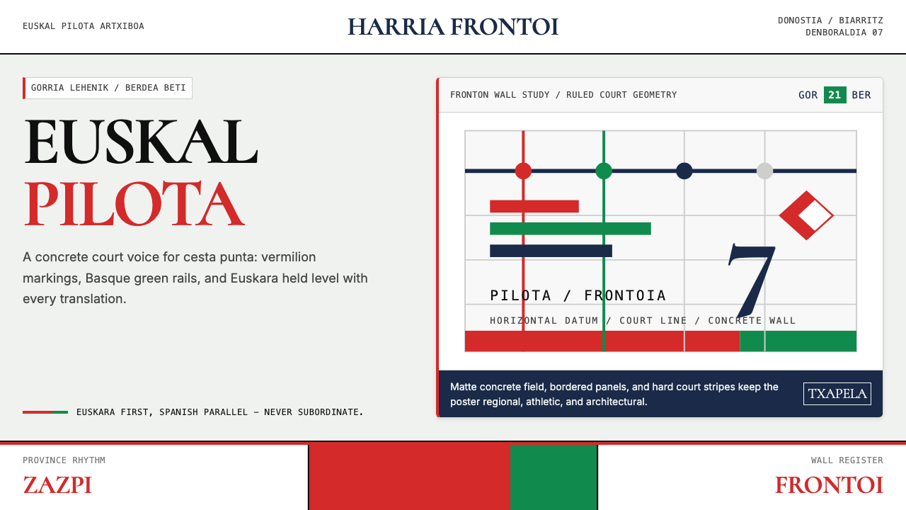 Basque Pelota Fronton Red & GreenFiercely regional. Vermilion court stripes and Basque green rule a concrete g…
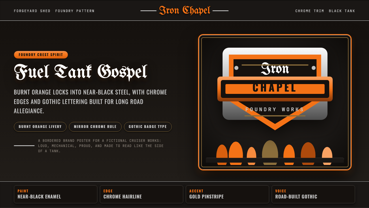 Harley Orange & BlackBuilt like a tank badge. Burnt orange, chrome hairlines, gothic type on near…
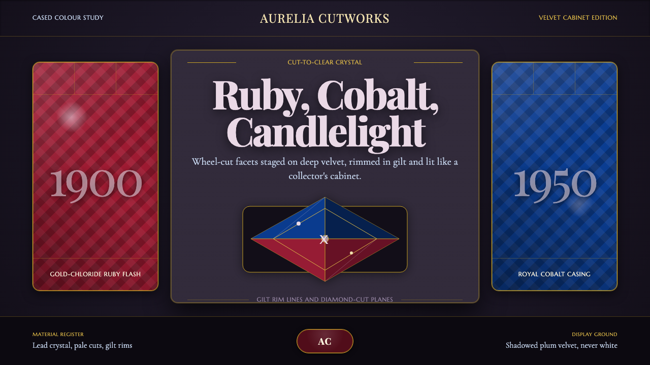 Bohemian Cut CrystalOpulence glows in shadow. Ruby and cobalt facets sit on velvet under gilt rim…
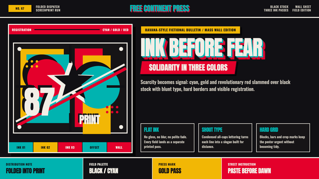 Cuban OSPAAAL Tricontinental PosterUrgency from scarcity. Cyan, gold and red slam over black in blunt silkscreen…
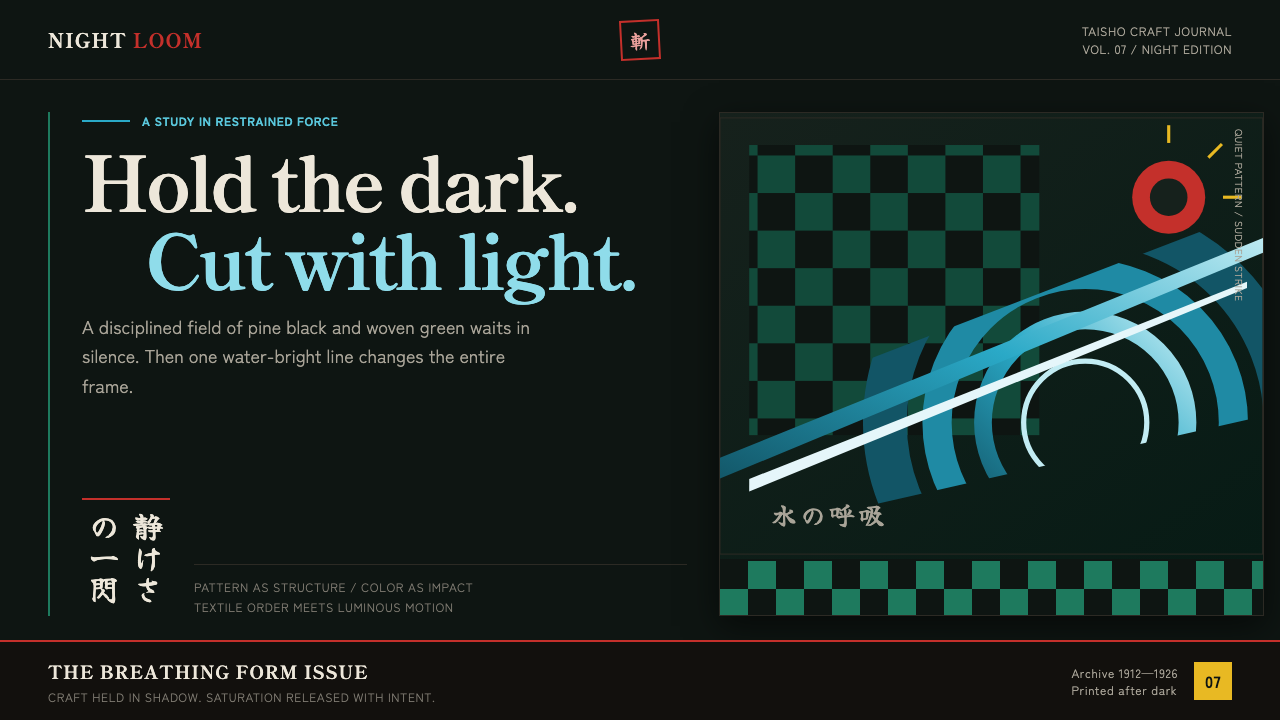 Demon Slayer (2019)Quiet craft, sudden force. Pine-black checks split beneath a water-teal strik…
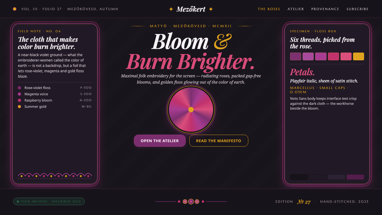 Hungarian Matyó VioletFolk embroidery, maximal. Rose-violet and gold blooms blaze gap-free on near-…