What is Silent Hill?
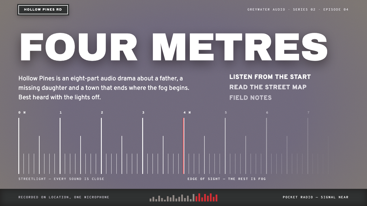
Silent Hill turned a hardware limitation into an atmosphere: a lilac-grey fog that swallows everything past a few paces, white street-sign lettering, and red used for one mark only.
Silent Hill in brief
The Silent Hill fog style is a low-contrast, grainy and deliberately quiet visual language built from Team Silent's 1999 PlayStation horror game. Its ground is the lilac-grey of the in-engine fog. Its type is white, like the enamel plates on the street signs of the fictional town. Everything beyond a short distance dissolves into paler grey, so the interface appears to emerge slowly from mist rather than sit crisply on a page.
Content is held in grey-green panels and bands of wet-asphalt grey. A deep title red is kept for alerts and for the red-pen circles that mark a map. Only when the page slips into the Otherworld, the game's nightmare version of the town, do rust, flaking brown walls and pure black void take over. The overall feel is soft at the edges, heavy with grain and always faintly listening for static.
What distinguishes it from conventional horror aesthetics is its psychological register. It does not rely on shock. It depends on reduced visibility, muted colour and the sense that something is present just beyond what you can see, which makes it well suited to narrative, atmospheric and contemplative interfaces.

Where does Silent Hill come from?
Silent Hill was developed by Konami Computer Entertainment Tokyo, in the team known as Team Silent, over roughly three years from 1996, and released in North America in January 1999 and in Japan in March of that year, on the PlayStation. Although it was made in Tokyo, the story takes place in a fictional American resort town, whose street names, signage and landscape draw on Western small-town imagery as seen through a Japanese lens. Keiichiro Toyama is credited as director, and the project is often described as a deliberate answer to the action-oriented direction of earlier survival horror.
The fog is the most famous design decision, and it began as a practical necessity. The PlayStation could draw only a limited distance in real time, so the town fades into mist beyond a few metres. Instead of hiding the limitation, the team made it the central atmosphere: the player cannot see far, cannot trust what is ahead and cannot easily tell what is moving. A technical constraint became a psychological device, and that logic — less visibility, more fear — is what the design system inherits.
The sound and image were shaped together. Composer Akira Yamaoka built a score from industrial and noise-music elements, with clanging metal, droning textures and a pocket radio that hisses with static when something dangerous is near. Takayoshi Sato's computer-graphics work shaped the game's cinematic sequences, and Masahiro Ito designed the unsettling creatures. Together they produced a world in which grain, rust and muffled sound do the frightening.
The game sits in the tradition of psychological survival horror, distinguished from its contemporaries by its focus on dread, symbolism and personal trauma rather than on monsters alone. Its look draws on industrial and noise aesthetics, and its short-draw-distance atmospherics became a reference for later horror titles. As a design system, it carries over the part of the experience that has proved the most durable: the quiet, grey, grainy mood, and the carefully rationed appearance of red.
What defines the Silent Hill look?
Colour
The base is a pale lilac-grey, the colour of fog under flat light. Panels shift to a muted grey-green, like the cover of an old book, and bands of wet-asphalt grey separate regions. White is used for primary text. A deep title red is kept strictly for alerts and for red-pen marks on maps, which makes every appearance of red feel deliberate. In the Otherworld, rust-orange and black take over.
Fog and depth
Depth is expressed through fading rather than through shadows or layering. Elements further down or further back dissolve into paler grey, and edges are slightly soft. Visibility is deliberately limited: a user should feel that content is approaching them out of the mist. Heavy gradients and glossy effects are avoided; the fade is subtle, even and cold.
Typography
Headings imitate street-plate lettering: white, capitalised, plain and evenly spaced, like enamel signs bolted to a pole. Body text is quiet and neutral, set with generous leading, and never bold for emphasis. The typography feels municipal and anonymous rather than expressive, which makes the town itself seem uninhabited and the reader a lone visitor.
Grain and texture
A fine, even grain sits over the surface, like the noise of an old broadcast or a low-resolution image. Surfaces are matte. Textures are used sparingly and are always desaturated: damp concrete, peeling paint and rusted metal appear only in the Otherworld state. The result is a feeling of age and neglect without visual clutter.
Two states
The system has a normal state of fog and a rare altered state, the Otherworld, in which the page changes to rust, black void and metal grids. Because the shift is infrequent, it carries weight. Used as a transition for errors, failures or narrative turns, it can create a jolt without any violent imagery.
Sound-minded tone
The pocket radio that hisses when something is near is part of the design's spirit, even in silent screens. Micro-interactions can suggest static through a faint flicker or a brief grain shift, but they should be rare and soft. The goal is a listening quality: the interface seems to be waiting, not performing.

Who shaped Silent Hill?
Toyama is credited as the director of the original Silent Hill. He led the team that moved survival horror toward psychological dread, and his role makes him the principal creative voice behind the game's decision to turn hardware-imposed fog into an atmospheric centrepiece rather than a flaw to hide.
Yamaoka composed and designed the sound of the game, building its score from industrial and noise music. His layered metal, drone and static textures define how the game feels as much as its visuals do, and his work is the reason this design system treats listening and silence as part of the aesthetic.
Sato is known for the computer-graphics work that shaped the game's cinematic sequences and character faces. His realistic approach to rendering helped the game convey emotional subtlety on early three-dimensional hardware, adding a human side to its otherwise cold environments.
Ito designed the unsettling creatures and much of the visual language of the Otherworld. His imagery of corrosion, bodily distortion and industrial decay informs the rust, mesh and flaking surfaces that appear when the design system shifts into its alternate state.
How do you use Silent Hill today?
For slide decks, the style suits narrative-led presentations: a case study of something that went wrong, a research story with an unresolved question, a talk on atmosphere or game design. Use a pale grey ground with a single white title in plate-style capitals, and keep the layout sparse. Let a thin red mark appear once to flag the key finding. Use the fog fade to move the eye down the slide rather than boxes and borders.
For web interfaces, it works for moody, narrative or archival products: game companion sites, interactive stories, audio platforms, journaling apps and anything where a quiet, subdued atmosphere is valuable. Panels in grey-green, white type and a faint grain give a coherent look. Keep red for destructive or critical actions only, and use the rust-and-black state for errors, offline modes or special story moments.
For editorial and marketing work, the style is a strong fit for long-form features, horror and mystery publishing, album and soundtrack releases and event pages for atmospheric experiences. Treat a page as a walk through mist: introduce content gradually, let images fade into the ground and avoid hard edges. Because the style is low in contrast, pair it with generous type size so that reading remains comfortable.
For product teams wanting calm and unease at the same time, the system can be tuned toward the quieter side, using only the fog, the white lettering and the grain. This version suits wellness-adjacent products with a melancholic tone, or tools meant to be used late at night. The key is to keep colours restrained and avoid bright accents that would break the mood.
The most common mistake is to over-dramatise: adding blood splatters, scary fonts, jump-scare animations or heavy vignettes. The original unsettles by withholding information, not by shouting. A second mistake is reducing contrast so far that text becomes unreadable; the fog should soften the page, not hide the content. A third is using red everywhere, which destroys its function as a rare, meaningful signal.

Silent Hill — FAQ
Why is fog the centre of this style?
In the original game, fog hid the limited draw distance of the PlayStation, but it also became the signature atmosphere, because players could not see what lay ahead. The design system takes that idea and applies it to interfaces: low contrast, soft edges and content that fades into pale grey create unease and a sense of discovery without any explicit threat.
What is the Otherworld state?
It is the game's nightmare version of the town, in which surfaces turn to rust, flaking walls and black void. In the design system, it is a rarely used alternate state that replaces the fog palette with rust, black and metal grids. Used sparingly for errors, failures or narrative turns, it creates a strong shift without needing graphic horror imagery.
Is the style readable enough for real products?
It can be, if handled carefully. The fog palette is low in contrast by nature, so primary text should stay white against a sufficiently dark panel, and body sizes should be generous. Use the fading effect on decorative regions and secondary content, not on the text a user must read. Test with real users and adjust contrast before shipping.
How does it differ from other horror interface styles?
Many horror styles are loud: bright red, distressed typography and visible gore. This one is the opposite. It is grey, grainy, soft-edged and quiet, with red reserved for a single mark. Its horror is psychological, relying on limited visibility and restraint, which makes it more flexible for subtle narrative and atmospheric work.
Where does the street-sign lettering come from?
It comes from the signs seen around the fictional town, such as the plates marking streets like BACHMAN AVE, which feature white capital lettering on a dark ground. The design system uses that look for headings, giving the interface an anonymous, municipal voice that adds to the sense of a place with nobody in it.
Related design styles
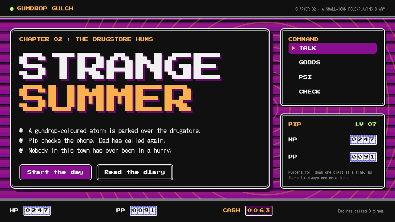 EarthBoundCalm black windows on a restless field. Double-bordered panels, magenta bands…
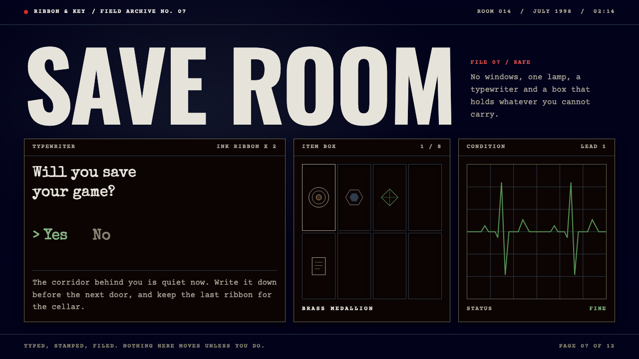 Resident EvilDread without gore. Midnight navy, typewritten files, one herb-green ECG line…
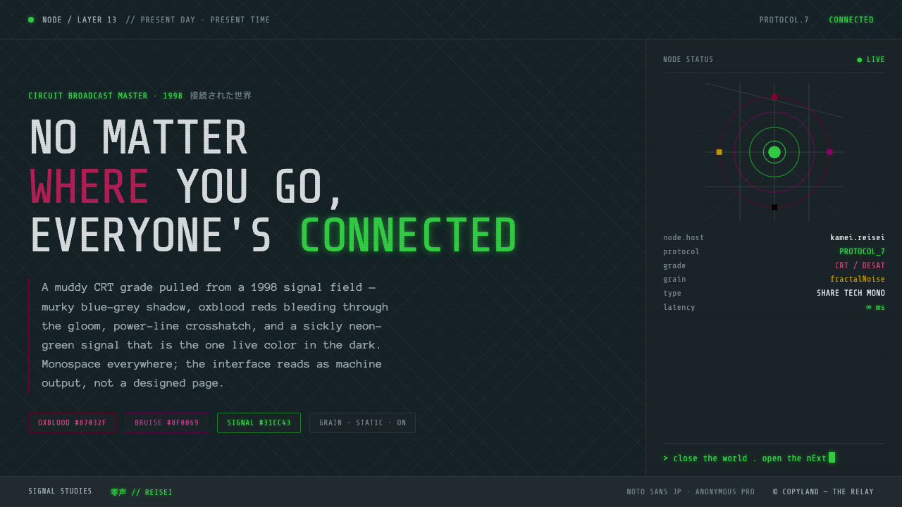 Serial Experiments LainMuddy CRT dread from the 1998 Wired. Blue-grey murk, oxblood reds, one sickly…
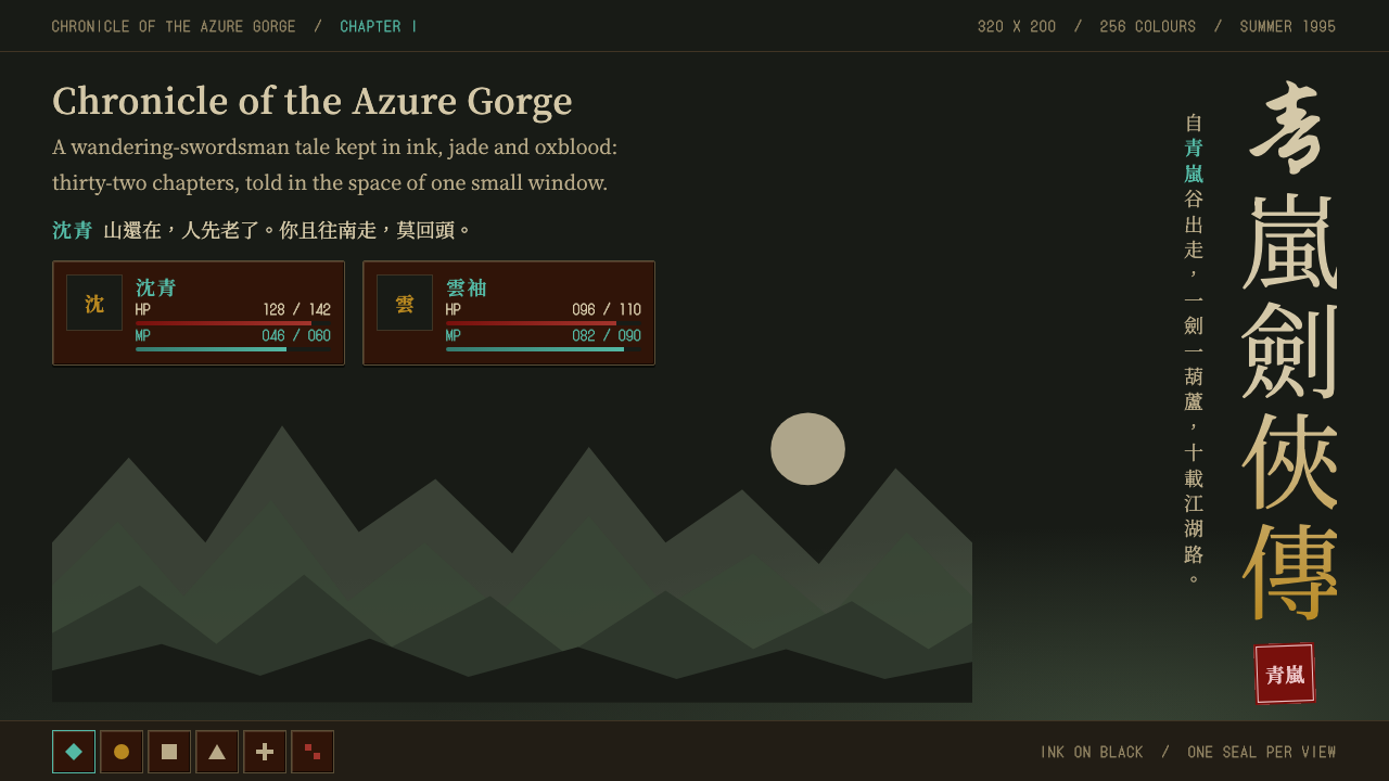 The Legend of Sword and FairyInk on black, closed by one red seal. Vertical brush title, oxblood panels, j…
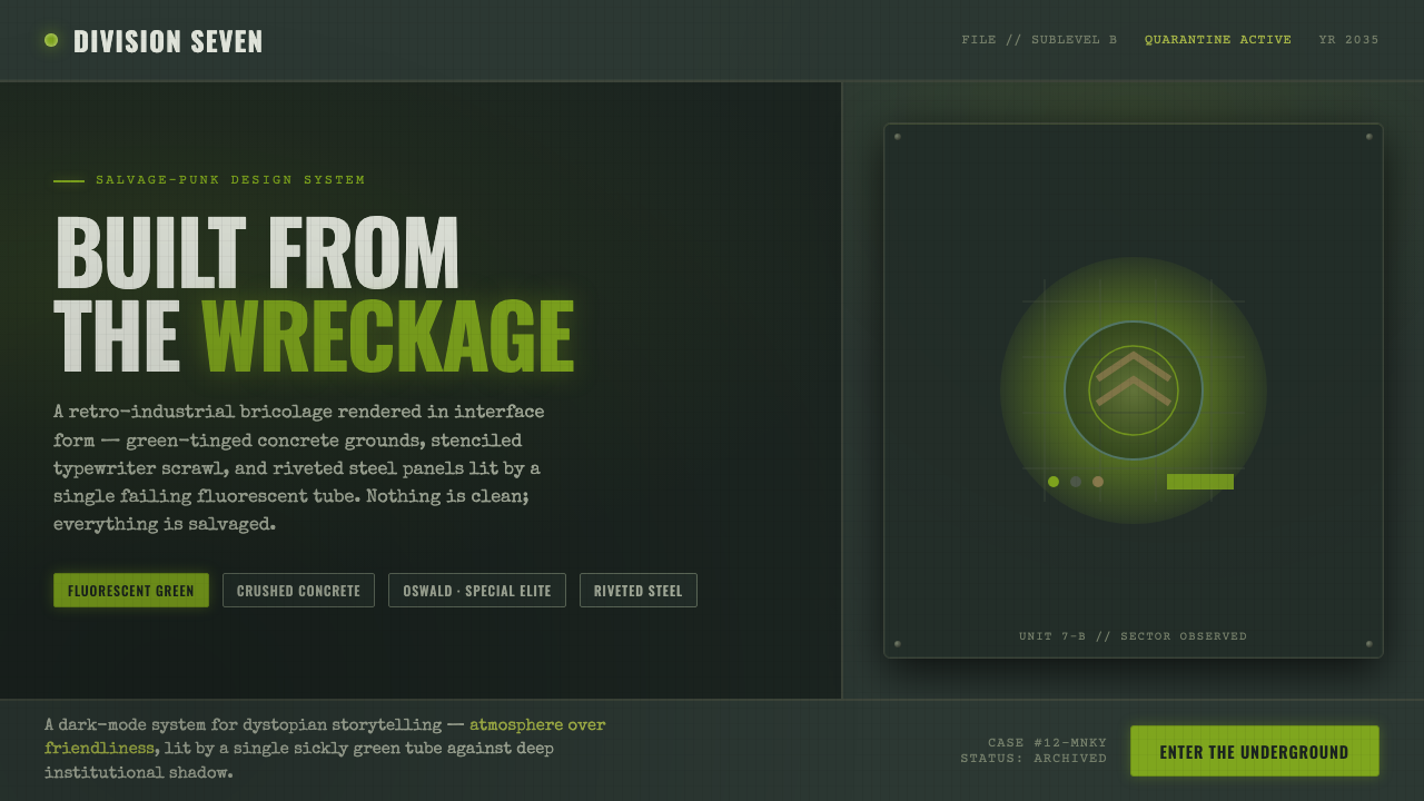 12 MonkeysBuilt from the wreckage. Sickly fluorescent green on crushed-black concrete,…
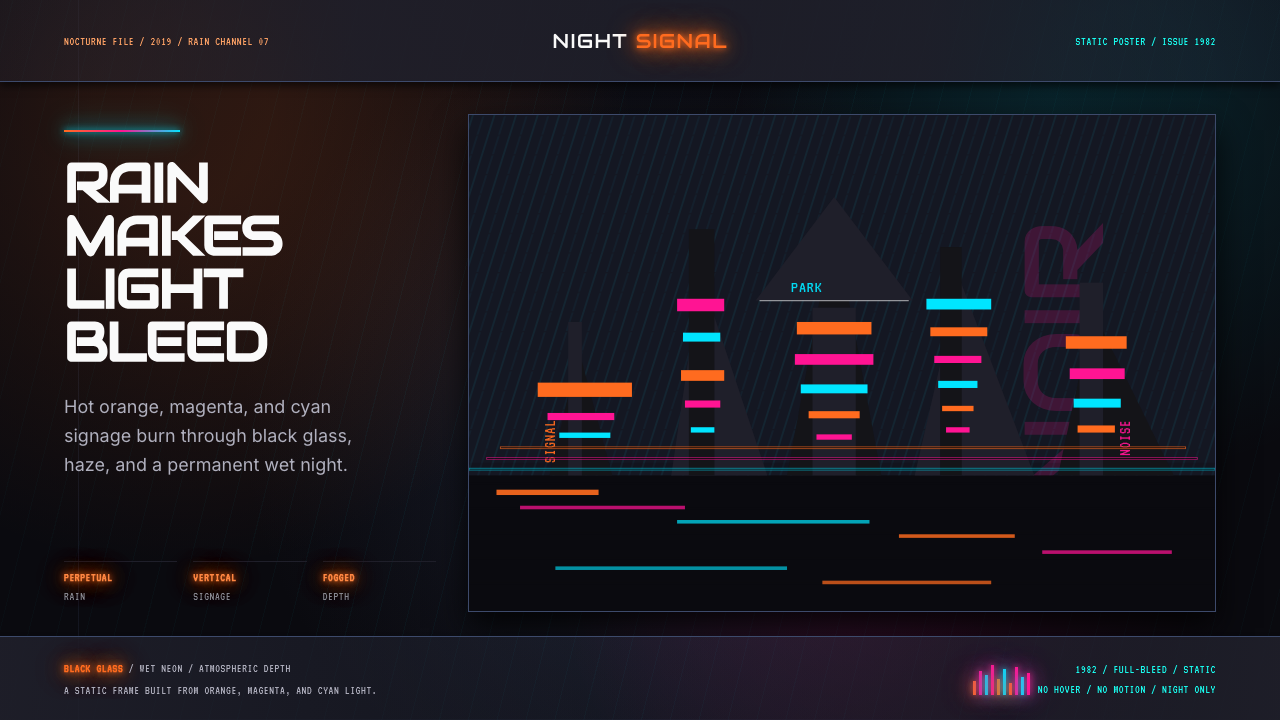 Blade Runner 1982 Neon NoirRain-soaked noir. Orange, magenta, and cyan neon cut black glass.