What is The Legend of Sword and Fairy?
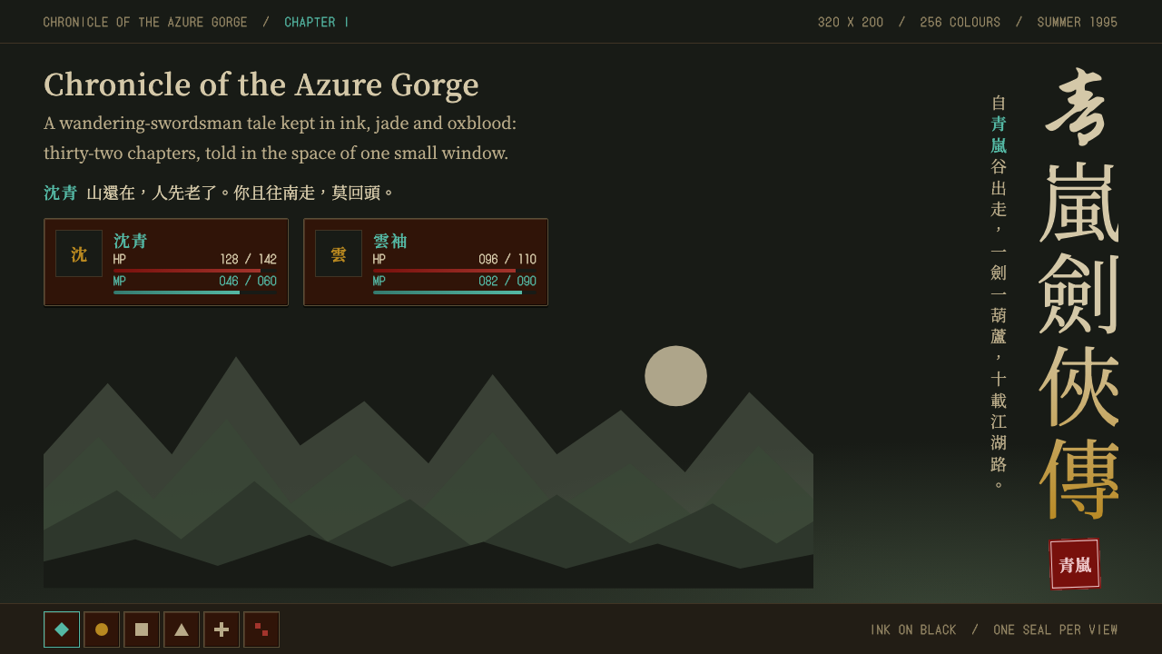
The Legend of Sword and Fairy is ink on black, closed by a single red seal, a wuxia romance drawn in a tiny palette of 256 colours.
The Legend of Sword and Fairy in brief
The Legend of Sword and Fairy style is drawn from the 1995 DOS release of the Softstar role-playing game that told the story of Li Xiaoyao and Zhao Ling'er in 320 by 200 resolution and 256 colours. Despite those limits, its opening screen reads like a scroll: grey-green ink mountains rising out of black, a brush-written title running down the right edge, and a red seal that closes the composition.
Inside the game, the interface is oxblood wood and worn stone. Status panels have bevelled edges, character names appear in jade-teal over floating dialogue, hit-point numerals are set in a parchment tone and a row of square icons runs along the bottom. The look is dark, restrained and quietly melancholic.
As a design system, it keeps that restraint: ink-dark ground, vertical text, a seal to finish, fewer glow effects and more empty space and mist. It suits story-led pages, and it suits portfolios that want a touch of old-world wistfulness.

Where does The Legend of Sword and Fairy come from?
The Legend of Sword and Fairy was released in July 1995 for DOS by the DOMO team at Softstar in Taipei, Taiwan, with Yao Zhuangxian leading the production. The Chinese name of the team, Kuangtu Chuangzuo Qun, appears in the record alongside his. The game became a landmark of Chinese-language role-playing, and later Windows editions followed, including the 1998 'tender feelings' version and the 2001 'New Legend of Sword and Fairy'.
Its visual identity was shaped by three sources. The first is Chinese wuxia fiction, the tradition of swordsmen, immortals, romance and loyalty that supplied the story's characters and moods. The second is Chinese ink-wash and gongbi painting: the soft grey-green mountains, the mist, the calligraphic title and the red seal all come from that painterly world. The third is DOS 256-colour pixel art, whose technical limits made the designers choose every colour carefully.
Those limits are part of the style rather than an obstacle to it. With so few colours available, the interface leans on a small, controlled family: ink black, oxblood brown, jade, parchment yellow and one red. Bevelled panels imitate wood and stone because the screen could not afford photographic textures, and the result has a handmade, worn warmth.
The sense of melancholy comes from the story and is reinforced by the layout. Mountains retreat into black, text runs vertically as in traditional writing and the seal at the end feels like a signature on a finished painting. When this system is applied to a modern page, those same features turn a screen into something closer to a scroll than to a dashboard.
What defines the The Legend of Sword and Fairy look?
Color
Ink black is the ground, with grey-green mountain tones rising out of it. Oxblood brown fills panels, jade-teal marks names and the one bright accent, and parchment yellow carries numerals. A single red is kept for the seal. The palette is small and controlled, a legacy of the 256-colour screen.
Typography
The title is written in a vertical running-script brush hand along the right edge, and text may run vertically in key places. Body text is plain and legible. The idea is that calligraphy gives the page its voice while everything else stays quiet.
Ink Landscape
Distant mountains in grey-green wash fade into black, with mist and a crane for scale. The landscape is used as atmosphere rather than as decoration, and it needs open space around it to work.
Bevelled Panels
Status and dialogue panels are oxblood wood and worn stone with bevelled edges. They give the interface a tactile, handmade quality that a flat dark box would lack, and they frame the story in the way a wooden frame holds a painting.
The Red Seal
A single red seal closes the composition, as on a finished painting. It is the only strong red on the page, which is why it works. Used once, it signs the layout; used many times, it becomes noise.
Pixel Icons
A row of small square icons along the bottom echoes the game's command bar. Their pixel-art origin gives them a slightly rough charm that fits the old-screen mood and keeps the interface grounded.

Who shaped The Legend of Sword and Fairy?
The producer who led the 1995 DOS release at Softstar in Taipei. His team's decision to draw a wuxia romance with the restraint of ink painting, within the narrow limits of a 256-colour screen, is the basis of this system.
The development group at Softstar in Taipei responsible for the game. Their collective work joined Chinese wuxia fiction, ink-wash painting and DOS pixel art into a single, coherent interface.
How do you use The Legend of Sword and Fairy today?
This style is built for restraint. It works when a page is willing to be dark and quiet, to let a single colour accent carry meaning, and to give space to atmosphere rather than packing every area with information.
For presentation slides, a cover can follow the game's opening: ink black, grey-green mountains fading in from the lower edge, a vertical brush title on the right and a red seal as the final mark. Content slides can use oxblood panels with a thin bevel and jade-coloured headings, with plenty of space around the text. Data slides should keep charts minimal and use parchment-yellow numerals on dark panels.
For web interfaces, the style suits narrative sites, game and fiction pages, cultural projects and portfolios with a story to tell. Navigation can be a row of square icons or a vertical text menu. Cards can borrow the bevelled panel look. Buttons should stay understated, with jade for links and a single red for a high-value action. It is less suited to data-heavy dashboards or to products that require bright, energetic tones.
For editorial and marketing work, the look supports long-form storytelling, cultural features and launches that want a sense of memory. Vertical text can be used for a title or a pull quote, a seal can end each article and mist-like gradients of grey-green can mark section transitions without hard borders.
A common mistake is to add glow and shine in an attempt to modernise it. The system gets its mood from dark, low-contrast tones, and bright effects undermine the quiet. Another is to use red repeatedly; once the seal is repeated, it stops being a signature.

The Legend of Sword and Fairy — FAQ
Why is the palette so small?
Because the 1995 DOS original ran with 256 colours at a low resolution, and the designers had to choose carefully. The system keeps that discipline: ink black, oxblood, jade, parchment and a single red do almost all the work.
What are the main influences behind the look?
Chinese wuxia fiction, Chinese ink-wash and gongbi painting, and DOS 256-colour pixel art. The first shapes the story, the second shapes the mountains, brush title and seal, and the third shapes the small icons and the overall palette constraint.
Is it a dark or light style?
It is a dark style, with ink black as the ground. The mountains, jade names and the red seal only read properly against that darkness.
Can I use vertical text on a modern website?
Yes, in small doses. The brush title running down the right edge is a defining feature, so a vertical heading or pull quote works well. Long body copy should stay horizontal for readability.
What projects suit this style best?
Story-led pages, game and fiction sites, cultural features and portfolios that want restraint and a little melancholy. It is less suitable for bright, high-energy or data-dense products.
Related design styles
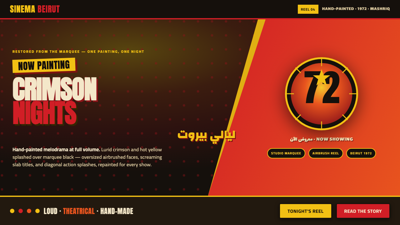 Lebanese Film PosterMelodrama at full volume. Lurid crimson and hot yellow on marquee black, slab…
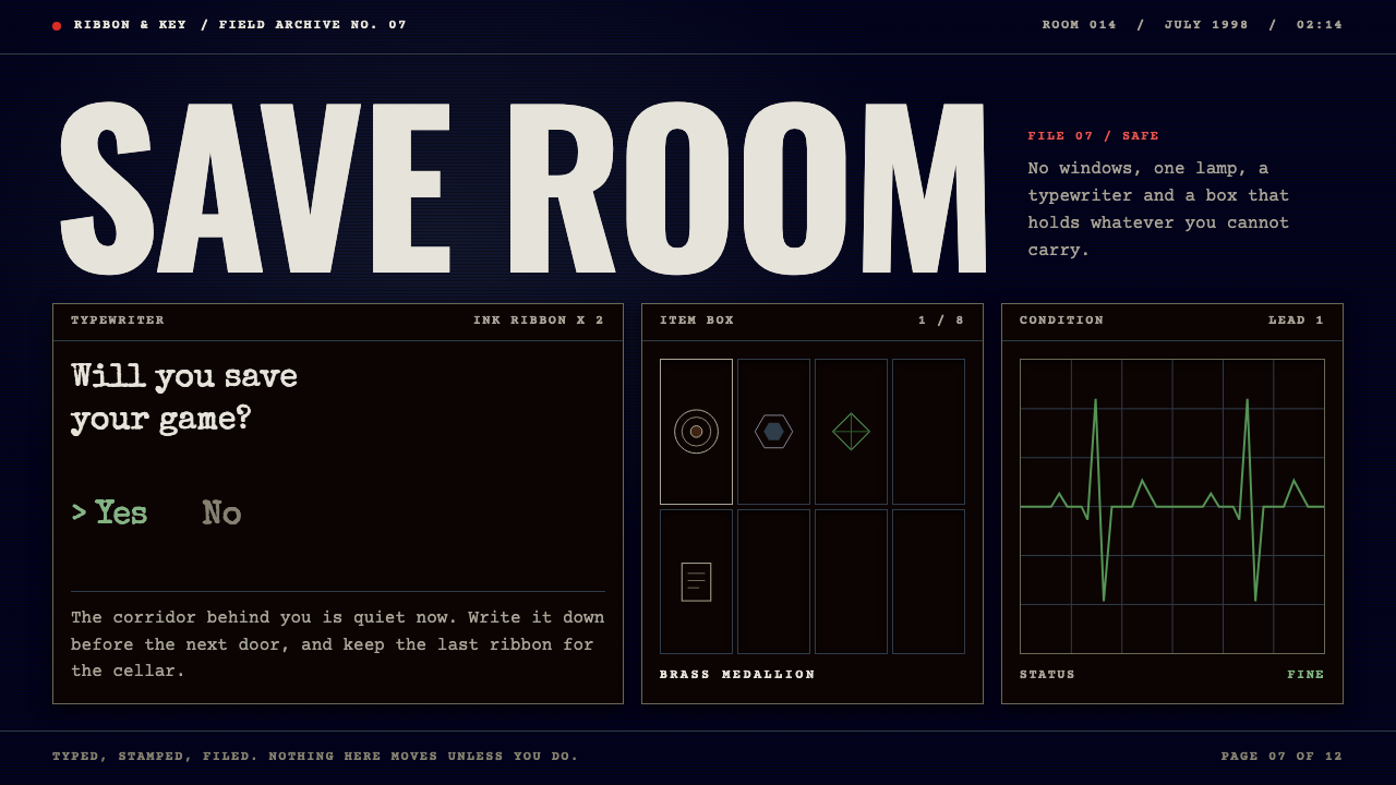 Resident EvilDread without gore. Midnight navy, typewritten files, one herb-green ECG line…
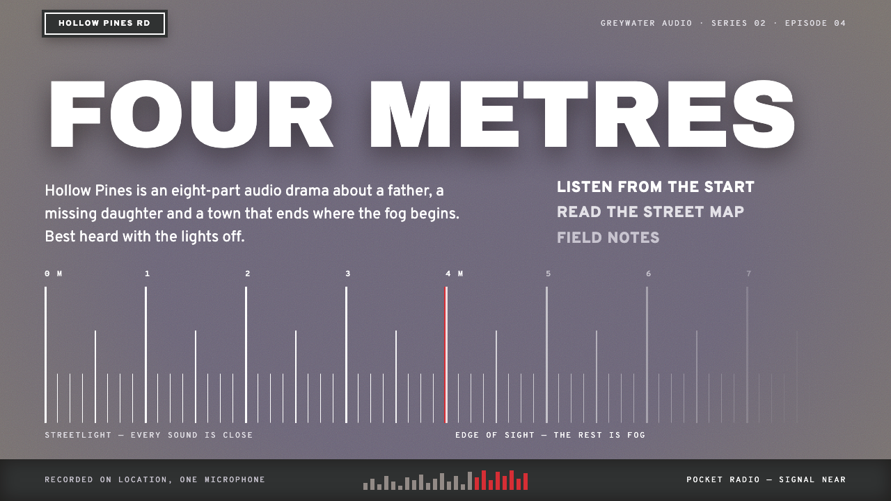 Silent HillQuiet dread, four metres deep. Lilac fog ground, white street-plate caps, red…
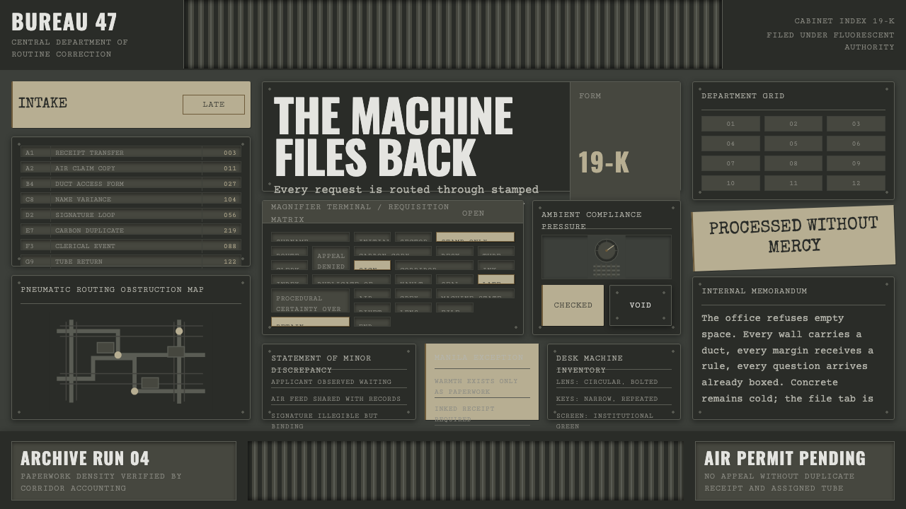 Brazil (1985)Bureaucracy turns hostile. Gray-green grids, duct bands, and manila stamps cr…
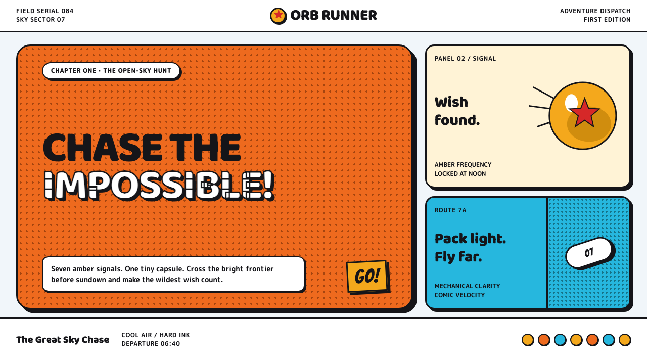 Dragon Ball (1984)Adventure lands with comic force. Gi-orange panels, amber spheres and crisp h…
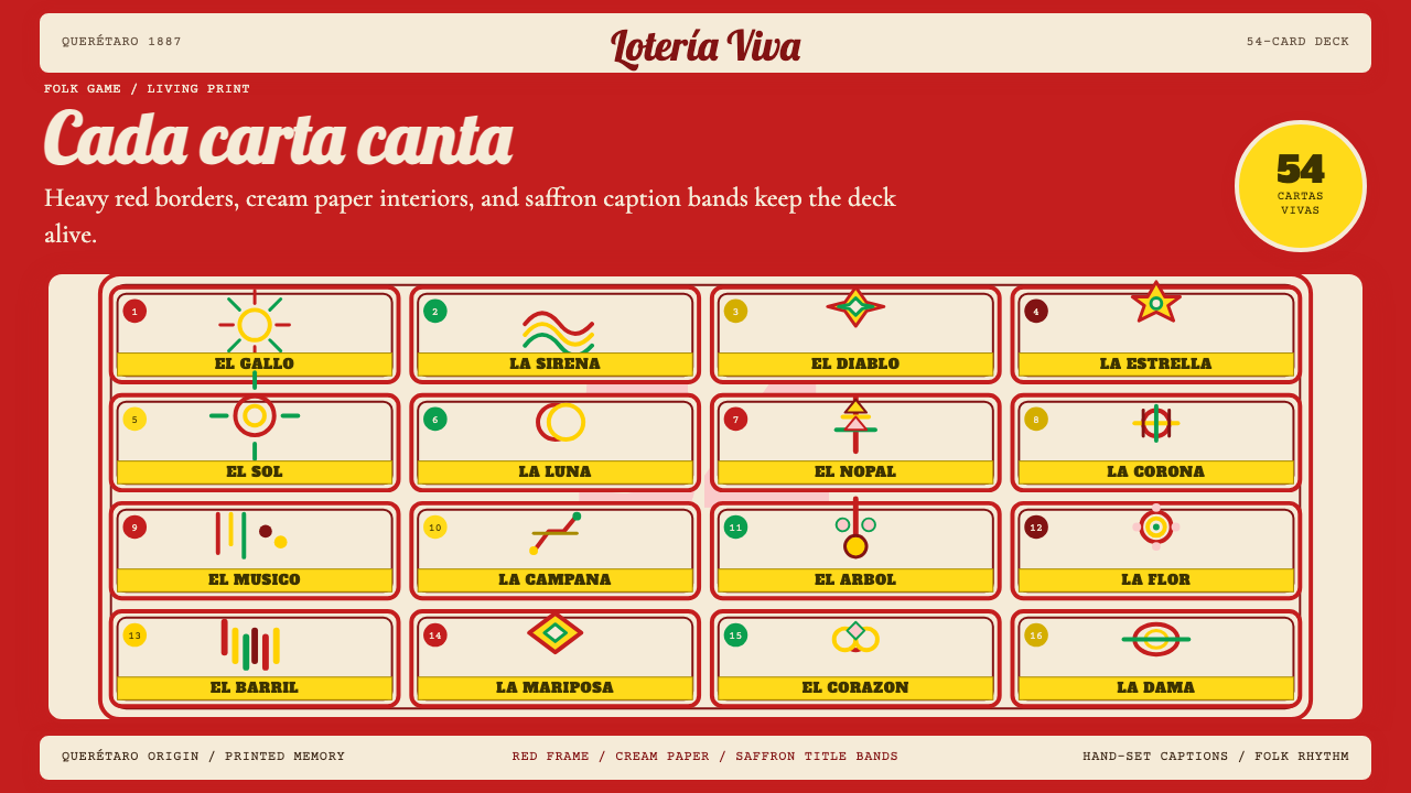 Mexican Lotería Folk CardLiving folk ritual. Cream cards, red borders, and saffron caption bands make…