What is Mexican Lotería Folk Card?什么是 Mexican Lotería Folk Card?
Fifty-four hand-called picture cards turned a folk bingo game into Mexico's most beloved visual ritual — and one of the richest folk-art design systems ever codified.五十四张逐一唱读的图画牌,将一场民间宾果游戏变成墨西哥最受喜爱的视觉仪式,也凝结成有史以来最丰富的民间艺术设计体系之一。
Mexican Lotería Folk Card in briefMexican Lotería Folk Card 速览
Mexican Lotería is a folk game played with a deck of 54 picture cards — La Luna, El Corazón, El Borracho, La Sirena — each depicting an archetype from Mexican daily life, mythology, and natural world. A caller known as the cantor draws cards at random and improvises rhymed couplets or riddles that describe each figure without naming it outright, while players mark their tablas (bingo boards) with beans or coins. The game is not merely entertainment; it is a living transmission of folk proverbs, regional humor, and collective memory.墨西哥彩票(Lotería)是一种以54张图画牌进行的民间游戏——月亮、心脏、醉汉、美人鱼——每张牌描绘一个来自墨西哥日常生活、神话与自然世界的原型人物。被称为「歌唱者」(cantor)的叫牌人随机抽牌,即兴吟唱押韵对句或谜语,描述画面中的形象却不直接点名,而玩家则用豆粒或硬币在自己的图表(tablas)上标记对应位置。这个游戏不仅仅是娱乐,更是民间谚语、地域幽默与集体记忆的鲜活传承。
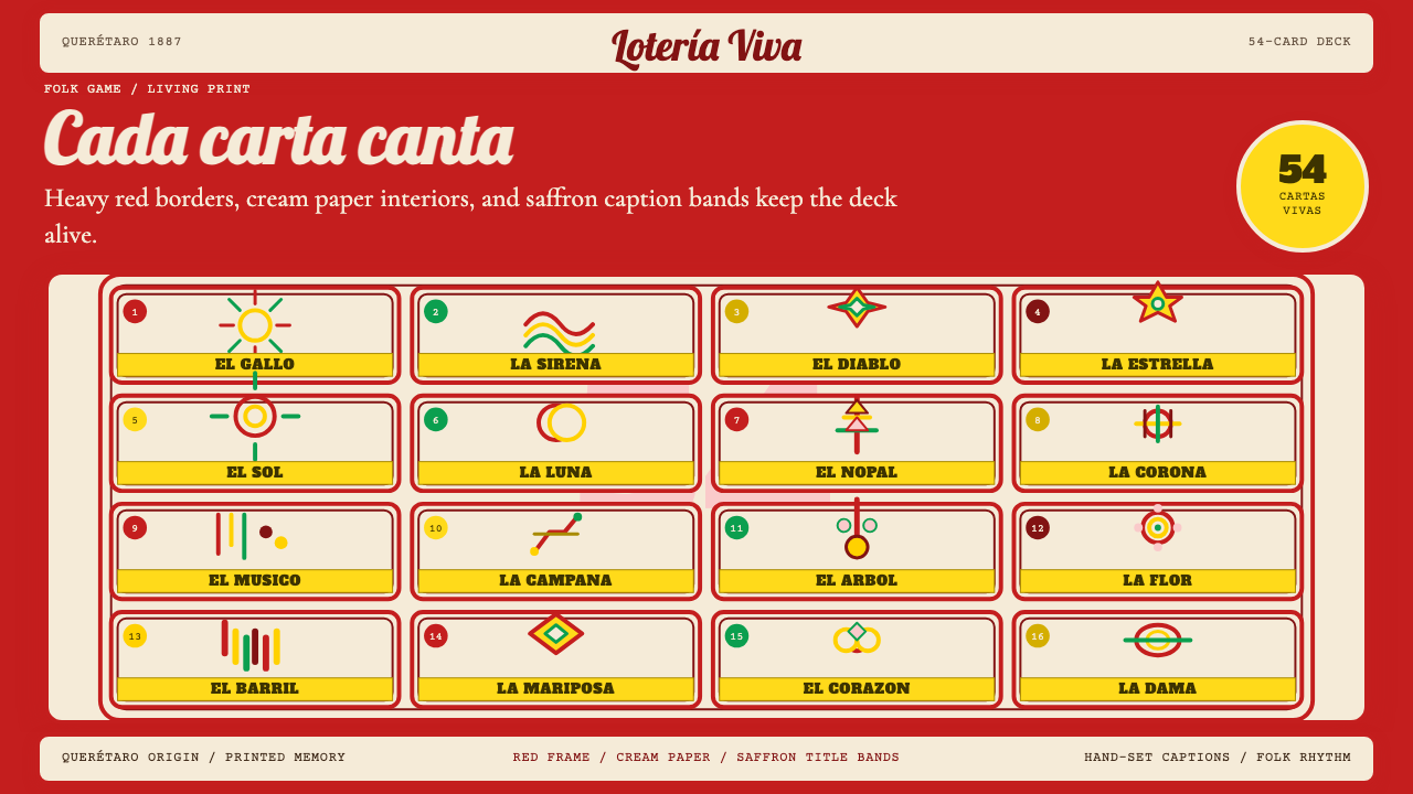
The design language of Lotería is instantly recognizable and tightly codified. Each card presents a single central figure rendered in flat, lithographed color against a cream ground, framed by a heavy ornamental border in deep red. A caption band — traditionally rendered in ochre or saffron — carries the card's name in bold serif lettering at the foot of the image. There is no gradation, no shadow that simulates depth, no naturalistic background: the figure exists as pure archetype, isolated and iconic, like a folk saint on a tile.彩票的设计语言辨识度极高,且经过高度规范化。每张牌呈现单一中心图像,以平涂石版印刷色彩绘于奶油色底面,四周环以深红色厚重装饰边框。传统上以赭黄或番红花色渲染的题签带,在图像底部以粗重衬线字体标注卡牌名称。没有渐变,没有模拟深度的阴影,没有自然主义背景——图像作为纯粹的原型存在,孤立而具有图腾感,如同瓷砖上的民间圣像。
The Lotería deck functions as a complete visual vocabulary. Its palette — cream, vermilion border, saffron caption band, and the flat, expressive colors of the figures themselves — is not decorative in the casual sense but liturgical: these colors were chosen to evoke the hand-painted devotional objects, retablo ex-votos, and papel picado banners that surround the game in the festival context where it is most often played. Applying this design system means inhabiting that ritual atmosphere — warmth, clarity, and a kind of cheerful solemnity at once.彩票牌组作为一套完整的视觉词汇发挥作用。它的色彩体系——奶油底色、朱红边框、番红题签带,以及图像人物本身那些平涂而富有表现力的颜色——并非随意装饰,而更近乎礼仪性的:这些颜色被选择出来,是为了唤起游戏最常出现的节庆语境中那些手绘的奉献物、还愿画(retablo ex-votos)和彩色剪纸旗(papel picado)。运用这套设计系统,意味着进入那种仪式性氛围——温暖、清晰,以及一种欢快的庄重感并存。
See the Mexican Lotería Folk Card design system查看 Mexican Lotería Folk Card 完整设计系统
Where does Mexican Lotería Folk Card come from?Mexican Lotería Folk Card 从何而来?
The word lotería derives from the Italian lotteria, itself from the Old Germanic hlut (lot, fate), reflecting the game's European origin. Lottery-style games arrived in New Spain during the colonial era, likely in the late eighteenth century, introduced by Spanish administrators who brought the practice from the Italian and Spanish royal courts. Early colonial lotería used playing-card suits and was associated with gambling among the urban elite — a far cry from the democratic folk game it would become.「彩票」(lotería)一词源自意大利语lotteria,后者又来自古日耳曼语hlut(命运、抽签),反映了这个游戏的欧洲起源。彩票类游戏在殖民地时代传入新西班牙,很可能在十八世纪末,由西班牙行政官员从意大利和西班牙王室宫廷带入。早期殖民地彩票使用扑克牌花色,与城市精英阶层的赌博活动相关联——与它后来成为的民主化民间游戏相去甚远。
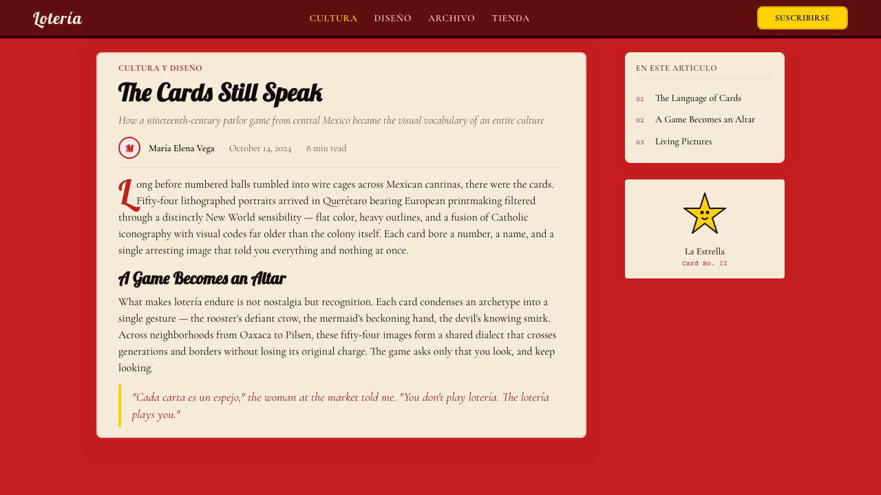
The pivotal transformation came in 1887, when Don Clemente Jacques, a Franco-Mexican entrepreneur based in Querétaro, commissioned a standardized deck for the game that would become the definitive popular edition. The Jacques deck codified the 54-card structure, the flat-color lithographic figures, the vermilion ornamental border, and the saffron caption band that remain canonical to this day. Continuous production from 1887 through the present — with the Pasatiempos Gallo company eventually acquiring the brand in the twentieth century — meant that the Jacques aesthetic became the shared visual memory of generations of Mexican families.关键性的转变发生在1887年,法裔墨西哥企业家唐·克莱门特·雅克(Don Clemente Jacques)在克雷塔罗委托制作了一套标准化牌组,这套牌将成为决定性的大众版本。雅克牌组确立了54张牌的结构、平涂色彩的石版印刷人物、朱红装饰边框和番红题签带,这些元素至今仍是经典标准。从1887年至今的持续生产——二十世纪后由Pasatiempos Gallo公司收购该品牌——意味着雅克美学成为几代墨西哥家庭共同的视觉记忆。
The post-revolutionary period (roughly 1920 to 1940) was decisive for Lotería's cultural status. As Mexico's government promoted folk art as a vehicle for national identity — a project championed by muralists, the Ministry of Education under José Vasconcelos, and a generation of intellectuals — the Lotería deck was reframed not as a gambling novelty but as an encyclopedia of Mexican popular archetypes. El Charro, La Calavera, El Nopal: these images were read as distillations of lo mexicano, the essence of Mexican life. The game moved from market stalls and cantinas into schools and family homes.后革命时期(大约1920至1940年)对彩票的文化地位至关重要。随着墨西哥政府推动民间艺术作为国家认同的载体——这一项目由壁画家、教育部长何塞·巴斯孔塞洛斯(José Vasconcelos)领导下的教育部及一代知识分子共同推动——彩票牌组被重新诠释,不再是赌博新奇物,而是墨西哥大众原型的百科全书。骑士、骷髅、仙人掌:这些图像被解读为「墨西哥性」(lo mexicano)的提炼,墨西哥生活本质的凝缩。游戏从市场摊位和小酒馆走进学校与家庭。
In the latter half of the twentieth century, Lotería iconography crossed the border with Mexican diaspora communities and became a central visual language of Chicano-American identity and art. Artists such as Carmen Lomas Garza and Yolanda M. López reinterpreted the traditional cards — replacing archetypes with Chicana women, barrio scenes, and political subjects — demonstrating the deck's adaptability as a critique and reclamation tool. Today the Lotería card format is used by artists, educators, activists, and designers worldwide, far beyond its original game context, as a frame for any content that benefits from the combination of iconic clarity, folk warmth, and ritual seriousness the format naturally conveys.二十世纪下半叶,随着墨西哥侨民社区越境迁移,彩票图像学成为奇卡诺裔美国人身份认同与艺术的核心视觉语言。卡门·洛马斯·加尔萨(Carmen Lomas Garza)、约兰达·M·洛佩斯(Yolanda M. López)等艺术家重新诠释传统牌面——以奇卡纳女性、街区场景和政治主题替换原有原型——展示了牌组作为批评与再占有工具的适应性。如今,彩票牌面格式被全球各地的艺术家、教育者、活动人士和设计师广泛使用,远超其原始游戏语境,成为任何内容的框架——凡是能从这种格式天然传达的图腾式清晰、民间温度和仪式庄重感中获益的内容,皆可借用。
What defines the Mexican Lotería Folk Card look?Mexican Lotería Folk Card 的视觉特征是什么?
Color Palette色彩体系
The Lotería palette is warm, limited, and purposeful. Cream or aged-ivory serves as the card ground, evoking the uncoated printing stock of the original lithographic editions. The border is rendered in a deep, assertive red — closer to vermilion than crimson — that frames each card as a stage. The caption band reads in ochre or saffron, a warm golden yellow that sits between the red border and the figure without competing. The figures themselves use a small set of flat, fully saturated colors — cobalt blues, earthy greens, warm flesh tones, terracotta — never blended, always distinct. Black is used only for outlines and lettering. The overall effect is festive without being garish: each color carries folk-devotional weight rather than purely decorative intent.彩票的色彩体系温暖、克制而具有目的性。奶油色或陈旧象牙色作为卡牌底色,唤起原版石版印刷版本的无涂层印纸质感。边框以深沉而有力的红色呈现——更接近朱红而非深红——将每张牌框定为一个舞台。题签带以赭色或番红花色显示,这种温暖的金黄色调处于红色边框与图像人物之间,不形成竞争。图像人物本身使用少量平涂、完全饱和的色彩——钴蓝、泥土绿、暖肤色、赤陶色——从不混合,始终分明。黑色仅用于轮廓线与字母。整体效果喜庆而不俗艳:每种颜色承载着民间奉献物的重量,而非纯粹的装饰意图。
Flat Figure Rendering平涂图像处理
Every Lotería figure is rendered in flat color without shading, modeling, or cast shadows. This is not a technical limitation but an aesthetic inheritance from the devotional image tradition — retablos, ex-votos, and painted saints — where flatness signals sacred rather than secular representation. The figure occupies the card plane as an emblem rather than as an illusion of a three-dimensional object. Outlines are drawn boldly, contours are decisive, and interior color areas are cleanly separated. The resulting images have the visual authority of stamps or seals: immediately legible at a small scale, impossible to mistake.每个彩票图像均以平涂色彩呈现,无阴影、无塑形、无投影。这不是技术局限,而是对奉献物图像传统的美学继承——还愿画、感恩奉献物和彩绘圣像——在这一传统中,平面性标志着神圣而非世俗的再现方式。图像以徽章而非三维物体幻觉的方式占据牌面平面。轮廓线粗重有力,边廓果决,内部色彩区域清晰分隔。由此产生的图像具有印章或封印般的视觉权威:在小尺寸下立即可辨,无从误认。
Ornamental Border装饰边框
The heavy red border is not merely decorative — it is structural, functioning as the architectural frame that distinguishes the Lotería card from all other card formats. The border typically features a repeated foliate or geometric motif drawn from the vocabulary of nineteenth-century commercial lithography: scrollwork, small rosettes, geometric interlocking patterns. The border weight is substantial enough to be read as a frame rather than a line, giving each card the formal gravity of a framed print or a votive panel. This border convention is the single element most consistently reproduced in contemporary Lotería-inspired design.厚重的红色边框不仅仅是装饰——它是结构性的,作为建筑式的框架,将彩票牌与其他所有牌类格式区分开来。边框通常呈现重复的叶形或几何母题,取自十九世纪商业石版印刷的视觉词汇:卷草纹、小玫瑰花饰、几何互锁图案。边框宽度足以被解读为框架而非线条,赋予每张牌如同装框版画或奉献祭板般的正式庄重感。这一边框惯例是当代彩票风格设计中被最一致地重现的单一元素。
Caption Band and Serif Lettering题签带与衬线字体
The ochre or saffron caption band at the foot of each card serves a dual function: it separates figure from border and it presents the card's name in bold, hand-set or lithographically rendered serif type. The letterforms are broad, sturdy, and legible at the small scale of the printed card. They carry the quality of proclamation — not the quiet annotation of a museum label but the confident declaration of a street-market crier. The caption and figure together are designed to be read as a unit: the name completes the image, and the image illustrates the name. Neither is subordinate.每张牌底部的赭色或番红花色题签带具有双重功能:将图像与边框分隔,并以粗重手排或石版印刷衬线字体呈现卡牌名称。字形宽阔、坚实,在印刷卡牌的小尺寸下清晰可辨。它们带有宣告般的气质——不是博物馆标签那种安静的注释,而是街市叫卖者那种自信的声明。题签与图像被设计为一个整体来阅读:名称补完图像,图像图解名称,两者均不从属于对方。
Archetype as Subject以原型为主题
Each of the 54 Lotería cards depicts not a specific individual but a cultural archetype — the drunkard, the mermaid, the soldier, the ladder, the sun, the moon, the world. The design convention demands that each figure be rendered with maximum iconicity: readable not only as a picture of a particular object but as the idea of that category. This commitment to the general over the specific is what gives Lotería imagery its staying power. The designs do not date because they do not reference a particular moment; they reference a permanent type. Contemporary use of this system inherits this principle: content should be iconic and categorical rather than illustrative and particular.54张彩票牌中的每一张描绘的不是某个具体个体,而是一种文化原型——醉汉、美人鱼、士兵、梯子、太阳、月亮、世界。设计惯例要求每个图像以最高度的图腾性呈现:不仅能被解读为某个具体物体的图画,更能被解读为那个类别的概念。这种对普遍性而非特殊性的执着,正是彩票图像经久不衰的原因。这些设计不会过时,因为它们不指向某个特定时刻,而是指向一种恒久的类型。当代运用这一体系时,继承了这一原则:内容应是图腾式和类别性的,而非说明性和特定性的。
Folk-Devotional Warmth民间奉献物的温度
Perhaps the most difficult quality to articulate but the most important to preserve: the Lotería aesthetic carries a particular emotional register that can be described as cheerful solemnity. The warm ground, the ritual colors, the bold but human-scaled figures — together they produce a feeling akin to looking at an altar decorated for a village fiesta rather than at a fine-art print. This warmth is not sentimentality; it is structural. It comes from the folk-art tradition of making serious things beautiful and accessible, of treating everyday objects as worthy of sacred framing. Any application of this style that loses this warmth in favor of pure graphic slickness will feel like a copy of the surface without the soul.这也许是最难用言语描述、却最重要的保留品质:彩票美学承载着一种特定的情感基调,可以被描述为「欢快的庄重」。温暖的底色、仪式性的色彩、粗重而人性化尺度的图像——它们共同产生一种感觉,类似于望着一座为村庄节庆而装点的祭坛,而非一幅纯艺术版画。这种温度不是伤感情绪,而是结构性的。它来自民间艺术传统——将严肃之物变得美丽而易于亲近,将日常物件视为值得神圣框架对待的传统。任何应用这种风格、却以纯粹的图形光滑感牺牲这种温度的做法,都会感觉像是复制了表面而失去了灵魂。
Compositional Centering构图居中原则
Unlike Bauhaus or Swiss-style work, Lotería composition is strictly centered and symmetrical within the card frame. The figure sits at the visual center, the border distributes evenly on all four sides, the caption band anchors the base. This centering is not a failure of compositional sophistication but a deliberate strategy: the card is an icon, and icons benefit from the visual stability of symmetrical placement. The centered composition also ensures legibility when the card is displayed in any orientation context — table game, wall decoration, print layout, or digital grid.与包豪斯或瑞士风格的作品不同,彩票构图在牌面框架内严格居中且对称。图像置于视觉中心,边框在四边均匀分布,题签带锚定底部。这种居中处理不是构图复杂性的缺失,而是一种有意为之的策略:牌面是一个图腾,而图腾从对称放置的视觉稳定性中获益。居中构图也确保在任何展示方向的语境中——桌面游戏、墙面装饰、印刷版面或数字网格——都能保持清晰可辨。
See the Mexican Lotería Folk Card design system查看 Mexican Lotería Folk Card 完整设计系统
Who shaped Mexican Lotería Folk Card?谁塑造了 Mexican Lotería Folk Card?
A Franco-Mexican entrepreneur based in Querétaro, Don Clemente Jacques commissioned and standardized the 54-card Lotería deck in 1887 that became the definitive popular edition of the game. His deck established the flat-color lithographic figures, the vermilion ornamental border, the saffron caption band, and the card subjects that remain canonical to this day. By maintaining continuous production from 1887 onward, the Jacques deck transformed what had been a fluid folk tradition into a fixed and shared visual system — effectively becoming the style guide for an entire cultural aesthetic.法裔墨西哥企业家唐·克莱门特·雅克(Don Clemente Jacques)在克雷塔罗经营,于1887年委托制作并标准化了54张彩票牌组,成为这个游戏决定性的大众版本。他的牌组确立了平涂石版印刷人物、朱红装饰边框、番红题签带,以及至今仍是经典的牌面主题。通过从1887年起的持续生产,雅克牌组将原本流动的民间传统转变为固定而共享的视觉体系——实际上成为整个文化美学的风格指南。
A foundational figure in Chicano art, Carmen Lomas Garza used the Lotería card format as a vehicle for depicting Chicana domestic life, family rituals, and barrio community scenes throughout the latter decades of the twentieth century. Her reinterpretations — which retained the bordered card structure and flat-color figure convention while replacing the traditional Mexican archetypes with scenes from South Texas Chicana experience — demonstrated that the Lotería format was not a fixed artifact but a living frame adaptable to new cultural subjects. Her work established a precedent for activist and community-oriented reuse of the design system.奇卡诺艺术的奠基人物之一,卡门·洛马斯·加尔萨(Carmen Lomas Garza)在二十世纪后几十年间以彩票牌面格式为载体,描绘奇卡纳家庭生活、家族仪式和街区社区场景。她的再诠释版本——保留了有边框的牌面结构和平涂人物惯例,同时以南德克萨斯奇卡纳生活场景替换传统墨西哥原型——证明彩票格式不是一个固定的文物,而是一个可以适应新文化主题的鲜活框架。她的作品为这一设计体系的社会活动和社区导向式再利用树立了先例。
A Chicana artist and activist based in San Francisco, Yolanda M. López produced influential reinterpretations of iconic Mexican imagery — including Lotería-derived formats — that centered Chicana women as subjects of their own visual culture rather than as objects of traditional folk iconography. Her practice of reclaiming and transforming inherited visual systems demonstrated how a design tradition with deep roots in one cultural moment could be appropriated and redirected to serve entirely different political and artistic purposes, without losing the visual legibility that made the original format effective.旅居旧金山的奇卡纳艺术家兼活动人士约兰达·M·洛佩斯(Yolanda M. López)对标志性墨西哥图像(包括彩票衍生格式)进行了有影响力的再诠释——以奇卡纳女性作为她们自身视觉文化的主体,而非传统民间图像志的客体。她重新占有并转化既有视觉体系的实践,展示了深根于一个文化时刻的设计传统如何在不失去使原始格式有效的视觉清晰度的前提下,被挪用并重新导向服务于完全不同的政治与艺术目的。
The company that acquired the Don Clemente Jacques Lotería brand in the twentieth century and maintained its continuous mass production through the present day. Pasatiempos Gallo is responsible for the ubiquity of the Jacques deck's aesthetic across Mexico and the Mexican diaspora: by producing affordable, widely distributed editions of the standardized deck over multiple generations, the company ensured that the 1887 visual system became the shared visual memory of millions of families. Its stewardship made the Lotería aesthetic into something closer to a public visual commons than a proprietary design.二十世纪收购唐·克莱门特·雅克彩票品牌并维持其大规模生产至今的公司。Pasatiempos Gallo使雅克牌组的美学在墨西哥及墨西哥侨民社区中无处不在:通过跨越多代人持续生产价格亲民、广泛发行的标准化牌组,该公司确保了1887年的视觉体系成为数百万家庭共同的视觉记忆。它的守护使彩票美学成为更接近公共视觉共同财产、而非专有设计的东西。
The 54 subjects of the canonical Lotería deck — El Gallo (the rooster), La Calavera (the skull), La Sirena (the mermaid), El Diablo (the devil), La Luna (the moon), El Nopal (the cactus), and their companions — constitute a collectively authored visual canon. No single artist is credited with the original drawings; they emerged from the interaction between commercial lithography conventions and the folk visual traditions of nineteenth-century Mexico. These 54 archetypes are the most important structural feature of the Lotería design system: they define the principle that each card must be both immediately recognizable and culturally resonant, legible to a child and meaningful to an elder.经典彩票牌组的54个主题——公鸡(El Gallo)、骷髅(La Calavera)、美人鱼(La Sirena)、恶魔(El Diablo)、月亮(La Luna)、仙人掌(El Nopal)及其同伴——构成了一个集体创作的视觉经典。没有任何单一艺术家被认定为原始图画的作者;它们从十九世纪墨西哥商业石版印刷惯例与民间视觉传统的互动中涌现。这54个原型是彩票设计体系最重要的结构性特征:它们定义了一个原则——每张牌必须既能立即被辨认,又具有文化共鸣;对孩子清晰可读,对长者意味深长。
How do you use Mexican Lotería Folk Card today?今天怎么用 Mexican Lotería Folk Card?
The Lotería folk-card aesthetic is one of the most warmth-generating design systems available to contemporary work, and its transferability depends on understanding what the format is actually doing: presenting a single, iconic subject within a ritual frame that signals importance, legibility, and folk belonging simultaneously. Applying it correctly is less about copying the exact palette and more about inhabiting the structural logic — centering a clear subject, framing it with authority, labeling it with proclamation-grade type, and deploying the warm color field that gives each element its emotional weight.彩票民间卡牌美学是当代设计实践中最能产生温度感的设计体系之一,其可移植性取决于理解这种格式实际上在做什么:在一个仪式性框架内呈现单一的、图腾式的主题,同时传达重要性、清晰可辨性和民间归属感。正确运用它,与其说是复制确切的色彩体系,不如说是融入其结构逻辑——居中放置清晰的主题,以权威的方式框定它,以宣告级别的字体为其命名,并铺设赋予每个元素情感重量的温暖色彩基调。
For presentation slides, the Lotería frame works powerfully as a cover device or section divider. A cover slide built on this system places a single bold illustration or icon at center, surrounded by the red border treatment, on a cream ground, with the deck or section title reading in the saffron or ochre band at the base — treating the entire slide as a single card. Content slides should carry the aesthetic through warm backgrounds and bordered text regions rather than trying to reproduce the card format literally on every page. Data visualizations in this style benefit from the flat-color, high-contrast approach: each data category receives a distinct folk-palette color, bars and segments rendered cleanly without gradients or drop shadows.在演示文稿中,彩票框架作为封面装置或分节分隔符效果强劲。基于这一体系构建的封面页在奶油色底面上居中放置单一的粗重插图或图标,环以红色边框处理,底部的番红或赭色带中排列卡组或章节标题——将整张幻灯片视为一张完整的牌面。内容页应通过温暖的背景和有边框的文字区域延续这种美学,而非在每一页上字面复制牌面格式。这种风格中的数据可视化受益于平涂、高对比度的处理方式:每个数据类别获得一种独特的民间色板颜色,柱条和扇区清晰渲染,无渐变,无投影。
For web interfaces — dashboards, landing pages, pricing tiers, and feature grids — the Lotería system provides a warm and culturally grounded alternative to both cold minimalism and generic illustration styles. Key moves: use a cream or warm off-white as the base surface, not pure white; apply the red border treatment to cards and featured content blocks rather than neutral borders; use the saffron or ochre color as a system accent for calls to action and highlights. Navigation and headings should use sturdy, confident serif type rather than geometric sans-serifs — the folk-card tradition is a lettered one, not a modernist one. Icon elements should be flat and boldly outlined rather than thin-line or gradient-filled.对于网页界面——仪表板、落地页、定价层级和功能网格——彩票体系提供了一种温暖而有文化根基的替代方案,有别于冷淡的极简主义和通用的插画风格。关键操作:使用奶油色或温暖的非纯白色作为基础底面,而非纯白;将红色边框处理应用于卡片和特色内容区块,而非中性边框;使用番红或赭色作为行动号召和高亮显示的系统强调色。导航和标题应使用坚实、自信的衬线字体,而非几何无衬线字体——民间卡牌传统是一个字体性的传统,而非现代主义的。图标元素应是平涂且轮廓粗重的,而非细线或渐变填充的。
For editorial layouts and marketing materials — posters, social cards, cultural event promotions, and brand identity work for food, music, or festival contexts — the Lotería system performs at its highest. A poster built on this vocabulary centers its subject boldly, frames it with the border convention, and uses the caption band as its headline treatment, creating an immediate folk-print authority that is almost impossible to achieve with any other design system. The warm palette reads across print and screen without adjustment, and the centering convention works at every scale from a small social card to a large-format banner.对于编辑版面和营销材料——海报、社交卡片、文化活动推广,以及食品、音乐或节庆语境中的品牌识别工作——彩票体系发挥出最高水平。基于这一词汇构建的海报将其主题粗重居中,以边框惯例框定,以题签带作为标题处理,创造出几乎任何其他设计体系都难以实现的即时民间印刷权威感。温暖的色彩体系无需调整即可在印刷和屏幕上同等清晰呈现,居中构图惯例在从小型社交卡片到大幅横幅的任何尺寸下都有效。
A common mistake when applying this system is flattening it into generic retro illustration: choosing any flat-color style, adding a decorative border, and calling it Lotería. The authentic system is more specific. The border must be ornamental, not geometric or minimal. The ground must be warm, not white or cool-toned. The type must carry weight and proclamatory confidence, not delicacy. The figure must be a type, not a portrait. And the overall palette must evoke the particular warmth of hand-printed devotional objects, not the cheerful brightness of a contemporary graphic poster. Lose any one of these qualities and the result will read as folk-inspired rather than genuinely folk-rooted.应用这一体系时的一个常见错误是将其扁平化为通用的复古插画:选择任意一种平涂风格,添加装饰性边框,便宣称是彩票风格。真实的体系更为特定。边框必须是装饰性的,而非几何的或极简的。底色必须是温暖的,而非白色或冷调的。字体必须带有分量和宣告性自信,而非纤细柔和。图像必须是一种类型,而非一幅肖像。整体色彩体系必须唤起手工印刷奉献物的特定温度,而非当代图形海报的欢快明亮感。失去其中任何一种品质,结果都将读起来像是受民间艺术启发,而非真正扎根于民间传统。
A second common mistake is treating the Lotería format as appropriate for any content regardless of emotional register. This system carries an inherent warmth, festivity, and human scale that makes it well-suited for cultural, communal, and celebratory contexts but potentially awkward for contexts that call for clinical authority, technological precision, or corporate neutrality. A healthcare dashboard or a financial analytics tool built in this style risks feeling whimsical when seriousness is required. The design system is not universally flattering — knowing when its warmth serves the content and when it competes with the content's required register is as important as any execution detail.第二个常见错误是将彩票格式视为适合任何内容的通用框架,而不顾其情感基调。这一体系承载着固有的温度、节庆感和人性化尺度,使其非常适合文化性、社群性和庆典性语境,但在需要临床权威感、技术精确性或企业中立感的语境中可能显得格格不入。以这种风格构建的医疗保健仪表板或金融分析工具,在需要严肃感的场合可能显得异想天开。这个设计体系并非普遍讨好——知道它的温度何时服务于内容、何时与内容所需的情感基调相竞争,与任何执行细节同等重要。
See the Mexican Lotería Folk Card design system查看 Mexican Lotería Folk Card 完整设计系统
Mexican Lotería Folk Card — FAQMexican Lotería Folk Card · 常见问题
Is Lotería the same as general Mexican folk art, or is it a specific visual system?彩票和通用的墨西哥民间艺术是一回事吗,还是说它是一套特定的视觉体系?
It is a specific visual system with a documented origin point — the 1887 Don Clemente Jacques standardized deck — that draws on but is distinct from the broader tradition of Mexican folk art. Not all Mexican folk art uses the Lotería card's particular combination of cream ground, vermilion border, saffron caption band, flat-color centered figure, and bold serif lettering. Other Mexican folk traditions — papel picado, Oaxacan wood carving, Talavera pottery, Huichol yarn painting — are visually distinct and should not be conflated with Lotería aesthetics. Applying this system well means referencing the specific Lotería vocabulary rather than a generalized notion of Mexican folk color.它是一套有明确起源点的特定视觉体系——1887年唐·克莱门特·雅克标准化牌组——它汲取自但有别于更广泛的墨西哥民间艺术传统。并非所有墨西哥民间艺术都使用彩票牌面特有的组合:奶油色底面、朱红边框、番红题签带、平涂居中图像和粗重衬线字体。其他墨西哥民间传统——彩色剪纸、瓦哈卡木雕、塔拉韦拉陶瓷、惠乔尔纱线画——在视觉上各有区别,不应与彩票美学混为一谈。运用这一体系时,参照的应是特定的彩票视觉词汇,而非泛化的墨西哥民间色彩概念。
Can this style work for a dark or night-mode interface?这种风格适合深色或夜间模式界面吗?
With significant care, yes — but dark inversion is not native to the Lotería system. The canonical palette is light-ground, and the warmth of the system depends substantially on the cream or ivory base. A dark version must replace the cream ground with a very deep warm brown or near-black with warm undertones — not a cool, technology-blue or neutral grey — to preserve the folk-devotional temperature. The vermilion border reads well on dark grounds. The saffron caption color holds at high contrast against dark backgrounds and becomes the warmth carrier in the absence of the light ground. The most effective dark-mode Lotería variant uses warm-black and terracotta as its structural colors, with saffron as the primary accent.谨慎处理的话,可以——但深色反转并非彩票体系的原生形态。经典色彩体系以浅色底面为基础,体系的温度感在很大程度上依赖于奶油色或象牙色底色。深色版本必须以非常深沉的暖棕色或带有暖色调的近黑色替代奶油底色——而非冷调的科技蓝或中性灰——以保留民间奉献物的温度。朱红边框在深色底面上效果良好。番红花色题签在深色背景上保持高对比度,在没有浅色底面的情况下成为温度的载体。最有效的深色模式彩票变体以暖黑色和赤陶色作为结构色,以番红花色作为主要强调色。
How do I handle photography or realistic imagery within this design system?在这个设计体系中如何处理摄影或写实图像?
Photography sits uneasily within the Lotería system because the system's power derives from flat, iconic figuration rather than naturalistic representation. When photography is necessary, the most successful approach is to treat it as a flat element: high-contrast silhouettes on a warm ground, aggressive crops that isolate a single iconic gesture or form, or duotone treatments that reduce the image to two of the folk palette's colors. Full-color naturalistic photography placed inside a Lotería-style border without treatment will undermine the system — the photographic depth conflicts with the flat-color field convention. In general, illustration or iconography created in the flat-color Lotería tradition will integrate more successfully than any photographic element.摄影在彩票体系中处境尴尬,因为这一体系的力量来自平涂的图腾式图像,而非自然主义再现。当摄影是必要的,最成功的处理方式是将其作为平面元素对待:在温暖底面上呈现高对比度剪影,进行激进裁切以孤立单一的图腾式姿势或形态,或使用双色调处理将图像简化为民间色板中的两种颜色。将未经处理的全彩自然主义摄影放置在彩票风格边框内会破坏体系——摄影的深度感与平涂色域惯例相冲突。通常来说,以彩票传统的平涂色彩风格创作的插图或图标,会比任何摄影元素更成功地融入这一体系。
Is it appropriate for brands outside of Mexican or Latin American cultural contexts to use this system?墨西哥或拉丁美洲文化语境之外的品牌使用这一体系是否合适?
This is a genuine question of cultural sensitivity rather than purely aesthetic judgment. The Lotería system is not simply a visual style; it is a living cultural tradition with specific community ownership. Thoughtful use outside its originating culture is possible and has precedent — designers worldwide engage with folk traditions that are not native to their own backgrounds — but it requires awareness of the difference between homage and appropriation. Using the visual system to celebrate or amplify Mexican or Chicano cultural content is clearly appropriate. Using it as an exotic ornamental treatment for content that has no cultural connection risks reducing a living tradition to decorative wallpaper. The more specific and informed the engagement with the system's actual history and meaning, the more likely the result is to be respectful rather than reductive.这是一个真正的文化敏感性问题,而非纯粹的美学判断。彩票体系不仅仅是一种视觉风格;它是一个具有特定社群归属的鲜活文化传统。在其起源文化之外有思虑地使用是可能的,也有先例——全球设计师与并非原生于自身背景的民间传统进行创作对话——但这需要意识到致敬与挪用之间的区别。将这一视觉体系用于庆祝或放大墨西哥或奇卡诺文化内容,显然是恰当的。将其作为异域装饰处理,用于与文化毫无关联的内容,则有将鲜活传统简化为装饰壁纸的风险。对这一体系实际历史与意义的介入越具体、越有知识基础,结果就越可能是尊重而非简化。
What distinguishes a well-executed Lotería-inspired design from a surface-level imitation?一个执行良好的彩票风格设计与流于表面的模仿之间有何区别?
Five markers distinguish authentic engagement from superficial borrowing. First, the ground color: genuine Lotería warmth comes from cream or aged ivory, not white or off-white with cool undertones. Second, the border: it must be ornamental with repeated decorative motifs, not a simple geometric rule or minimalist frame. Third, the figure: it must be a bold, flat, self-contained icon with strong outlines, not a loosely rendered illustration. Fourth, the type: it must be sturdy and proclamatory, not delicate or fashionably thin. Fifth, and most importantly, the figure-caption relationship: the name and image must work together as a unit, each completing the other, as in the original cards. Designs that apply the palette and border while neglecting the iconic figure tradition and the figure-caption pairing will read as decoration rather than as a genuine invocation of the system.五个标志区分了真正的创作对话与表面借用。第一,底色:真正的彩票温度来自奶油色或陈旧象牙色,而非白色或带冷色调的暖白色。第二,边框:它必须是带有重复装饰母题的装饰性边框,而非简单的几何线条或极简框架。第三,图像:它必须是轮廓有力的粗重平涂自足图腾,而非松散渲染的插图。第四,字体:它必须坚实而具有宣告性,而非纤细或时髦地轻薄。第五,也是最重要的,图像与标题的关系:名称与图像必须作为一个整体协同运作,各自补完对方,如同原版牌面一样。那些应用了色彩体系和边框,却忽视图腾图像传统和图像—标题配对关系的设计,读起来将是装饰性的,而非对这一体系的真正召唤。
Related design styles相关设计风格
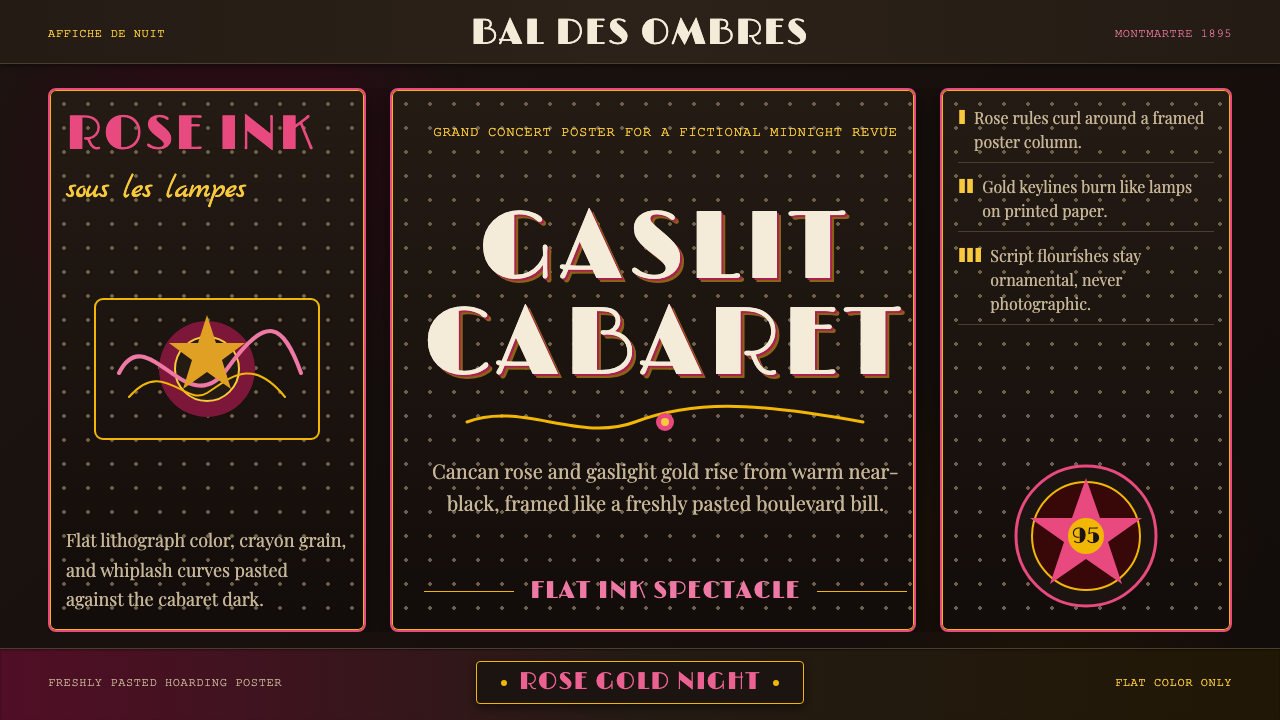 Belle Époque ParisCabaret night glows. Rose ink and gaslight gold curl across warm near-black p…歌舞厅之夜发光:玫红与煤气灯金在暖近黑海报框中卷曲。
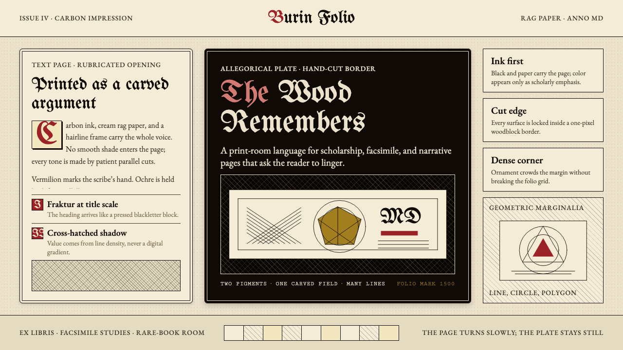 Dürer WoodcutInk remembers everything. Fraktur titles, rag-paper cream, and cross-hatched…木刻记住一切:哥特标题、破布纸奶油色与交叉排线。
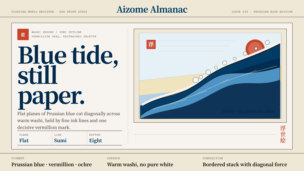 Edo Ukiyo-e (Hokusai)Flat power on paper. Prussian blue diagonals and vermillion seals cut across…纸上有力:普鲁士蓝对角线与朱红印章切入暖和纸。
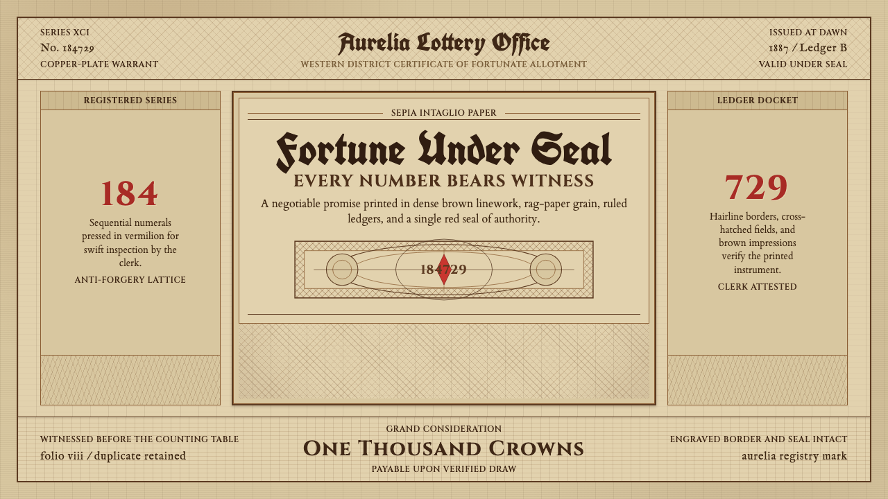 Engraved Lottery TicketLegal gravity in sepia. Guilloche borders, blackletter type, and a vermilion…棕褐里有法律重量。扭索边框、黑体题名与朱红封蜡。
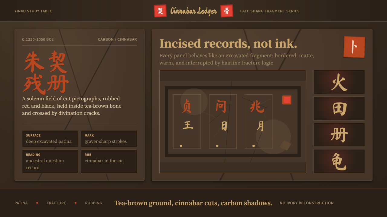 Oracle Bone 甲骨文Feels excavated, not restored. Tea-brown panels carry cinnabar glyphs and cra…不是复原而是出土:茶褐骨面承载朱砂字与卜裂纹。
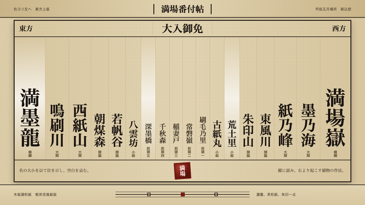 Sumo BanzukeCeremonial density. Sumi columns crowd tan washi; rank-scaled type meets one…仪式感来自拥挤:浓墨竖列铺满茶色和纸,字号按等级放大,朱印收尾。