What is Resident Evil?
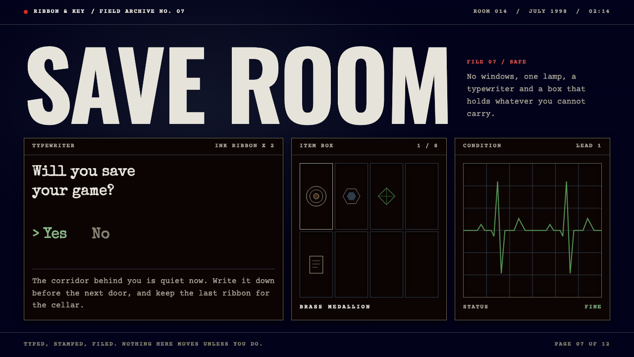
Resident Evil built dread out of restraint — a navy void, typewritten files and one green heartbeat line, with the monsters kept off screen.
Resident Evil in brief
The Resident Evil save-room style is a dark, low-light interface language drawn from the quiet screens of Capcom's 1996 PlayStation game, the title that gave the survival horror genre its name. It is not the language of the monsters or the gore. It is the language of the pauses between them: the inspection screen where an item turns slowly in a deep navy void, the small grid of inventory slots, the electrocardiogram line that reports your health, and the typewriter in the safe room that asks whether you would like to save your game.
Visually the style is built on a midnight navy ground, bone-white or typewriter-ink text, thin square frames, and a single herb-green signal colour reserved for status and life. Everything sits inside rectangular boxes with hard corners. Nothing glows, bounces or fades with flourish. Information is presented the way an archivist would present it: a memo, a label, a numbered slot, a line that rises and falls.
What makes the style distinctive is how much it withholds. Dread is created by low illumination, generous empty space and the implication that something is just outside the frame. For designers working on narrative, mystery or atmospheric pages, it offers a way to build tension without ever showing a threat — the mood comes from the interface itself.

Where does Resident Evil come from?
Resident Evil was released by Capcom in Japan in March 1996, with a North American release following days later. It was developed in Osaka and is most closely associated with director Shinji Mikami, working alongside producer Tokuro Fujiwara, a veteran of the company's earlier output. The story is set in July 1998: members of a special tactics unit called S.T.A.R.S., including Chris Redfield and Jill Valentine, are forced into an isolated mansion on the outskirts of a fictional American city, where they discover that something has gone badly wrong.
The game's look was shaped by the hardware of its moment. The PlayStation could not yet render large, richly detailed three-dimensional environments in real time, so the team used pre-rendered backgrounds: each room is essentially a painted still image, with characters drawn on top as polygonal figures. Fixed camera angles were chosen by the designers to frame each room like a film shot. The browns, blacks and blue-greys of those backgrounds, lit from low sources and heavy with shadow, are what gave the mansion its oppressive character.
The interface had to live alongside those images and do the opposite of competing with them. Menus were therefore kept spare. The inventory screen is a quiet panel; the item-inspection view floats an object in empty dark space; the health display is a small monitor trace whose colour changes with condition; found documents are presented as plain typewritten pages. The save point is a physical object in a calm room, which turns a technical function into a moment of relief and gives the series its lasting rhythm of tension and rest.
Historically the game sits at a junction of several traditions: fixed-camera adventure games, the haunted-house story, and early three-dimensional computer graphics on consumer consoles. Its influence on later horror games was enormous, and the template of safe rooms, scarce resources and slowly unfolding documents has been revisited ever since. The visual translation of that template into a design system — navy, typewriter, square frame, one green line — preserves what the original did best: making a screen feel like a place you are afraid to leave.
What defines the Resident Evil look?
Colour
The ground is a deep midnight navy that reads almost as black, a void rather than a background. Text and frames are bone white or a pale warm grey, like typed paper under a lamp. A single herb green is reserved for health and positive status, and it is the only saturated colour on the screen, which is exactly why it draws the eye. Warning states can shift toward amber and red, but sparingly, so that alarm still means something.
Typography
Body text imitates a typewriter: monospaced or typewriter-inspired letterforms, even spacing, no italic flourishes. Headings are short and plain, closer to file labels than to marketing headlines. Small caps-style labels and numbered references reinforce the sense of a case file. The text is never decorative; it is evidence.
Frames and layout
Everything lives in square-cornered boxes with thin frame lines. Inventory-style grids of equal slots organise items, with one slot highlighted at a time. Layouts are centred or quietly symmetrical, with wide empty margins around a single focal object. There are no rounded pills and no card shadows; depth comes only from darkness and framing.
Status indicators
The electrocardiogram line is the signature motif. A thin trace running across a small monitor panel communicates condition at a glance, changing its colour and rhythm as things get worse. In a web or app context the same idea becomes a heartbeat-style progress or health indicator: minimal, line-based, and honest about state rather than celebratory.
Motion
Movement is slow and deliberate. An item rotates gently in its void; a panel appears with a plain cut or a soft fade; a door-opening pause stands in for a loading state. Nothing snaps, bounces or overshoots. The pacing is part of the fear, because the user is made to wait slightly longer than is comfortable.
Mood and restraint
The defining quality is what is left out: no gore imagery, no glitch effects, no jump-scare gestures. Low light, empty space and implication do the work. The interface should feel like the one calm room in a dangerous building, a place where saving, reading and breathing are possible.

Who shaped Resident Evil?
Mikami directed the original Resident Evil at Capcom and is the creative figure most associated with it. His approach to pacing — scarce resources, claustrophobic spaces, long stretches of quiet punctuated by sudden danger — defined the template that gave survival horror its identity, and the calm-and-dread rhythm of the save room is part of that design philosophy.
Fujiwara produced the game and is credited among its key figures. A long-serving Capcom developer, he helped steer the project through its transition from an experiment into a flagship release, and his role underlines that the series grew out of the company's accumulated craft in adventure and action design.
The game was made at Capcom in Osaka. The team's decision to pair pre-rendered backgrounds with fixed cameras, and to make the interface deliberately austere, turned a technical limitation into a lasting visual identity that later horror designers would study and echo.
How do you use Resident Evil today?
For slide decks, the save-room style suits presentations that tell a story rather than report a metric: a post-mortem, a case study, a security briefing, or a launch narrative that starts with something going wrong. A cover slide works best as a single dark panel with a short typewritten title, a thin square frame and one green rule. Content slides should present one idea at a time, in a plain monospaced voice, with lots of empty navy around the text. Resist the urge to fill the space.
For web interfaces and dashboards, the inventory grid is the natural organising pattern. Settings, assets or records become equal-sized slots with one highlighted selection, and a small heartbeat line can display system health. Pricing pages can borrow the file-folder logic: each plan is a labelled document in a quiet box rather than a loud card. Keep the green for status and success only, so that when it appears, it carries information.
For editorial and marketing work, the style is excellent for interactive fiction, game-adjacent microsites, mystery newsletters and anything that benefits from a sense of discovery. Present articles as found documents, with a short typed heading and a muted body. A save-and-continue motif can turn a long-form reading experience into something that feels like progress through a place. The style rewards slowness, so it suits pages where readers are meant to linger.
For product interfaces more broadly, treat the save room as a metaphor for reassurance. Autosave states, backups, confirmations and recovery screens can use its calm framing to reduce anxiety at moments when users fear losing something. A short, plain question and two clear options is all it takes. Dark, quiet confirmation dialogs inherit the emotional logic of the original typewriter.
The most common mistake is to treat the style as a horror costume. Adding blood-red splatter, cracked textures, distressed fonts or flickering glitch effects destroys the restraint that makes it work; the original frightens by withholding, not by shouting. A second mistake is to spread the signal green across many elements, which dilutes its meaning. Keep the palette tight, the frames square, the margins wide and the motion slow.

Resident Evil — FAQ
Is this style about horror imagery?
No. It deliberately leaves out monsters, blood and shock effects. It is based on the game's quiet interface screens: the item inspection void, the inventory grid, the health monitor line and the typewritten documents. The sense of dread comes from low light, emptiness and restraint, which makes the style usable for serious narrative, security or mystery content without looking like a Halloween page.
Where does the typewriter and save-room idea come from?
It comes from the 1996 Capcom game, where safe rooms contain a typewriter that lets players record their progress. The moment is calm and slightly ritualistic, and it contrasts with the tension everywhere else. The design system adopts it as a metaphor: typed text, a quiet frame and a clear question stand for reassurance in an otherwise tense environment.
Can I use this style on a light background?
It is fundamentally a dark style. The navy void is what makes the green line and the pale text feel like signals. If you must adapt it to a light context, keep the structural elements — square frames, typewriter type, a single status colour, wide margins — and use a warm paper tone, but understand that you will lose the low-light tension that defines it.
How is it different from other dark UI styles?
Many dark interfaces use neon accents, glassy panels or gradients to look futuristic. This one does the opposite: it is flat, square, low in contrast and archival in feeling. Its accent colour is a calm green rather than an electric one, and its type is typewritten rather than technological. The result feels like a case file, not a cockpit.
What kinds of projects suit it best?
It works best for narrative-led pages: interactive fiction, mystery or true-crime content, game microsites, security and incident reports, and any experience where discovery and suspense matter. It is less suitable for cheerful consumer products, children's content or anything that needs to feel bright and energetic. When in doubt, ask whether the page benefits from atmosphere; if it does, this style is worth trying.
Related design styles
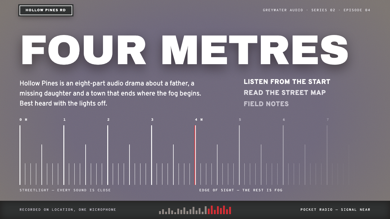 Silent HillQuiet dread, four metres deep. Lilac fog ground, white street-plate caps, red…
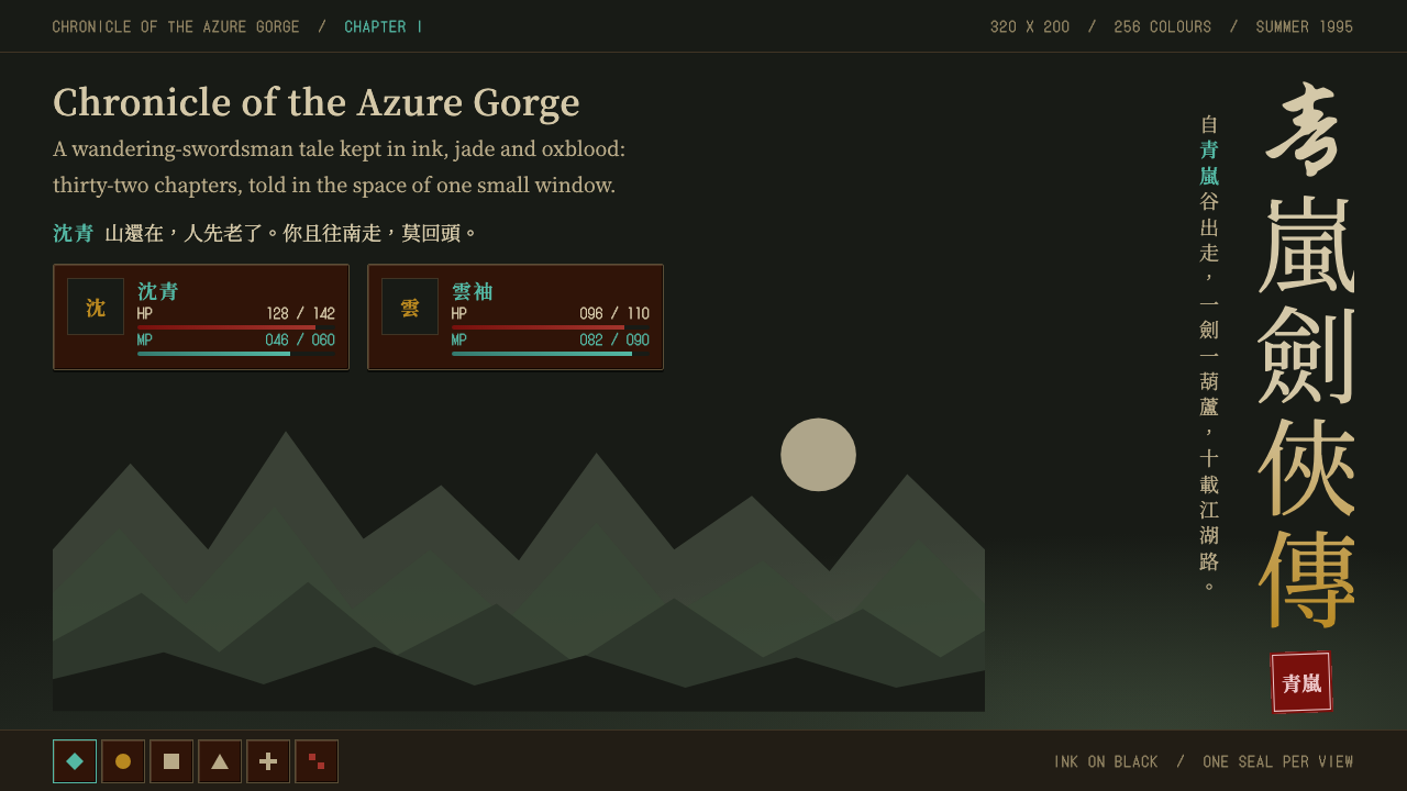 The Legend of Sword and FairyInk on black, closed by one red seal. Vertical brush title, oxblood panels, j…
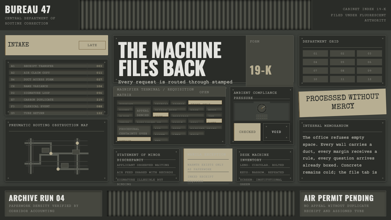 Brazil (1985)Bureaucracy turns hostile. Gray-green grids, duct bands, and manila stamps cr…
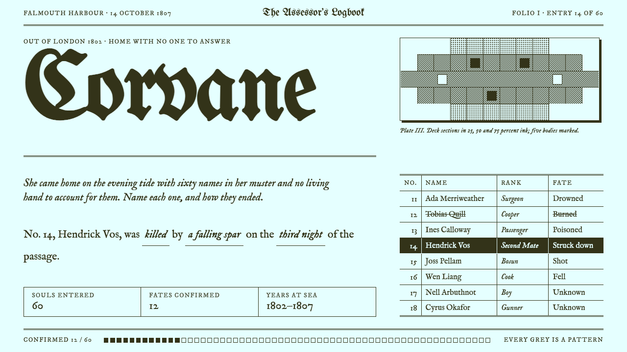 Return of the Obra DinnTwo inks, zero greys. Olive ink on cyan-white paper, blackletter titles, dith…
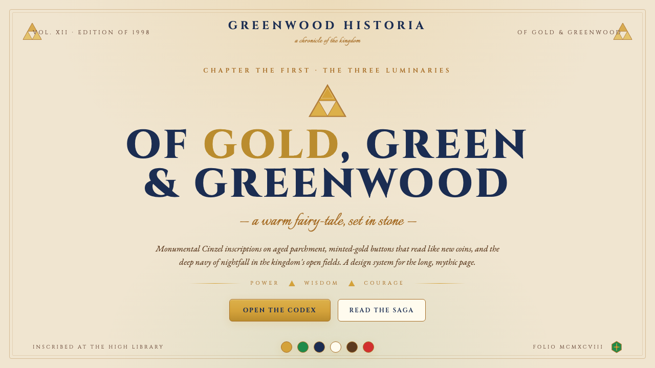 Zelda Ocarina of TimeWarm-fantasy mythology as a UI. Cinzel inscriptions on cream parchment, minte…
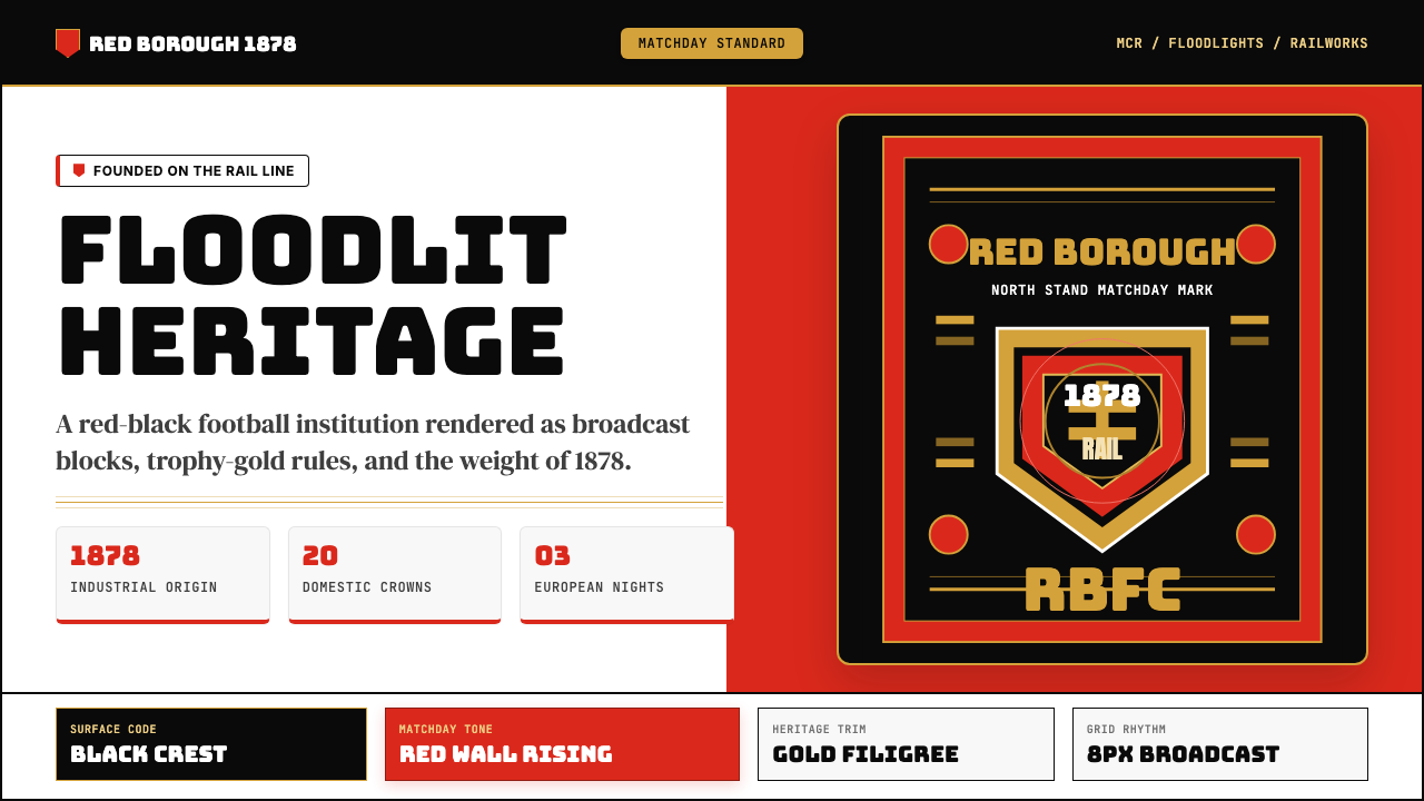 Manchester United (Red Devils)Heritage hits like a chant. Red-black blocks, Bungee type, and gold filigree…