What is EarthBound?
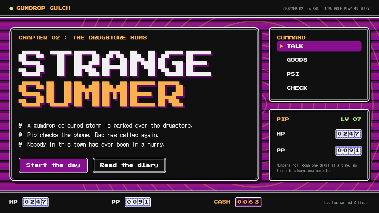
EarthBound design is calm on top and restless underneath: near-black rounded windows with double borders, floating over backgrounds that ripple in magenta and gold.
EarthBound in brief
EarthBound style is the visual language of MOTHER 2, the 1994 Super Famicom role-playing game known in North America as EarthBound. The game sends a kid in a baseball cap through a sleepy American-style town and into fights with hippies, cops and aliens. Its battles are staged in near-black rounded windows edged with white-and-grey double borders, floating over backgrounds that ripple, swirl and loop in magenta and gold.
The central idea of the style is contrast between two layers. On top sits a calm, highly readable text window, the same kind of window a player has seen for hours. Underneath, a hallucinatory background never stops moving. The quiet box keeps the player oriented while the loud background supplies personality, humour and a faint sense of unease.
As a design system, it asks for restraint in the interface and freedom in the backdrop. Text boxes stay dark, plain and consistent. Atmosphere comes from patterned fields in a deliberately narrow palette, accents are used sparingly, and numerals behave with a little mechanical charm, rolling like an odometer rather than jumping straight to their new value.

Where does EarthBound come from?
MOTHER 2 was released in Japan on 27 August 1994 for the Super Famicom, with the North American release following in 1995. It was written and directed by Shigesato Itoi, a Japanese writer and copywriter known beyond games. Satoru Iwata is credited among the key figures for his technical work on the project, while Keiichi Suzuki and Hirokazu Tanaka are associated with its music. The source material places the work in Tokyo and Kyoto, two cities that stand for the Japanese video game industry of the time.
The game belongs to the wave of sixteen-bit Japanese RPGs on the Super Famicom, but it deliberately departs from the swords-and-dragons conventions that dominated that wave. Instead of a medieval fantasy world, it presents an affectionate parody of American suburbia, filled with drugstores, burger joints, local bullies and eccentric neighbours. That gentle, satirical lens is a large part of why the game is remembered.
Its battle backgrounds draw from a third source: the psychedelic art of the 1960s and 1970s. Swirling, looping, colour-shifting patterns fill the screen behind the combatants, evoking posters and album sleeves of that era. The backgrounds are not scenery in the usual sense; they move, warp and pulse, and they change from one enemy to the next. Against them, the interface windows are the one stable element.
That pairing, a strict, conservative interface laid over a wild background, is what a design system inherits. The windows keep the plain readability that Japanese console RPGs had established, while the background layer lets the style be more eccentric than most of its peers. It is a style about deadpan humour: serious boxes, ridiculous contents.
What defines the EarthBound look?
Near-black rounded windows
Panels are almost black, with softly rounded corners. They are the readable layer of the whole system and carry all dialogue, commands and statistics. Because they are so dark and uniform, they sit calmly over even the busiest background.
White-and-grey double borders
Each window is bordered twice: a bright outer line and a softer grey inner line. The double edge gives the panel a subtle embossed depth without any shadow or gradient, and it is the most recognisable single detail of the interface.
Restless psychedelic backgrounds
Behind the windows, patterned fields in magenta and gold ripple and loop continuously. The backdrop is an animated texture rather than a picture, and its slow, repeating motion supplies energy without competing for attention with the text above it.
Magenta bands and gold pixel titles
Magenta banded fields and gold pixel-lettered titles form the main colour accent pair. Gold marks headings and important labels, while magenta fills the background bands. Other accents, such as the neon green associated with the dream-like place called Magicant, appear only in small touches.
Two pixel typefaces
A bold pixel face, Press Start 2P, handles commands, headings and numerals, while a lighter pixel gothic, DotGothic16, carries long reads and Japanese text. The pairing gives the page a clear division between labels that are glanced at and passages that are actually read.
Rolling odometer meters
HP and PP numbers do not drop instantly when damage lands. They roll down digit by digit like an odometer. The effect turns a statistic into a small drama and gives the player a moment to react, which is a gentle, humane approach to interface feedback.

Who shaped EarthBound?
Itoi wrote and directed MOTHER 2. A writer and copywriter by background, he brought a deadpan, observational humour to the game, and the affectionate parody of American suburbia is his signature. The contrast between serious boxes and absurd content in the style traces directly to his tone.
Iwata is credited among the key figures for his technical contribution to the project. His work helped the Super Famicom run the game's animated battle backgrounds, which are central to the style's restless lower layer.
Suzuki is one of the two composers associated with the soundtrack. The music shares the game's habit of mixing the familiar and the strange, which parallels the visual pairing of plain windows and warped backgrounds.
Tanaka is the other composer credited among the key figures. Together with Suzuki he gave the game a soundscape that matches its visual eccentricity, showing how a whole identity can be built from a handful of constrained elements.
How do you use EarthBound today?
For slides, this style suits talks about games, culture, humour, internet nostalgia and creative work that wants to feel playful but still clear. A title slide can use a magenta and gold patterned background with a single near-black window in the centre holding the title in gold pixel type. On content slides, keep every piece of text inside a dark double-bordered window and let the background do the decorating. For data slides, put the number in a window and let it count up or down like an odometer instead of simply appearing.
For websites and product interfaces, it works well on game pages, fan communities, creative portfolios, event microsites and onboarding flows that benefit from a gentle storytelling tone. Dialogue-style tooltips, command menus and status panels all map naturally onto the window system. Use the lighter pixel gothic for anything that has to be read at length, and keep the bold pixel face for short commands and numbers.
For editorial and marketing work, it gives posters, social posts and email headers a warm, slightly strange character. A dark window with a single line of text over a rippling magenta backdrop can announce a release, a date or a joke. Accent colours such as neon green or gold-clay tones should be used for single focal points, never for whole sections.
The most common mistake is to let both layers be loud. If the windows have bright colours, strong shadows or busy patterns, the contrast that defines the style disappears. The second is to freeze the background: the restless motion underneath is half the personality, and even a slowly shifting pattern is better than a static image. A third mistake is to ignore performance and accessibility: moving backgrounds should be slow, low in contrast with the windows, and switchable to a still version for people who prefer reduced motion.
The practical rule is simple. Keep the windows calm, dark and double-bordered; keep the backdrop strange; keep the accents few. If a viewer can read every word comfortably while feeling slightly dizzy at the edges, the style is working.

EarthBound — FAQ
What is the difference between MOTHER 2 and EarthBound?
They are the same game. MOTHER 2 is the Japanese title, released on the Super Famicom on 27 August 1994, and EarthBound is the title of the North American release that followed in 1995.
Who created EarthBound?
It was written and directed by Shigesato Itoi. Satoru Iwata is credited among the key figures for technical work, and Keiichi Suzuki and Hirokazu Tanaka are associated with the music.
Why are the backgrounds so psychedelic?
The battle backgrounds draw on the psychedelic art of the 1960s and 1970s. Their swirling, looping patterns contrast deliberately with the plain text windows above them, which gives the game its signature mix of calm and weirdness.
Which fonts does this design system use?
Press Start 2P is used for commands, headings and numerals, and DotGothic16 is used for long reading text and Japanese. The two pixel faces divide the page into quick labels and readable passages.
How should the HP and PP meters behave?
They should roll like an odometer instead of dropping instantly, digit by digit, so a change feels like a small event. This is a signature behaviour of the original game and a gentle way to give feedback in modern interfaces.
Related design styles
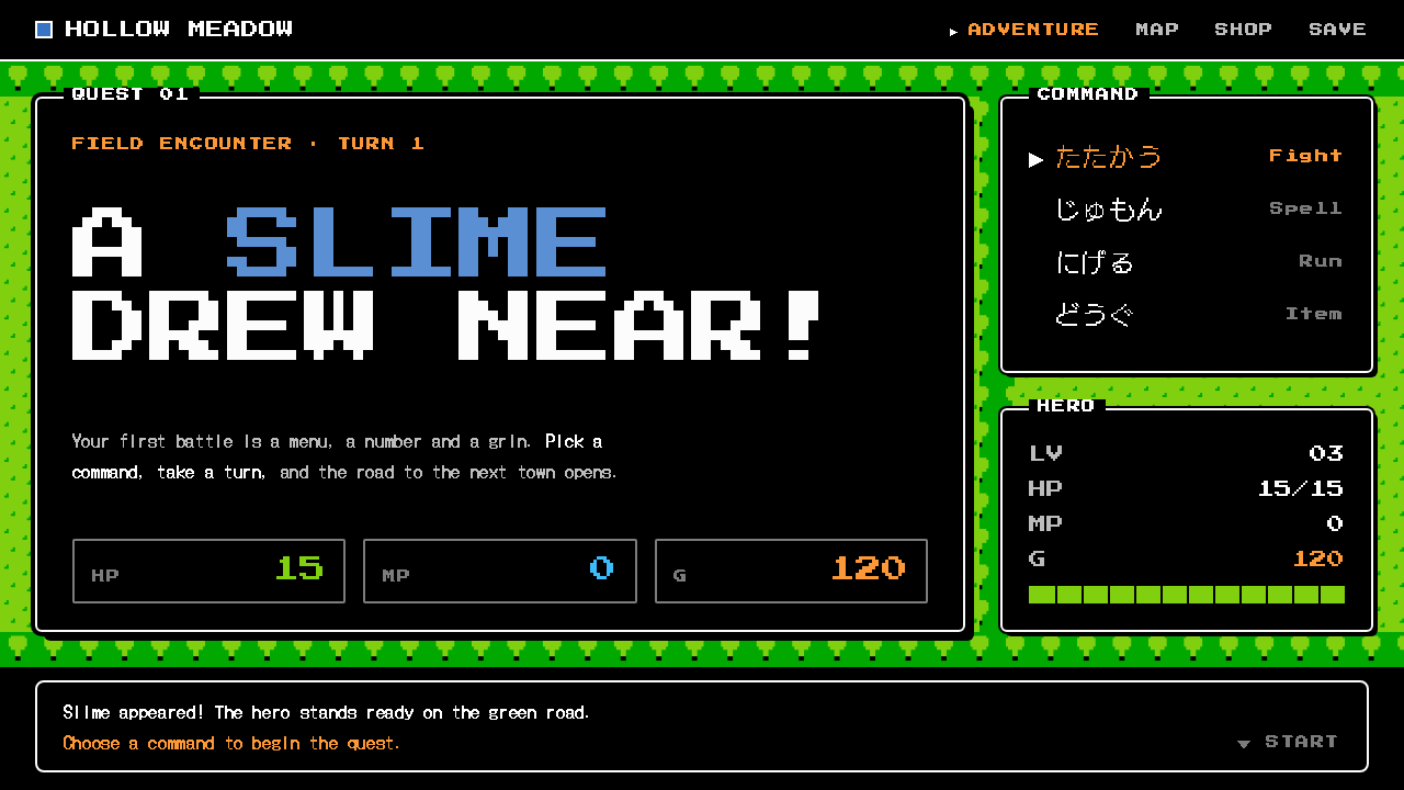 Dragon QuestA black window, a white rule, a ▶ cursor. Flat NES color chips over a green t…
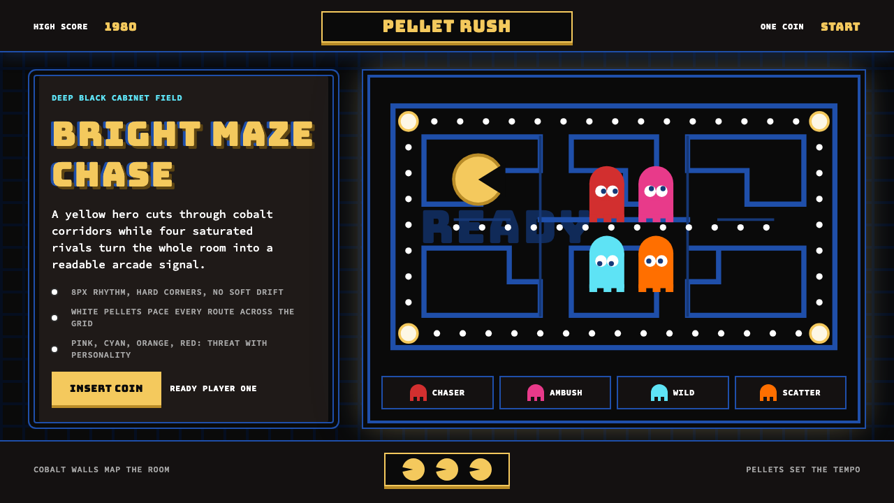 Pac-Man (Namco 1980)Arcade joy burns bright. Yellow disc, cobalt maze, and four ghost hues snap o…
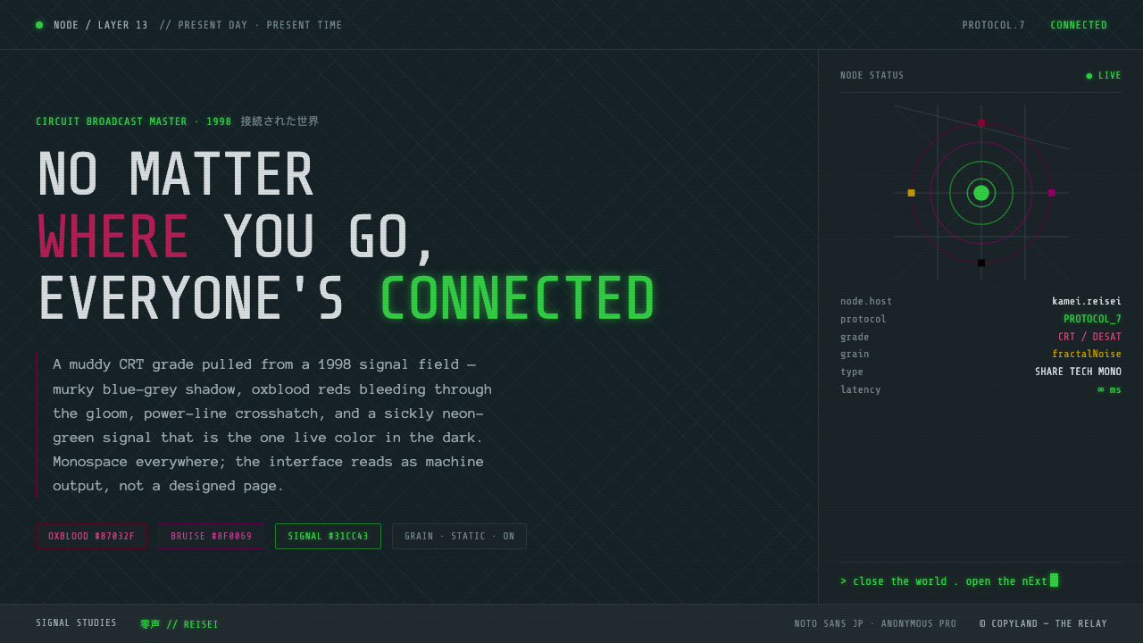 Serial Experiments LainMuddy CRT dread from the 1998 Wired. Blue-grey murk, oxblood reds, one sickly…
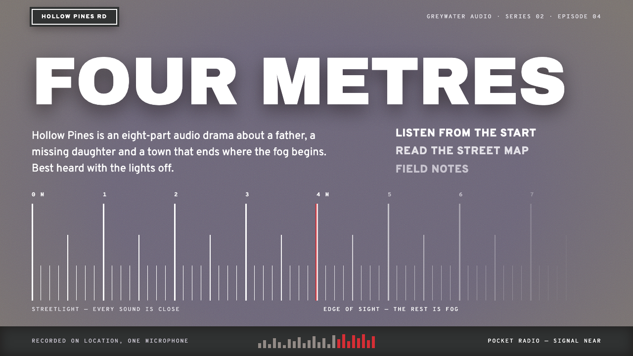 Silent HillQuiet dread, four metres deep. Lilac fog ground, white street-plate caps, red…
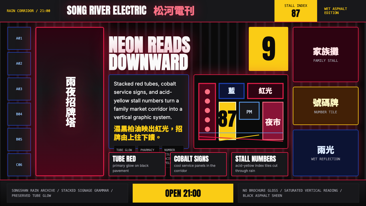 Taiwanese Raohe Night Market NeonTaipei night reads vertically. Neon red, cobalt panels, and acid-yellow numbe…
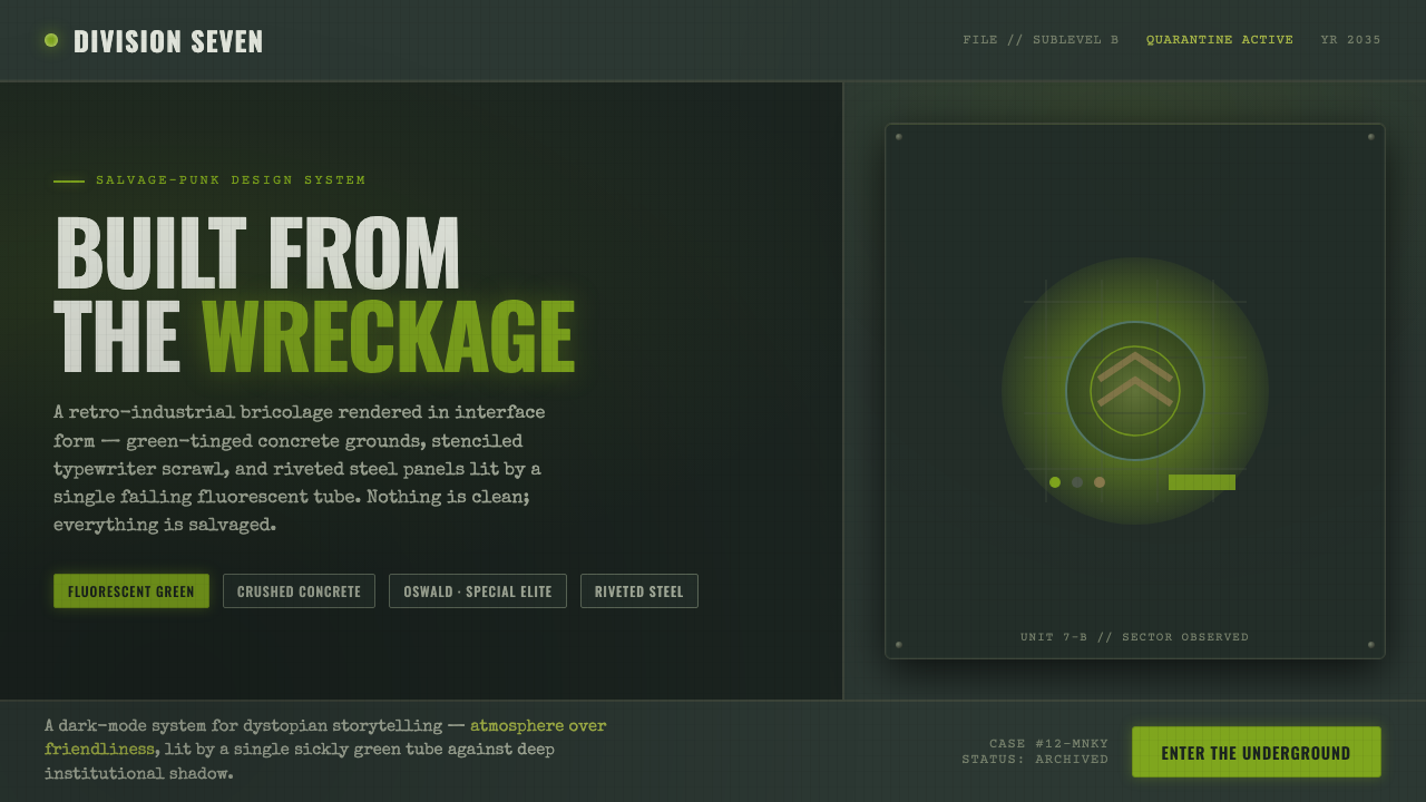 12 MonkeysBuilt from the wreckage. Sickly fluorescent green on crushed-black concrete,…