What is Serial Experiments Lain?
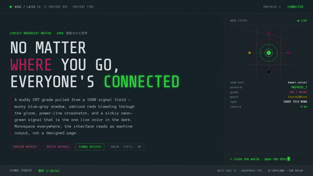
Muddy CRT dread turns a dark interface into a haunted signal: blue-grey shadow, oxblood interruption, terminal type, and one sickly green light that feels less like decoration than evidence.
Serial Experiments Lain in brief
Serial Experiments Lain is a thirteen-episode anime from 1998 that meditates on identity, isolation, and the dissolving boundary between the physical world and the Wired. Its visual language is not sleek futurism. It is a broadcast signal that seems worn, overheated, and faintly contaminated: deep blue-grey shadows, film grain, power-line crosshatch, and humming static establish unease before any accent color appears.
The palette cuts through that murk with restraint. Oxblood and magenta-oxblood provide moments of bodily warmth and danger, while rust and golden-brown suggest old hardware, sodium light, or a room seen after midnight. Sickly neon green is reserved for the feeling of a live signal: a status, a trace, a message, or something that has noticed the viewer. The contrast is emotional as much as visual.
As a design system, the style translates this atmosphere into a dark, terminal-flavored vocabulary. Monospaced type, subdued hierarchy, low-contrast surfaces, static-like texture, and isolated luminous accents create an interface that feels inhabited by a network rather than decorated for one. The goal is not to make every element dramatic. It is to make the quiet parts feel watchful.
Where does Serial Experiments Lain come from?
The source places Serial Experiments Lain in East Asia, specifically Japan, with a 1998 broadcast date. That position matters because the style belongs to a particular threshold moment: digital networks were becoming culturally imaginable, yet the screen still carried the physical character of television hardware. The result is neither nostalgia for analog media nor confidence in a clean digital future. It is a visual language for uncertainty, built from the friction between a human body and an impersonal system.
Its broader lineage runs through design from the 1990–2010 period, especially late-90s digital-anxiety anime. The phrase digital anxiety describes more than a subject matter. It suggests a mood in which connection can intensify isolation, information can feel like pressure, and a technological surface can become psychologically intimate. The palette therefore avoids polished metallic futurism. It prefers muddiness, shadow, and imperfect transmission, allowing the interface to feel unstable without becoming visually chaotic.
The Wired and Navi cyber-mysticism provide the system’s conceptual center. The network is not treated merely as a technical utility or a bright science-fiction cityscape. It becomes a parallel condition of existence, one that complicates identity and makes the boundary between the physical world and the connected world difficult to hold. In design terms, this supports interfaces that feel partly operational and partly occult: labels, signals, and status cues are clear enough to read, but never entirely free of mystery.
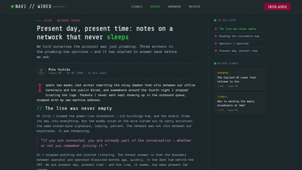
The CRT-era TV aesthetic completes the origin story. Film grain, blue-grey darkness, crosshatched power lines, and static noise make the screen feel like a material object with a history. Translating that broadcast-master murk into contemporary work means preserving its restraint. Texture should sit inside the atmosphere, not become a decorative overlay. Light should appear as a signal breaking through darkness, not as a general polish applied evenly across the page.
What defines the Serial Experiments Lain look?
Blue-Grey Murk
The ground is dark, cool, and desaturated rather than absolute black. Deep blue-grey shadow gives the interface a submerged quality, as if every panel is being viewed through a tired screen. Surfaces should remain close enough in value to create uncertainty, while text and meaningful controls emerge through careful contrast. The atmosphere depends on resisting the usual dark-mode instinct to make every layer crisp, glossy, and immediately separate.
Oxblood Interruption
Oxblood red and magenta-oxblood are not cheerful accents. They cut into the blue-grey field with the weight of flesh, warning, or emotional pressure. Use them for moments that need to feel consequential: a broken connection, a dangerous state, a sudden emphasis, or a visual block that interrupts passive reading. Their strength comes from scarcity. If red becomes the background mood, it loses the sense of intrusion that makes it distinctive.
Terminal Typography
Monospaced type supplies the system with its machine-like voice. It makes labels, metadata, and short status messages feel addressed by an instrument rather than by a soft editorial narrator. Type should be compact in tone but not cramped in reading. A restrained hierarchy works best: one dominant voice, small shifts in scale and brightness, and occasional stronger treatment for warnings or signals. Typography carries the interface’s psychological tension.
CRT Texture
Film grain, faint static, and power-line crosshatch turn a flat interface into a physical transmission. These marks should be sensed before they are consciously noticed. They are atmospheric evidence of the screen, not illustrations of a screen. Overly sharp noise becomes retro decoration; overly prominent scan-like patterning makes the content difficult to use. The authentic effect is muddy, persistent, and slightly uncomfortable.
Sickly Green Signal
The recurring neon green is the system’s rarest and most active light. It should feel like something has powered on inside the darkness. Use it for live states, confirmations, traces, or fragments that need to suggest network presence. It is not a friendly success color and should not be spread across every interactive element. The green works because the surrounding interface remains subdued and because its brightness feels slightly unhealthy.
Low-Contrast Depth
Depth comes from patient layering rather than bright separation. A panel may be distinguished from its surroundings through a slight shift in blue-grey tone, a thin line, a texture change, or a concentrated accent. Not every container needs to announce itself. This creates the feeling of a network whose structure is present but only partly visible. The hierarchy should reveal itself gradually, rewarding attention instead of shouting over the atmosphere.
Who shaped Serial Experiments Lain?
Yoshitoshi ABe is named among the key figures for this style. In Curio’s reference system, the name anchors the human and psychological side of the visual language: isolation, identity, and the uneasy presence of a person inside a network. Designs associated with this reference should therefore preserve vulnerability beneath the machinery. The interface can feel technical without becoming emotionally anonymous.
Ryūtarō Nakamura is one of the three key figures identified by the source. His place in the reference points toward the composed audiovisual atmosphere of Serial Experiments Lain: darkness is not empty space, and silence is not a lack of information. A useful adaptation lets pacing, stillness, and intermittent signal carry meaning. The design should leave room for unease to accumulate rather than explaining every state immediately.
Chiaki J. Konaka completes the source’s trio of key figures. The associated design lesson is conceptual as much as visual: the network can be treated as a space of belief, identity, and dissolving boundaries, not merely as a technical backdrop. This supports language that is precise but slightly uncanny, and layouts that make operational information feel connected to a larger unseen system.
How do you use Serial Experiments Lain today?
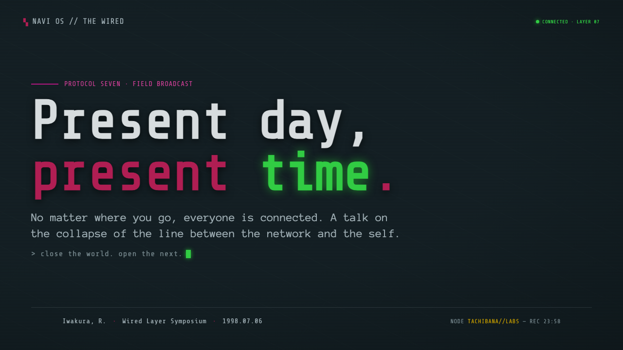
For presentation work, let the cover establish the haunted transmission before the content becomes dense. A nearly black or blue-grey field can hold a restrained title in monospaced type, with one oxblood interruption or a narrow sickly green signal providing the visual event. Content slides should remain quieter: use low-contrast panels, short terminal-like labels, and a small number of deliberate accents. Data slides can treat charts as signal traces, allowing one active color to identify the meaningful change while the rest recedes into the murk.
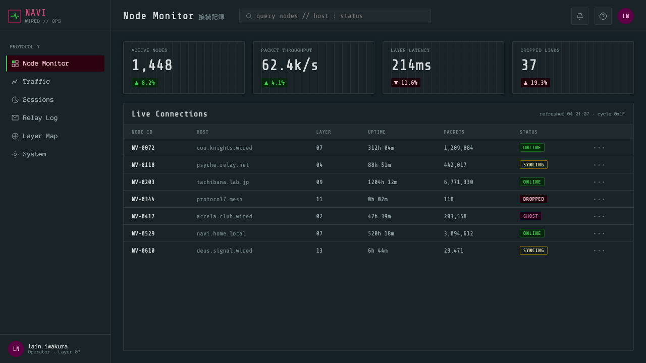
For web interfaces, the style suits dashboards, monitoring tools, and pricing pages that want to feel infrastructural rather than polished. Dashboards can use blue-grey layering for inactive information, oxblood for failures or consequential states, and sickly green for a live connection or confirmed presence. Pricing pages should resist bright promotional gradients. Make the plans feel like access levels inside a system, using typography, subdued borders, and carefully rationed signal color to establish hierarchy.
For editorial and marketing work, the system creates a strong contrast between readable information and an atmosphere of isolation. Articles can pair a narrow text measure with generous dark margins, static-like texture, and occasional metadata presented as terminal fragments. Marketing pages can use large quiet fields, abrupt red interruptions, and one green highlight to make a launch, announcement, or product state feel like an intercepted transmission. Imagery should support the mood rather than compete with the type and signal accents.
The common mistake is confusing CRT atmosphere with a pile of retro effects. Heavy noise, constant glow, aggressive red, and too many green indicators flatten the hierarchy and make the work look like a theme rather than a world. Another mistake is making every surface equally dark and equally low contrast, which turns unease into simple illegibility. Keep the murk selective, let text remain dependable, and reserve the brightest signal for moments that deserve suspicion or attention.
Serial Experiments Lain — FAQ
Is this style simply cyberpunk?
Not quite. It shares the networked subject matter and terminal vocabulary of cyberpunk, but its emotional register is muddier and more inward. The visual system is built around isolation, identity, and the dissolving boundary between the physical world and the Wired. It does not depend on bright city lights, polished machinery, or constant technological spectacle. Its defining mood is a contaminated broadcast signal quietly becoming personal.
How can a dark interface remain readable?
Keep the atmosphere low contrast, but do not make essential text equally faint. Use blue-grey shifts, restrained lines, and texture to separate secondary layers, then give primary content a dependable tonal presence. The style works through selective obscurity, not universal obscurity. Users should sense that the system is shadowed while still knowing where to read, what changed, and which action matters.
Should sickly neon green be used for every interactive state?
No. Its meaning depends on scarcity. Reserve it for a live signal, confirmed presence, trace, or moment that feels as if the network has become active. If every button, link, and success state glows green, the color becomes ordinary and friendly, which contradicts the style’s uneasy character. Most interactions should be carried by typography, subdued contrast, or quiet structural change.
What is the purpose of the CRT texture?
It gives the interface a material transmission history. Grain, static, and crosshatch suggest that the screen is not an invisible window but a physical surface carrying a signal. The texture should support the blue-grey murk and make the page feel slightly persistent or contaminated. It should never overpower the content. When users notice the effect before they notice the message, the texture has become decoration instead of atmosphere.
Related design styles
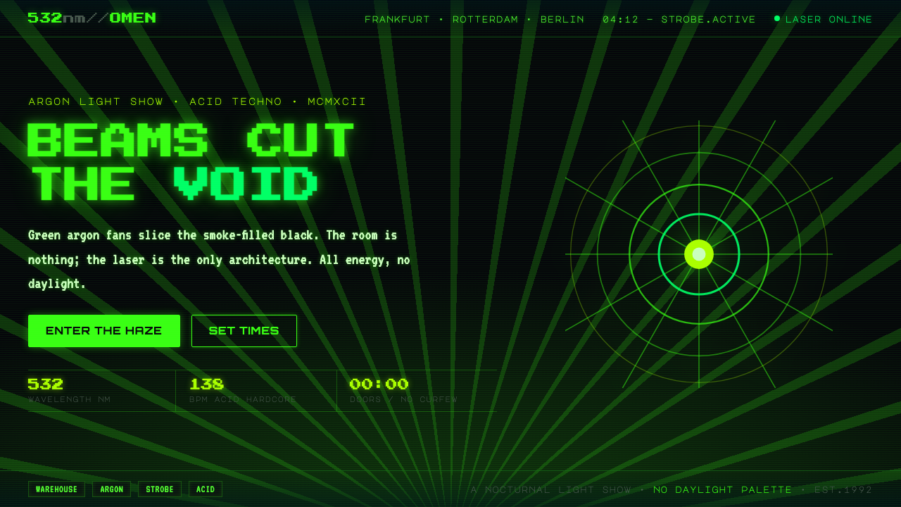 Acid Rave Laser Show 1992Beams cut the void. Argon green on pitch-black smoke, pixel marquee type, add…
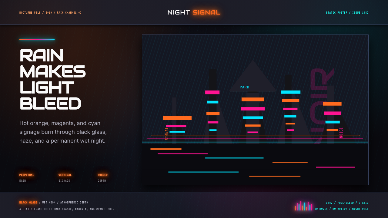 Blade Runner 1982 Neon NoirRain-soaked noir. Orange, magenta, and cyan neon cut black glass.
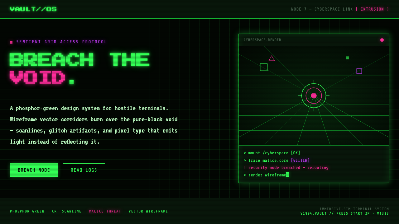 System ShockHostile retro terminal. Phosphor-green wireframes burn over black, magenta ma…
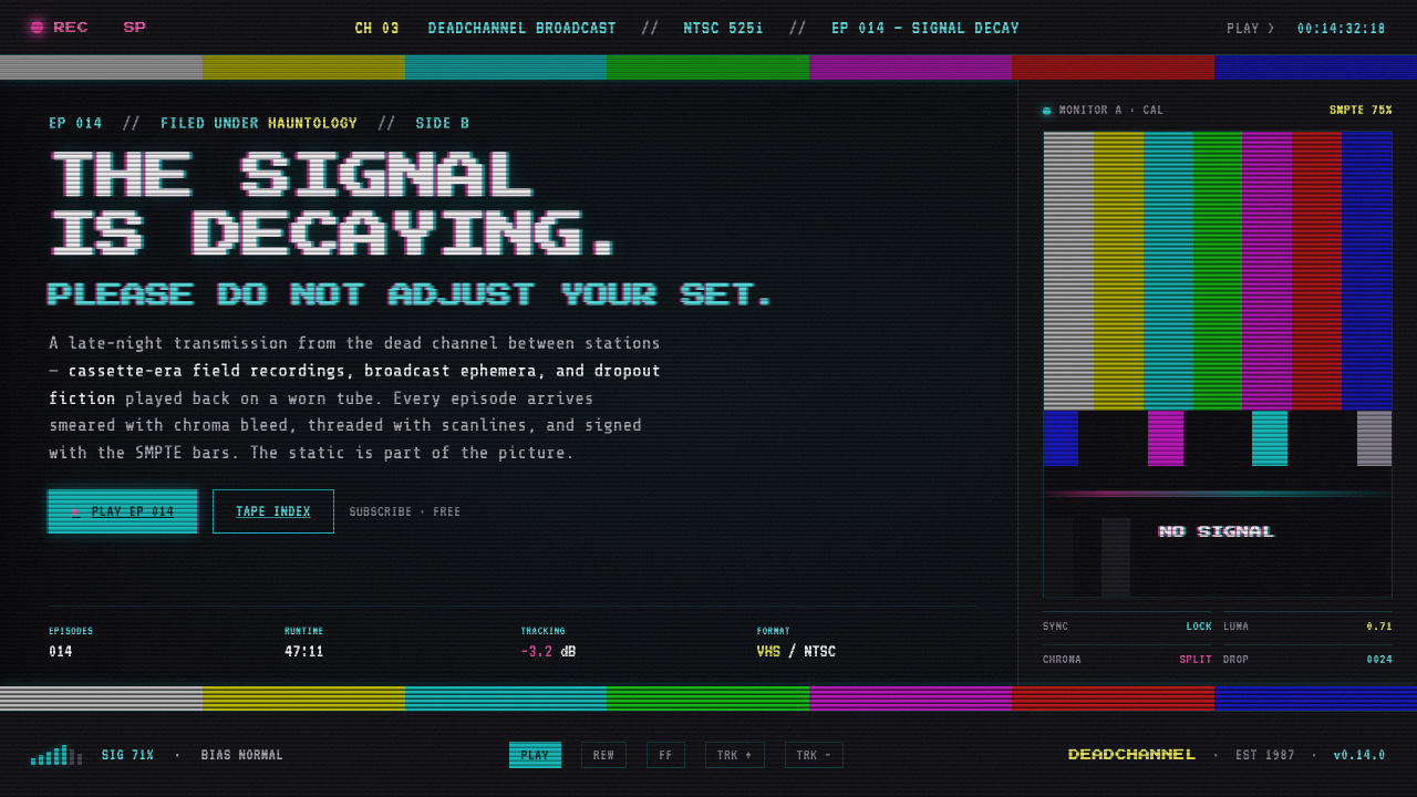 VHS Glitch TapeThe signal is decaying, on purpose. SMPTE color bars, scanlines, chroma split…
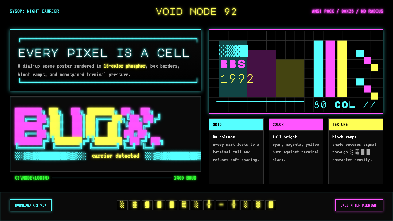 ASCII Art BBS (1992)Terminal art hits hard. Cyan-magenta-yellow glow, box borders, block ramps.
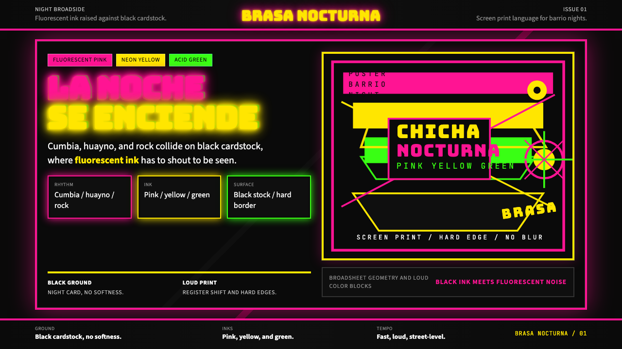 Peruvian Chicha Fluorescent PosterStreet-night fury. Pink, yellow, and green stack on black cardstock in hard b…