What is Demoscene?
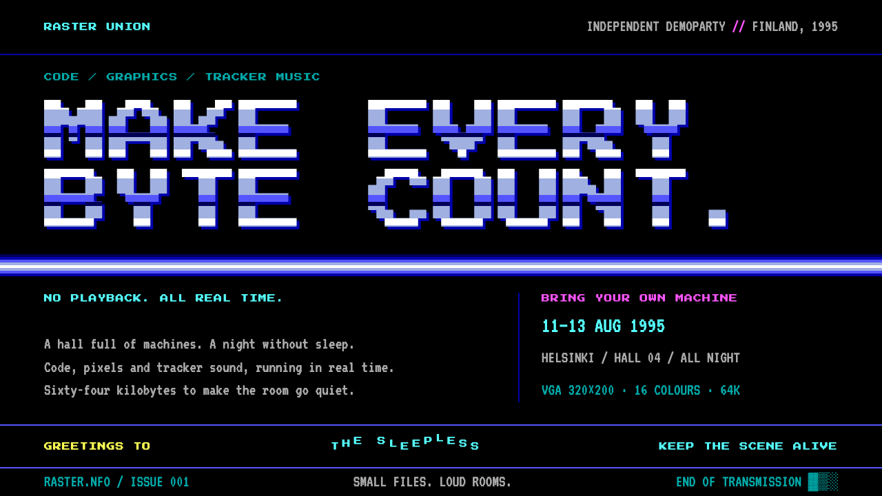
The demoscene look is a black CRT screen where every byte had to earn its place, so light cyan type, banded chrome and bitmap letters glow against nothing at all.
Demoscene in brief
Demoscene is the visual language of the PC demoscene of the 1990s, the subculture in which young programmers, musicians and pixel artists competed at gatherings called demoparties to produce real-time audiovisual programs, or demos, that squeezed as much spectacle as possible out of limited hardware. The look is that of a black CRT monitor driven by a VGA PC: pure black surfaces, a small fixed palette of saturated colors, bitmap lettering and hard, stepped gradients.
Its defining constraint is scarcity. A demo was judged by what it could do within tight limits of memory, speed and sometimes file size, so every visual device was a technique rather than a decoration. Colors came from the sixteen-step CGA and VGA palette, not from an unlimited spectrum. Gradients were built from visibly separate bands, like copper bars on the screen. Motion happened in hard frames and palette cuts, never soft easing, because the machine did not have time to be gentle.
Seen as a design system, it is an unusually coherent one. There is a text-mode body face for information panels, a chunkier arcade face for scrolling banners, a handful of named colors with fixed jobs, square corners everywhere and a total absence of blur or soft shadow. It suits games, music projects, hackathons, technical communities and anything that wants to signal craft, nostalgia and a love of the machine.

Where does Demoscene come from?
The demoscene grew out of earlier computer subcultures. In the 1980s, groups that cracked games added little animated introductions to their releases, and over time those intros became the point: programmers began to make standalone audiovisual pieces to show off skill. By the 1990s the PC had become a main arena, and the community organized itself around parties where groups met in person, often in large halls with rows of computers, and stayed up for several nights finishing entries for competitions.
The Nordic countries were the center of gravity. The Party, held in Denmark from 1991 to 2002, and Assembly, held in Finland from 1992, were the principal PC demo events of the decade. A crowd of teenagers and young adults, programmers, tracker musicians and pixel artists, carried their own machines into a sports hall and worked through the nights to deliver a program that ran live. In that setting the peak PC demo look, roughly from 1993 to 1997, took shape.
The landmark is Second Reality by the group Future Crew, which won the PC demo competition at Assembly in 1993 and is still treated as a benchmark of the culture. Members associated with that scene include Sami Tammilehto, known as Psi, and the musicians Jonne Valtonen, known as Purple Motion, and Peter Hajba, known as Skaven. The music of such productions was written in tracker formats such as MOD and S3M, and the sibling traditions of ANSI and BBS art contributed the habit of drawing with text characters and blocky color.
What the style preserves is the particular atmosphere of that screen: a black void, a few vivid colors that look electric because nothing else competes with them, and an aesthetic that treats technical limits as an opportunity for style. It is nostalgic, but it is also a tidy lesson in how constraint produces a coherent visual identity.
What defines the Demoscene look?
Black ground
Every surface is pure black. There are no dark greys, no tinted backgrounds and no textures, because a CRT showing nothing is simply black. This is what makes the colors seem to emit light: they are not painted onto a page but lit on a dark screen. Panels are distinguished by borders and by the color of their contents, not by a change in background.
Sixteen-step palette
Color comes only from the classic CGA and VGA sixteen-step palette, and each color has a job. Light cyan marks headings, bright blue fills panels, a periwinkle metallic tone is used for chrome and logos, magenta appears as beat flashes, and yellow is reserved for greetings and credits. The colors are saturated and unblended, so adjacent hues clash on purpose, in the way old hardware made them clash.
Bitmap type
Two bitmap faces do all the work. VT323 imitates the eighty-column text mode of a PC, and it carries body copy and the information panels known as NFO files. Press Start 2P, a chunkier arcade-style face, is used for scroller lettering and banners. Both are set with sharp pixel edges, and neither is smoothed or italicized. Text should look as if it were written to a character grid.
Banded gradients
Gradients are not smooth. They break into visible horizontal bands, like the copper bars that demos drew by changing the background color line by line. A chrome logo is a stack of distinct stripes shifting from light to dark and back, giving a metallic impression without a single blend. The result is flashy and unmistakably digital.
Square geometry
Corners stay square, borders are single-line frames, and shapes align to a grid. There are no rounded rectangles, no pills and no soft shadows. Panels sit like text-mode windows, with box-drawing borders and tidy margins. The geometry reinforces the sense that everything was placed by a machine with a grid in mind.
Hard motion
Motion moves in hard frames and palette cuts rather than easing. A highlight jumps from one state to another, a color flashes on a beat, a scroller crawls across the screen at a constant rate. There are no fades, springs or blurs. Where movement appears, it should feel stepped and rhythmic, tied to a beat as if driven by tracker music.

Who shaped Demoscene?
Future Crew was the demogroup behind Second Reality, which won the PC demo competition at Assembly in 1993. The production is widely treated as a benchmark of the culture, and it fixed in the public imagination what a polished PC demo could look and sound like.
Known by the handle Psi, Tammilehto is among the people associated with Future Crew and the Finnish demoscene. Handles like his are part of the style's culture: members were known by short aliases rather than by their given names.
Valtonen, known as Purple Motion, is one of the musicians associated with Future Crew. Tracker music of this kind, written in formats such as MOD and S3M, is half of what makes a demo feel like a demo, and the beat-driven flashes of the visual style respond to it.
Hajba, known as Skaven, is another musician associated with Future Crew and the tracker-music tradition. The demoscene treats music, code and graphics as equal crafts, which is why the visual system is built so clearly around sound-driven timing.
How do you use Demoscene today?
Demoscene works best where an audience already understands the reference and enjoys it: games, music projects, hackathons, developer communities and technical showcases. It carries a strong signal of craft and nostalgia, and it rewards a committed treatment. Half-measures, such as a black background with a single neon accent, simply read as a dark theme.
For presentation slides, a cover can be a pure black screen with a banded chrome title, light cyan subheading and a line of scrolling-style text along the bottom edge. Content slides should look like text-mode screens: a bitmap body face, panel borders in a single line, headings in light cyan and a clearly bounded list of items. Data slides suit stepped bar charts built from distinct bands, with each series assigned one palette color and no gradients or glows beyond the banding.
For web interfaces, treat each section as a text-mode window. Use the bitmap body face for copy, reserve the arcade face for banners and short titles, and keep corners square. Navigation can look like a menu bar of capitalized words, with the active item inverted rather than animated. Dashboards and leaderboards fit especially well, since an NFO-style panel is naturally a table of names and numbers. Pricing pages should keep plans as bordered blocks with a bright-blue fill and one highlighted tier in yellow.
For editorial and marketing work, use the style for event pages, release notes, game announcements and music drops. A greetings list set in yellow, a credits block in light cyan and a magenta flash on a key beat can structure a long page. Keep copy short and technical in tone, in the way an NFO file lists its contents.
The most common mistake is softening it. Rounded corners, drop shadows, smooth gradients or light-weight anti-aliased typography break the illusion at once. The second is using too many colors at once; each color has a role, and when everything flashes nothing does. Finally, avoid applying it to content that must feel calm or institutional, where the high-contrast glow can be tiring and the retro reference may distract.

Demoscene — FAQ
What is a demoparty?
A demoparty is a gathering where people who make demos, along with programmers, musicians and pixel artists, meet to compete and socialize. In the 1990s, events such as The Party in Denmark and Assembly in Finland drew crowds who brought their own computers, stayed up through the nights and finished real-time audiovisual programs for competitions. The Demoscene style draws directly from the screens produced in that environment.
Why are the gradients broken into bands instead of smooth?
Because the original look came from hardware limits. Demos drew bands of color, often called copper bars, by changing a background color line by line, and the limited palette meant steps were visible. The style keeps that banding on purpose: it reads as metallic and digital, and it signals that the surface was made by a technique rather than painted with a soft brush.
Can I use a lighter background?
The reference is a dark system by definition: pure black is what makes the palette look luminous. A light background would require reassigning the colors and loses much of the effect. If you need a light variant, treat it as a different design, for example a paper-like terminal print, rather than as a recolored Demoscene.
Which fonts does the style use?
It uses two bitmap-style faces: VT323 for body text and NFO information panels, imitating a PC text mode, and Press Start 2P for scroller lettering and banners. Both should be set at sizes that keep their pixel edges crisp, without smoothing, italics or added shadows.
Is it only suitable for retro or gaming projects?
Nostalgia is its strongest register, so games, music and hacker culture are the natural homes. It also works for developer tools, technical conferences and creative-coding showcases that want to signal craft. It is a poor choice for finance, healthcare or any context where a calm and trustworthy tone matters more than personality.
Related design styles
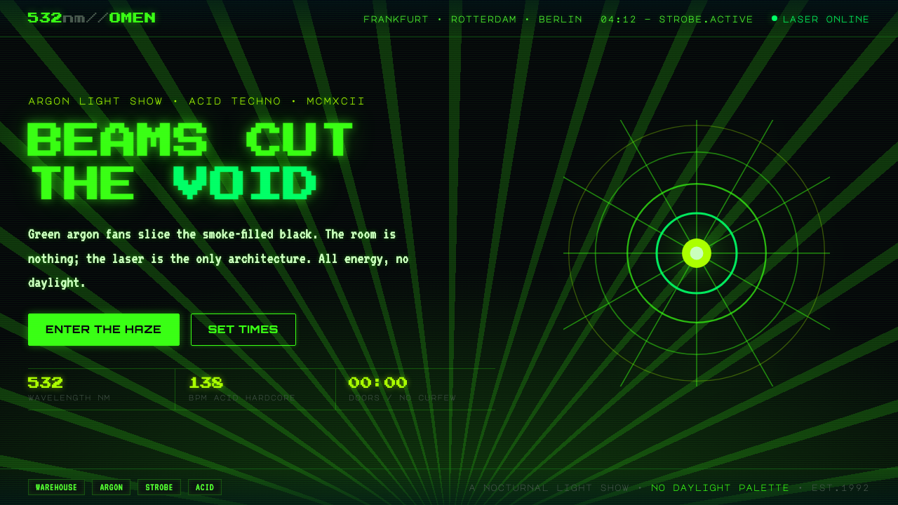 Acid Rave Laser Show 1992Beams cut the void. Argon green on pitch-black smoke, pixel marquee type, add…
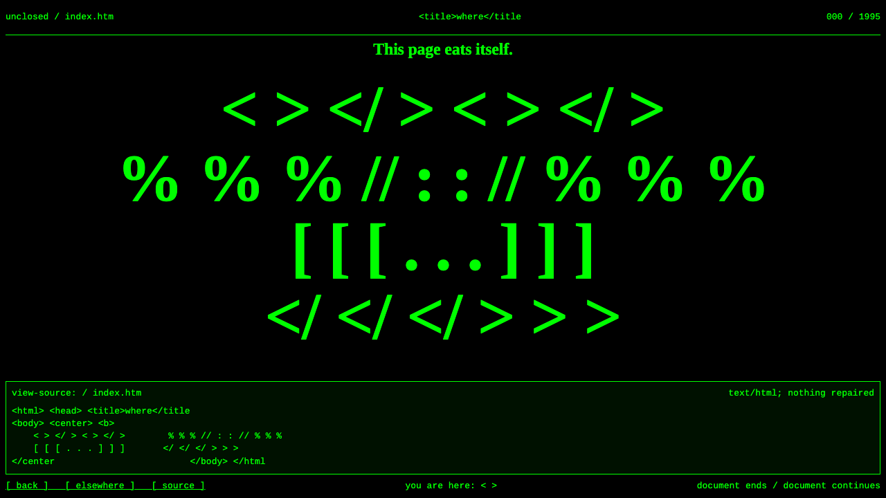 net.art (JODI)Confusion is the medium. HTML green on black; Times noise collapses into Cour…
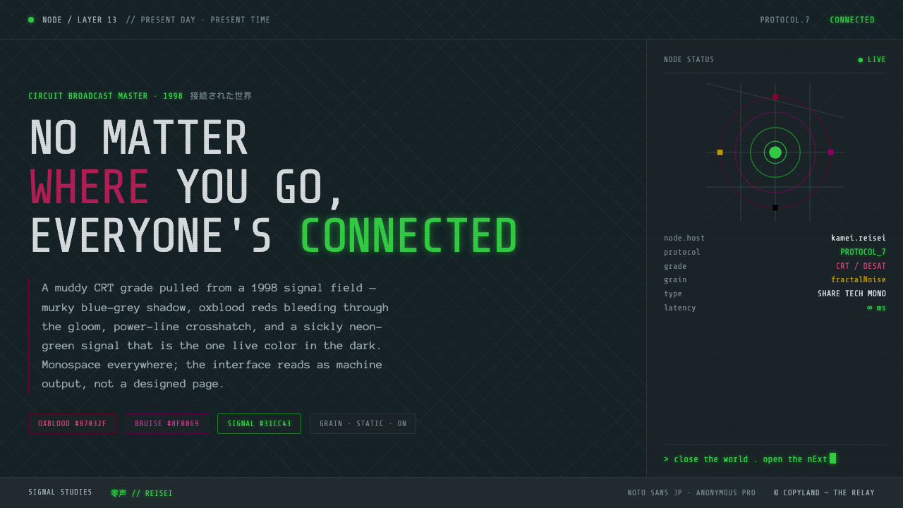 Serial Experiments LainMuddy CRT dread from the 1998 Wired. Blue-grey murk, oxblood reds, one sickly…
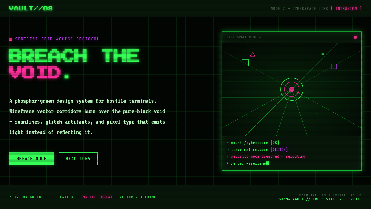 System ShockHostile retro terminal. Phosphor-green wireframes burn over black, magenta ma…
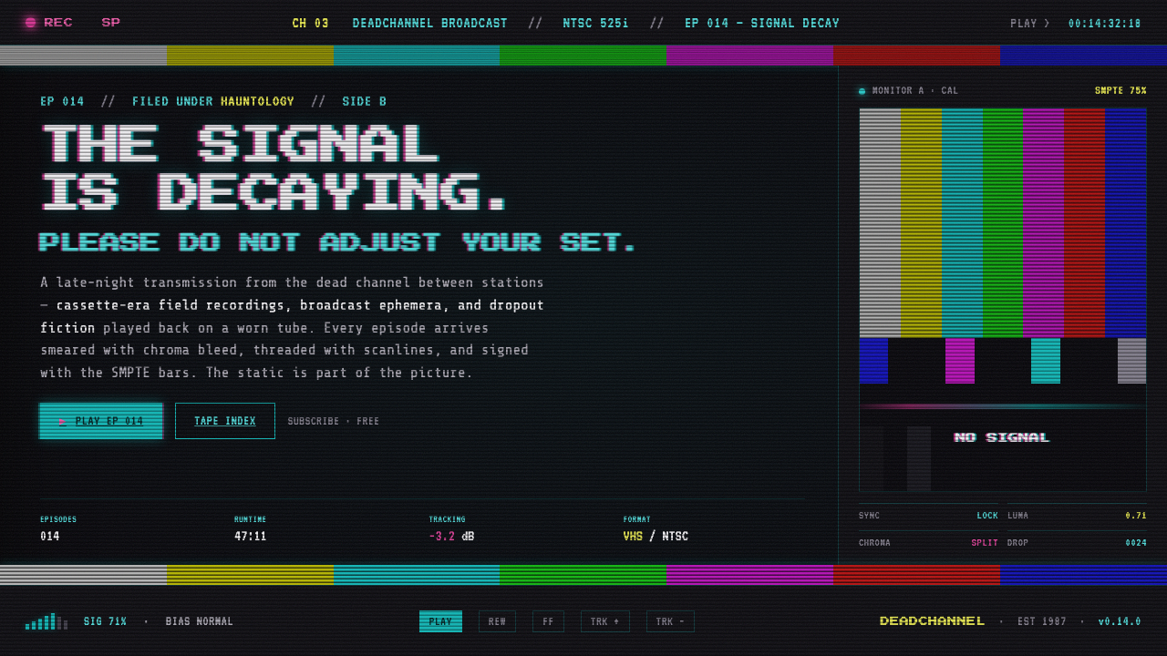 VHS Glitch TapeThe signal is decaying, on purpose. SMPTE color bars, scanlines, chroma split…
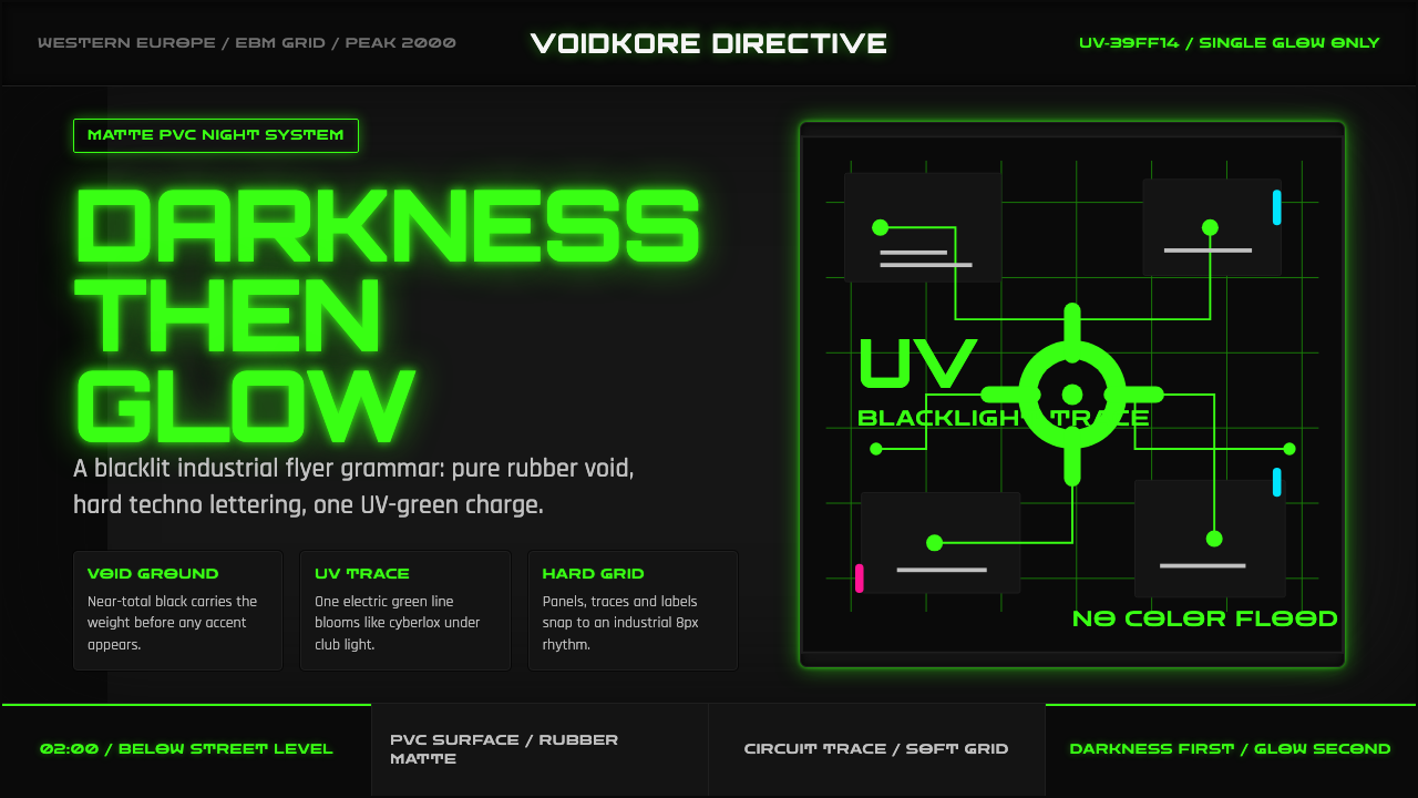 Cybergoth RaveDarkness rules. Pure black PVC is split by one UV-green circuit glow.