What is net.art (JODI)?
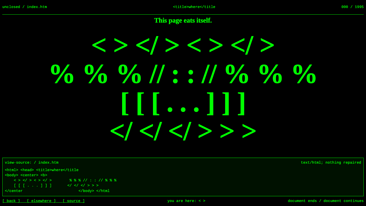
net.art in the JODI manner makes confusion the medium: browser-default green on black, Times noise collapsing into Courier source, and a page you must decode before it explains anything.
net.art (JODI) in brief
net.art is the name given to a small, informal movement of artists who used the early World Wide Web as their material between about 1995 and 1999. Rather than treating the browser as a neutral window, they treated its defaults, its errors and its source code as the artwork itself. The style here is built from the most famous example, the site wwwwwwwww.jodi.org, by Joan Heemskerk and Dirk Paesmans.
The visual vocabulary is whatever a mid-1990s Netscape browser did by default: a black page, bright pure green for text and links, Times for body text, Courier for anything monospaced, and a handful of flat colour grounds. Markup is left deliberately broken or misused, so the page arrives as noise, blinking and shifting, and only the viewer's curiosity reveals its structure.
This is the opposite of most design systems, which exist to make information clear at once. Here the first experience is disorientation, and clarity comes later, if at all, by looking underneath. It is a style for work that wants to unsettle the reader before it says anything, such as experimental art, music projects, critical essays about technology and deliberately difficult interfaces.

Where does net.art (JODI) come from?
wwwwwwwww.jodi.org was registered in August 1995 by Joan Heemskerk and Dirk Paesmans, who work together under the name JODI. They are based in the Netherlands and Belgium, with a studio connection to Barcelona. The site is the single most cited work of the net.art period, and it is still online. A first-time visitor sees a screen of flickering green characters on black that looks like a broken page or a system fault.
The trick is hidden in the source. A viewer who chooses to look at the page source finds the same characters laid out neatly, forming something like a schematic drawing in text. The chaos on screen came from a small markup omission that made the browser squeeze the diagram into noise. The work therefore asks the visitor to move between two states, the surface and the code, and to understand that both are the artwork.
JODI was part of a wider circle. Vuk Ćosić, a Slovenian artist, is often credited as one of the figures around the early use of the term net.art, a name said to come from a garbled email message. Olia Lialina made narrative web pieces in the same period, using frames, hyperlinks and black backgrounds as storytelling tools. Together they treated the web as a new, unfinished medium that could be questioned, broken and re-read.
The surrounding traditions are net.art itself, glitch art, which values errors as aesthetic events, and browser art, which makes the browser the subject. All of them rejected the idea that the web was only a delivery channel for finished corporate content. The design system takes that attitude and turns it into rules: browser-default colours, only system typefaces, hard blinking, full-page colour changes and View Source as part of the experience.
What defines the net.art (JODI) look?
Pure green on black
The ground is black and the text and links are the brightest, most saturated green a screen can show. It is not a designed palette but the colour pairing a browser applied when a page specified it in the crudest way. The harsh contrast makes everything vibrate slightly, which is part of the intended discomfort.
Only system fonts
Two faces appear, a Times-style serif for body text and a Courier-style monospace for code and structured text. There are no custom web fonts, no weights, no careful pairing. The serif looks plain and slightly old-fashioned, and the monospace makes everything look like a terminal printout. The refusal to style type is itself the style.
Deliberately broken markup
Tags are left unclosed, misused or nested in the wrong way, so the browser produces unexpected results: squeezed diagrams, runs of text that never wrap and areas that seem to collapse. The visual noise is not decoration but the direct output of errors, and it changes with each browser and window size.
Hard blinking
Text switches fully on and off with no fade, as the old blink behaviour did. There is no easing and no softness, only abrupt presence and absence. Used sparingly, it creates urgency and unease; used everywhere, it becomes unreadable, which is sometimes exactly the point. Accessible alternatives should be provided for people sensitive to flashing.
Full-page colour grounds
Pages can switch entirely to raw, flat grounds such as pure red, yellow or orange, with no gradient or texture. These are the default colour names a browser understood, so they feel unprocessed. The abrupt jump from black to a flat colour acts like a cut in film, resetting the viewer's expectations.
View Source as content
The system treats the code behind the page as part of the work. Structured text, ASCII-style drawings and hidden messages sit in the source, waiting for the curious. This means the design extends beyond the screen: the deepest layer of the experience is the one that most visitors never open.

Who shaped net.art (JODI)?
Heemskerk is one half of JODI and co-registered wwwwwwwww.jodi.org in 1995. Her work with Paesmans established the idea that a web page could be an artwork whose subject is the browser itself, its failures and its hidden source. The site's continued presence online makes it a rare surviving primary document of the period.
Paesmans is the other half of JODI. Together the duo extended their approach beyond the web into software and game modifications, keeping the same interest in breaking systems open to see how they work. Their practice shows that the style is a method of inquiry rather than a one-off visual trick.
Ćosić, an artist from Slovenia, is often named in accounts of how net.art got its name, a term said to have emerged from a corrupted email message. His role illustrates how the movement was formed through online exchange among a small, international group rather than through galleries or institutions.
Lialina made narrative web works in the same period, using frames, links and stark backgrounds to tell stories. Where JODI emphasises disorientation, Lialina shows how the same raw web materials can carry a quiet, emotional narrative. Together they define the range of what net.art could be.
How do you use net.art (JODI) today?
This style is a deliberate tool, not a general-purpose theme. Use it when disorientation serves the content: when the subject is the web itself, when you want to critique polished interfaces or when you are making work meant to be explored rather than skimmed. If the user needs to complete a task quickly, choose another system.
For presentation slides, the black and green pairing makes an unmistakable cover, especially for talks on internet history, technology criticism or experimental culture. Keep the text sparse and use the monospace face for key phrases. Content slides can alternate between black and a single flat colour ground, and data slides can be shown as raw text tables in the monospace face, as though printed from a terminal.
For web interfaces, the style suits art projects, experimental music pages, personal sites, portfolios of generative or browser-based work, and thoughtful parody. A dashboard in this mode should be used only for something playful: a log viewer or terminal-like tool. Pricing and sign-up pages are poor candidates, because confusion at the point of payment destroys trust.
For editorial and marketing work, it fits essays on technology, event posters for digital art, record sleeves for electronic releases and campaign pages that want to signal a rejection of polish. A good piece in this style has a reward for the curious, such as a hidden line in the page source or a message that appears only after interaction. Always make the underlying meaning discoverable, so that the confusion feels purposeful.
The most important mistake to avoid is making the page truly unusable. The style's confusion is a form of invitation, so navigation, contact details and essential information must remain reachable, and blinking must come with a way to turn it off. Another mistake is cleaning the style up with custom fonts and soft colours, which removes its force. Finally, do not use it as a cheap retro costume; the original worked because it exposed how the web really functioned.

net.art (JODI) — FAQ
What is net.art?
It is an artistic movement from roughly 1995 to 1999 in which artists used the early web as a medium, treating browser behaviour, errors and source code as part of the work. Key names include Joan Heemskerk and Dirk Paesmans as JODI, Vuk Ćosić and Olia Lialina.
Why does the page look broken on purpose?
Because the confusion is the artwork. In the original site, a small markup omission made the browser squeeze an orderly text diagram into flickering noise. The visitor is invited to look at the source and discover the hidden structure, so what looks like a malfunction is actually a layered experience.
Is this the same as brutalist web design?
They overlap in rejecting polish, but they differ in intent. Brutalist web design is usually a deliberate, readable aesthetic with strong structure. The JODI approach is closer to a glitch: it uses browser defaults and errors to disorient first and explain later, and it treats the code underneath as part of the content.
How do I use blinking responsibly?
Use it sparingly, on short phrases rather than whole pages, and provide a control that disables it. Flashing content can be uncomfortable or unsafe for some people, so keep the effect slow enough and limited enough to be safe, and respect the reduced-motion preferences set by the user's system.
Where does this style work and where does it fail?
It works for art, experimental music, critical writing about technology and playful personal sites, where disorientation is part of the message. It fails in transactional or safety-critical contexts such as checkout, banking or healthcare, where users need to understand and trust the interface immediately.
Related design styles
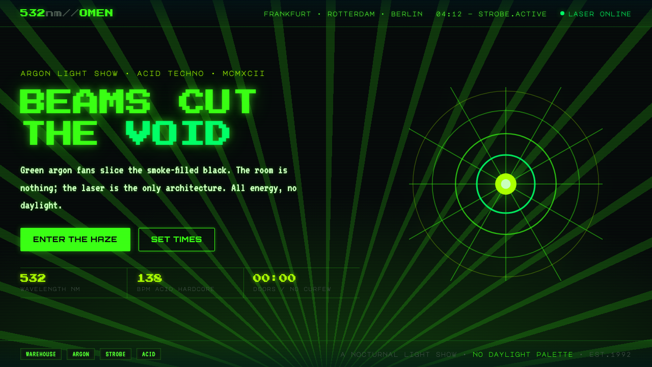 Acid Rave Laser Show 1992Beams cut the void. Argon green on pitch-black smoke, pixel marquee type, add…
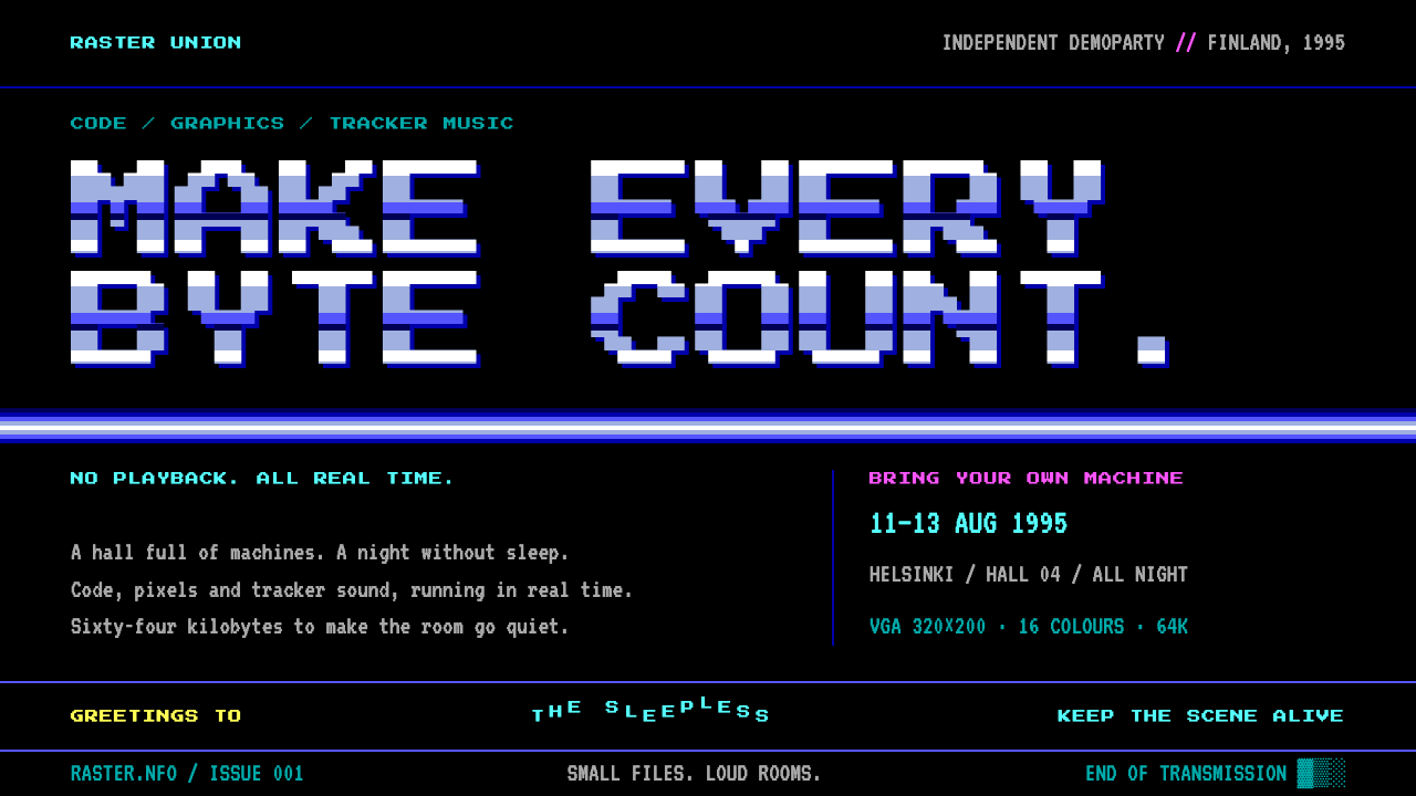 DemosceneEvery byte earns its place. Bitmap type and banded chrome burn cyan against p…
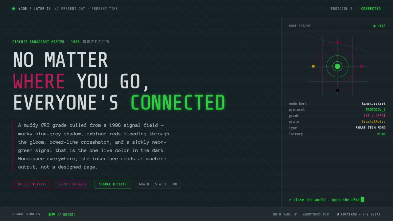 Serial Experiments LainMuddy CRT dread from the 1998 Wired. Blue-grey murk, oxblood reds, one sickly…
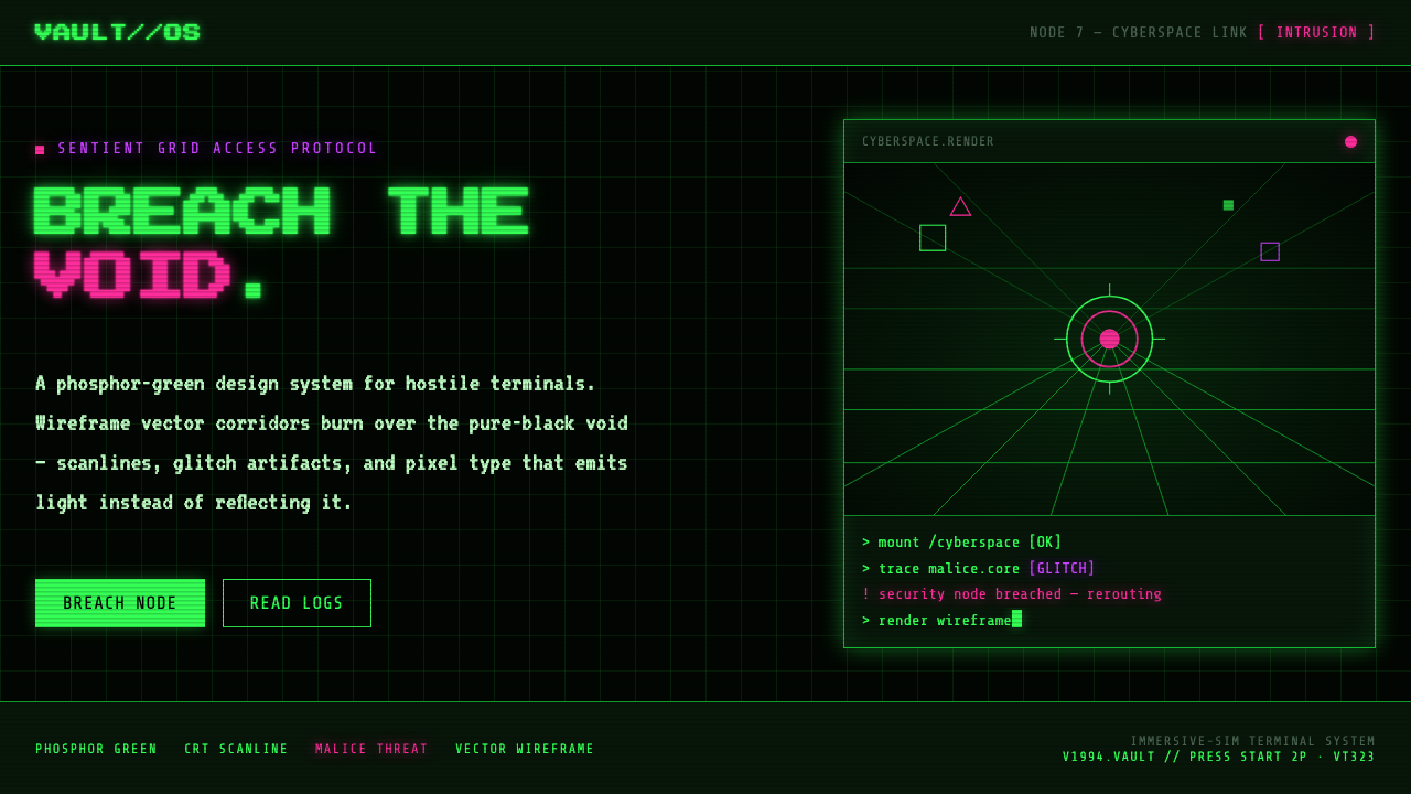 System ShockHostile retro terminal. Phosphor-green wireframes burn over black, magenta ma…
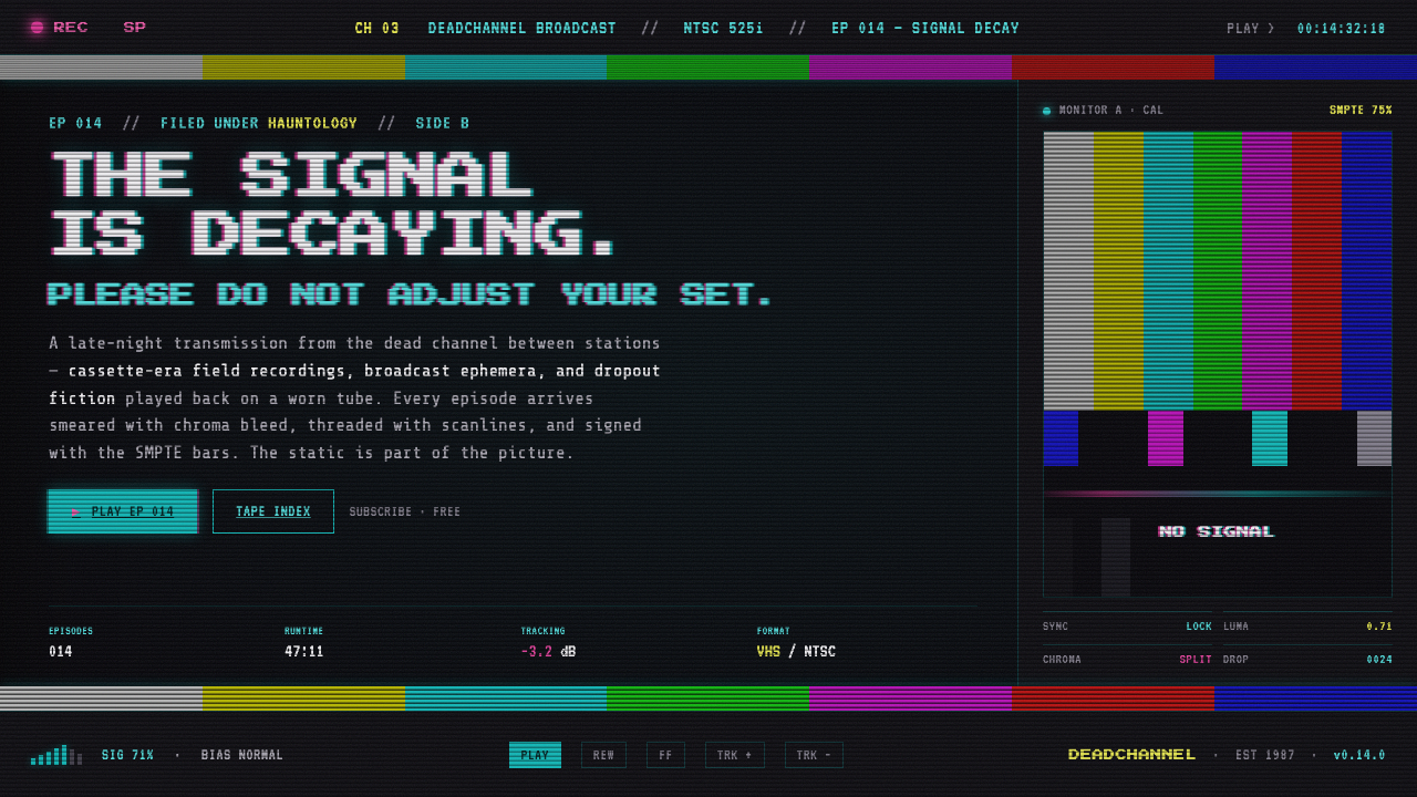 VHS Glitch TapeThe signal is decaying, on purpose. SMPTE color bars, scanlines, chroma split…
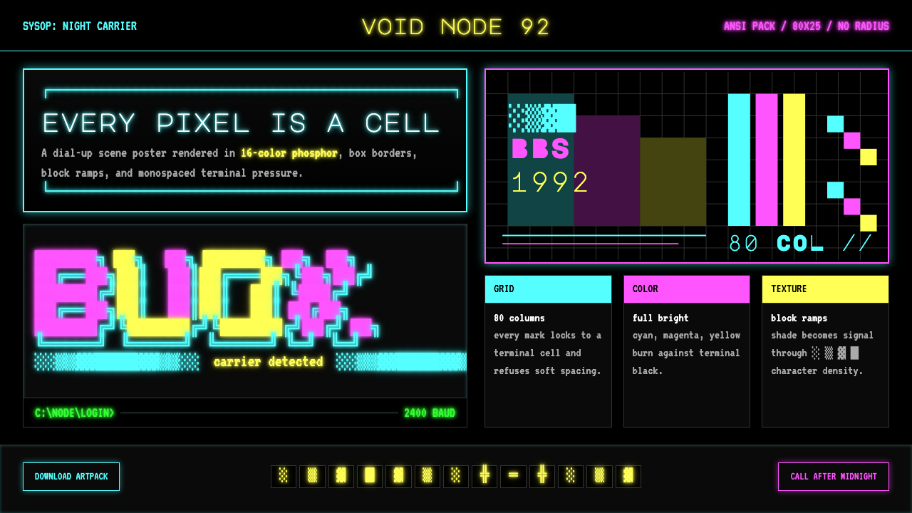 ASCII Art BBS (1992)Terminal art hits hard. Cyan-magenta-yellow glow, box borders, block ramps.