What is Shungite Charcoal Mineral?
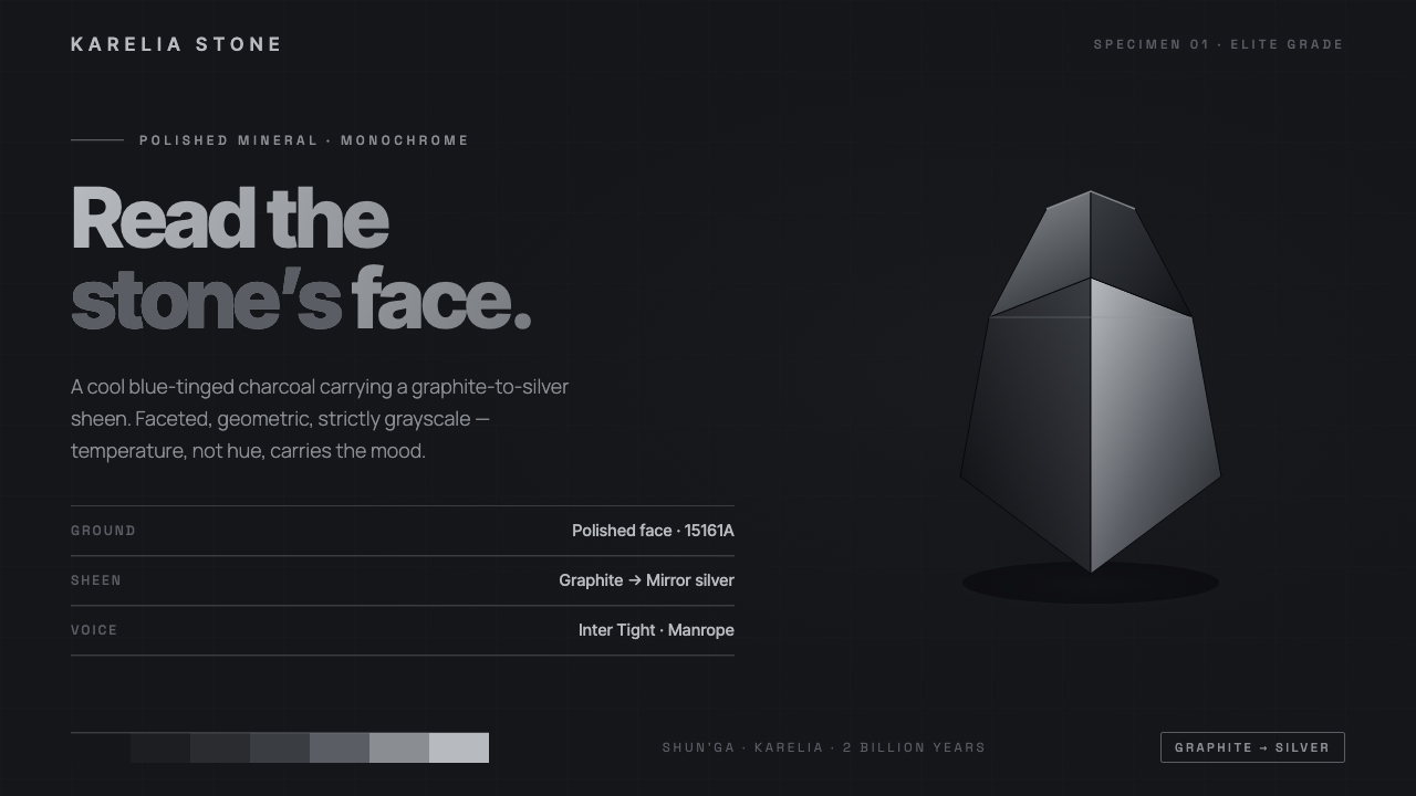
Shungite turns darkness into a surface — cool blue-charcoal, graphite-silver sheen, faceted geometry, and a strict refusal of every warm or decorative interruption.
Shungite Charcoal Mineral in brief
Shungite Charcoal Mineral reads the polished face of a rich near-black carbon mineral from Karelia. Its visual identity is not simply black: it is a cool, blue-tinged charcoal with a restrained metallic sheen that moves from graphite to silver. In higher-carbon elite shungite, that surface becomes almost mirror-bright, producing a dense gunmetal impression without leaving the grayscale family.
The design system distills the stone into a clean geometric language. Faceted planes suggest cut mineral surfaces; matte fields sit beside controlled glossy passages; hairline steel rules introduce structure without decoration; generous negative space gives the dark material room to register. Every contrast is drawn from surface and value rather than hue, so the composition remains strictly monochrome.
The resulting mood is mineral, precise, and composed. Darkness is used as a material condition rather than a theatrical backdrop, while silver highlights behave like light passing across a polished edge. The style feels most coherent when every element appears intentional: planes align, rules stay quiet, type remains legible, and no warm color or ornamental detail competes with the stone-like surface.
Where does Shungite Charcoal Mineral come from?
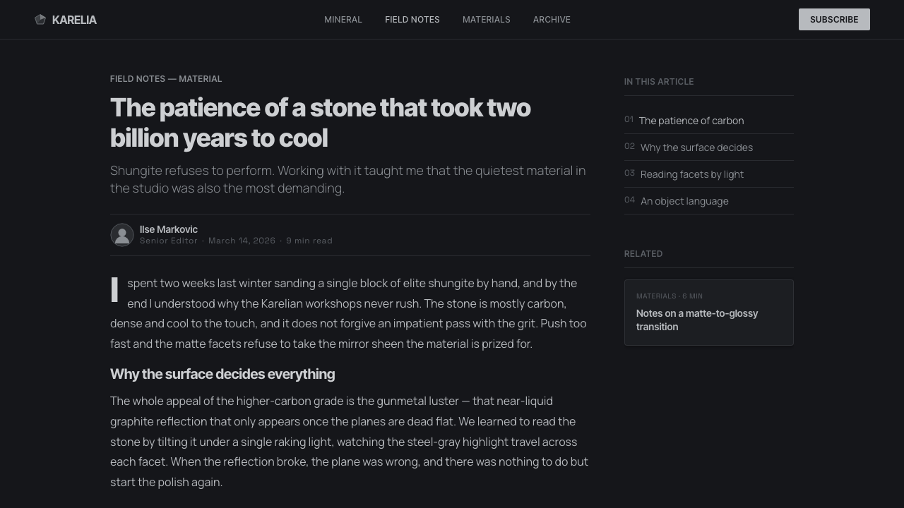
The material reference is an ancient Precambrian mineral sourced from Shun’ga in Karelia, Russia. Shungite is characterized here as a rich near-black carbon mineral whose identity begins with its stone face: dense, cool, and dark, yet capable of returning a metallic glint when polished. The system takes that physical impression as its primary source rather than borrowing from a broader decorative tradition.
Its contemporary design origin belongs to the period from 2010 to now, during the wellness-branding moment for an ancient mineral. The visual language emerged through a meeting of minimalist wellness branding, polished-mineral product design, and monochrome modernism. These movements share an interest in reducing visual noise while preserving a sense of substance, finish, and controlled presence.
The translation from mineral to interface is deliberately selective. The stone’s near-black body becomes charcoal ground; the graphite-to-silver sheen becomes a hierarchy of matte and reflective surfaces; the cut face becomes faceted geometry; and the fine metallic line becomes a quiet structural rule. Nothing in the system requires literal stone texture. The goal is to preserve the material logic of polished shungite in a cleaner, more reusable form.
Because the style is global and internet-born, it can move easily between wellness brands, crystal-goods makers, and gem and mineral suppliers. Its source remains specific, but its application is portable: the same restrained grayscale can frame a product, organize information, or establish a digital environment. The internet context also encourages consistency across screens, packaging, catalogs, and product pages without turning the mineral reference into a novelty graphic.
What defines the Shungite Charcoal Mineral look?
Color
The palette stays within cool charcoal, blue-tinged near-black, graphite, gunmetal, and silver. The blue is an undertone inside the charcoal, never a separate accent. Silver appears as a return of light on a polished face, while darker values provide mass and quiet. Warm hues and chromatic interruptions are excluded because they weaken the mineral reading.
Surface
Surface contrast carries much of the system’s expression. Matte charcoal can establish a grounded field, while graphite or silver passages introduce the sensation of a polished plane catching light. The transition should feel deliberate and mineral-like, never decorative or glossy for its own sake. Texture remains restrained so the design reads as a considered surface rather than a simulated photograph.
Faceted Geometry
Geometry refers to the cut face of the stone: planes meet at purposeful angles, edges carry visual weight, and shapes feel assembled rather than fluid. Facets may organize a background, frame a product, or divide a panel into quiet changes of value. Their purpose is to create structure and direction, not to fill empty space with ornament.
Typography
Typography should be clean, geometric, and highly legible against the dark ground. Strong contrast in scale and density creates hierarchy, while restrained spacing lets letters hold their shape in the surrounding darkness. Silver or pale text can signal prominence, but it should not become a metallic effect applied everywhere. Type is the clearest human voice inside the mineral field.
Rules and Negative Space
Hairline steel rules provide orientation without competing with the content. They can separate information, align labels, or mark the edge of a faceted plane, but their visual presence should remain quiet. Generous negative space is equally structural: it gives dark surfaces room to breathe and prevents the composition from becoming a dense block of black.
Depth and Light
Depth comes from the relationship between value, plane, and sheen rather than from elaborate illusion. A darker field can recede, a graphite facet can turn, and a silver edge can catch attention like a polished bevel. Shadows should remain controlled and close to the object. The effect is dimensional but still diagrammatic, as if the design were carved, cut, and carefully placed.

Who shaped Shungite Charcoal Mineral?
These brands represent the contemporary context in which shungite’s ancient material identity becomes a modern visual system. Their contribution is a disciplined reduction: calm dark grounds, carefully staged mineral sheen, and enough negative space for the product or message to feel intentional. They establish the style’s connection to clarity, restraint, and the polished presentation of a natural material.
Crystal-goods makers extend the system from branding into the product object itself. Their work makes faceted planes, polished edges, and the distinction between matte and reflective surfaces immediately legible. In this context, monochrome is not a loss of character; it lets shape, finish, and the mineral reference carry the identity without competing color.
Gem and mineral suppliers anchor the style in material specificity. Their presence keeps the system connected to actual stone rather than abstract dark luxury. The visual language can therefore remain spare while still communicating origin, surface quality, and the difference between a dense charcoal body and a mirror-bright gunmetal finish.
How do you use Shungite Charcoal Mineral today?
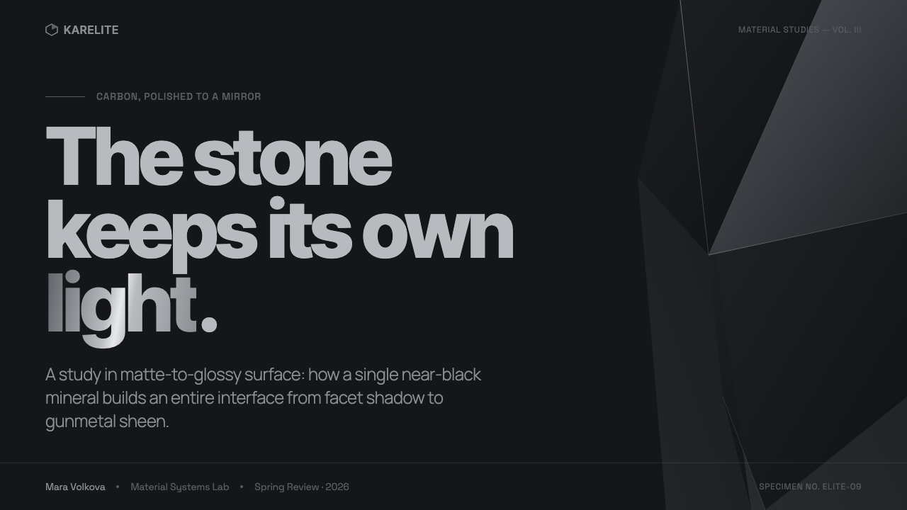
For presentation slides, use the cover as a dark mineral field with a single strong faceted gesture, a restrained silver edge, or a quiet graphite plane carrying the title. Content slides should preserve generous breathing room and use hairline rules to organize sections rather than decorative dividers. Data slides benefit from the same logic: charts should feel carved from the surface, with value and sheen establishing hierarchy while the grayscale keeps the information coherent.
For web interfaces, the system suits dashboards and pricing pages that need authority without visual noise. Keep the principal field near charcoal, reserve pale graphite or silver for readable text and active emphasis, and let faceted panels distinguish groups of information. Cards should feel like mineral slabs with controlled edges, not floating ornaments. Pricing tiers can be separated through surface depth and restrained contrast rather than competing accent colors.
For editorial and marketing work, the style creates a strong relationship between dense dark surfaces and open space. An article can place a narrow reading column inside a broad charcoal field, using steel rules for metadata and graphite planes for quotations or product notes. Marketing pages can present a mineral object against a quiet dark ground, then shift to a silver-led section for specification or provenance. The alternation should feel like light moving across stone.
For product catalogs, collection pages, and supplier materials, keep the mineral reference close to the object. Use faceted framing, subdued surface transitions, and restrained labels to distinguish finish, form, and source. Product imagery should be cropped with purpose and allowed to retain its dark mass. The surrounding interface should support inspection rather than create an atmosphere so elaborate that the object disappears inside it.
The common mistake is treating the style as permission to make everything black, metallic, and reflective. A convincing result needs tonal separation: matte charcoal for foundation, graphite for structure, and silver only where light or hierarchy needs to return. Another mistake is adding warm neutrals, colorful gemstone accents, excessive texture, or decorative gloss. The system works through disciplined grayscale, faceted order, and negative space; remove any element that interrupts those relationships.
Shungite Charcoal Mineral — FAQ
Is Shungite Charcoal Mineral simply a black design style?
No. Its identity depends on the difference between cool charcoal, blue-tinged near-black, graphite, gunmetal, and silver. Black alone produces a flat field. Shungite Charcoal Mineral needs controlled shifts in value and surface so the viewer can sense density, polish, edge, and depth while the composition remains monochrome.
Can the style use blue or other accent colors?
Blue may exist as the cool undertone inside charcoal, but it should not behave like a separate colorful accent. The approved language is strictly monochrome, so warm hues and chromatic interruptions should be excluded. If a section needs emphasis, use a lighter value, a polished surface, a faceted edge, or a stronger spatial position instead of introducing color.
Why are matte and glossy surfaces both necessary?
They recreate the essential reading of polished stone. Matte charcoal provides mass and rest, while graphite or silver sheen suggests a plane turning toward light. Without matte, the design becomes uniformly reflective; without sheen, it loses the polished mineral reference. The contrast should remain controlled and structural rather than decorative.
Does the style require literal stone textures or mineral photography?
No. The system is based on the stone’s visual logic, not on literal imitation. Faceted planes, quiet value transitions, polished edges, and disciplined negative space can communicate the reference without covering every surface in texture. Literal imagery is appropriate when the object itself needs inspection, but the interface should remain cleaner than a photograph.
Where does Shungite Charcoal Mineral work best?
It works best where material presence, restraint, and clear organization matter: minimalist wellness branding, crystal-goods presentation, gem and mineral supply, product catalogs, dashboards, pricing pages, and editorial systems centered on polished objects. It is less convincing when the brief depends on warm color, abundant ornament, or playful chromatic variety, because those qualities conflict with its strict grayscale discipline.
Related design styles
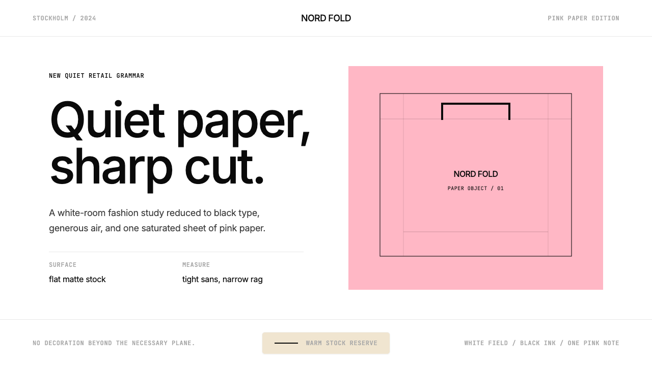 Acne Studios Pink-PaperQuiet luxury in one pink plane. Inter type floats on white with a bag-like re…
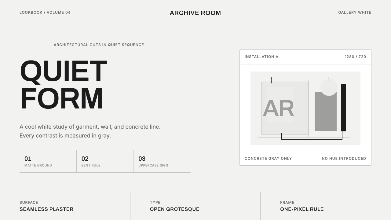 COS Gallery MinimalSilence has structure. Cool gallery white, Archivo uppercase, and concrete-gr…
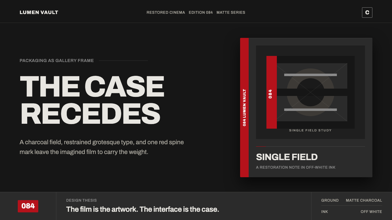 Criterion ArthouseThe case disappears. Charcoal field, off-white Archivo, hairline rules, one r…
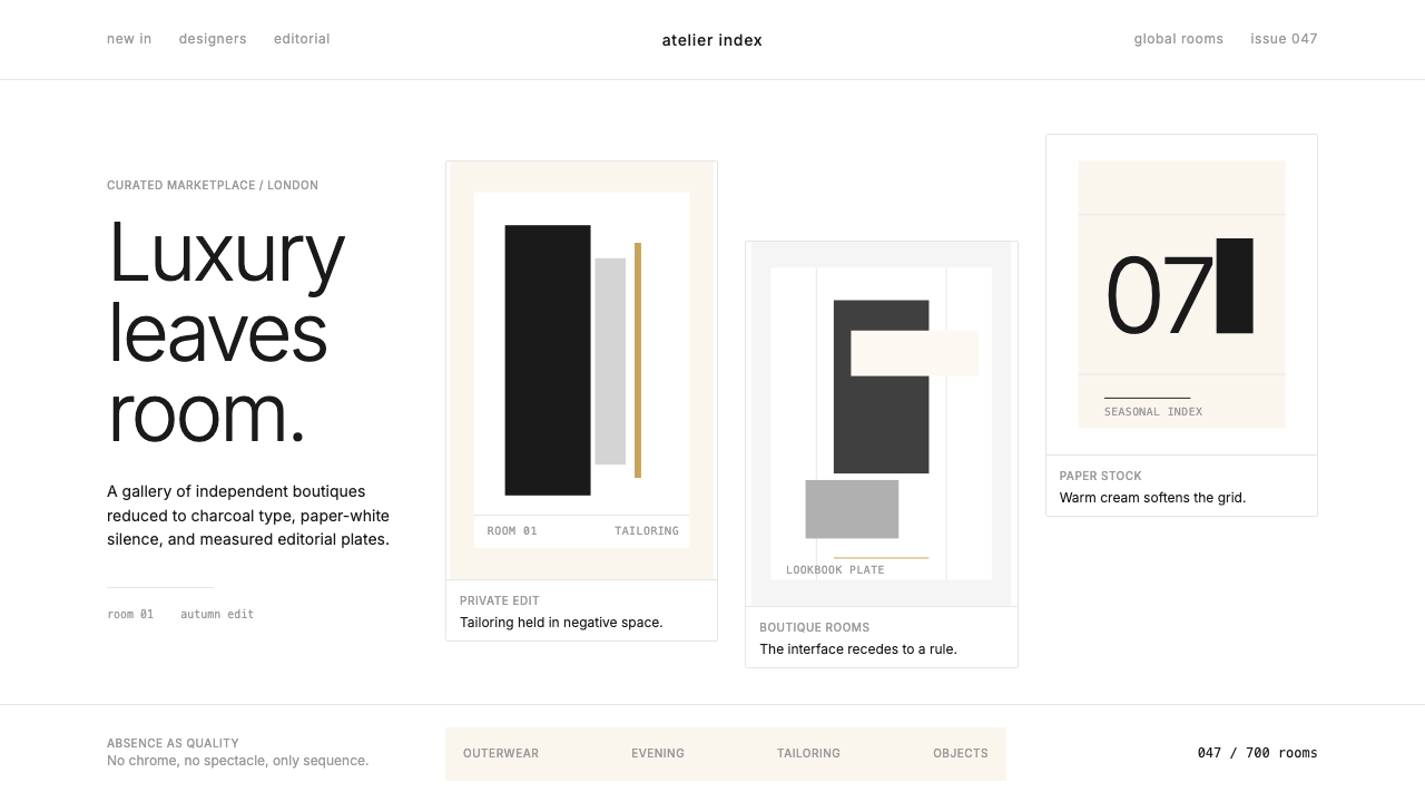 FarfetchLuxury as absence. Charcoal type, white canvas, and hairline editorial plates.
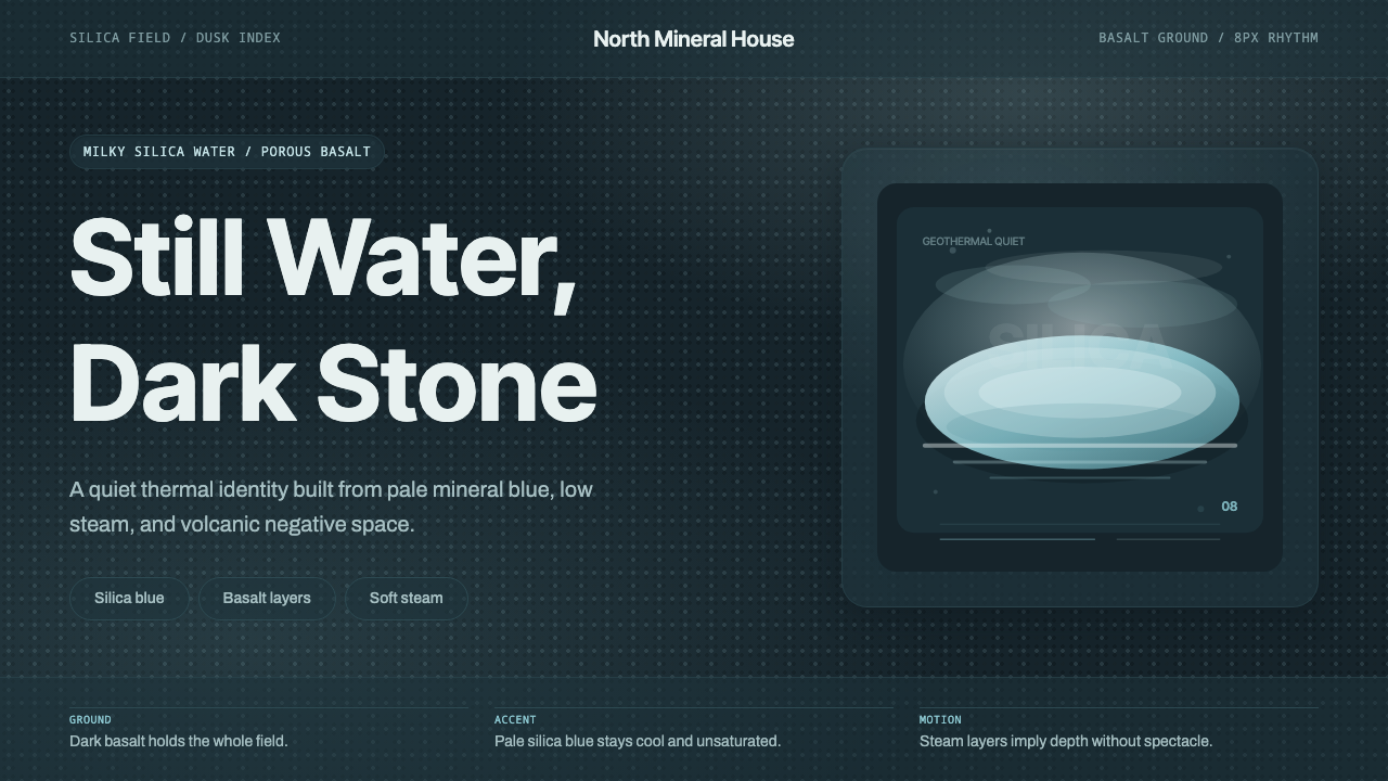 Glacial Teal LagoonQuiet feels elemental. Basalt darks and milky silica blue drift in a low-cont…
 Qatari Pearl Modern Architecture 2024Monumental restraint. Obsidian panels, sand-gold gridlines, pearl-white geome…